World Architecture Awards 10+5+X Submissions
World Architecture Awards Submissions / 53rd Cycle
Vote button will be active when the World Architecture Community officially announces the Voting period on the website and emails. Please use this and the following pages to Vote if you are a signed-in registered member of the World Architecture Community and feel free to Vote for as many projects as you wish.
How to participate
WA Awards Submissions
WA Awards Winners
Architectural Projects Interior Design Projects
Architectural Projects Interior Design Projects
Intrinsic
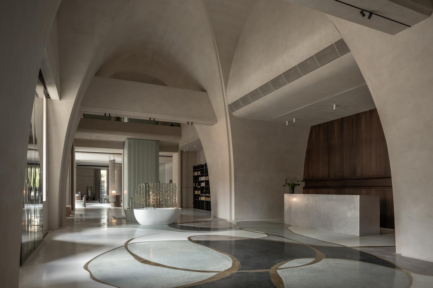


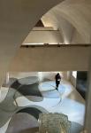
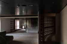

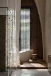


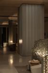

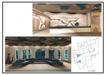
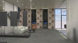
This is a showroom of bathroom equipment for one of the most famous local brands in Taiwan. Our client built the first modern kiln in Taiwan back in 1966, which is a vital part of the history of modern Taiwanese ceramic progress. The brand is known for its professionalism and quality in ceramic products.
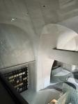
In this showroom, we try to bring the visitors back to 1966 by reimagining the ceramic firing process. Stepping into the showroom, visitors will be greeted by a grand dome that mimics the shape of a kiln with a wood-textured wall on the back of the front desk. When light projects from the bottom floor, it creates a visual movement of the fireplace effect with the wood texture, creating a simple atmosphere with the theatrical, artistic beauty of nature. The main showroom walls are decorated with a rough kiln surface texture and color, creating a strong but soothing color and texture comparison between the surroundings and the display pieces.
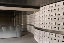
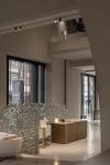
This Calce wall coating not only provides a unique texture but also automatically adjusts the humidity and temperature according to the number of people, creating a comfortable and energy-saving interior space. In addition to the firebrick-textured walls, we selected various colored ceramic tiles for the floor and shaped them in natural curved lines.
Those colored ceramic tiles not only represent the five color elements in Chinese philosophy as a good omen but also present how metal oxides color the ceramic fabrication.
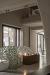
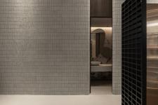
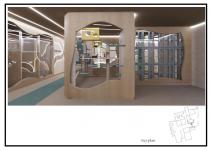
The space arrangement of this project aims to break the conventional decorative display walls and shelves in retail. Our design considered each selling piece and decorative material as an art piece and a part of the whole space, transitioning each space with light, U-shaped glass, grilles, and small ceramic tiles.
By using soft materials and delicate lighting, we create a sense of movement among the unmovable items. We want the space to be affluent, feeling as if one is in a natural cave, experiencing how the client’s products are created from materials to art pieces. For instance, we reused the offcuts and defective products from the clients and turned them into handmade tile pieces for the wall, like a mosaic, allowing the raw beauty of the material to speak for itself. Each piece shows its own unique handmade traces and tells its craft story. The nearby stainless steel display shelf also reflects that beautiful design in simplicity. At the same time, when new products are to be displayed, there is no need to redecorate the entire showroom, reducing the waste cost in business redecoration and promoting a more sustainable retail space. In this unique showroom & retail space, we designed a natural-like interior space as a tribute to our main target: the products, hoping to bring all visitors an immersive museum-like experience.
Chain10 Architecture & Interior Design Institute
In this showroom, we try to bring the visitors back to 1966 by reimagining the ceramic firing process. Stepping into the showroom, visitors will be greeted by a grand dome that mimics the shape of a kiln with a wood-textured wall on the back of the front desk. When light projects from the bottom floor, it creates a visual movement of the fireplace effect with the wood texture, creating a simple atmosphere with the theatrical, artistic beauty of nature. The main showroom walls are decorated with a rough kiln surface texture and color, creating a strong but soothing color and texture comparison between the surroundings and the display pieces.
This Calce wall coating not only provides a unique texture but also automatically adjusts the humidity and temperature according to the number of people, creating a comfortable and energy-saving interior space. In addition to the firebrick-textured walls, we selected various colored ceramic tiles for the floor and shaped them in natural curved lines.
Those colored ceramic tiles not only represent the five color elements in Chinese philosophy as a good omen but also present how metal oxides color the ceramic fabrication.
The space arrangement of this project aims to break the conventional decorative display walls and shelves in retail. Our design considered each selling piece and decorative material as an art piece and a part of the whole space, transitioning each space with light, U-shaped glass, grilles, and small ceramic tiles.
By using soft materials and delicate lighting, we create a sense of movement among the unmovable items. We want the space to be affluent, feeling as if one is in a natural cave, experiencing how the client’s products are created from materials to art pieces. For instance, we reused the offcuts and defective products from the clients and turned them into handmade tile pieces for the wall, like a mosaic, allowing the raw beauty of the material to speak for itself. Each piece shows its own unique handmade traces and tells its craft story. The nearby stainless steel display shelf also reflects that beautiful design in simplicity. At the same time, when new products are to be displayed, there is no need to redecorate the entire showroom, reducing the waste cost in business redecoration and promoting a more sustainable retail space. In this unique showroom & retail space, we designed a natural-like interior space as a tribute to our main target: the products, hoping to bring all visitors an immersive museum-like experience.
Chain10 Architecture & Interior Design Institute
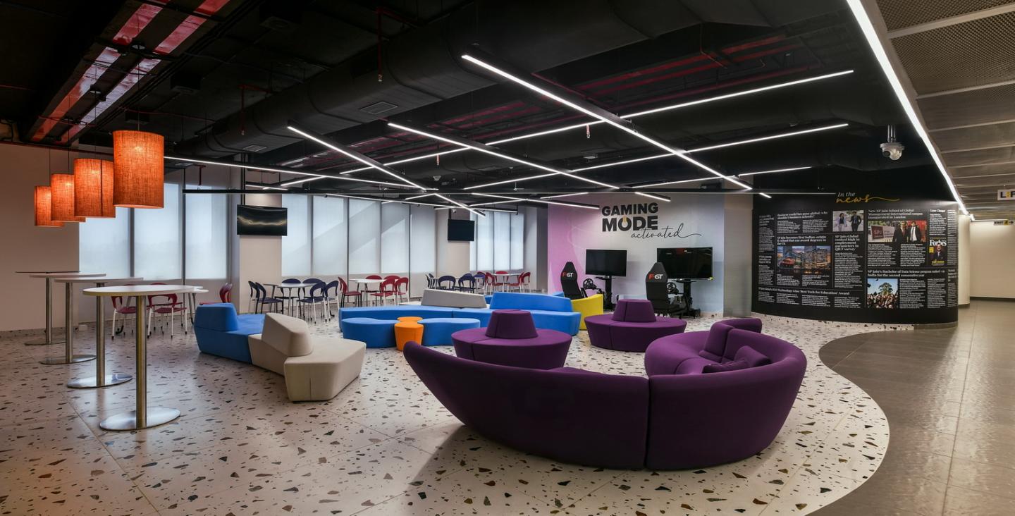
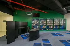
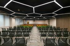
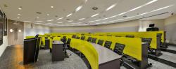
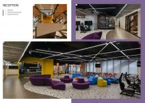
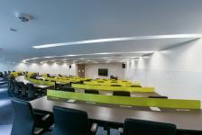
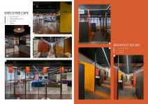
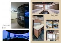
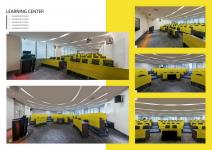
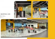
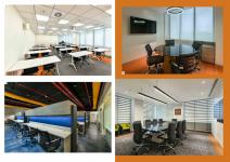
S. P. Jain School of Global Management, Mumbai Campus Interior
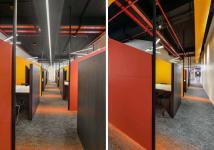


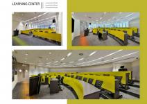

EMBRACING THE FUTURE: A CAMPUS DESIGN FOR THE GEN Z ERA
In the ever-evolving landscape of education, campus design plays a pivotal role in shaping the learning experience. As we look to the future, it’s crucial to create environments that are not only aesthetically pleasing but also functional, interactive, and reflective of the globalized world we live in. A campus with a vibrant and international flavor, catering to the Gen Z generation, is a testament to the commitment to innovation and inclusivity in education.
VIBRANCY THROUGH DESIGN
A vibrant campus design is more than just a visual treat; it’s an embodiment of energy, creativity, and the joy of learning. Bright, open spaces with innovative architecture and a splash of colour can invigorate the learning atmosphere. Incorporating green spaces, art installations, and interactive zones further adds to the campus’s vibrancy, creating a conducive environment for both studying and socializing.
AN INTERNATIONAL EXPERIENCE
In a world that is increasingly interconnected, an international flavor is a must. Our campus design reflects a commitment to diversity and cross-cultural exchange. It includes spaces for international student lounges, cultural centers, and global cuisine options. Thematic elements from different cultures enhance the international ambiance, making all students, regardless of their background, feel welcome and valued.
CATERING TO THE GEN Z GENERATION
Understanding the Gen Z generation is key to successful campus design. This tech-savvy
generation thrives on innovation and interactively, Smart classrooms equipped with the latest teaching tools, virtual reality labs, and tech hubs promote an engaging learning experience. Flexible learning spaces accommodate both collaborative and independent work, adapting to Gen-Z’s dynamic learning preferences.
INTEGRATION OF TECHNOLOGY
Technology is not just a tool but an integral part of the modern learning experience. Our
campus is equipped with interactive technology, making lessons more engaging and accessible.
Virtual learning platforms and digital libraries to empower students to take control of their education.
A FRIENDLY AND INVITING ATMOSPHERE
Friendliness and warmth are central to our campus’s design philosophy. Common areas with comfortable seating, cozy nooks for group discussions, and open courtyards create inviting spaces for students to connect, relax, and recharge. A friendly campus culture fosters relationship and a sense of belonging, making it easier for students to thrive academically and socially.
In conclusion, a vibrant, international, Gen-Z focused campus design with the integration of the latest teaching tools and interactive technology embodies the future of education. By embracing these concepts, our institution commits to providing a holistic and enriching educational experience for all students, preparing them to thrive in a globally connected world. Welcome to a campus where innovation, inclusivity, and the joy of learning come together to shape a brighter future.
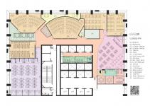
Interior Area
5th Floor = 20,000 SFT ( 1860 SMT)
9th Floor = 12,000 SFT ( 1115 SMT)
Interior Design Team:- Vishal Parmar, Ankit Jain, Vishal Sawant, Dighant Moolya, Sanika Kajare
MEP Consultant:- ARKK Consultants, Mumbai
PMC:- DACPL, Mumbai
In the ever-evolving landscape of education, campus design plays a pivotal role in shaping the learning experience. As we look to the future, it’s crucial to create environments that are not only aesthetically pleasing but also functional, interactive, and reflective of the globalized world we live in. A campus with a vibrant and international flavor, catering to the Gen Z generation, is a testament to the commitment to innovation and inclusivity in education.
VIBRANCY THROUGH DESIGN
A vibrant campus design is more than just a visual treat; it’s an embodiment of energy, creativity, and the joy of learning. Bright, open spaces with innovative architecture and a splash of colour can invigorate the learning atmosphere. Incorporating green spaces, art installations, and interactive zones further adds to the campus’s vibrancy, creating a conducive environment for both studying and socializing.
AN INTERNATIONAL EXPERIENCE
In a world that is increasingly interconnected, an international flavor is a must. Our campus design reflects a commitment to diversity and cross-cultural exchange. It includes spaces for international student lounges, cultural centers, and global cuisine options. Thematic elements from different cultures enhance the international ambiance, making all students, regardless of their background, feel welcome and valued.
CATERING TO THE GEN Z GENERATION
Understanding the Gen Z generation is key to successful campus design. This tech-savvy
generation thrives on innovation and interactively, Smart classrooms equipped with the latest teaching tools, virtual reality labs, and tech hubs promote an engaging learning experience. Flexible learning spaces accommodate both collaborative and independent work, adapting to Gen-Z’s dynamic learning preferences.
INTEGRATION OF TECHNOLOGY
Technology is not just a tool but an integral part of the modern learning experience. Our
campus is equipped with interactive technology, making lessons more engaging and accessible.
Virtual learning platforms and digital libraries to empower students to take control of their education.
A FRIENDLY AND INVITING ATMOSPHERE
Friendliness and warmth are central to our campus’s design philosophy. Common areas with comfortable seating, cozy nooks for group discussions, and open courtyards create inviting spaces for students to connect, relax, and recharge. A friendly campus culture fosters relationship and a sense of belonging, making it easier for students to thrive academically and socially.
In conclusion, a vibrant, international, Gen-Z focused campus design with the integration of the latest teaching tools and interactive technology embodies the future of education. By embracing these concepts, our institution commits to providing a holistic and enriching educational experience for all students, preparing them to thrive in a globally connected world. Welcome to a campus where innovation, inclusivity, and the joy of learning come together to shape a brighter future.
Interior Area
5th Floor = 20,000 SFT ( 1860 SMT)
9th Floor = 12,000 SFT ( 1115 SMT)
Interior Design Team:- Vishal Parmar, Ankit Jain, Vishal Sawant, Dighant Moolya, Sanika Kajare
MEP Consultant:- ARKK Consultants, Mumbai
PMC:- DACPL, Mumbai
Animal assisted therapy center - Therapet

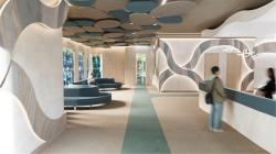
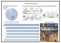
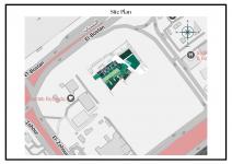


In Egypt, the need for mental health support is more urgent than ever, yet the environments designed for care are often intimidating, inaccessible, or emotionally exhausting. At the same time, the country continues to struggle with stray animal overpopulation, leaving thousands of dogs and cats vulnerable to unsafe conditions, with few sustainable sheltering solutions. Therapet was born from the intersection of these two pressing societal gaps.
Therapet is a hybrid therapeutic center and animal shelter, designed to serve both people and animals through the healing power of human-animal connection. The project aims to redefine how we think of care spaces, especially for individuals healing from trauma, anxiety, or emotional distress.
The approach is rooted in Trauma-Informed Design (TID): an architectural philosophy that prioritizes psychological safety, sensory regulation, and user empowerment. These principles guided the spatial layout, zoning, material selection, lighting strategies, and acoustic planning throughout the center.
But Therapet goes a step further: it introduces animal-assisted therapy as a foundational component of the architectural program. Rather than being clinical add-ons, animals are integrated holistically into the therapy experience, from one-on-one sessions to casual interactions in communal areas.
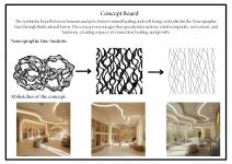
The conceptual backbone of the project is inspired by the Neurographic Line which is a free-flowing, organic form that visually and symbolically represents emotional release, transformation, and symbiosis. This line guided circulation paths, zoning curves, and ceiling treatments, reinforcing movement, softness, and visual calmness across the entire design.
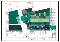
The project unfolds through multiple interconnected functions:
• A mental health therapy center offering one-to-one, group, and movement-based treatment sessions
• A stray animal shelter providing medical care, recovery spaces, and adoption zones
• Shared environments like pet-friendly cafés and walking gardens that blur the line between therapy and daily life, offering people the ability to interact with animals in informal, low-pressure ways
Therapet is not just a place for treatment, it’s a place for restoration, trust-building, and human-pet bonding. It treats animals not as accessories to therapy but as co-participants in healing. The architectural experience reflects this empathy at every turn.
By combining social architecture, mental healthcare, and animal welfare into one ecosystem, Therapet proposes a new typology:
A space where both species are seen, heard, and healed.
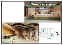
The highlighted zones:
1. Reception Area
Designed to feel more like a sanctuary than a clinic, the reception welcomes visitors with soft lighting, open sightlines, and calming materials like marmoleum and acoustic plaster. Transparent pet kennels nearby offer immediate connection to animals, easing tension from the moment users enter.
2. Pet-Friendly Café
This public zone allows for informal, non-clinical human-animal interaction — a space for social connection, stress relief, and emotional support. Materials are selected for durability and warmth, creating a cozy environment that breaks down the sterile feel of traditional therapeutic settings.
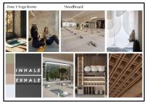
3. Yoga Room
The yoga space hosts guided animal-assisted movement therapy sessions. It uses natural textures, soft floor finishes, diffused lighting, and wooden ceiling panels to encourage grounding, breathwork, and nervous system regulation. Cats and dogs are integrated gently into the space, enhancing calmness through tactile and emotional engagement.
Zones:
Pet friendly cafe
Yoga rooms
Therapy rooms
Consulting room
Staff offices
Pet kennels
Adoption gardens
Outdoor cat patio
Outdoor walking garden
Food prep and storage
Training courtyard
Staff loungue
Pet isolation rooms
Medical reception
Examination rooms
Surgery rooms
Grooming room
Vet offices
Locker room
Break area
Restrooms
Systems
Tempered glass for pet kennels
Ultra-thin aluminum panels
Sloped floor for pet kennels
Marmoleum pet friendly flooring
Flexible plasterboard
Height adjustable ceiling acoustic panels
Cat kennels with ventilation
HEPA flirtation system
Customized acoustic panels for wall murals
Fire system ( fire extinguisher, fire detector )
HVAC system
Lighting system
Project designed and presented by: Raghad Sayed Ragab
Faculty of Arts & Design - Interior Design Department - MSA University
Under the supervision of:
Prof. Dr. Hoda Madkour
Prof. Dr. Ola Hashem
Prof. Dr. Khaled Hawas
Prof. Dr. Amany Mashhur
Dr. Tarek Fouad
AL. Ghada Ammar
A.L Fatma Zakaria
T.A. Dalia Fekry
T.A. Maryam El-Gohary
T.A Merihane Jebari
T.A Rawan Yasser
Therapet is a hybrid therapeutic center and animal shelter, designed to serve both people and animals through the healing power of human-animal connection. The project aims to redefine how we think of care spaces, especially for individuals healing from trauma, anxiety, or emotional distress.
The approach is rooted in Trauma-Informed Design (TID): an architectural philosophy that prioritizes psychological safety, sensory regulation, and user empowerment. These principles guided the spatial layout, zoning, material selection, lighting strategies, and acoustic planning throughout the center.
But Therapet goes a step further: it introduces animal-assisted therapy as a foundational component of the architectural program. Rather than being clinical add-ons, animals are integrated holistically into the therapy experience, from one-on-one sessions to casual interactions in communal areas.
The conceptual backbone of the project is inspired by the Neurographic Line which is a free-flowing, organic form that visually and symbolically represents emotional release, transformation, and symbiosis. This line guided circulation paths, zoning curves, and ceiling treatments, reinforcing movement, softness, and visual calmness across the entire design.
The project unfolds through multiple interconnected functions:
• A mental health therapy center offering one-to-one, group, and movement-based treatment sessions
• A stray animal shelter providing medical care, recovery spaces, and adoption zones
• Shared environments like pet-friendly cafés and walking gardens that blur the line between therapy and daily life, offering people the ability to interact with animals in informal, low-pressure ways
Therapet is not just a place for treatment, it’s a place for restoration, trust-building, and human-pet bonding. It treats animals not as accessories to therapy but as co-participants in healing. The architectural experience reflects this empathy at every turn.
By combining social architecture, mental healthcare, and animal welfare into one ecosystem, Therapet proposes a new typology:
A space where both species are seen, heard, and healed.
The highlighted zones:
1. Reception Area
Designed to feel more like a sanctuary than a clinic, the reception welcomes visitors with soft lighting, open sightlines, and calming materials like marmoleum and acoustic plaster. Transparent pet kennels nearby offer immediate connection to animals, easing tension from the moment users enter.
2. Pet-Friendly Café
This public zone allows for informal, non-clinical human-animal interaction — a space for social connection, stress relief, and emotional support. Materials are selected for durability and warmth, creating a cozy environment that breaks down the sterile feel of traditional therapeutic settings.
3. Yoga Room
The yoga space hosts guided animal-assisted movement therapy sessions. It uses natural textures, soft floor finishes, diffused lighting, and wooden ceiling panels to encourage grounding, breathwork, and nervous system regulation. Cats and dogs are integrated gently into the space, enhancing calmness through tactile and emotional engagement.
Zones:
Pet friendly cafe
Yoga rooms
Therapy rooms
Consulting room
Staff offices
Pet kennels
Adoption gardens
Outdoor cat patio
Outdoor walking garden
Food prep and storage
Training courtyard
Staff loungue
Pet isolation rooms
Medical reception
Examination rooms
Surgery rooms
Grooming room
Vet offices
Locker room
Break area
Restrooms
Systems
Tempered glass for pet kennels
Ultra-thin aluminum panels
Sloped floor for pet kennels
Marmoleum pet friendly flooring
Flexible plasterboard
Height adjustable ceiling acoustic panels
Cat kennels with ventilation
HEPA flirtation system
Customized acoustic panels for wall murals
Fire system ( fire extinguisher, fire detector )
HVAC system
Lighting system
Project designed and presented by: Raghad Sayed Ragab
Faculty of Arts & Design - Interior Design Department - MSA University
Under the supervision of:
Prof. Dr. Hoda Madkour
Prof. Dr. Ola Hashem
Prof. Dr. Khaled Hawas
Prof. Dr. Amany Mashhur
Dr. Tarek Fouad
AL. Ghada Ammar
A.L Fatma Zakaria
T.A. Dalia Fekry
T.A. Maryam El-Gohary
T.A Merihane Jebari
T.A Rawan Yasser
BMW Maintenance Center


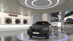

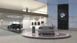

The BMW Maintenance Center is a comprehensive, high-end automotive service facility designed to reflect the identity, excellence, and innovation of the BMW brand. Strategically located in the industrial zone of 10th of Ramadan City, Egypt, the project acts as a gateway for customer engagement, after-sales service, and brand immersion, all delivered within a modern, functionally zoned architectural composition. This center goes beyond traditional car service facilities by integrating hospitality, experience design, and sustainable strategies into one cohesive environment that serves customers, staff, and brand representatives alike.
The design approach responds not only to the functional requirements of automotive service and showroom environments, but also to the emotional and brand-driven aspects of the user experience. Every space has been carefully considered, from spatial sequencing to lighting quality, in order to create a seamless journey for both the customer and the operational workflow. The architectural language, interior detailing, and zoning structure are all aligned with BMW’s global standards of precision, performance, and innovation.
The overall layout of the center is divided into three main buildings, each serving a distinct yet interconnected purpose:
Building 1: Reception, Showroom, and Cafeteria
Building 2: BMW Events Hall
Building 3: Maintenance & Administrative Building
Building 1: Reception and Car Showroom
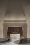
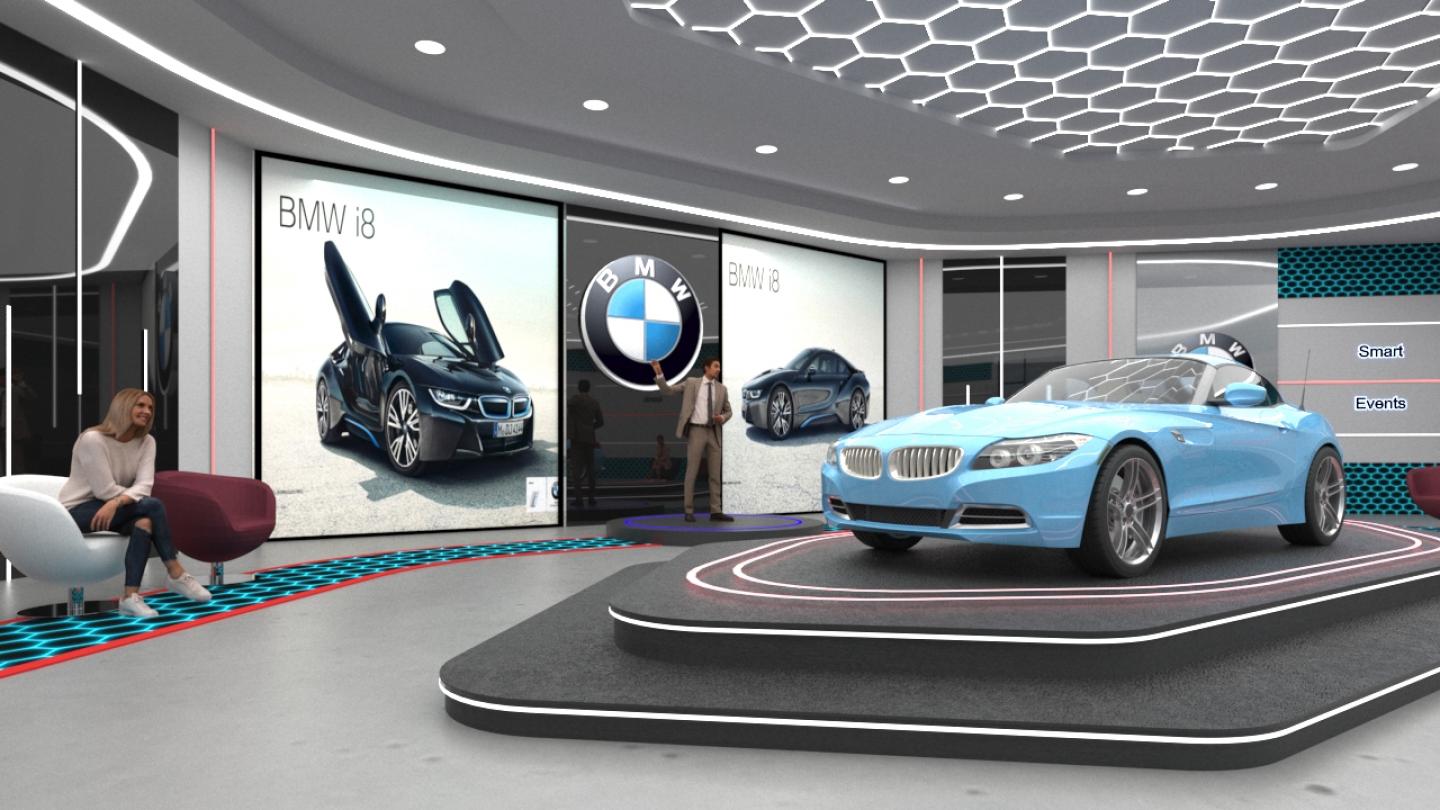
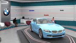
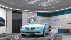
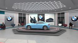
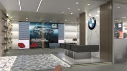
The first zone functions as the client-facing gateway to the BMW Maintenance Center. It includes a spacious reception area, a waiting lounge, a multi-model BMW showroom, sales offices, teller stations, and a cafeteria on the mezzanine level. The primary design objective in this zone was to create a welcoming yet sophisticated atmosphere that communicates trust, luxury, and innovation from the moment a client steps in.
The interior features clean lines, high-performance materials, and an intentional blend of textures that speak to the BMW brand: metallic finishes, porcelain tiles, and acoustic surfaces are balanced with warmer wooden tones and daylighting. The showroom layout allows for flexible vehicle display and smooth pedestrian circulation, ensuring that visitors can freely explore the BMW lineup. Strategic lighting, both natural and artificial, plays a key role in highlighting the cars' sculptural qualities while creating a modern and comfortable environment.
Above the reception and showroom area, the cafeteria and upper-level offices provide semi-private zones for clients and staff, offering spaces for meetings, remote work, or informal interaction. The layout is fluid and efficient, ensuring a balance between public hospitality and professional functionality.
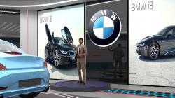
Building 2: BMW Car Events Hall
The second zone houses a multi-use car events hall dedicated to product launches, exhibitions, interactive driving simulators, and brand activations. It is designed to be flexible, open, and immersive, enabling BMW to connect emotionally and experientially with its audience.
This space departs from the conventional workshop-like atmosphere often associated with automotive facilities. Instead, it offers an engaging environment with programmable lighting, branding surfaces, projection walls, and digital displays. The geometry of the hall is inspired by movement and dynamic flow—both essential themes in the automotive world.
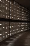
Structural clarity, acoustics, and lighting control were central to the design of this space. The material palette consists of polished concrete, sound-absorbing wall panels, matte black ceilings, and LED track systems, creating a high-tech ambiance suitable for showcasing BMW’s advanced engineering and future-forward concepts. This hall also serves as a flexible space for educational events, community engagement, and automotive media productions, enhancing the brand’s cultural presence in the region.
Building 3: Maintenance Workshop and Administration
The third and largest structure is the service and operations building, designed to accommodate the complete maintenance cycle of BMW vehicles. The ground floor includes multiple vehicle bays, diagnostic stations, tire service areas, parts storage, and a dedicated delivery zone. Circulation routes are optimized for both vehicles and technicians, with clear zoning that separates mechanical work from administrative and client interactions.
On the first floor, the administrative wing supports the operational needs of the center, offering office spaces, meeting rooms, and staff facilities. Daylighting and ventilation are maximized to provide comfort for employees, and the interior design adopts a more understated corporate style with functionality at its core.
This building demonstrates an industrial aesthetic inspired by precision and utility, with exposed structural elements and a practical material palette that includes epoxy flooring, galvanized steel elements, and modular wall systems. Sustainability is embedded in the design through natural ventilation shafts, water-efficient fixtures, and roof-mounted photovoltaic tiles that contribute to the building’s energy needs.
Project Title: BMW Maintenance Center
Location: 10th of Ramadan City, Sharqia Governorate, Egypt
Project Type: Automotive Maintenance and Brand Experience Facility
Project Function: The project functions as a high-end service destination for BMW clients, offering a full cycle of customer service, vehicle maintenance, and branded experiences.
Total Built-Up Area: Approx. 2000 - 2200 m²
Site Area: 6600 m²
Number of Buildings: 3
Building 1: Client-facing facility with a reception area, car showroom, waiting lounge, teller offices, sales area, and upper-floor cafeteria and ergonomic office stations.
Building 2: A dedicated BMW event hall equipped with adaptable lighting, branding features, and flexible setups for launches, exhibitions, and interactive experiences.
Building 3: A two-level maintenance building that includes a fully equipped service workshop on the ground floor and administrative offices above, optimized for operational flow.
Target Users: BMW vehicle owners, service clients, corporate visitors, sales representatives, and staff.
Architectural Concept:
The design is inspired by BMW’s core values of performance, innovation, and precision. Forms are influenced by the geometry and efficiency of honeycombs, while materiality reflects the sleek and technical character of the brand. The project aims to create a balance between operational functionality and a high-end visual identity, giving visitors an immersive automotive experience.
Structural System: Reinforced concrete frame with steel roof elements, Wide spans used in the showroom and workshop to allow flexible circulation of vehicles, Steel trusses used in the events hall to support lighting and AV systems
Materials Used:
Flooring: Grey and black porcelain tiles, epoxy in workshops
Walls: Acoustic paneling, metal mesh partitions, concrete finishes
Ceilings: Suspended ceilings with linear lighting in public zones; acoustic ceiling tiles in office/admin areas
Exterior Cladding: Aluminum composite panels and glass curtain wall for transparency and branding
Lighting Strategy: Natural lighting is maximized in office and showroom areas using large glazed panels and skylights. Artificial lighting includes recessed LED fixtures, track lighting in the showroom, and programmable RGB lighting in the events hall. Motion and daylight sensors enhance energy efficiency.
HVAC & Mechanical Systems: Central HVAC system with VRF units. Zone-based temperature control for different user areas. Exhaust and air filtration systems in the maintenance zone. Fire alarm and suppression system in compliance with safety regulations
Sustainability Features: Energy-generating photovoltaic tiles integrated into roof design. Natural ventilation shafts for passive cooling. Smart glass for solar gain control. Low-flow water fixtures and greywater recycling for landscaping
Software & Tools Used: 3Ds Max for parametric modeling. AutoCAD for detailed drawings and layout plans. V-Ray Render Engine for visualizations. Adobe Photoshop for presentation materials
Project Designer: Monica Sherif Ayad Gendy
Supervising Professor: Prof.Dr.Hoda Gad, Prof.Dr. Khaled Hawas and Dr. Tarek Fouad
University: MSA University, Interior Design Department
Academic Year: 2024-2025
Project Type: Graduation Project
Rendering & Visualization: Software used: AutoCad, 3Ds Max, V-Ray and Adobe Photoshop
Rendered by: Monica Sherif Ayad Gendy
The design approach responds not only to the functional requirements of automotive service and showroom environments, but also to the emotional and brand-driven aspects of the user experience. Every space has been carefully considered, from spatial sequencing to lighting quality, in order to create a seamless journey for both the customer and the operational workflow. The architectural language, interior detailing, and zoning structure are all aligned with BMW’s global standards of precision, performance, and innovation.
The overall layout of the center is divided into three main buildings, each serving a distinct yet interconnected purpose:
Building 1: Reception, Showroom, and Cafeteria
Building 2: BMW Events Hall
Building 3: Maintenance & Administrative Building
Building 1: Reception and Car Showroom
The first zone functions as the client-facing gateway to the BMW Maintenance Center. It includes a spacious reception area, a waiting lounge, a multi-model BMW showroom, sales offices, teller stations, and a cafeteria on the mezzanine level. The primary design objective in this zone was to create a welcoming yet sophisticated atmosphere that communicates trust, luxury, and innovation from the moment a client steps in.
The interior features clean lines, high-performance materials, and an intentional blend of textures that speak to the BMW brand: metallic finishes, porcelain tiles, and acoustic surfaces are balanced with warmer wooden tones and daylighting. The showroom layout allows for flexible vehicle display and smooth pedestrian circulation, ensuring that visitors can freely explore the BMW lineup. Strategic lighting, both natural and artificial, plays a key role in highlighting the cars' sculptural qualities while creating a modern and comfortable environment.
Above the reception and showroom area, the cafeteria and upper-level offices provide semi-private zones for clients and staff, offering spaces for meetings, remote work, or informal interaction. The layout is fluid and efficient, ensuring a balance between public hospitality and professional functionality.
Building 2: BMW Car Events Hall
The second zone houses a multi-use car events hall dedicated to product launches, exhibitions, interactive driving simulators, and brand activations. It is designed to be flexible, open, and immersive, enabling BMW to connect emotionally and experientially with its audience.
This space departs from the conventional workshop-like atmosphere often associated with automotive facilities. Instead, it offers an engaging environment with programmable lighting, branding surfaces, projection walls, and digital displays. The geometry of the hall is inspired by movement and dynamic flow—both essential themes in the automotive world.
Structural clarity, acoustics, and lighting control were central to the design of this space. The material palette consists of polished concrete, sound-absorbing wall panels, matte black ceilings, and LED track systems, creating a high-tech ambiance suitable for showcasing BMW’s advanced engineering and future-forward concepts. This hall also serves as a flexible space for educational events, community engagement, and automotive media productions, enhancing the brand’s cultural presence in the region.
Building 3: Maintenance Workshop and Administration
The third and largest structure is the service and operations building, designed to accommodate the complete maintenance cycle of BMW vehicles. The ground floor includes multiple vehicle bays, diagnostic stations, tire service areas, parts storage, and a dedicated delivery zone. Circulation routes are optimized for both vehicles and technicians, with clear zoning that separates mechanical work from administrative and client interactions.
On the first floor, the administrative wing supports the operational needs of the center, offering office spaces, meeting rooms, and staff facilities. Daylighting and ventilation are maximized to provide comfort for employees, and the interior design adopts a more understated corporate style with functionality at its core.
This building demonstrates an industrial aesthetic inspired by precision and utility, with exposed structural elements and a practical material palette that includes epoxy flooring, galvanized steel elements, and modular wall systems. Sustainability is embedded in the design through natural ventilation shafts, water-efficient fixtures, and roof-mounted photovoltaic tiles that contribute to the building’s energy needs.
Project Title: BMW Maintenance Center
Location: 10th of Ramadan City, Sharqia Governorate, Egypt
Project Type: Automotive Maintenance and Brand Experience Facility
Project Function: The project functions as a high-end service destination for BMW clients, offering a full cycle of customer service, vehicle maintenance, and branded experiences.
Total Built-Up Area: Approx. 2000 - 2200 m²
Site Area: 6600 m²
Number of Buildings: 3
Building 1: Client-facing facility with a reception area, car showroom, waiting lounge, teller offices, sales area, and upper-floor cafeteria and ergonomic office stations.
Building 2: A dedicated BMW event hall equipped with adaptable lighting, branding features, and flexible setups for launches, exhibitions, and interactive experiences.
Building 3: A two-level maintenance building that includes a fully equipped service workshop on the ground floor and administrative offices above, optimized for operational flow.
Target Users: BMW vehicle owners, service clients, corporate visitors, sales representatives, and staff.
Architectural Concept:
The design is inspired by BMW’s core values of performance, innovation, and precision. Forms are influenced by the geometry and efficiency of honeycombs, while materiality reflects the sleek and technical character of the brand. The project aims to create a balance between operational functionality and a high-end visual identity, giving visitors an immersive automotive experience.
Structural System: Reinforced concrete frame with steel roof elements, Wide spans used in the showroom and workshop to allow flexible circulation of vehicles, Steel trusses used in the events hall to support lighting and AV systems
Materials Used:
Flooring: Grey and black porcelain tiles, epoxy in workshops
Walls: Acoustic paneling, metal mesh partitions, concrete finishes
Ceilings: Suspended ceilings with linear lighting in public zones; acoustic ceiling tiles in office/admin areas
Exterior Cladding: Aluminum composite panels and glass curtain wall for transparency and branding
Lighting Strategy: Natural lighting is maximized in office and showroom areas using large glazed panels and skylights. Artificial lighting includes recessed LED fixtures, track lighting in the showroom, and programmable RGB lighting in the events hall. Motion and daylight sensors enhance energy efficiency.
HVAC & Mechanical Systems: Central HVAC system with VRF units. Zone-based temperature control for different user areas. Exhaust and air filtration systems in the maintenance zone. Fire alarm and suppression system in compliance with safety regulations
Sustainability Features: Energy-generating photovoltaic tiles integrated into roof design. Natural ventilation shafts for passive cooling. Smart glass for solar gain control. Low-flow water fixtures and greywater recycling for landscaping
Software & Tools Used: 3Ds Max for parametric modeling. AutoCAD for detailed drawings and layout plans. V-Ray Render Engine for visualizations. Adobe Photoshop for presentation materials
Project Designer: Monica Sherif Ayad Gendy
Supervising Professor: Prof.Dr.Hoda Gad, Prof.Dr. Khaled Hawas and Dr. Tarek Fouad
University: MSA University, Interior Design Department
Academic Year: 2024-2025
Project Type: Graduation Project
Rendering & Visualization: Software used: AutoCad, 3Ds Max, V-Ray and Adobe Photoshop
Rendered by: Monica Sherif Ayad Gendy
