Submitted by WA Contents
Aurora Design sculpts a façade resembling "carving gems" in Yunnan Province
China Architecture News - Jul 09, 2024 - 12:38 2330 views
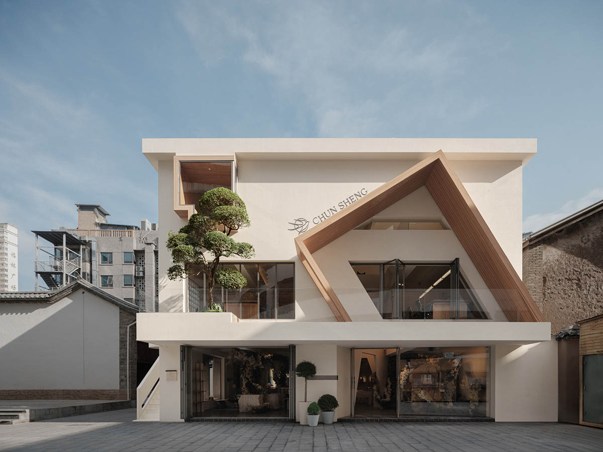
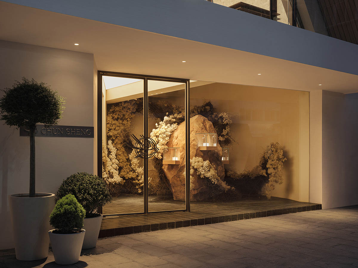
Aurora Design has created a jewellery store that features a façade resembling "carving gems" in Kunming, Yunnan Province, China.
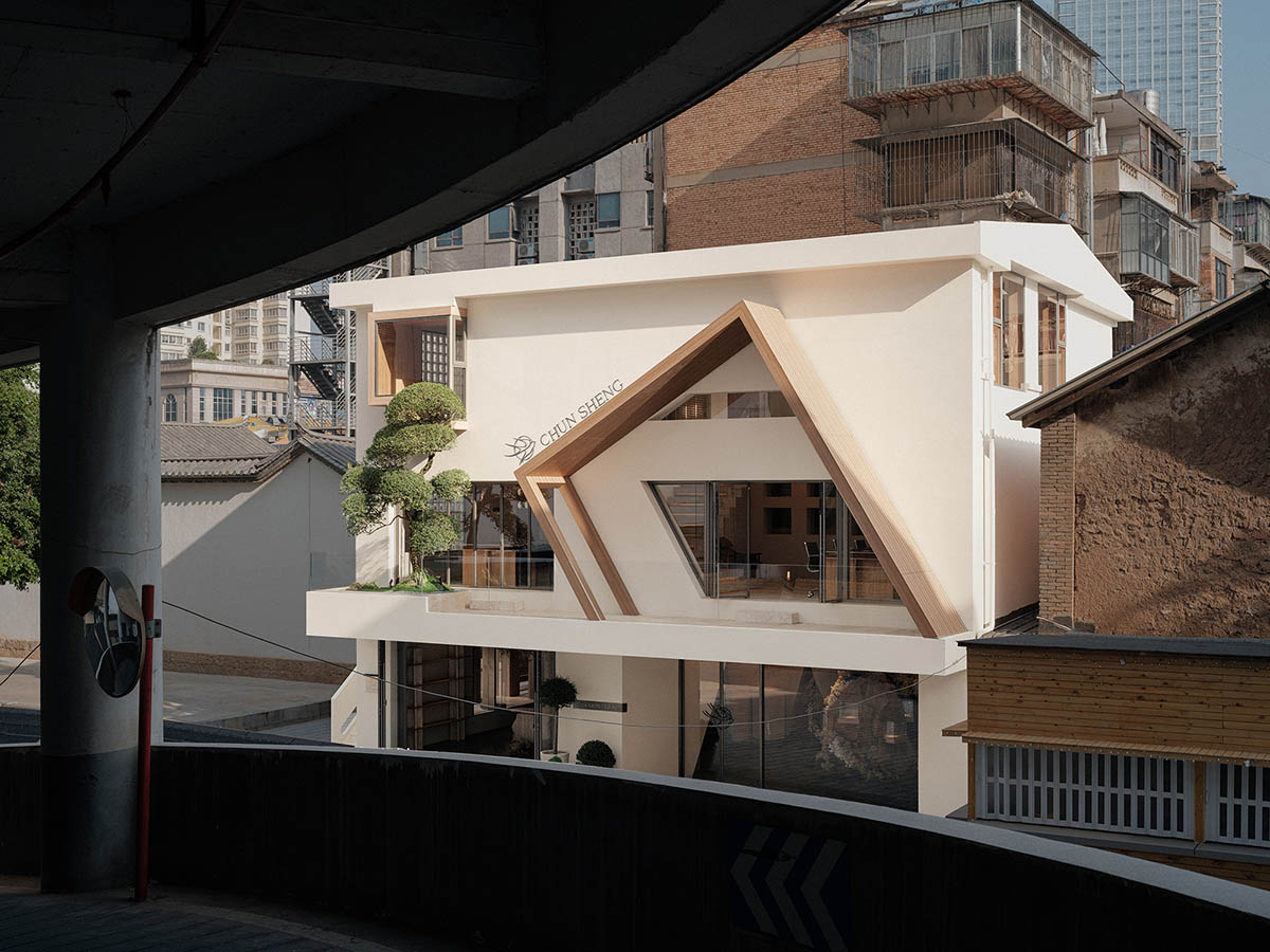
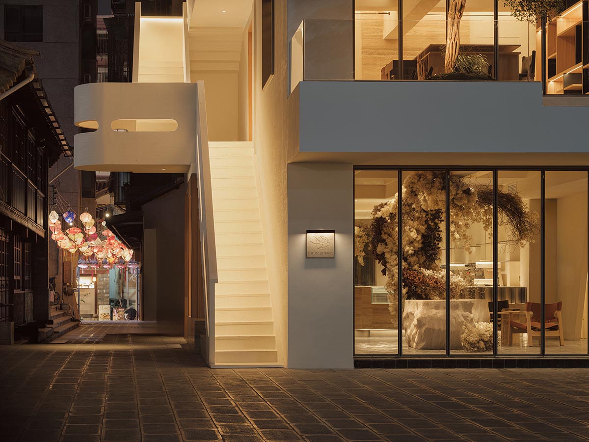
Named Chun Sheng Jewelry, the 300-square-metre store is a renovation project from an old residential building located in an old neighborhood in the center of Kunming, adjacent to a multi-story parking lot and a snack street.
The project is made more interesting by the intricate surrounding environment and the conflict between the old and the new. It is reasonable to anticipate "spring" to arrive at any time.
Established in the post-1995 era, Chun Sheng Jewelry is a new generation art jewelry store that specializes in premium original gemstone designs that accentuate natural beauty. The company has established a production facility of its own, giving it complete control over all the minute details of each project.
Every stage of the process, from design to final product, is done by skilled artisans by hand, combining exceptional craftsmanship and individual creativity. The youthful proprietor infuses the notions of organic beauty and creative way of life into the jewelry design, resulting in a unique and lively brand.
After exploring the local culture, the interior design brings the "spring" into shape with the proper introduction of light. Following the expression of the brand, the unique charming of the “Spring City” has been generated.
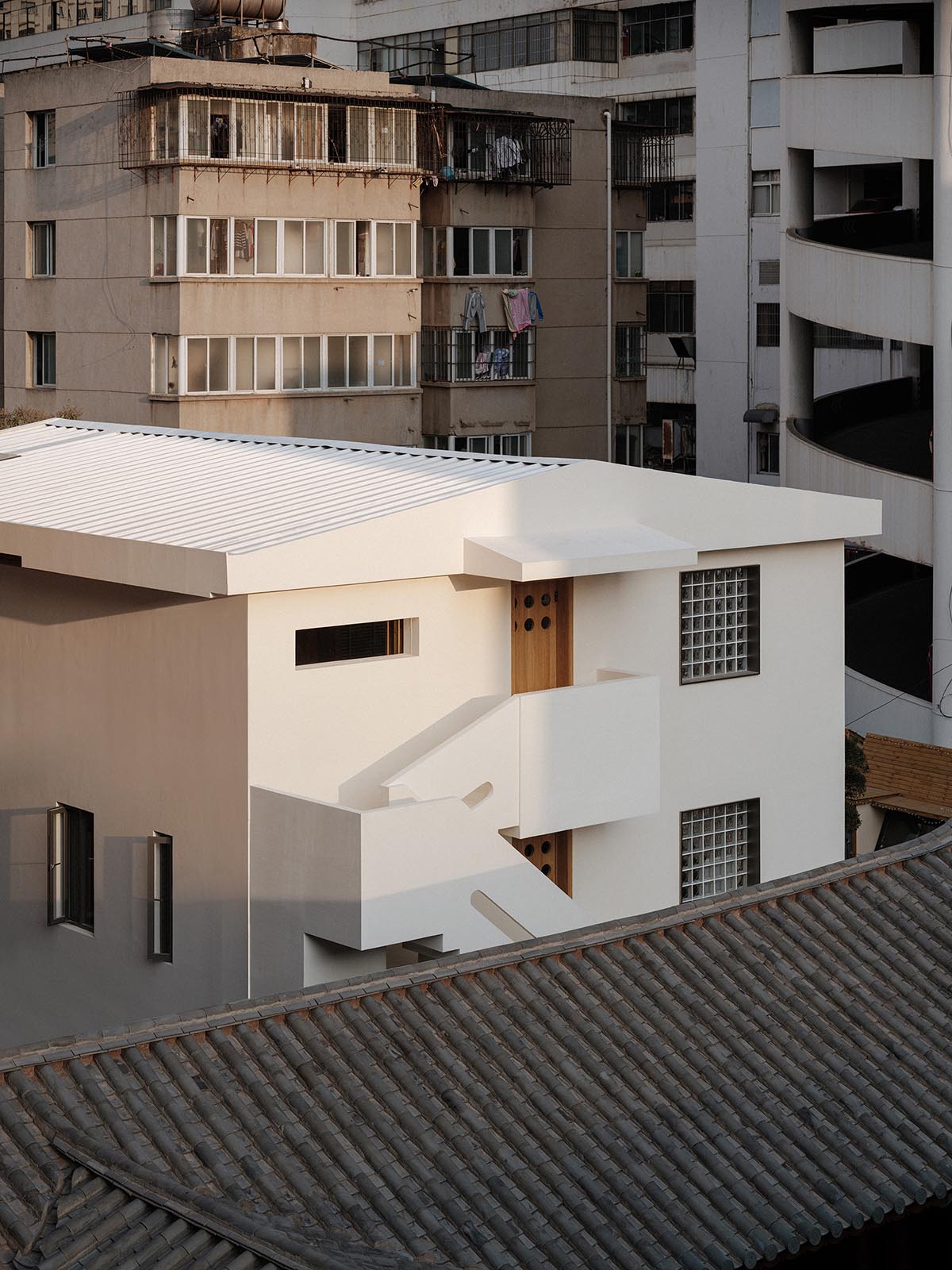
This three-story building's original frame hasn't changed to blend in with the surroundings. However, by breaking the area up into a number of modular sections and taking down the original structure's load-bearing walls, a new, light-filled room was created inside.
More natural light has been added to the south side through an expanded terrace and outdoor exhibit area, allowing the previously enclosed area to feel more connected to the outdoors.
The essence of spring is evoked by the infusion of light, and time is captured in the light's whimsical movements.
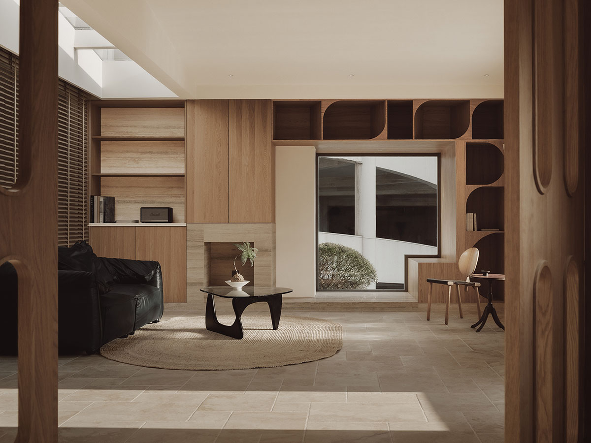
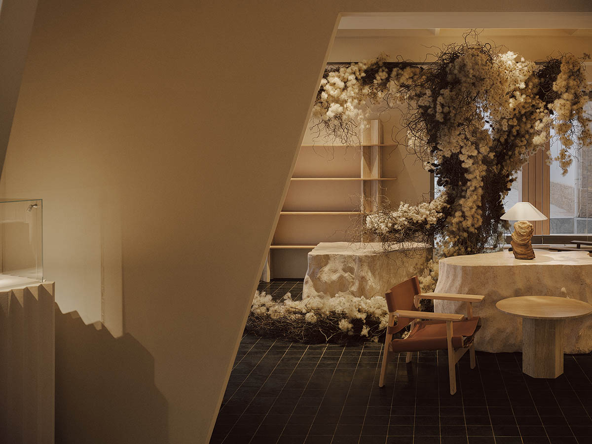
The interior space is filled with the energy of spring as sunlight streams in through the glass doors on two of its sides. It reaches beyond the wood and stone; the scent of tea fills the air, softly enveloping the essence of spring; delicate branches sprout and bloom as spring arrives.
Spring energy permeates the interior space as sunlight streams in through the glass doors on two sides. As spring approaches, it ascends the stone ledges, delicate branches sprout and bloom; it reaches past the wood and stone, and the scent of tea fills the air, softly enveloping the essence of spring.

The original goal was to make the space as comfortable as possible for patrons. So the idea for an office with a tea area was born. It is now a necessary and essential component of the area.
Branch and wood meet as shadows and light play on the stone. The soft aroma of tea is carried by spring breezes, letting thoughts of springtime wander around the space.
The other side's staggered overlapping triangle area, which resembles an insect emerging from hibernation, breaks the space's unbridled spirit and fluid dynamism.
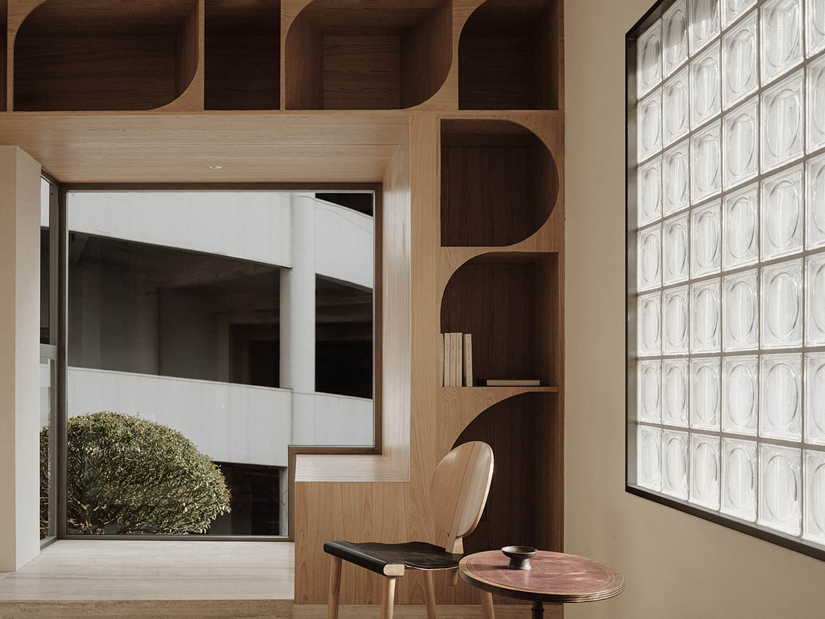
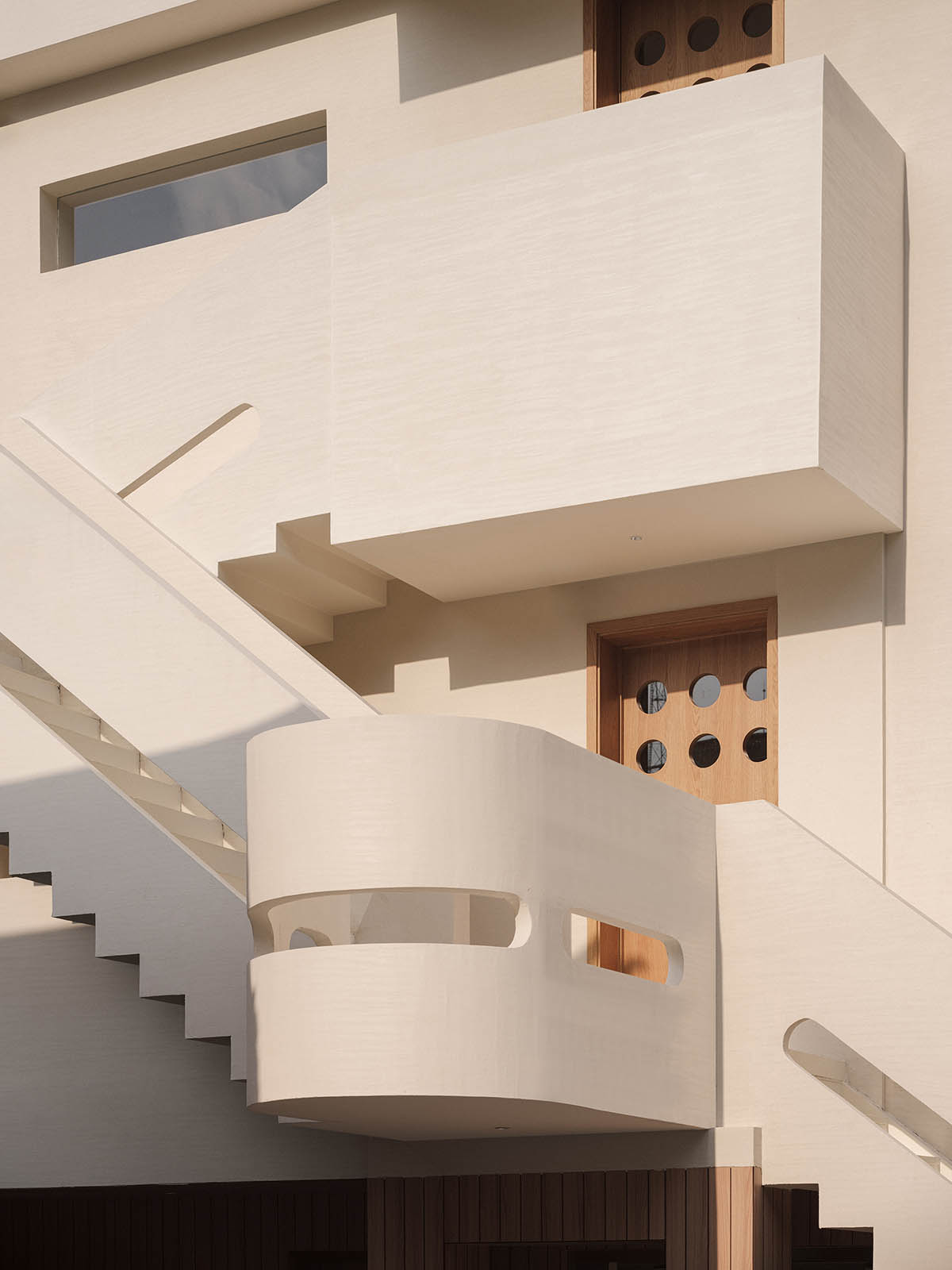
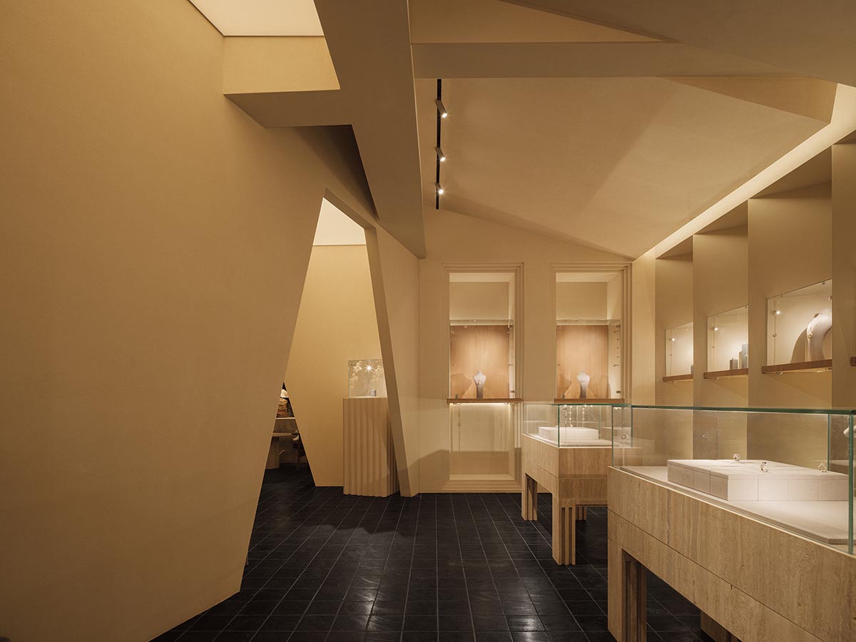
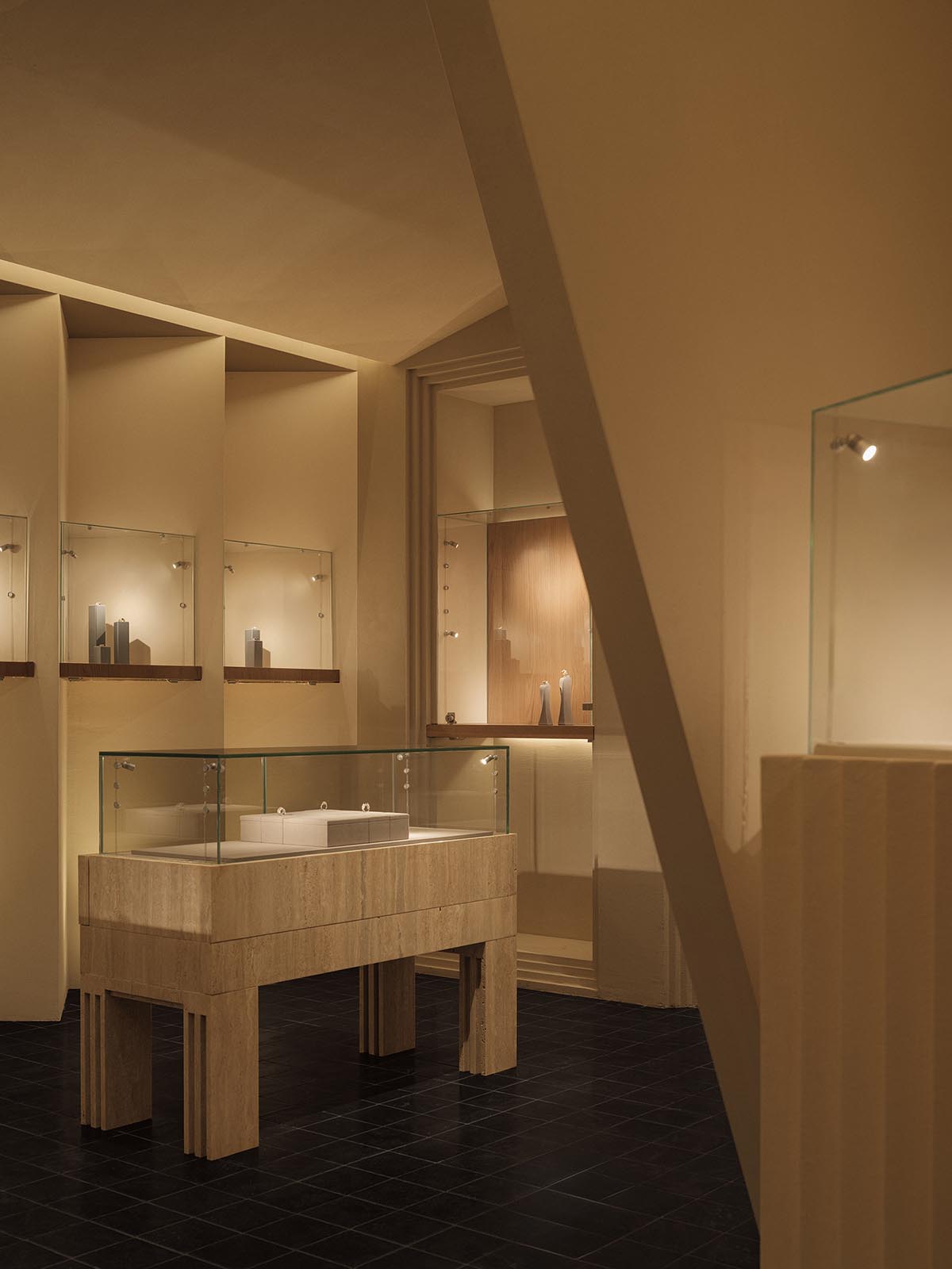
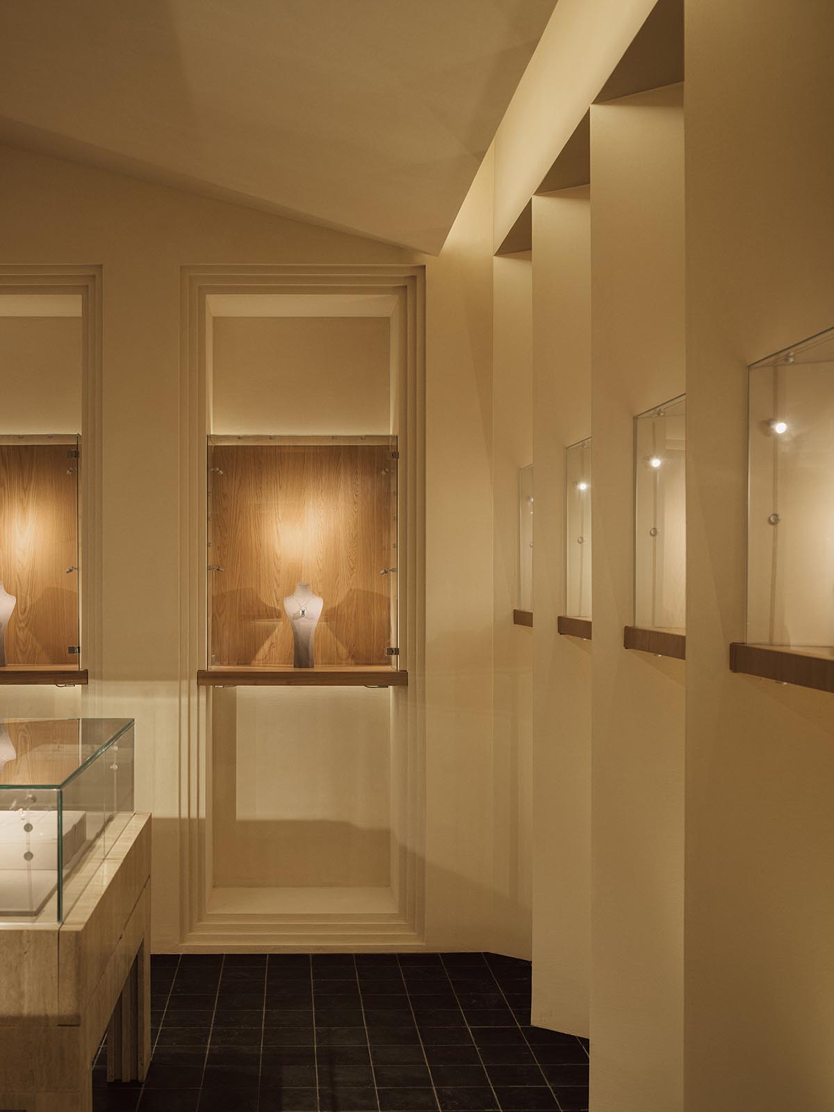
The beauty of spring and endless time is displayed through the painstakingly sculpted gems and jewels, where flickering light dances. A calm atmosphere is created by the uneven ceiling shape and the subdued lighting. The time was agreed upon. The wall's sharp edges and alternating curves give it the appearance of sculpture.
The form mimics the instruments jewelers used to sculpt precious stones. The spatial forms have been sculpted by the designers using the same method to direct the visitors' sensory experience.
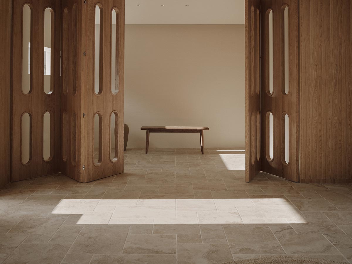
The warm white micro-cement finish captures the rays of light as they playfully weave between the smooth and recessed surfaces as daylight slowly ascends the cloud at midday. It murmurs the faint breath of time, pausing in the rest areas. Pushing open the wooden door will welcome you into a warm and inviting space with wooden furnishings and marble flooring.
Warm white, light wood, and dark wood hue combinations are comparable to the various tones in a chorus that depict the various phases of spring: the early spring patter, the mid-spring bird chirping, and the late-spring flower dropping.
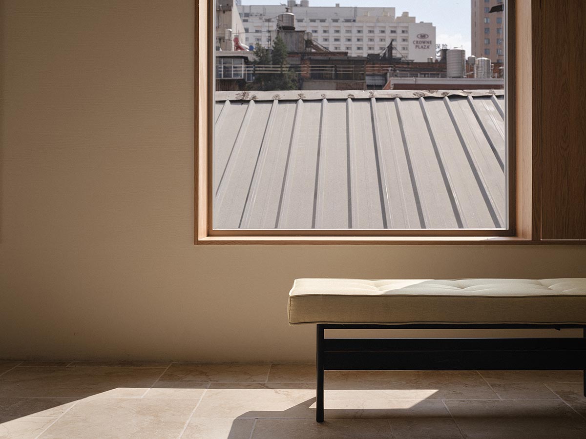
The room's wooden furniture, which was initially created by the studio, skillfully combines practicality and visual appeal. The room has a cozy feel to it because of the wood's warm texture and the other natural materials.
The workspace was initially disassembled by the designer using workflow as a guide, and color patterns were then used to creatively convey the space's purpose.
The specially created "jewelry room" on the north side is a space where clients can realize their own wacky ideas and allow their ideas to sprout, develop, and bear fruit. Seeing the carving for yourself is like walking into a springtime feast.
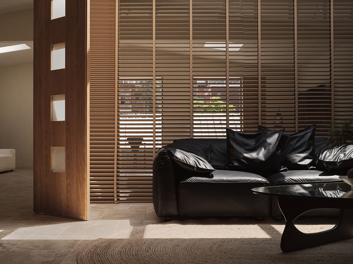
This is a creative treasure trove, with pieces of art bearing individual meanings and inspiration popping up everywhere.The shifting patterns of shimmering light create a multi-space that maintains the brand's original qualities, natural beauty, and awareness. A distinct brand character identity was thus qualified.
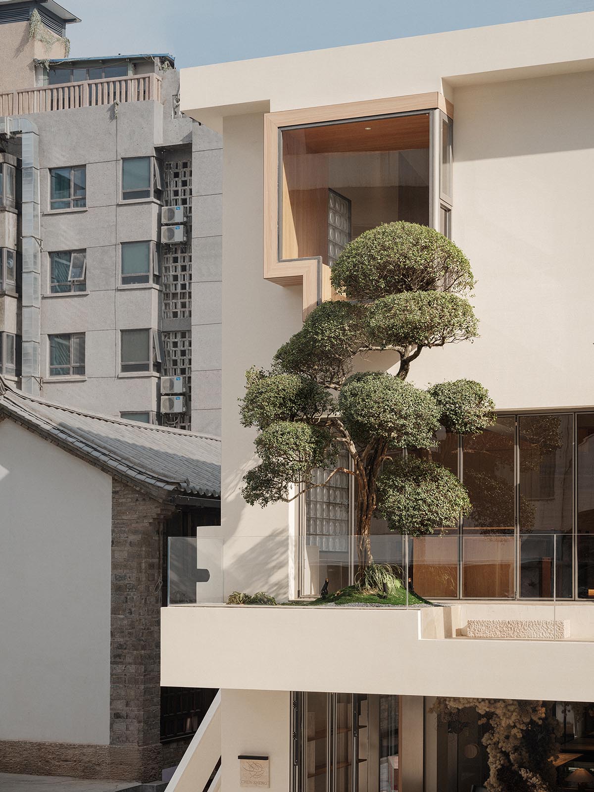
A sense of verdancy permeates the work area. In order to create a "natural moment" in the office that is ideal for mind-calming, the designer moved some of the plants from the original site to the terrace while keeping the rest of the plants.
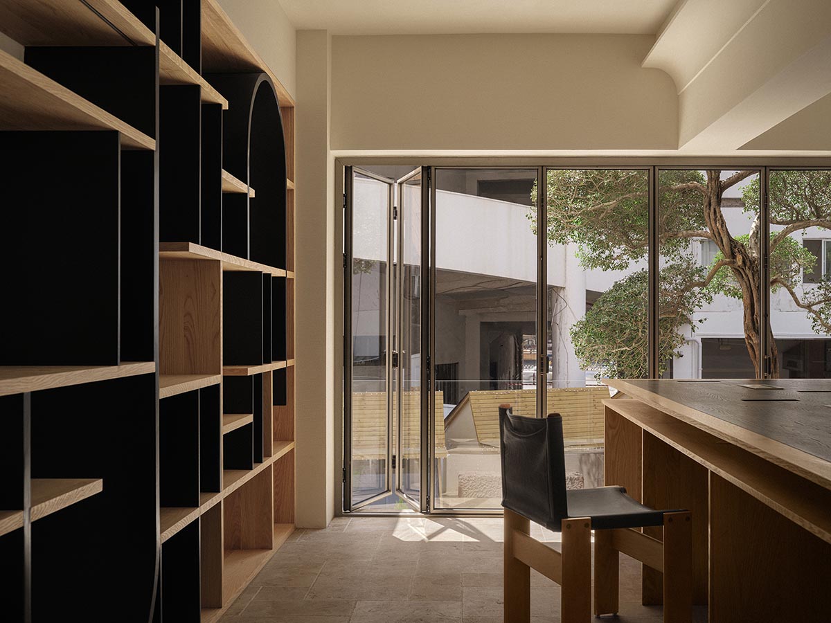
The gray area, a wooden installation next to the plant, served as a transition between the outside and the inside by overlapping various geometric shapes. While the curious looks of the pedestrians outside ignite the lovely imagination about spring, the camera lens is allowed to explore the space from the inside, which preserves and records the images of spring.
With its muted color scheme and simple geometric shapes, the staircase that connects the second and third floors enhances the room's balance. The atmosphere is carried to the third floor, which was primarily utilized as an office and VIP area.
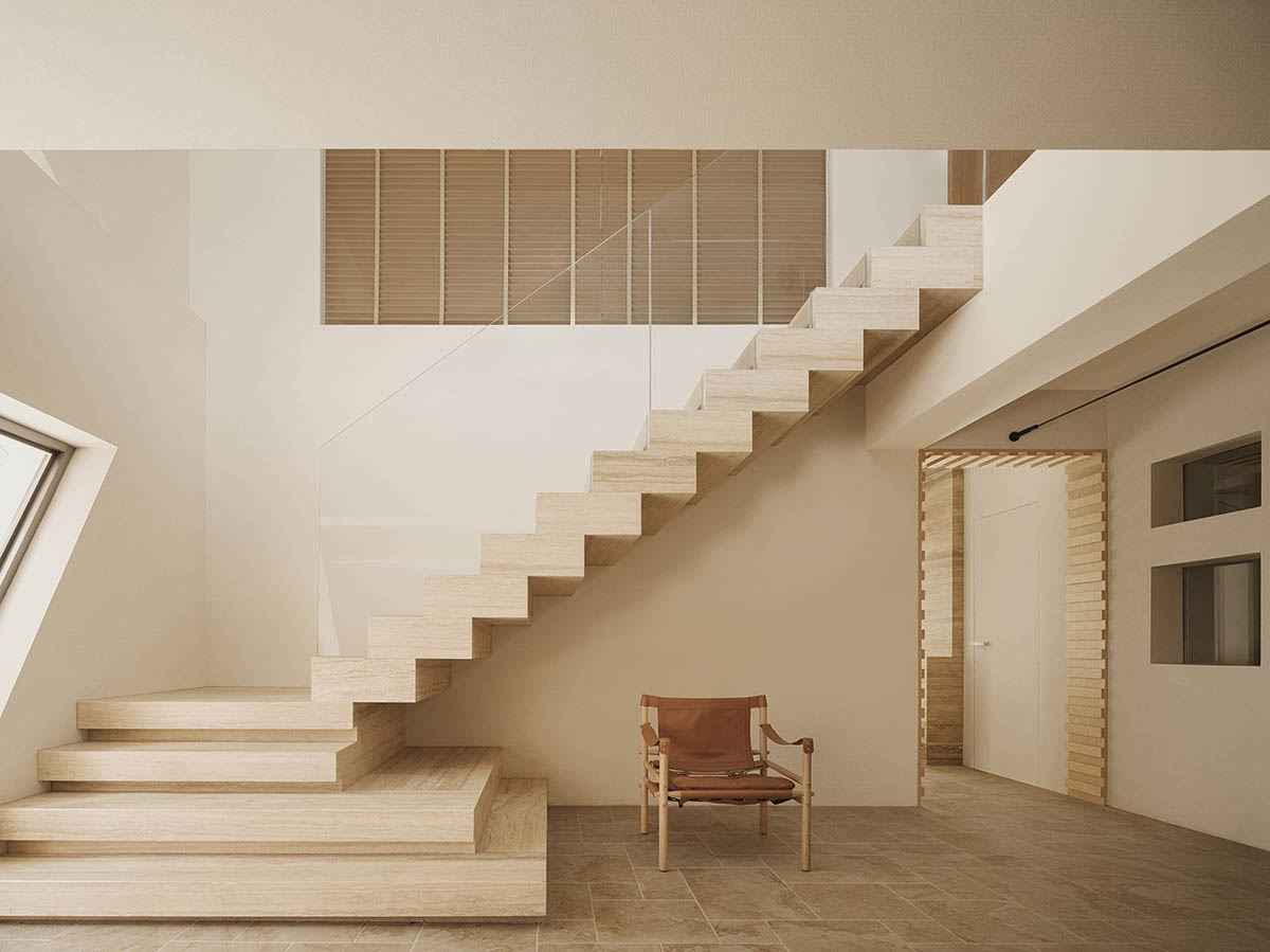
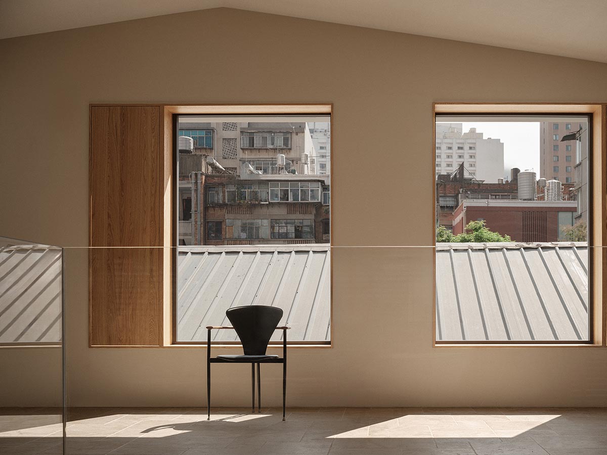
To add more natural light, the design made extensive use of rectangular windows. The white and bright light in the floating window brings in the landscape; the large glass blocks on the south side make the midday sunlight more warm and gentle; and the side window on the west side, with its secretive and gentle light, protects the studio's complete privacy. The skylight on the top of the office provides bright but focused light that meets the requirement of jewelry identification.
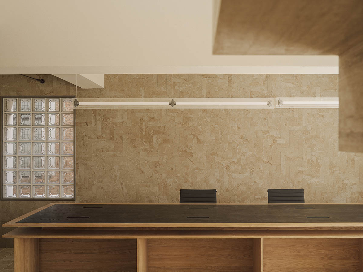
By varying the light's intensity, the design has constructed the surroundings entirely. Cork grilles are used to divide functional areas in order to maintain sight communication and spatial continuity while maintaining a consistent tone throughout the entire area.
The designer chose the colors for the entire project while keeping in mind the neighborhood's features, which allows for the most straightforward color expression. The facade's predominant white color draws attention to how well it blends in with the surroundings.
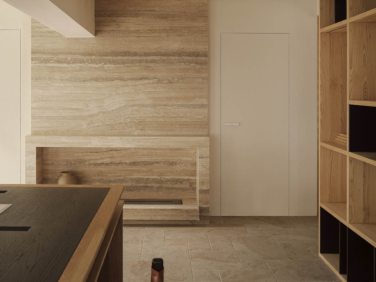
Another important factor to take into account is how light and shadow are presented, emphasizing their inherent beauty by using white as the undertone. Regarding the interior, a lot of warm and neutral hues are added to emphasize the spatial theme of balance, coziness, and calmness, with the jewelry serving as the focal point of the overall color expression.
Personalized expression is integrated into the urban texture by Aurora Design, which bases this on an exploration of local culture. The brand concept is elaborated with muted colors, and the brand's tone is expressed through multi-dimensional light and shadow exploration.
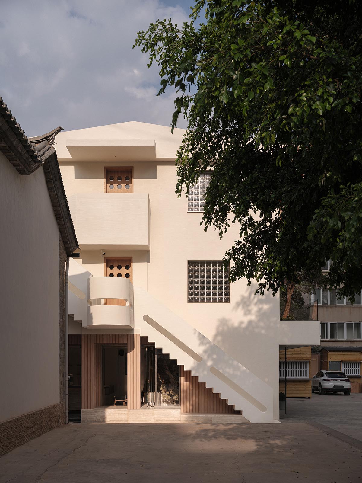
Cross-border integration in the conversation about architecture and urbanization is what Aurora Design aims to achieve. It deftly manipulates light and dark hues, shifting perspective and space, allowing nature to take root in shape and take up residence in the heart.
The warm light and the original brand spirit of the Essence of Jade and Gem communicate the innovative lifestyle of welcoming spring and sipping tea.
Project facts
Project name: Chun Sheng Jewelry
Location: Kunming, Yunnan Province, China
Project area: 300m2
Design time: 2023.08
Completion time: 2023.12
Design firm: Aurora Design
Chief designer: Yang Xuewan
Lighting design: Uniimport
Construction: Rebuilding Space Lab
Video: WM STUDIO
All images © Na Xin from INSPACE.
> via Aurora Design
