Submitted by WA Contents
Studio 10 designs exhibition space with white tubular structures and black translucent ramps in China
China Architecture News - Apr 05, 2021 - 14:10 6640 views
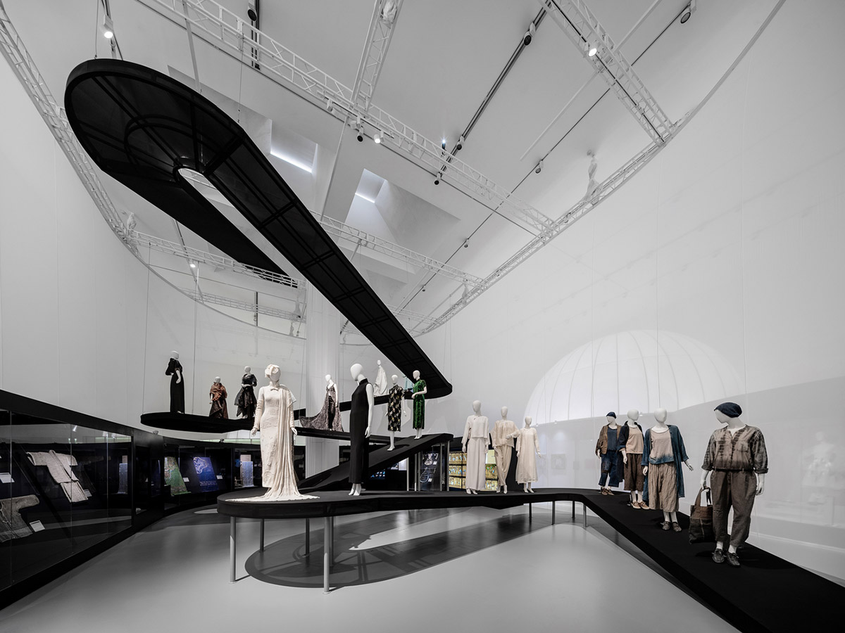
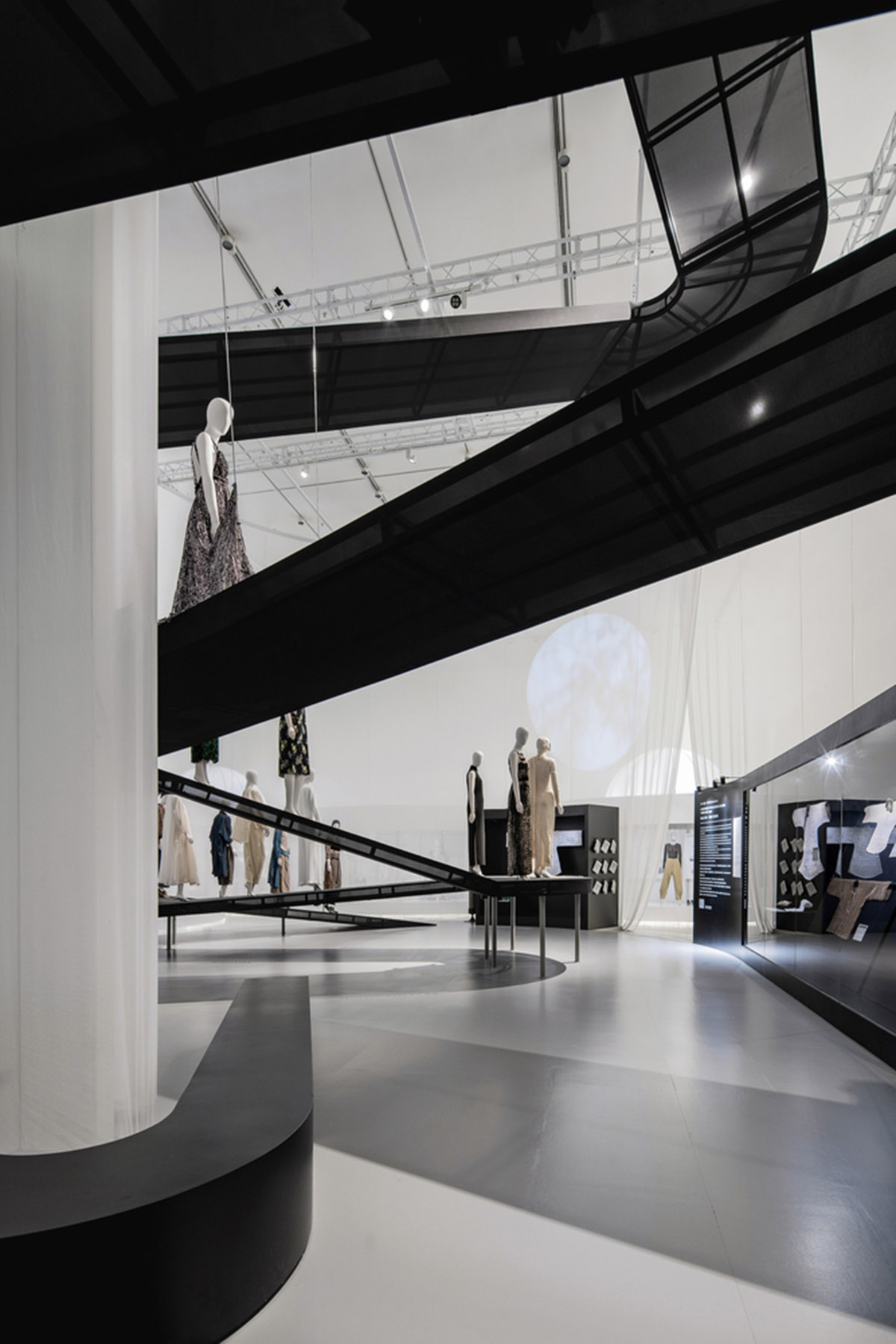
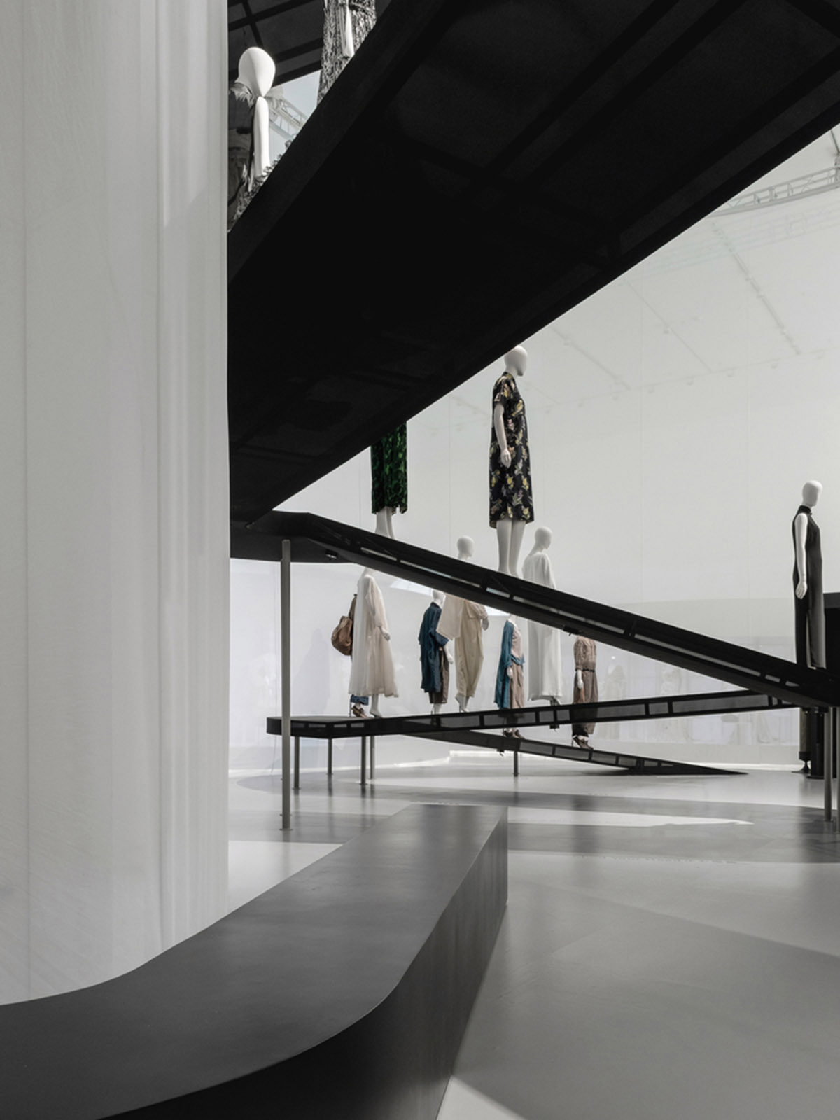
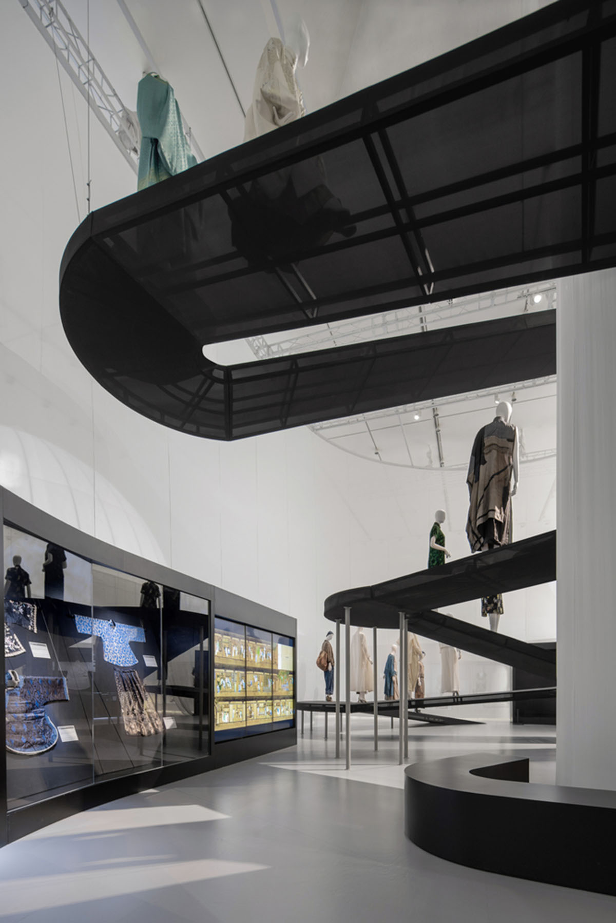
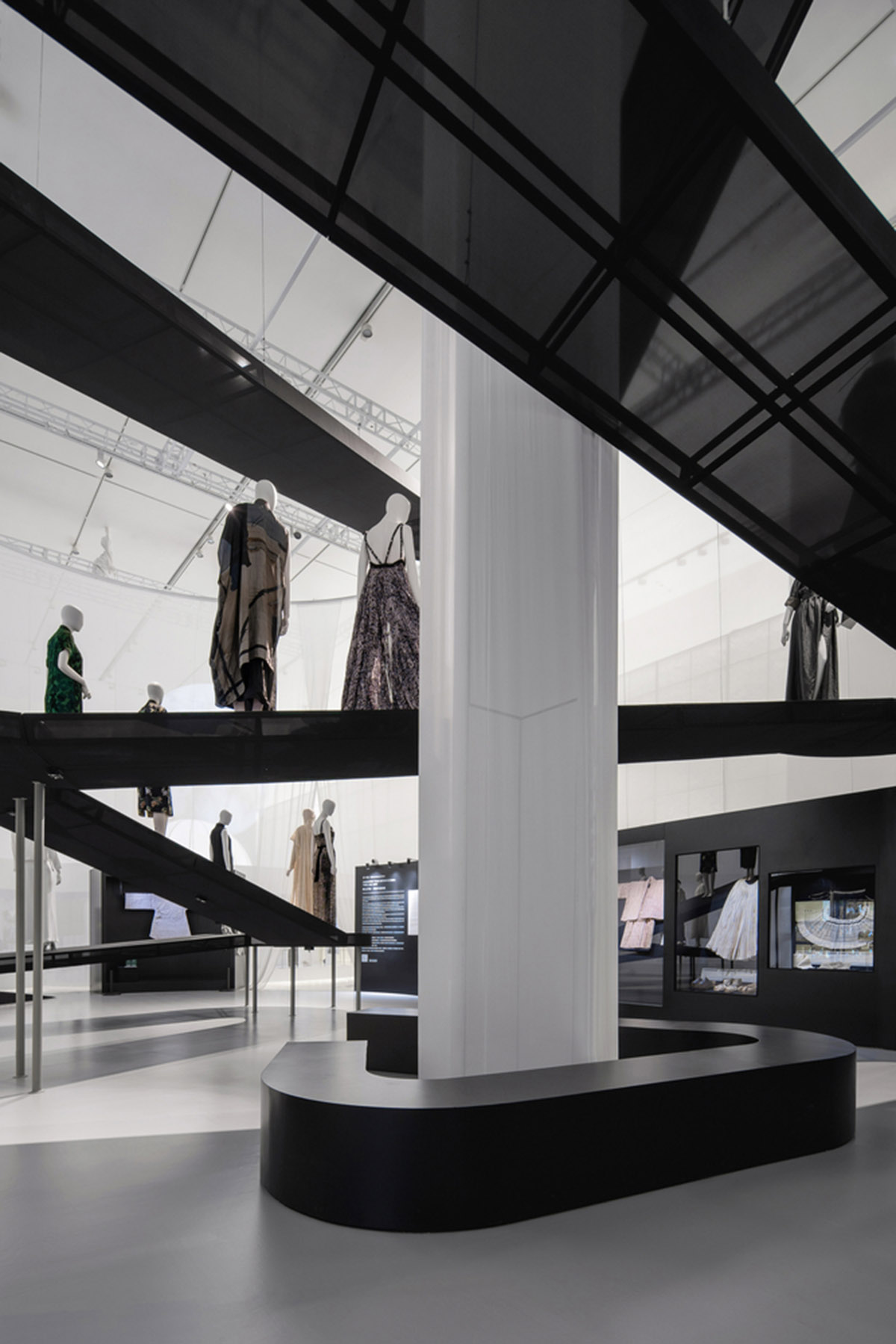
Studio 10 has designed an exhibition space that features white tubular structures and flying black translucent ramps to carry the models inside the exhibition in Shenzhen, China.
Named Spatial Design Of The Exhibition Fashioned From Nature, the 1,280-square-metre space was co-curated by the Victoria & Albert Museum (V&A), China Silk Museum with guest curator Edith Cheung and Design Society.
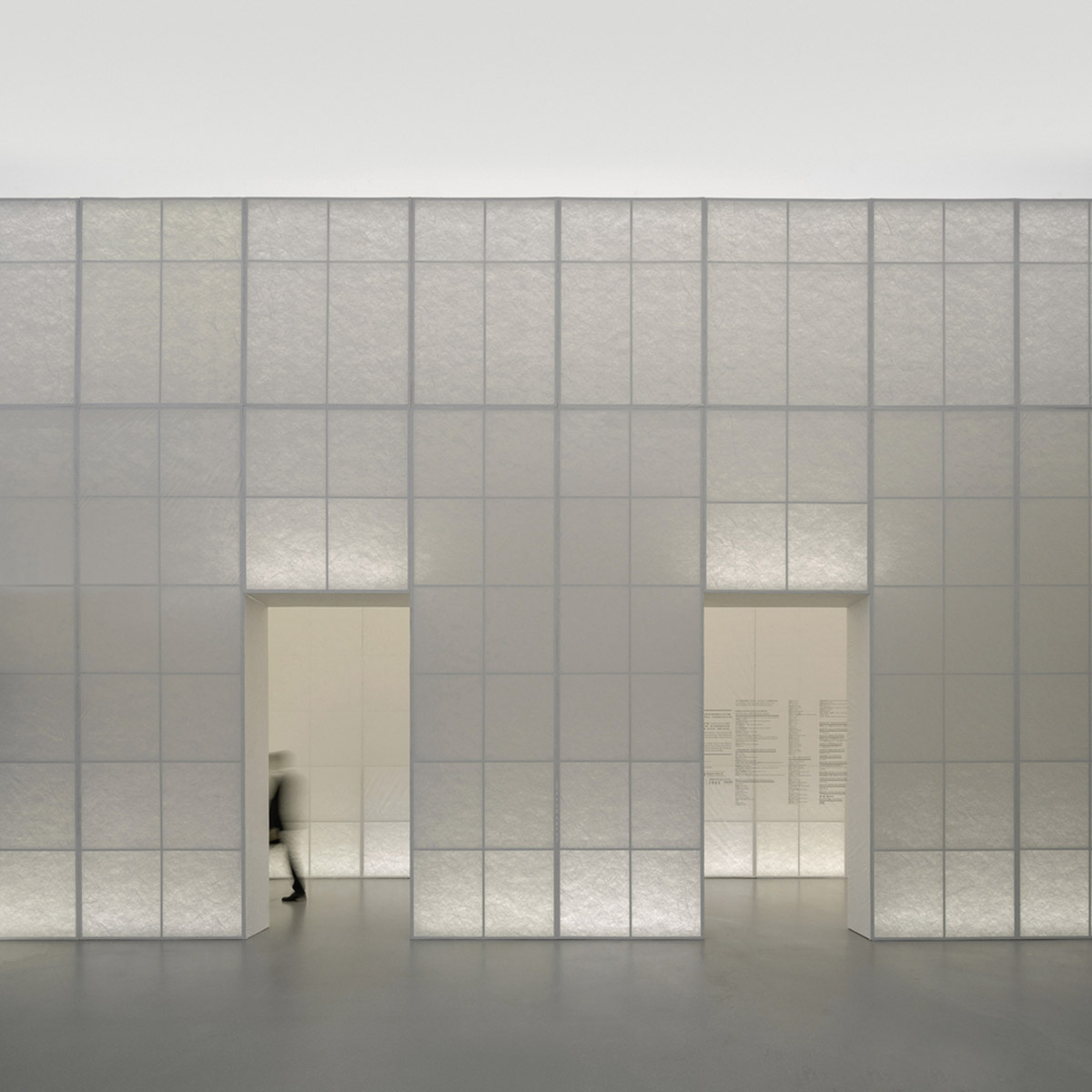
The exhibition is conceived as an abstract yet poetic interpretation and comparison of the Eastern and Western views of nature, as well as the evolution from classical through contemporary garden spaces.
Divided into tow sections, one is named "Fashioned From Nature" and is curated by the V&A Museum and Design Society. The first section of the exhibition narrates the complex relationship between fashion specific to human society and nature since the 16th century, with reflections as well as an emphasis on environmental sensitivity and preservations.
The second section, named as "Fashioned From Nature In China: Then And Now", is an echo to the theme in the east. The spatial design of the exhibition promotes "nature" as the subject and chooses “garden” as the theme.
"We hope to explore the similarities and differences of the natural views embodied in Eastern and Western gardens through the exhibition spatial design," said Studio 10.
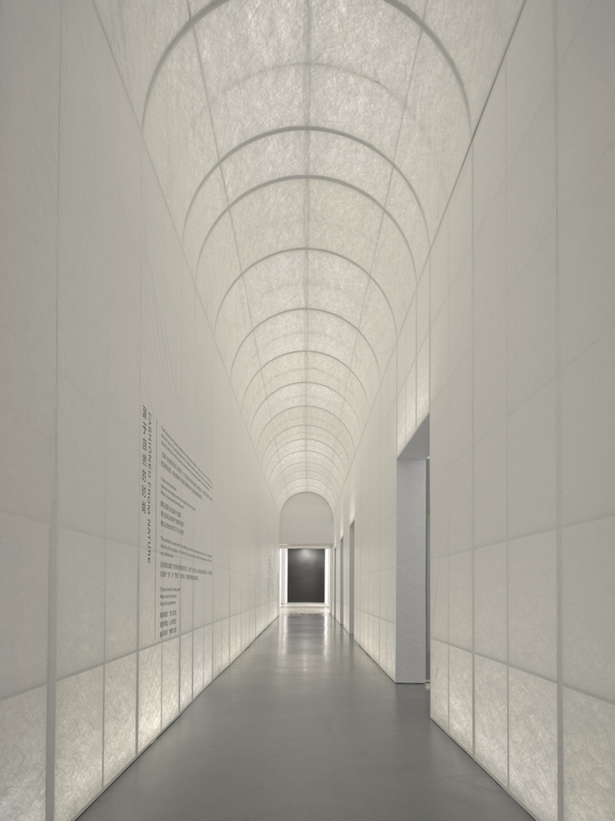
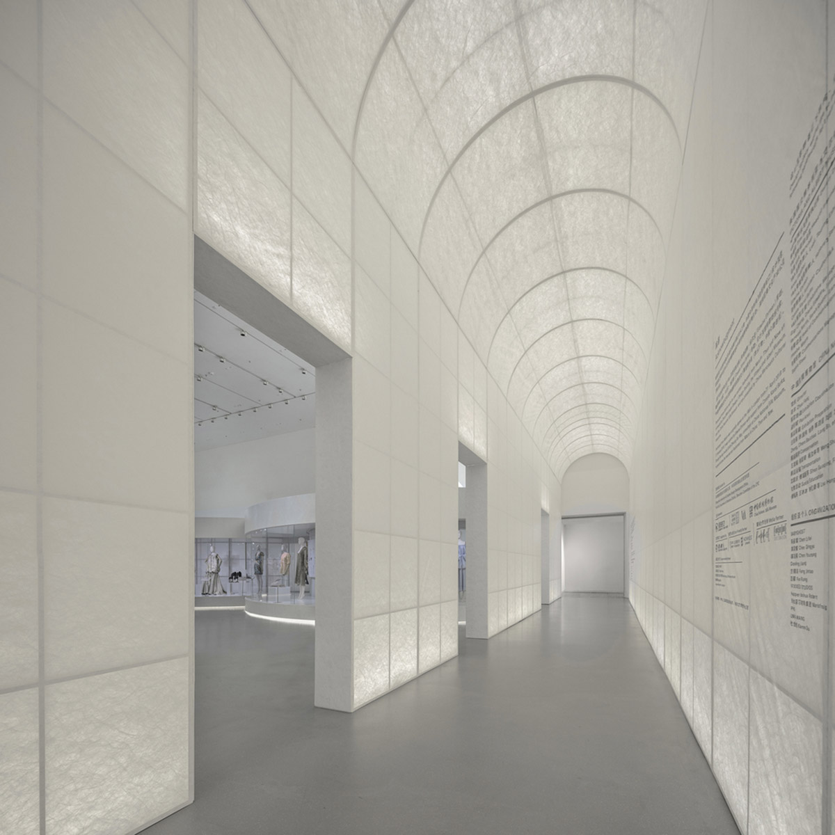
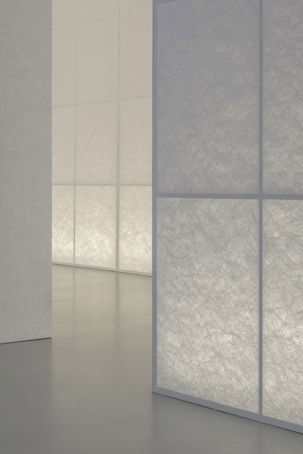
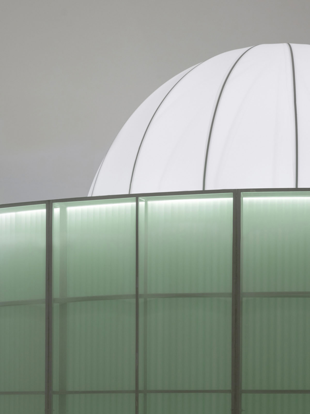
"The entrance archway is finished with Tyvek. When backlit, it faintly reveals the vine-like fibers, forming an abstract “green corridor”," added the studio.
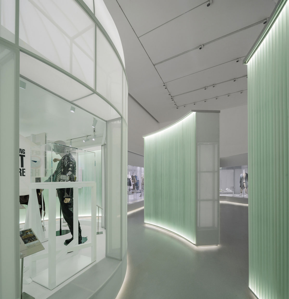
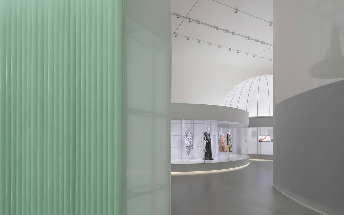
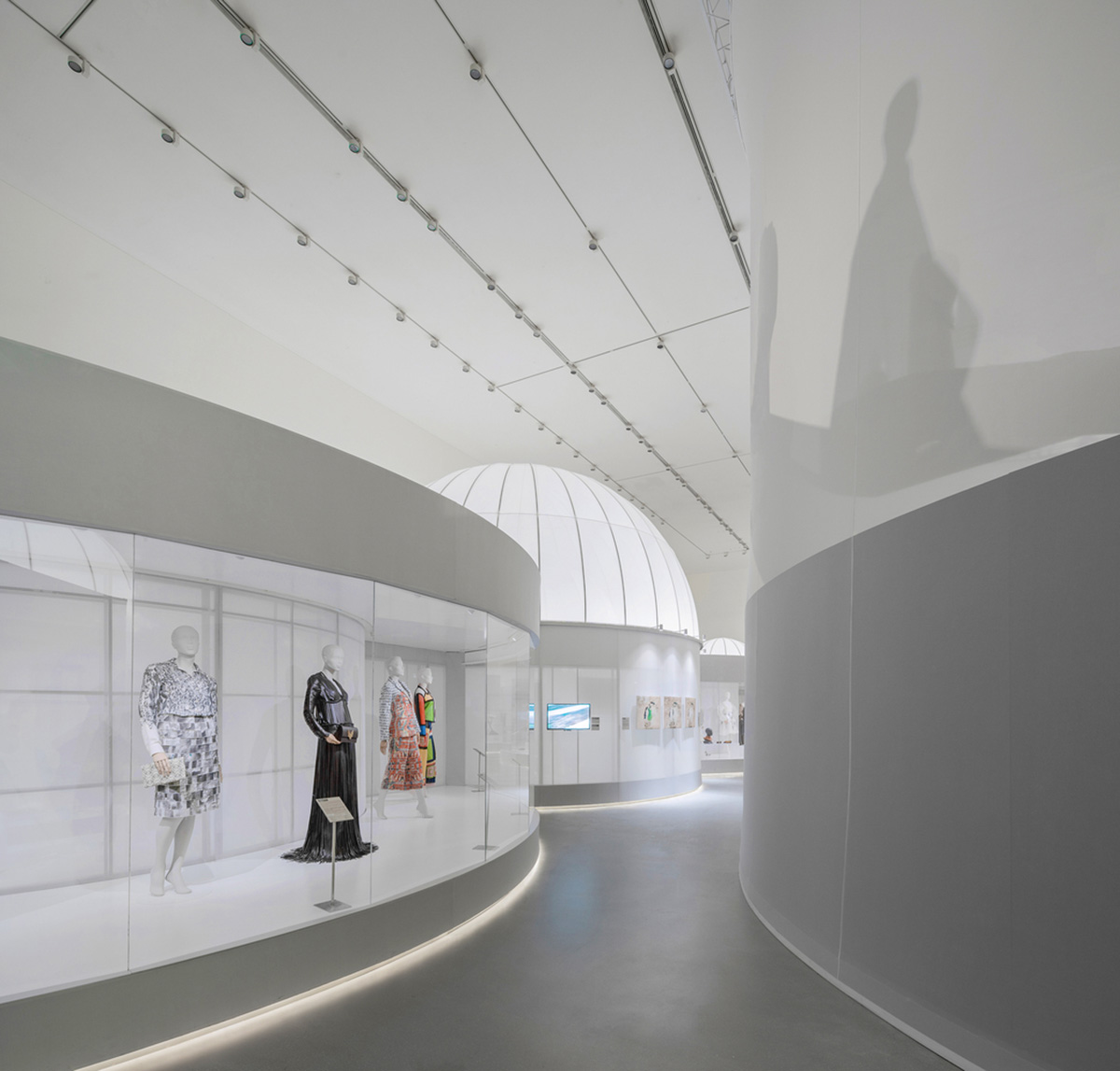
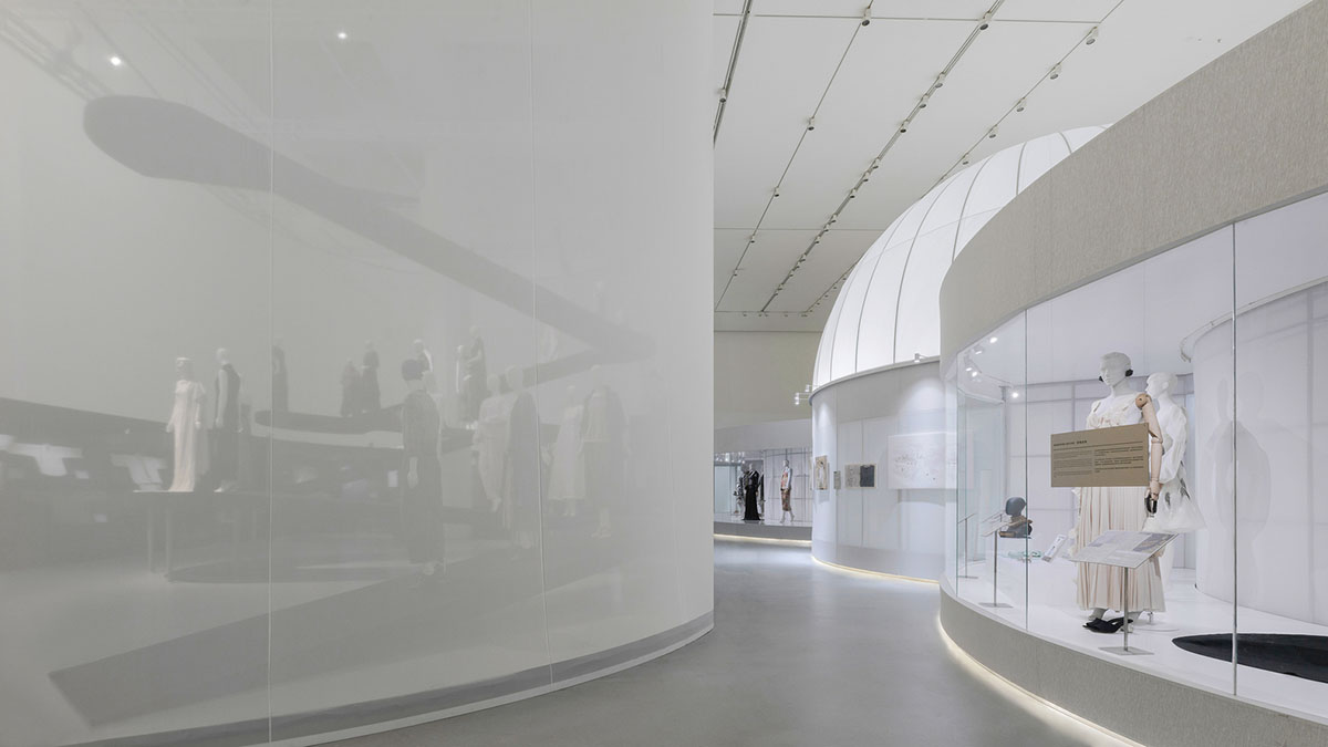
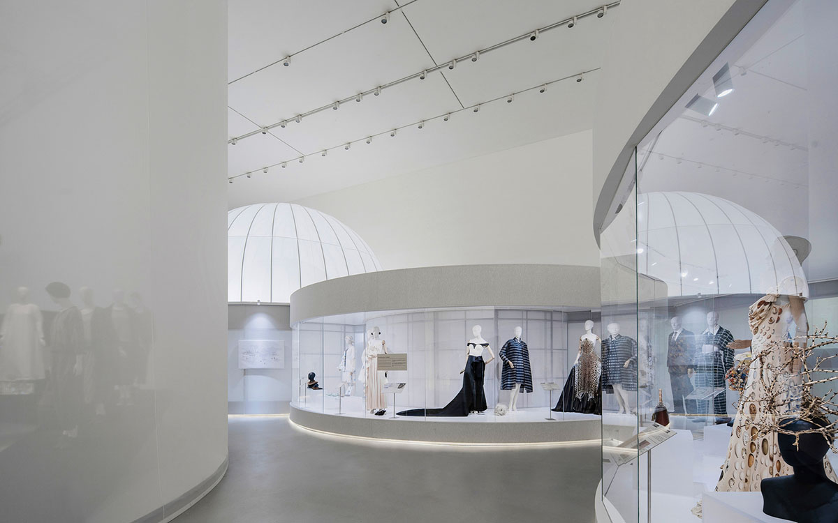
Through the green corridor, visitors enters the first section of the exhibition, referring to the classical period of the English section. In this part, the architects used translucent fabrics to create an abstract “Western” classical garden, which is highly geometric, axially symmetrical, and perspective-driven while connecting circular spaces and showcases of different sizes through the axis.
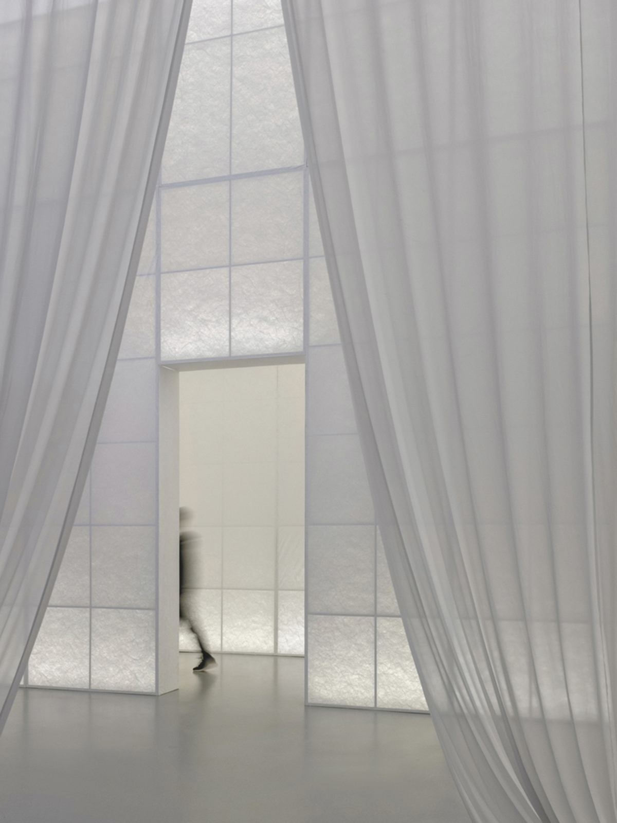
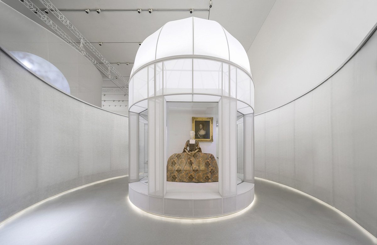
Just like the emphasis on the relationship between architecture and axis in Western classical gardens, the studio used three circular "Garden Spaces" placed in the vanishing points, which are also the intersection of the axis.
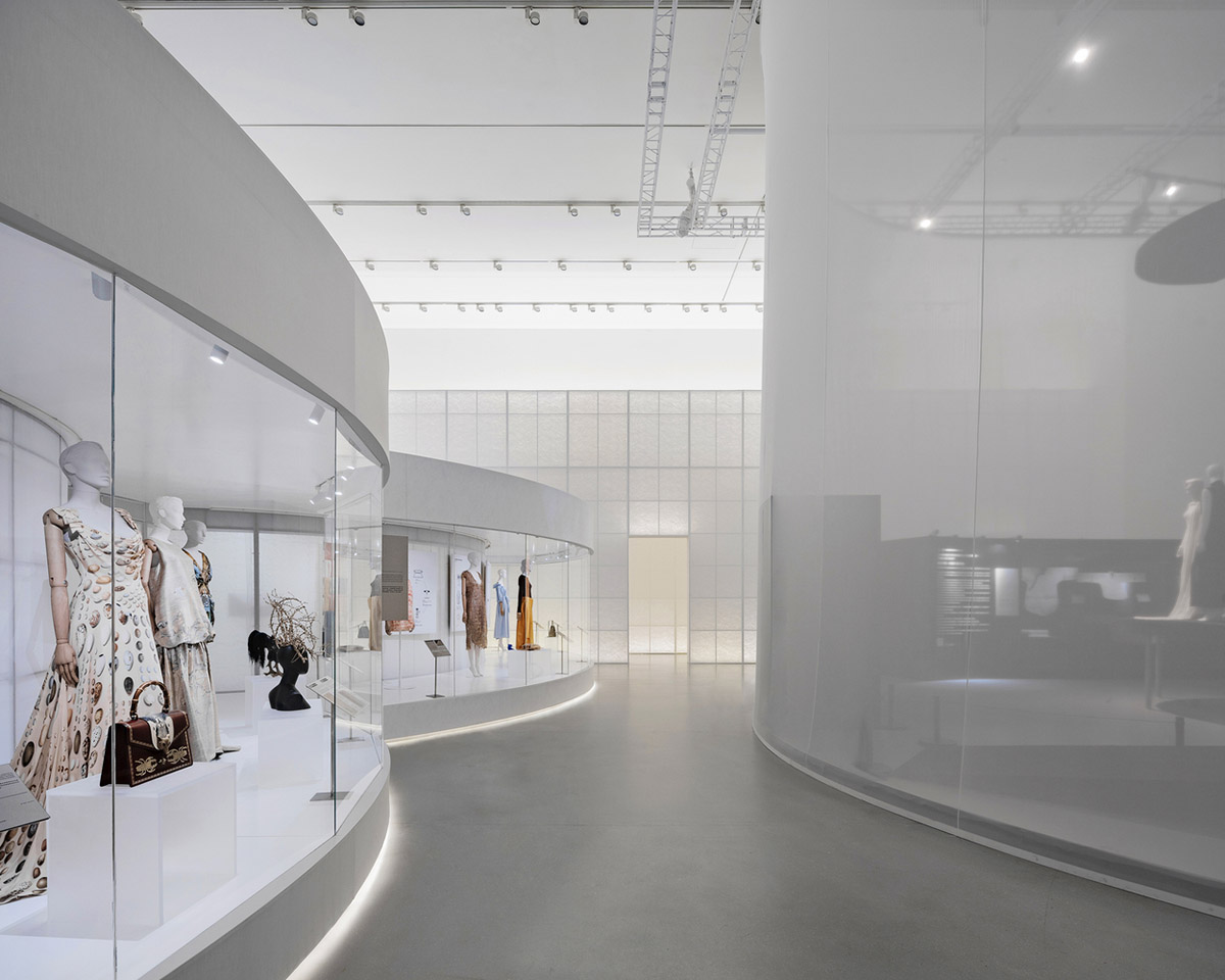
Presenting three abstract and volumetric structures, which are 360-degree circular independent structures, they showcase and highlight objects with a special focus.
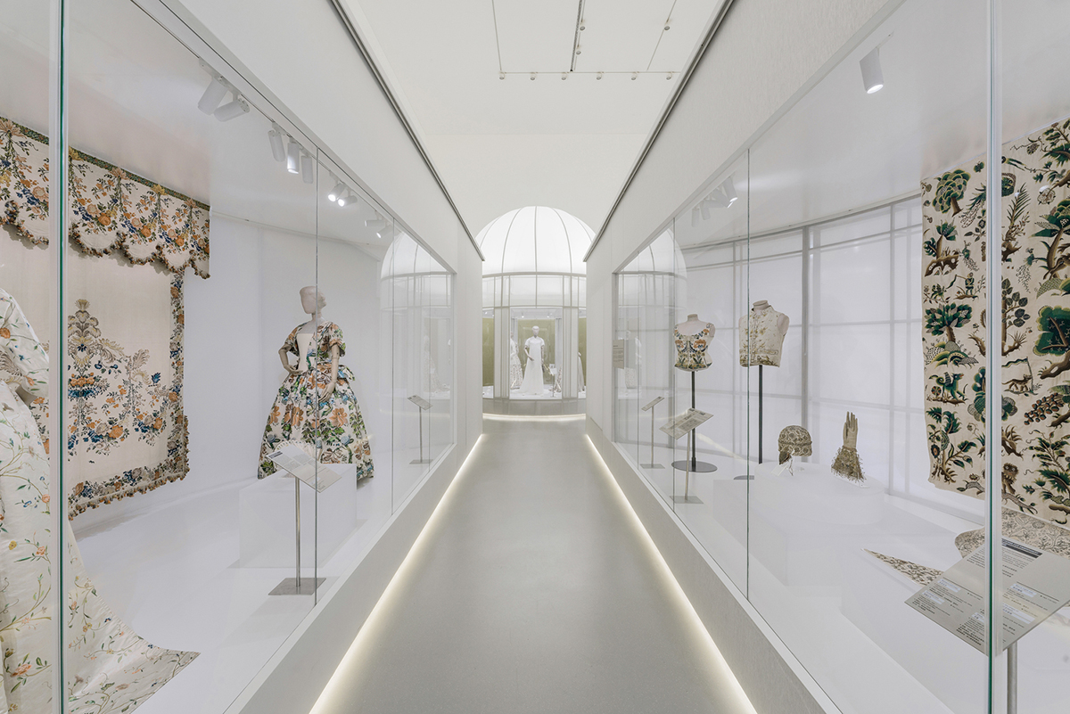
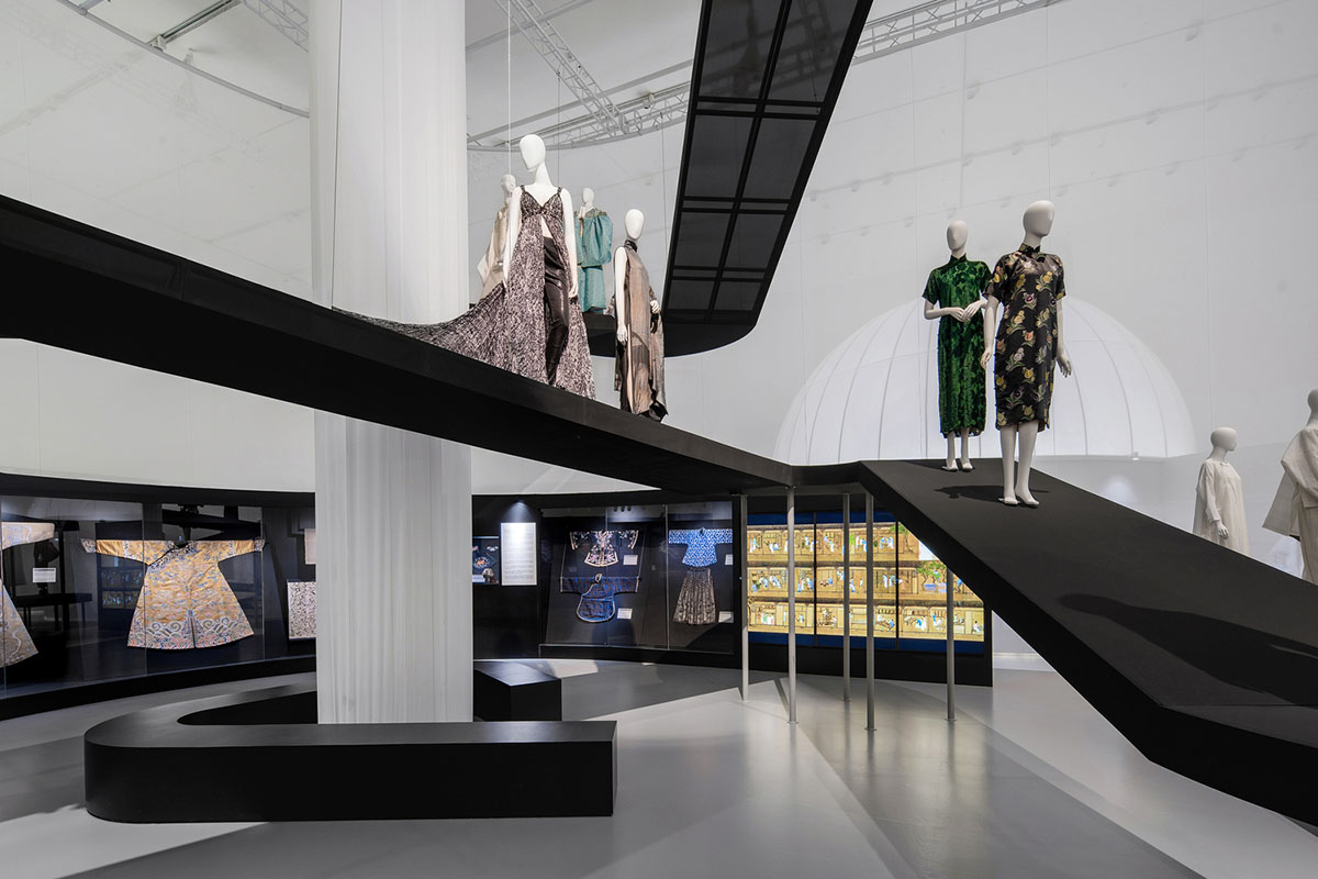
These tubular structures are connected via a long hallway that allows visitors to visit each of them separately. The second section, featuring black translucent ramps, is situated in the middle of the space.
"Then comes the last garden, which is formed by an array of acrylic tubes," added the studio. "The modern material implies that the narrative of the exhibition is coming close to modernity, where people began to contemplate and reflect on the relationship between fashion and nature."
From there visitors enter the contemporary and prospects of the exhibition, the space instantly opens up, from classical confined circular showcases to one continuous, free-flowing showcase, echoing the flexible layout of contemporary landscape and spatial design.
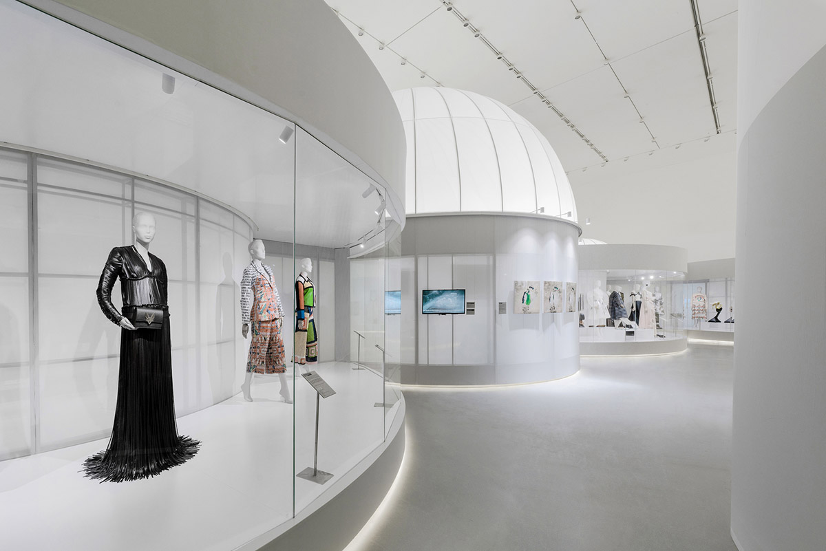
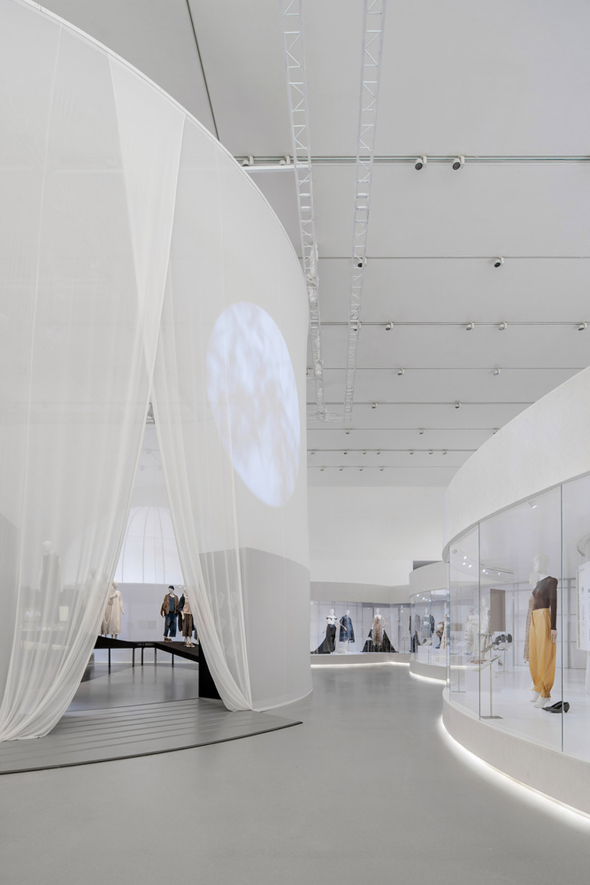
The Chinese section is placed in the end of the exhibition. Described as "a pill-shaped plan", it is enclosed with translucent fabric, leaving only a slit for the entrance.
"Visitors can vaguely see whilst wondering in the V&A section, which is a process of curiosity accumulation. In this section, the spatial design follows a natural approach - there is no axis or fixed linear circulation," added the architects.
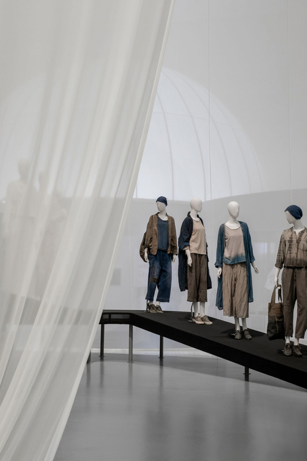
"A translucent ramp sits in the space, just like a mountain trail or stream meandering down from the sky, free and winding. The models dressed in showcased pieces are placed on the ramp, as if they are walking down the mountain trails."
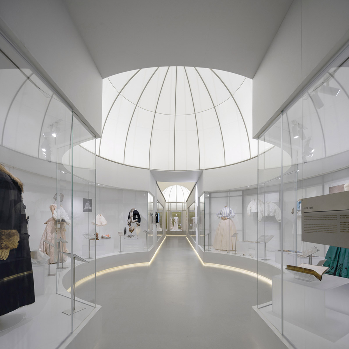
Visitors can move around the space intuitively and freely, as if they are in a romantic and poetic nature setting.
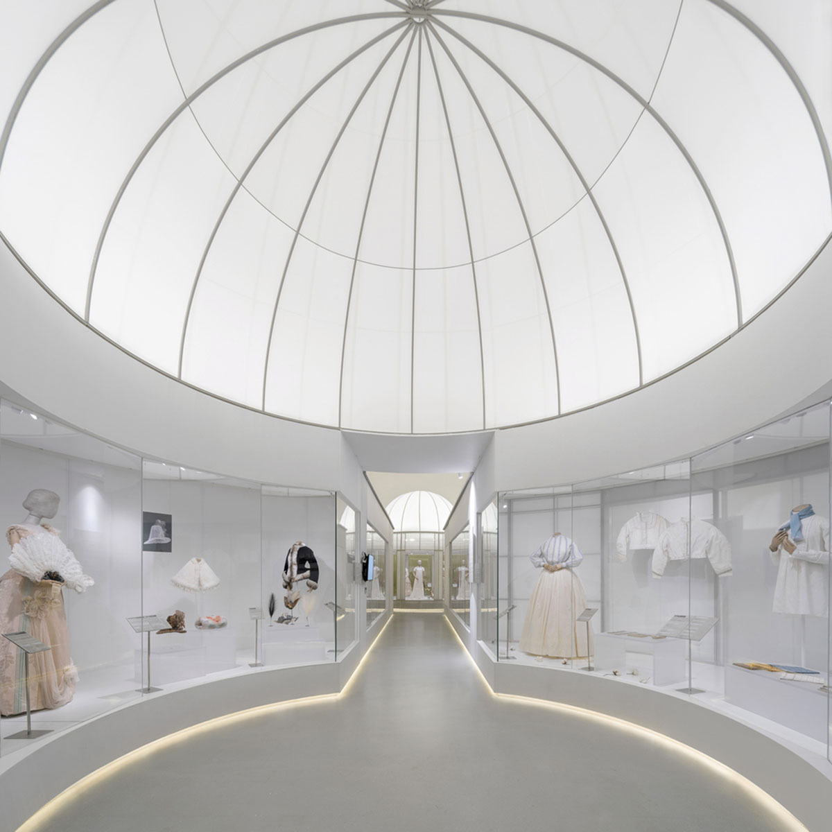
As the architects highlight, the exhibition is made of lightweight and translucent materials by using fabric, TPU, Tyvek. to weaken the interposition of physical space and the existence of entity; expressing Eastern and Western, classical and modern garden’s abstract and poetic views through “void” and “translucency”.
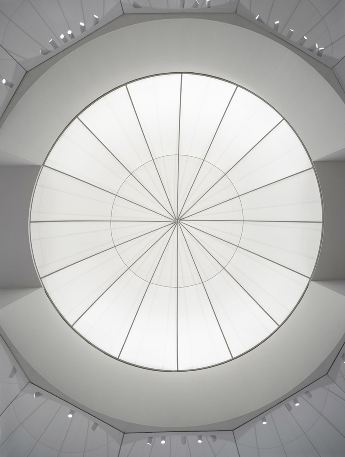
Studio 10 intends to inspire visitors to ponder and reflect upon the relationship between human and nature from fashion and a broader perspective.
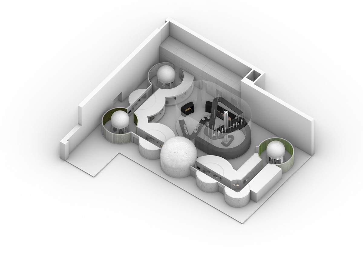
Axonometric
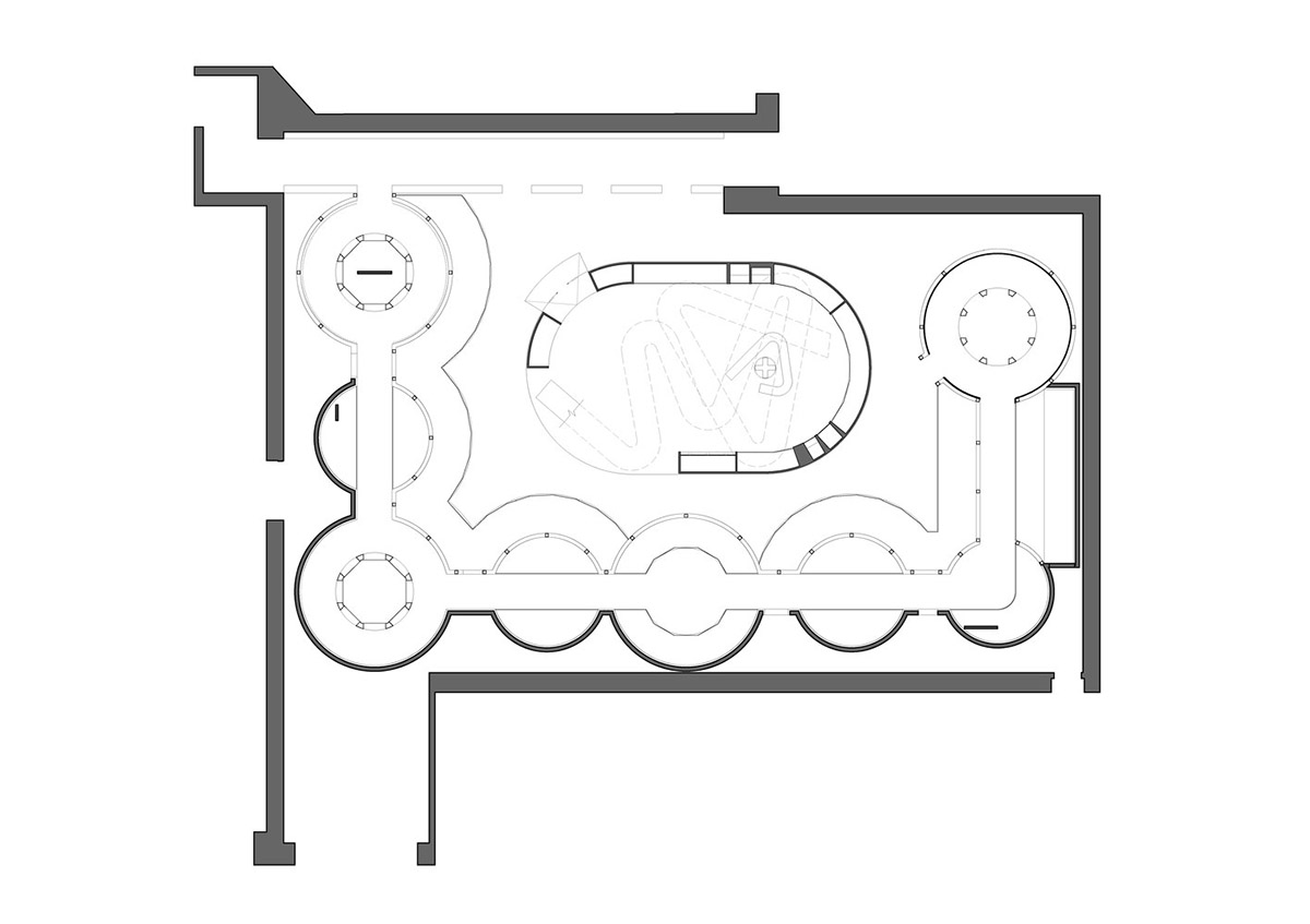
Floor plan
Project facts
Project name: Spatial Design Of The Exhibition Fashioned From Nature
Architects: Studio 10
Location: Shenzhen, China.
Size: 1,280m2
Date: 2020
Curator: Design Society, Victoria & Albert Museum (V&A), China Silk Museum
Guest Curator: Edith Cheung
Design Consultant: Studio 10
Principal-in-charge: Shi Zhou
Design Team: Cristina Moreno Cabello, An Huang, Jiaying Huang, Meishi Zhao, Xin Zheng, Jiaxiao Bao (Project Assistant), Feifei Chen (Project Assistant)
Graphic Design Consultant: SANYI_Lab
Construction Drawings Consultant: SHENNAN Design
Lighting Consultant: JOJO Lighting
All images © Chao Zhang.
All drawings © Studio 10
> via Studio 10
