Submitted by WA Contents
Giant organically-shaped pillar becomes a showcase element in the heart of clothing store in Brazil
Brazil Architecture News - Dec 27, 2021 - 15:38 4684 views
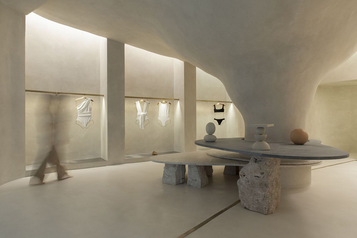
A central, giant organically-shaped pillar becomes a main showcase element in the heart of a clothing store in Leblon, Brazil.
The store, called Haight Clothing Store, was designed by Rio de Janeiro practice AIA Estúdio and Raphael Tepedino to evoke natural caves.
The 110-square-metre clothing store, envisioned for a Brazilian clothing brand Haight, is located within the Shopping Mall Leblon to create a welcoming environment and a consumption experience that brings something improbable in its essence.
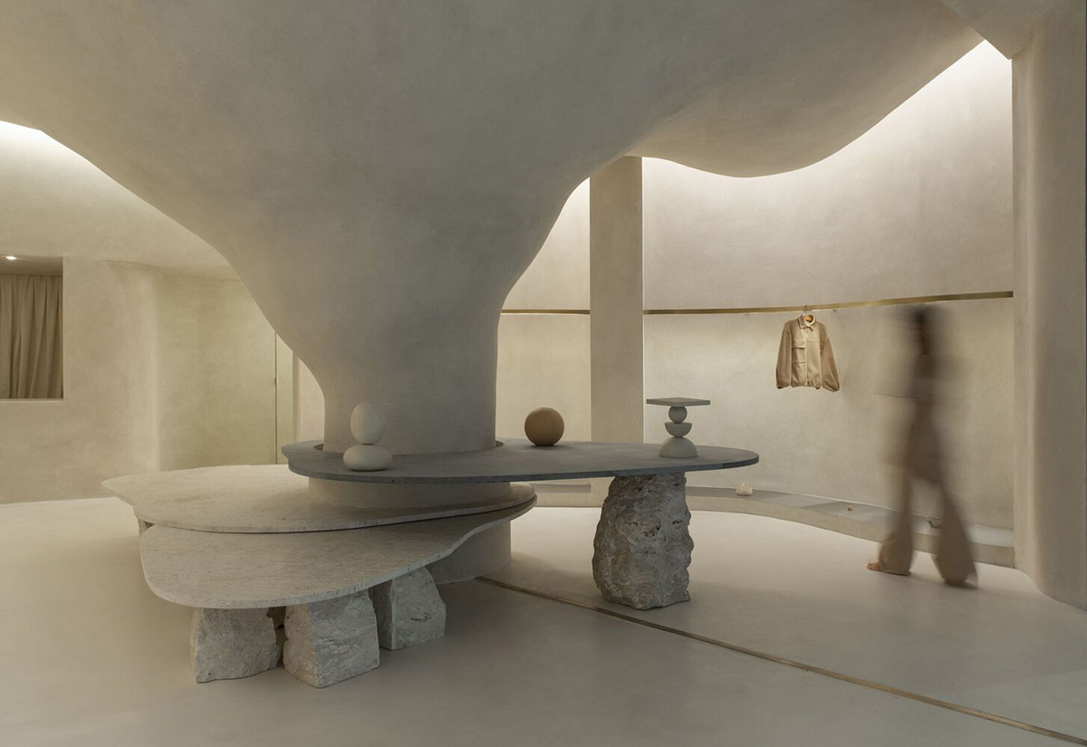
Considering the language of Haight’s conceptual basis, the design team has created an opposite version of the language by transforming natural landscape elements into a warm, soft and cave-like atmosphere.
A perfect combination of colors, textures, smooth surfaces with cut-out forms and cave-like volumes complements the store in a fluid way for its customers.

While customers are lost in the perfection of flowing forms, choosing the pieces to buy becomes even easier among the continuity of these surfaces.
"Consequently, being inside a mall for the first time posed a significant challenge for the project," said AIA Estúdio and Raphael Tepedino.
"Accordingly, the design adopted a contrasting strategy between the store and mall - which, despite the rigid and controlled environment, offers opportunities such as the possibility of not having a door."
Haight Clothing Store entirely focuses on an organic, procedural and layered language to represent and discover Haight's universe.
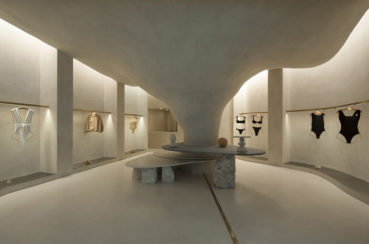
Inside, even if it is a small store, each piece makes a statement for visitors. The space attracts the user with minimal and concise structural interventions by creating powerful emotional allure.
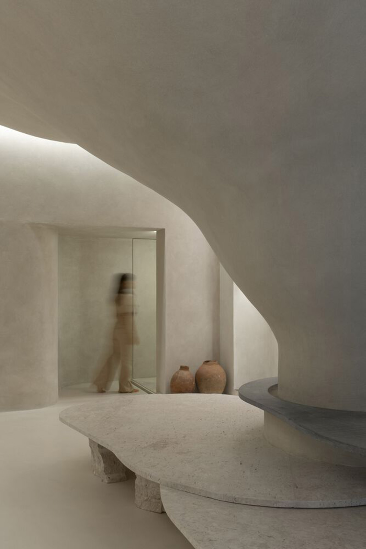
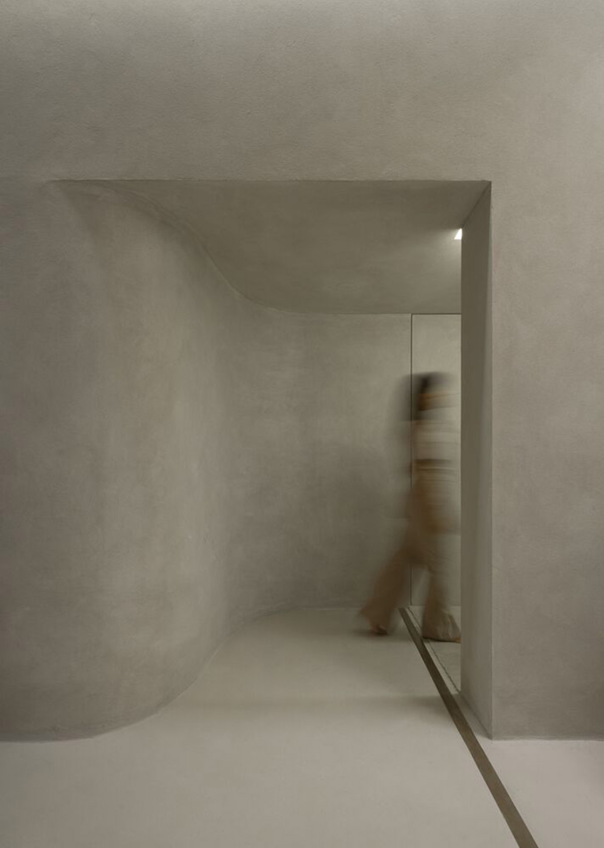
The store features a large opening that defines the entrance to the store, also leaving access completely free. On the one hand, the shape of the entrance emphasizes the proposed contrast and, on the other, establishes a kind of fusion between the interior and exterior.
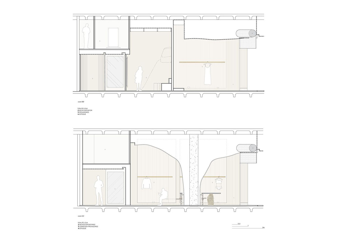
A central, organic-formed pillar, located in the center of the store, becomes a protagonist of design - which could also be interpreted as an obstacle – became the main spatiality generator.
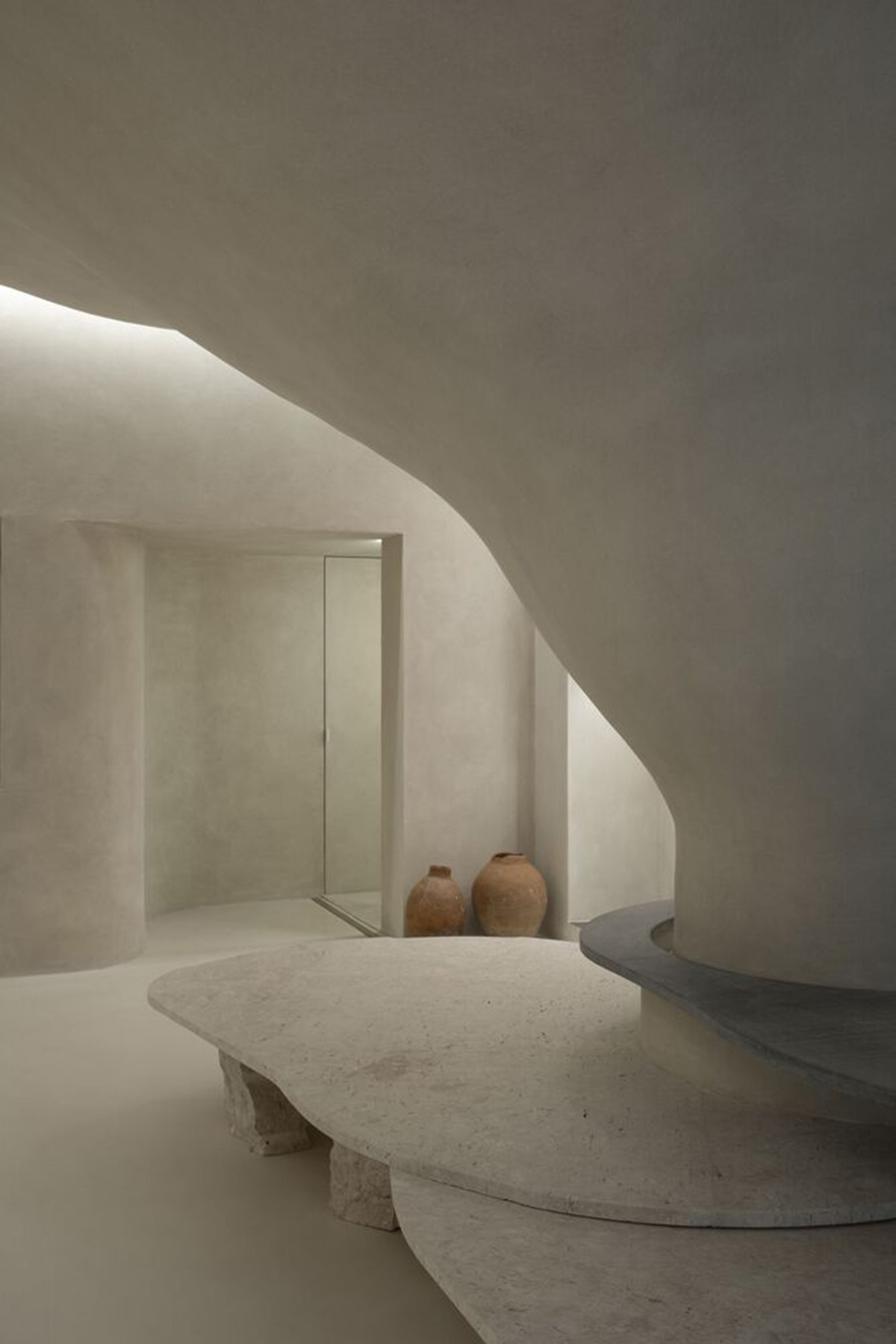
"It is from the occupation around the pillar that the space fluidity is achieved. This disposition is enhanced by curved lines that define the path inside the store," the design team added.
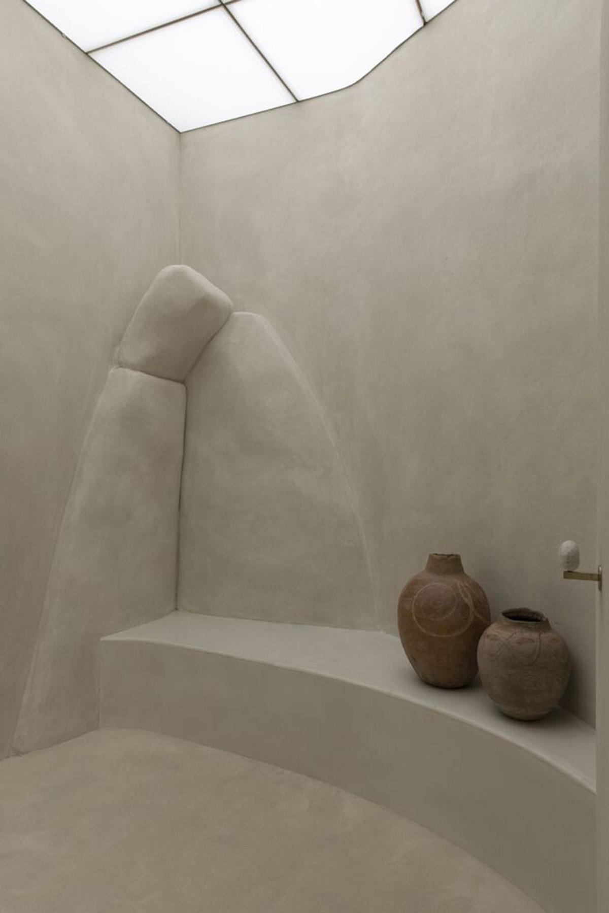
The design team creates this volume from a fusion between pillar and ceiling to become an element in an organic way that refers to "natural caves and gives unity to the whole."
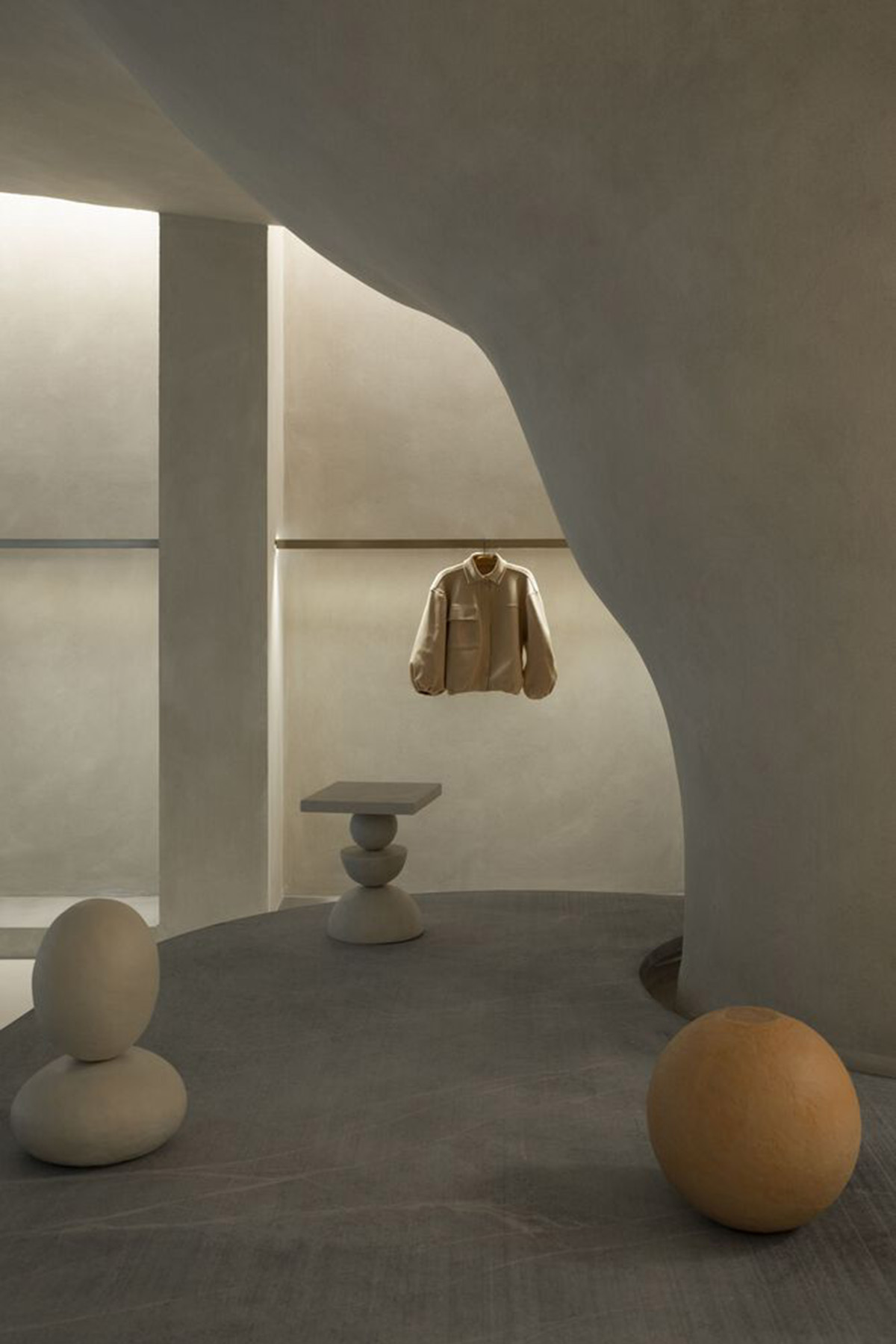
Around it, there are three stone plates of different heights acting as an exhibition space and place to sit.

The design team prefers to use Bahia beige marble and soapstone as the main materials to compose the center of the store. For structuring these plates, they used rough Bahia beige. The way they are arranged - although independent with varying heights and materials - forms the unit that organizes circulation.
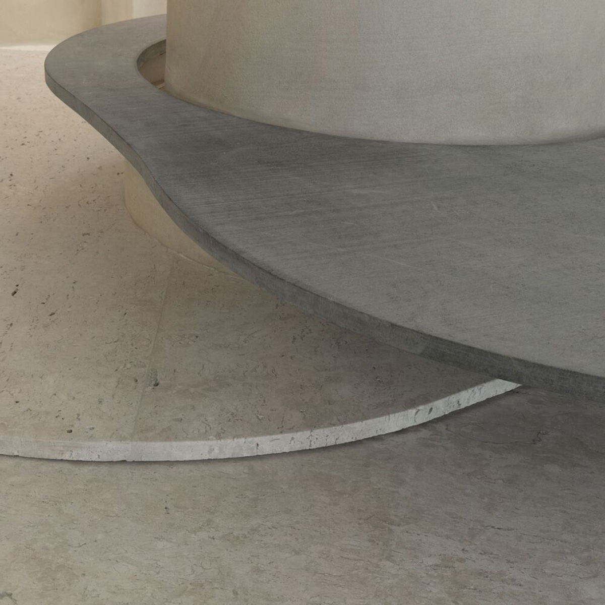
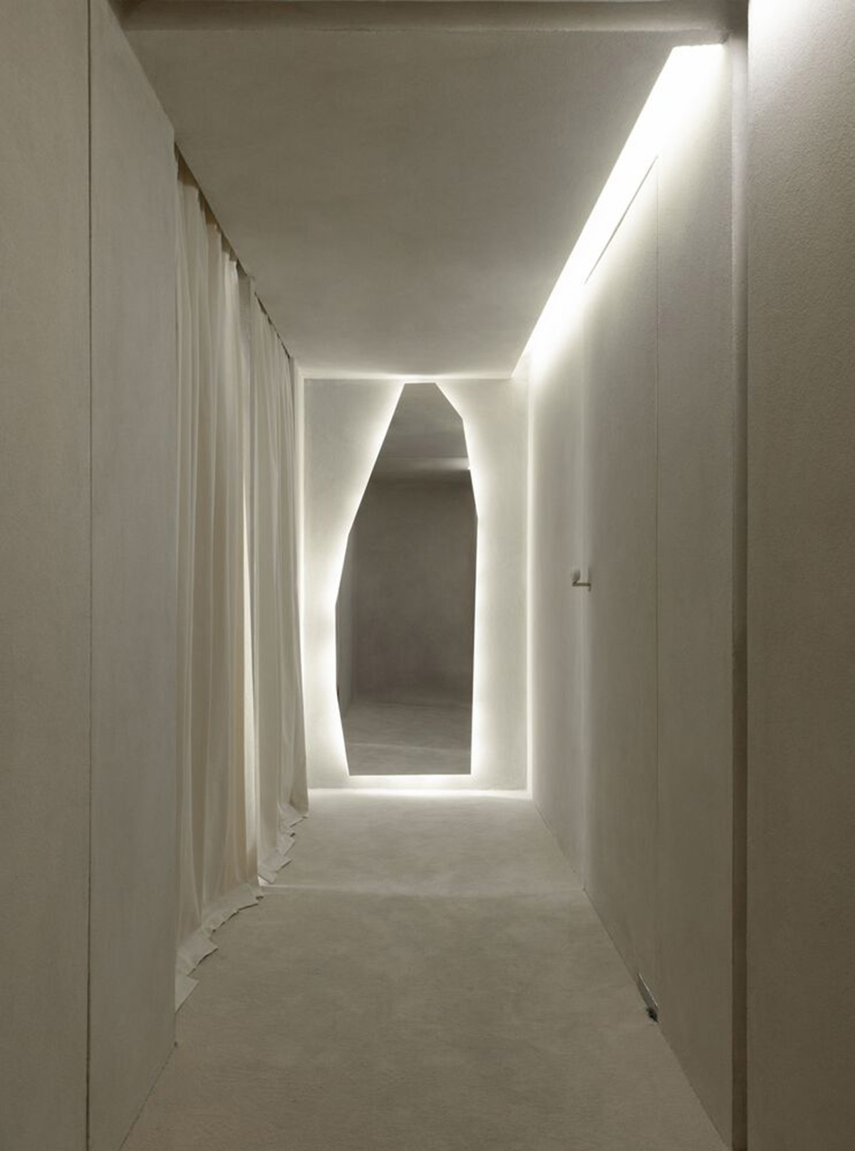
The "terracor” material, which covers all the walls and ceiling, gives unity to the ambiance through its rough texture that refers to natural surfaces.
The infinite and diverse processes of erosion that form cliffs, caves, stalactites, sands, stones and the movements of water with its tracks and shapes led to the team's creative process being part of the concept developed for the store's spatiality. This conceptualization is also explored from lighting, using indirect light as a fundamental element to create this atmosphere, as the design team highlighted.
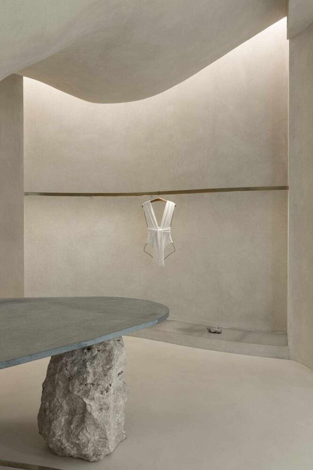
The exhibition interspace was thought of as a "cut" in the "walls," an operation emphasized by the transition of materiality.
This cut reveals a stainless steel plate in the base of the niche. Inside, there are exhibition racks in brushed brass, which, with their more solar aspect, contribute to subtly warming up the store's ambiance, together with the soapstone and its grayer tone.


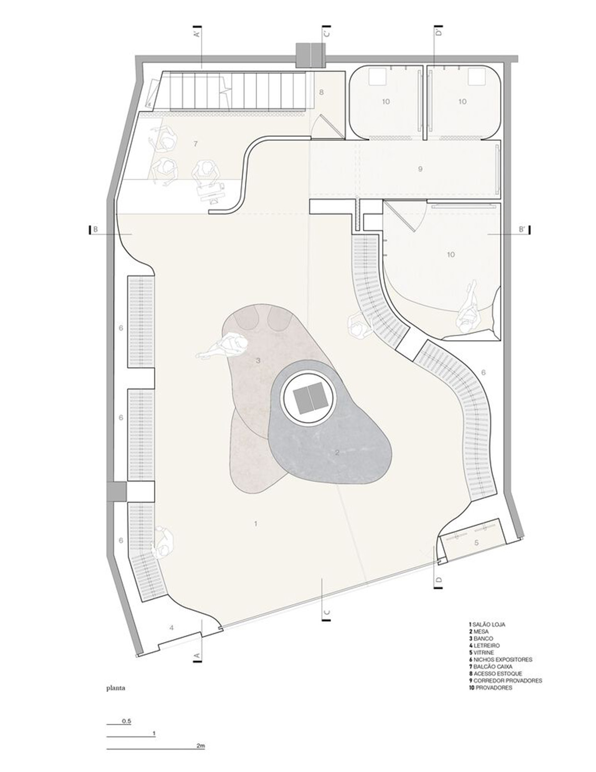
Ground floor plan
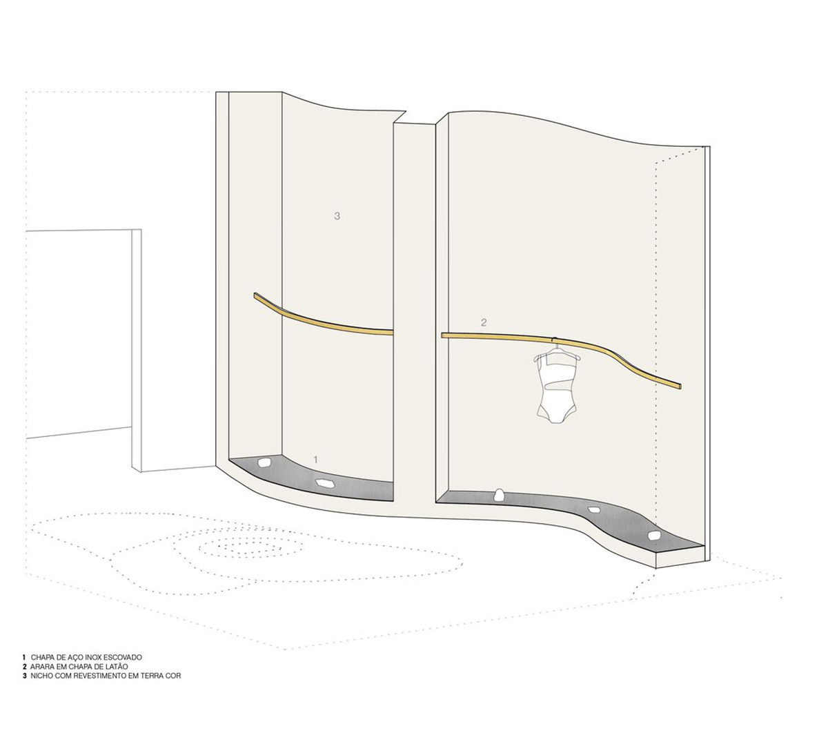
Axonometric drawing
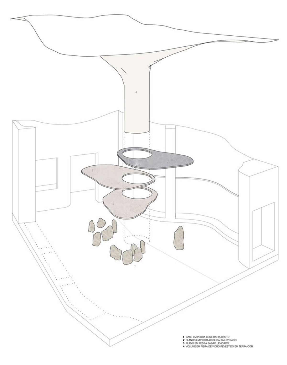
Axonometric drawing-2
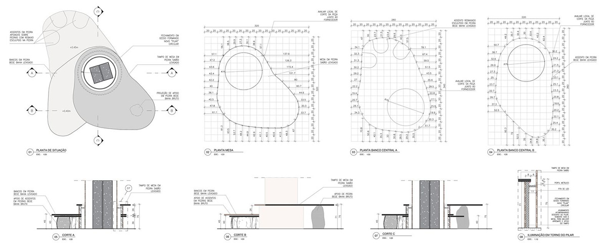
Detailed plans
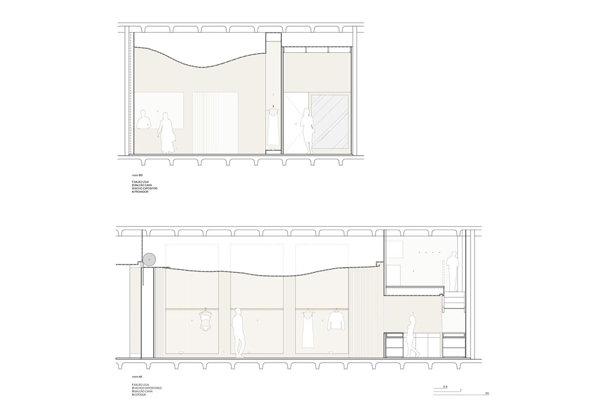
Sections
Sections

Elevation
Meanwhile, find out WAC's most-read interior design news in 2021. See all interior design projects showcased on World Architecture Community's Interior Design Projects page.
Project facts
Project name: Haight Clothing Store
Architects: AIA Estúdio, Raphael Tepedino
Location: Leblon, Brazil
Size: 110m2
Date: 2021
All images © Maira Acayaba
All drawings © AIA Estúdio, Raphael Tepedino
> via AIA Estúdio & Raphael Tepedino