Submitted by WA Contents
The Lubalin Center Launches a virtual Flat File
United States Architecture News - Mar 01, 2016 - 15:43 7489 views

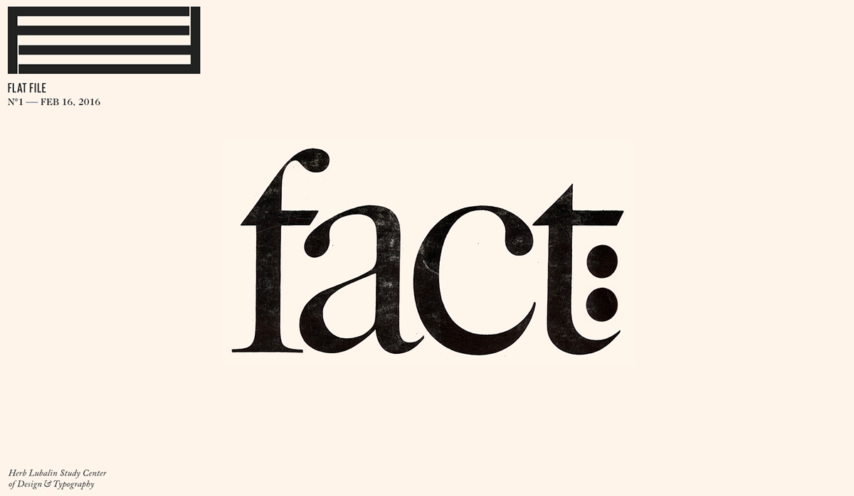
A screen from the Flatfile examination of Herb Lubalin's design for 'Fact:' magazine.
The Herb Lubalin Study Center has launched a new website, Flat File, that will showcase singular works of graphic design from its collection on a weekly basis. Alexander Tochilovsky A'00, curator of the Center, edits the site, providing insightful context and history about the works. The first two works examined are Herb Lubalin's design for "Fact:" magazine and Alvin Lustig's work on Look magazine's staff newsletter.
"It feels like it took us a few years to get to this place where we could think this up but the actual project took only a few weeks," Tochilovsky says. "A fortuitous meeting with a web designer, Anton Herasymenko, who visited the archive to browse, and a brief chat, got the ball rolling."
Though launched without any fanfare, the site has garnered significant attention from the design and typography community in a short span of time. "The first tweet about it was seen by 16,000 people; 2,000 viewed the site in its first day. In the first five days that one post about Fact:magazine was viewed 4,300 times. The mailing list we set up for it grew by 1,500 subscribers. This is all in one week," Tochilovsky says.
The Lubalin Center, which is open by appointment to anyone interested in browsing its extensive collection of design and typographical ephemera, recently celebrated its 30th anniversary. A related exhibition included actual flatfile cabinets where each drawer focused on an individual designer. Some of the future subjects for Flat File, the website, include Push Pin Studios' Almanack and Karl Gerstner's Capital magazine.
"I think the appeal this has is that there isn't that much out there that focuses on individual pieces of design, and does it in a short, manageable format that designers can read quickly, and get something out of it," Tochilovsky says. "We wanted to find a good balance between strong visual presentation and insightful but brief text. I want it to be inspirational, and for designers to be able to see how design history can be relevant to today's practice."