Submitted by WA Contents
Store interiors by Sò Studio feature soft beige tones to give the feeling of "like your skin"
China Architecture News - Apr 26, 2023 - 15:06 3900 views
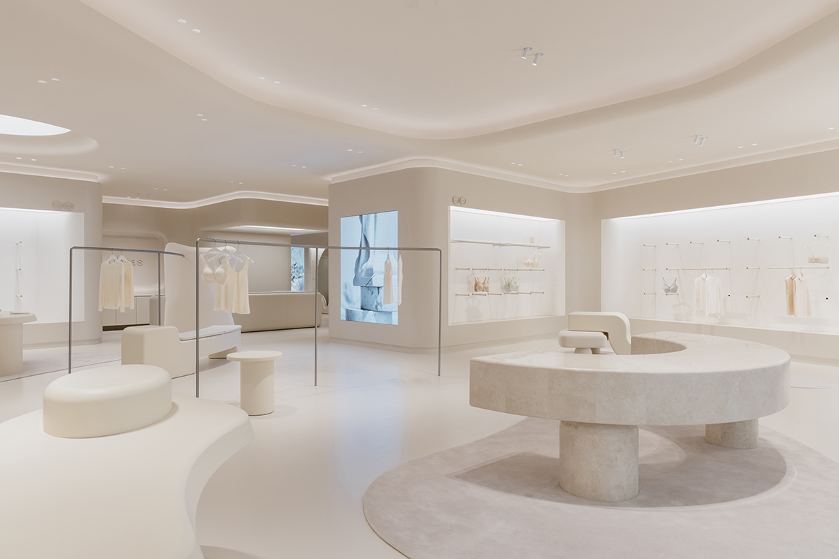
Sò Studio has created interiors for a concept store, featuring soft beige tones and curved display shelves to give the feeling of "like your skin, comfortable, caring with protection" in Shanghai, China.
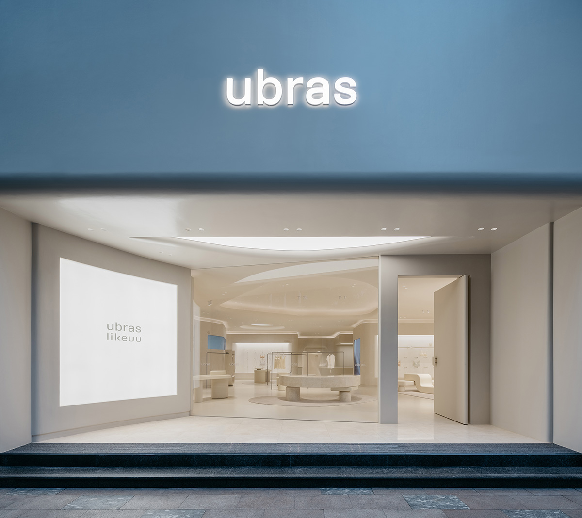
The store, called Ubras Concept Store Shanghai, is a 240-square-metre space designed for a lingerie brand ubras on 766 Middle Huaihai Road, Shanghai, China.
Echoing. Set your body to be free
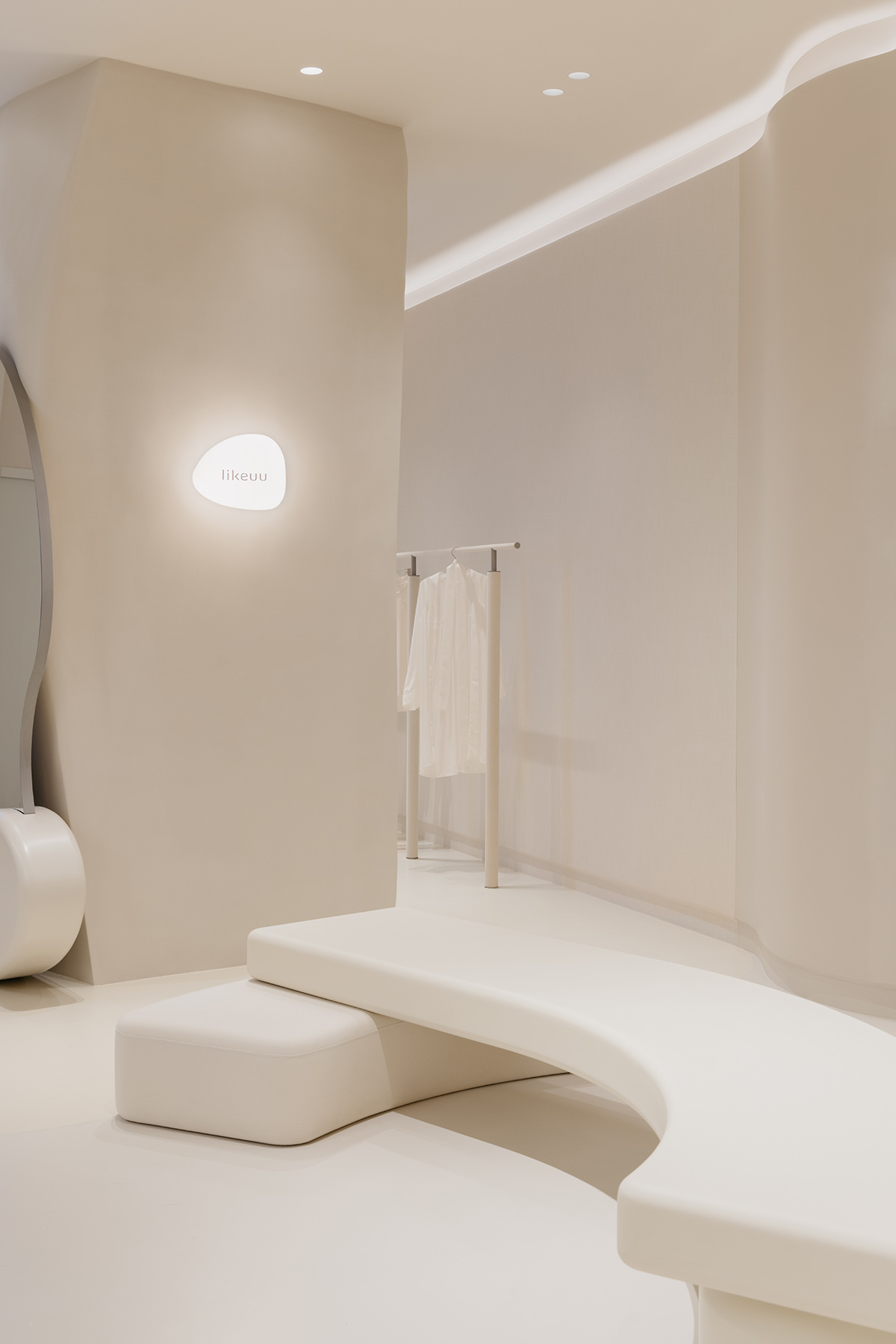
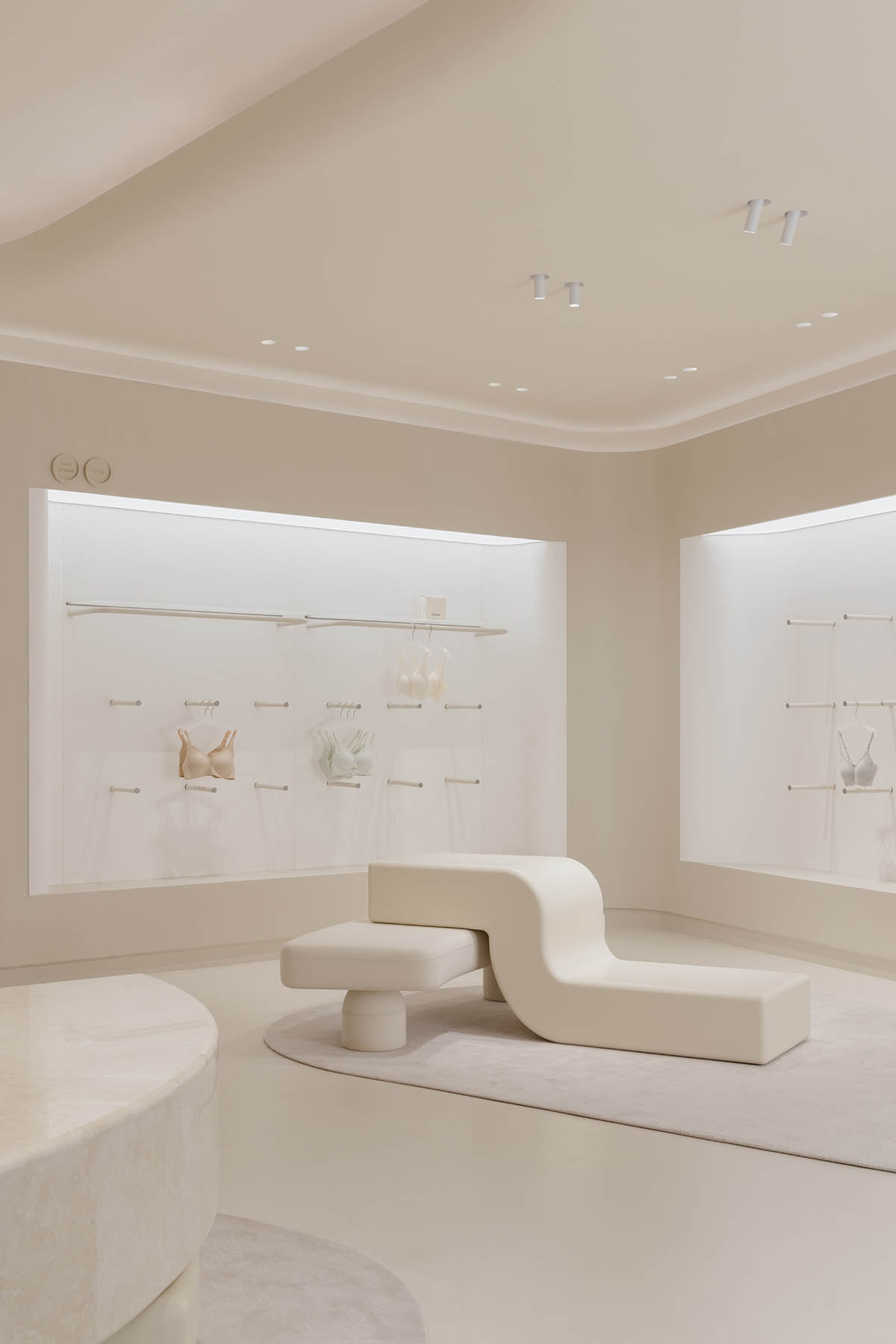
Presenting smoothness, softness and fluid edges and corners, the store has a minimal and cozy interior that visitors would feel enshrouded by Ubras Concept Store Shanghai.
The interior elements, colors and materials were selected to respond the brand value of “loyal to self, free at heart” through the celebration girl power.
"Enshrouded and supported"
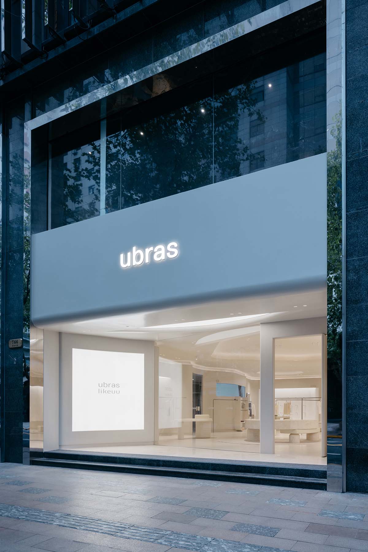
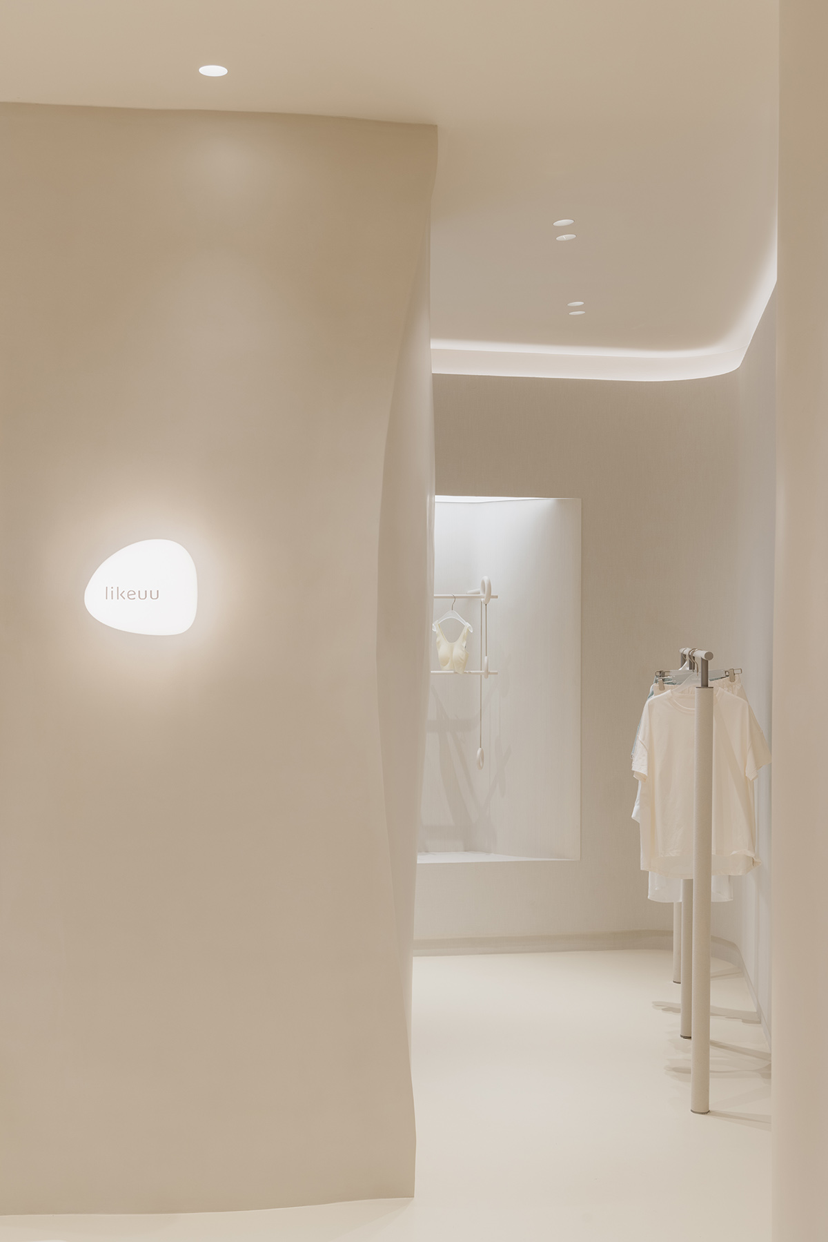
The bustling and vibrant Huaihai Middle Road is composed of high commercial concentration with facades of each store expanded to the road. The exterior of Ubras Concept Store has been meticulously receded to give back street to the city, as well as to generate a welcoming space for people.
The designers aimed to place a simple, curved, luminous wall to weaken the business atmosphere, introducing a comfortable, caring preluded space for the visitors.
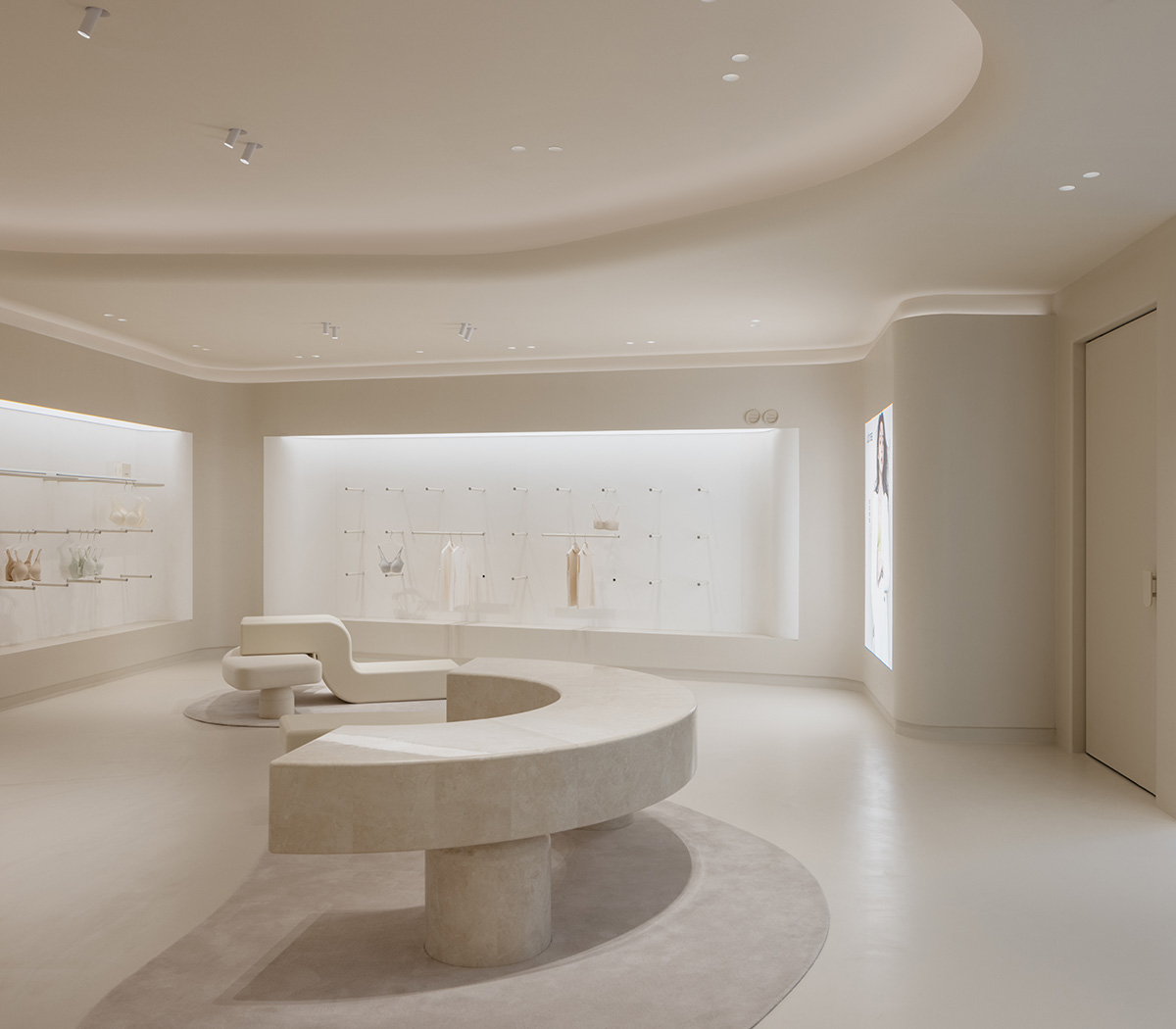
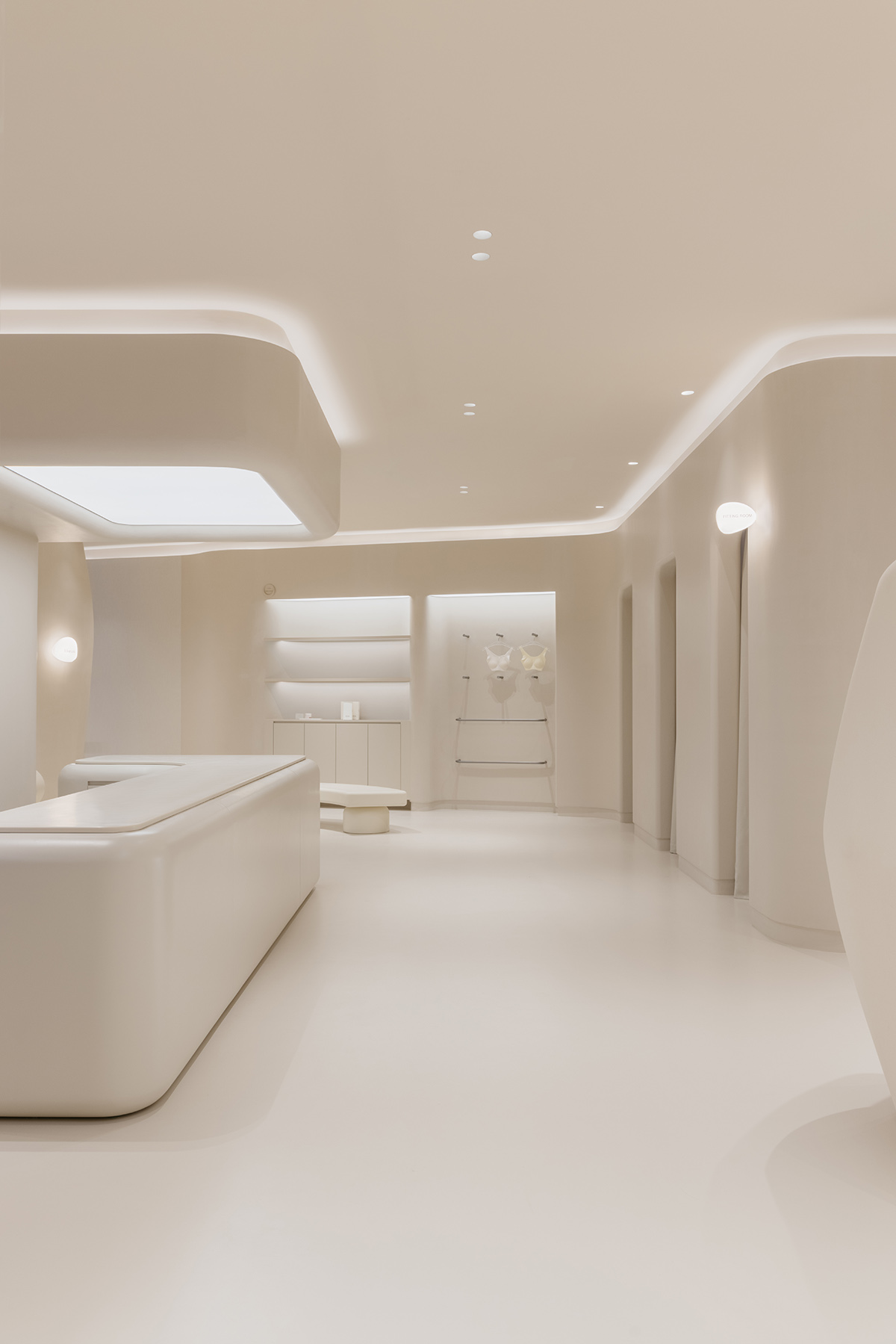
Customers are welcomed with a large entrance that guides them to a public/resting space highlighted with a half-curved countertop. The rest of spaces includes underwear area, reception, fitting room, lifestyle area, likeUU and storage.
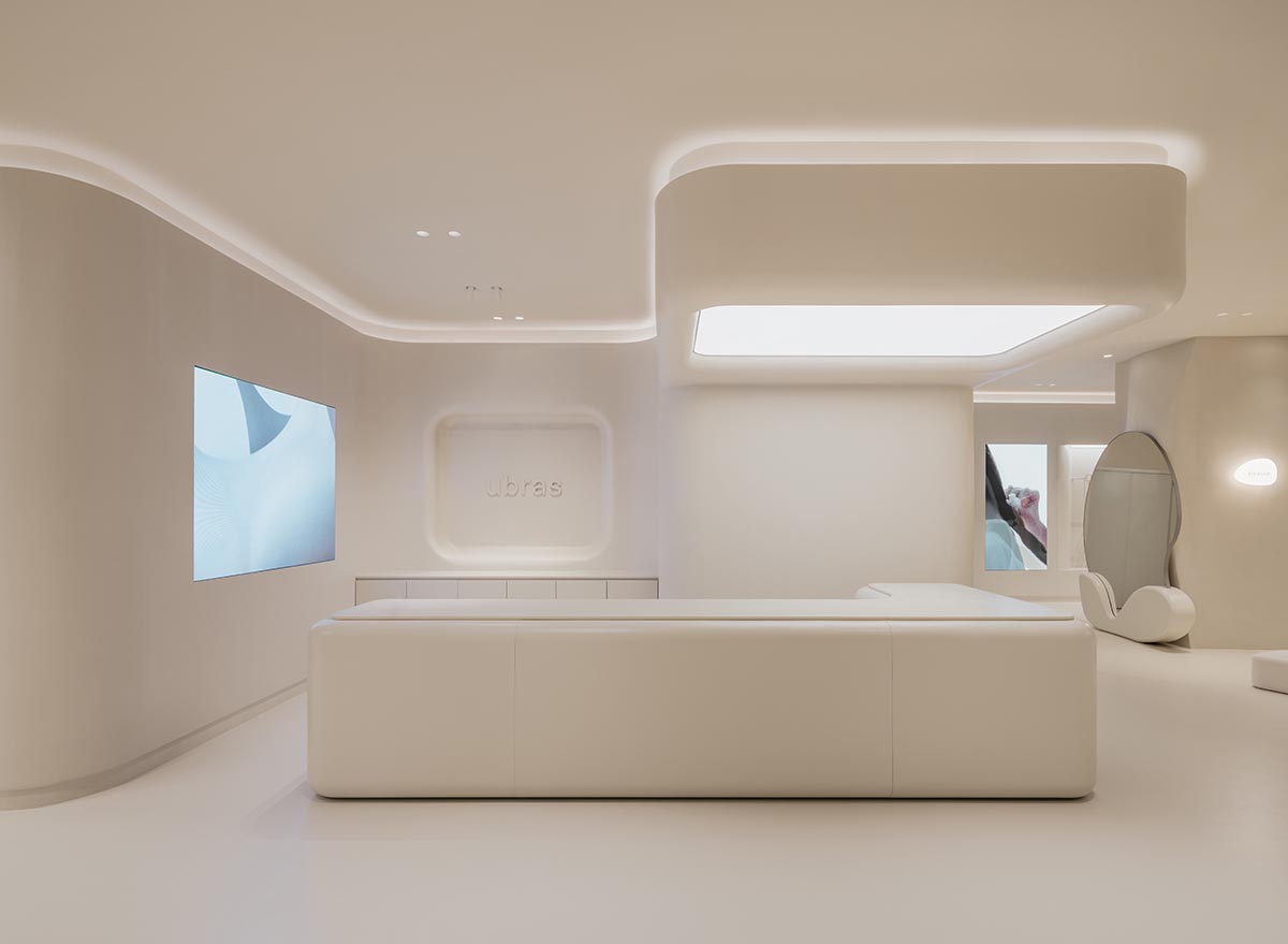
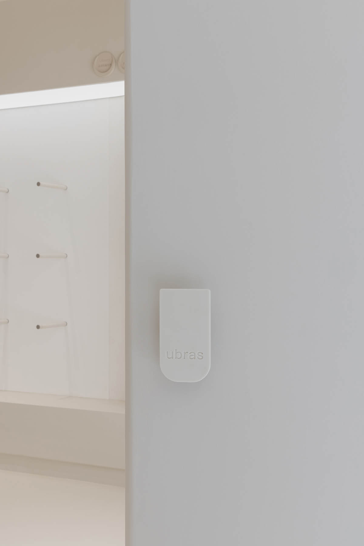
Brand symbols are also gradually revealed in the entrance, with u-shaped light film on the top and the u-shaped handle on the sliding door, evoking the start of an immersive store experience.
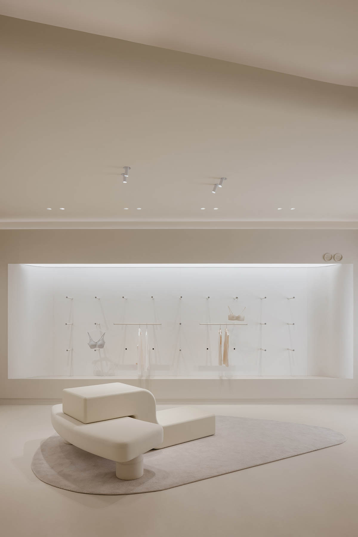
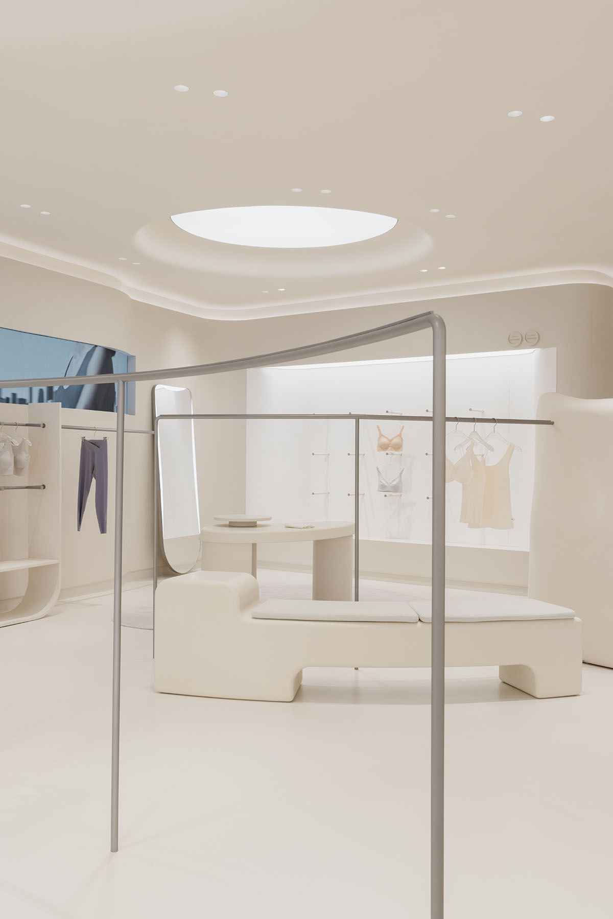
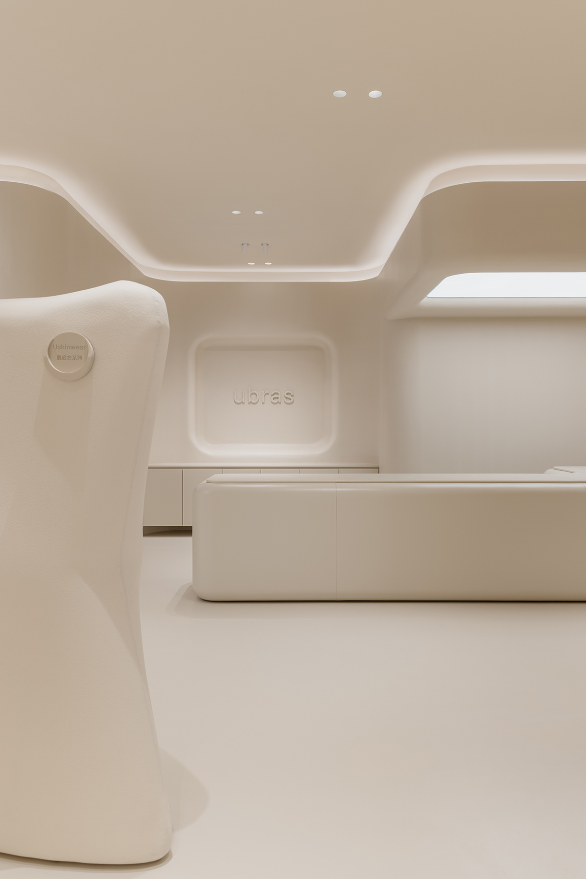
Upon entering, structural props are distributed in every sectional area, which forms a contrastive visual effective with the unity of soft beige tones.
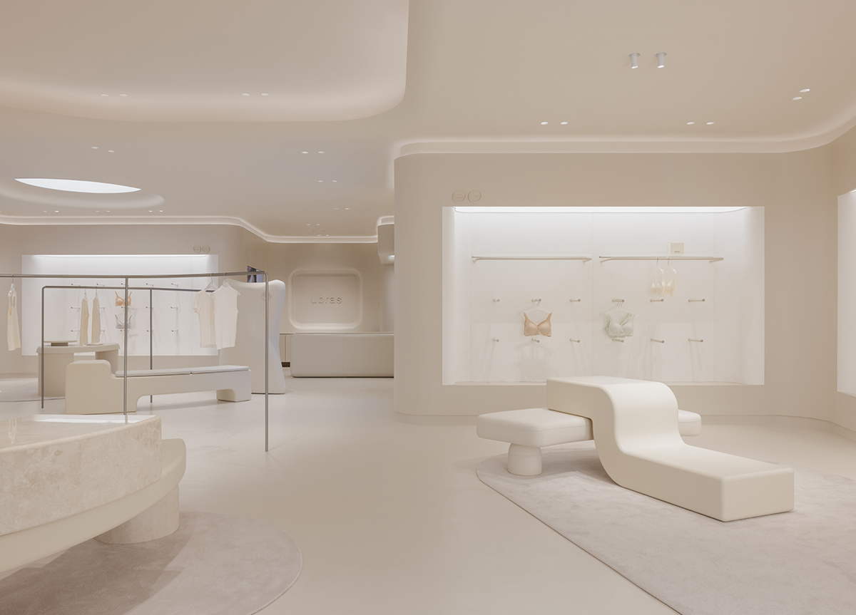
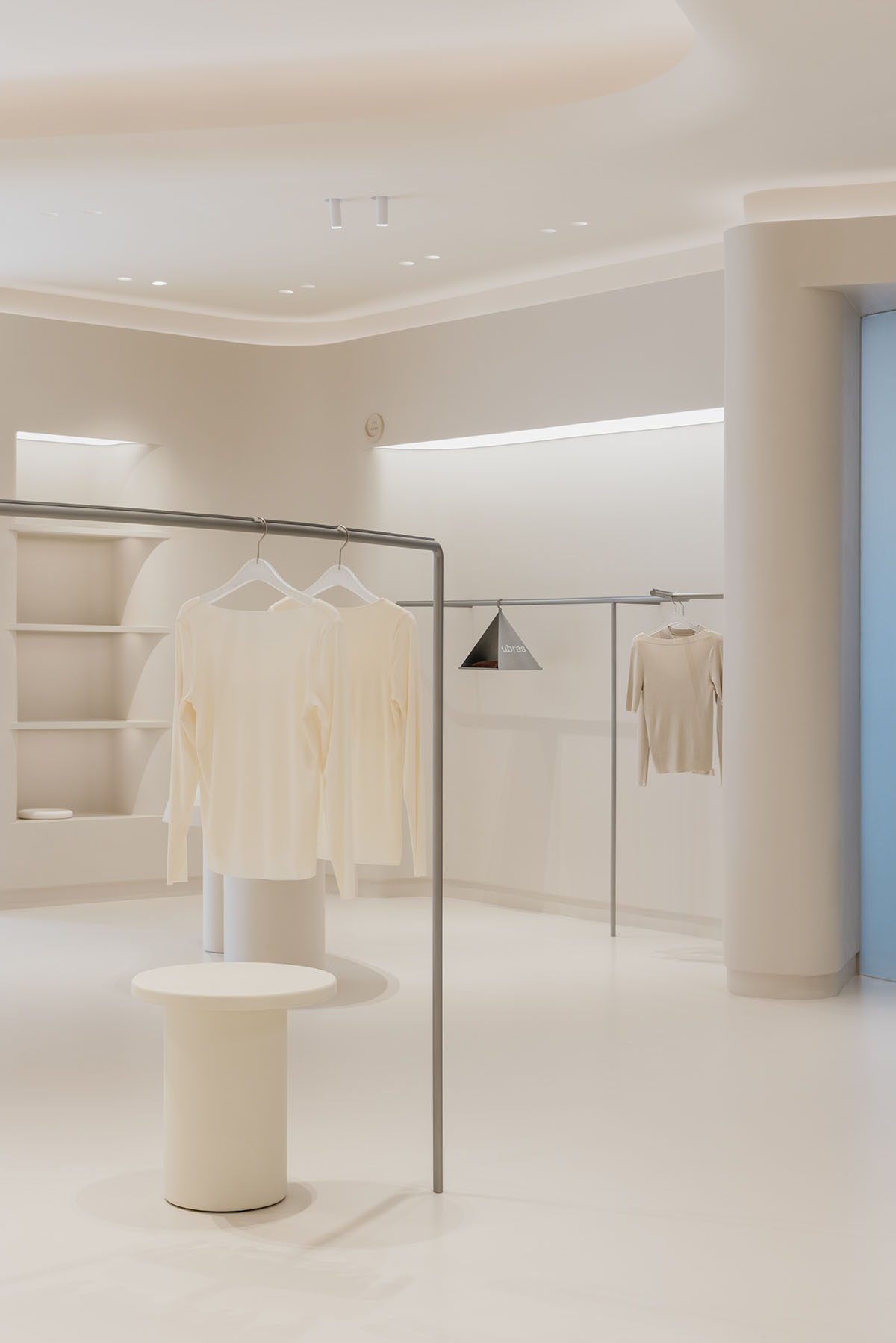
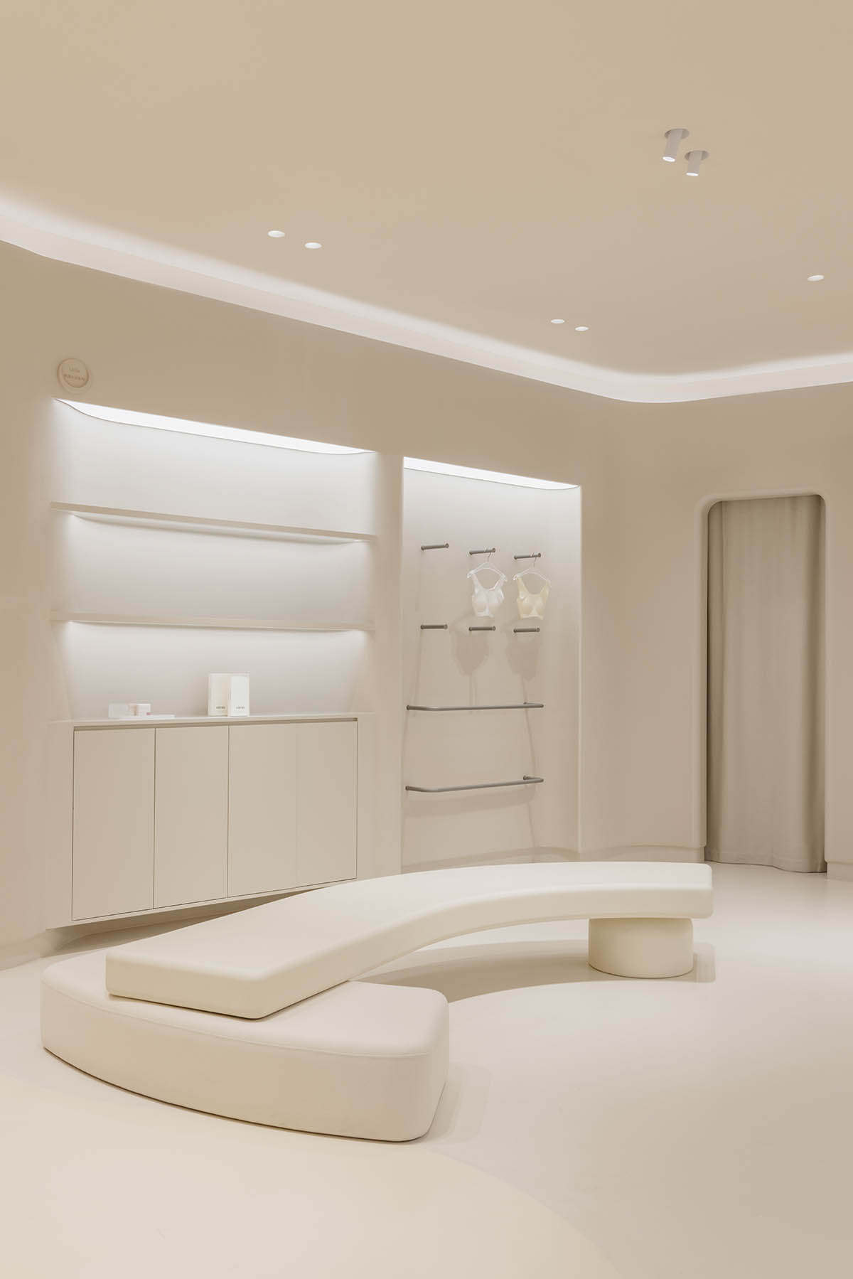
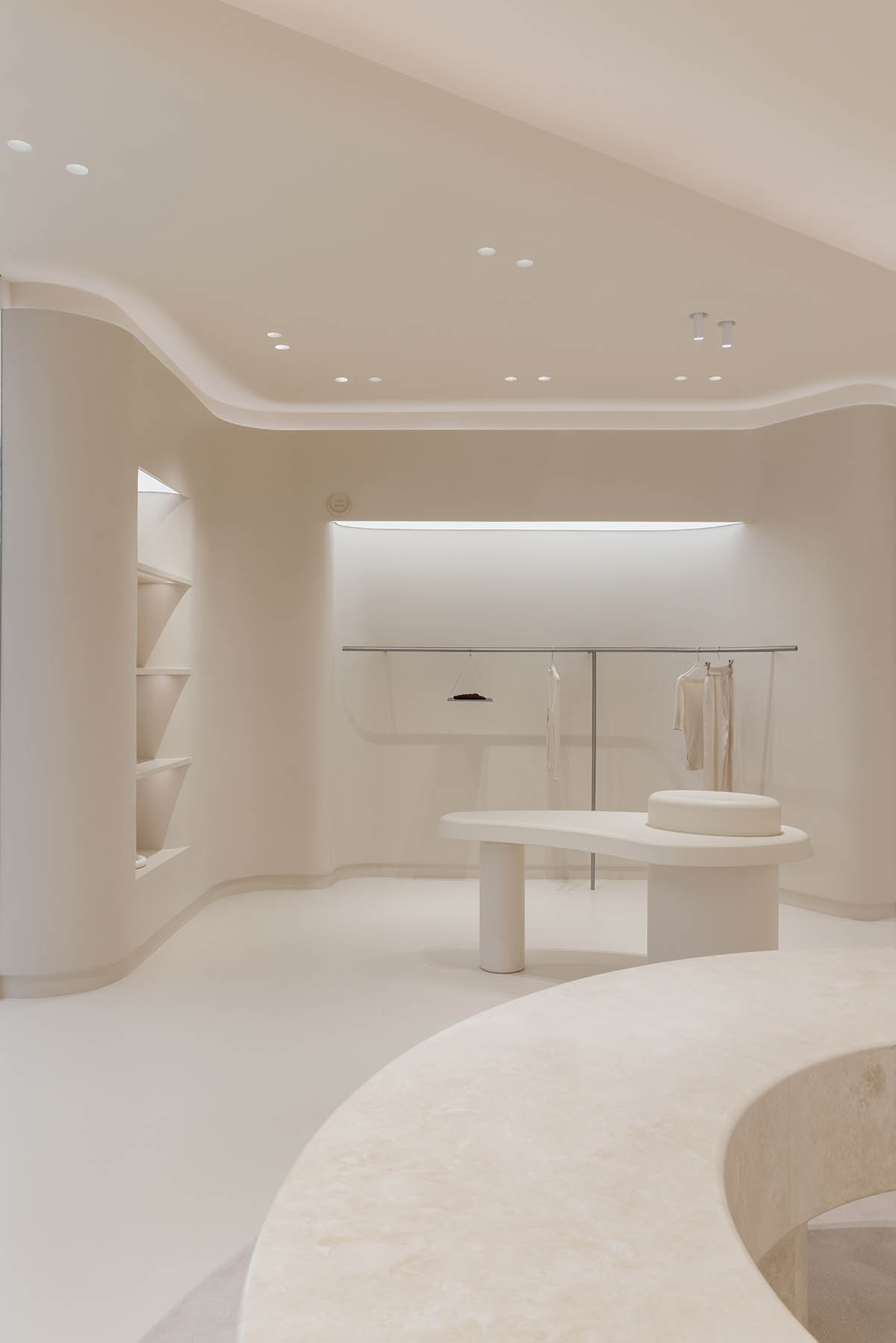
By virtue of different areas generated by props, a concise, streamlining circulation is formed; In terms of the prop shape, whether it is a "u-shaped stone prop" or an irregular "pillow prop", the designers attempted to soften the protruding part on the surface as much as possible, corresponding to the whole space in curved shape.
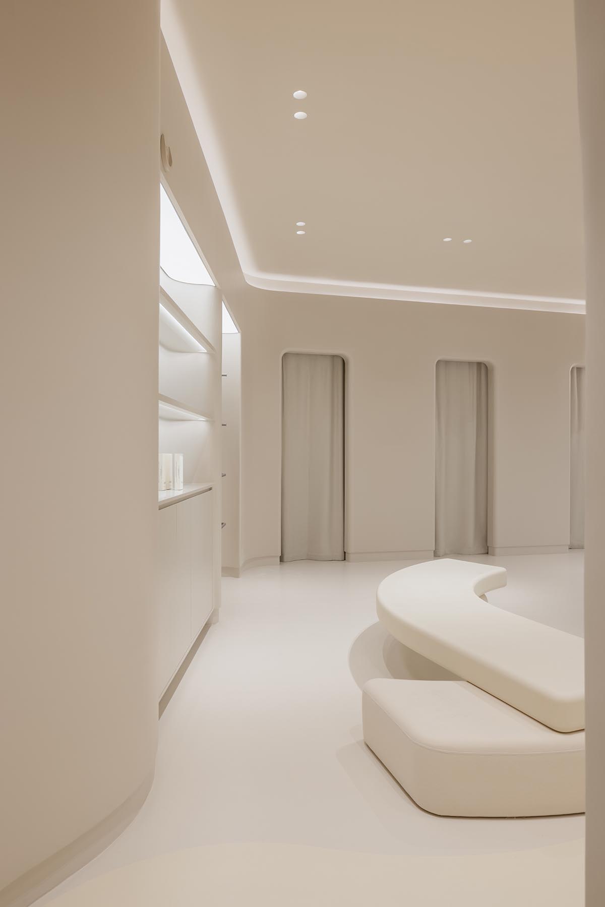
Moreover, the existing columns were treated with soft finishes, which fits into the serene and tranquil store atmosphere. As for curating a complete store experience, micro-cement materials and rubber-textured elastic paint were applied throughout the store, punctuating brand concept of “like your skin, comfortable, caring with protection".
A special area, called LikeUU, is dedicated for teenagers to purchase close-fitting clothes. Following the overall palette and simplicity as core, the form of laminate and ring display have been installed, balancing a certain sense of privacy and lively atmosphere.
As long as they walk inside, visitors of different ages can feel loving and care while meandering around the store.
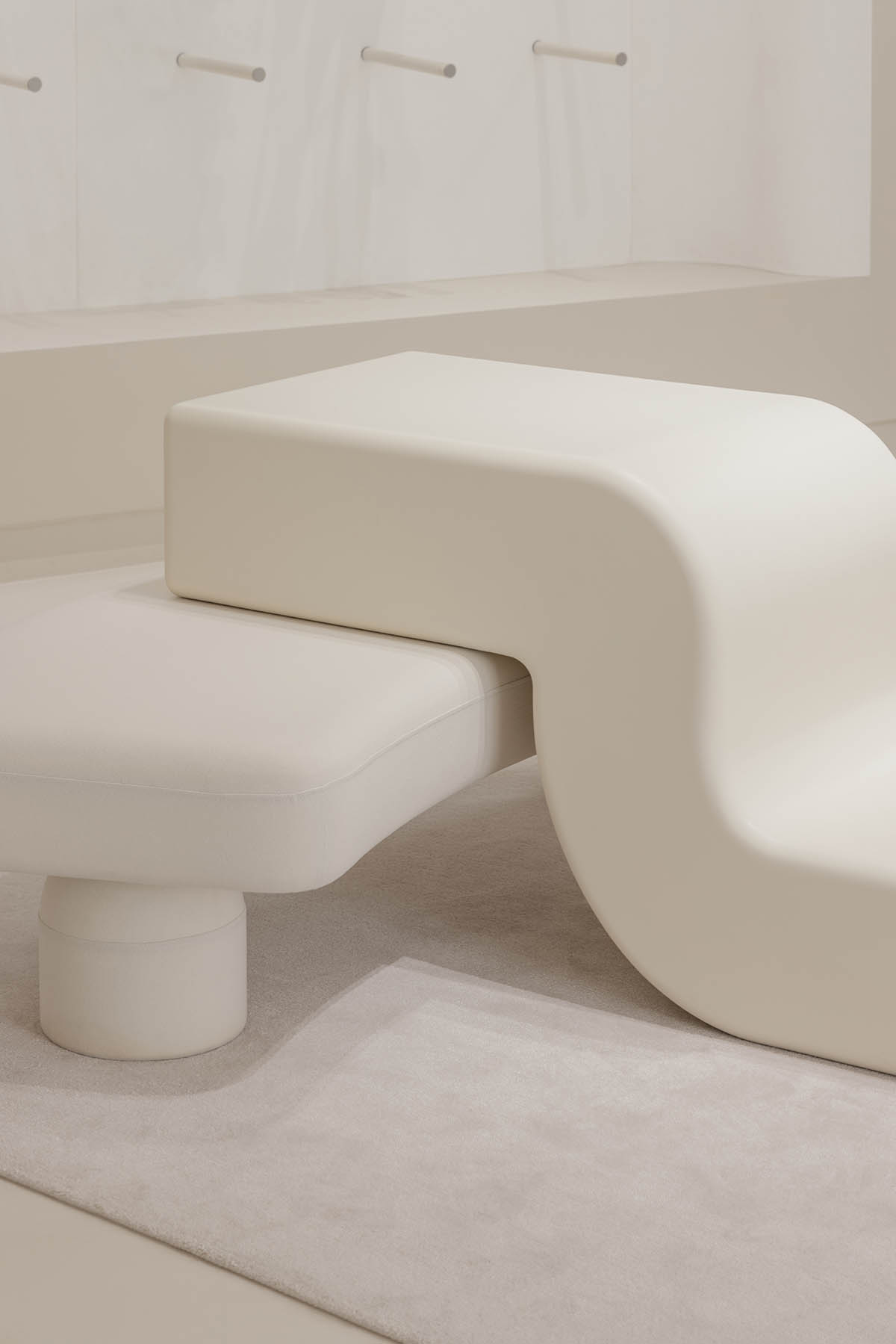
The cash register, designed in an L-shaped prop, is located in the center of the store, which makes invasion to the surrounding space and incorporates the structure of the sunken lighting film above, forming the focal point of the destination and completing the retail space.
While the studio also hopes that the conceptually driven interior will bring people an intimate experience of being cared sensually.
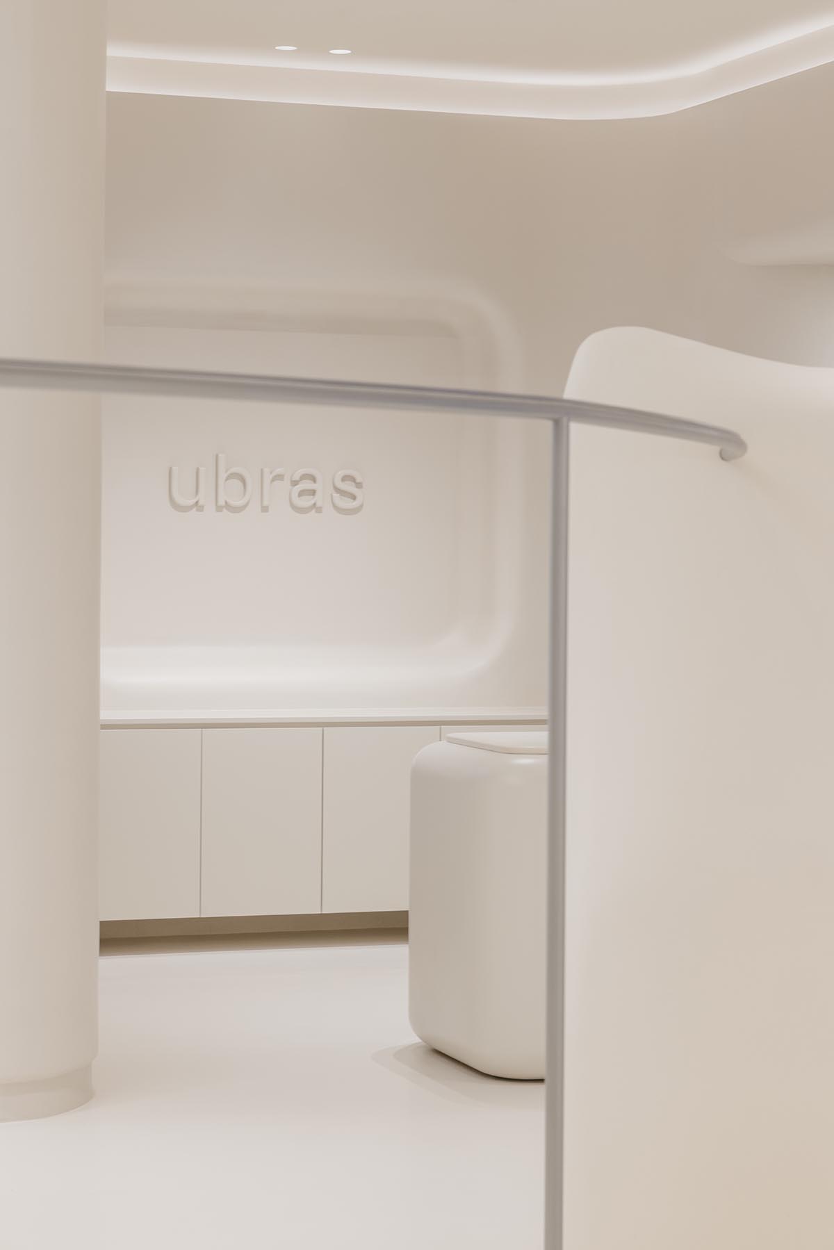
"Feeling the subtlety"
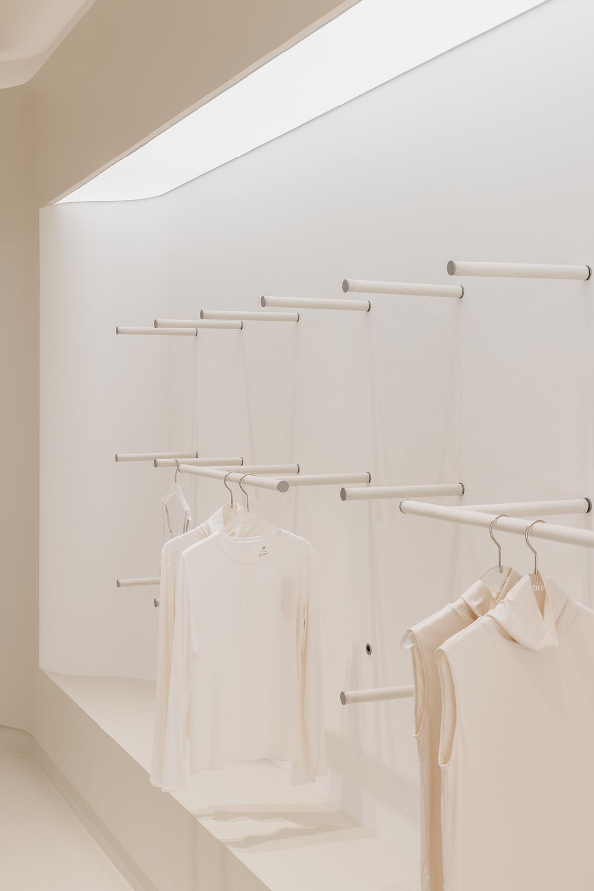
The studio used soft materials in all display walls, combined with the arc-shaped light band around, and according to the team, this lifts up the soft and delicate feeling towards one’s journey in the store.
The lighting system adopts several modes during the day and night at the principal of simulating the brightness from source of the surrounding environment, while also improves the visual comfort of the whole space.
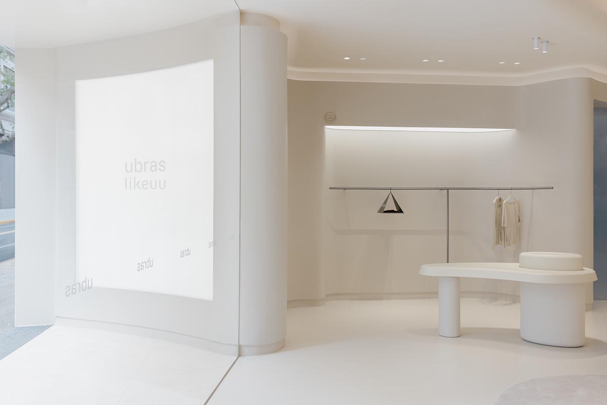
Aligned with the brand identities, the "u" shape has been emphasized through the door, door handle, mirror, display props and shelves, as well as the soft details of edges and corners, to create a cozy environment for patrons, like one’s close-fitting clothes to his body.
At the same time, the studio aimed to deliver a sense that every space user can experience delicate beauty in our daily life or through tiny details.
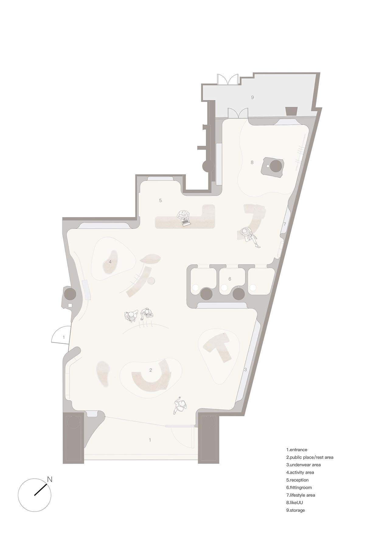
Floor plan
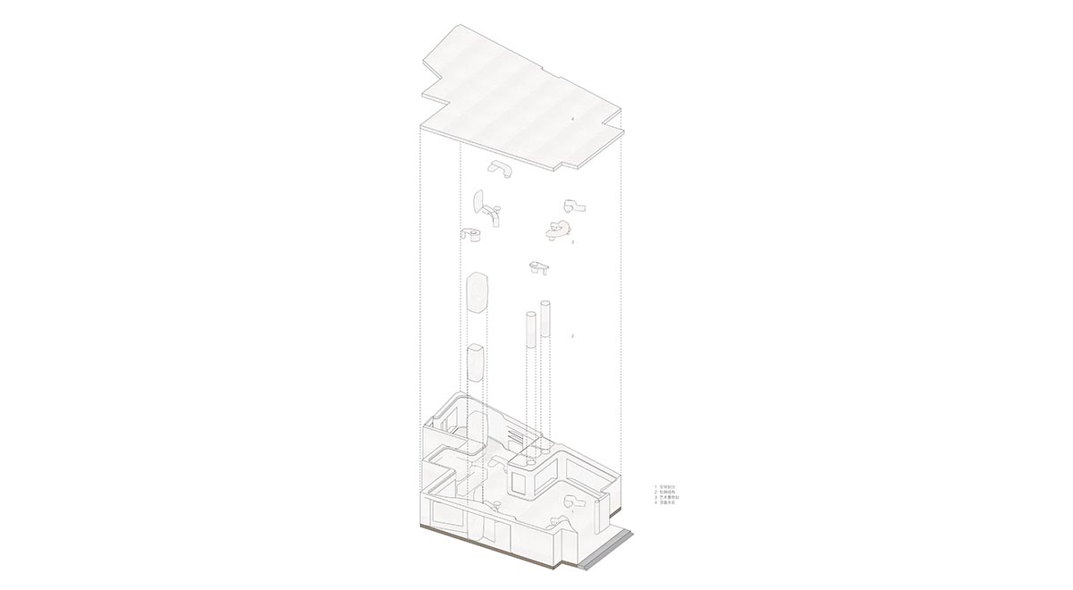
Diagram
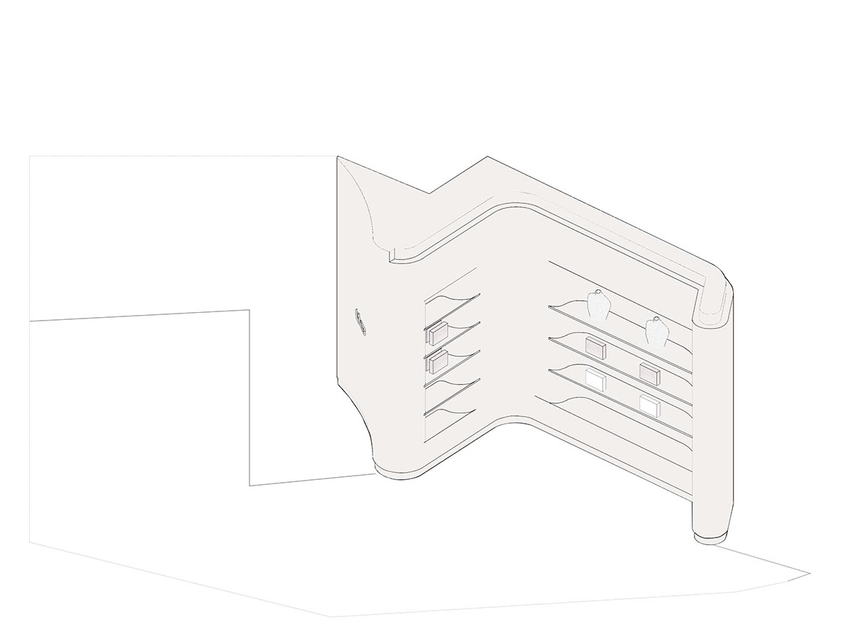
Display cabinets
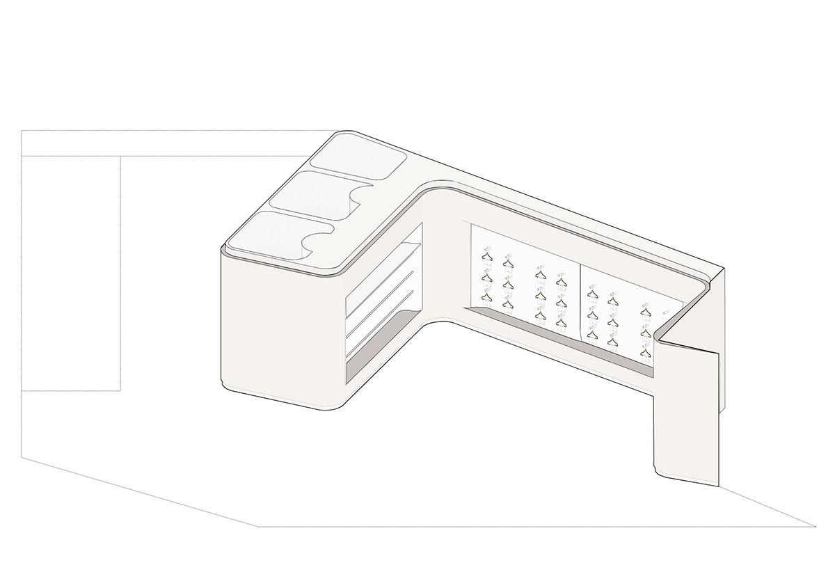
Display cabinets
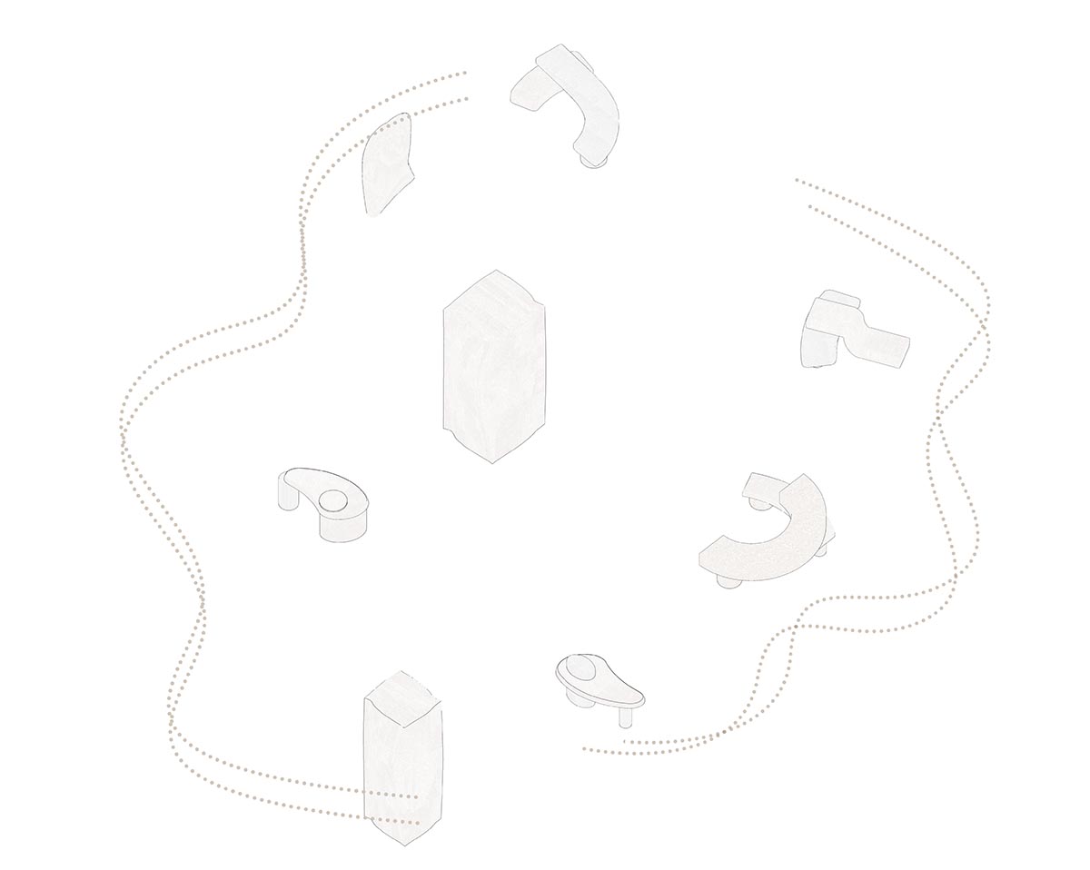
Props and circulation
Sò Studio designed LOOKNOW Flagship Store in Shanghai, China and designed Restaurant Lunar that combined soft and sharp lines for its interiors in Shanghai.
Sò Studio was founded in 2016 by partners Yifan Wu and Mengjie Liu. The practice is an innovative interior, and industrial design practice based in Shanghai.
Project facts
Project name: Ubras Concept Store Shanghai
Interior Design: Sò Studio
Design Director: Yifan Wu, Mengjie Liu
Design Team: Louis Li, Poon Pan
Location: Shanghai, China
Size: 280m2
Completion Year: 2022
Client: ubras
Materials: Topciment micro-cement, SergeFerrari high-performance composite fabric, Dupont Corian, Parallel Textiles, AMEI carpet
Lighting Conslitant: RE-SENSE
All images © Wen Studio.
All drawings © Sò Studio.
> via Sò Studio