Submitted by WA Contents
FMA. designs corporate building with warm, earthy tones in a former 17th-century convent
Mexico Architecture News - Jul 22, 2024 - 15:21 3824 views
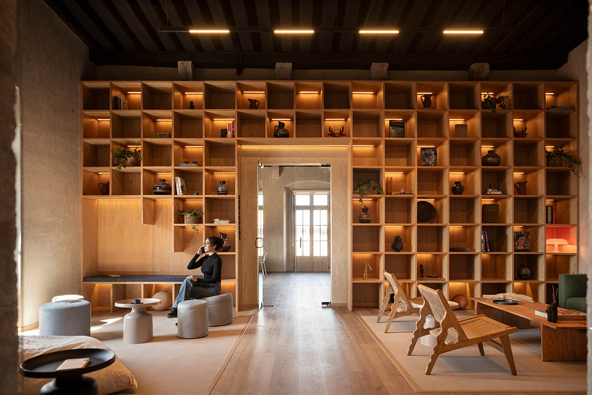
Mexican architecture and design pactice FMA. brings a palette of warm and earthy tones into a new interior of a corporate building in Morelia, Mexico.
Named GO HQ, this 1,000-square-metre corporate building is housed in a former 17th-century convent and is situated in Morelia's historic center.
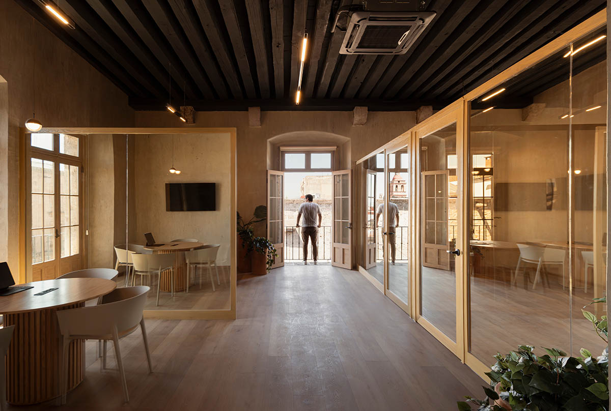
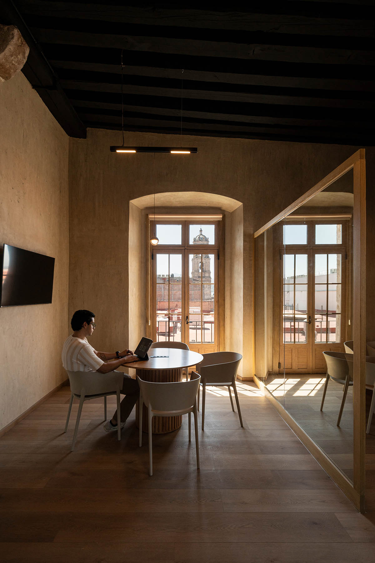
Warm tones, porous walls and oak wood furniture strongly reveal the language of the space.

Respecting the building's original architectural features while making the most use of the available space was the main challenge of the project, according to FMA.
Furthermore, it was important to carefully identify the changes the convent had undergone over time and to differentiate between those that were and weren't appropriate.
"In recent times, lifestyles and work environments have undergone significant adaptations to meet both health and social needs, as well as the preferences of contemporary generations," said FMA.
"These changes have sparked a quest for repurposing and revitalizing existing properties, rather than letting them lay dormant and unused," it added.

The second challenge involved rethinking the way the company carried out its work activities. This required introducing flexible workspaces in place of fixed ones, breaking with conventional office structures and ideologies.
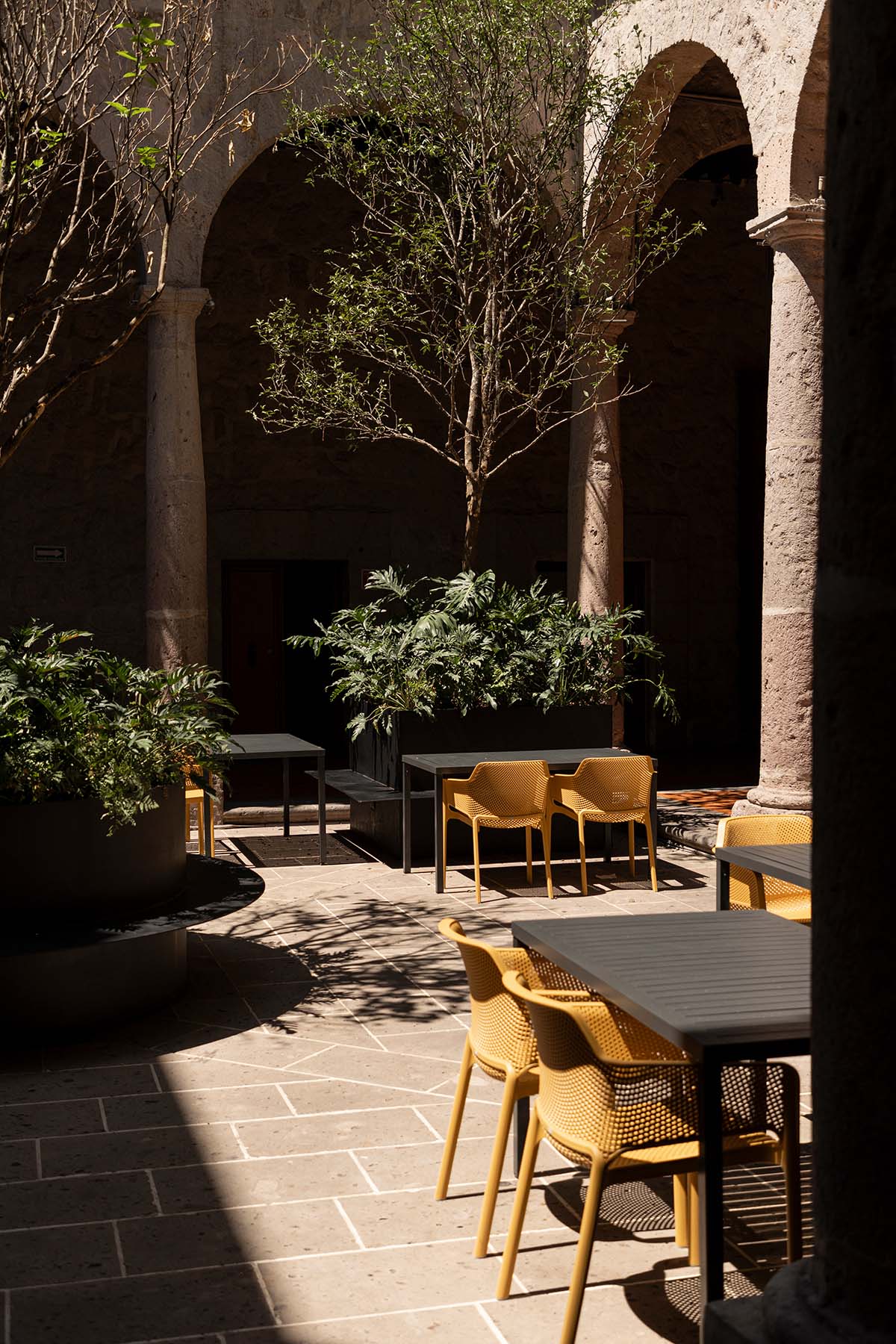
All of the action took place on the ground floor in the central courtyard, or cloister, which was converted into an executive dining room. Here, orange trees were incorporated into five planters to create an indoor garden that doubles as useful urban furniture and greenery. When necessary, workers can use these components as outdoor workspaces thanks to the design.
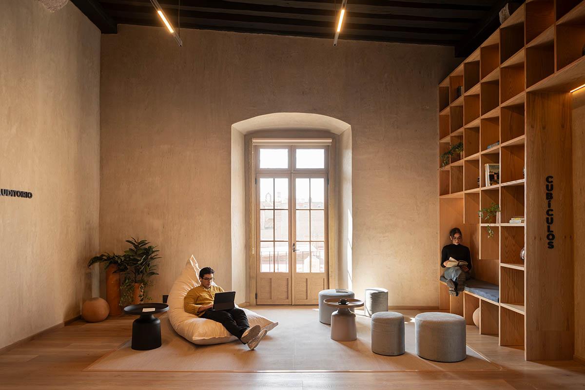
Moving upstairs, the workspaces were designed to be disruptive living areas. The architectural program is still simple, but each area's variety and versatility are remarkable. This place was designed with spaces that defy traditional work norms and layouts.
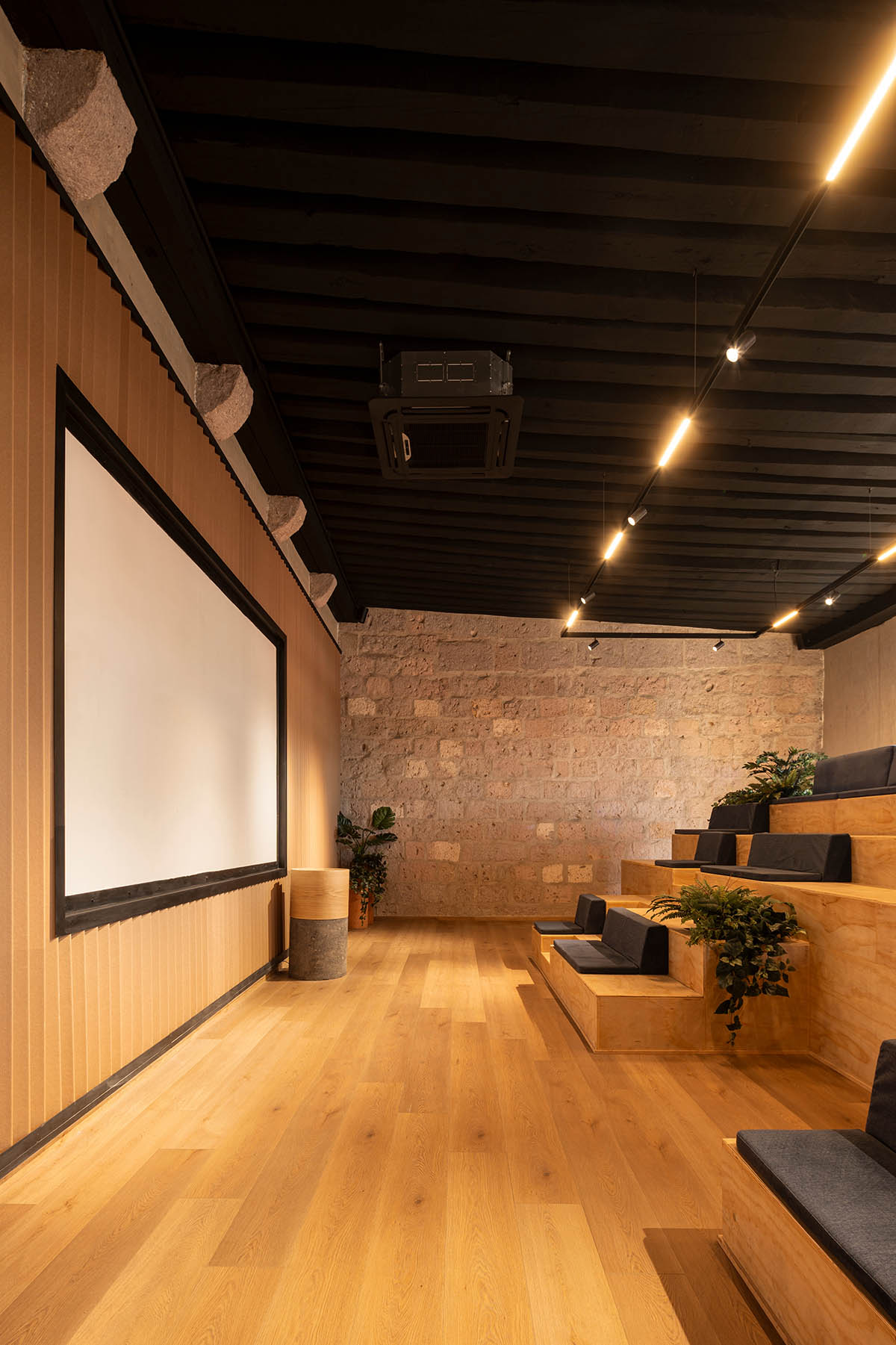
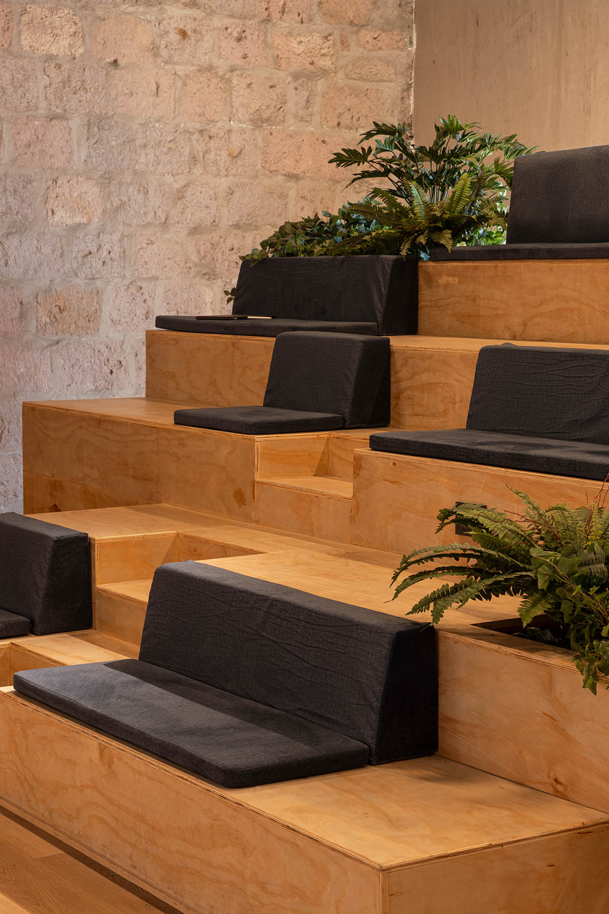
Examples include a library that serves as a reception and waiting area and an auditorium with bleachers that can be used as a meeting room or just a place for people to relax with a good book.

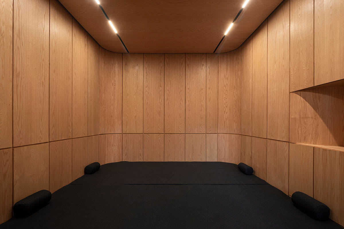
With a coffee bar, TV room, and Ping-Pong table, the leisure area was thoughtfully planned to promote socializing and unwinding for patrons during their free time. Among these modern amenities, the meditation room—fondly called the "nest"—stands out.
This peaceful area is devoted to reflection, offering a haven for people to refresh their thoughts and escape daily life. This highlights the importance of mental and physical well-being and eventually improves workers' quality of life and productivity.

Several factors were taken into account in this design approach in order to maximize the user experience inside the corporate building.
The old lighting was replaced with an intelligent system that minimizes energy use and improves performance throughout the workday by adjusting based on the circadian cycle. In order to provide thermal insulation for interior comfort and acoustic insulation from the busy avenue outside, double-glazed windows were also installed.

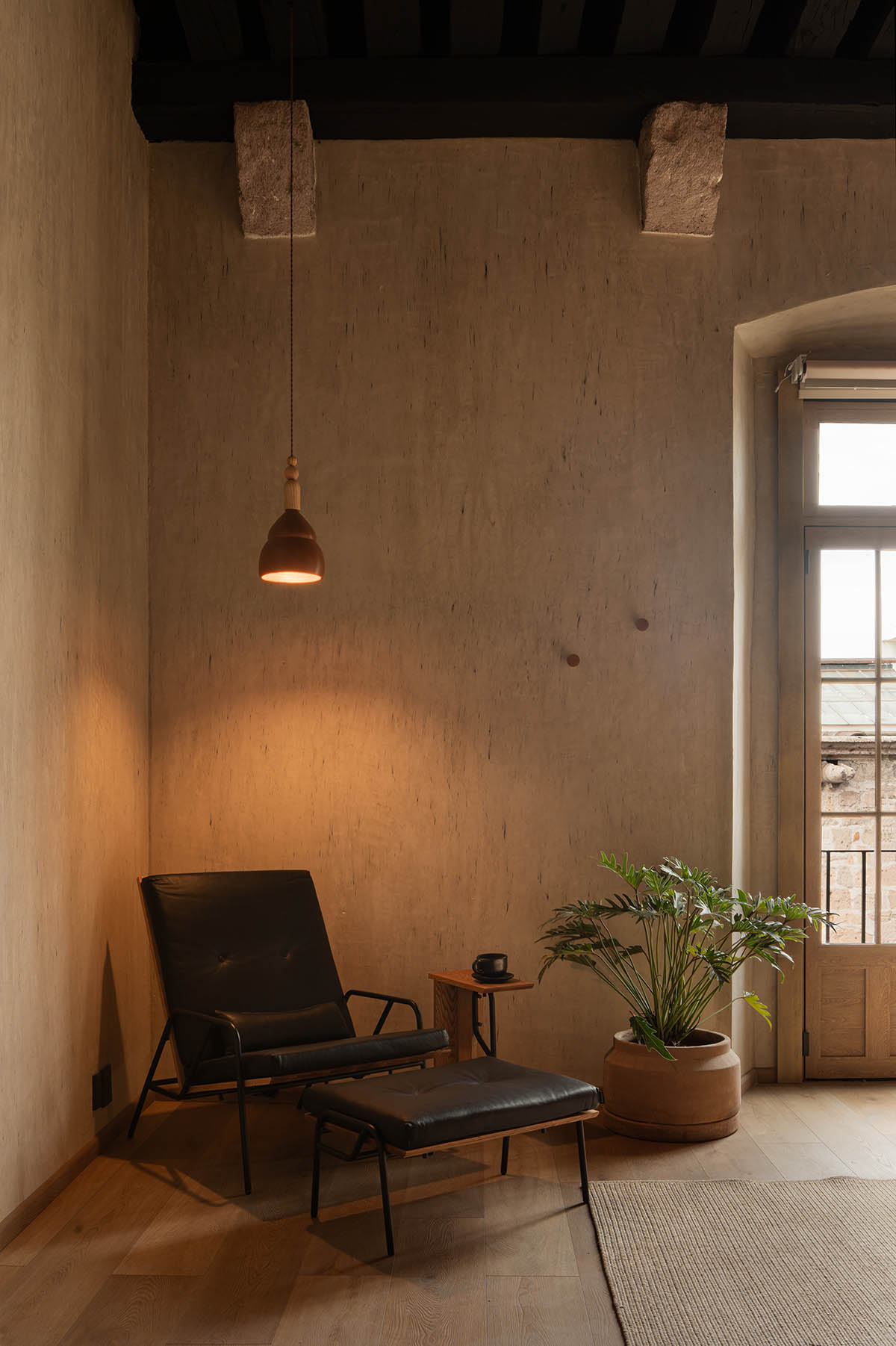
"The interior design was carefully selected from a palette of warm, earthy tones aimed at fostering inviting and tranquil environments conducive to creativity and relaxation," said the office.
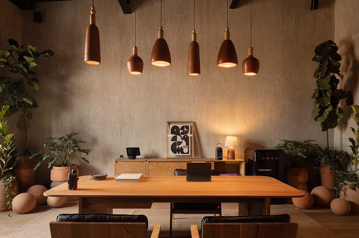
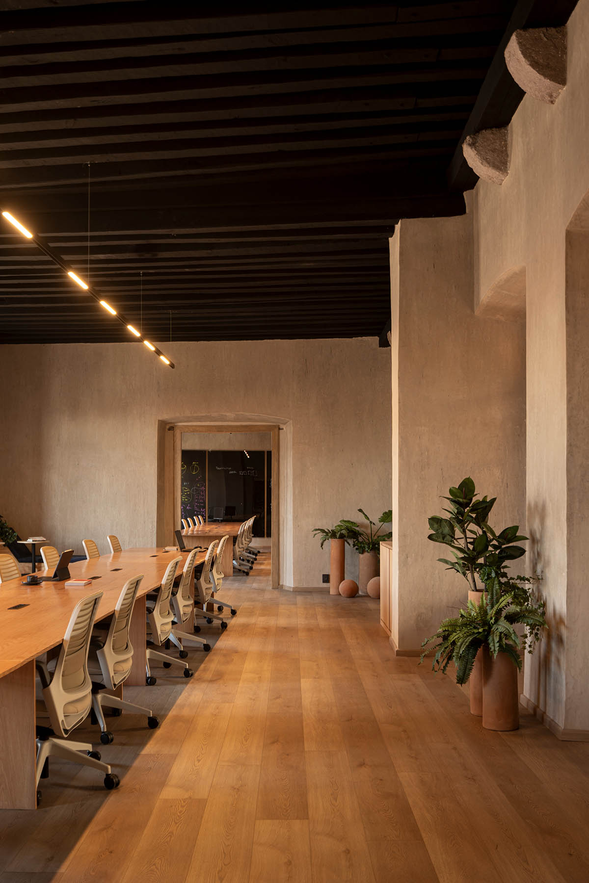
"Specific vegetation was carefully chosen and integrated into the interior spaces, selected not only for aesthetic appeal, but also for the ability to regulate temperature and purify the air within the offices," the office explained.
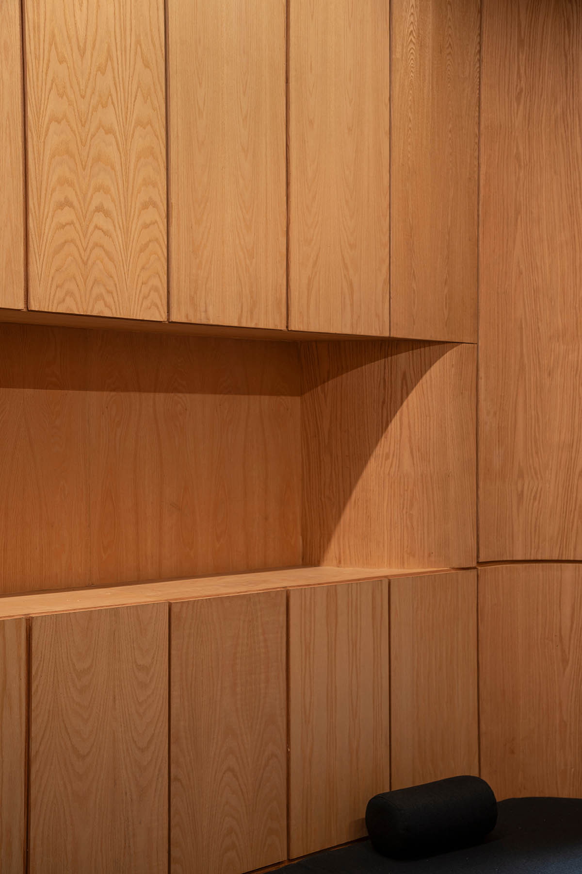
In choosing materials, natural and local finishes were prioritized in order to maintain the project's feeling of coziness and warmth and to promote regional businesses and craftsmen.
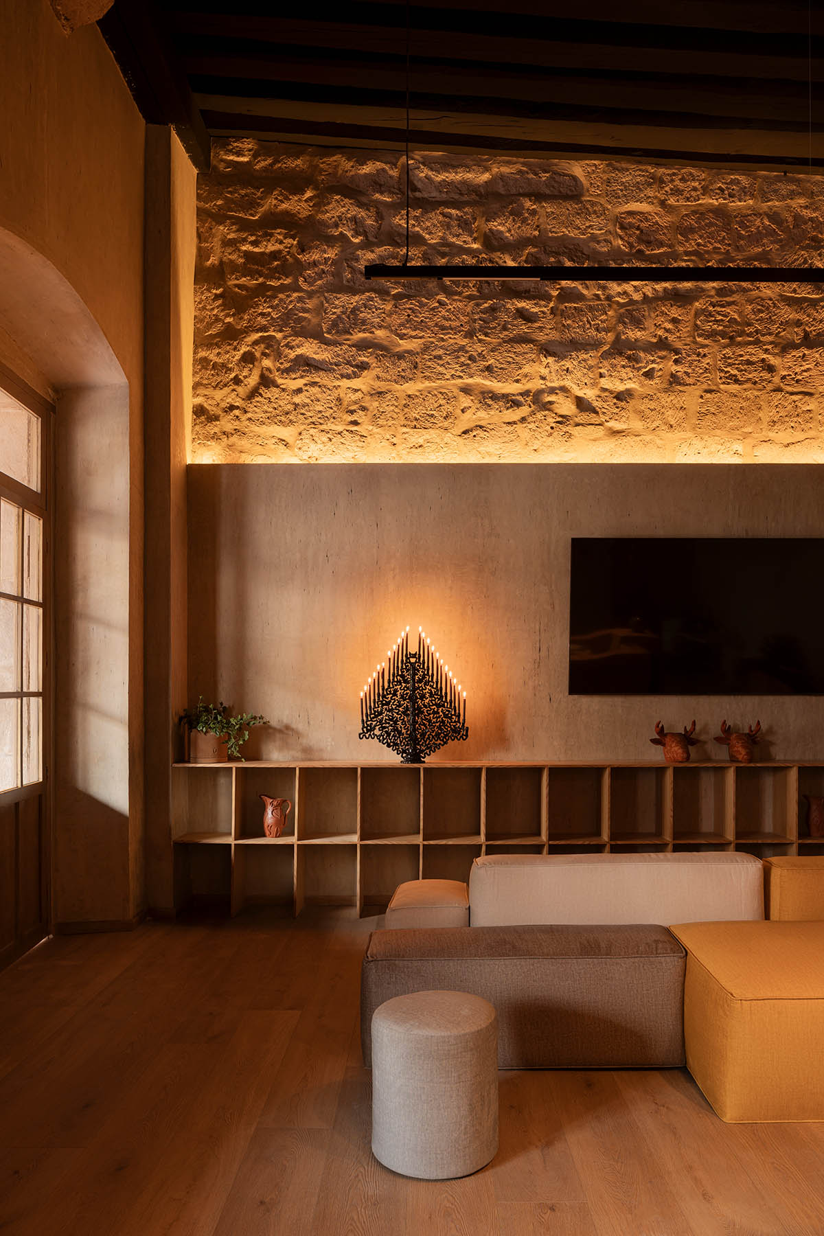
Sand-colored plaster was used to decorate the walls, providing a muted background that was broken up by delicate accents like furniture, plants, and atmosphere.
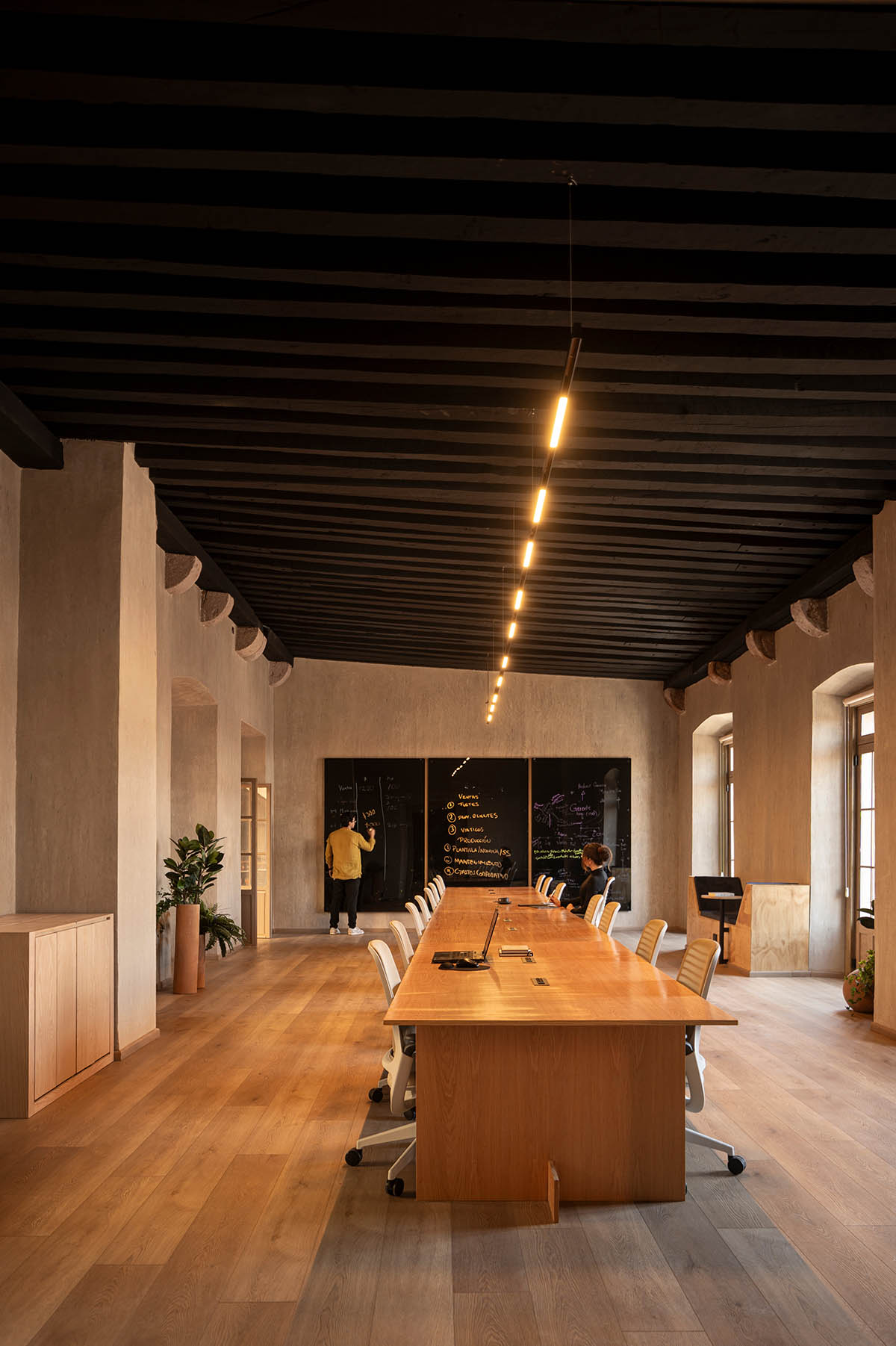
The woodwork was primarily made of oak, which was lacquered naturally. The flooring was made of white oak planks. Furthermore, Michoacan artisans' clay pieces—which included planters, lamps, and ornamental items—were carefully integrated into the design.

Ground floor plan
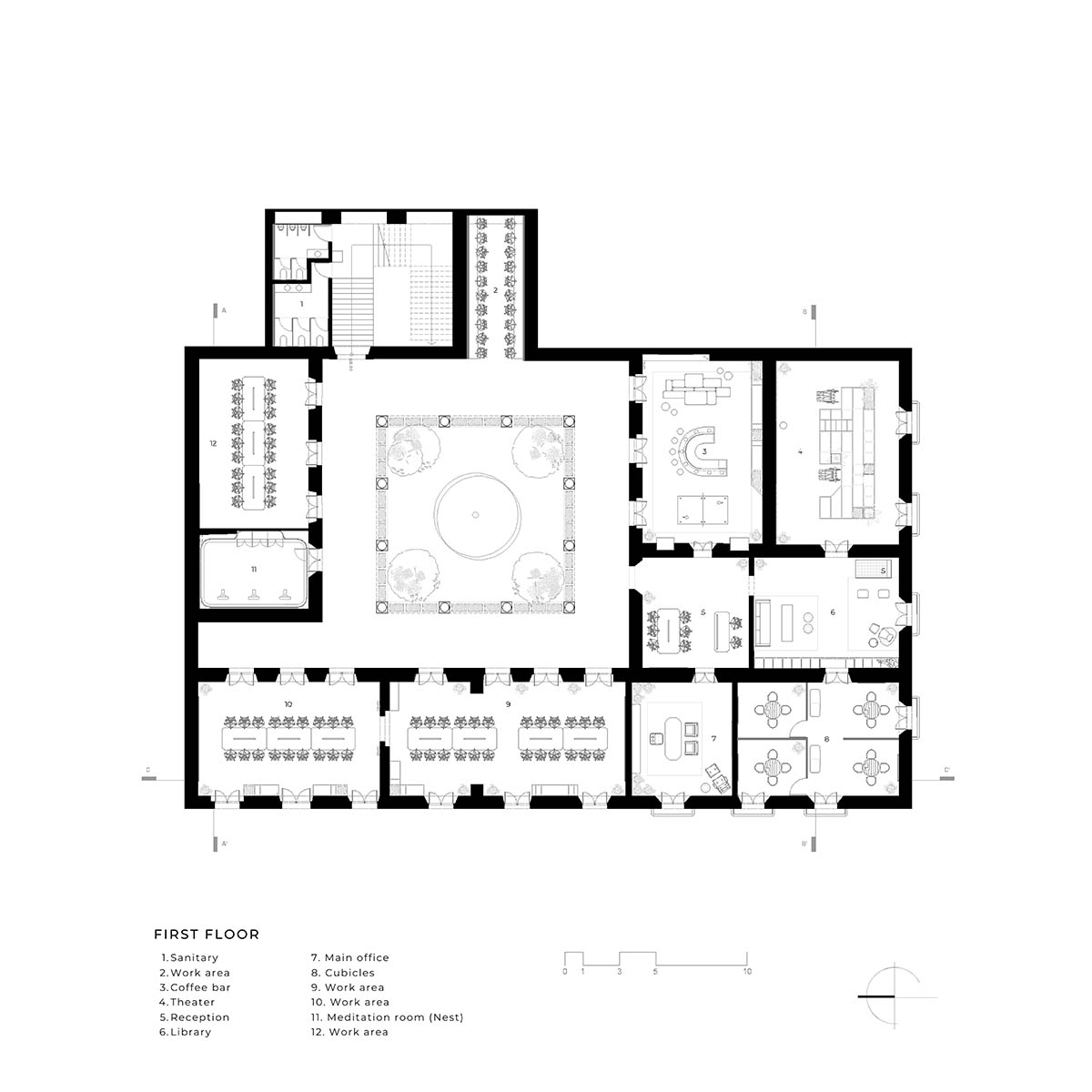
First floor plan
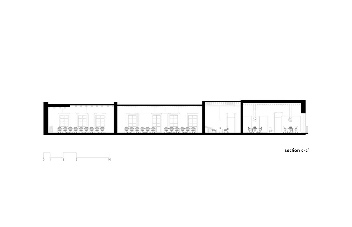
Section

Sections
FMA. designed the interiors of a bar with raw and rustic details in Morelia, Mexico.
FMA. was founded by Francisco Méndez, in the city of Morelia in 2018. The firm has created a range of projects in Mexico's commercial, hotel, residential, and urban sectors during its short existence.
Project facts
Project name: GO HQ
Architects: FMA.
Location: Morelia, Mexico.
Architect in charge: Francisco Méndez
Gross floor area: 1,000m2
Year of completion: 2024
All images © César Belio.
> via FMA.
conversion corporate building earth FMA. HQ oak transformation