Submitted by WA Contents
High windows allow users to get well-lit living spaces for this house by Rever & Drage Architects
Norway Architecture News - Feb 02, 2021 - 15:25 10142 views

Norwegian architecture firm Rever & Drage Architects has built a private house that has high windows to get well-lit living spaces overlooking the views of Molde, Norway.
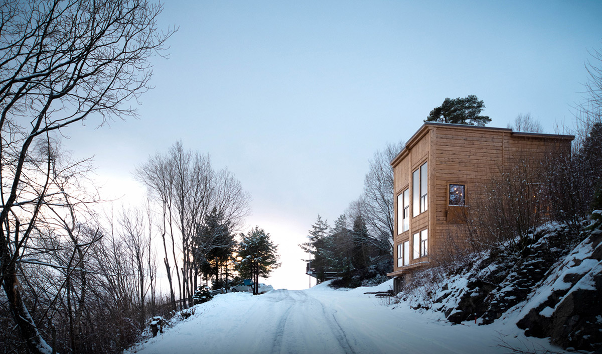
Named Zieglers Nest, the 152-square-metre building is a slender and elongated house built on a steep and small site. The house has been designed for a family who have five members to offer them a wide variety of rooms they can use when needed.
Although it has been designed as a compact and single-massing, the front facade is the most interesting component to discover. On the uninsulated ground level area, it includes a parking and entrance as well as equipment storage and technical rooms - which is completely open.
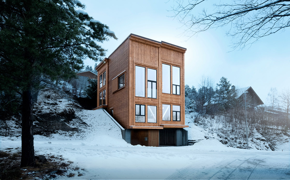
"To make this area a pleasant space, outdoors but sheltered from the weather, daylight is let in via gaps along the building's west- and east facades," said Rever & Drage Architects.
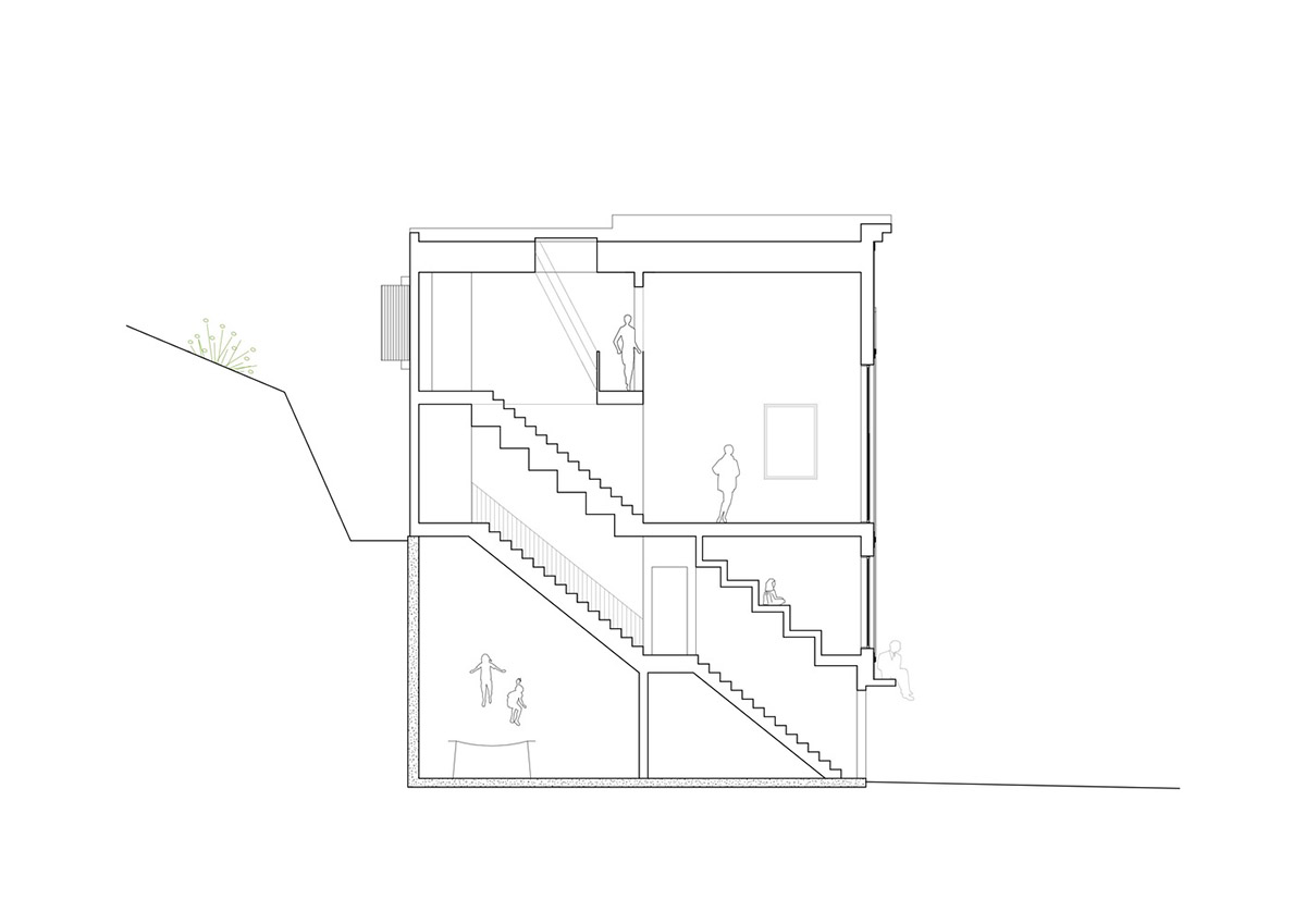
The innermost part of the ground floor is the other interesting space that opens up to a five-meter high utility room for trampoline and ball games for the family.
"This part has to floodlight so that you get a well-lit arena in the evenings and in the wintertime," the architects added.
"In rainy weather, water flows down the concrete walls and out along drains into the ground."
"When the rain has ceased, the low sun warms up the concrete under the house and moist air is dried out through the gaps on the sides," the studio continued.
According to the architects, "this type of outdoor space increases the likelihood that children will choose outdoor activities and helps the family get through the sometimes difficult toddler phase!."
The building's program functions are distributed on three levels with a roof terrace. The first floor contains a wardrobe, a laundry room, and two bedrooms.
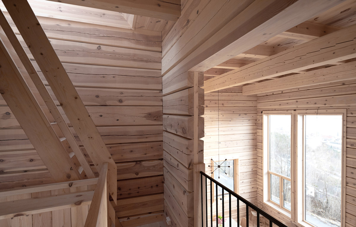
The staircase and the wardrobe floors are made in oak, which gives good durability in the area where users wear shoes and boots.
The staircase leading further up is in pine, which is soft to walk on barefoot. The first floor is built in framework, while the top two floors are built as a log construction.

"For this reason, the staircases, which rest on the framework, are constructed independently of the upper floors such that the log construction can compress, without being hindered by the static parts of the building," added the studio.
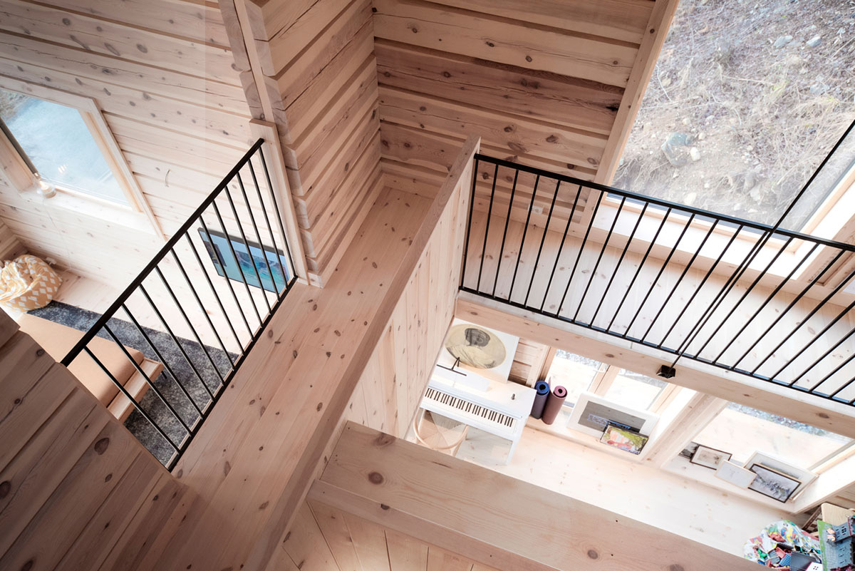
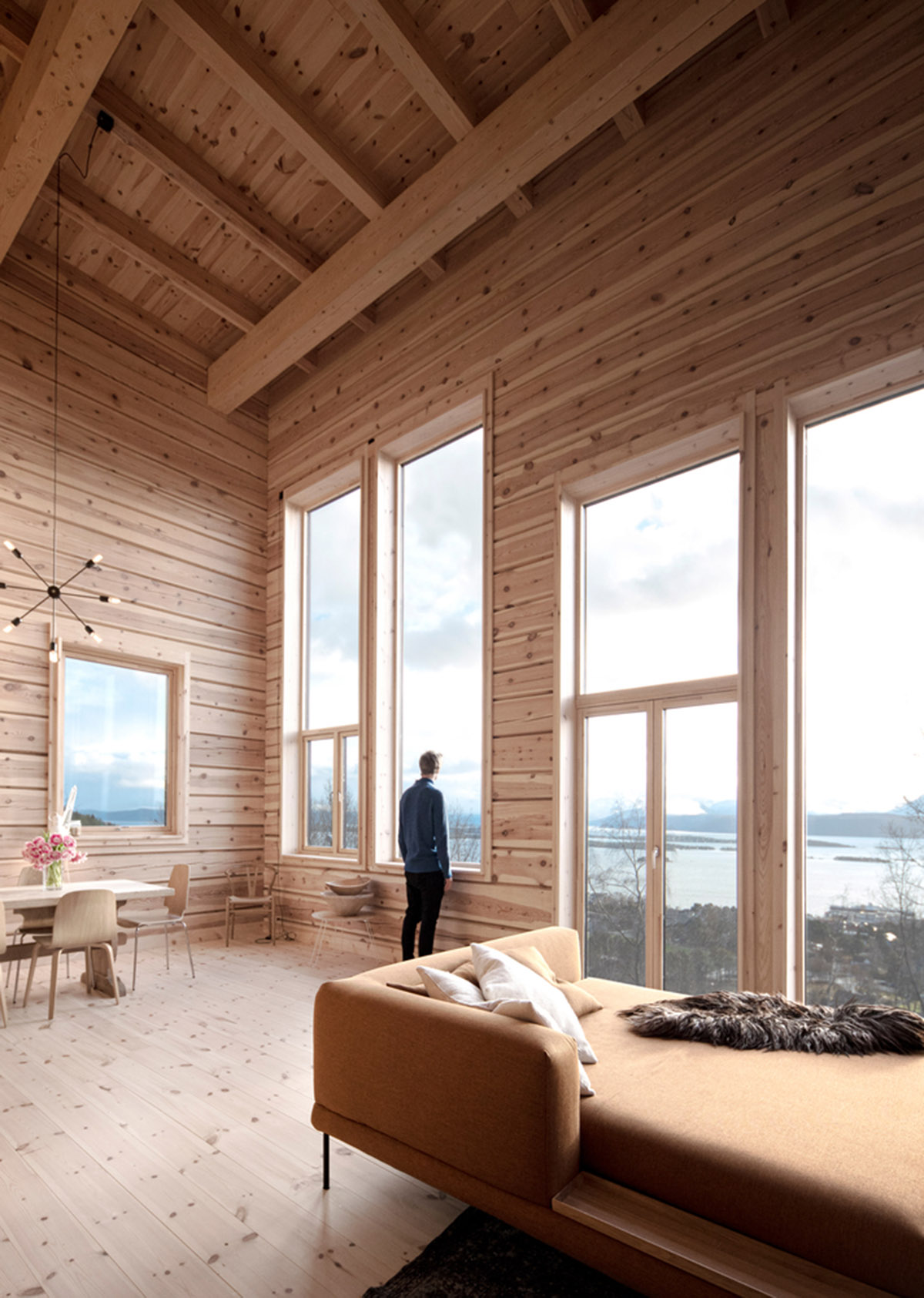
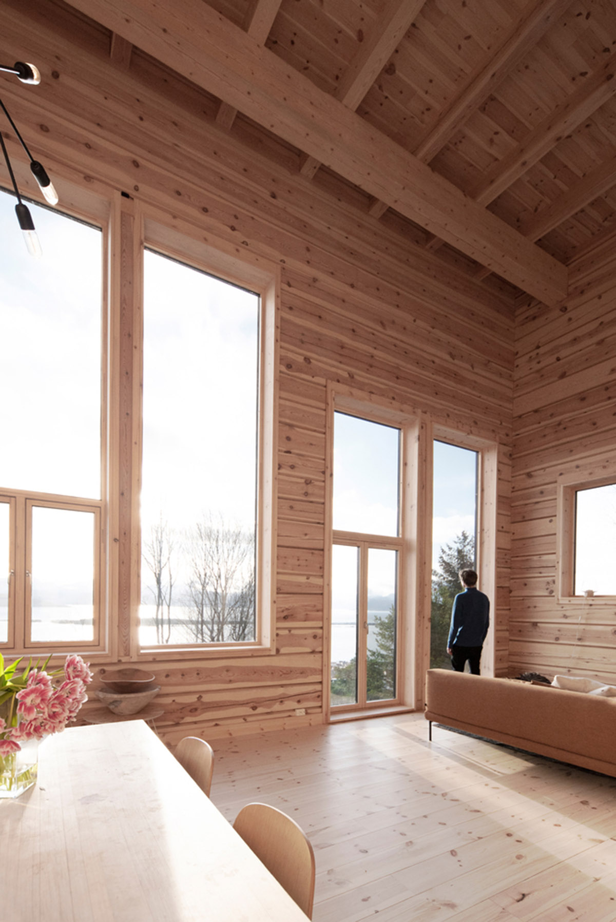
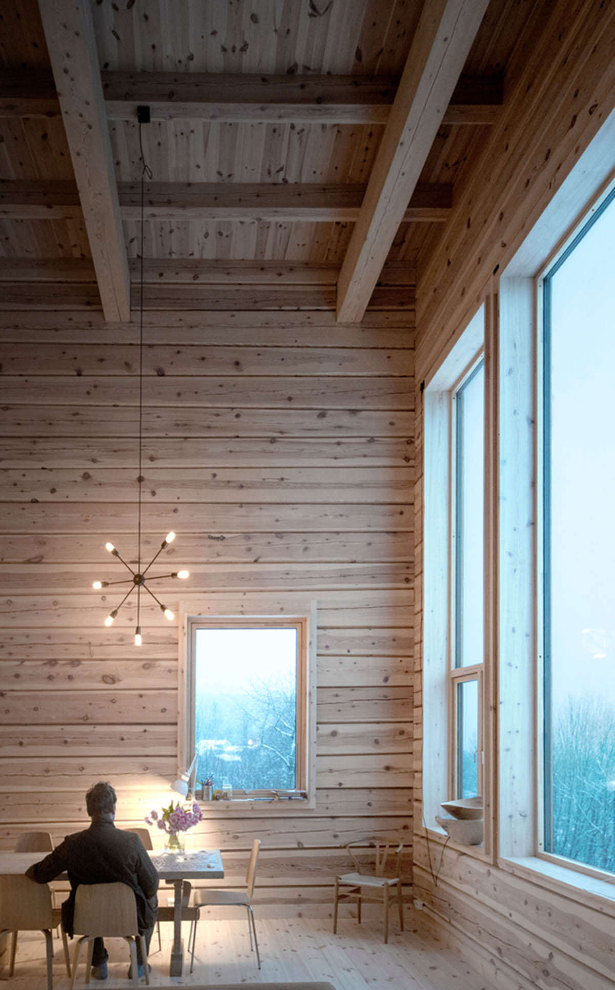
On the second floor, which is the building's main floor, there are a kitchen, living room, and library. This level is designed as a floating space to receive abundant daylight from west, south, and east. Lighting and views change according to the different outlooks the rooms are facing.
"The tall windows in the living room face the scenic views of the Molde panorama with fjord and mountains to the south, the conservatory in the kitchen faces the sheltered garden to the east, while the library faces the close-up effect of a green pocket (white in wintertime) to the west," explained the architects.
"The living room has double-height and serves both as a banquet hall and also catches and stores the sun´s energy during the daytime."

In the spring and autumn when the sun is both low and strong, the family can retreat to the kitchen and library in the daytime, while the inner log wall is warmed up by the sun and stores heat for the night.
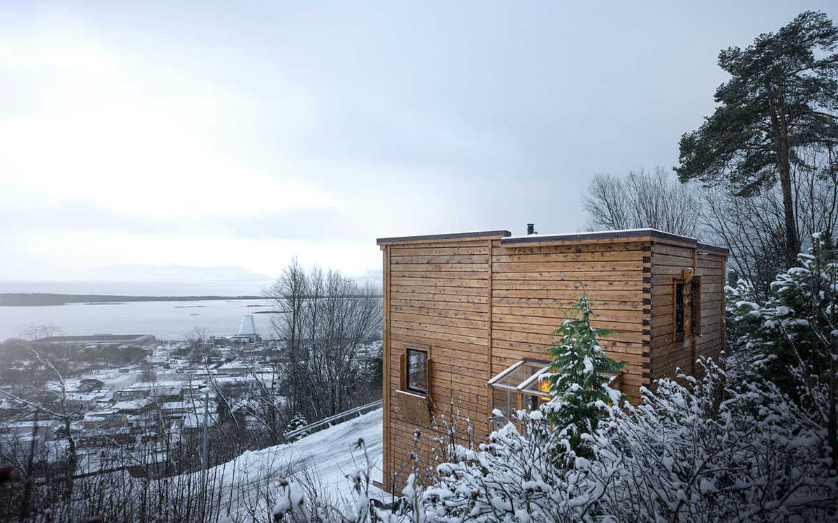
On the third floor, this floor includes a bedroom and a bathroom as well as a gallery as part of the library. "There is also a Romeo and Juliet balcony towards the living room for home stage performances," the added.
From the gallery, users can proceed to the roof terrace for extra evening sun, starry sky, and northern lights. The upper bedroom window has shutters designed to provide visual shelter from a footpath northwest of the building, as well as letting in the morning sun.
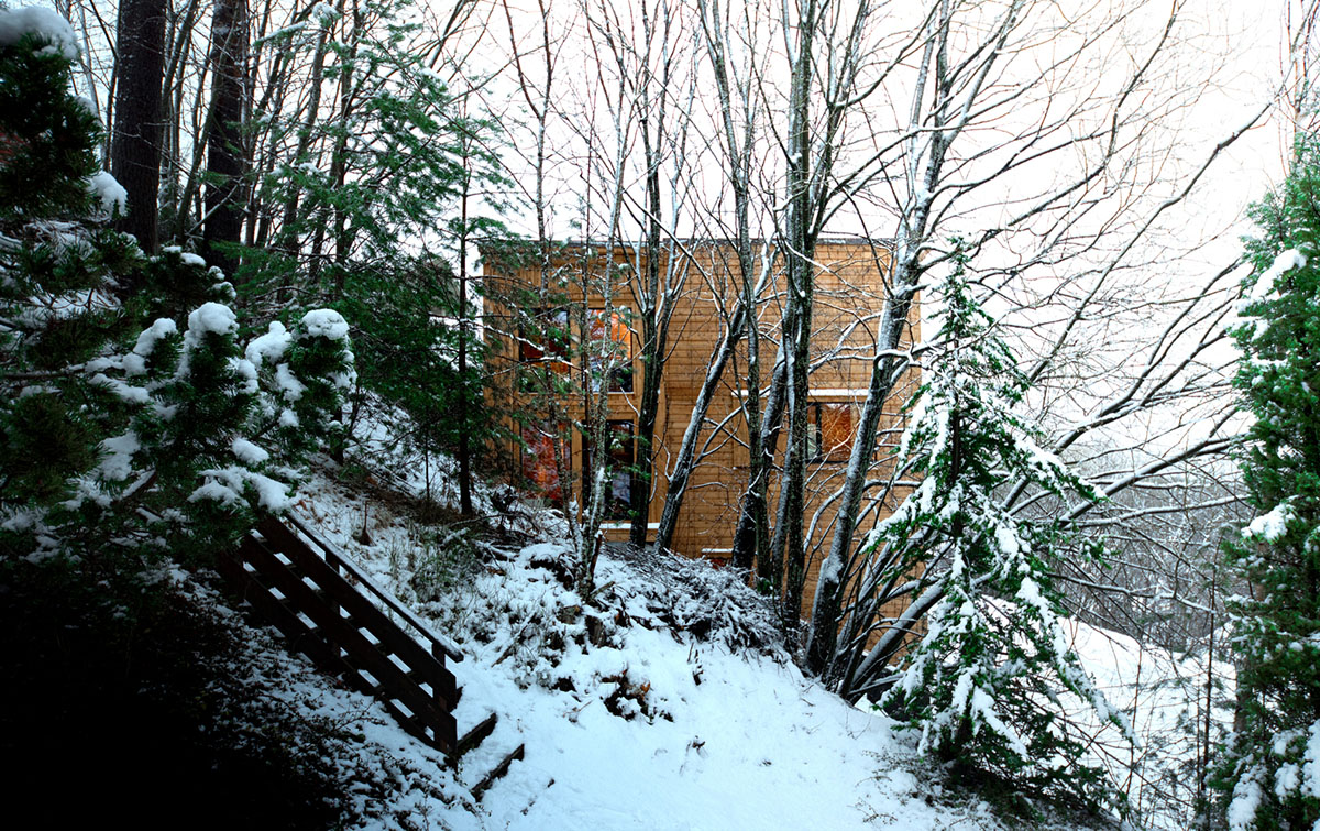
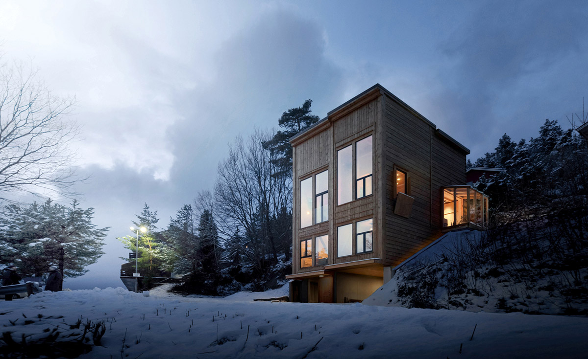
On the exterior, the facades' articulations are applied differently in front and side façades The front façades have standing panels with a higher degree of articulation, while the side façades have horizontal panels and a more sober articulation.
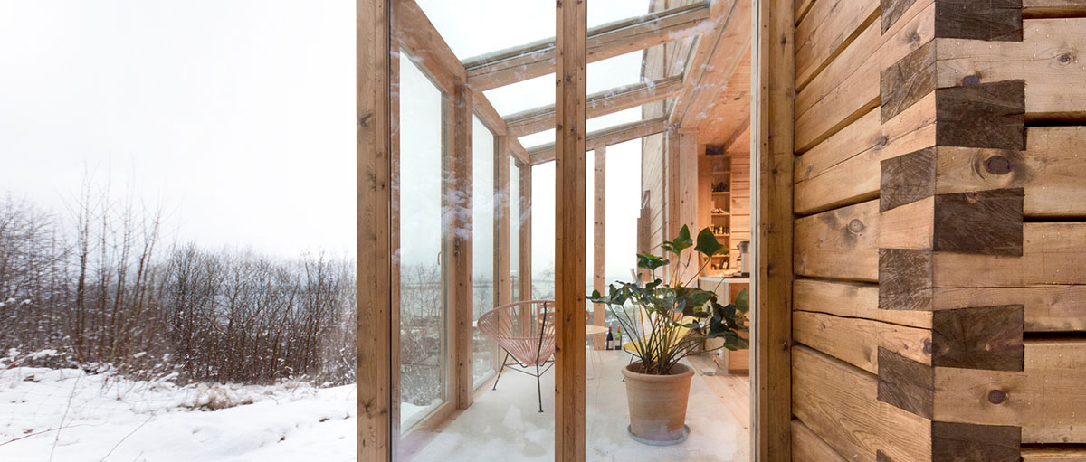
"The south facade has two fronts whereas the western one is slightly lower to shield the ground floor from predominant southwesterly rain," the architects added.
"The library has its front facing the green (white) pocket to the northwest, while the kitchen has its front towards the garden. For the northern facade the details, like the window shutter and the dovetail notch corner, are more prominent than the composition as a whole. In this way, it's a typical rear of a building."
As the architects highlight, what one attempts to achieve in differentiating the facades in this way is, first, that the building can be read as four volumes rather than one, thus softening the otherwise rigid rectangular prism effect, and secondly, the fronts gives an external indication of the inside rooms' directions.

"The moderate contrast between the fronts and the sides, as well as the unison use of material and colour makes this distinction not too obvious."
"Somewhat more surprising in the final result is that as an expression the building lies somewhere between a collection of your grandmother's cupboards and traditional Amsterdam houses placed, in a sharply carved meadow!."


Basement floor plan

Floor plan 1

Floor plan 2

Floor plan 3
Section
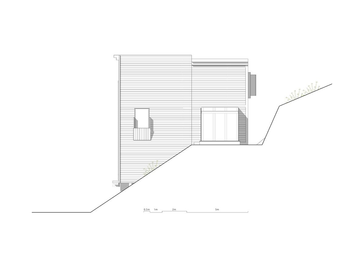
East elevation
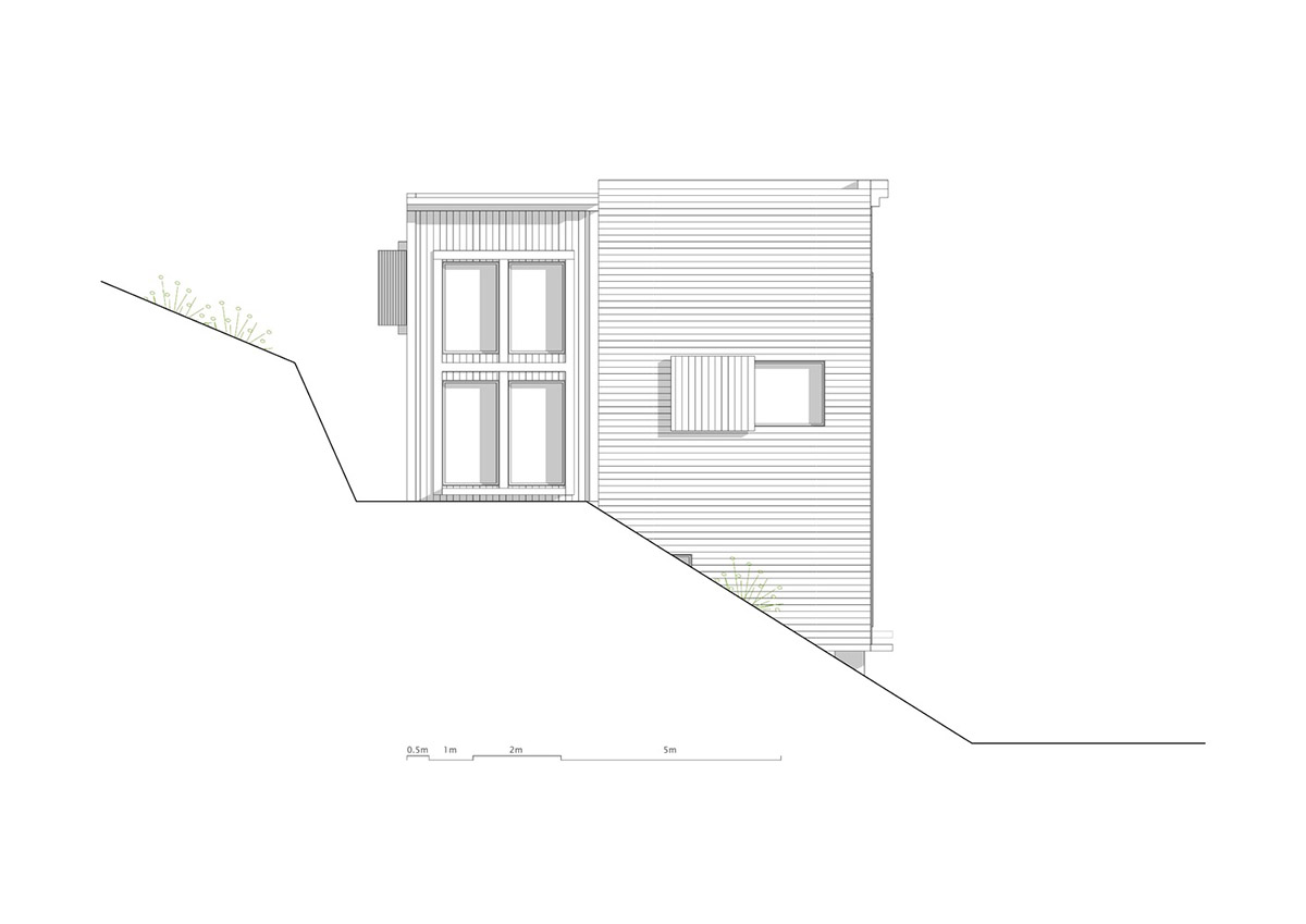
West elevation
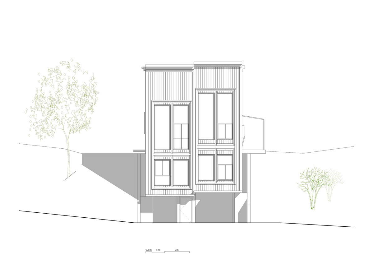
South elevation
Rever & Drage is an architectural firm consisting of three architects with headquarters in Oslo and a branch in Flekkefjord.
Project facts
Project name: Zieglers Nest
Architects: Rever & Drage Architects
Location: Molde, Norway.
Size: 152m2
Date: 2020
All images © Tom Auger
All drawings © Rever & Drage Architects
> via Rever & Drage Architects