Submitted by WA Contents
Collective B's beauty shop in South Korea features pink-hued colors and layered walls
Korea, South Architecture News - Jul 16, 2020 - 13:51 15780 views
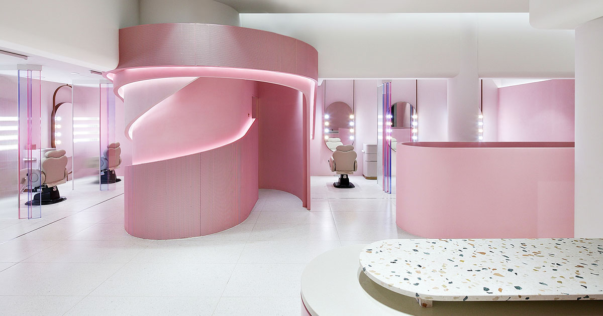
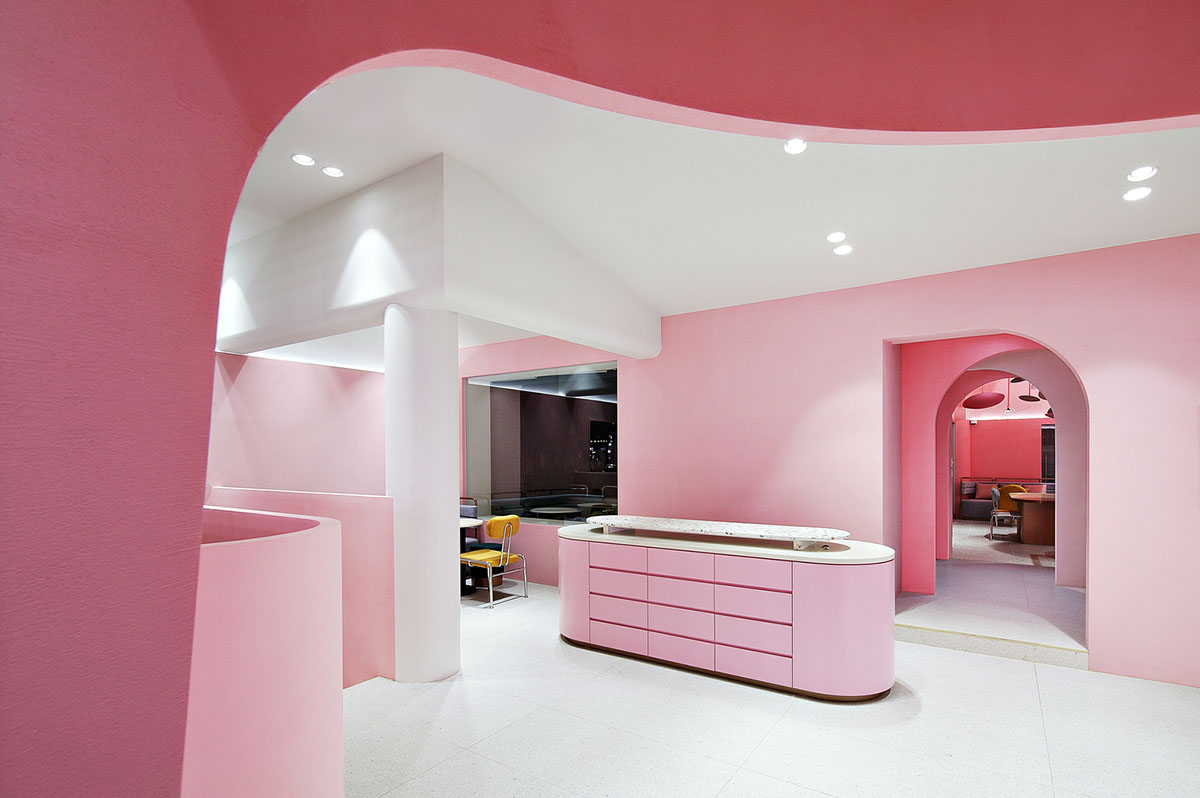
Seoul-based design studio Collective B has designed interiors for a beauty shop in Gangnam-Gu in South Korea, featuring pink-hued colors, layered walls, repeating wallpaper patterns and yellow-colored chairs.
Called Villa de Murir, a beauty curation brand mûrir commissioned the studio to design a new beauty store that provides customers a different atmosphere and reflects mûrir’s signature Beauty Pairing service.
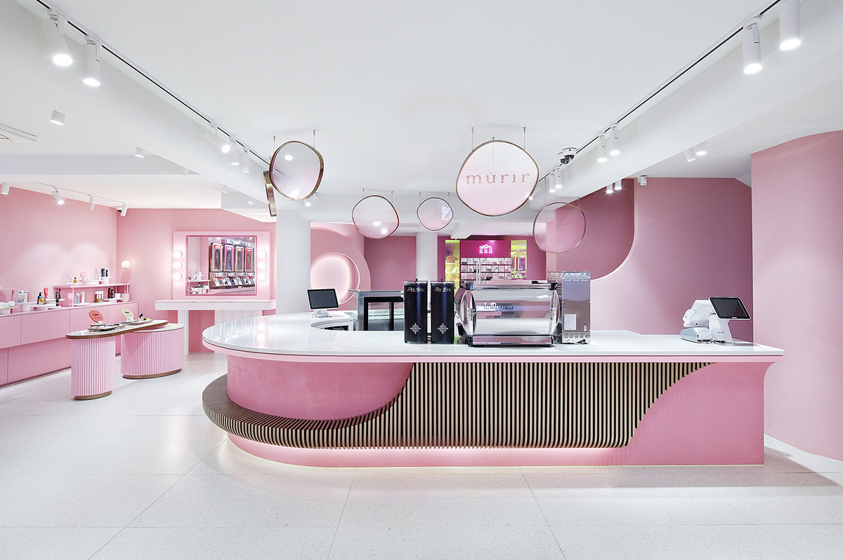
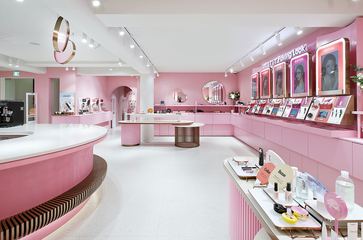
A 562-square-metre interior space consists of a Beauty Select Shop presenting mûrir’s products as well as curated products by other brands, a Makeup Shop offering five different makeup treatments developed by mûrir.
There is also an Open Studio that is used as a production studio for beauty youtube content creators, and lastly a Cafe which is designed SNS savvy millennials in mind.
The four programmatic sections distributed on two floors are arranged in a way that they can be seen at any time regardless of the customer journey through the space.

Collective B created an interior design that works as an effective brand communication touchpoint for millenials looking for a break from everyday routine at which they can explore their personal beauty.
The design studio is inspired by keywords derived from the mûrir branding. "Overlap" - Overlap was inspired by mûrir’s naming.
"The motive of blooming flowers and the growth process of fruits were expressed through layered walls and the curves of repeating patterns," said Collective B.
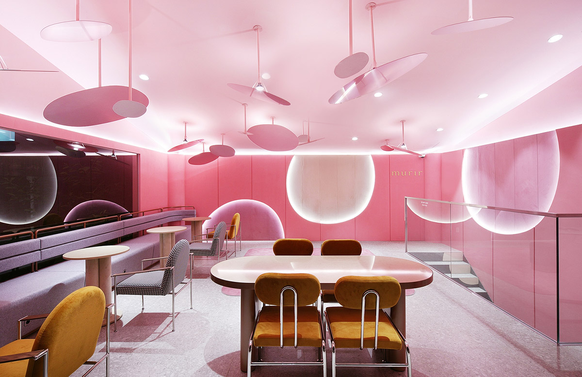
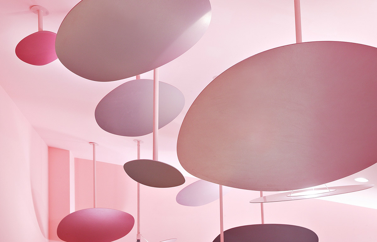
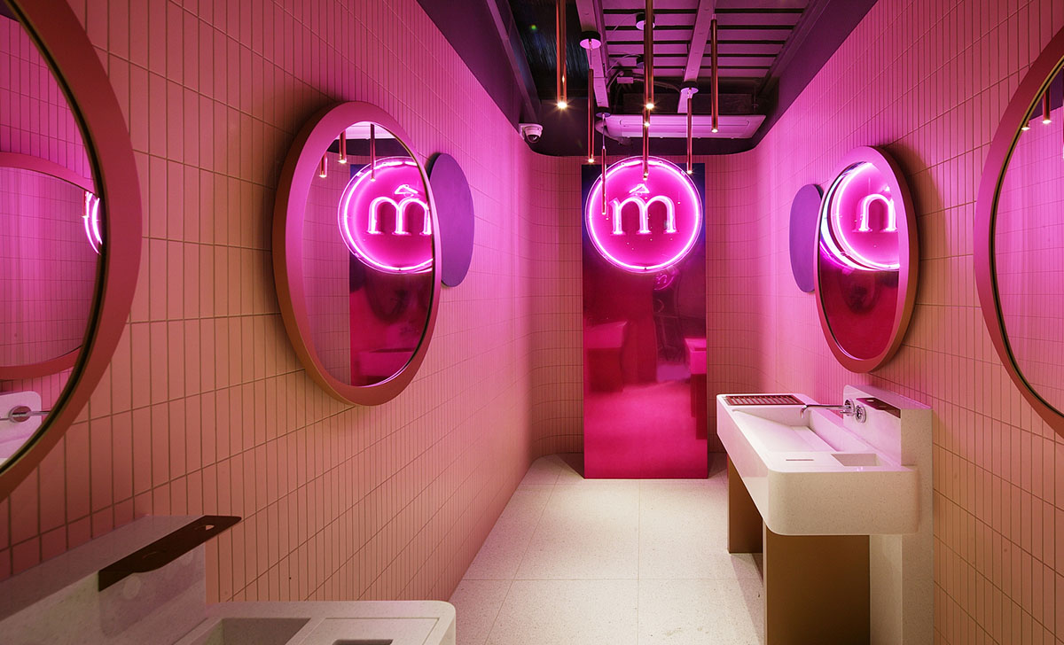
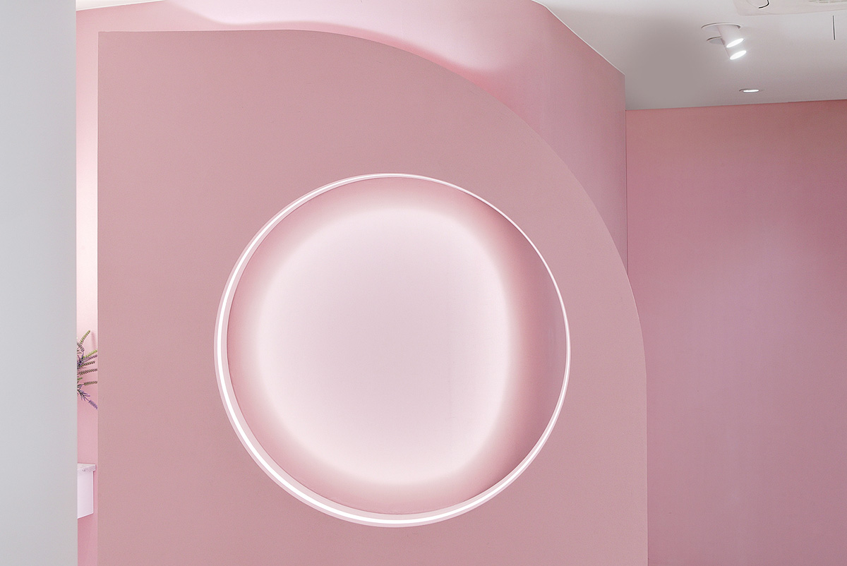
The studio created free circles in the interiors. The free circle, symbolizing mûrir’s respect for the diversity of beauty, was applied in various ways with ceiling objects, lighting pendants, and wallpaper patterns.
For each space different materials were utilized to express the brand identity throughout the whole space. The key element was color in design.
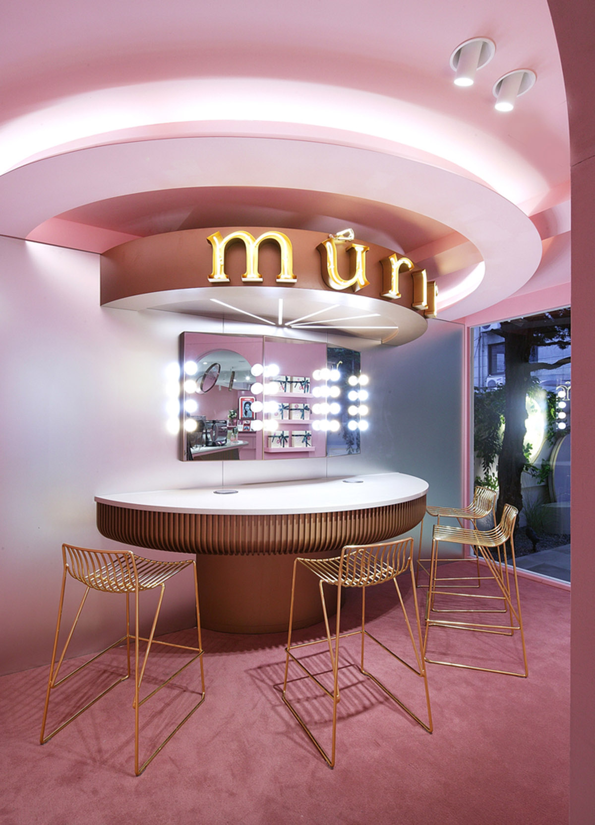
The designers choice pink color symbolizing the beauty of fruits and flowers in full bloom. The pink color was also matching different usage scenarios, mûrir pink was used in three different tones.
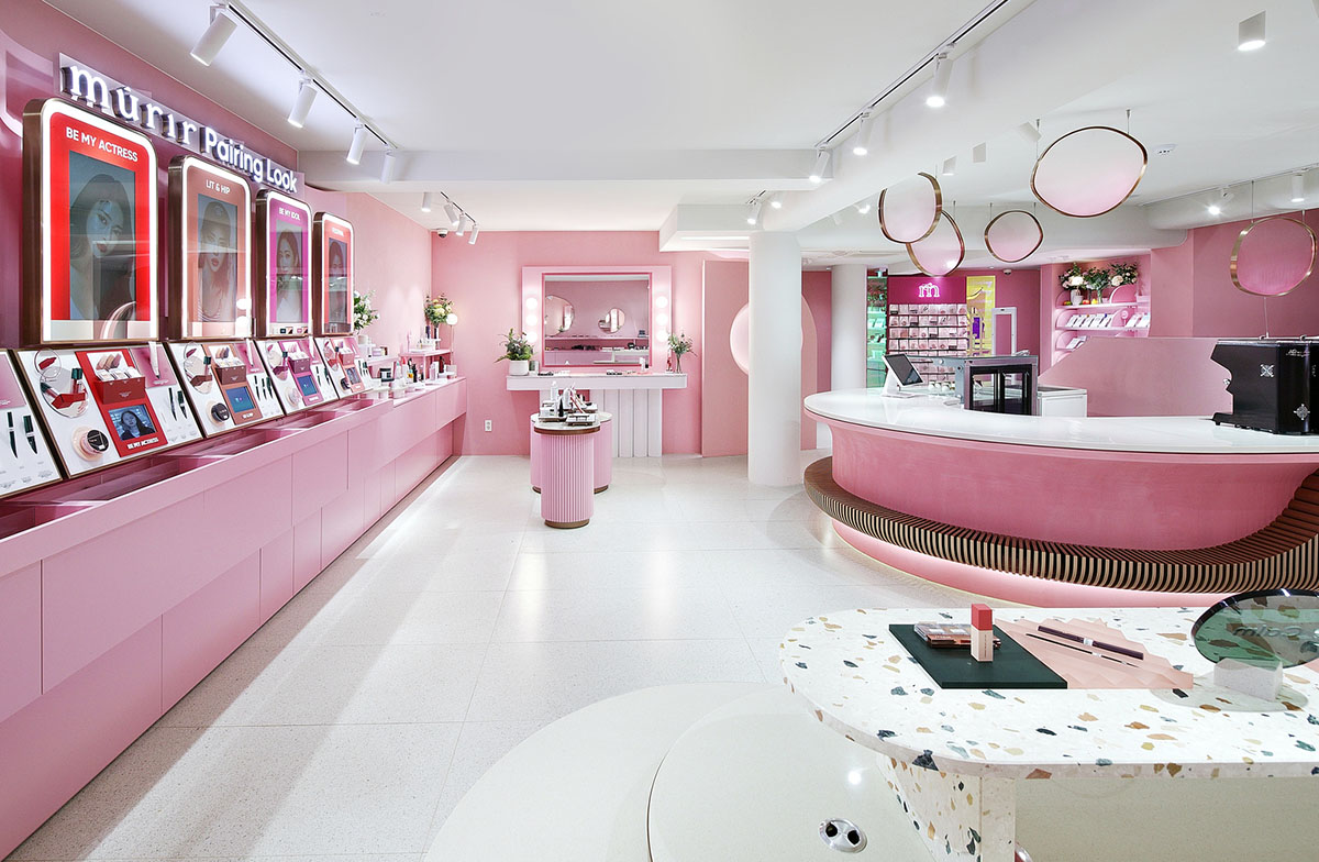
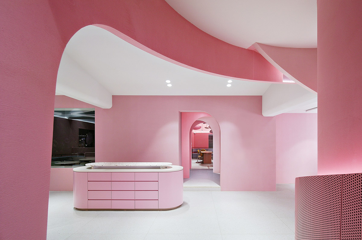
"Baby pink was used in the Makeup Shop in order to reduce the effects of luminance. Peach pink was applied in the Beauty Select Shop to make the green mûrir products stand out as much as possible," said the studio.
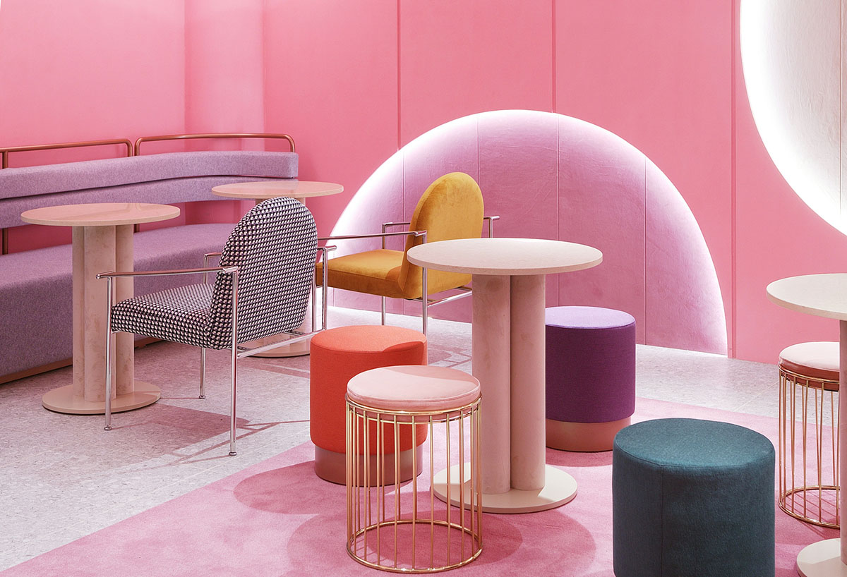
"The brightest of the three pink tones, coral pink, was used in the Cafe with its rich colors."
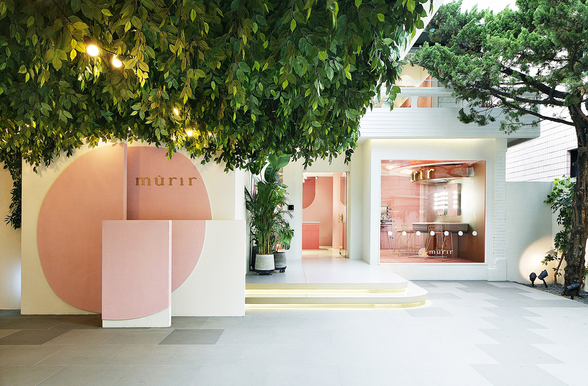
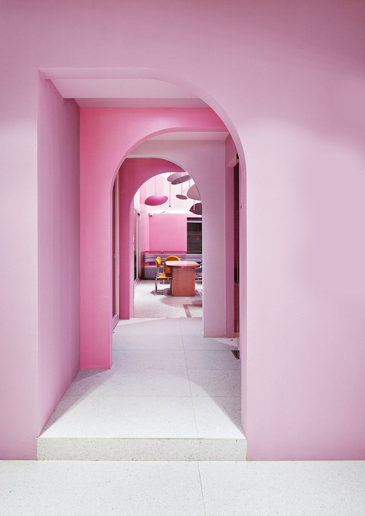
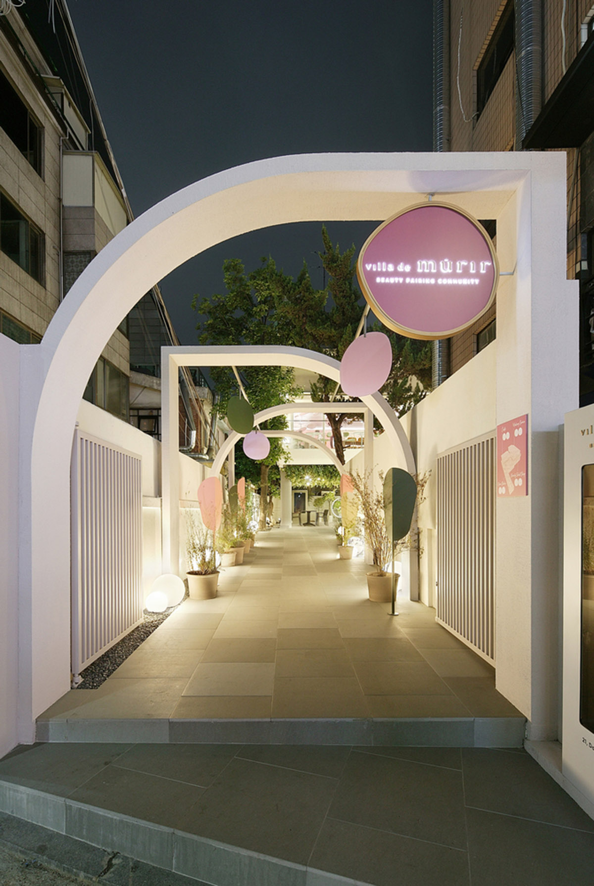
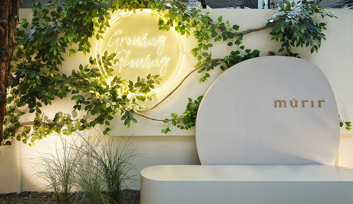
The experience Villa de mûrir provides exceeds that of a plain cosmetics retail store. In the entrance area, the ceiling installation of mûrir free circle objects and leaf-shaped objects bridges the 15-meter-long distance between the street and the actual retail space and stimulates curiosity about the beauty curation brand’s venue.

After passing this entrance area, the Open Studio with transparent windows allows an insight into the creation process of makeup content.
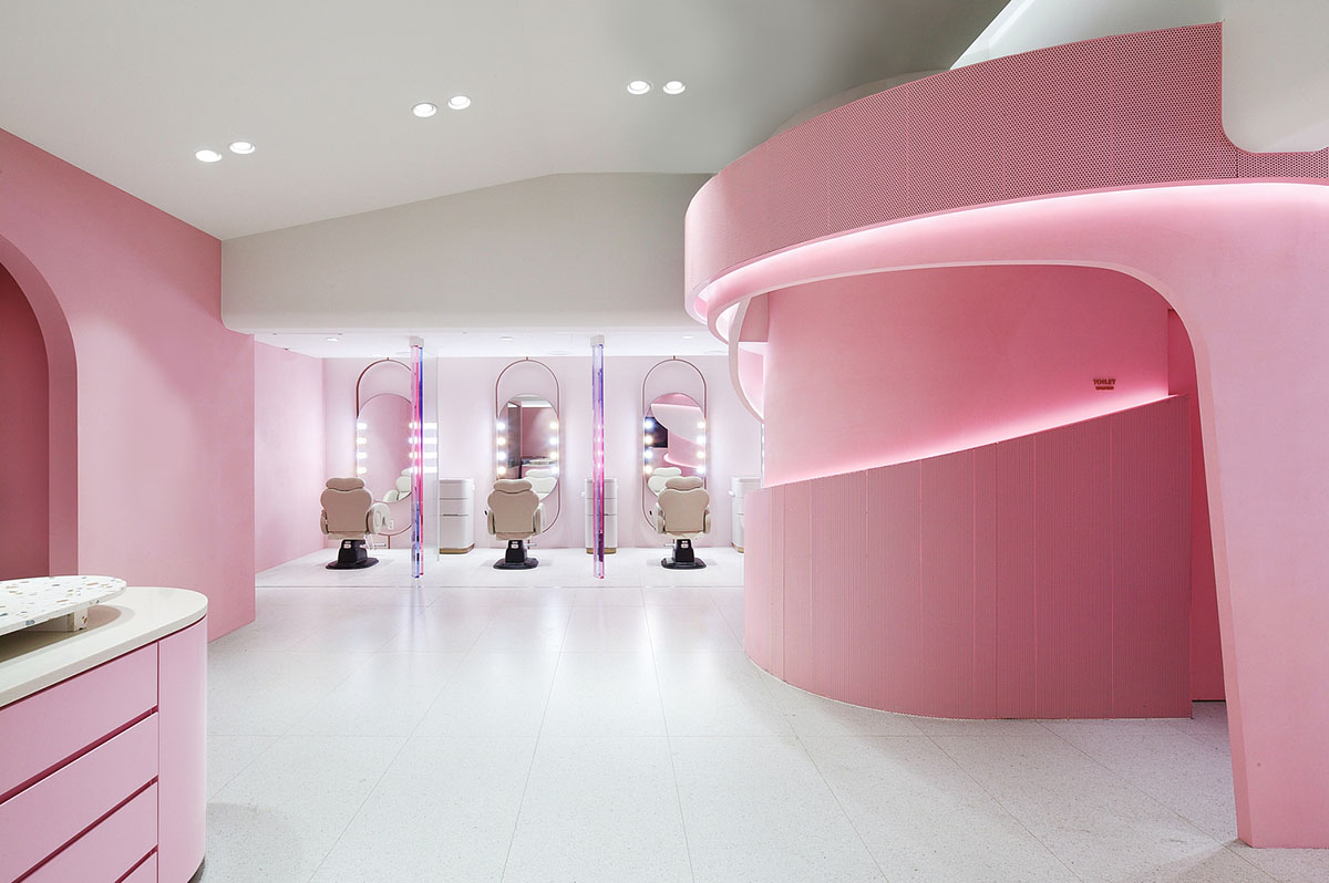
On the second floor, there are a Makeup Zone and a Cafe. "The Makeup Zone feels like an extension from the public area and allows visitors to naturally feel connected to the makeup spaces, while automatic screens provide privacy at each station," as the designers explained.
"Objects painted in gradual mûrir pink color tones are installed in between the makeup chairs so that customers can enjoy the makeup service treatment undisturbed."
The Cafe area features the strongest exhibition of mûrir pink applied to the walls. mûrir free circles in various sizes and multi-colored furniture clearly communicate the brand message of “Lively Beauty” in a consistent manner.
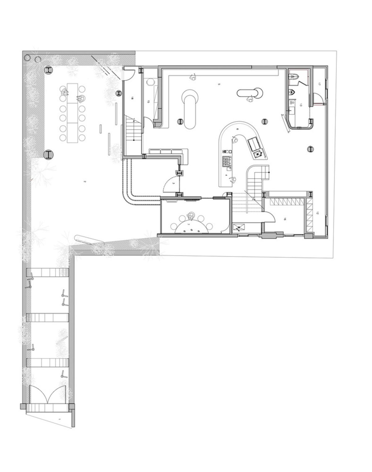
Floor plan 1

Floor plan 2
Project facts
Project name: Villa de Murir
Architects: Collective B
Designers: Dongwook Kim, Yoonjin Lee, Seokmi Hong, Taesoo Kim, Minjeong Choi
Location: Gangnam-Gu in South Korea
Size: 562m2
Date: 2019
Client: The Cell Company
All images © Young Kim
All drawings © Collective B
> via Collective B