Submitted by
TOOP Architectuur Uses Old Shipping Containers To Convert Them Into Architects' Studio In Belgium
teasere-40-.jpg Architecture News - Feb 20, 2020 - 15:28 2807 views
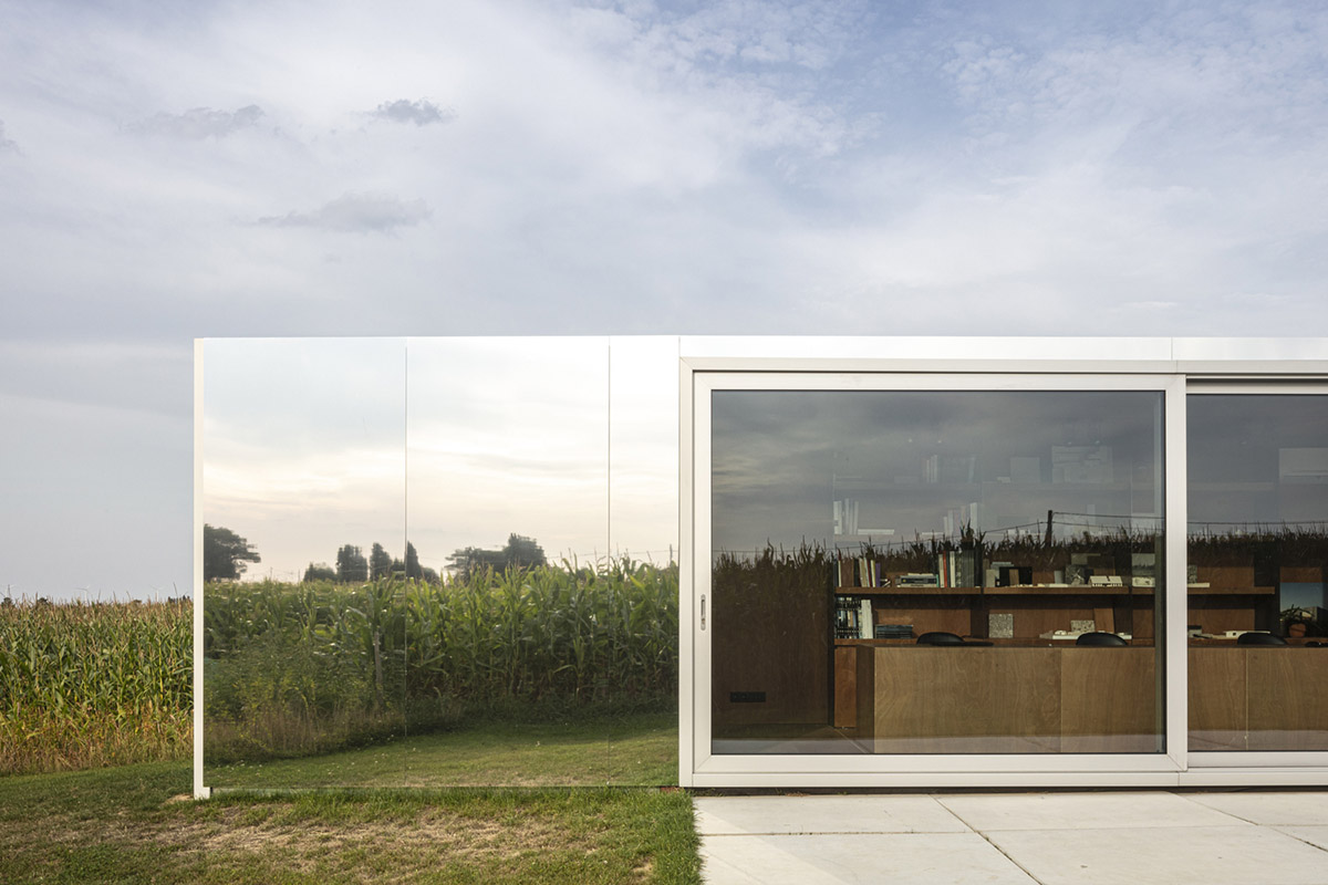
Belgian architecture practice TOOP architectuur has used old and low-budget shipping containers to transform them into architects' own studio in different locations of Belgium.
Called COTOOP Studio, the architects used two low-budget shipping containers to create flexible and movable office spaces adapted to different site specifications and needs in a different architectural language.
First office was set in the rural landscape of Westouter, close to the French border, while the other office was built at the end of an inner-city garden in Lokeren in East Flanders.
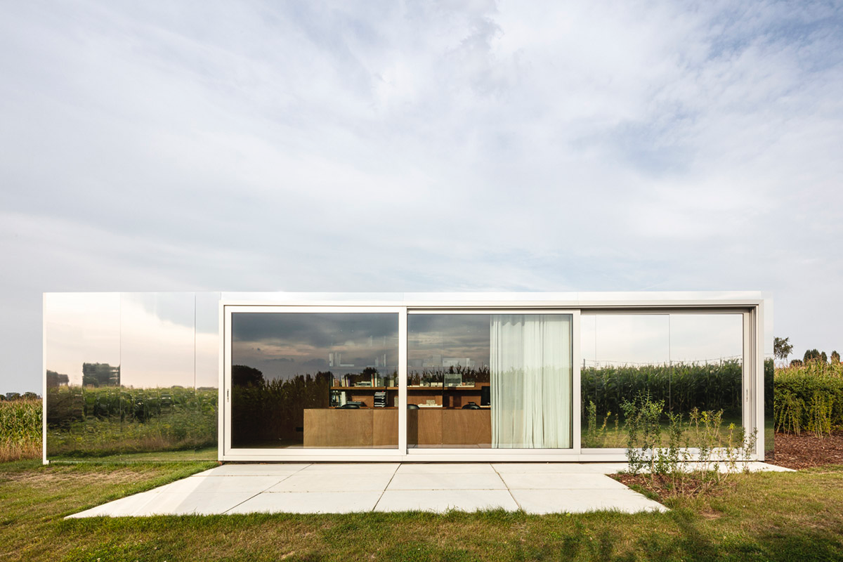
These office structures, clad in mirror panels and wood, were designed as movable structures that can easily be placed everywhere. The office boxes have a strong formal identity by the recognizable dimensions.
"They are flexible as they exist in varied sizes which could give answer to different sites. But the containers are also easy to transform. Openings can be made at different places without breaking the strength of the frame," said TOOP architectuur.

"In need of more office space on 2 different locations for our architecture studio, we tried to give an answer to important matters today: Can we really create flexible office spaces? How should something like an office act in its surrounding?."
"How do we as architects expose ourselves to future clients? Can we create interesting movable offices that give different answers to different places within 1 concept?," asked the architects.
"The architectural offices are part of a diptych giving different answers to a specific site. Part one of our diptych is designed for the characteristics of a typical row house plot in the city center. Part two has a very different surrounding as it is part of a rural plot of the hilly countryside," they continued.
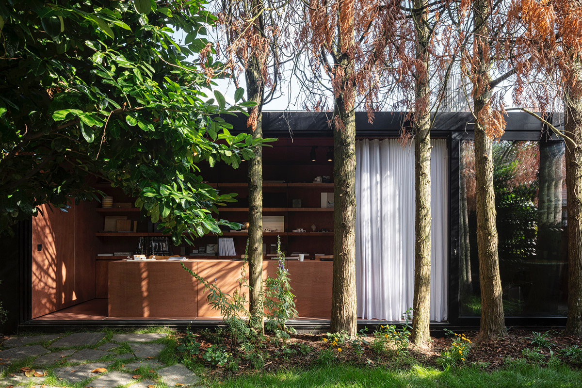
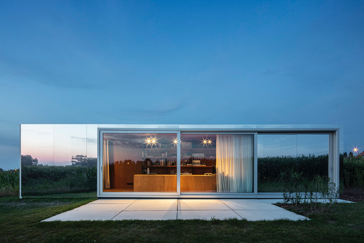
The intention on both places was very different according to the architects. Part one (office one) is placed at the end of a city garden. Reflecting and thus enlarging the garden through a huge sliding window.
The visitor of the shop laying at the street side of the plot gets triggered by the glass façade behind the trees in the garden. In darker periods of the year the office becomes part of the interior of the shop by becoming visible at the back of the garden.
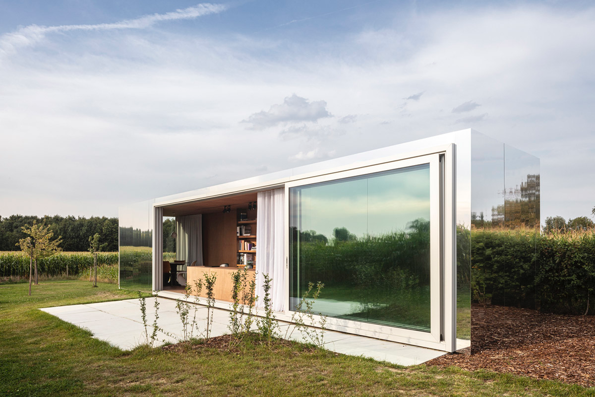
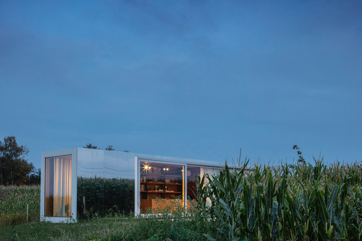
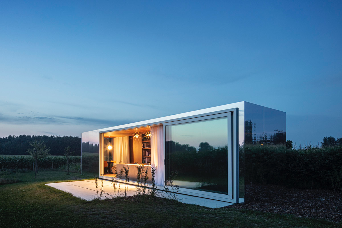
Part 2 (office two) has the intention to disappear in the landscape by its reflective materials used for the outer skin. On this beautiful plot, we tried to create an office which is as invisible as possible and always lets the landscape speak at its maximum.
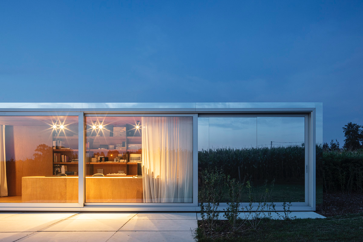
By cladding the exterior skin with mirroring aluminum panels the landscape is reflected from every angle and the office takes over the color of the environment. Precisely chosen openings for the interior connection towards the landscape. One is oriented towards a nearby laying hill. The other is framing a small forest at the end of the plot.
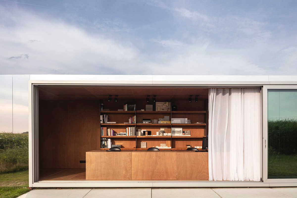
For the interior design of the two architectural offices, the studio wanted to give a strong visual identity that works for a city environment as well as for a rural area. Therefore the architects chose to clad everything in one warm material that is timeless.
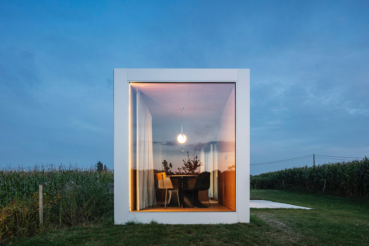
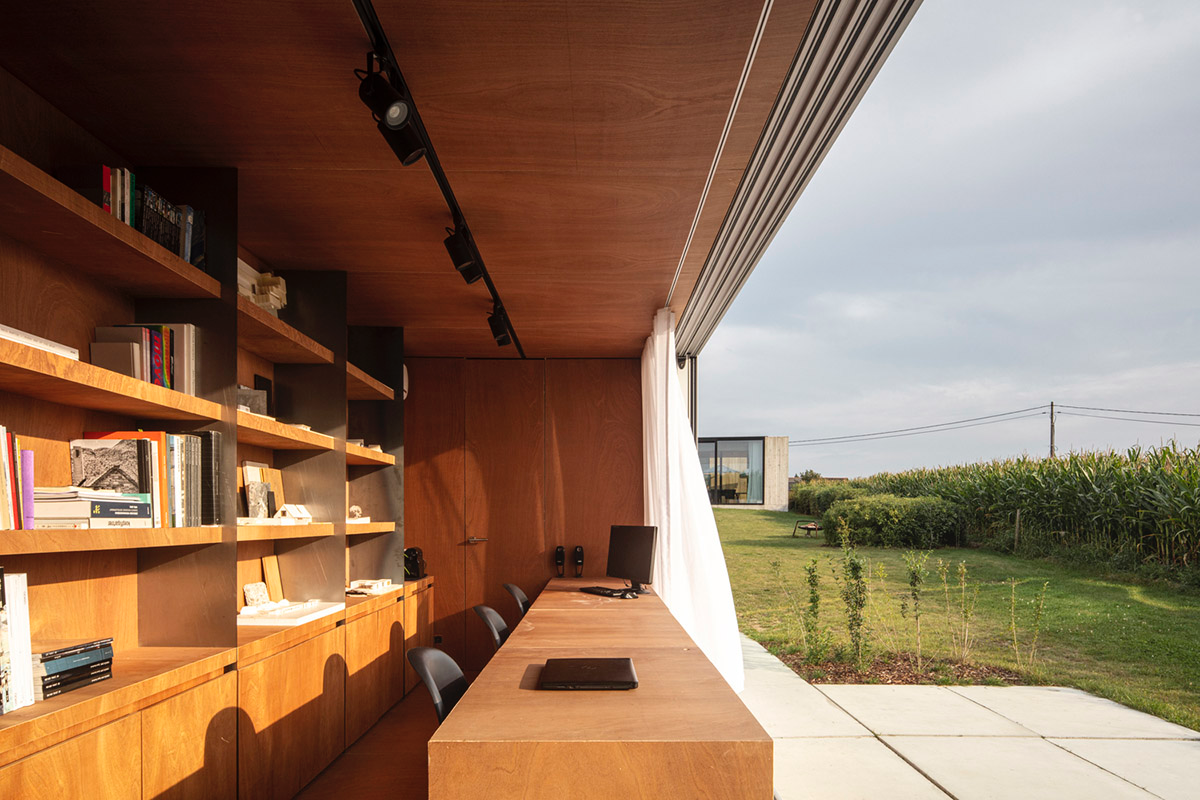
They chose to use the typical red plywood which is mostly used as a construction material and not often as a visual element. By using such a low budget yet very beautiful material they show visitors the possibility of doing interesting things with low budget materials.
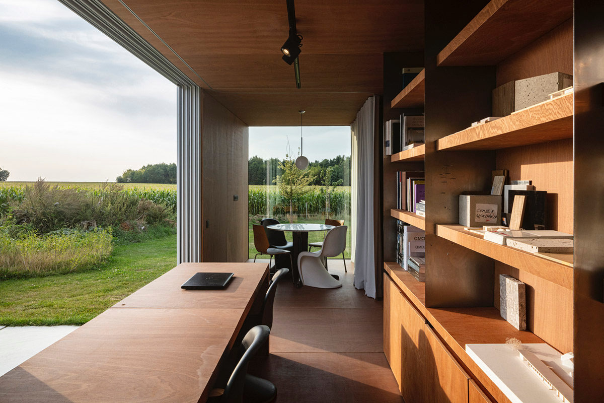
The dimensions of the plywood panels are also used as a module. They form the base for the width of the desks, the bookshelves, etc.

They are placed with negative joints so that the untreated steel ribbons can be placed in between and forming the vertical elements of the bookshelves without having to screw anything.
This makes it possible to easily deconstruct the bookshelves and reuse the materials. Both parts of the diptych are what we call architectural labs.

They form the intellectual hearts of our office where visitors and our team can work together, get inspired by materials, the surrounding, each other.
The concept of the labs can easily be seen on more places. One could imagine another lab giving a different answer to another site but forming a part of a triptych. Or even more becoming a polyptych.

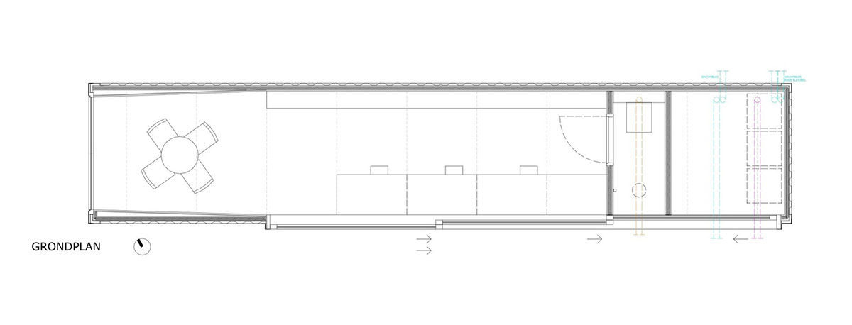
Ground floor plan

Floor plan

Elevation
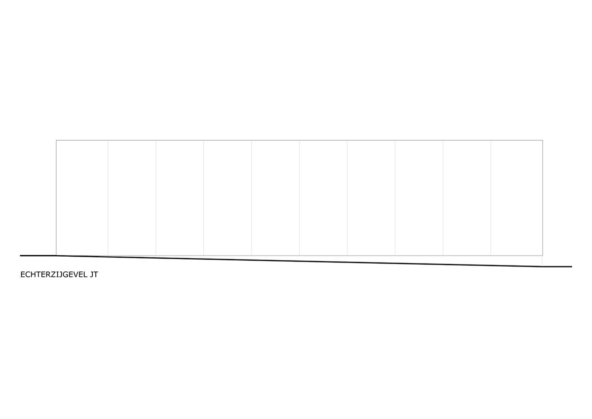
Elevation
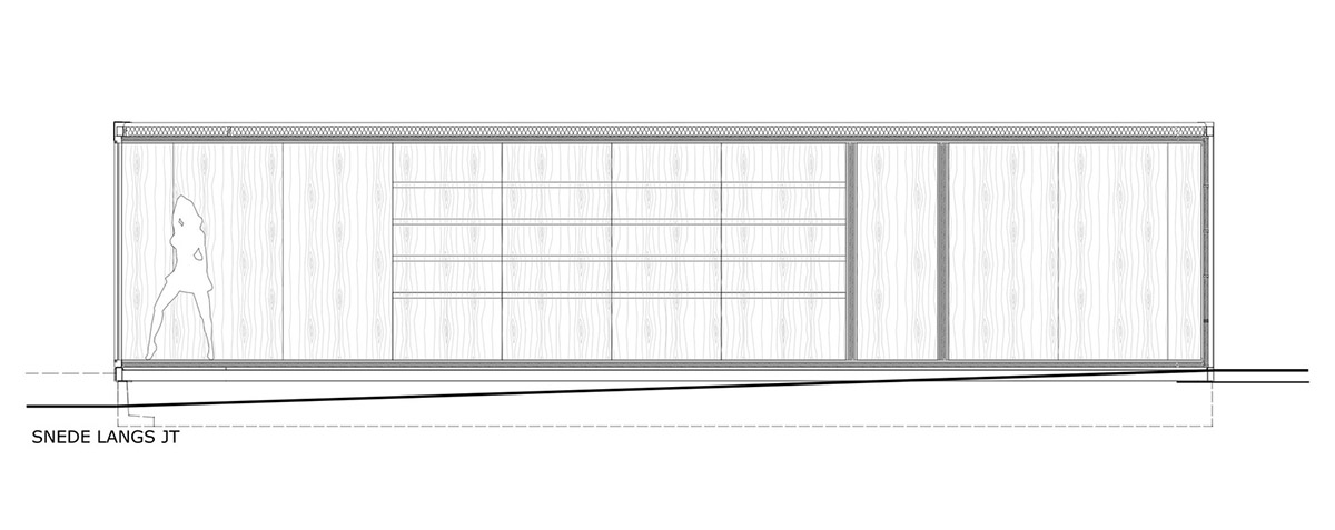
Elevation
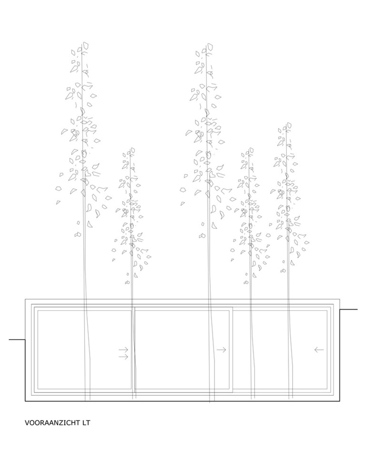
Elevation
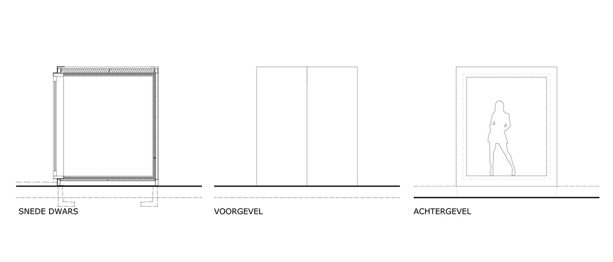
Section
Project facts
Project name: COTOOP Studio
Architects: TOOP architectuur
Location: Heuvelland, Belgium
Size: 36m2
Date: 2019
All images © Tim Van De Velde
All drawings © TOOP architectuur
> via TOOP architectuur