Submitted by WA Contents
Various Associates creates grey scale interior in different forms of display in SND Store
China Architecture News - Jul 24, 2019 - 03:15 12718 views
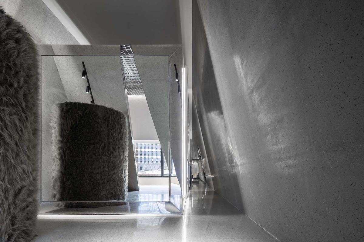
Different forms of grey scale displaying areas welcome visitors at this fashion store in Chongqing, China. Designed by Various Associates, the designers aimed to create a medium where the relations of body and space can be connected effectively.
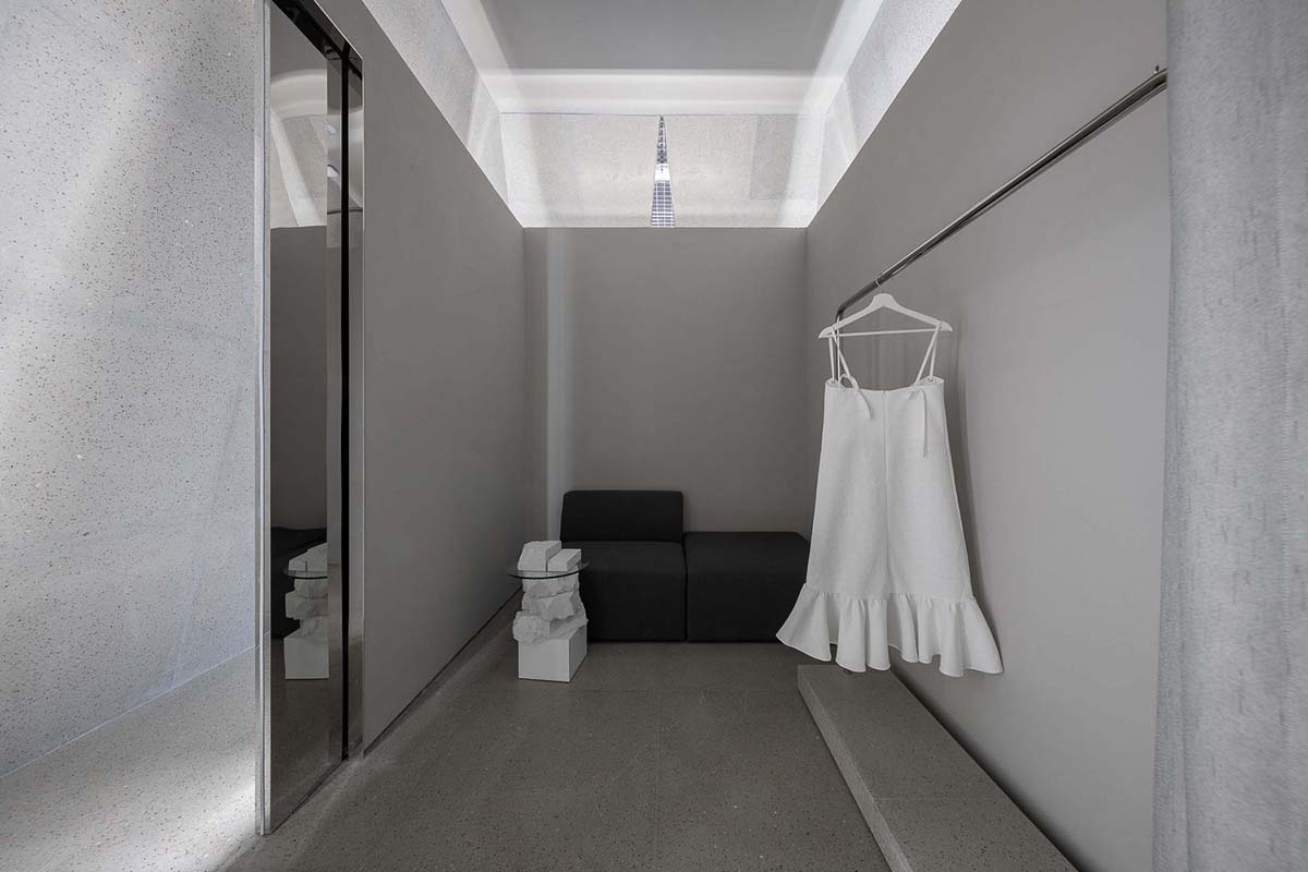
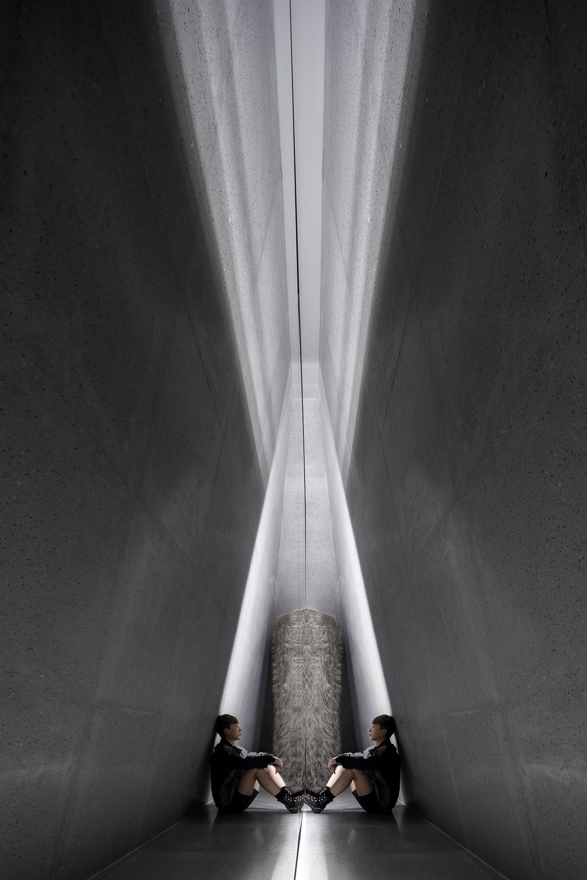
Called SND Boutique, the different placements of grey-colored walls, mirrored spaces, pinkish surfaces and glass boxes propose a dynamic interior as well as its ghost-like atmosphere.
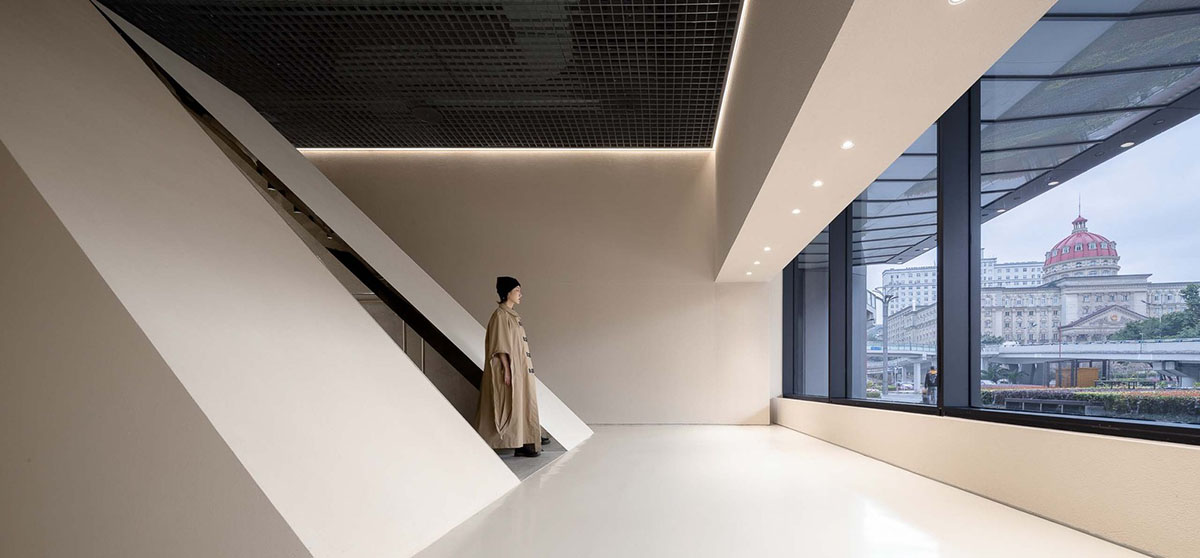
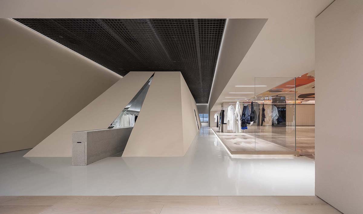
The designers used pure and simple layout, with a symbolic “milestone” placed at the center right on the central-axis. The milestone holds an obvious implication - a new starting point for SND to move towards an internationally representative buyer's shop. The designers wanted to push the traditional boundaries of a shop design.
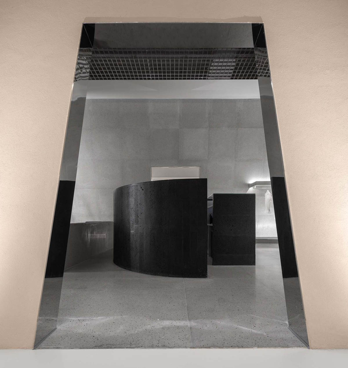
Creating a church-like architectural form at the center, this space serves as an embodiment of SND’s brand belief, which is to strike a balance between keeping the brand personality and catching on the fashion trends.
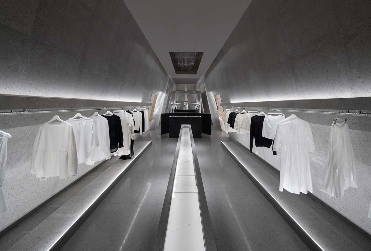
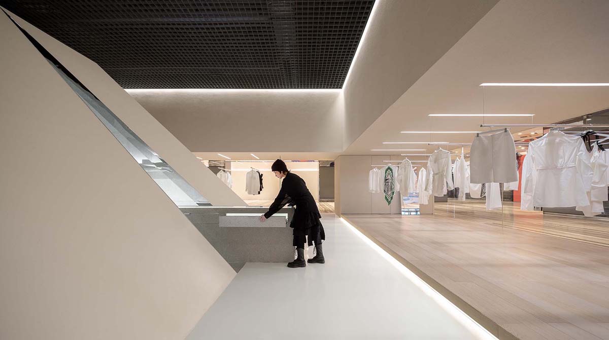
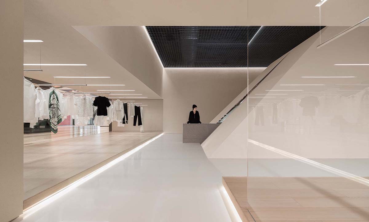
The open display area on both sides resembles a square. Through its unique layout, customers can know clearly the routes and can view every product in display while walking, offering them a chance to select and compare goods easily.
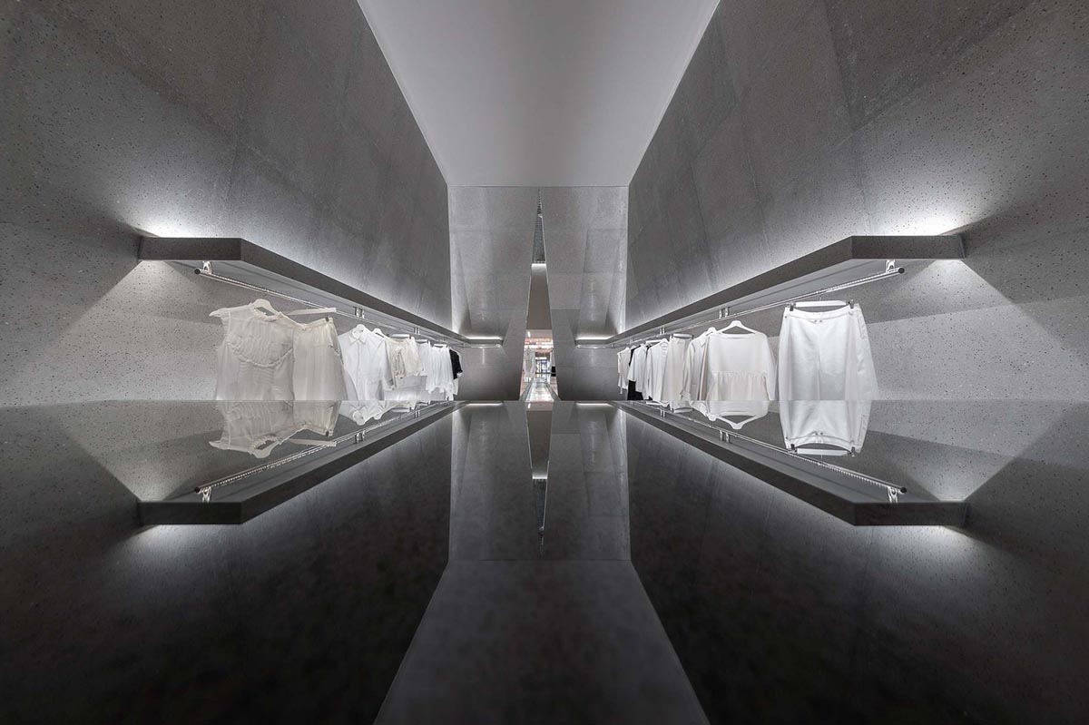
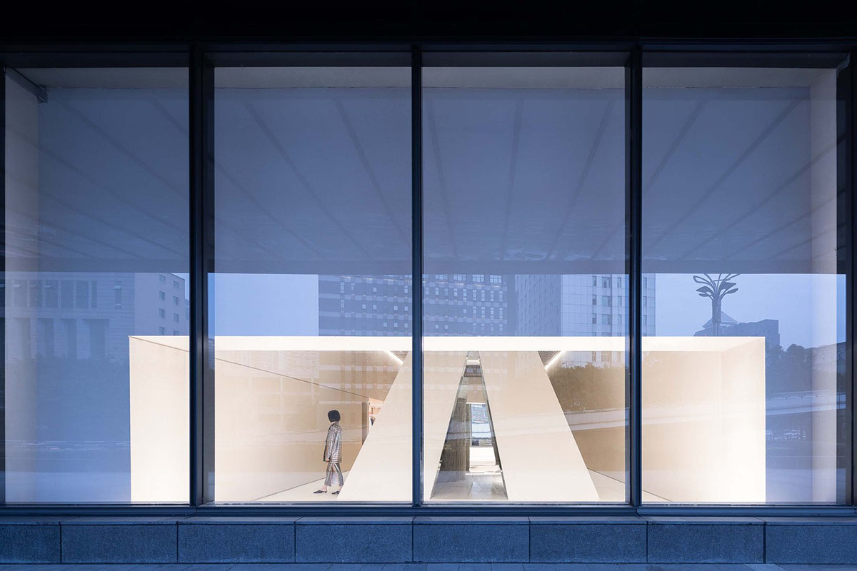
The design team had not only take into consideration the site's own narrow and linear characteristics, but also the brand's functional requirements for art, behavior, and display. Seen from any angle outside the shop, its hierarchical layout and the texture of materials have enabled the shop to be a memorable landscape for any passers-by.
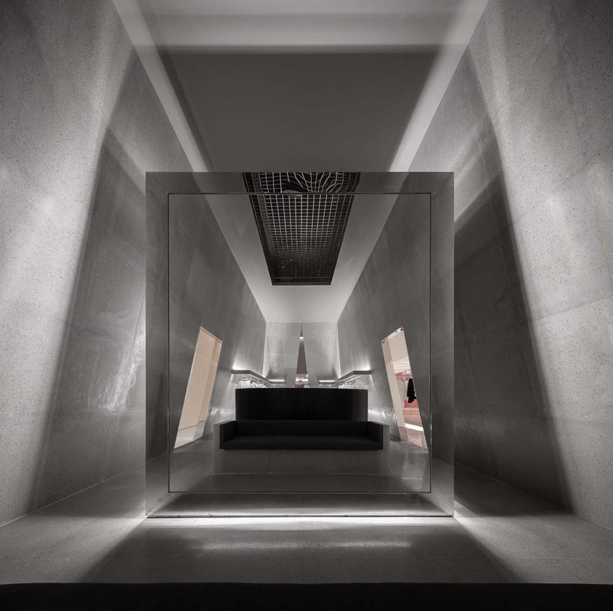
Within the cube, Various Associates continues the idea of symmetric design, offering the interior space a scared and ceremonial sense. Jewelry is displayed in the long straight showcase right in the middle, which is easy for customers to choose carefully.
Luxury brands of haute couture are displayed in both sides, and are illuminated with professional soft lightening so as to show the texture of the clothes.
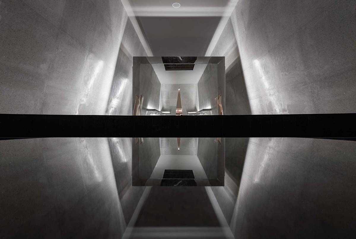
The reception desk is curved and stands at the heart of the space, dividing the display area and the rest area in the cube while offering timely services to customers in need.
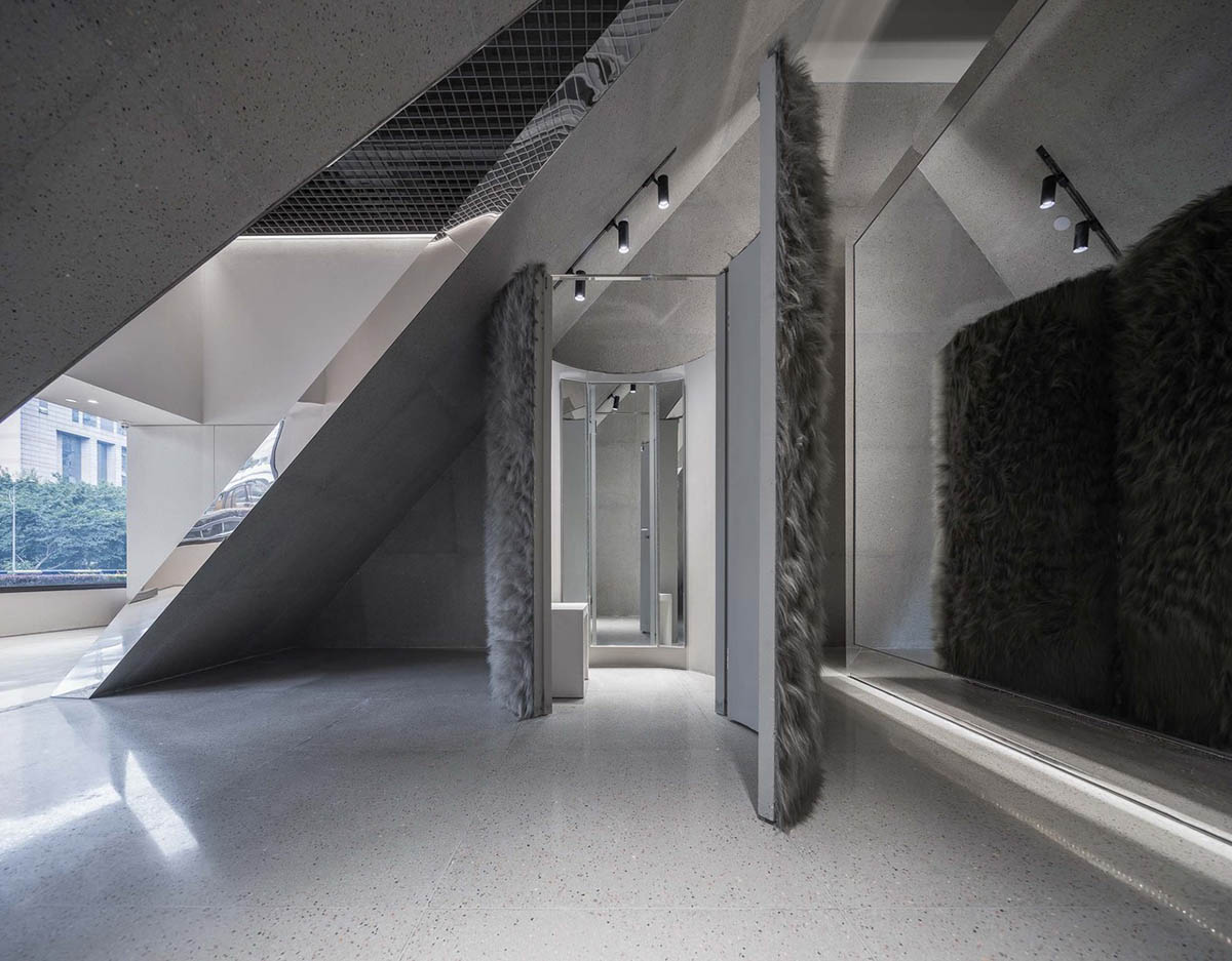
In this project, Various Associates have overcome the conventional thinking mode of traditional brand stores. Not only the products have been fully displayed, the brand personality of SND was also highlighted in its own unique design language.
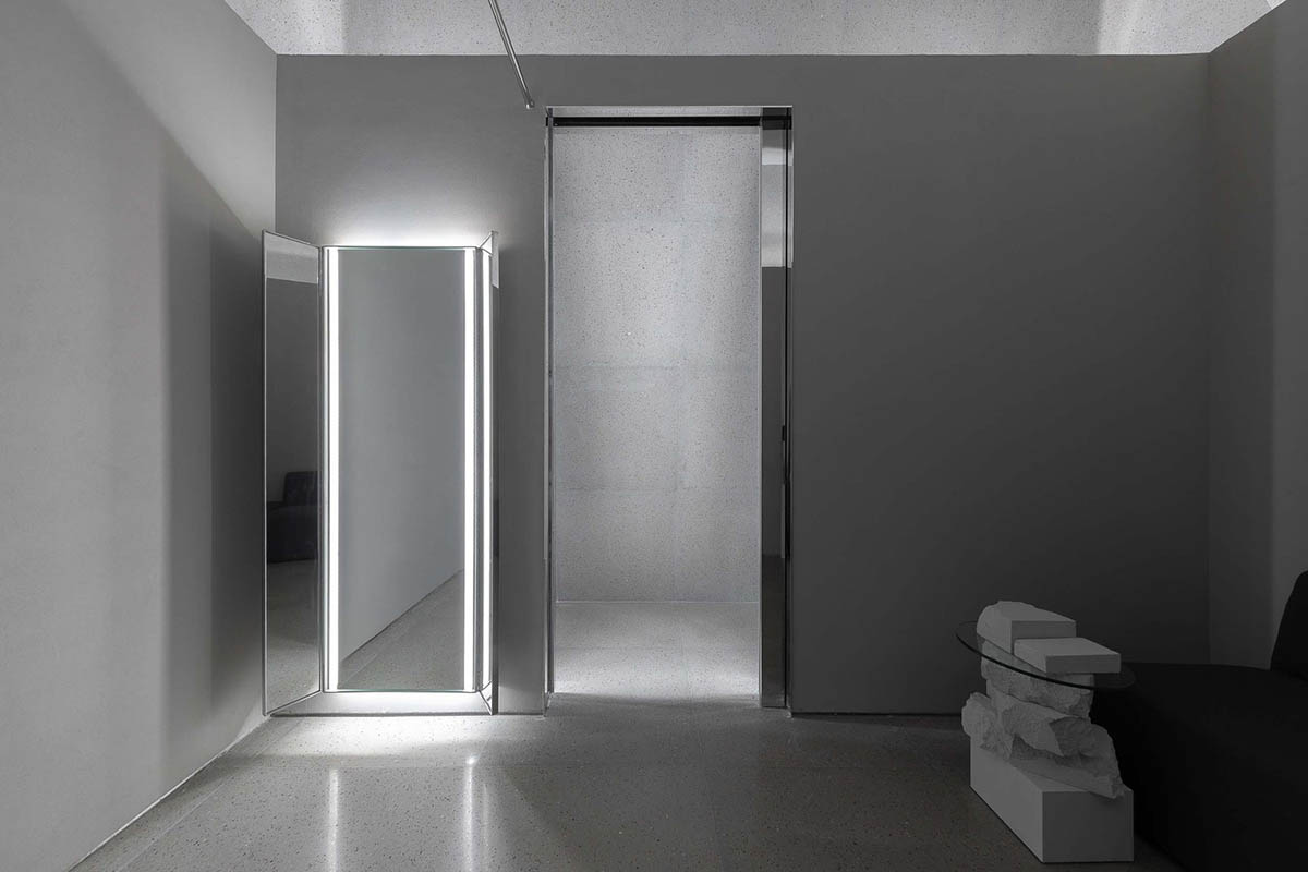
The size of window display area has been maximized to the largest extent, while at the same time, the flexibility and diversity of product display were retained, which offered more possibilities for brand activities and presentations follow up.
This innovative design by Various Associates marks the achievement of quality and visual performance, and realized the association of brand space with urban life.

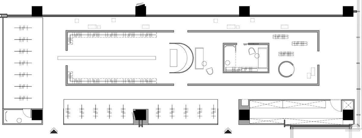
Floor plan
All images © Feng Shao
> via Various Associates
