Submitted by WA Contents
Five designers explore the possibilities of future lifestyles of interiors at Beijing's Artpark9
China Architecture News - Jun 13, 2019 - 05:19 12853 views

Five exceptional designers, including Shuhei Aoyama, Han Wenqiang, Jiang Yuan & Song Chen, and Tang Chung-han, designed distinct rooms and interior spaces centering on the possibilities of future lifestyles in ArtPark9 in Beijing, China.
New Everbright Center invited five exceptional designers to design four guest rooms in ArtPark9. Based on distinctive design strategies from different perspectives, the four human-oriented spaces feature harmony in diversity, together interpreting ideal living environments for contemporary Asian people via oriental philosophy.
The designs include: Hillside Dwelling by Archstudio, In Between by Design Apartment, Borderless Space by SODA Architects and Harmony Courtyard by B.L.U.E. Architecture Studio.
See the designs in details below:
Hillside Dwelling by Archstudio

Image © Jin Weiqi
The project, designed by Han Wenqiang, Song Huizhong, is a guest room situated on the 28th floor of New Everbright Center, ArtPark9, Tongzhou District, Beijing. The goal was to create pleasant living experiences in a standard unit of urban high-rise buildings and explore a possible future lifestyle.
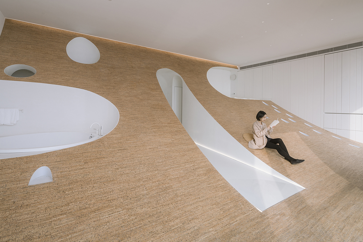
Image © Jin Weiqi
"Dwellings of mankind have been changing with time. In the primitive period, people lived in caves. Our ancestors turned to nature for shelters and defined the pre-existing caves as living spaces," said the designers.
"As time moving on, ancient people sought to live a secluded life in mountains, representing a lifestyle of staying away from the bustling world and coexisting with nature."
Nowadays, urban people inhabit concrete jungles, with residence becoming a kind of standard spatial product. Based on reflections on the evolution of human beings' dwellings, Archstudio tried to return to the origin and essence of living spaces and stimulate the interaction between people and the outdoor environment.
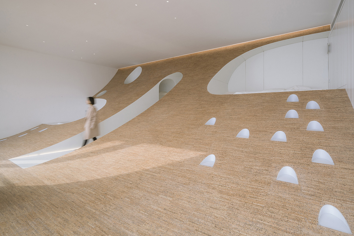
Image © Jin Weiqi
In the rectangular space, the floor is raised from the bottom of the large French window to the ceiling gently, which forms a hillside-shaped structure and generates three-dimensional relations between people inside the space and landscape outside. Based on people's living behaviours and body size, five basic functional areas were created within the space,including the entrance and the washroom in the caves under the hillside, areas for sleeping and bathing which are on the best place of the hillside to enjoy the outdoor view, and the area for walking and resting on the lower part of the hillside.
The hillside is covered with cork boards, featuring a soft and warm texture. All the caves can be taken as bespoke furniture, with their functions being defined by body size and physical behaviours. Besides, the space is equipped with some necessary modern facilities such as a mini bar and a projection screen, which are hidden on the wall and ceiling, ready for use at any time.
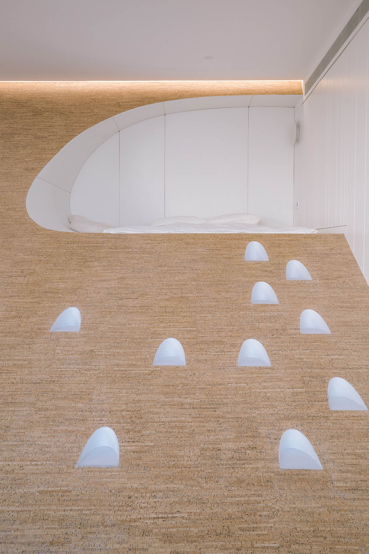
Image © Jin Weiqi
This space creates a co-existing relationship between the artificial and the natural, the primitive and the exquisite, and the clear and the ambiguous. Though not a "comfortable" space in the traditional sense, it provides people who are used to cosy urban life with unique sensory and physical experience, and enables them to recapture the joy of living.
In Between by Design Apartment
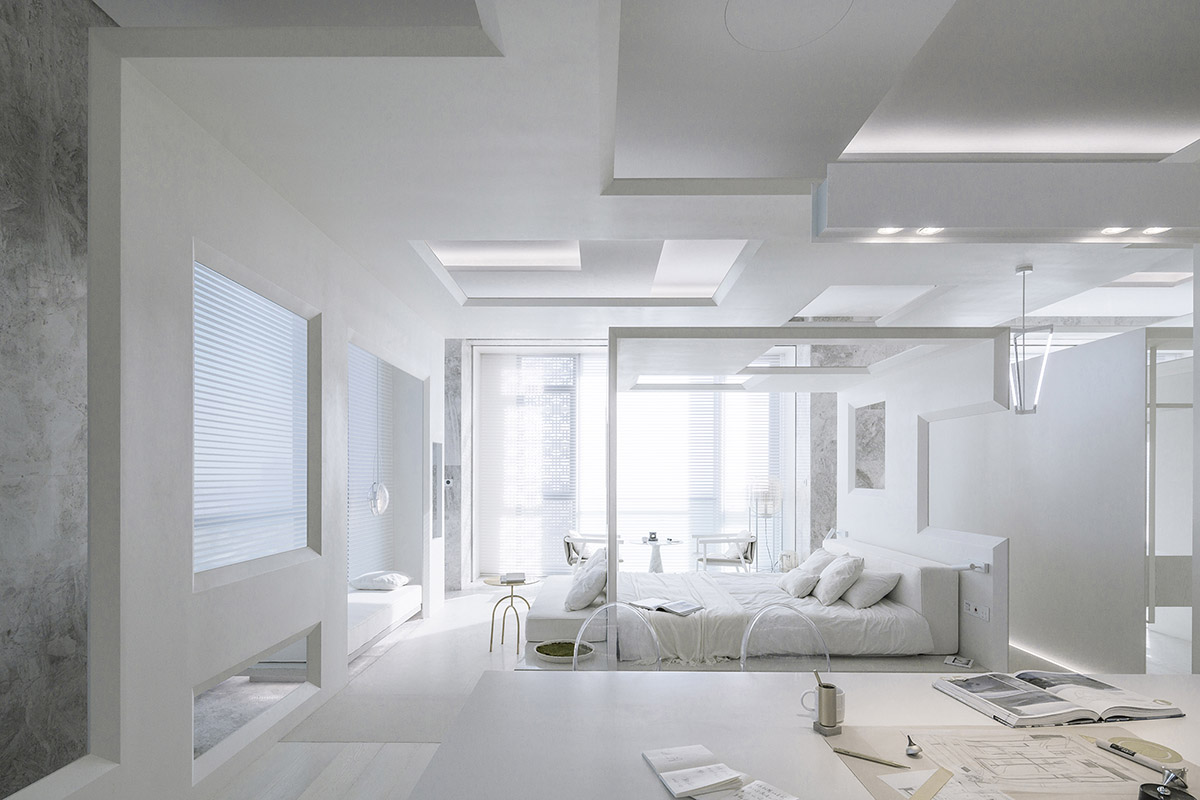
Image © Jin Weiqi
Living a routine life commuting between home, work and other commitments, some people may take wherever they go as home. However, what is the real meaning of home? For the designer, home is about inclusiveness. It can accept your emotion, departure, gathering, and let you embrace your true self.
The space is aptly named "In Between", which is written as "之间" (pronunciation: Zhi Jian) in Chinese characters. It is like a "gray space", which enables the transition between exterior and interior, mood changeover and self-conversion.
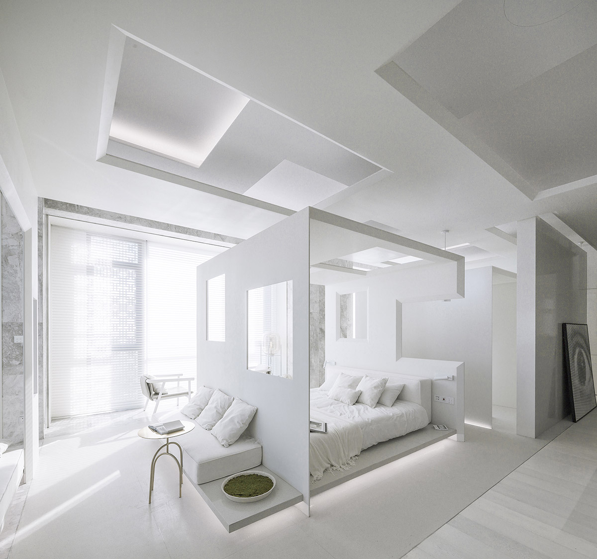
Image © Jin Weiqi
For Tang Chung-han, the designer, the project name has a more special meaning. Through separation and unity, textures, envelopes and layers, he intended to create continuous spatial experiences. The Chinese character “之” is zigzag, resembling the form of a path or a kind of connection, which narrates the story about a sequence of interconnected spaces.
The entire space is finished in white, transparent and bright. White, which is symbolic of softness and inclusiveness, can be matched with any colours. And it can also reflect the maximum amount of sunlight.
Without physical boundaries, the space is partitioned by a variety of lines, which are either wide or narrow, either blurry or clear. Every design detail is an undulating paean, with the rhythm provoking people into reflection.
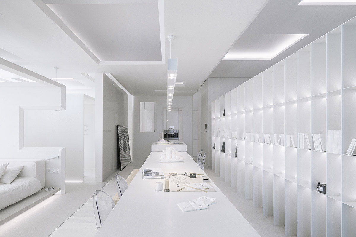
Image © Jin Weiqi
The space, designed by Tang Chung-han, is like the fish-belly-like white sun rising gradually at dawn, which adds vigour to creatures in the earth, and also like the bright moonlight at night, bringing peace and calmness and dispersing the darkness. The artistic painting forms a visual focus, which is full of tension and seems to break through the constraint of space. The white gaps on it seem to try to integrate into the wall, fully displaying the beauty of conflict and harmony.
Around the bed, several openings are carved out, which not only ensure the permeability and transparency of the space, but also reduce the feeling of loneliness caused by the size of space, thus making people feel more secure and increasing enjoyment.
Light flows downwards from the ceiling and penetrates the space layer by layer, thereby adds lightness and rhythm to it. "I want a space with a sense of formality, a concept of home, and more importantly, a unique spatial experience," the designer said.
Borderless Space by SODA Architects
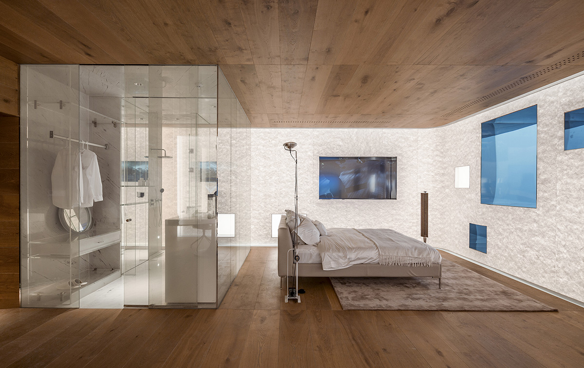
Image © Jin Weiqi
In geometry, boundary is a line without thickness, while it may be the seam between walls in terms of construction. For this project approached by SODA Architects, breaking the physical boundary and making use of video images as the way of connecting different dimensions is the starting point for the spatial design.
In general, the boundary of space is defined by its location and site. The designers used digital materials to break the physical boundary, with a view to achieving the elegant fusion of the "screen wall" and "transparent wall".
The most direct medium connecting the indoor space and the outside world is the window. Therefore, the designers - Jiang Yuan and Song Chen - rearranged the window areas and extended the geometric texture of the rectangle to the closed solid walls on two sides of the space unit.
Four screens of different sizes are respectively embedded into three walls, which are set to play contents of distinctive themes, such as Paris Live, NASA’s 24-hour live broadcast, and live local TV channel in Beijing, so that people can feel and see diversified situations of different time zones.
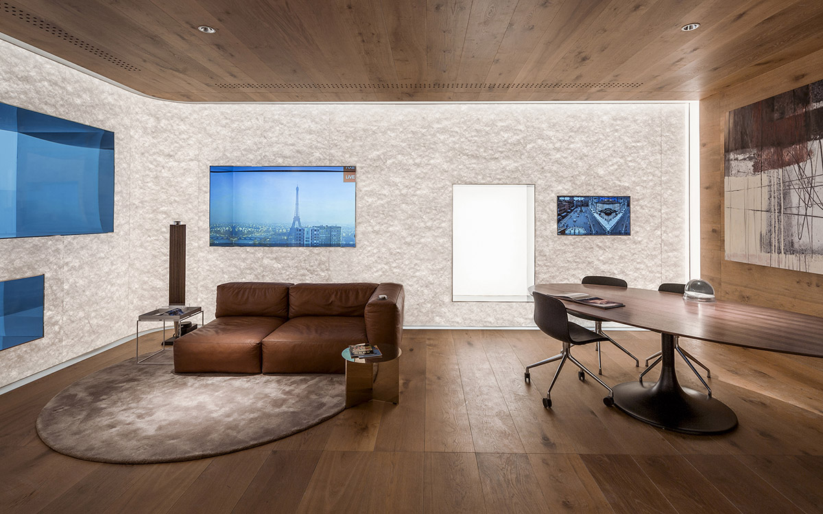
Image © Jin Weiqi
The screens, displayers and light boxes on the three walls are arranged in a mixed way, which breaks the fixed feeling of traditional solid space boundary and forms an irregular “screen wall”. When people see the sunset in Beijing through real windows, Paris is still sunny in the virtual window inside the house. And when they wake up in the morning, the view of boundless dark universe sent back by NASA is just on the screen beside the bed.
In such a space, the concept of time is blurred. It is stretched and expanded through all the screens, enabling people to enjoy different visual impressions and have various emotional experiences.
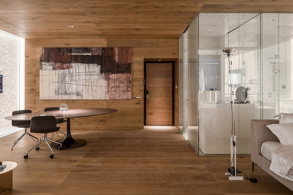
Image © Jin Weiqi
Through the combination of interior design and technology, the designers hope to break the hard boundaries of traditional residential units. The walls are as transparent as if they could be penetrated, weakening their solidness and massiveness. As multimedia equipment, the screens are not bound by forms. They can display dynamic landscape images which are integrated with the outside scenery as a whole, and also function as digital windows to present video images of varying time zones and dimensions.
This project embodies the practice of "media space" that SODA Architects advocates — utilizing digital content to realize the perfection of functions and the optimization of experiences in the space, make it full of dynamic flexibility and interest, and thereby to create a warm, comfortable elegant living environment with the spirit of exploring the future.
Harmony Courtyard by B.L.U.E. Architecture Studio

Image © Xia Zhi
What's the definition of city? It's a container, which holds the living and working space for everyone; It's history, which spans hundreds or thousands of years in the time river; It's a living being, which has been growing and shaped by generations of people. When you look at the city, the city also watches you.
"Harmony Courtyard", designed by Shuhei Aoyama, is an interior space covering an area of about 120 sqm, and a home for a new type of household. In this project, the designer Shuhei Aoyama thought deeply about how to create a comfortable contemporary living space, and more importantly, explored a new possibility for home in the future.
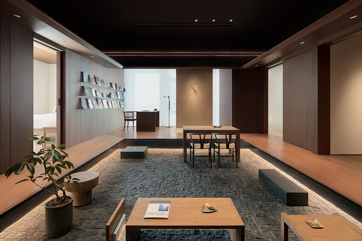
Image © Xia Zhi
The dwelling pattern of humans has been evolving with the time. At the very beginning, several generations of the family lived together, which is regarded as the version 1.0 of households. Later, the family unit gradually became smaller, usually consisting of the parents and one child (generally two kids in Japan), that is "Household 2.0". Nowadays, more and more one-person households are emerging, especially in large cities worldwide, indicating that "Household 3.0" is coming.
Cities are gradually transforming into places composed of one-person households. In the core area of Tokyo, the senior and young people who live alone account for more than half of their populations. Traditional households have been disintegrating and disappearing, which is what Beijing will have to face in the future.
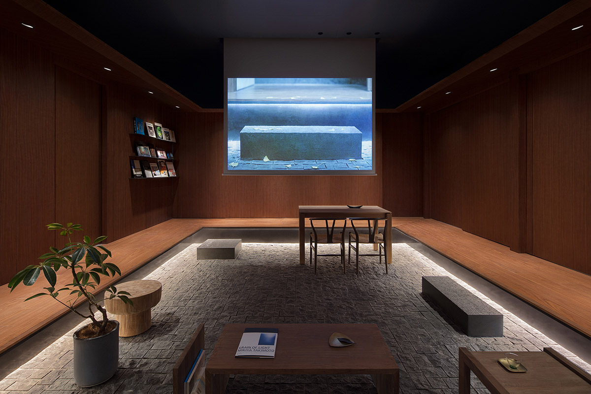
Image © Xia Zhi
In the "Household 1.0" era, there are courtyard dwellings and earthen buildings.During the "Household 2.0" period, there are residential apartments with one living room and two or three bedrooms. When it comes to "Household 3.0", what should a home look like?
With this question, Shuhei Aoyama and his team started the project research. He found that the layouts of most residences were based on the household pattern formed by marriage and blood relations. Therefore, to create a living space for a one-person household, the first step was to break the traditional residential interior layout.
The design team dismantled all the partition walls in the original space, and created a courtyard-like public area in the middle of the space. Besides, they elevated the surrounding corridor in an appropriate height, making the yard sunken and endowing the corridor with the function for sitting.
The space appears to be a traditional Chinese courtyard when looking down at it. If the roof is removed, the bedroom, toilet, shower room, and kitchen, etc. around the yard could be seen from above. The designer tried to compress the private space as much as possible, so as to leave more space for the public area, where life will be enjoyed.
This home, designed for a new type of household, liberates people from their private space. It is no longer a closed living space, but a dwelling mode for the emerging one-person households, which is more open, highly compound and embraces more possibilities.
Top image: Hillside Dwelling by Archstudio. Image © Jin Weiqi
> via Archstudio & Design Apartment & SODA Architects & B.L.U.E. Architecture Studio.