Submitted by WA Contents
An Art Museum veiled by pleated aluminium panels creates mysticism between inside and outside
China Architecture News - Jul 21, 2017 - 19:07 18433 views
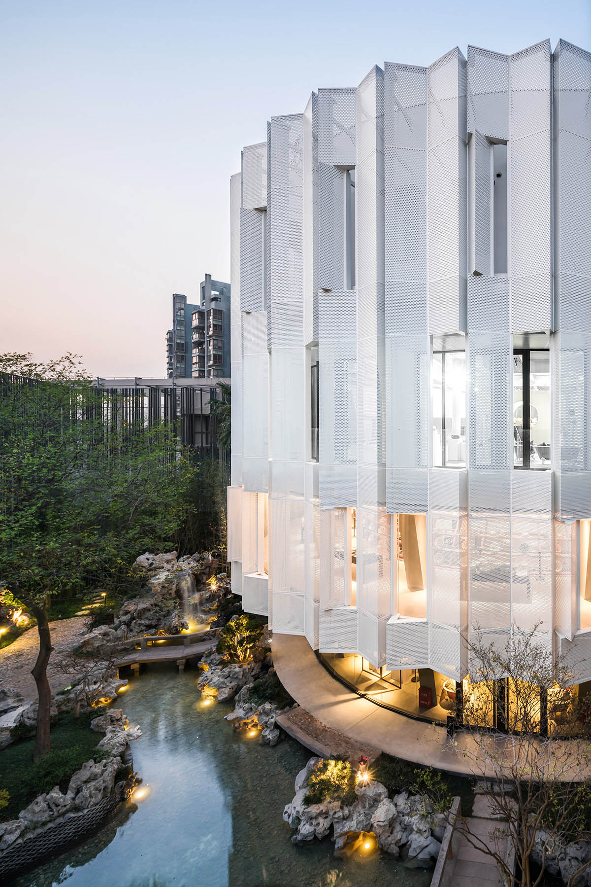
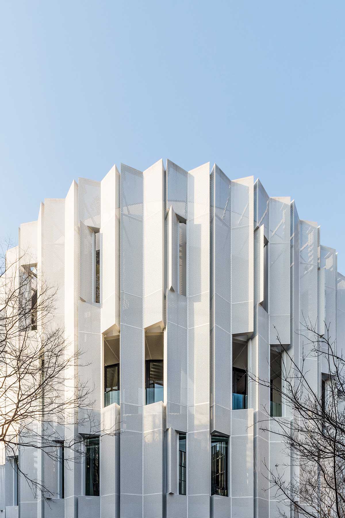
Countless foldable aluminium panels wrap a circular art museum's facade to create a different aura between inside and outside, which makes difficult to understand the exact function of the building. This stylish and contemporary-looking art museum - named Eight tenths Garden - is located within a historic garden of Shanghai, which was previously used as a sales centre.
A client, the Shanghai's famous enamel factory’s last manager, commissioned Wutopia Lab to design a micro-cultural complex, housing his exclusive collection of enamels and some additional functions such as coffee shop, a library, offices, bed and breakfasts, as well as a restaurant, study rooms and chess rooms. This micro cultural complex was also designed to be used as a venue for the conference in the idle hours.
"Enamel was once the most important daily necessities dominated China, but now almost unstable," said Wutopia Lab.
"Over the years he has collected a mass of enamels, the quality and quantity of these enamels can become the eye of this micro cultural complex. With the construction of the Eight tenths garden."
"Mr. Client’s son comes back from Milan, founded a fashionable enamel brand and settled in the Eight tenths garden. This is a rebirth of old technology and family traditions."
"We hope the building could reveal the spirit of Shanghai. The spirit of Shanghai is life based, which is a richness not only pleasant but also restrained," added the studio.
The four-storey building is located in a memorable historic garden with a bamboo entrance in the front yard, making the Eight tenths Garden independent. But the Eight Tenths garden is not a private garden, it is freely open to the surrounding residents, which makes the garden approved by the surrounding residents.
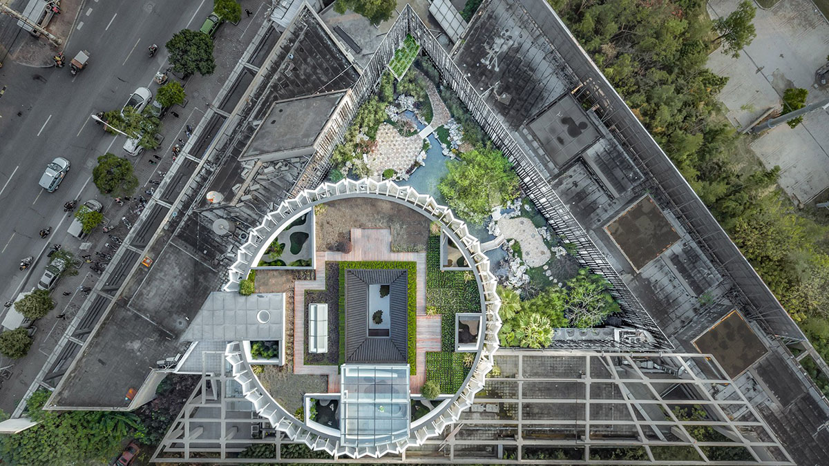
"They cherish the garden, feeling satisfied to walk quietly in the garden a few steps to meet. We are rebuilding the space in a complex neighborhood, this is the only time which won the neighborhood a letter of praise of the project," added the studio.
"This is why we put the front yard design into the urban micro-space revival plan. The street was once a simple aisle, the original landscape was worn-out, but our front yard changed the corner, making it lively again. The sociological meaning of architecture is revealed."
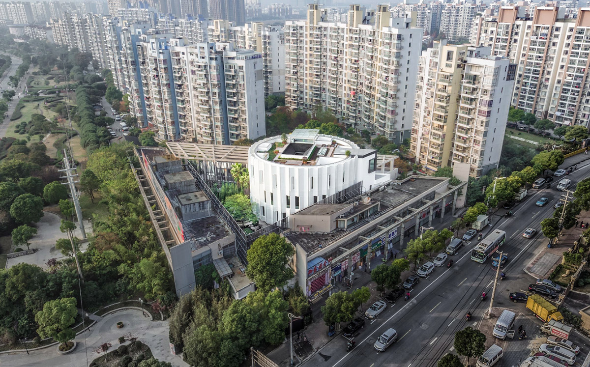
The entrance is located on the garth of the triangle. The other two sides of the building were the neighborhood committee and shops along the street. The joint offices are placed on the third floor, and the bed and breakfast on the fourth floor goes back to a restraint of elegance.
People could easily read a spirituality from it. On the top of the roof, the studio pays tribute to the ancient literati garden by placing a vegetation garden.
"The space of this 2,000 square meters’ building should be abundant in variation but also has a connection with each other. We do not want the obsessive minimalism, nor do we want an exaggerated scene which lacks of connections," explained Wutopia Lab.
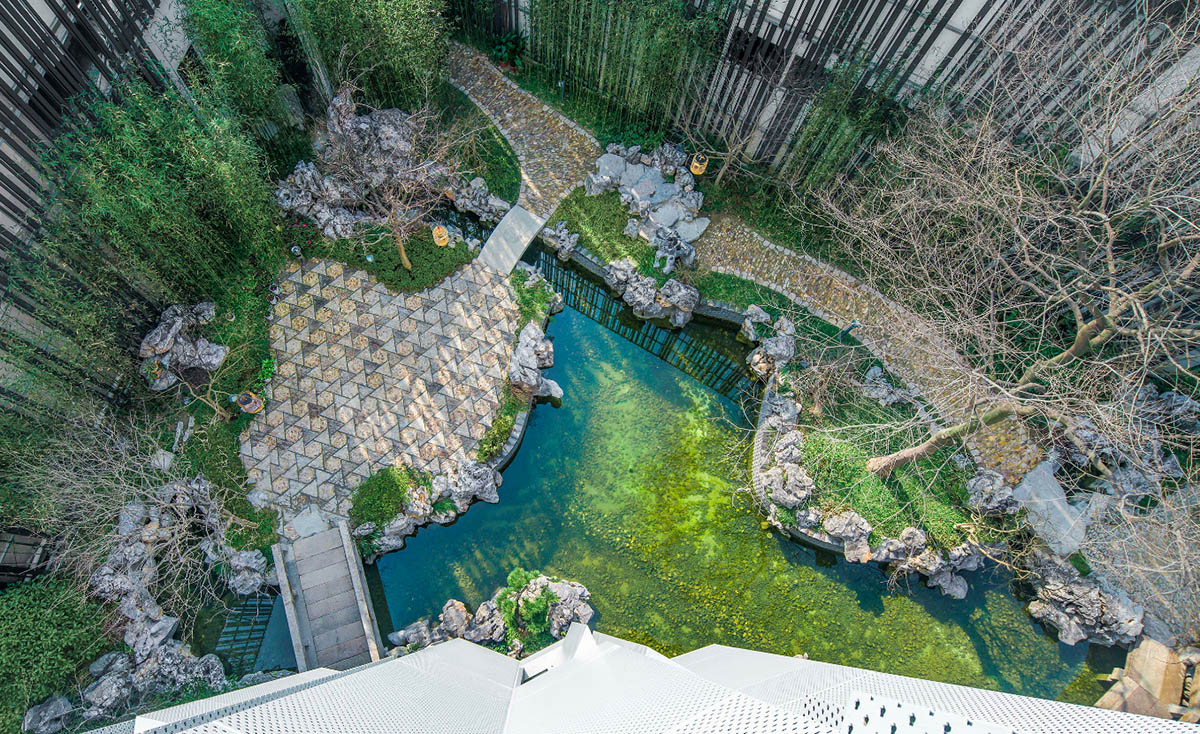
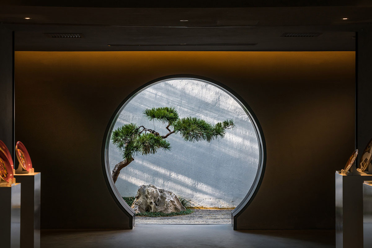
"We used antithesis to unfold the space. The garden in the outside represents complexity, inside building, in the other hand, shows simplicity. But these simplicities are somewhat different. The art museum should be contracted and powerful, but the study room and the restaurant next to it should be warm and soft."
The courtyards are contemporary Chinese courtyards, originated and refined from the painting of Chou Ying, which is a practice of the vertical city, trying to build a real villa in the air.
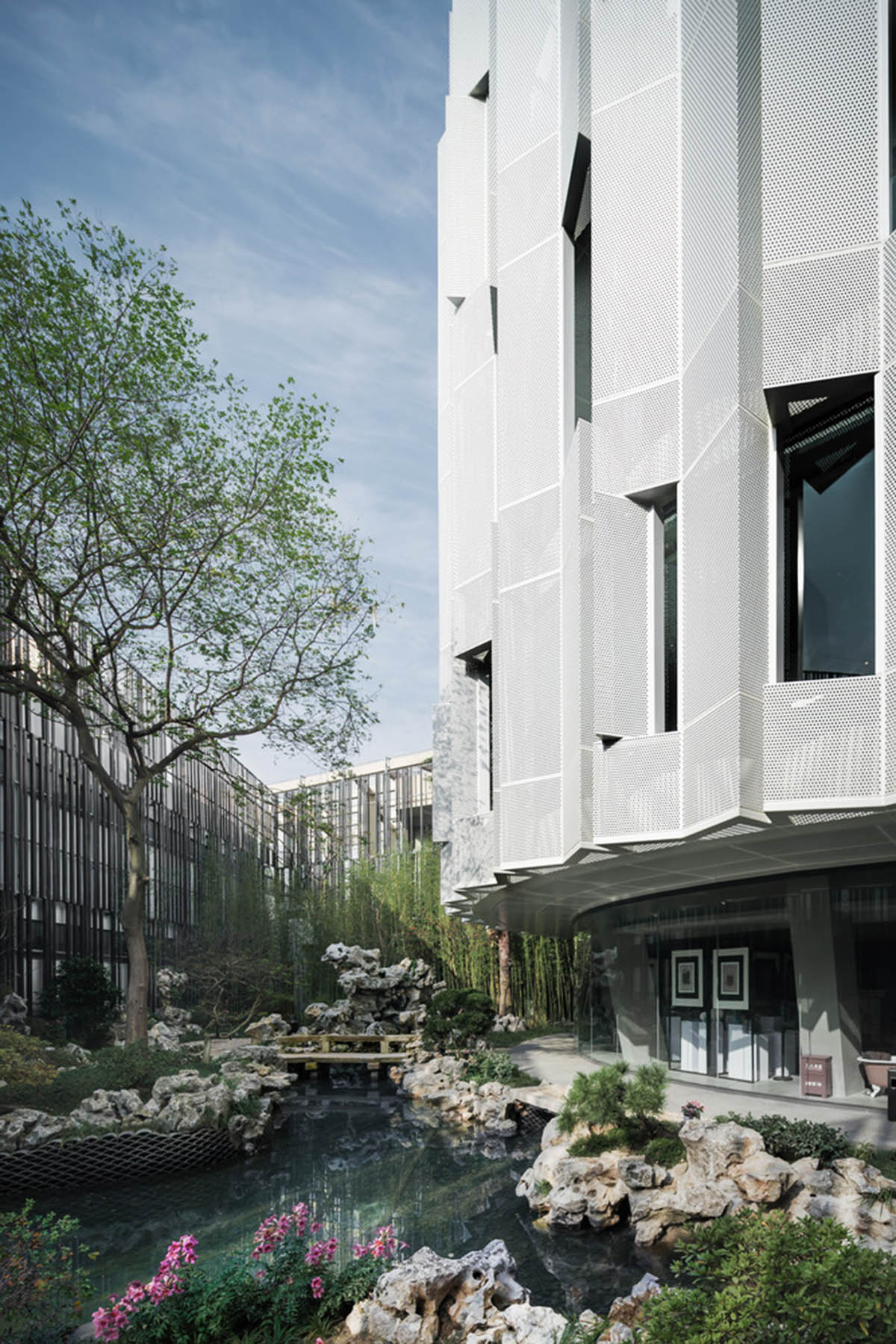
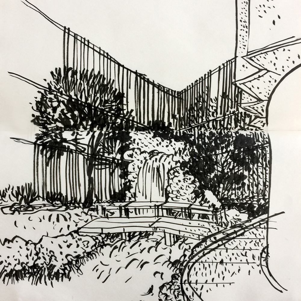
The Eight Tenths Garden is very close to the neighborhood committee and the street shops. Inside the courtyard, there are two back walls in addition to the garden hall, which hangs plenty of air conditioning and a variety of pipes. The studioused a curtain as a fencing wall to insulate this cluttered environment from the Eight Tenths Garden.
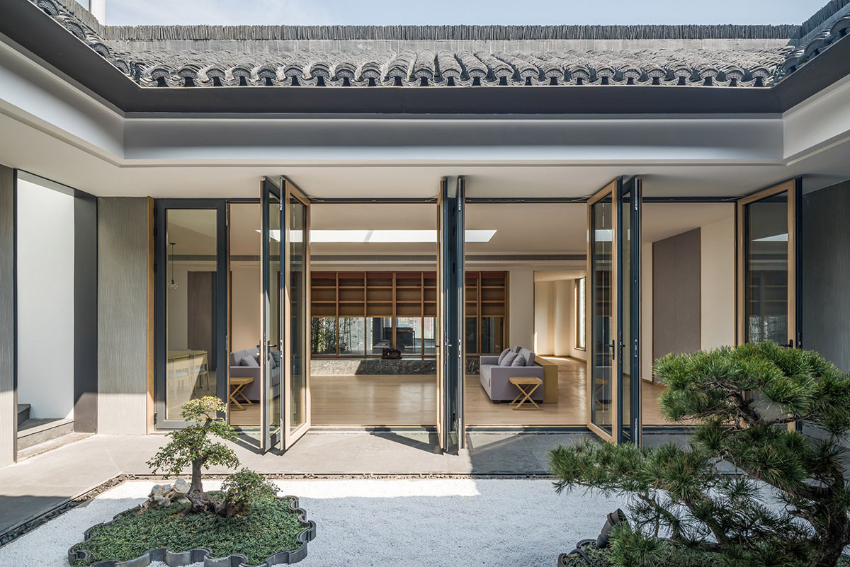
For the fencing wall, the studio tried corrugated board, glazed tile, perforated aluminium - pattern is the pixel style of the "thousands of miles mountains and rivers" - aluminum grille with vertical green. The architects refused to use the vine green wall - the style of the wall is not important but must be black and must not be completely sealed.
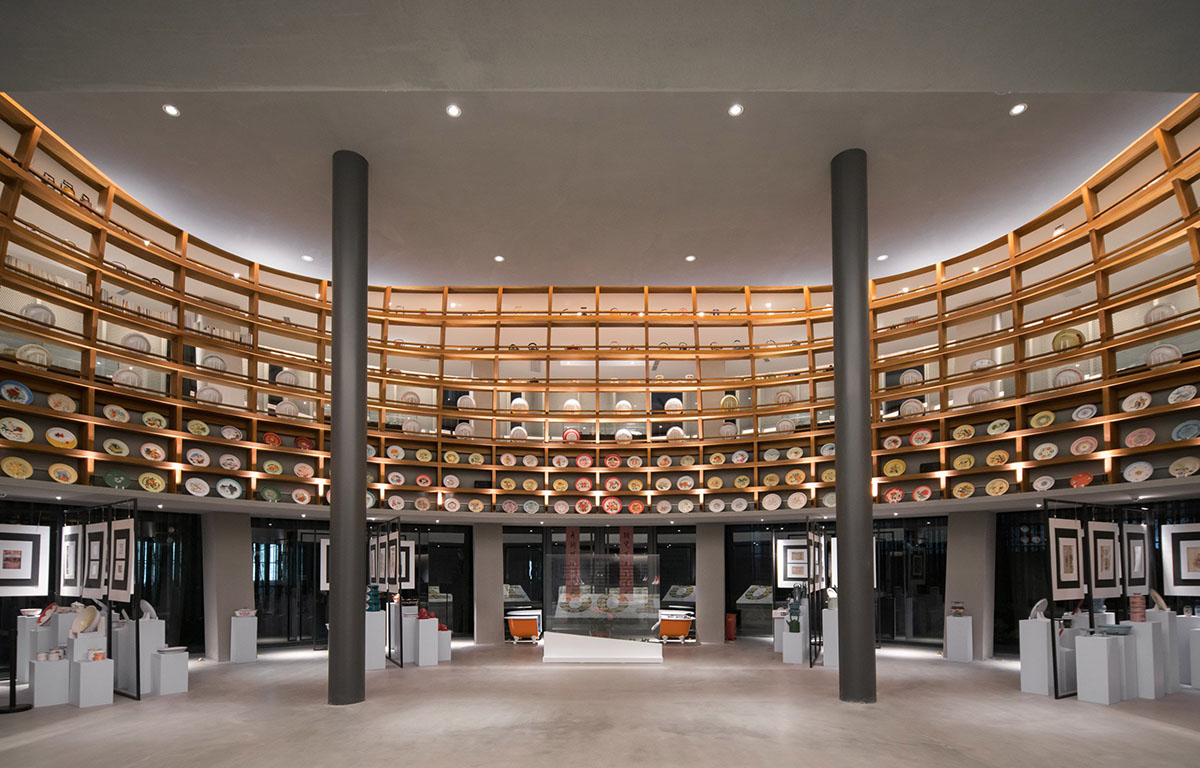
Only this kind of fencing wall could give a contrast from the surroundings to the Eight tenths Garden, making it a rebirth place raised from the old place. The galvanized frame is also part of the old thing, while the black grille is new.
The pattern is not important, but the final size of the pattern should be study case it determines the aesthetic details. Only black can split the fencing walls and old things and become the background of the central gorgeous round curtain modestly.
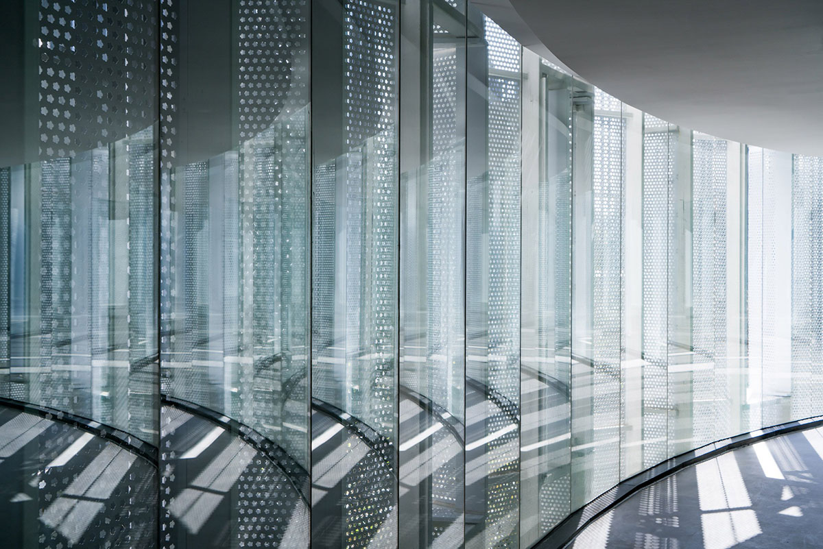
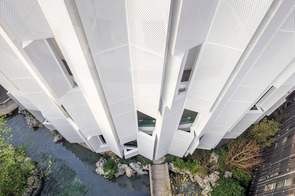
The architects use perforated aluminum plates in the folding fan style to create a veil on the facade. This veil is not used for the climate control, it has a glass curtain wall, a yard as well as a balcony behind.
They created a blur between the facade and the climate border. They hope to build a garden which pays tribute to the Shanghai street park in its 70s, as well as to the local garden history.
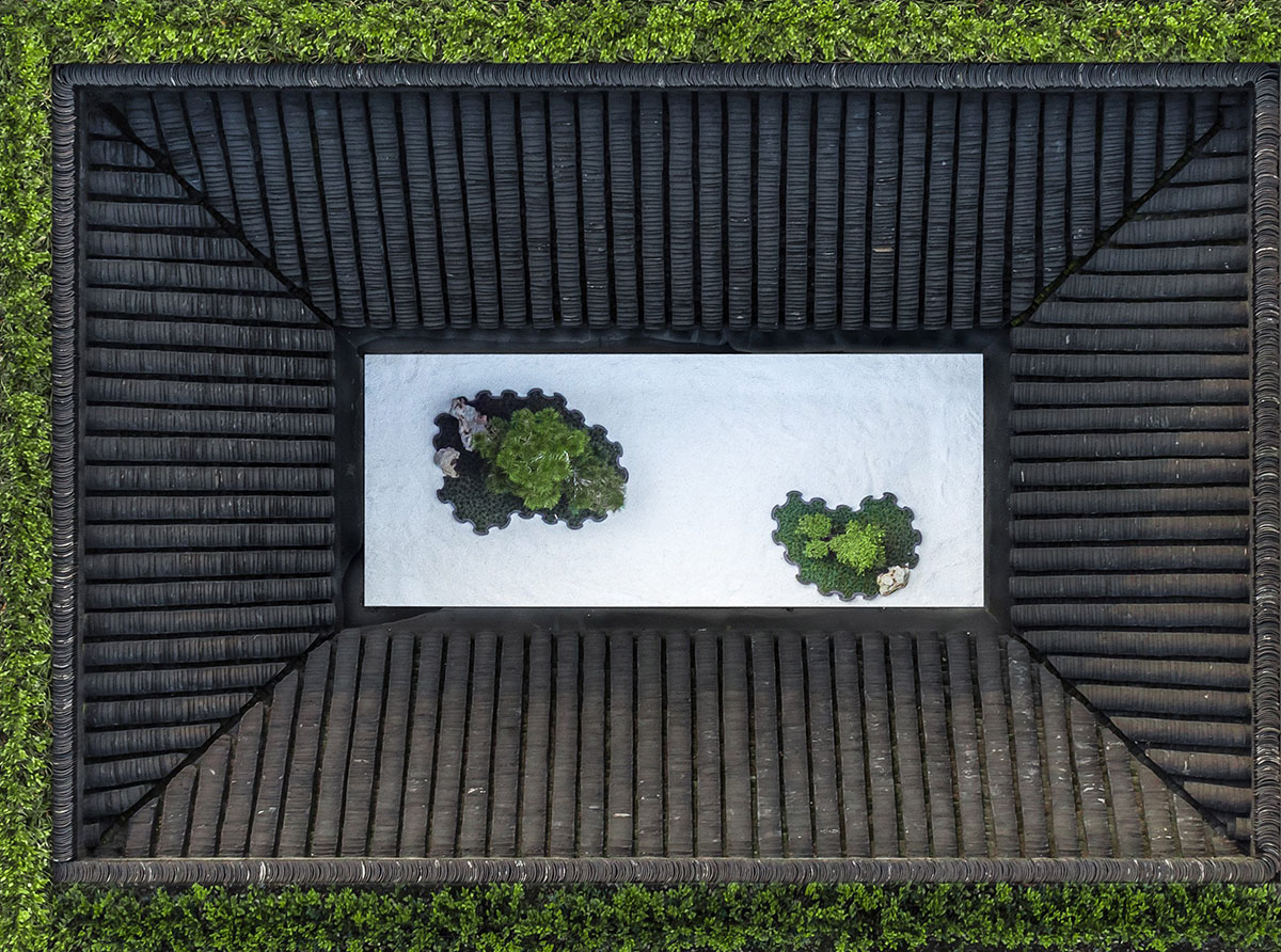
"Let the garden and the building fuse together into one. The entirety of building and garden is architecture," they added.
"They cherish the garden, feeling satisfied to walk quietly in the garden a few steps to meet. We are rebuilding the space in a complex neighborhood, this is the only time which won the neighborhood a letter of praise of the project. This is why we put the front yard design into the urban micro-space revival plan."
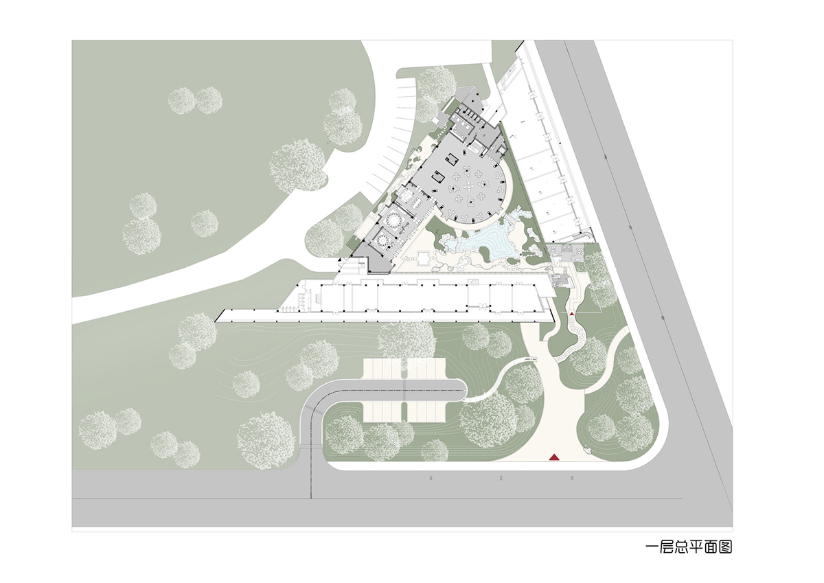
Site plan
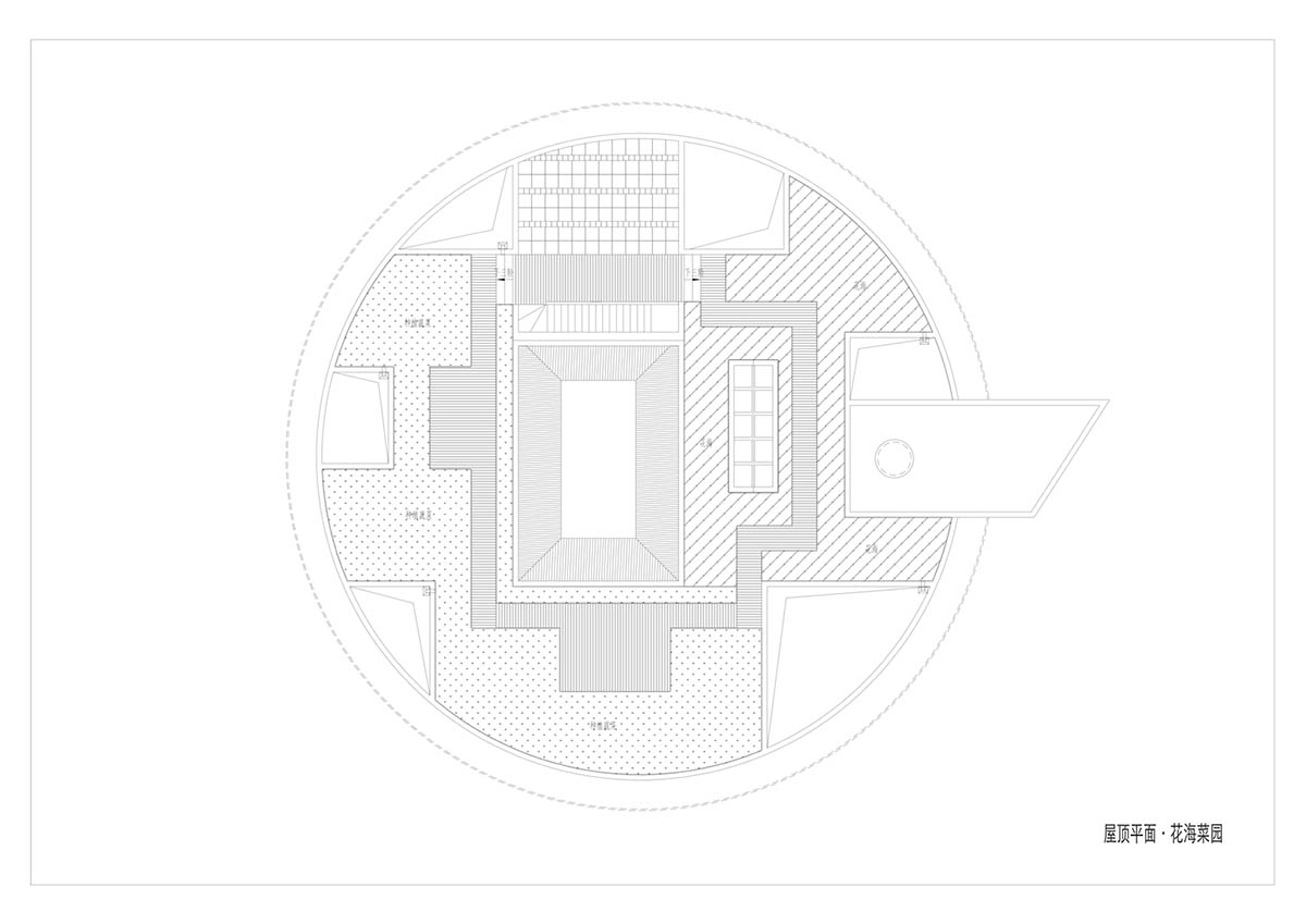
Roof plan

4th floor plan
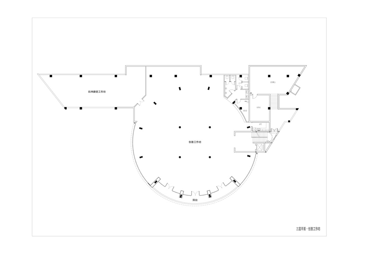
3rd floor plan

2nd floor plan
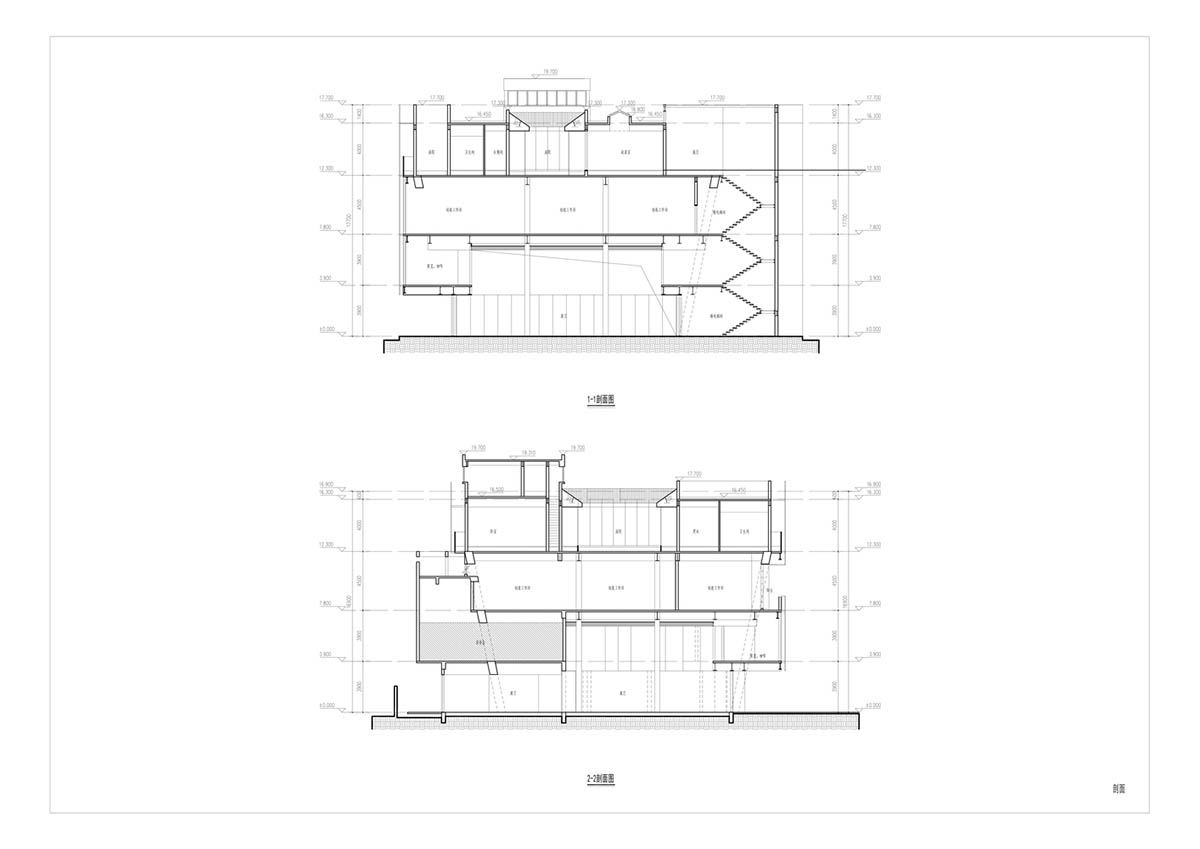 Sections
All images © CreatAR
> via Wutopia Lab
