Submitted by WA Contents
AL_A completes world’s first porcelain courtyard for V&A Museum
United Kingdom Architecture News - Jun 30, 2017 - 09:32 19660 views
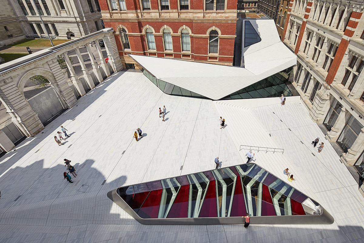
Amanda Levete's firm AL_A has completed a new underground gallery and courtyard at the Victoria and Albert Museum (V&A) - the entrance of the Sackler Courtyard was entirely made of 11,000 porcelain tiles by hand. The new entrance bears the mark of the craftsman through subtle variations of shape that gives each its own unique character. AL_A's new public space is conceived as the "world’s first porcelain courtyard." The Sackler Courtyard opens to the public today.
Stirling Prize-winning architect Amanda Levete's firm AL_A was commissioned to design the Exhibition Road Quarter in 2011 following an international competition. The studio's approach inextricably links the new spaces to the historic V&A and maximises the usable area of both the gallery and the courtyard, requiring excavation beneath and the underpinning of an entire wing of the V&A’s Grade I listed buildings.
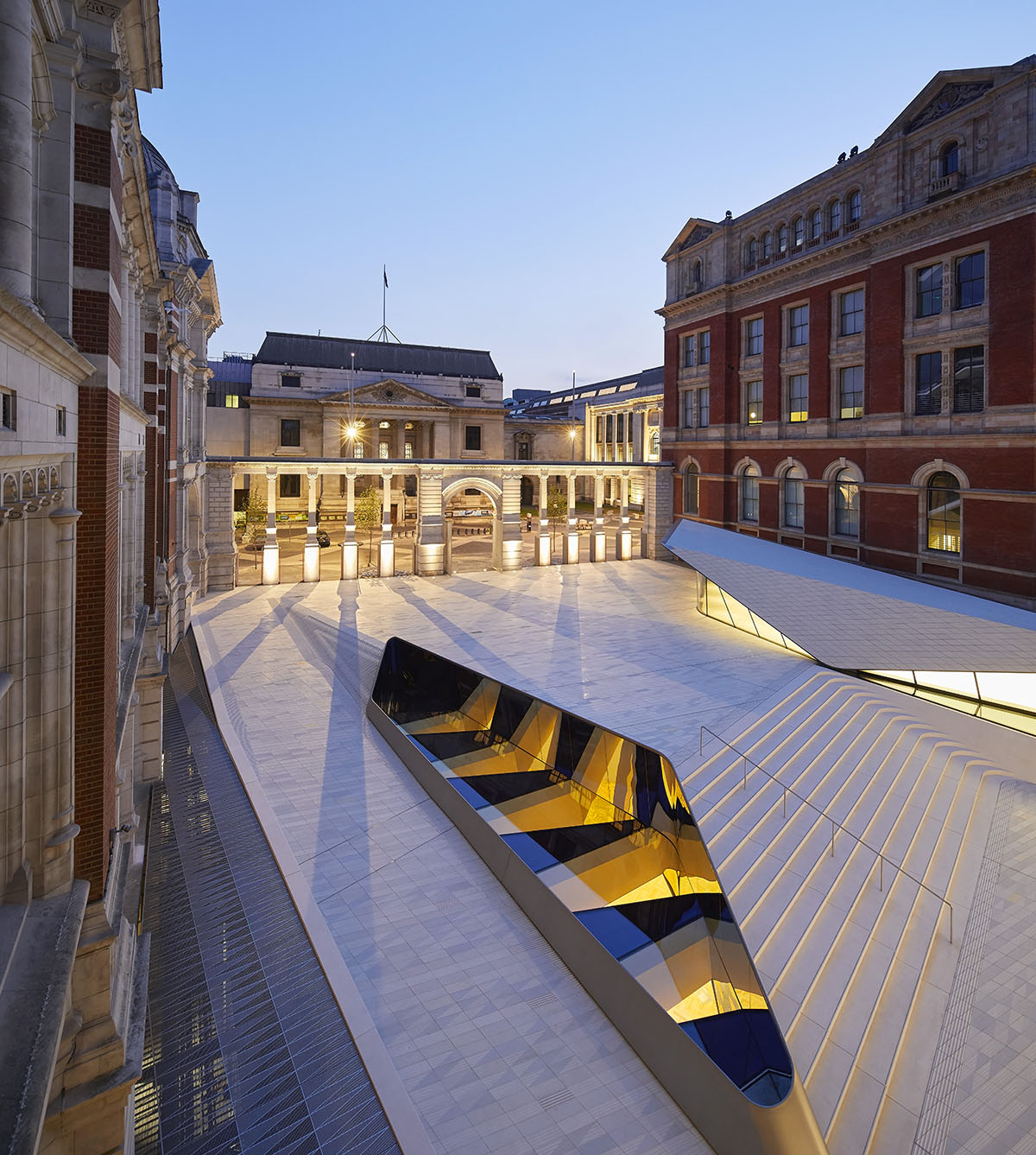
The Sackler Courtyard at the V&A Exhibition Road Quarter
AL_A created a vast new gallery space, is hidden below ground. AL_A wanted to reflect "the visible" within "the invisible." The pattern of the courtyard above the gallery is derived from the geometry of the gallery ceiling below, and the ceiling in turn is a response to the structural challenge of spanning 38m uninterrupted.
An oculus brings moments of dramatic daylight into the gallery and, conceiving it as a museum vitrine, it allows views through the structure to the void below to reveal the gallery ceiling. The didactic mission of the V&A in its celebration of the marriage of arts and crafts with design and industry is made visible in the creation of the world’s first porcelain courtyard.
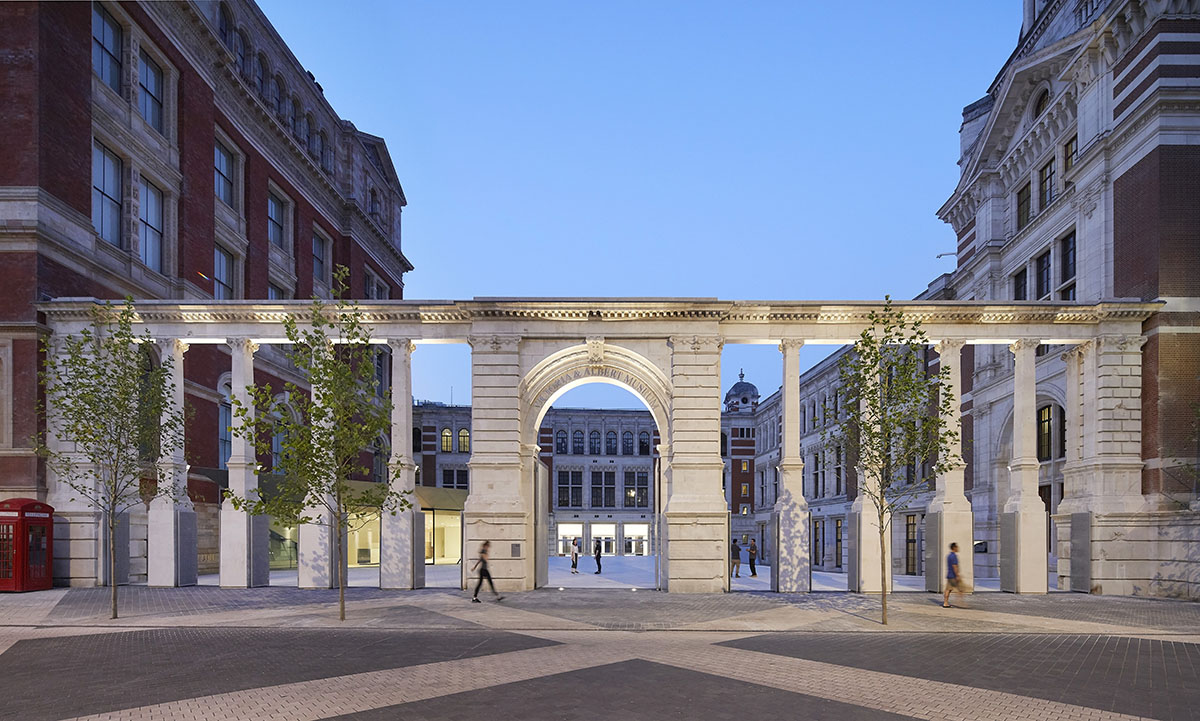
The Aston Webb Screen at the V&A Exhibition Road Quarter
The studio used 15 different types of tiles which combine to produce a colour field to express a pattern that reveals the hidden 256-tonne structure of the fourteen steel trusses that form the gallery ceiling and support the courtyard. The glaze was inspired by the Qingbai ware ceramics held in the V&A collection, with grooves below the surface of the tile holding the translucent glaze.
The £54.5-budgeted scheme involves the design of the Sainsbury Gallery, which provides a flexible, 1,100 square-metre column-free exhibition gallery that provides the V&A with a purpose-built space for its world-leading programme of temporary exhibitions and the design of the Sackler Courtyard - which is the world's first porcelain public courtyard.
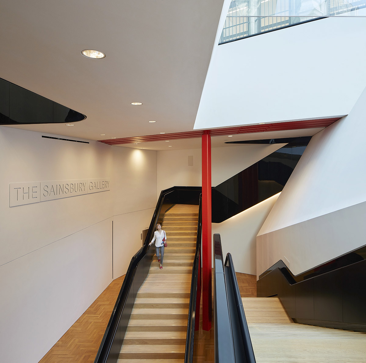
Descending staircase at the V&A Exhibition Road Quarter
AL_A's transformation project also includes the design of the Blavatnik Hall - a new entrance into the V&A from Exhibition Road, which transforms how visitors experience and discover the Museum and its collections and the design of the Aston Webb Screen - visitors will now enter the V&A from the street through the 11 openings of newly created colonnade formed from the 1909 Aston Webb Screen.
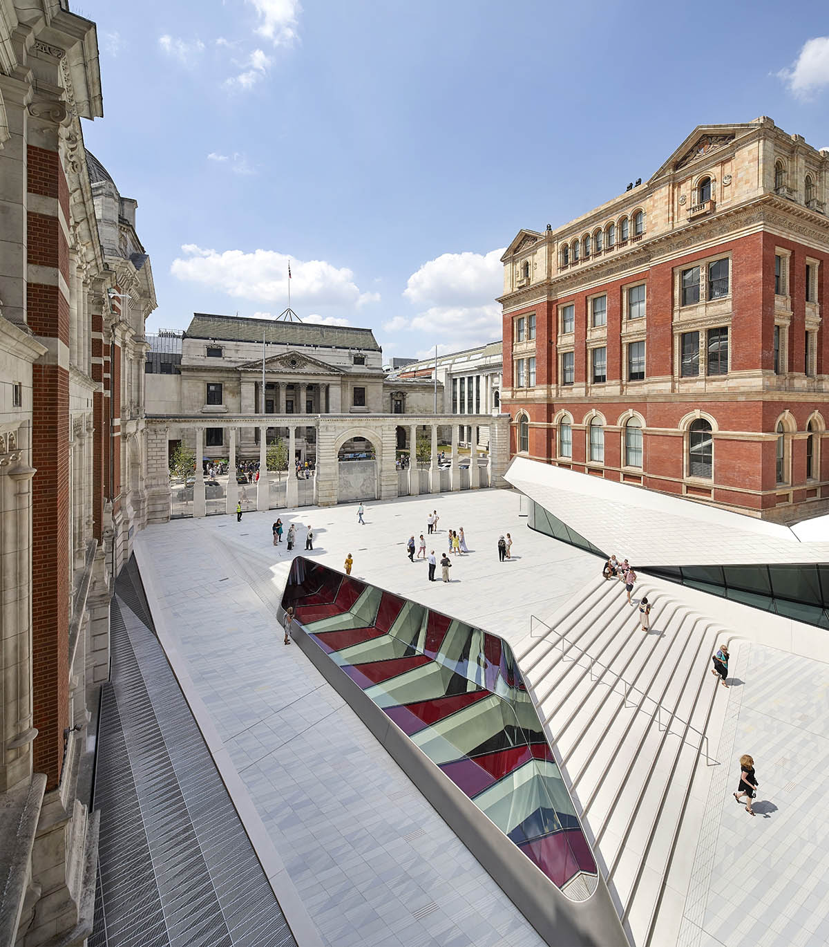
The Sackler Courtyard and Cafe at the V&A Exhibition Road Quarter
"The Exhibition Road Quarter is a reflection of the pioneering identity of the V&A and continues its mission of innovation into the twenty-first century," said Amanda Levete.
"We have reframed the relationship between Exhibition Road and the Museum, creating a less formal, more public place that is as much of the street as it is of the Museum. It will attract and welcome in new audiences, making ideas of accessibility and democracy very explicit. This Quarter reimagines the museum as an urban project. The new courtyard creates an exceptional place for London – a destination for installations, events and, above all, for appropriation by the public."
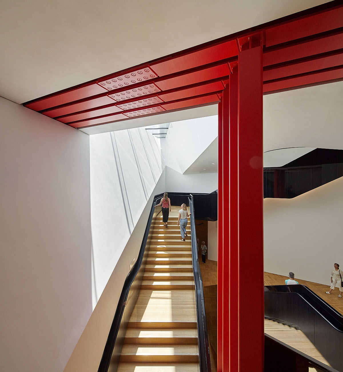
Ascending staircase at the V&A Exhibition Road Quarter
"Our design was born from a deep engagement with the heritage, architecture and collections of the V&A. An understanding of the mission of the Museum and its collection led to our ambition of “making visible the invisible” played out in the design through large moves and small details alike," added the architect.
Resurrecting Aston Webb’s original intentions for a permeable colonnade, alterations were made to the Grade I listed Aston Webb Screen as it no longer serves to hide but to reveal, making it easy for people to drift in off Exhibition Road and into the Sackler Courtyard. Despite opening up the Screen, the entrance to the Museum has to be closed at night.

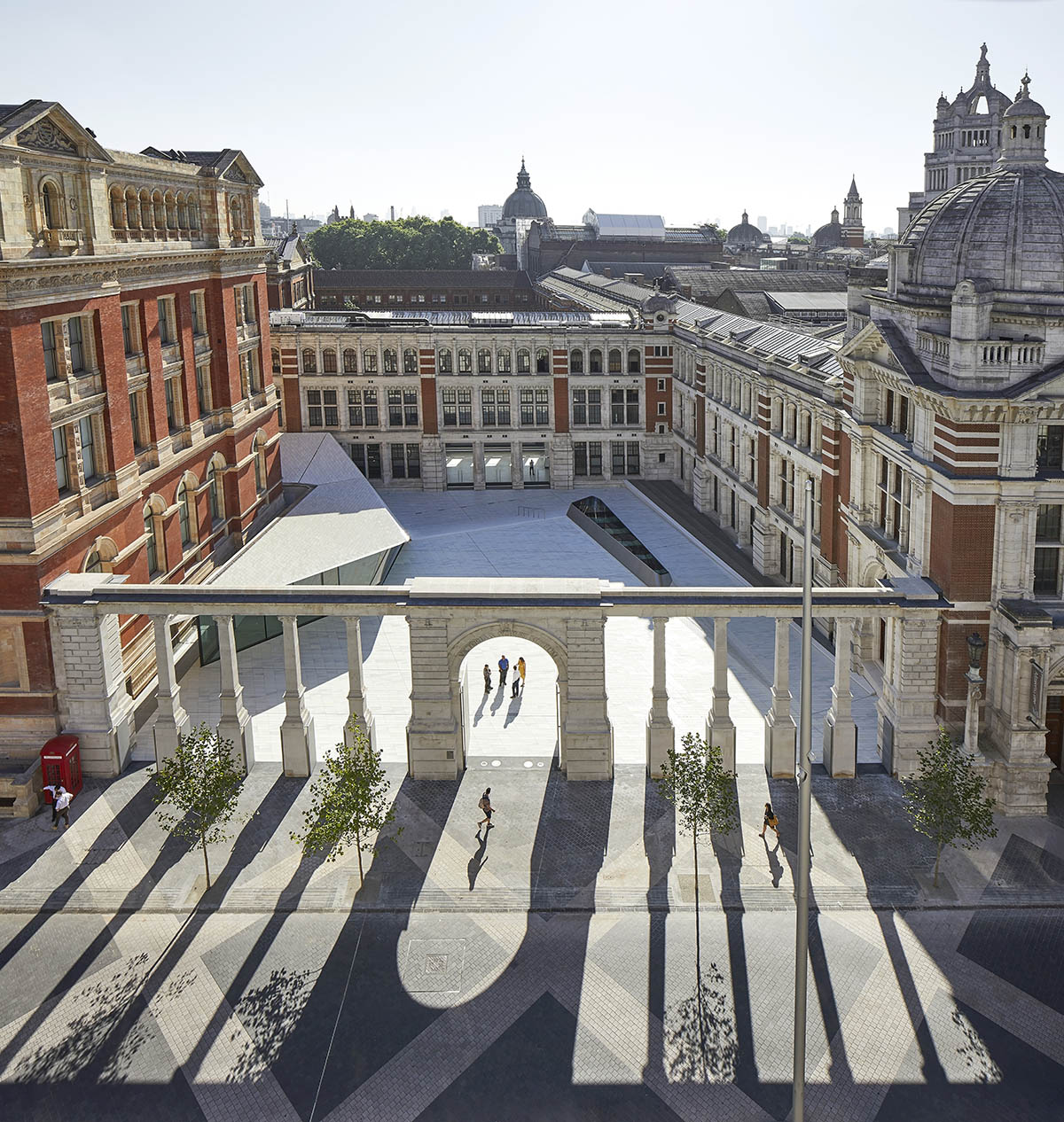 V&A Exhibition Road Quarter
AL_A found significance in the living history of the Museum fabric and the Screen’s stonework that retains the physical scars that World War II inflicted on the Museum. New perforated gates have been manufactured that reference the absence of the stonework we have removed from the Screen, becoming a beautiful way of mapping the imprint of shrapnel damage. The gates resolve the paradox of resilience and permeability, memorialising the past as well as celebrating the future.
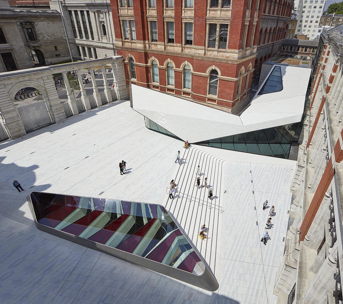
The Sackler Courtyard at the V&A Exhibition Road Quarter
The Sackler Courtyard reveals, on all four sides, architecturally significant façades that had previously been hidden, including the sgraffito façade on the Henry Cole Wing, which has never been on public view.
The café roof is covered in a further 4,300 handmade porcelain tiles and will be furnished with the 8mm Chair designed especially for the V&A by AL_A. The gates to the courtyard and the café will be open from 8.30am to encourage people to stop for coffee on their way to work or study or as they wait to enter the Museum.
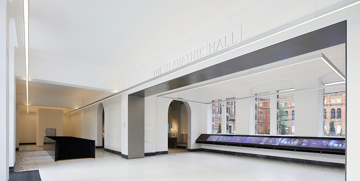
The Blavatnik Hall at the V&A Exhibition Road Quarter
"We have used the Exhibition Road project to tell the story of the V&A. We reflect its values, its commitment to daring and innovation, and the continuation of the radical. There is no other institution that would be quite so audacious in its commission, in the blend of the old and new, and in the daring of the construction process to realise it," said Amanda Levete.
"The V&A has collections and a curatorial approach that has made it the world’s leading museum of art and design. It now has a gallery space and state-of-the-art conservation and art handling facilities to match its unrivalled international reputation."
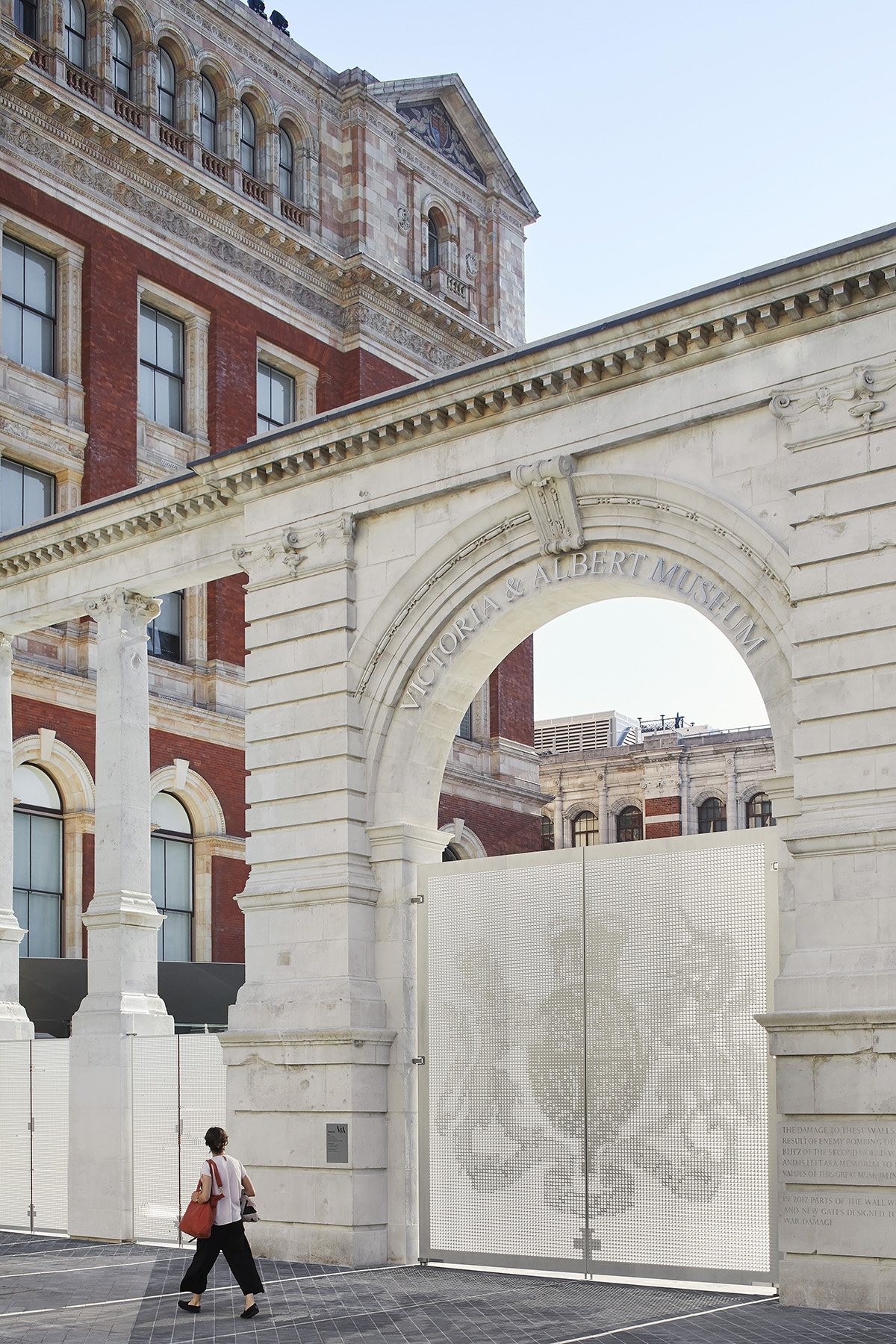
The Aston Webb Screen with gates closed at the V&A Exhibition Road Quarter
Three bays of the Western Range have been cut to create a new entrance to the Blavatnik Hall and the Museum, exposing the elegant profile of the stonework and becoming an eloquent example of the power of revealing more by subtraction than by addition.
The Hall is new entrance space in the existing building and a seamless connection to the V&A, linking to the Ho and Hintze Galleries and with views through to the heart of the V&A, the Madejski Gardens. The new entrance sequence gives visitors an intuitive understanding of the Museum, bringing them to more places and to discover more of the collections.
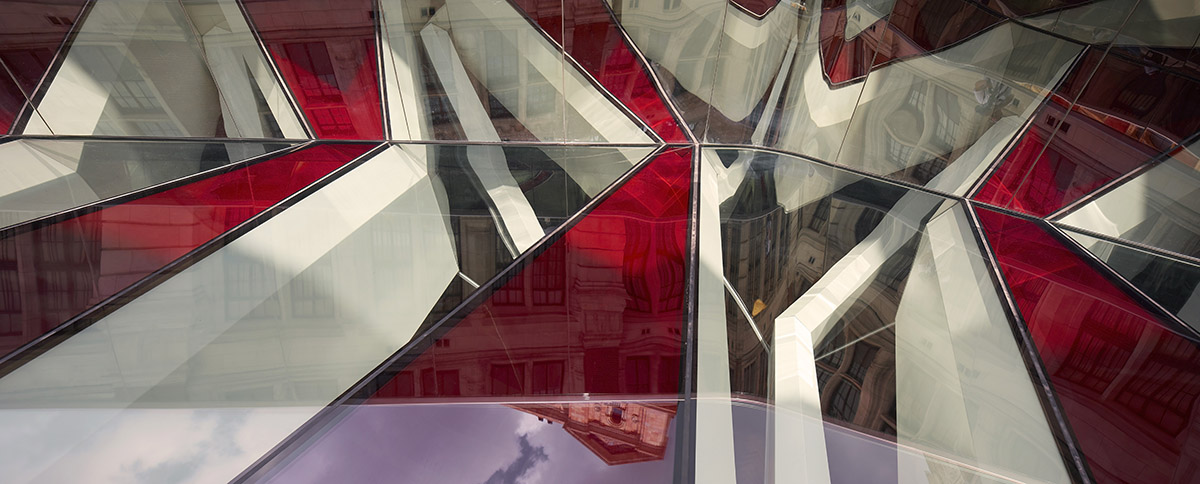
The Oculus at the V&A Exhibition Road Quarter
The descent to the gallery is celebrated as an important part of the visitor’s journey, woven into the historic fabric of the Museum. Visitors are drawn down by natural light, lessening until reaching the bottom where an uplifting pool of daylight appears, seemingly magically so far below ground.
Descent and ascent have been kept separate, designed with a specific focus on the theatre of the journey and the interplay between new and old – and to ensure that visitors only exit, not enter, through the shop. Framed views of the Henry Cole Wing and the Aston Webb Building give visitors an understanding of where they have come from and where they are in relation to the rest of the Museum.
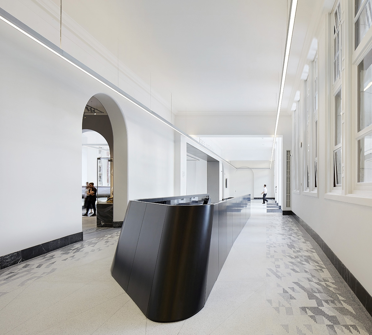
The Blavatnik Hall at the V&A Exhibition Road Quarter
The Sainsbury Gallery is a 1,100 square-metre column free, hyper-flexible exhibition space that sits above two further floors of dedicated art handling, conservation and preparation space.
This will become the engine room of the V&A’s internationally-acclaimed programme of temporary exhibitions, allowing curators to realise their creative ambitions and giving the V&A unparalleled facilities to help it secure the loan of the most delicate and valuable artefacts.
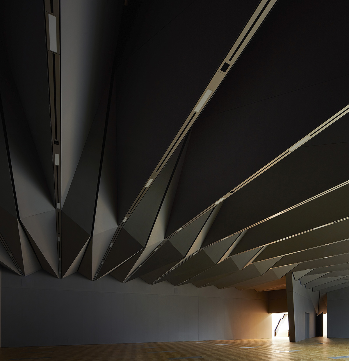
The Sainsbury Gallery at The V&A Exhibition Road Quarter
The character of the Sainsbury Gallery is born from the history and spirit of the Museum. The expression of the ceiling is derived entirely from is structural function of spanning 38m uninterrupted and soars up to 10.5m over the visitor despite being beneath the courtyard. This expression follows in the neo-Gothic and neo-Classic museological tradition of ornate ceilings at the V&A.

The Henry Cole Wing and café at the V&A Exhibition Road Quarter
The Exhibition Road Quarter scheme is an engineering feat with extraordinarily challenging structural works, all carried out while the Museum remained fully accessible to the public.
The project and its subterranean gallery 18m below the courtyard necessitated piling almost 50m down within 1m of a Grade I Listed building and underpinning a wing of the V&A and its collection while the Museum was fully operational.
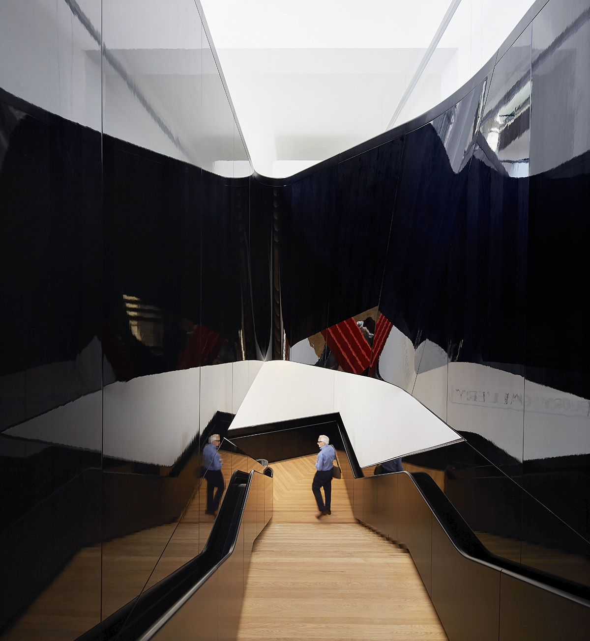
Descending staircase at the V&A Exhibition Road Quarter
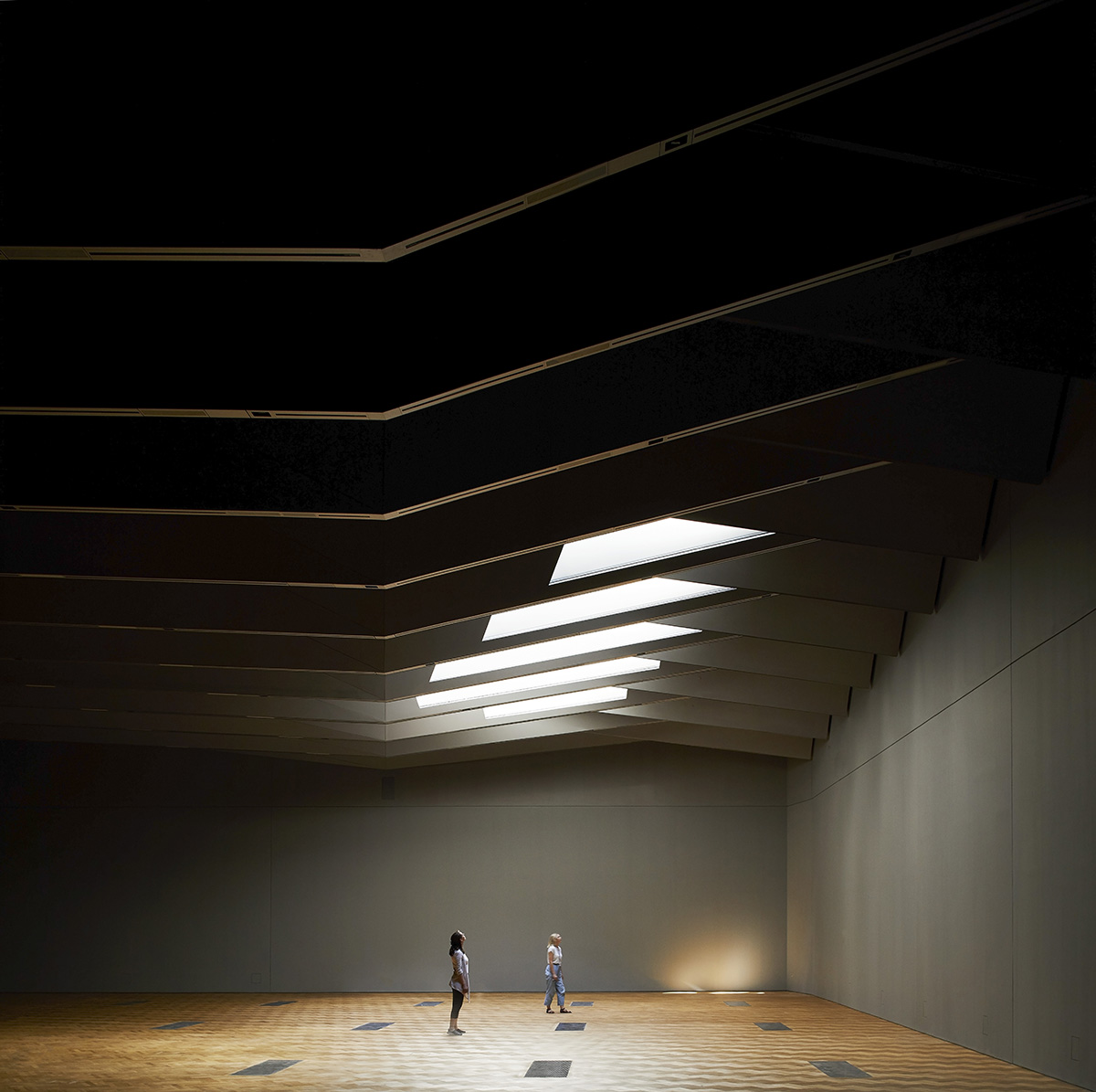
The Sainsbury Gallery at the V&A Exhibition Road Quarter
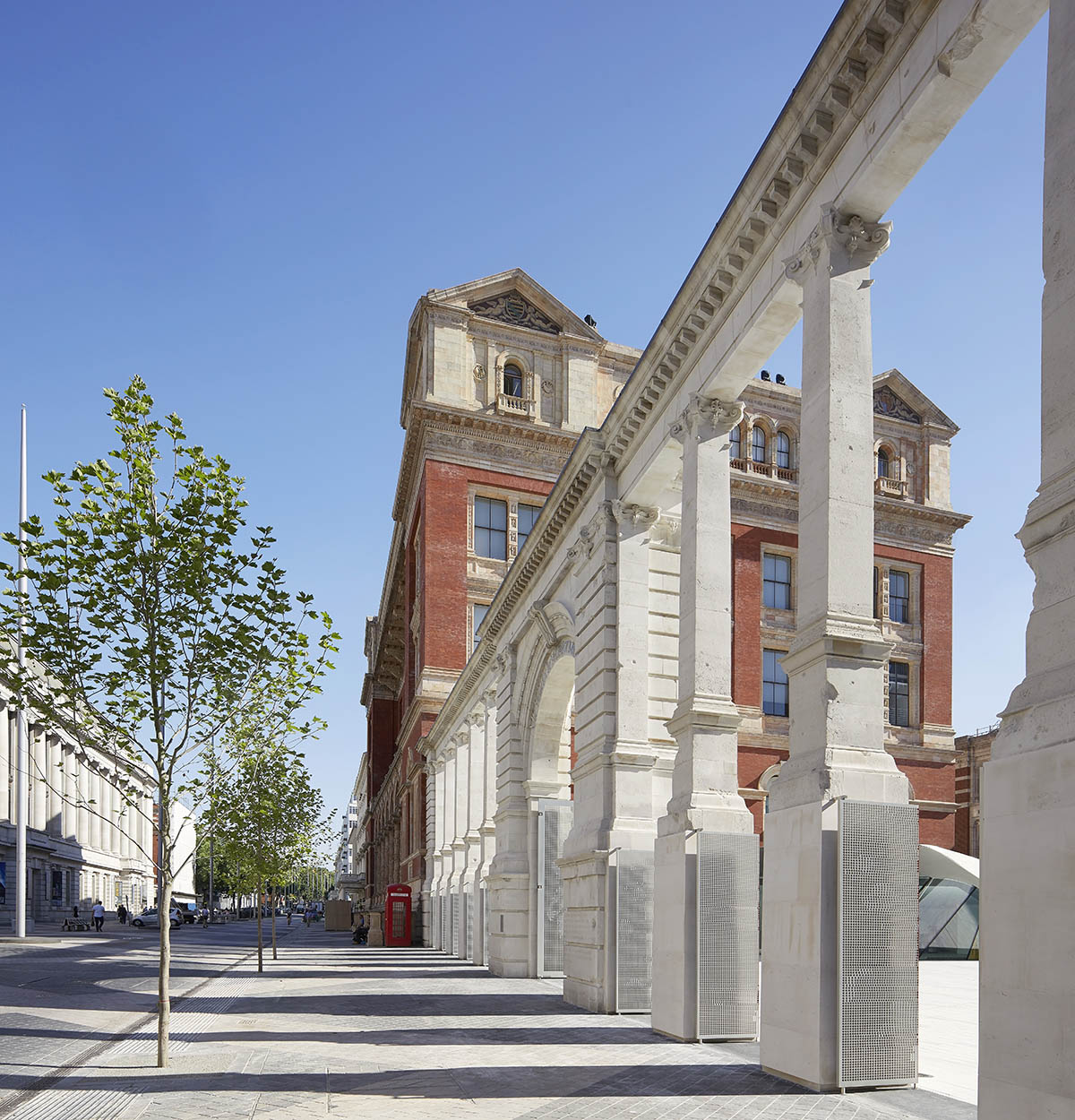
The Aston Webb Screen at the V&A Exhibition Road Quarter
All images © Hufton+Crow