Submitted by WA Contents
Cui Shu designs fully doorless film studio to remove all physical boundaries between old and new
China Architecture News - Jan 11, 2017 - 14:35 15320 views
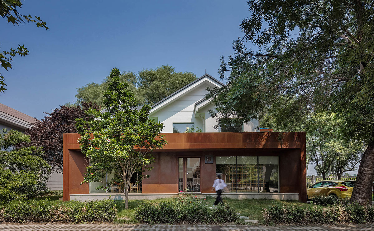
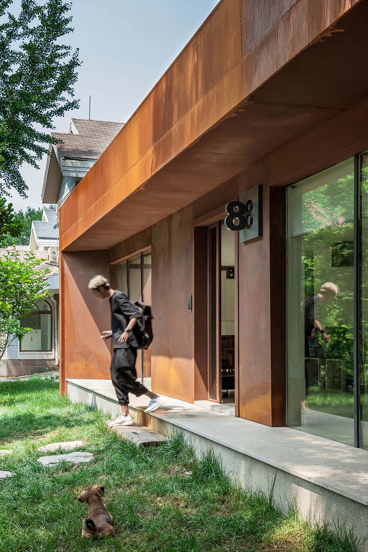
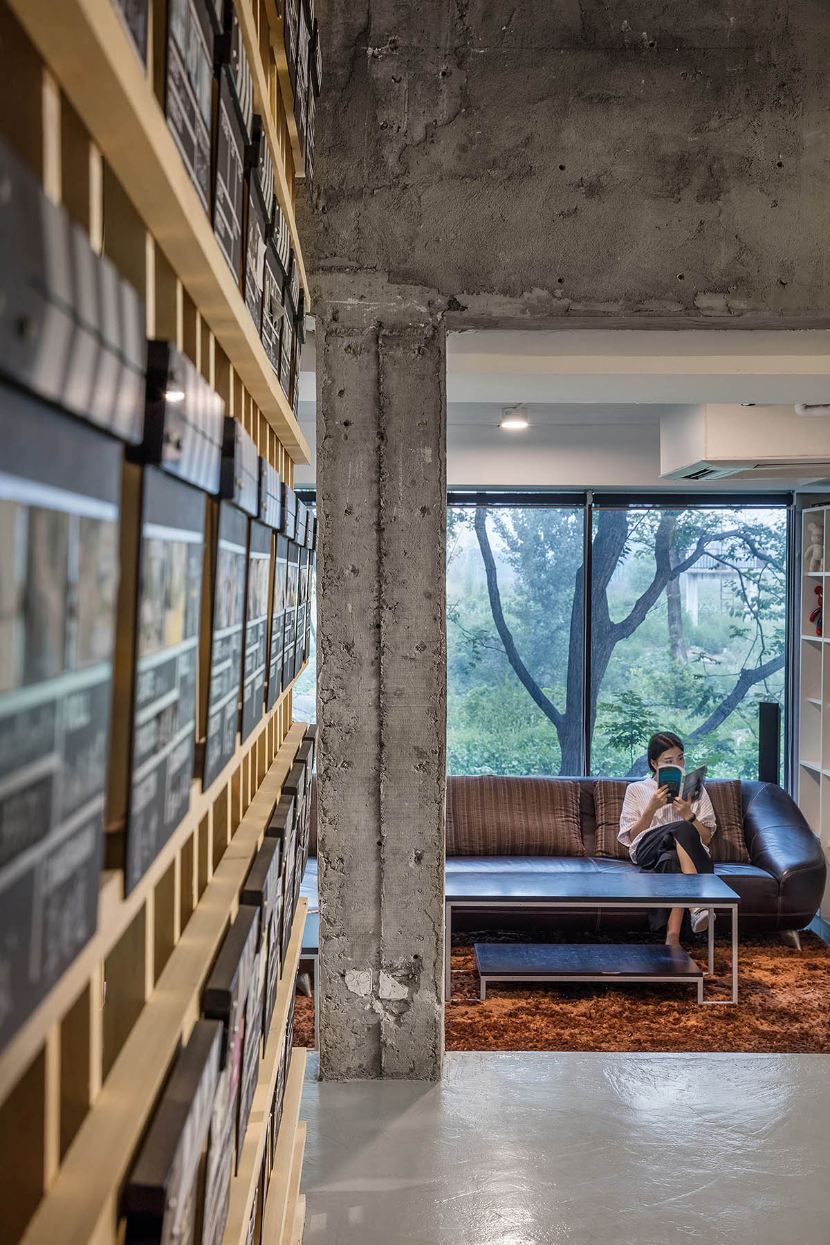
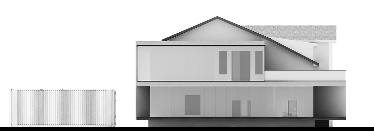
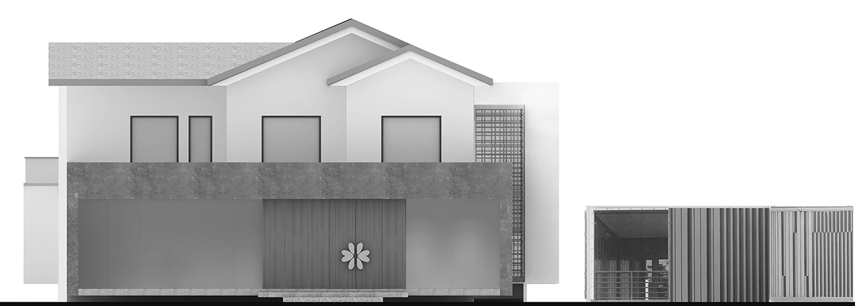
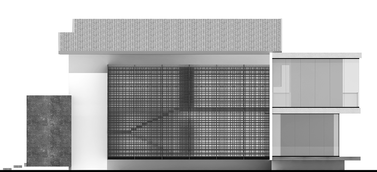
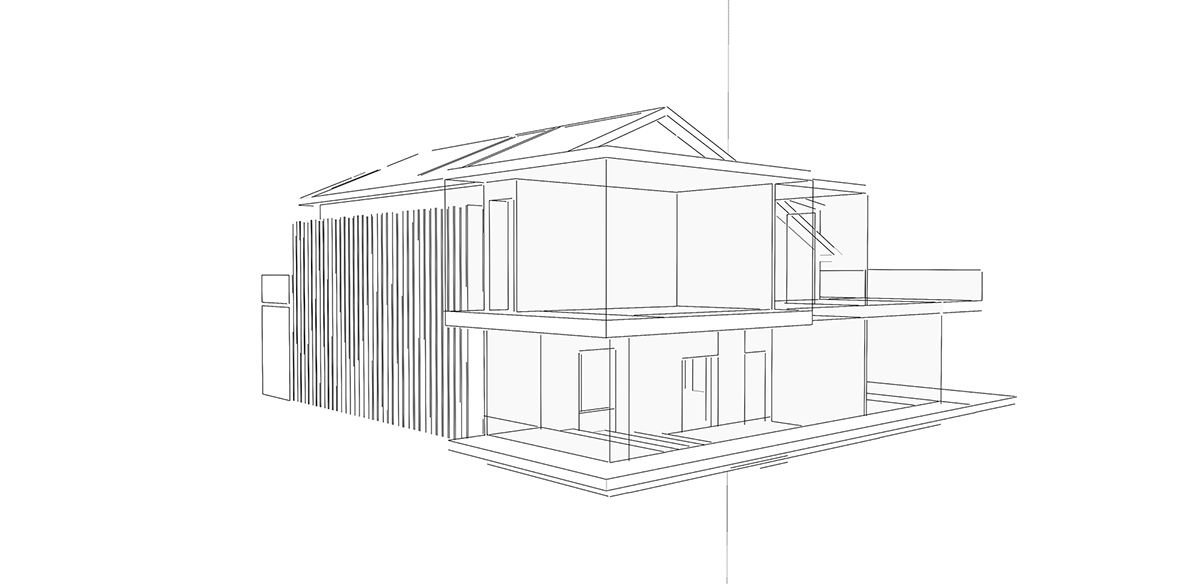
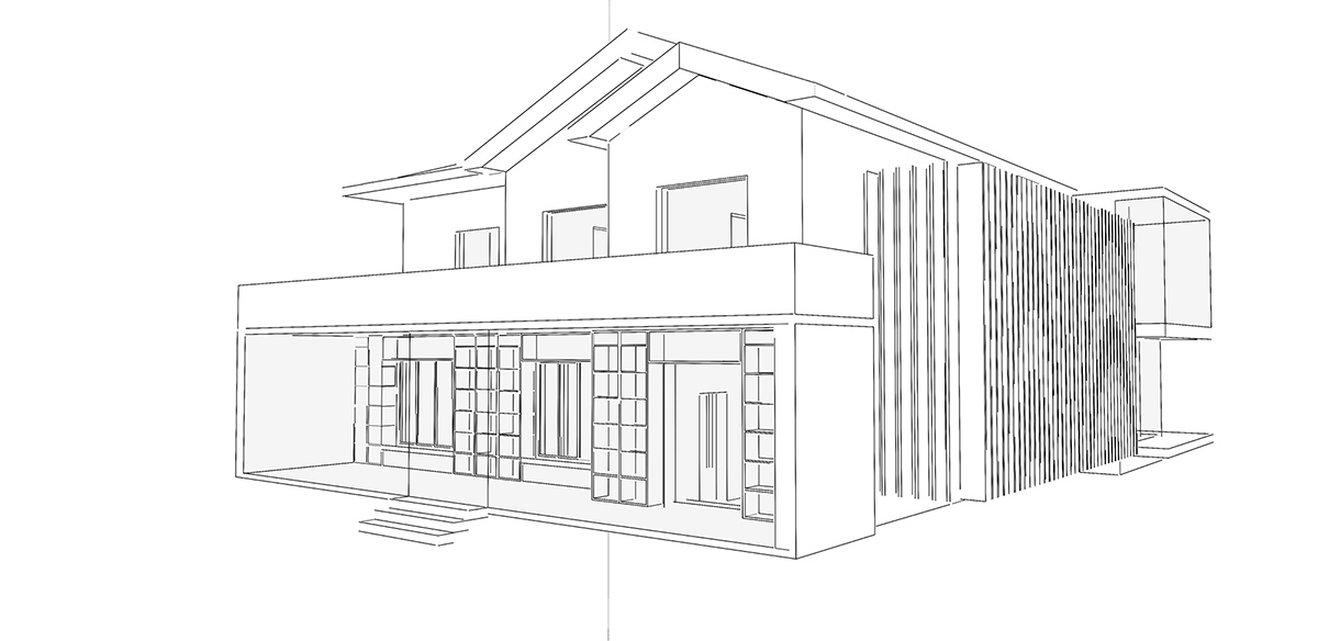
Chinese designer Cui Shu, founder of Cun-Design, designed a doorless office design for Blue Moon Films, which can be conceived as soft transition between space and time. Cun-Design renovated the 1990s building with a fresh, contemporary look by retaining its original structure the same.
''Many new landmark buildings have been constructed with the urbanization of China. However, old buildings are rather overlooked in modern era. It is time to slow down, and reevaluate what contributes to the rebirth of buildings,'' said the designer.
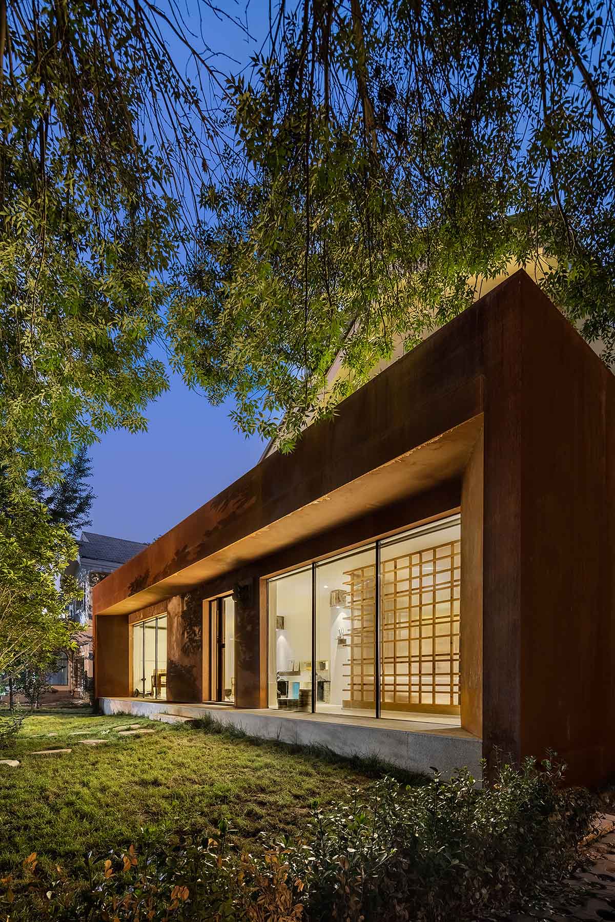
This mansion located on the bank of Wen-Yu River of east Beijing. It is flattering to call it a mansion. The whole building was constructed at the end of 1990s, and had been left much broken now. The building is old not only in its design but also the construction, structure and internal functions. Architectural design in old times obeys to a set form; function layout of a residential building must be in accordance with characteristics of that era, yet such characteristics are not up-to-date.
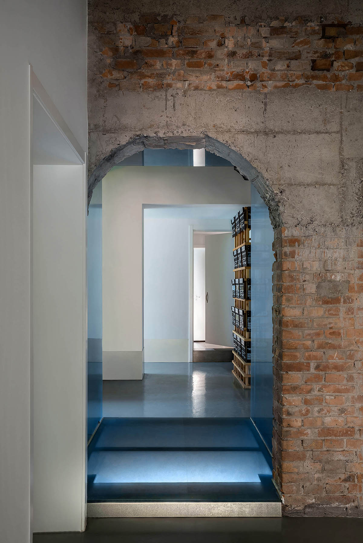
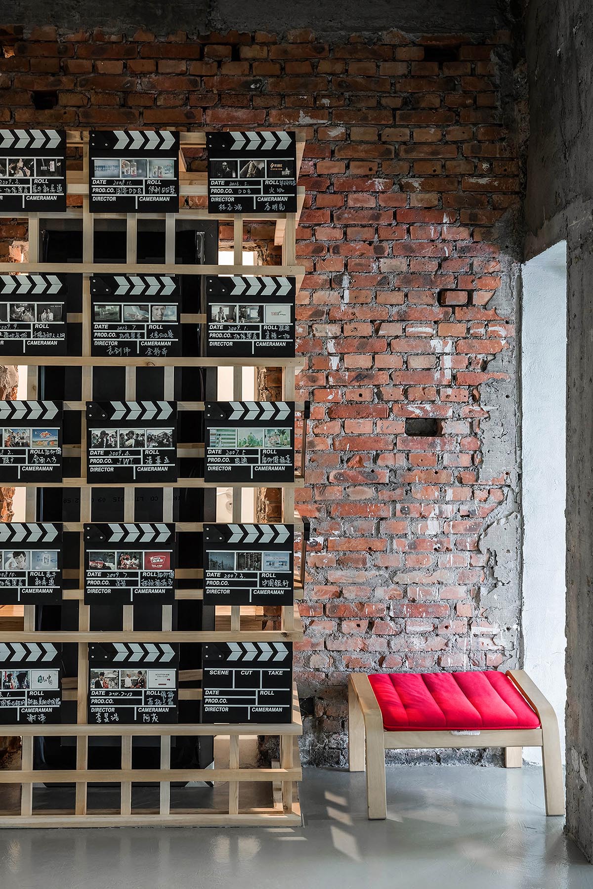
They fit for the way of life of those days but not for current times. The studio's first impression on this house is that it is out of tune with today’s people and their way of living. Cui Shu maintained its original structure during the renovation, and formed a contrasting boundary between old and new within the project.
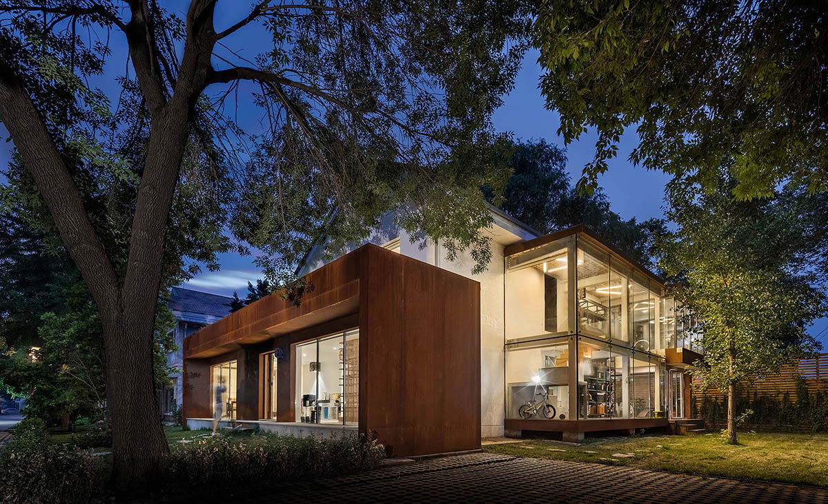
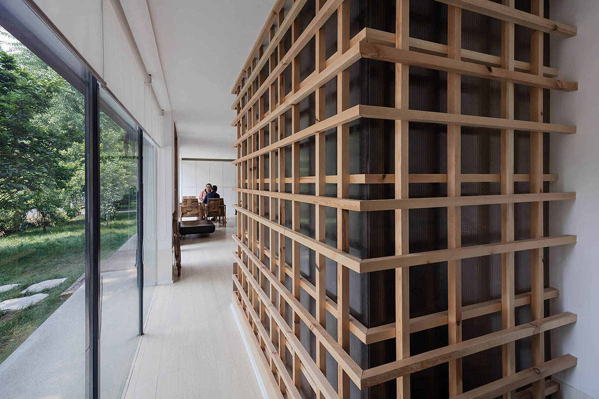
While highlighting relationship between indoor space and outdoor courtyards, the designer takes full use of the finely cut single sided connection to maximize the use of space, in this way, original structure of this old building has been fully retained.
With open courtyard, plants, lighting and shadows, the design integrates indoor space with outdoor space and make the space return to its original nature. An intimate, easy-accepted and low profile space is thus created.
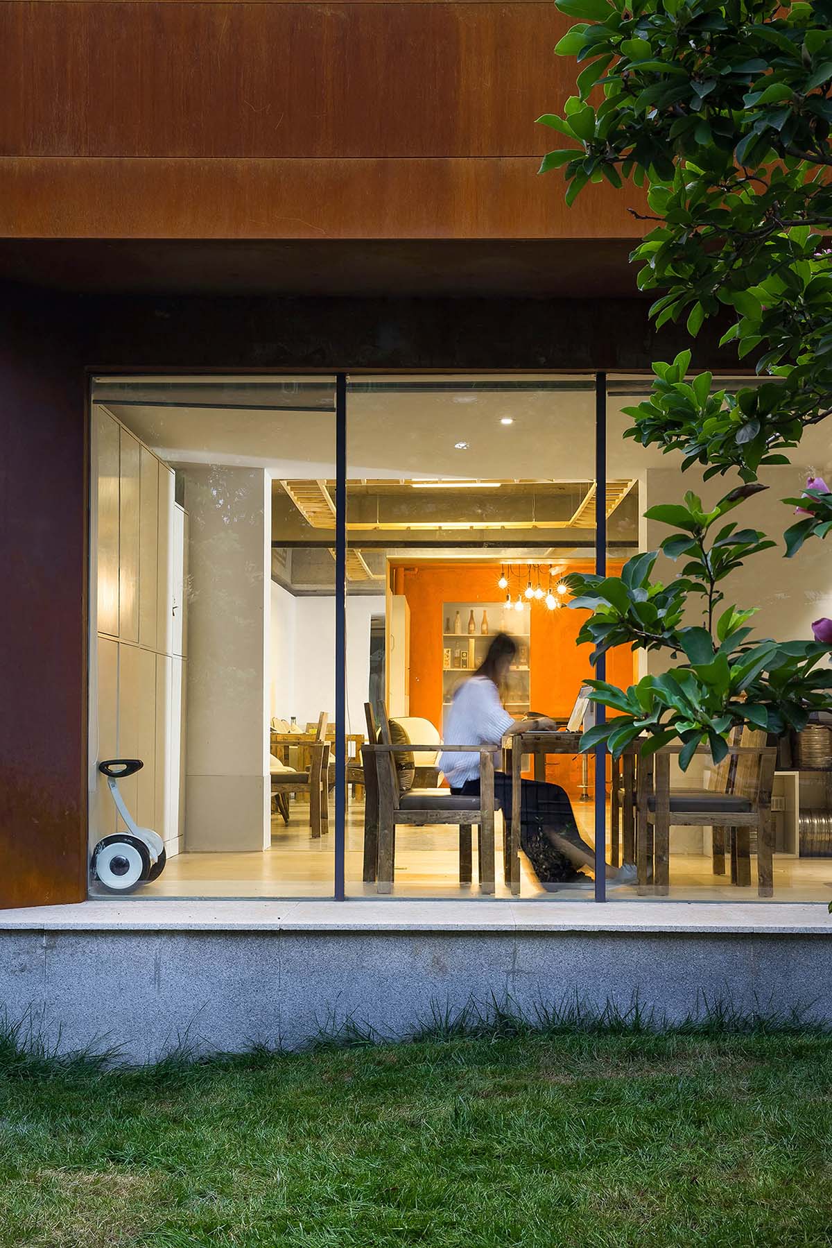
The biggest problem we encounter with is the interior space is too old. When interior heat preservation is removed, red brick structure of the era when the building’s built was exposed, and the layout looks very small.
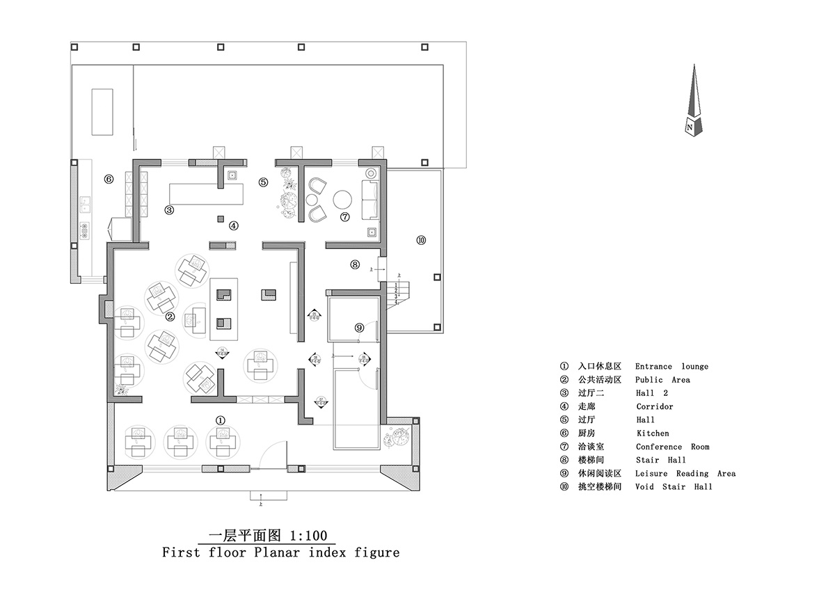
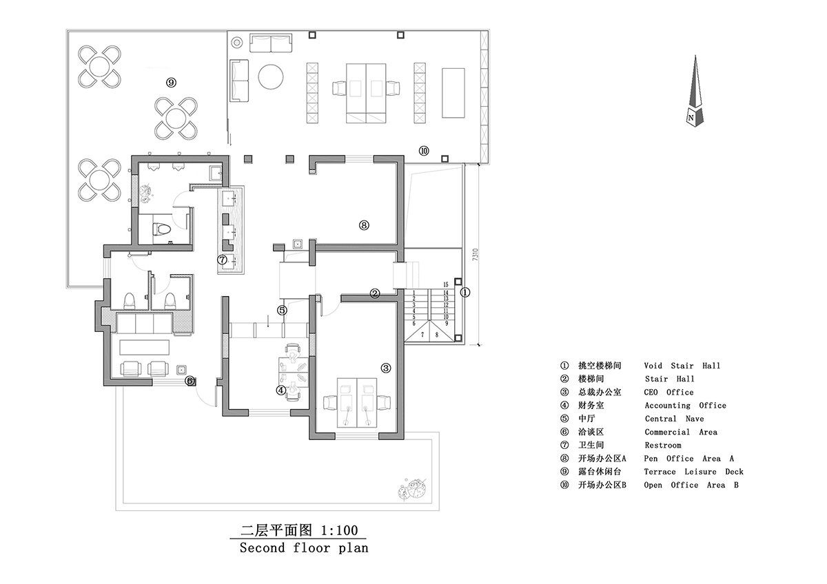
The design studio then come up with an idea to connect all the rooms and remove all removable walls, and make sure no doors is placed between spaces. All windowsills are demolished and turned into exits, in this way the indoor space is accessible through side corridor for all stuffs.
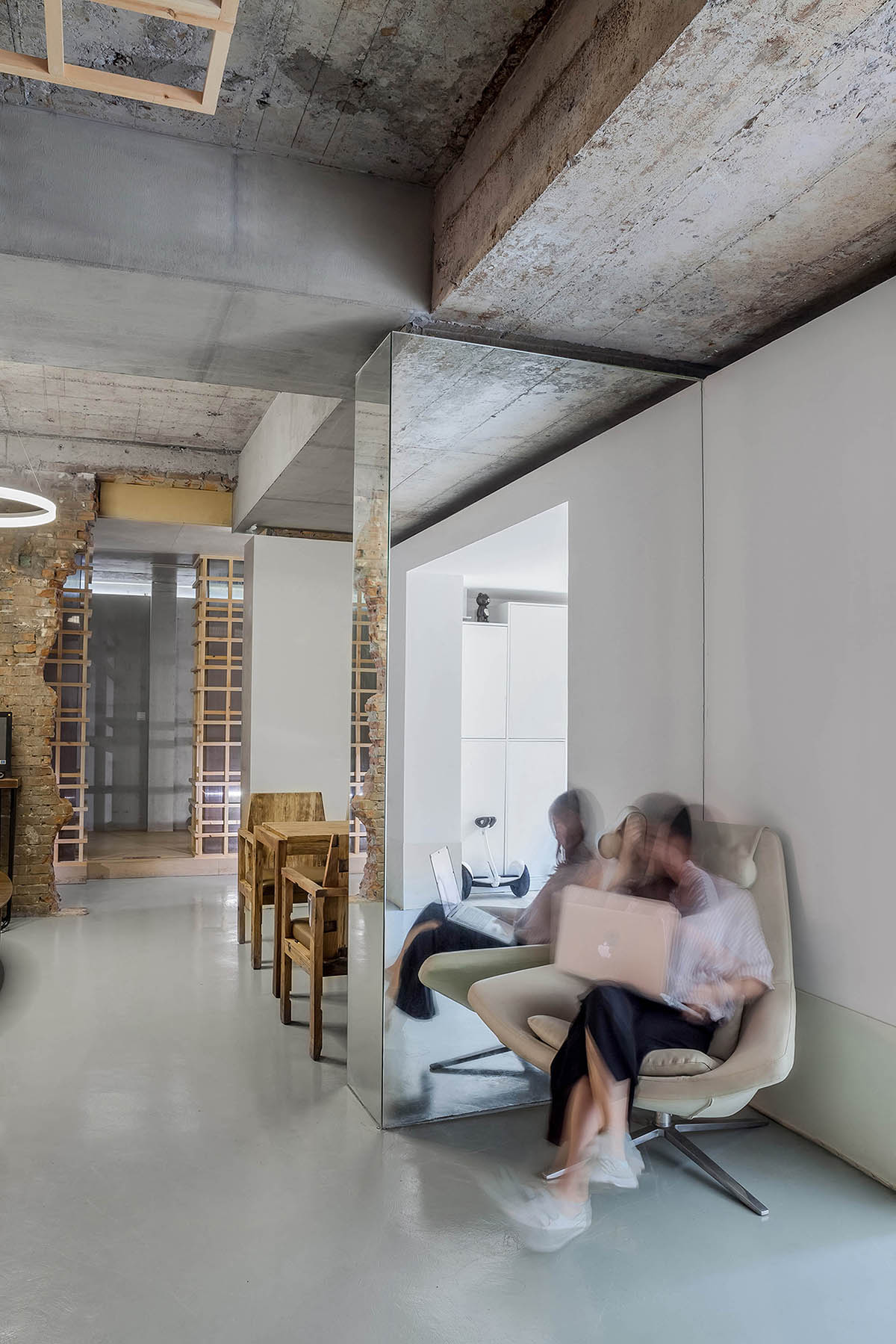
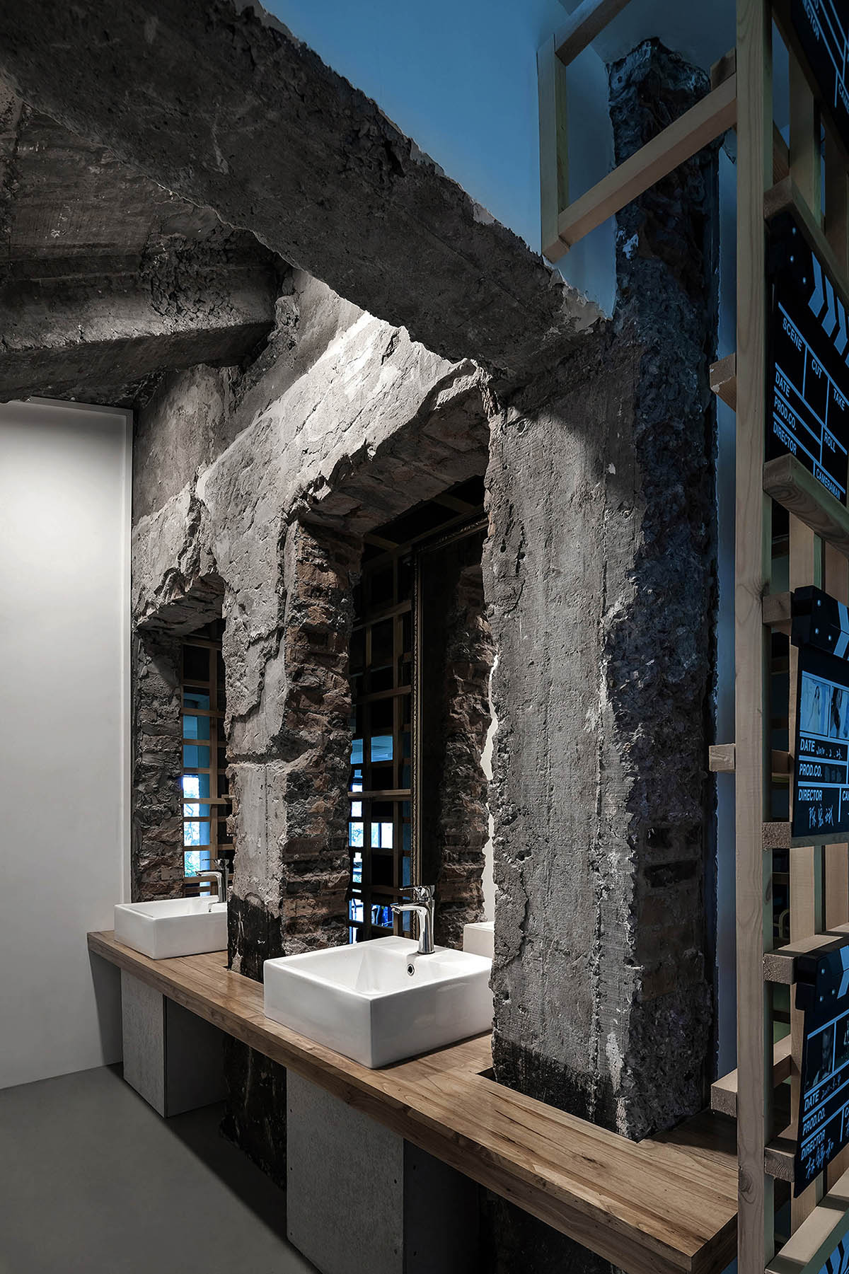
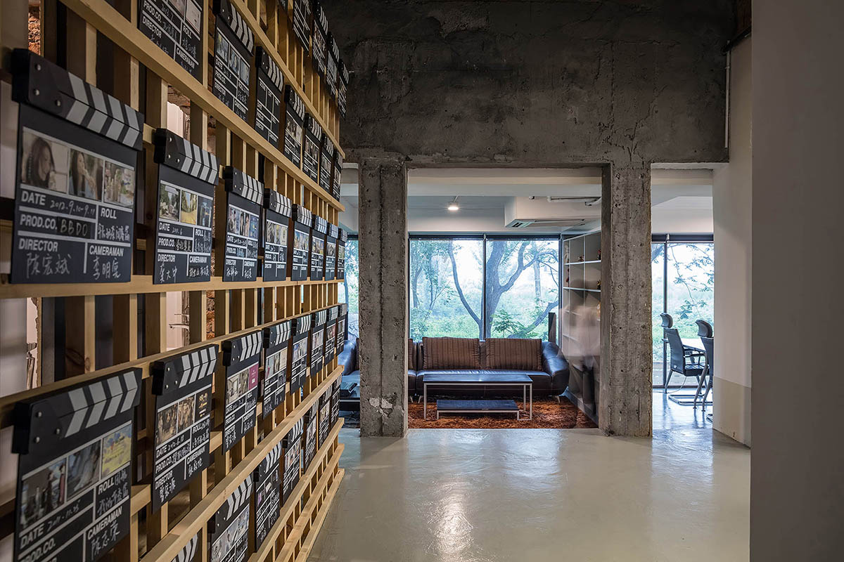
''We believe that an “empty” space is not empty and lack of character, on the contrary, it makes it possible for us to illustrate this space more truly and clearly, and to avoid getting a space with unnecessary design elements. On the left of the line between time, there are original buildings of the 90s, while on the right are re-designed buildings, a dialogue between old and new is formed. Mirrors hide the sight of pillars, and lengthen the visual dimension through reflection,'' said the studio.
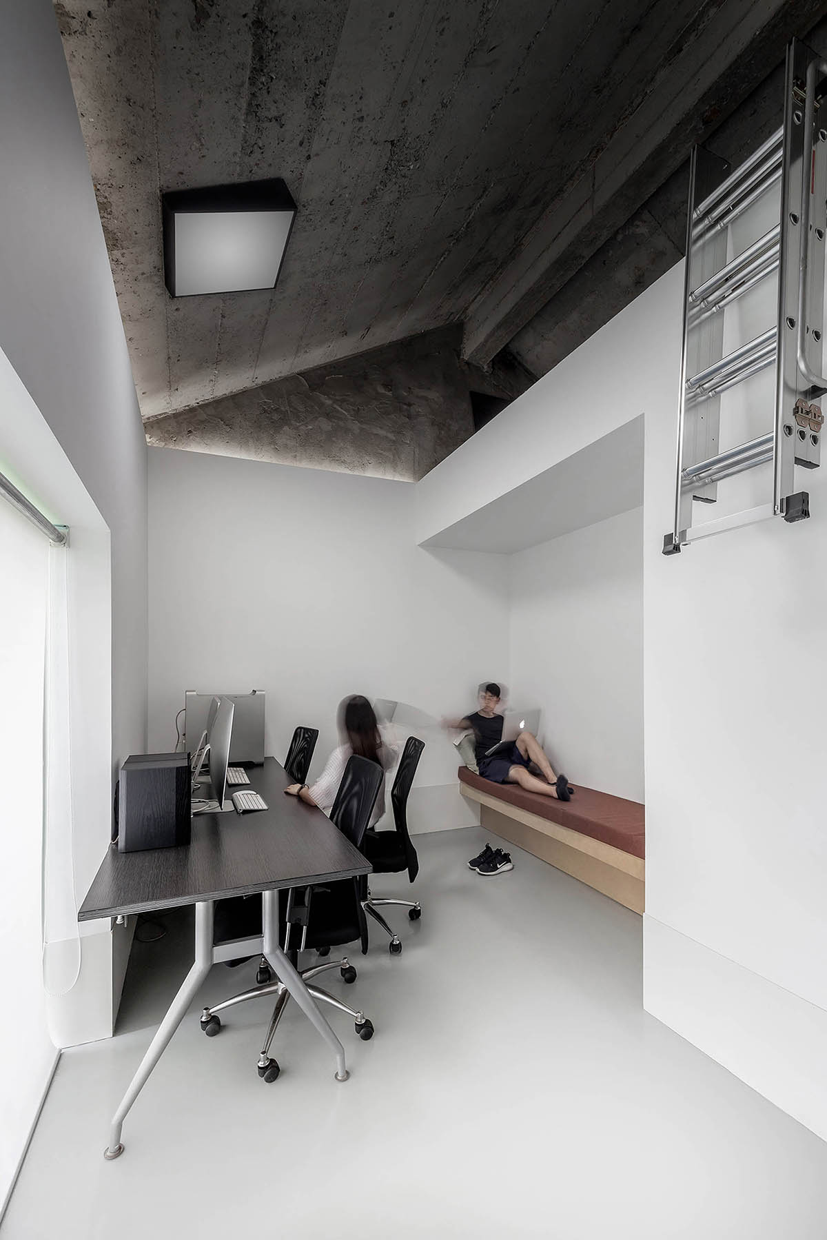
Designers keep a 4cm wide gap on the ceiling, and hide the source of illumination inside. No wire is visible throughout the building. Since the company functions as a studio, their directors need private spaces for rumination.
''We make a few areas with sun blocks, in which one’s action can be hidden from plain sight, helping creators in coming up with new ideas. Bathrooms retain its original rough surface, yet we pushed the sink into the wall, and place the mirror within, in order to create a cavernous sight. We wrap the “cave” with a framework outside it, while being the washbasin, there are projects they even done,'' they added.
An area in orange could be found among the old buildings. While original building is remained to some degree, a sense of broken and old will be shown. So Cun-Design adds color orange which represents the color of their logo.
What strong color contrast reflects is the passion of a film team. The studio removes the original stairs to the outside of the building and build glass box corridor in the original place and gets rest area and main bedroom connected, so the contrast between new and old creates a kind of beauty naturally.
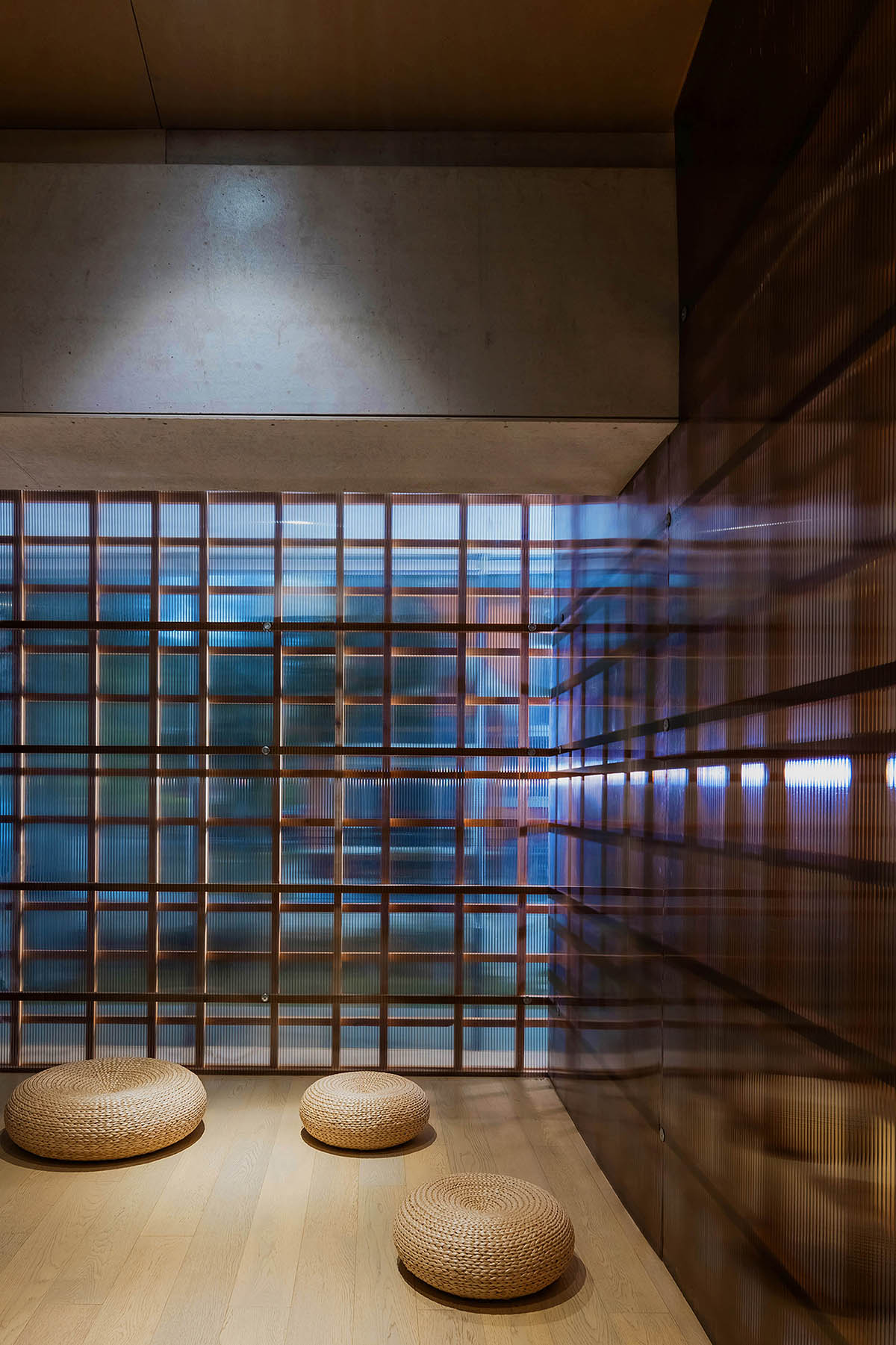
The studio should be a place where people are closely related with space, and the create ecological environment should contain traditional history and modern life. If design serves demands, it would contain a kind of beauty, and would exist forever carrying this kind of beauty.
''In other words, a good space designer is a builder of space quality. The best works are those in which a designer makes every visitor of the space perceived his feeling in his own way. In a good design, space and people should have a harmonious relationship. Techniques serve design and design should not be just about technique and superficial things,'' the designers added.
Project facts
Chief Designer: Cui Shu
Design Company: Cun-Design
Location: The 8th mansion, Yujin Garden, Tongzhou District, Beijing, China
Function: Office
Designing period: 2015
Finishing time: 2016.04
Area: 500m2
All images © Wang Ting, Wang Jin
> via Cun-Design