Submitted by WA Contents
Waterfrom Design's art space features flowing walls to create "intuitive experience"
China Architecture News - Mar 08, 2019 - 03:35 22713 views
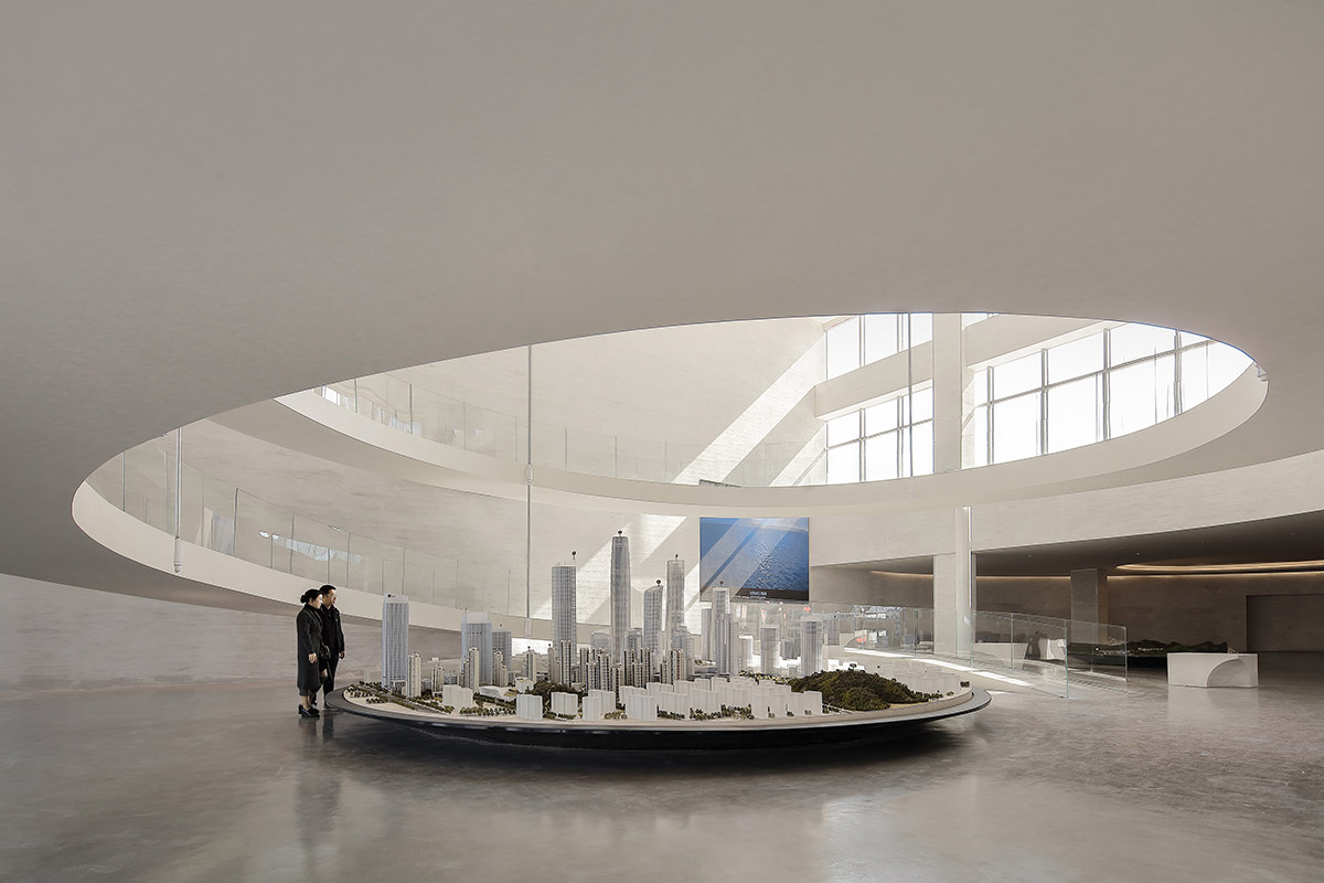
Taipei and Shanghai-based architecture practice Waterfrom Design has completed the interior of a new exhibition space in Jinan, China. Named Jinan Landmark Marketing Center, the interior space is made of flowing walls and smooth surfaces to create an "intuitive experience" inside for visitors.
Located in Jinan, China, the architects are inspired by the springs of Jinan city since the city is well known with its landscape of lakes, water and also a source of cultural enrichment. The starting point of design produces a spatial pattern and hopes to interpret the fluent posture that the flowing water emerges from the stone crevices, sparkling.
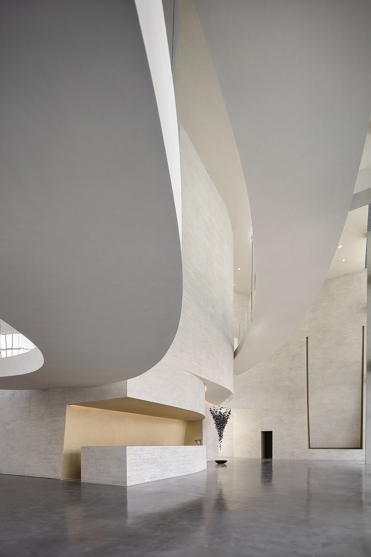
"Meanwhile, with abundant urban landscape culture as the venation, the design of aqueous phase starts from the concept of museums, with the hope that the space created can not only display objects but also bring viewers a pure enjoyment of architectural strength and aesthetic feeling," said Waterfrom Design describing its project.
"The unusual special scale and viewing method make the intuitive experience mix with the exhibits to be interwoven into a unique cultural memory and offer more in-depth field implications."
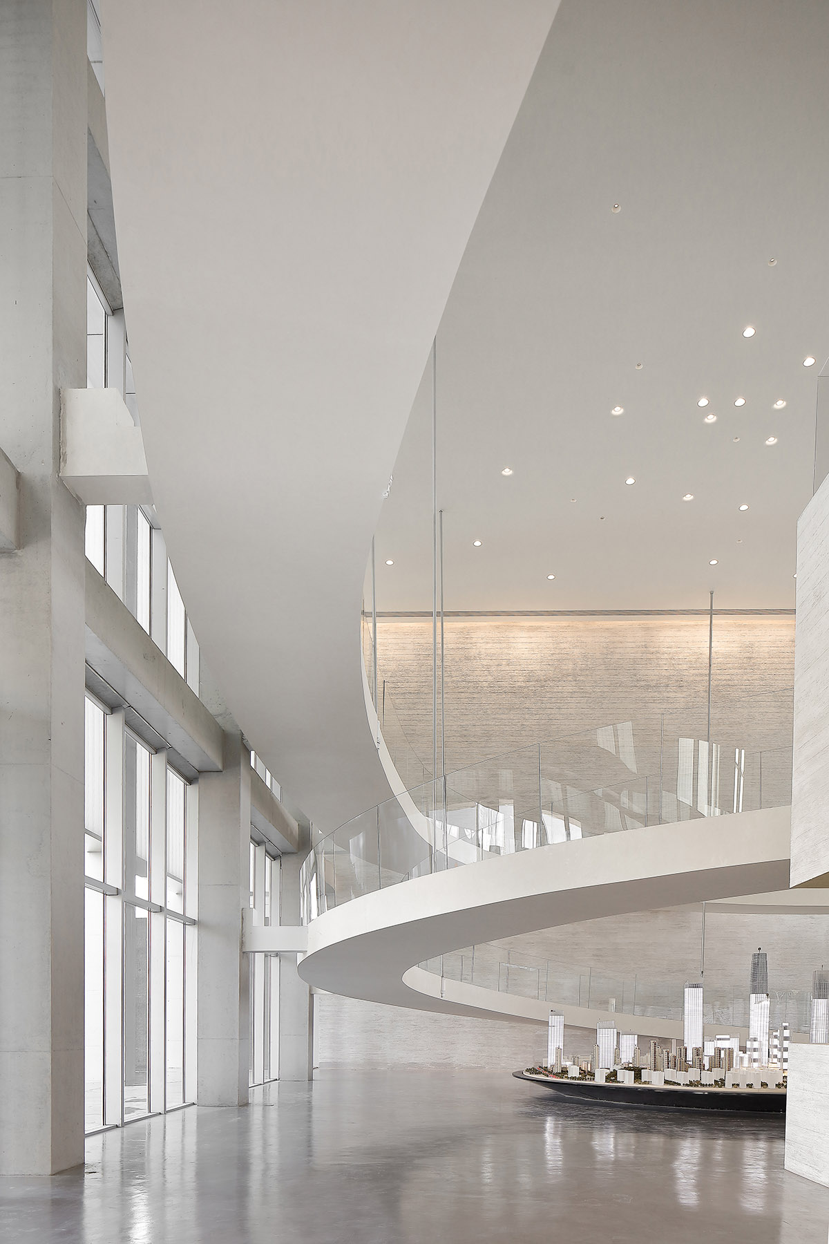
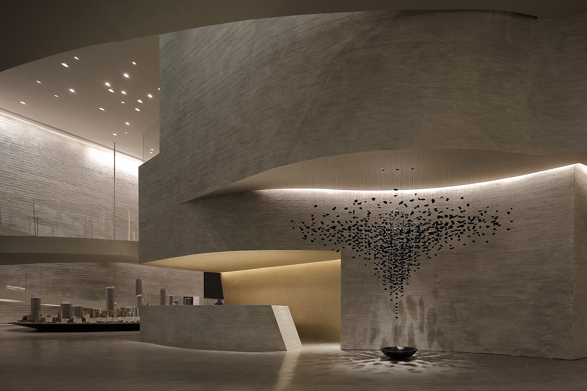
Covering a total of 2,800-square-metre space, the building includes exhibition space, offices and resting spaces. A giant sinuous ramp in the interior dominates the art space and brings all attentions to one point, as well as its sculptural form.
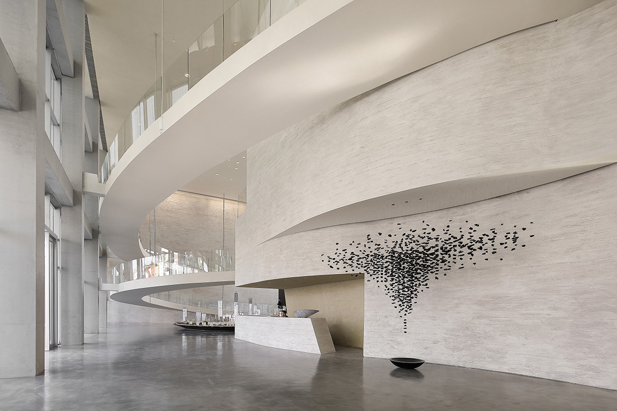
The architects choose "water" as the core, but it is not laid out as specifically as pool water or waterfall. "Instead, we extract the metaphysical and resonant-with-intuition "meaning", hoping that the space is filled with flowing and quiet natural forces, just like when facing the infinite scale of nature, we realize that we are small and will unconsciously slow down our hearts," added the architects.
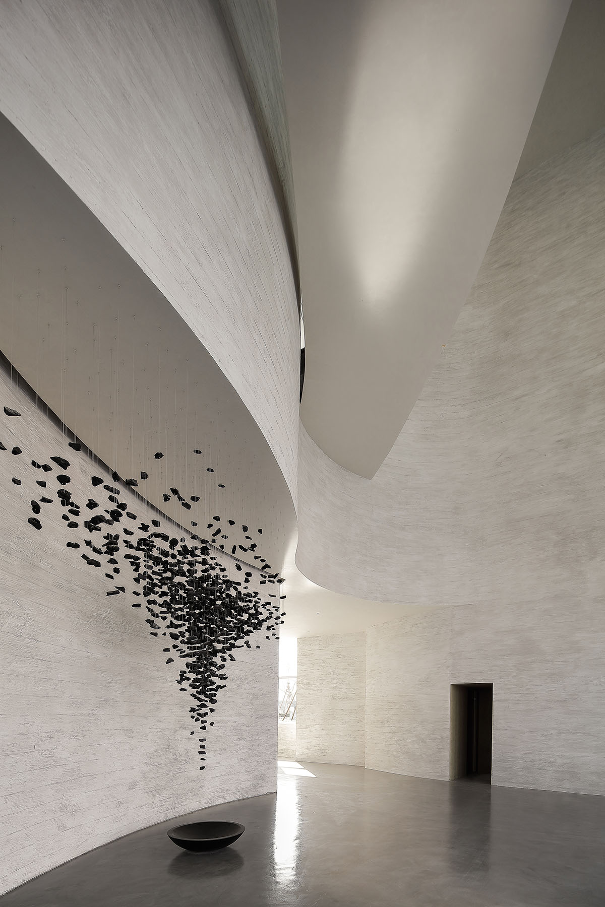
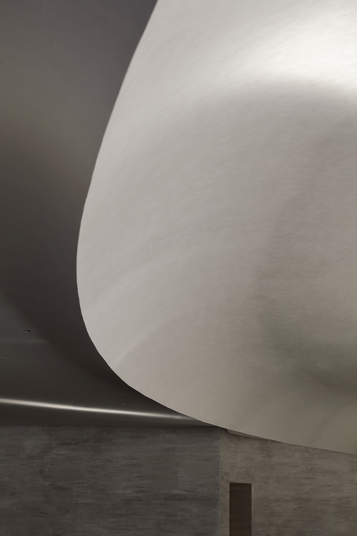
"Architectural design typically uses vertical and horizontal lines to cut and allocate the space facade, but when the gently-flowing curves serve as the main idea for design, we create an environment where no sharp angles can be seen and the lines are brimming with a sense of rhythm, bringing the viewers an unusual feeling."
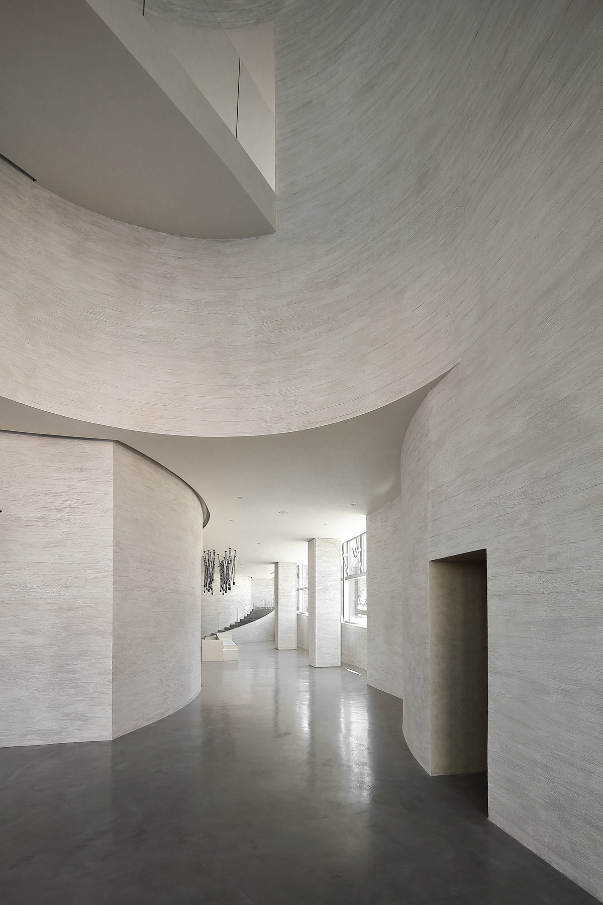
An architecture with such attributes looks like a giant and enterable sculpture, which not only shapes the internal and external spatial relationship, but also includes the sense of time of the viewers and walking. How to expand the modeling to a four-dimensional space to form a complex of the viewers and the environment has thus become an important subject.
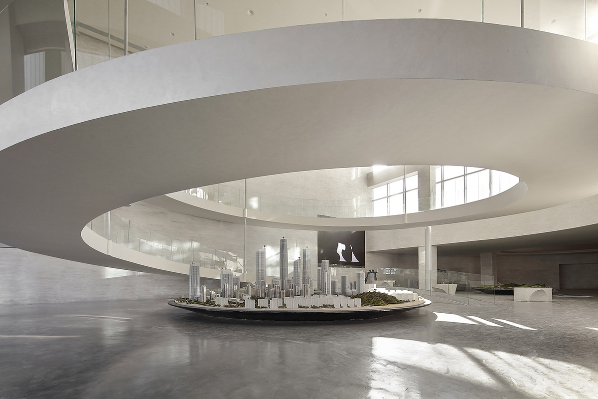
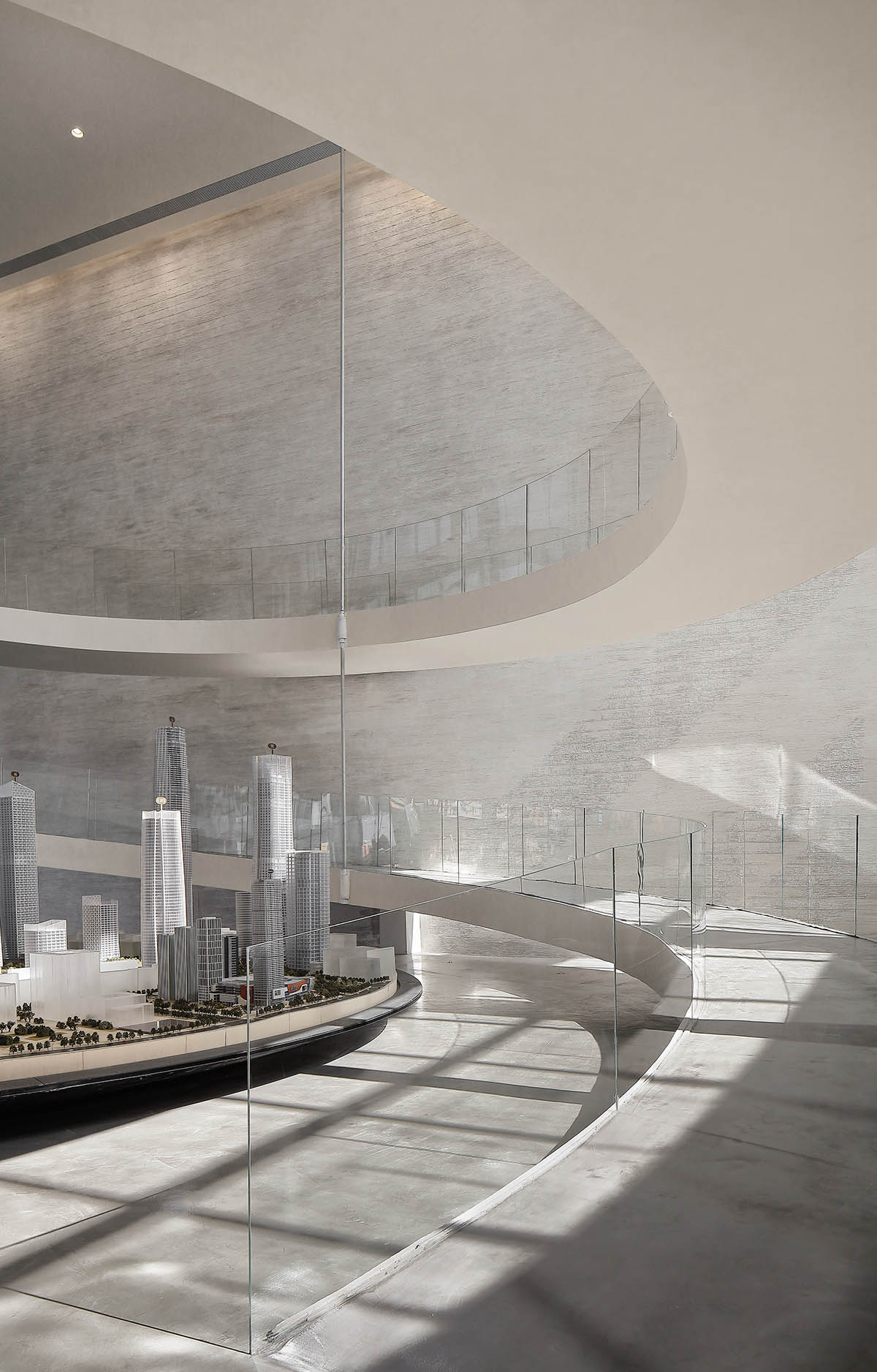
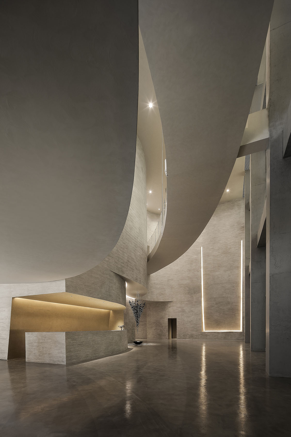
One gradually-curling ladder is built in the 14.5-meter-high hall, creating an opening with a sense of deterrent feeling for the space. The architects replace the keen-edged stairs with gentle slopes, which is the first of its kind to break the rigid segmentation boundaries of traditional floors and eliminate the corners that interrupt the vision, similar to the experience in attending exhibitions in the Guggenheim Museum in New York, where the wall surface surrounds the viewers like strip-shaped landscape, and the viewers can walk or pause on the slightly tilting level surface without difficulty, and enjoy a peaceful feeling of going for a walk.

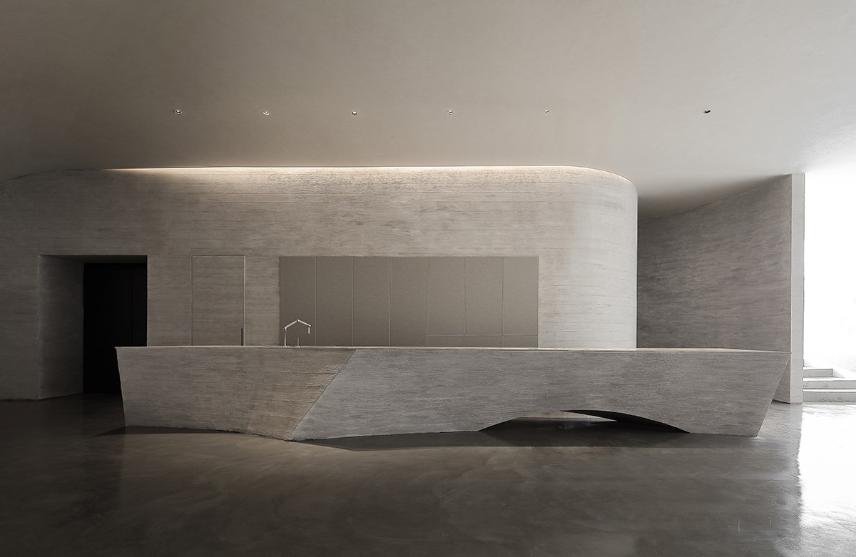
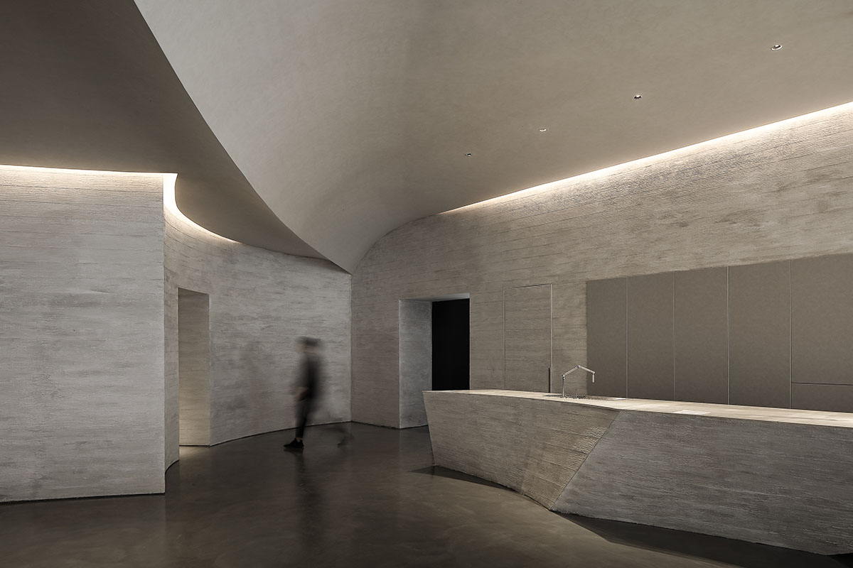
With the continuation of the logic of fluency and no fracture surface, the walls and moving lines in the hall are constructed by lines and curved surfaces that look unintentionally bending-shaped but simple and tidy. They either overlap or wind and fold with one another, just like the natural caves polished by water for hundreds of years.
The peeling, cutting, digging and chiseling of outlines through natural baptism, lines full of timeliness and strength, dynamic lines indoors constructed by forward and withdrawal surfaces and areas with different functions are like the invisible waves and holes in the spring cave, existing in silence and connected with one another, and each undulation and bending will lead the vision to another wave of curved surfaces and dimensions.
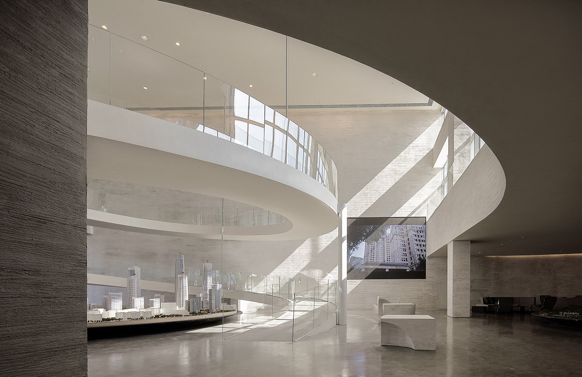
The movement directions of the walls also resemble the work of the Italian sculptor Umberto Boccioni, which consciously stretches out the vitality and uniqueness through self-modeling.
In the midst of such a field language, one can feel a tendentious driving force from the static form, as if stepping into a building that was twisting, deforming, segmenting and moving in the last moment.
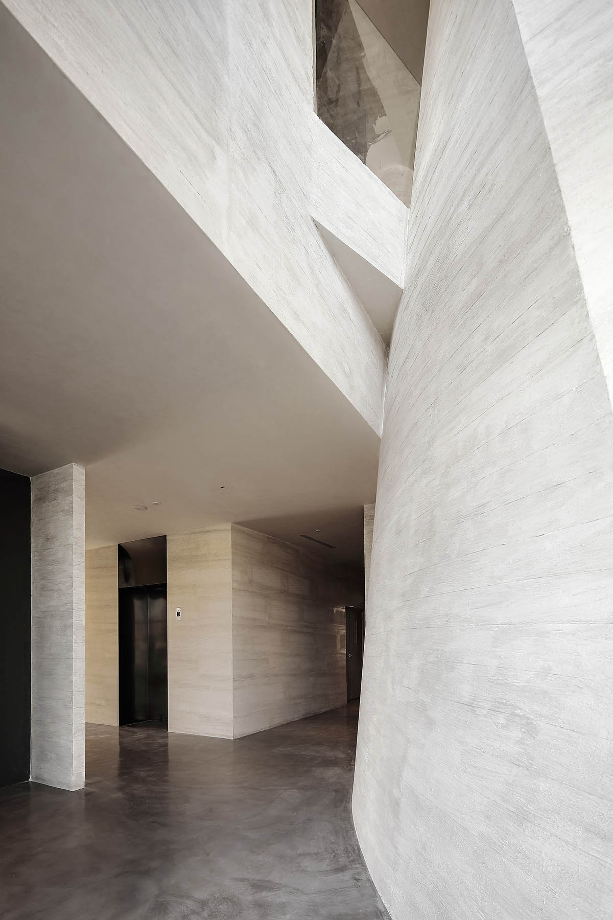
"We attempt to integrate the material and spiritual worlds by means of space modeling and enable the viewers to blend in time and thus make changes through depending on the impression and thought emerging with the spatial relationship," the architects explained.
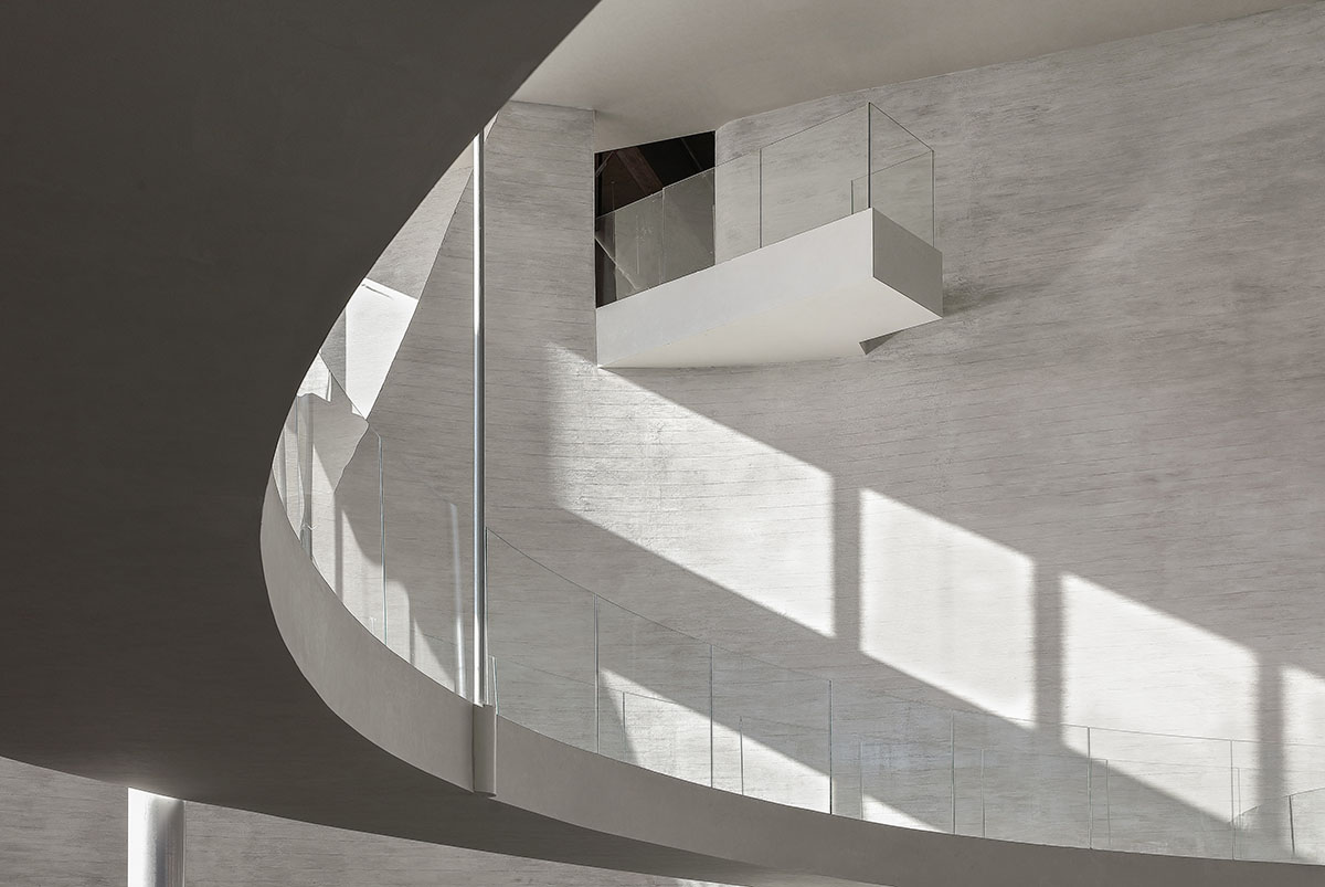
The wall looks like the stones that expand the texture in horizontal directions and the grade level looks like a quiet lake that forms along with the lakeshore. Natural things like rocks, stones, gravels and lakes are interpreted through more detailed material surface, and straight, cold and hard cutting lines representing manual work are weakened.
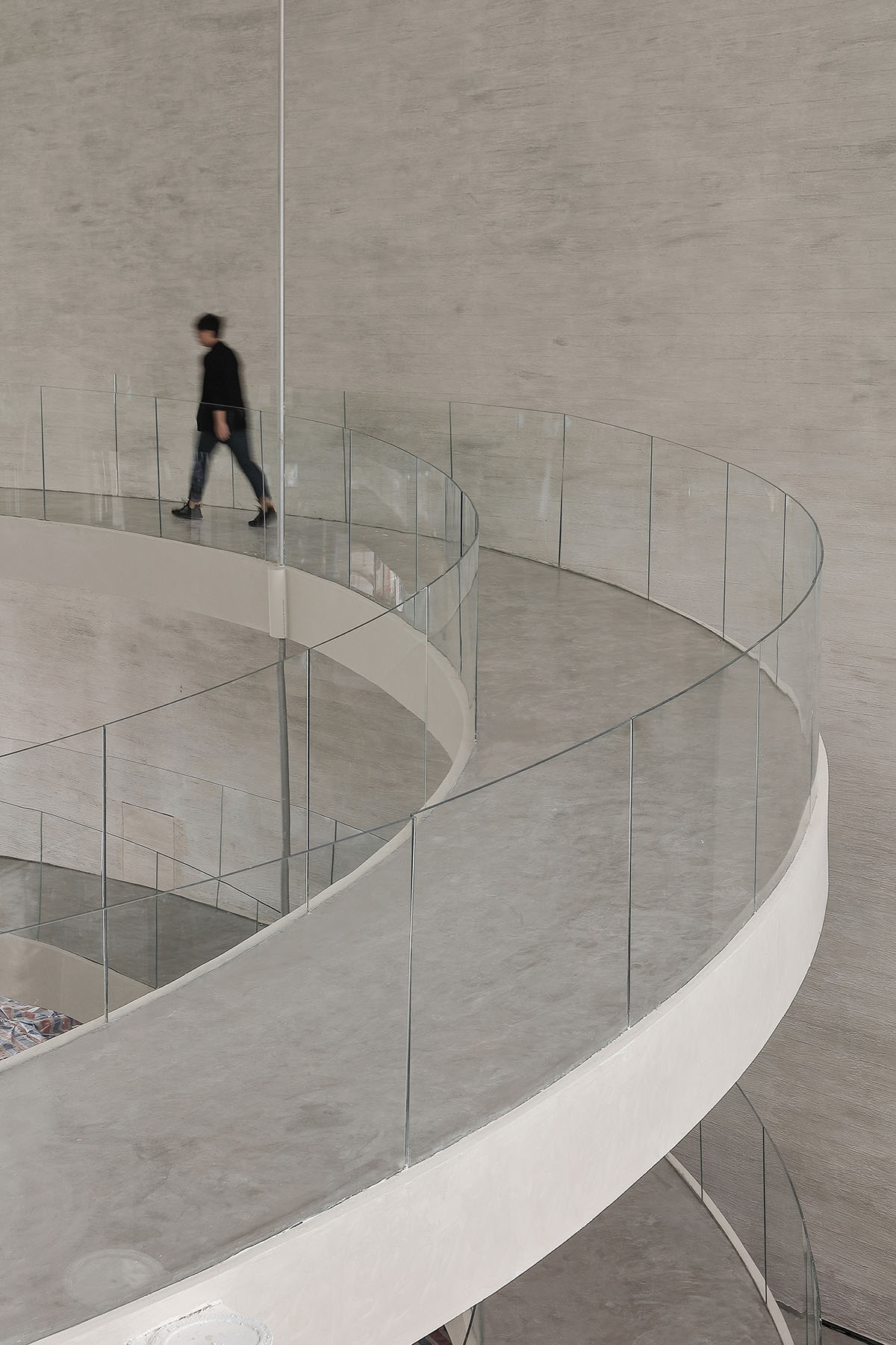
This once again echoes with the lines in organic movement and seething in the structure and enables people to taste a more permanent presence that goes beyond the tedious daily life in heaven and earth.
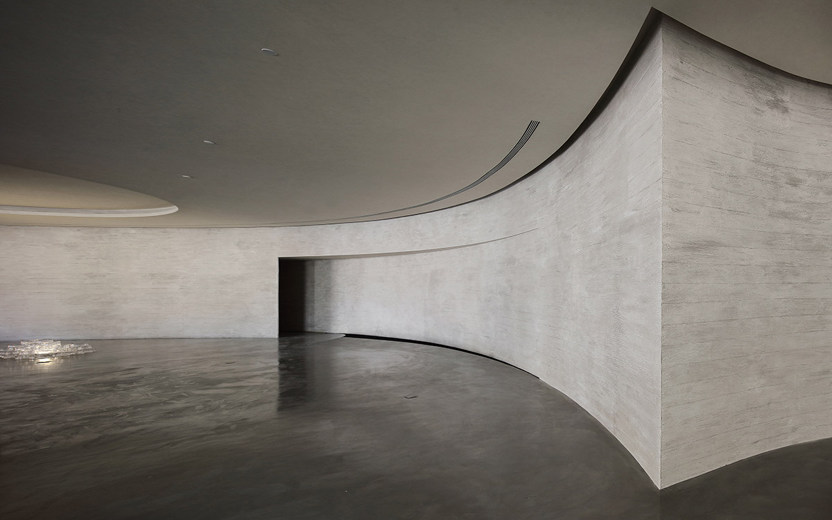
In such a space, the light is not straightforward or clear at a glance. In addition to the brightness changes on the curve surface as a result of the daylight movement outside the window, the dark shadow in the interlaced depth of the wall surface and the halo flowing between the winding paths and wall seams look like glistening light of waves reflected on the dome of the cave, outlining the synchronicity of space and rate of change, just like Nude Descending a Staircase, No. 2, a reputable modernist painting of Marcel Duchamp, which adopted a continuously moving static state to indicate movement and capture the time.
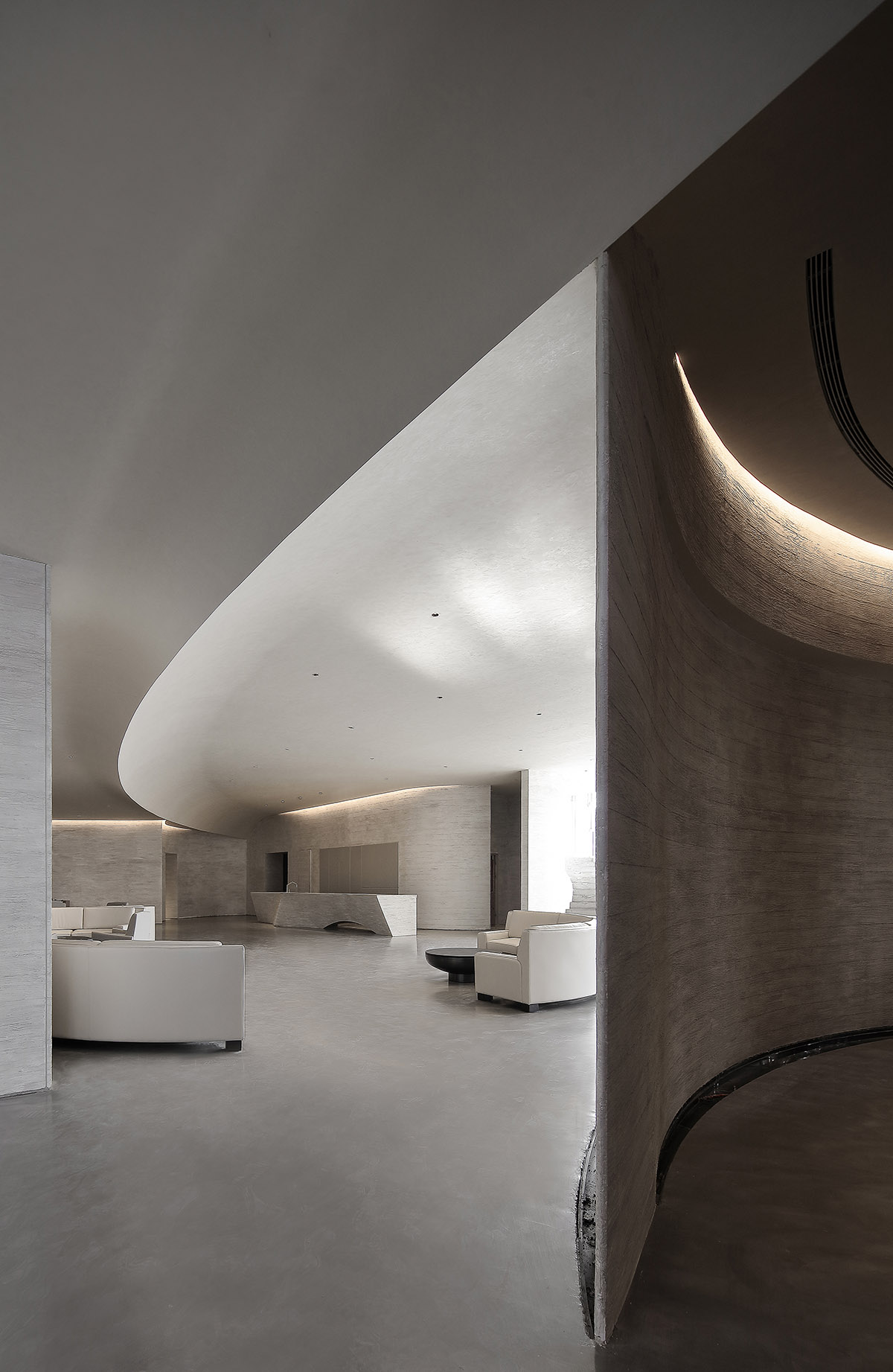
Amid such a space, the viewers are not only shaken by the representational structure, but also able to see how the space can display the infinity beyond the facade and the power of movement. Finally, the nutrient brought home after stepping into a building can nourish people's daily life bit by bit.
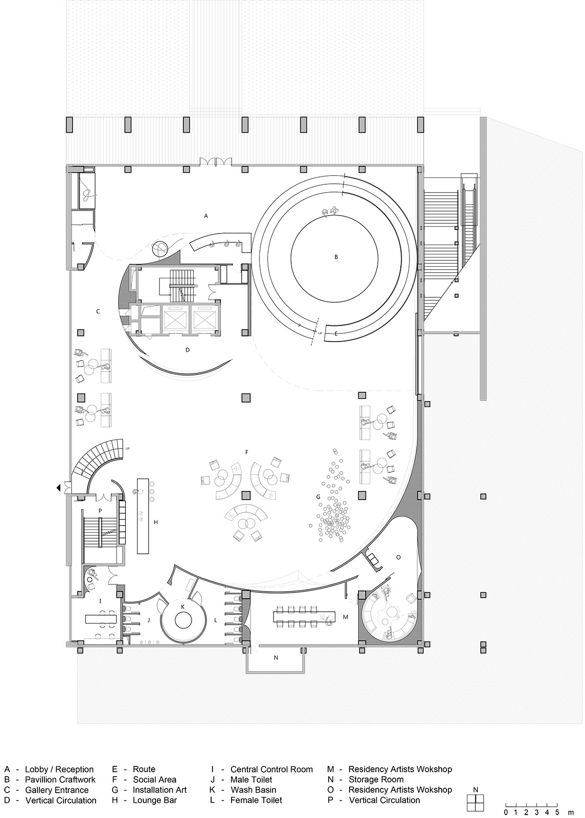
First floor plan
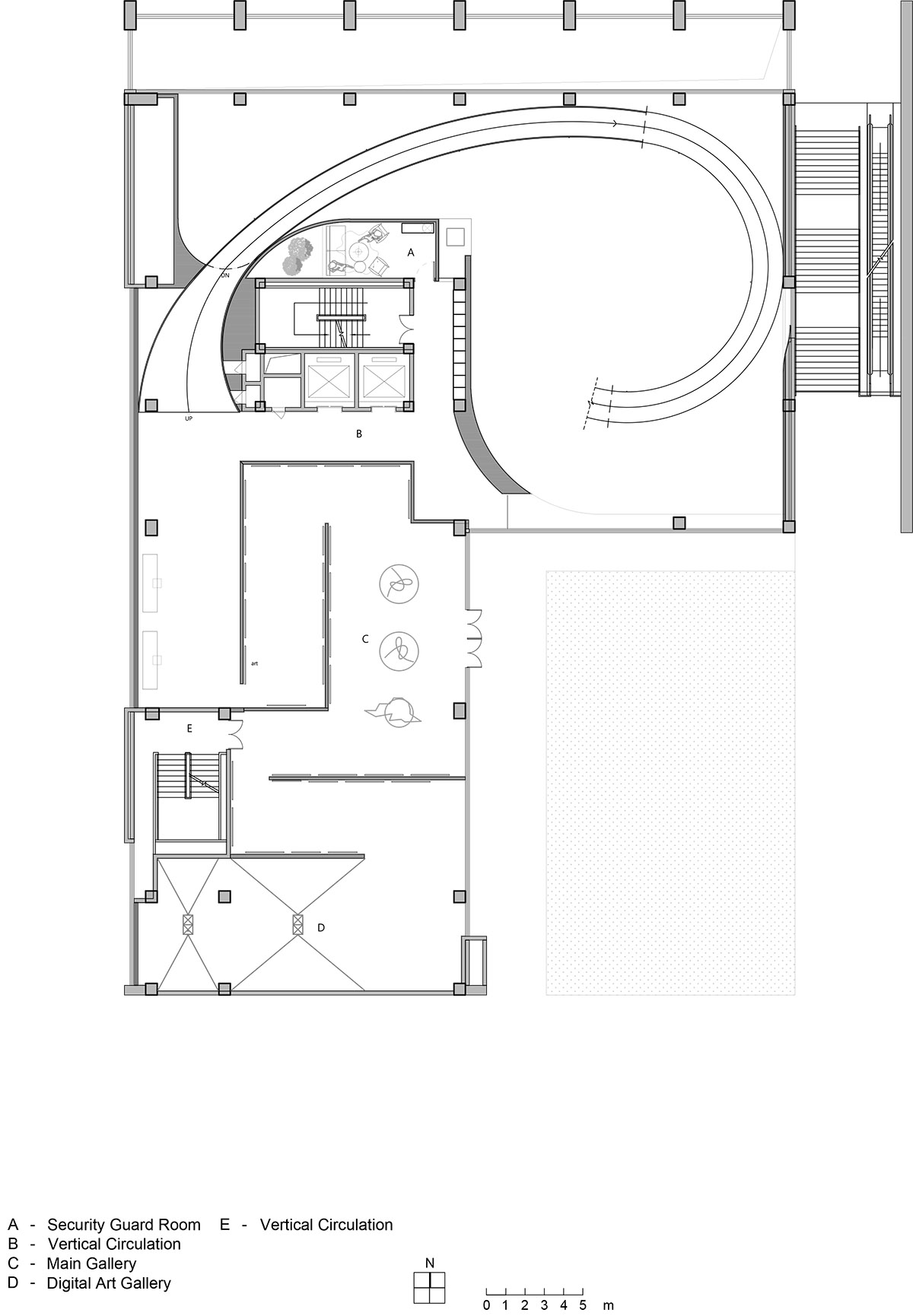
Second floor plan
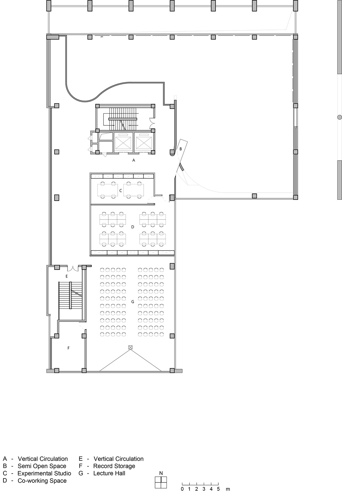
Third floor plan
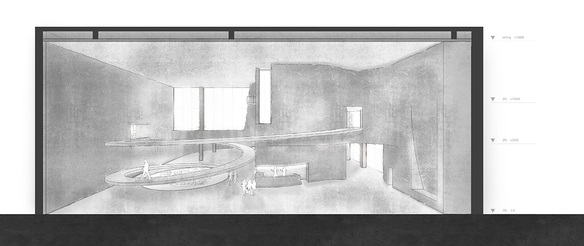
Elevation-1
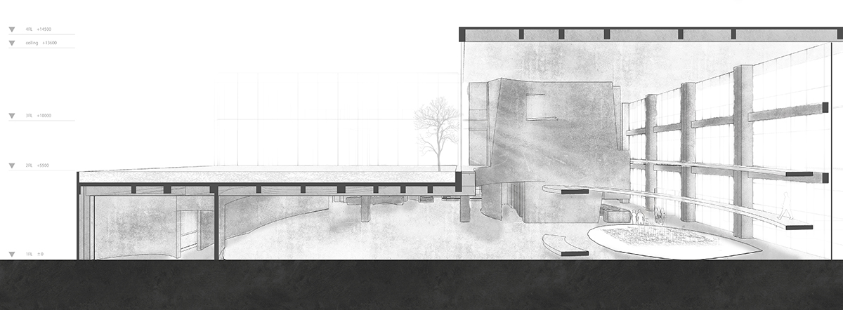
Elevation-2
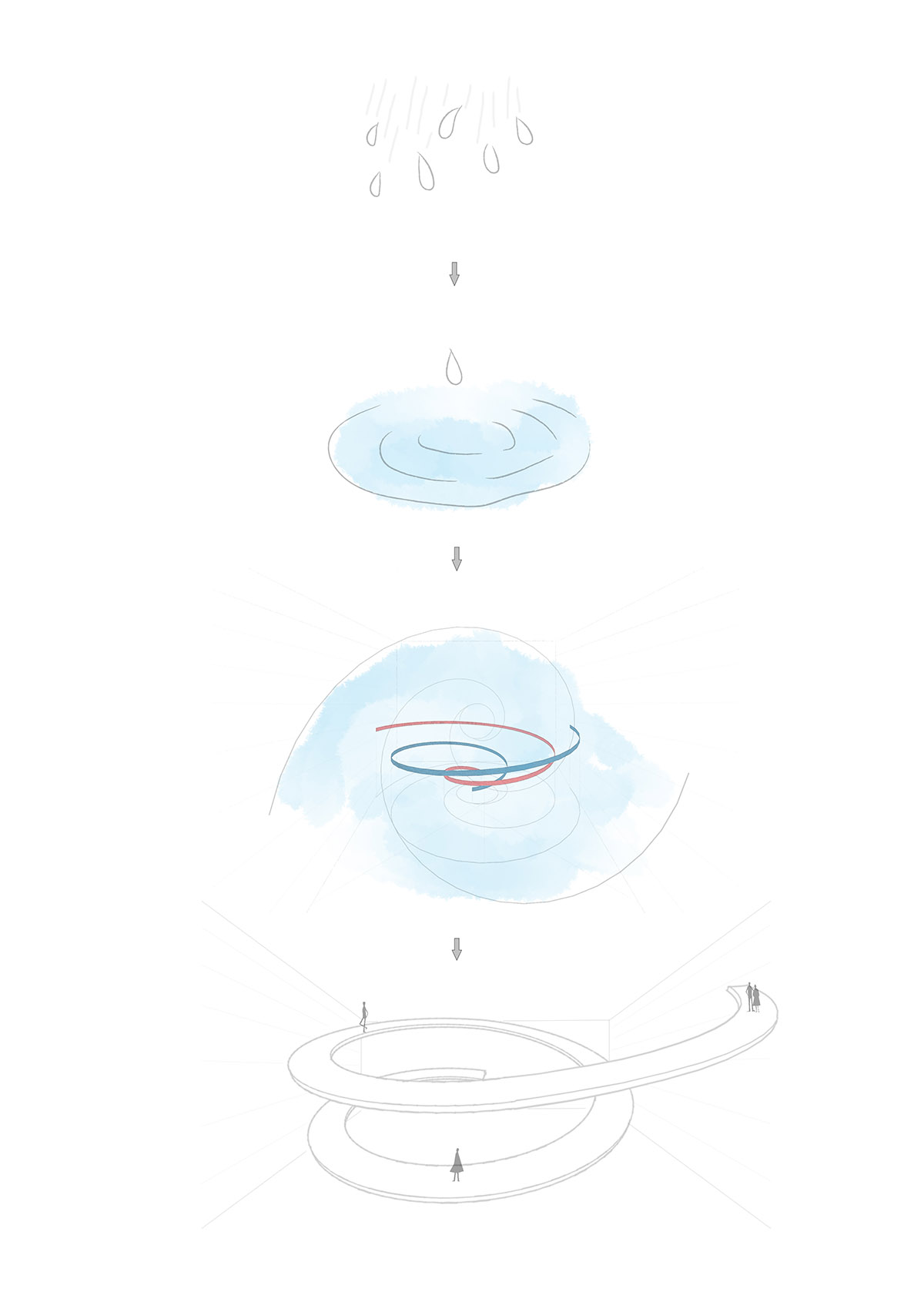
Preliminary concept diagram
Project facts
Interior Designer: Waterfrom Design
Client: Jinan China Resources
Category: art space / reception center
Location: Jinan, China
Area: 2800m2
Layout: exhibition space. resting area. office
Material: fir pattern formwork. hand paint. moca cream golden marble. gagatite. continuous floor.brass. veneer. titanium plating metal
Design Period: 2018.1-2018.6
Construction Period: 2018.7-2018.10
Copyright: Waterfrom Design
All images © Yuchen Chao
All drawings © Waterfrom Design
> via Waterfrom Design