Submitted by WA Contents
Circular, oval and square volumes form art museum designed by Wutopia Lab in China
China Architecture News - Aug 08, 2022 - 12:38 5444 views
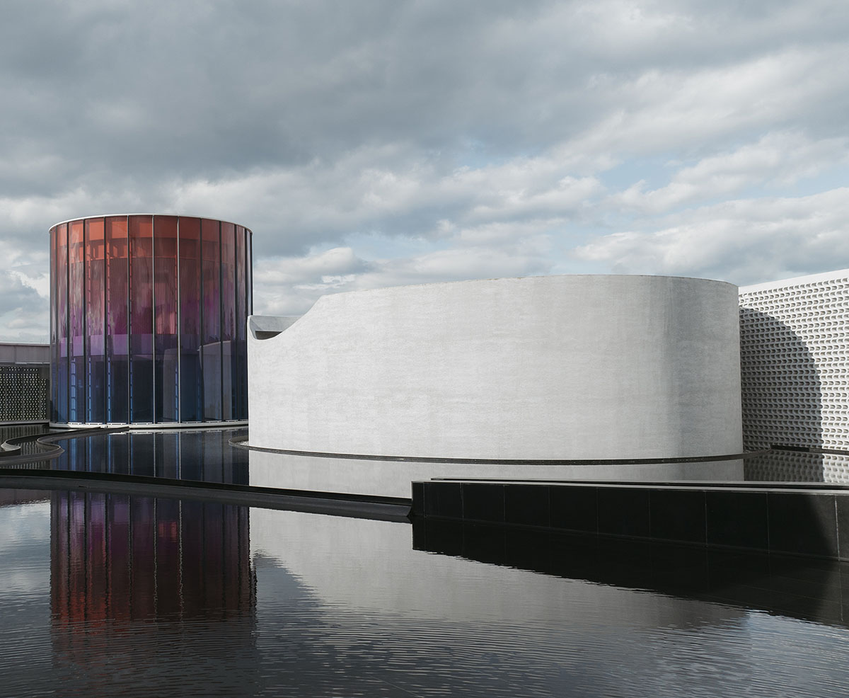
Shanghai-based architecture firm Wutopia Lab has designed an art museum that comprises square, circle and oval volumes surrounded by a flowing another volume in Beidaihe District, Qinhuangdao, China.
Called Monologue Art Museum, the 1,272-square-metre project was commissioned by Sino-Ocean Group to create a monologue art museum on the park green of SEATOPIA in Beidaihe, Qinhuangdao.
The museum is dedicated to an infinite minority of people who want to be free from the worldly distractions. The project was completed and opened to public in July 2022. Read the full narrative of the project with the architects' own words below.

Image © Seven W
Monologue
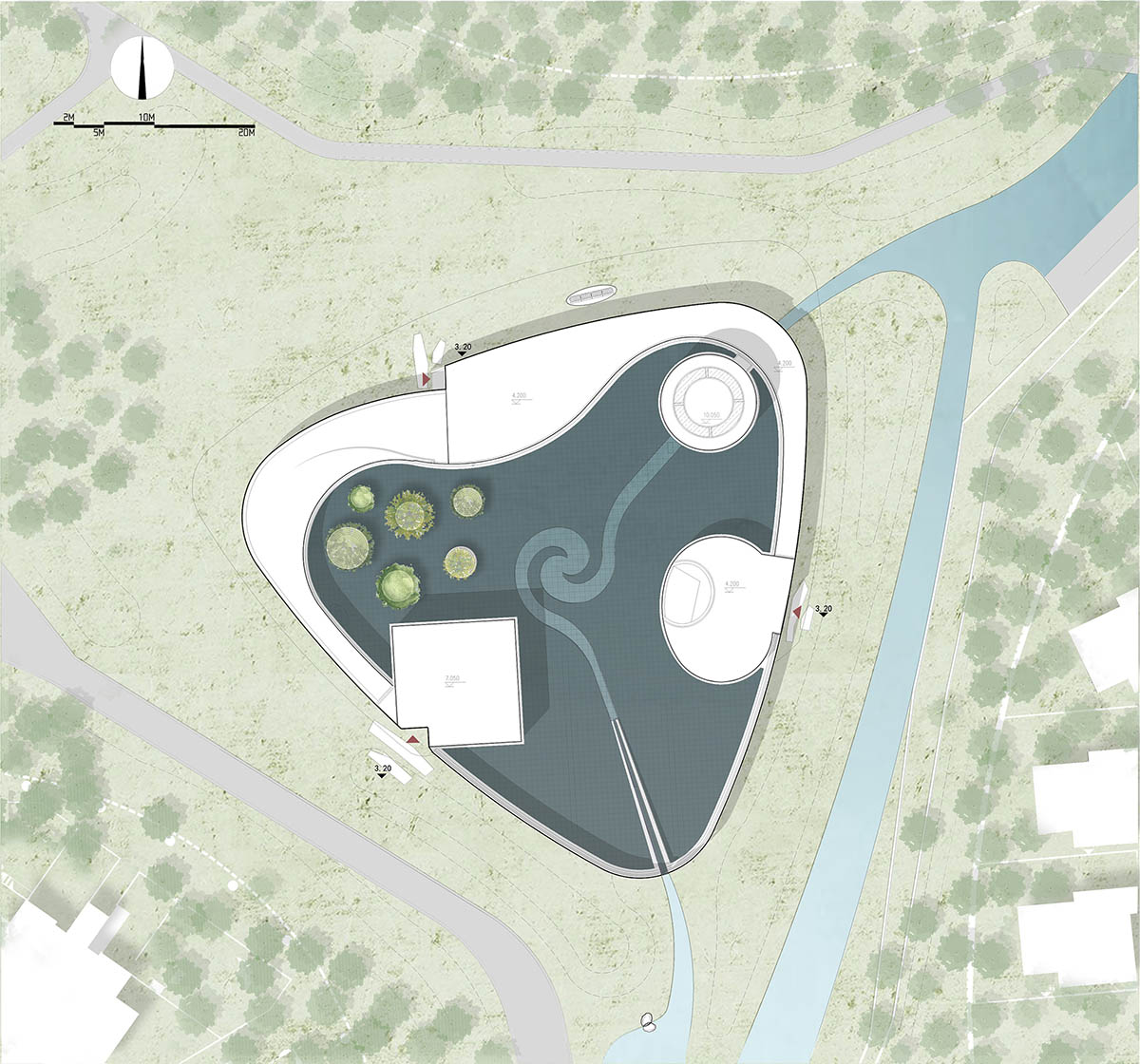
Queen Dido created the great Carthage by cutting a cow skin into thin strips and circling a piece of land. In an open green space at the intersection of three residential clusters in the Weilan Coast campus, I broke up the 1,300 square meter building into different monoliths combined with walls, corridors and ambiguous spaces into a trangular-shaped 3,600 square meter place, the Monologue Art Museum.
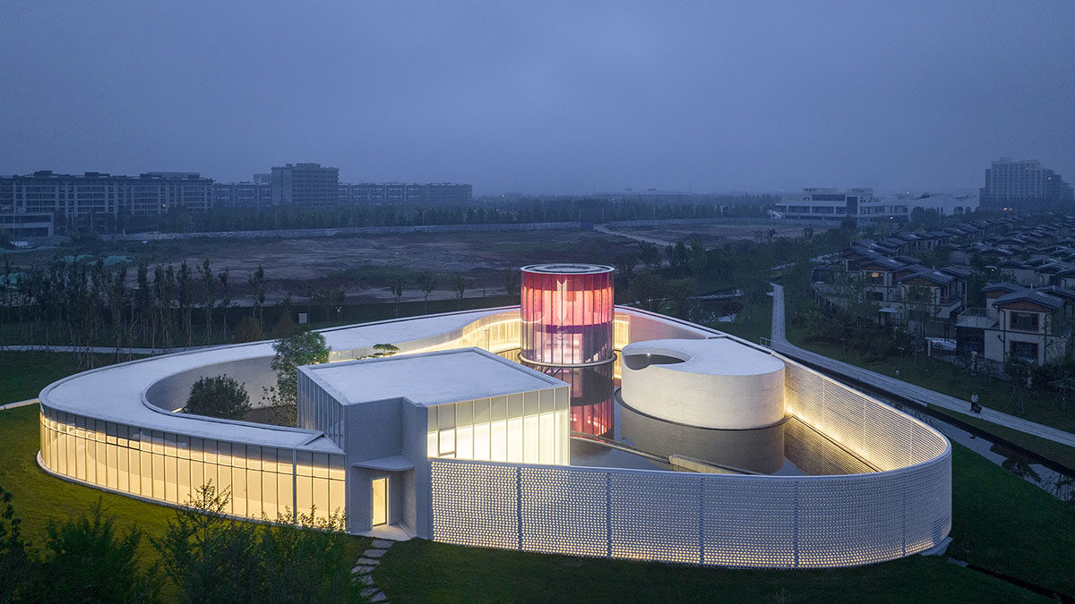
Image © Seven W
Even More Charming
Side A
The Monologue Museum is a slowly unfolding hand scroll. Starting from the small entrance theater where the light breaks through the corners, entering the art gallery, the quiet water courtyard slowly reveals itself along the open corridor with shifting lights, passing through the colorful yoga room to the bright art gallery (exhibition and painting rooms). Then the light fades, the path gets narrower, and you almost miss the tearoom hidden behind the wall. At the end, there is a dance studio. When you exit the building, you continue along the flower wall and wade through the water in the dappled shadows. The water runs through the center and diving the building, seemingly towards the sea. When I came across the small theater again, I saw six trees by the water, whispering and shaking their heads in the breeze. All the scenery including sounds and thoughts slowly unfolded into paintings.
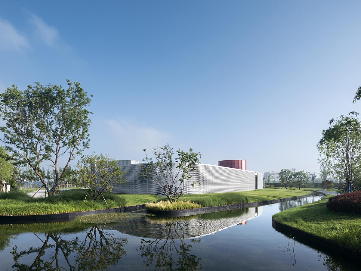
Image © CreatAR Images
Side B
Monologue Art Museum is a multi-function space. It allows different people to be in different spaces at the same time, but one can be alone in an artistic way. The plan is complex and irregular, and the structural design is not conducive to earthquake resistance. However, when the museum is divided, except for the art gallery, the rectangular dance studio, the circular yoga studio and the oval theater are all symmetrical and regular with excellent seismic performance. In this regard, Lao Hu (structural engineer) set up three seismic joints to divide them into four independent structural units. The expansion and deformation of the extra-long structure was released, reducing the heat stress, and avoiding structural cracks caused by temperature changes. Having to accept the seismic joints, I had to carefully design the nodes to conceal their presence on the roof, façade, and interior to ensure that my painting is visually continuous.
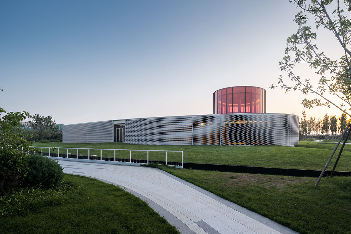
Image © CreatAR Images
Still the Way Back Then
Side A
The small theater is the foyer of the Monologue Art Museum. To reduce the floor area for calculating the floor area ratio, it was designed as a flex space. At the same time, to keep the audience's attention on the performance and not to dramatize the central water scene, the small theater was designed as a closed space. I cut a curved skylight above the back of the stage to allow daylight or moonlight to spill down like a waterfall, "There is a crack in everything, that's how the light gets in."
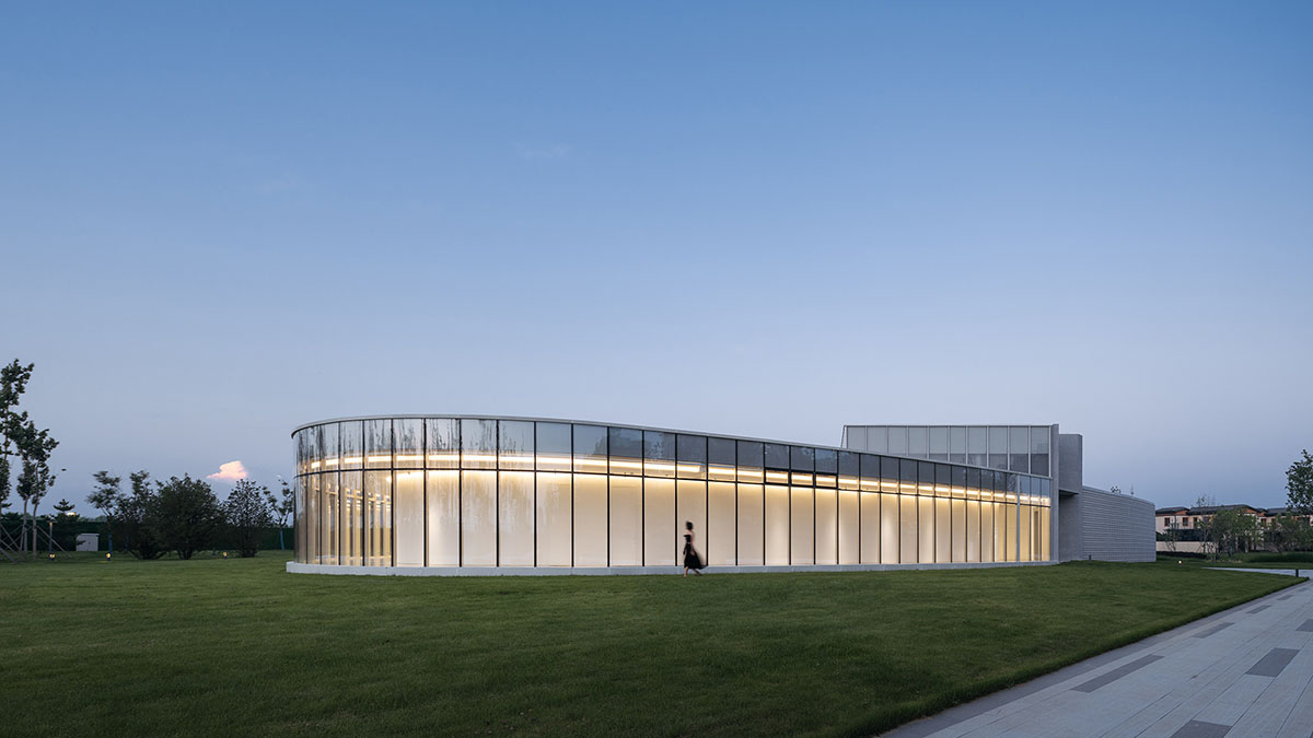
Image © CreatAR Images
Side B
Separated from the main steel structure, the small theater is shaped by a continuous closure of the reinforced concrete wall panel structure, an elliptical column standing on the pool. The inside is noisy while the outside is quiet.
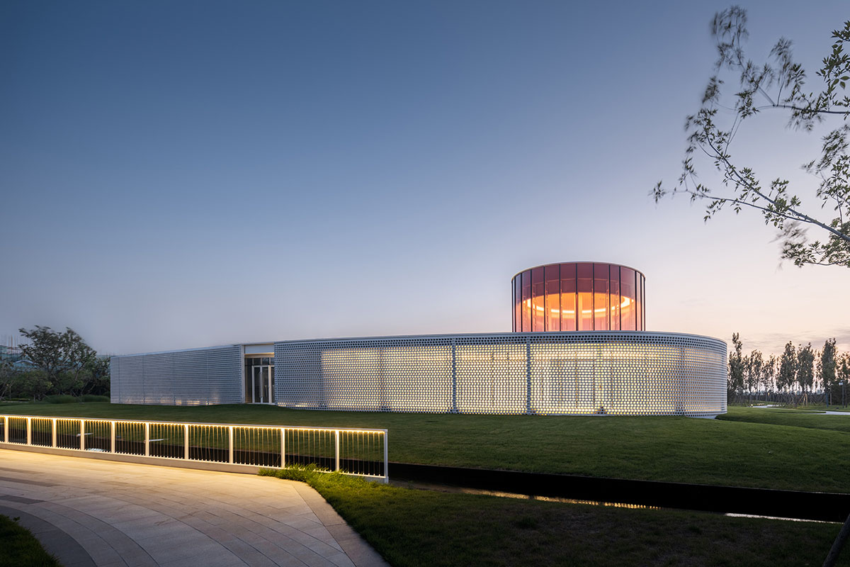
Image © CreatAR Images
All in One
Side A
The most artistic feature of Chinese painting is the line. Different parts of the brush are used to form various lines on the paper, straight and flexible, thick and light, dry and wet, varying in thickness but continuous. Such lines not only inform space but also frequency. I see the boundary of the Monologue as such a shifting ink line. I use white instead of black in the architecture. The starting stroke is the small oval theater. The point is the yoga room, the dried brush is the flower wall, the art gallery is the stroke that connects these, the thin and somewhat fast is the corridor with a nib, then it leans to become a side peak forming a slow thick line, the enlarged art museum, then the dance studio is a stroke slowly back to the nib. At the beginning the art gallery and the art museum are closed on the outside and open on the inside to the water courtyard, while after that it is closed on the inside and open on the outside to the large landscape, which resembles how the pen moves.
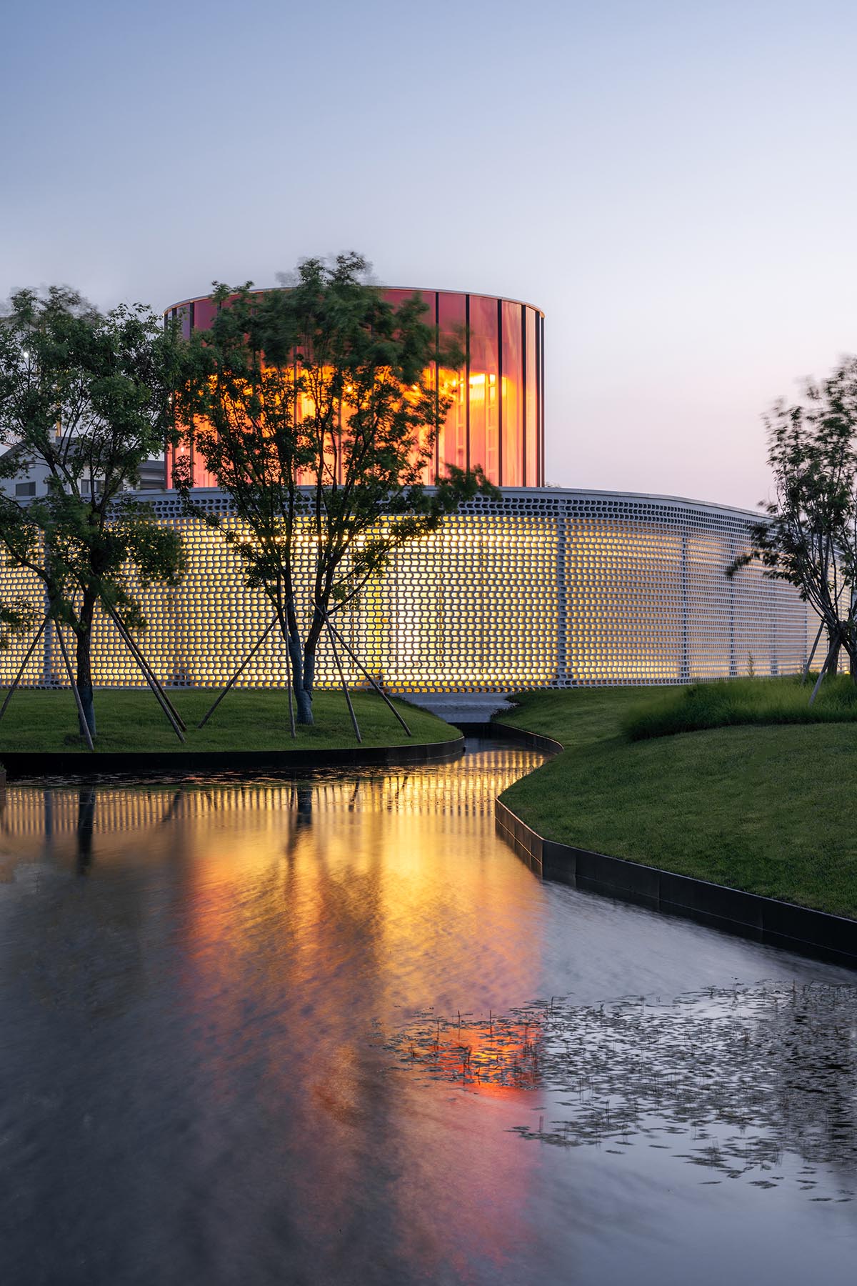
Image © CreatAR Images
Side B
I wanted the glass surface facing the exterior of the courtyard and the museum to have a continuous view without any structural elements. To reduce the self-weight of the structure and to reduce the size of the structural elements, the roof is made of a whole cast layer of 40mm fine stone concrete with ribbed patterned steel plates on top to ensure thermal insulation and waterproof performance. Then Lao Hu set up independent column overhanging beam steel units in the narrow corridor, and hid them in the walls. And the single-span frame overhanging beam steel structure unit was used in the enlarged art museum space. The maximum overhang is 4.6 meters. It ensures a fully permeable effect with no vertical elements blocking the facade facing the water courtyard.

Image © CreatAR Images
Above and Below
Side A
In 2009 I visited a dance school in London designed by Herzog & De Meuron. The director politely told me that dancers want to have a lot of light when they train. The so-called beautiful landscape and colorful façade would interfere with their emotions. I designed the dance studio at the Monologue as a translucent glass box, with enough light but filtering out the outdoor scenery as a backdrop. Behind the mirrored wall of the classroom is the entrance foyer and the dressing room in the mezzanine. The dancers can then dance as above and so below.

Image © CreatAR Images
Side B
The dance classroom only has a small area of mezzanine space on one side of the entire regular plan square. To avoid sudden changes in local stiffness on the structure of adverse seismic effects, Lao Hu suggested using hinged connection in the mezzanine beams and columns, to ensure that the classroom rule of single-story steel frame system.
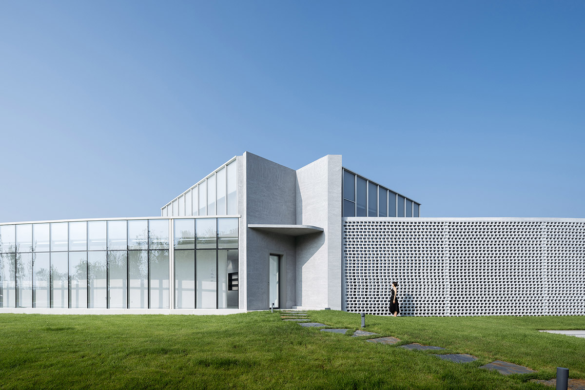
Image © CreatAR Images
It's Always Been Like This
Side A
I gave up my dream of landscape painting after copying Ni Zan's Six Gentlemen in my second year, realizing that I would never be able to be an artist like him. But those six trees became my lingering obsession. Therefore, many of my works in the future have the design of using the trees as a point of reference. This time, due to the limitation of climate and source, I used pine, elm, cypress, maple, oak and celtis sinensis in the north instead of Ni Zan's original six types of trees in Jiangnan to form new Six Gentlemen of the water garden.

Image © CreatAR Images
Side B
The client suggested that turn the equipment room into a tearoom. Then the equipment had to be placed outside in two groups, one in the courtyard and the other one in the green space outside the gallery. I designed a leaf-shaped perforated aluminum baffle to hide the equipment. The equipment was turned into an installation for the Monologue Art Museum.

Image © CreatAR Images
The only Light in the Darkness
Side A
The courtyard was originally designed to have white dry-clay-stone floor. It could give the whole building a weightless feeling, which was successfully experimented in my White Upland project, creating an unreal illusion. I changed my mind when I designed the presentation of the Six Gentlemen, instead of pursuing a slightly sweet dream, I tried to express a somewhat melancholic mood after reflection. The painting of Six Gentlemen expresses the vast water surface with a large amount of emptiness, which makes the picture present a sublime atmosphere without being limited by the size. In this regard, I decided to change the white into black, turning the accessible white square into a black pool that can be seen. This creates a new depth in the visual aspect. In this way, the white building is surrounded by a deep pool of silence, you stare at it while it stares at you. The surroundings suddenly become quiet. There is only the rustling of the wind blowing through the Six Gentlemen.

Image © CreatAR Images
Side B
However, I did not eliminate the landscape water system in the original courtyard that takes the meaning of Winding Stream Party. I wanted the design of this flowing water to become a surging current in the calm water courtyard, forming the design of water within water. The water flows from the plunge into the center of the courtyard, spirals and twists, then flows toward the yoga room, connecting with the external water system under the foundation of the building, and finally quietly flowing into the sea. This connects the self-contained Monologue Art Museum to the Yellow Sea.
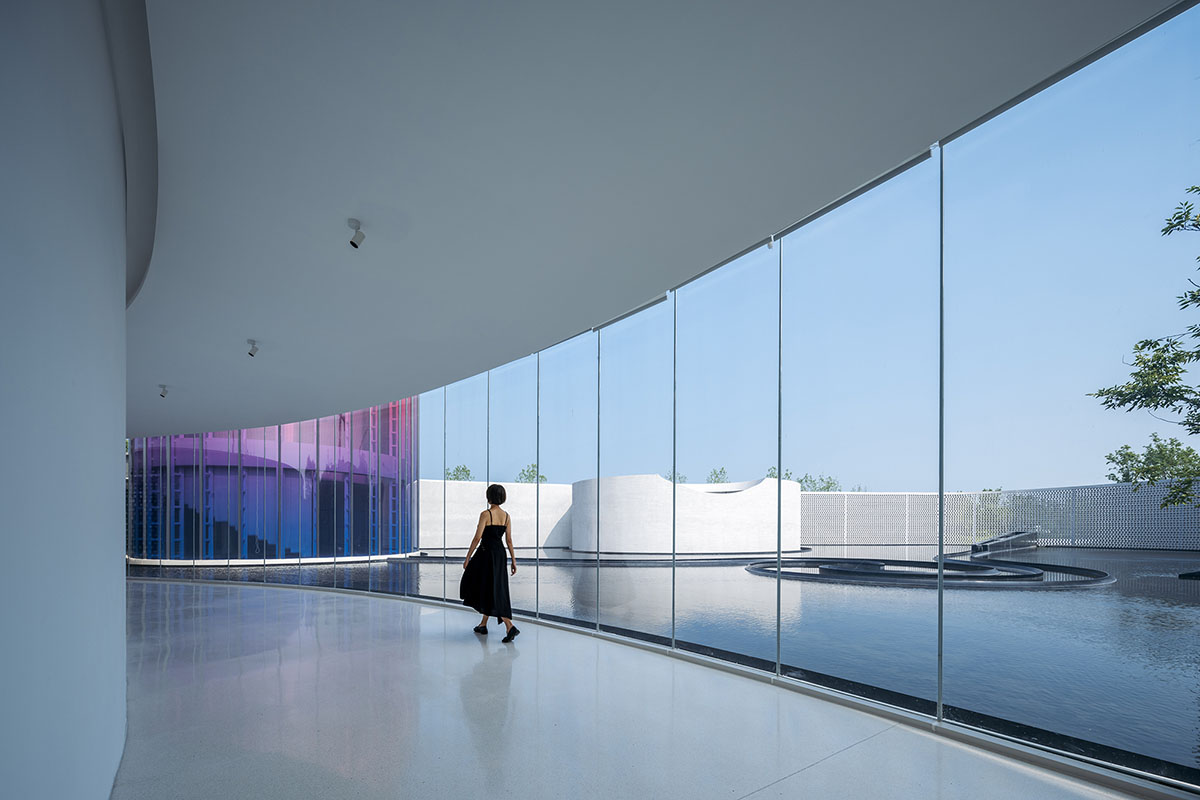
Image © CreatAR Images
The Black that Doesn't Sink into the Dark
Side A
The water courtyard has quieted down. When I looked at the white building with a glass façade on the edge of the black pool in the rendering, a new familiarity arose, and the atmosphere of the place was too clichéd. So, I decided to light it up by turning the highest circular yoga room facade into a gradient of stained glass. With a touch of color in the thick ink, there comes a glittering glass fortress.
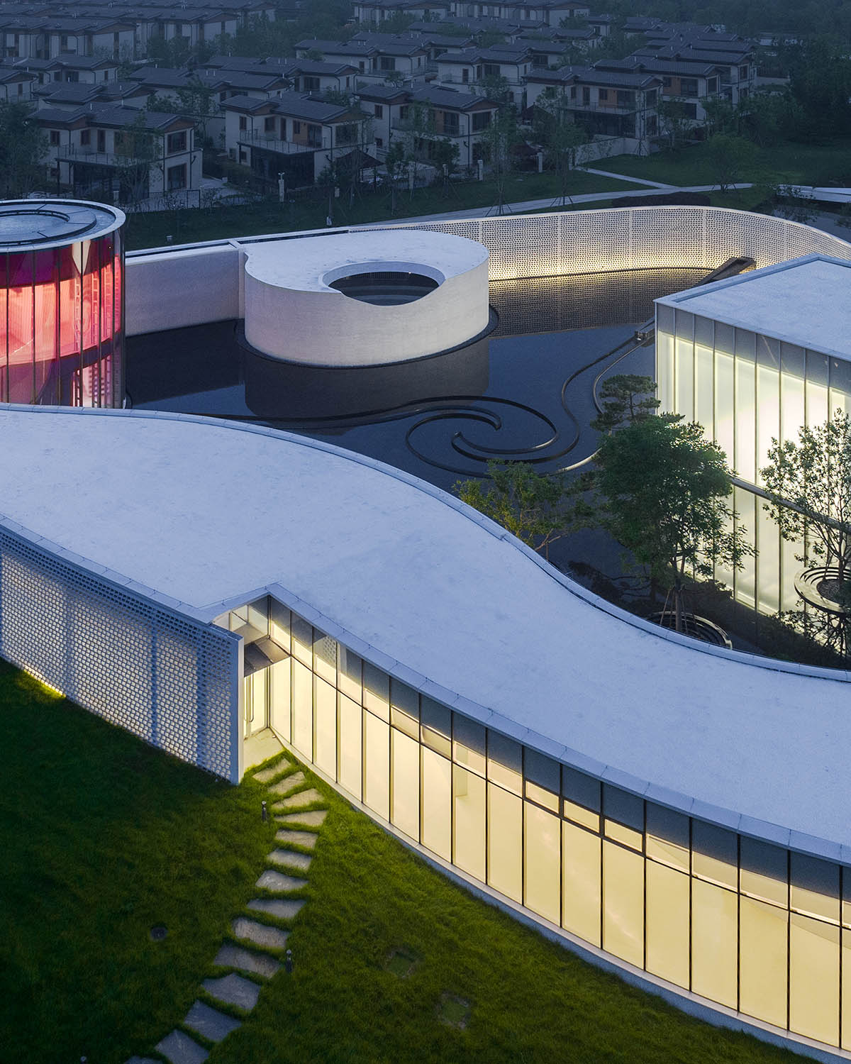
Image © Seven W
Side B
The glass fortress originally had only one floor, but the client insisted on having a changing area, and I could only set up a second floor for it to ensure the visual openness of the first floor. I also wanted the façade glass to maintain vertical continuity. I asked Lao Hu to hang the floor up to disconnect the floor and glass façade. Lao Hu arranged the frame in cross shape to provide horizontal lateral stiffness on the roof, combined with the peripheral ring beam to form a frame to provide torsional stiffness, forming a clear and efficient force system. He used four hanging pillars suspended from the main frame beam and hidden in the closet to lift the second-floor slab. Finally, the staircase was also suspended from the floor slab lightly. The first floor was then opened to the gorgeous light.
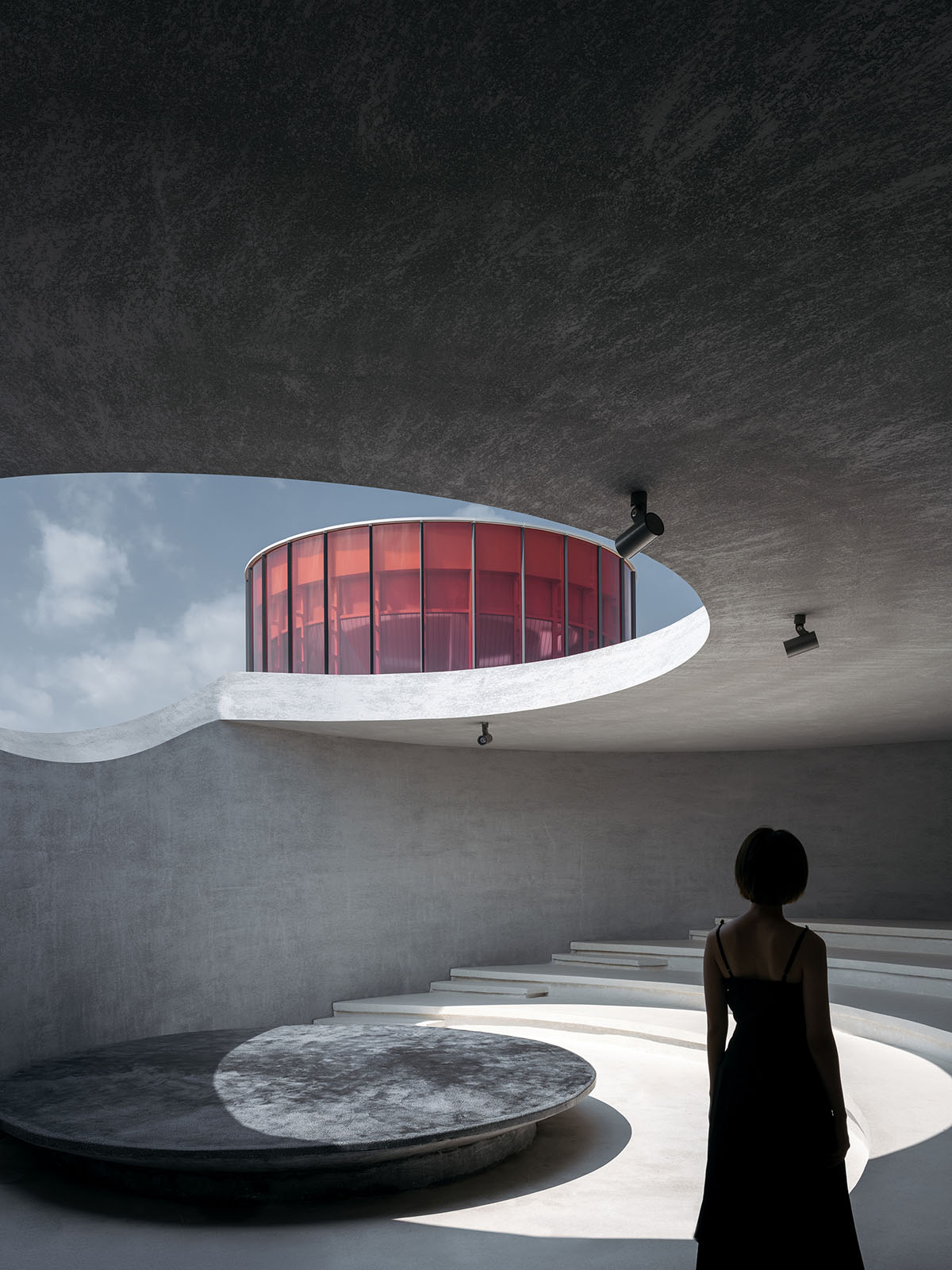
Image © CreatAR Images
A Few Stars on the Border
Side A
The interior and exterior walls of the Monologue are made of glass, solid wall and flower wall. Independently or in combination, the three are continuous as shifting ink brushstrokes that create the varying boundary conditions of the museum. The flower wall is "written" down as the ink dries.
Side B
To keep the 5m high flower wall safe as well as unfolded continuously, it was necessary to add structural columns every 3.8m behind the flower wall. At the same time the roof panels are overhanging as the compression roof of the brick wall. The intricate flower brick is a GRC brick made of 3% steel fiber content using the premixed method, and there are two modules combined to form the façade pattern. The brick wall either runs double to frame a courtyard, or interfaces with glass or solid walls to forms a continuous 150-meter-long corridor to wrap around the Monologue Museum.
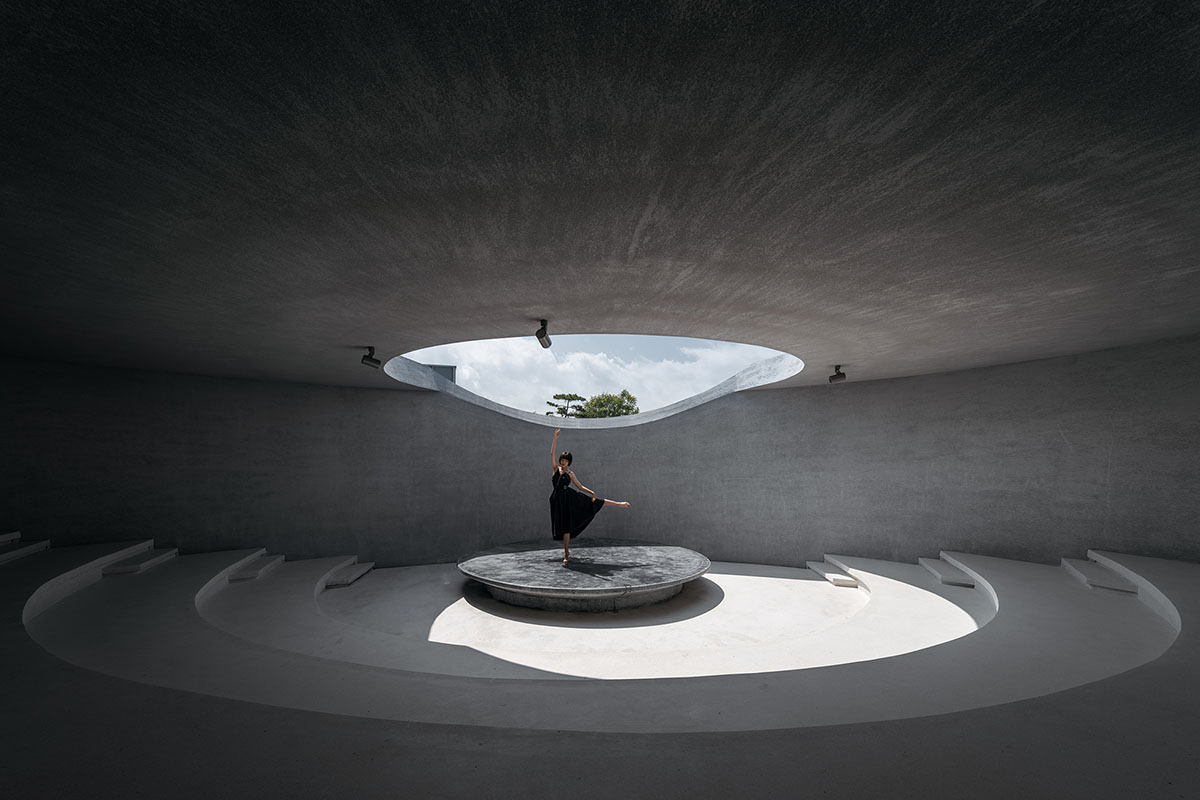
Image © CreatAR Images
A Sleepless Man
I divided a single wall in two to form a tearoom hidden behind the back wall of the corridor, just like the white gap we leave between the brushstrokes. It is an intimate and silent space, a corner where we hide our thoughts. I opened a long horizontal window along the height of the sight line to frame the sight as a scroll, where the six gentlemen were revealed. “Staring at each other while silent fell, remaining speechless only time can tell.”
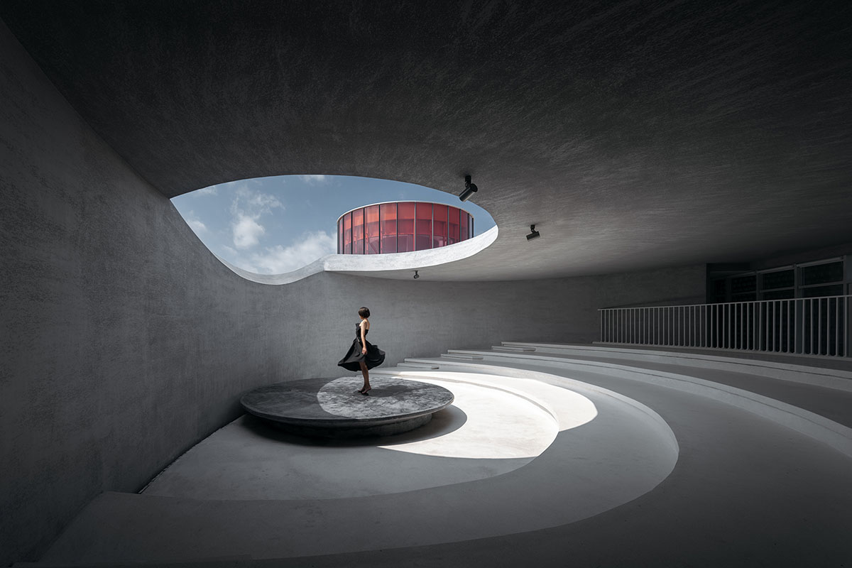
Image © CreatAR Images
Solitude
There are all kinds of little but cheerful desire in the resorts. Sometimes it could even be too noisy. We need to be quiet. The reason why Xiaoyan Zhang named the art museum Monologue is probably his ambition to create an island in the middle of the bustling sea where people can be alone and solitary. It is our one-person paradise. And the sea is somewhere nearby.
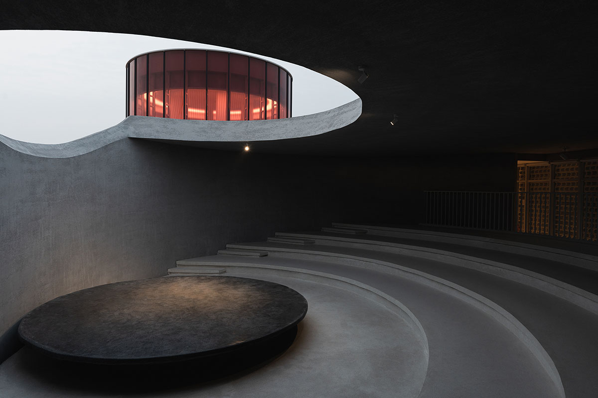
Image © Seven W
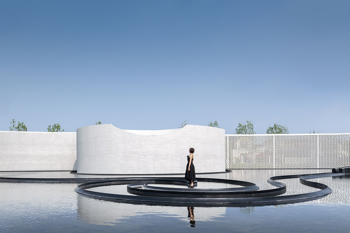
Image © CreatAR Images
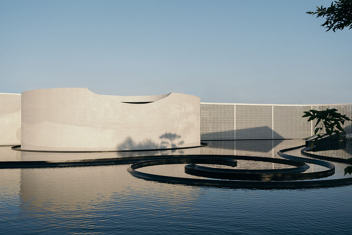
Image © Seven W
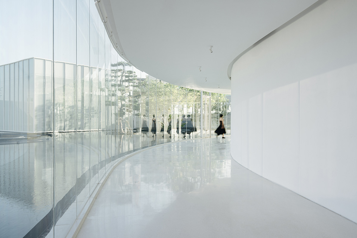
Image © Seven W

Image © Seven W
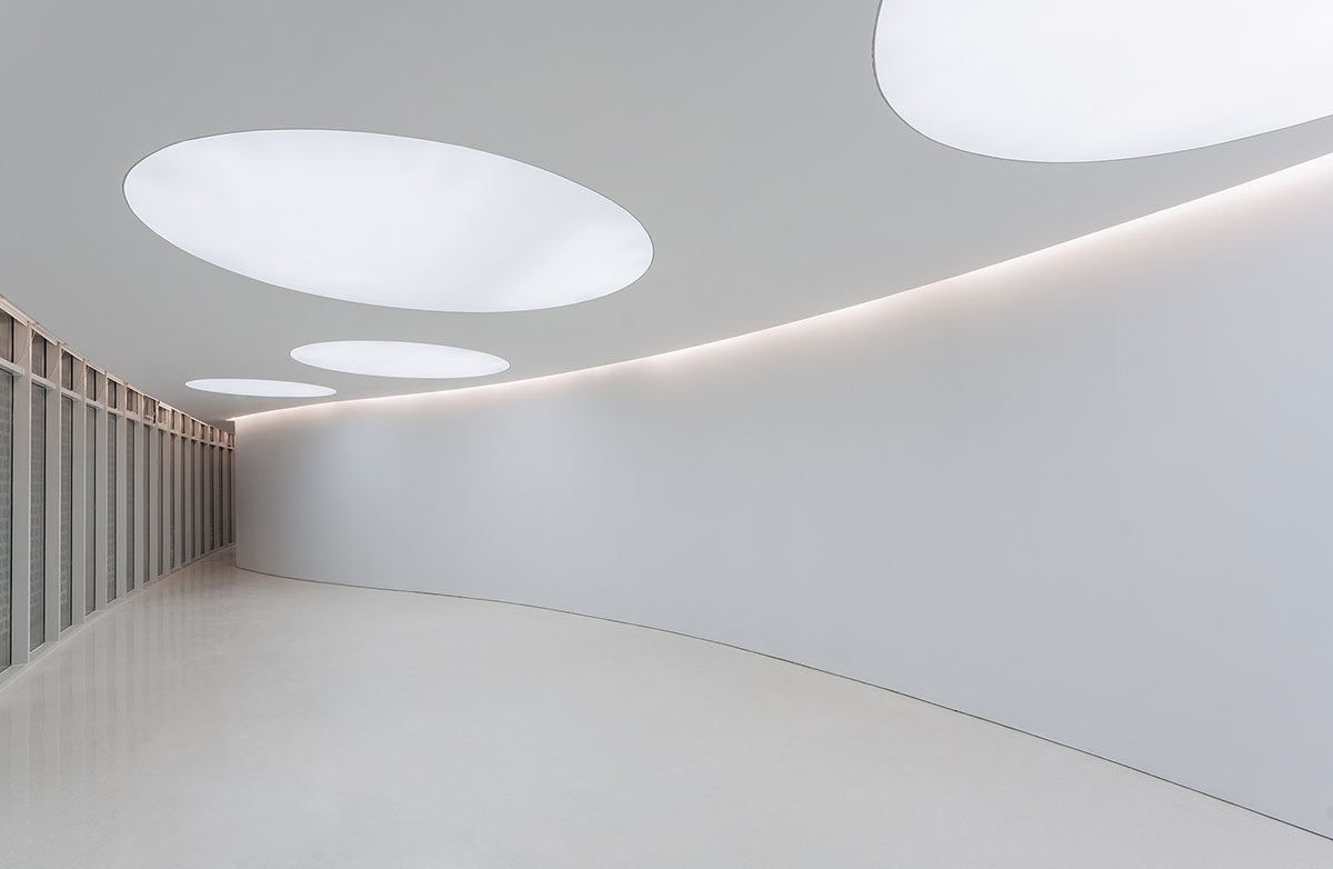
Image © Seven W
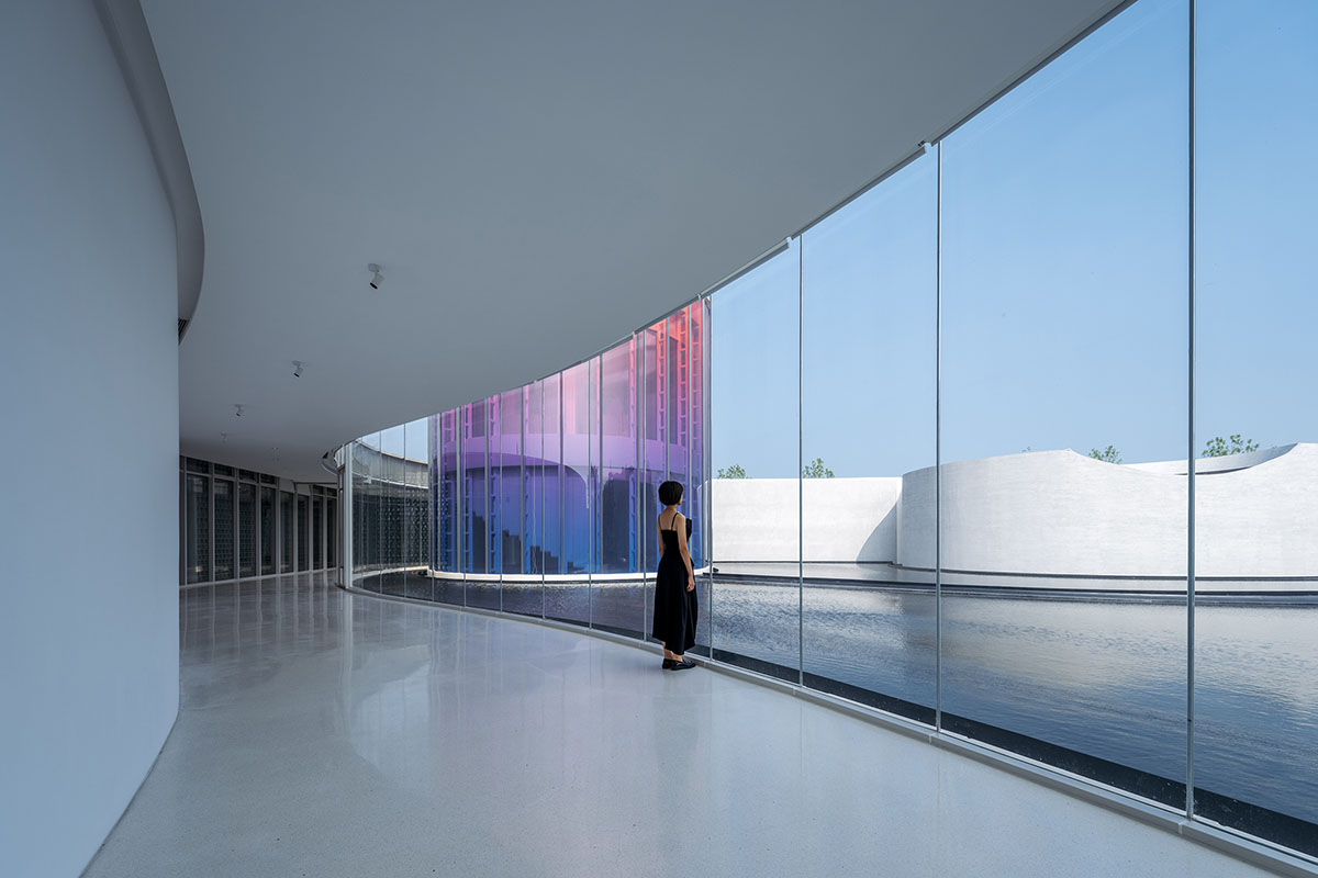
Image © CreatAR Images

Image © CreatAR Images
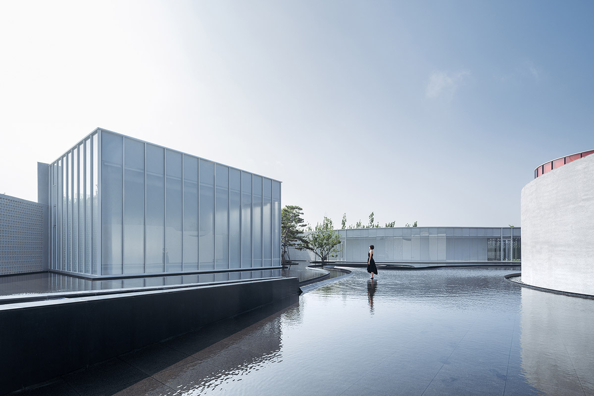
Image © CreatAR Images
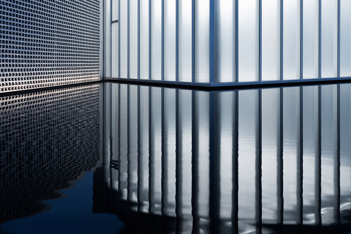
Image © Seven W
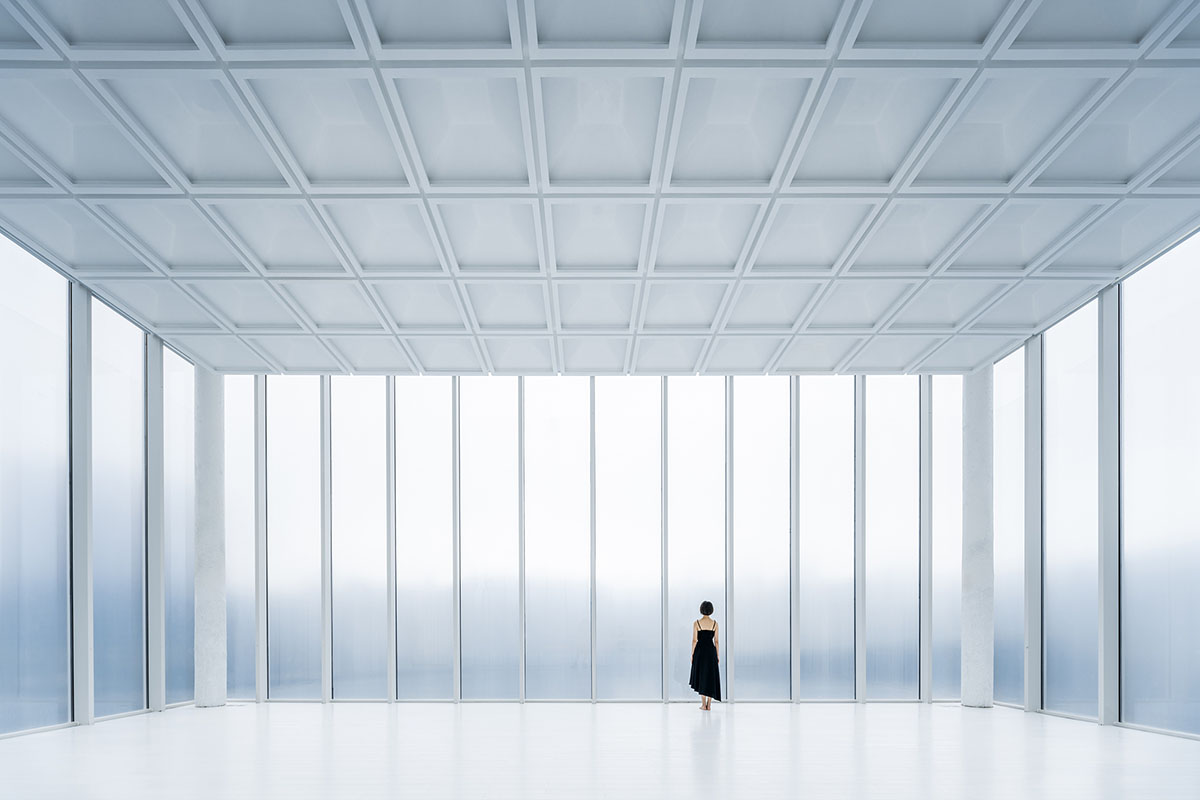
Image © CreatAR Images
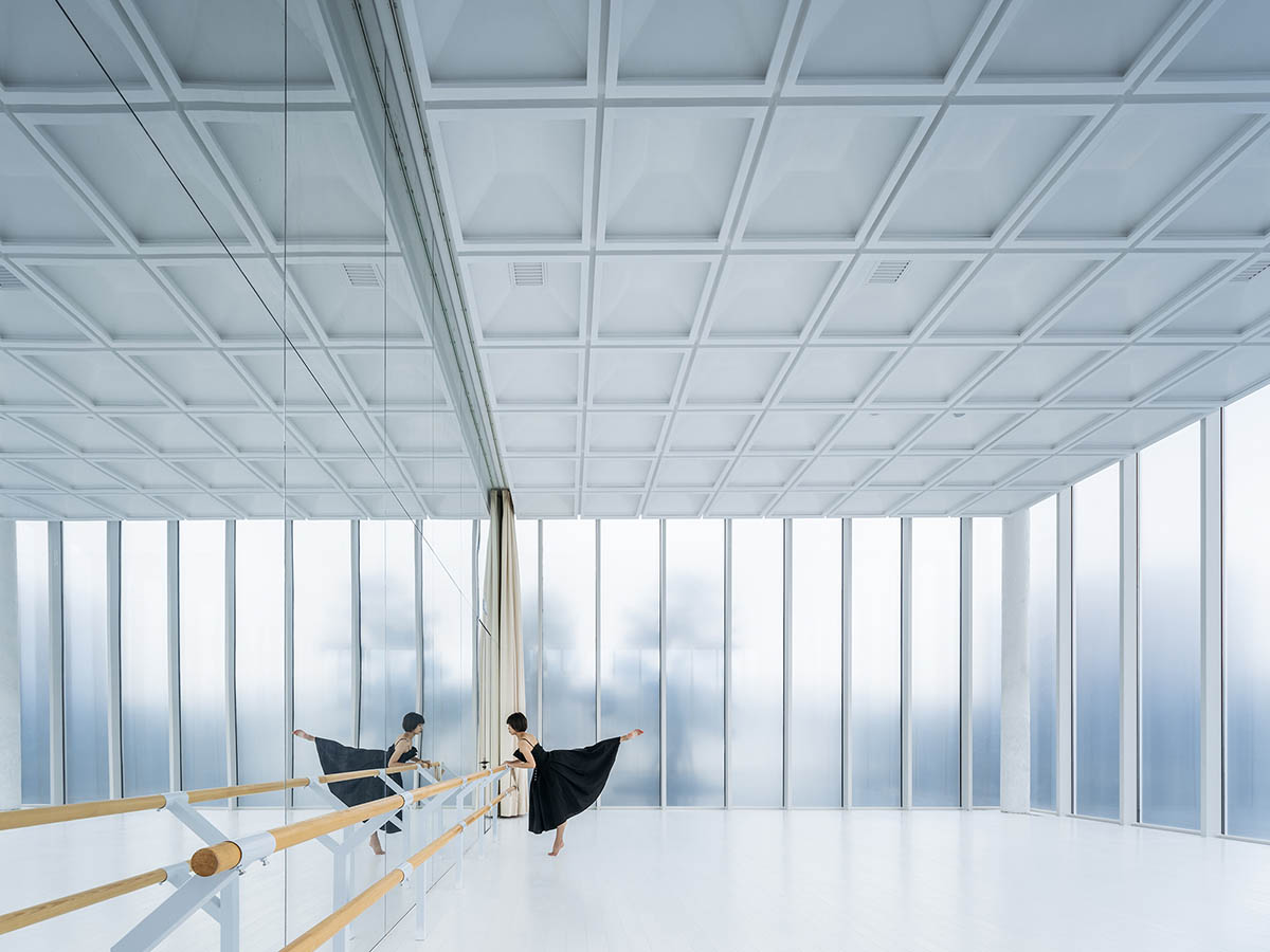
Image © CreatAR Images
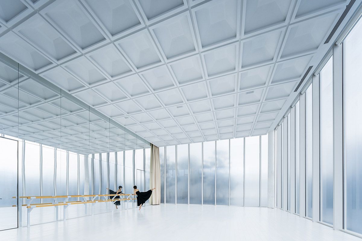
Image © CreatAR Images
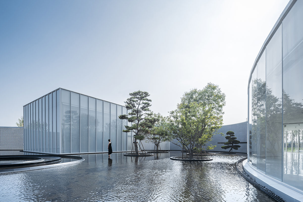
Image © CreatAR Images
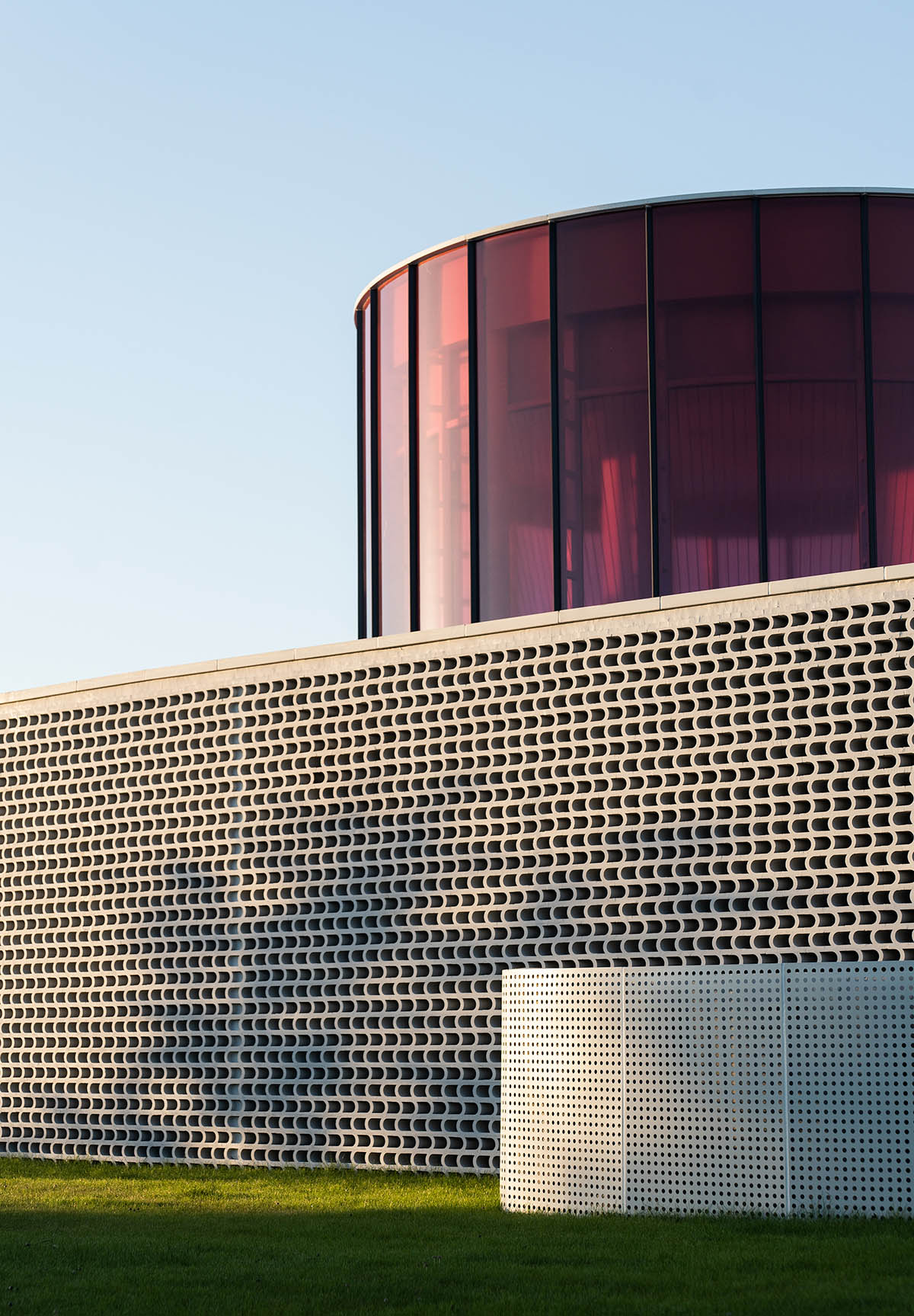
Image © Seven W
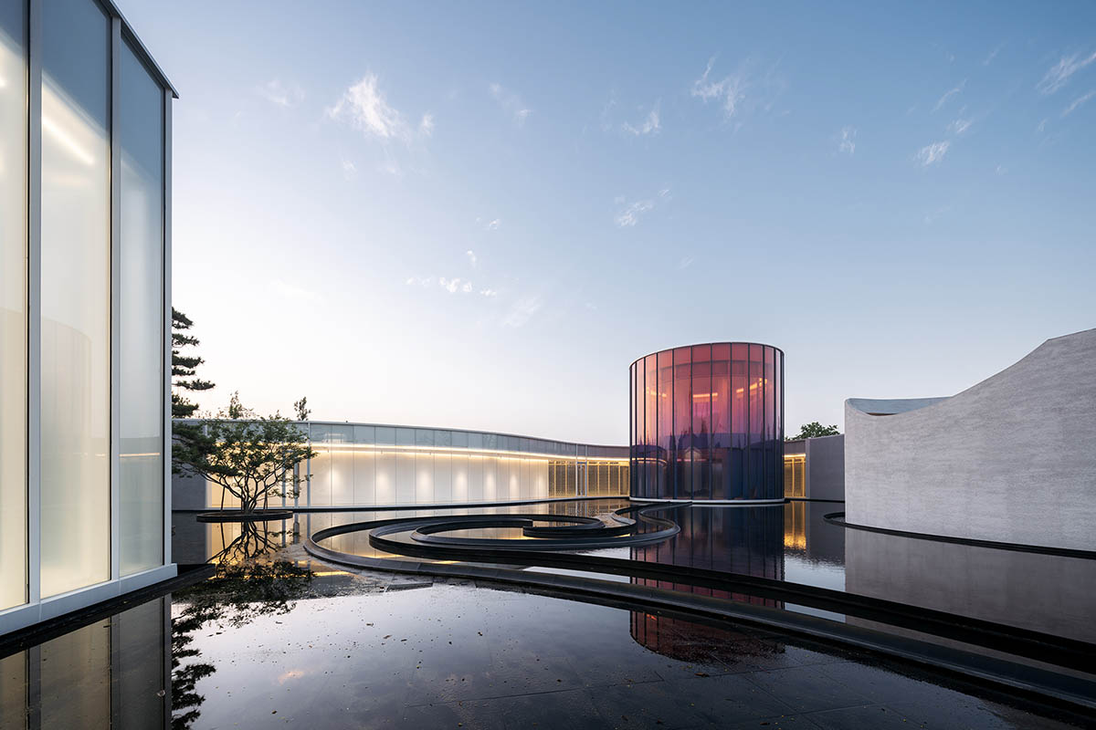
Image © CreatAR Images
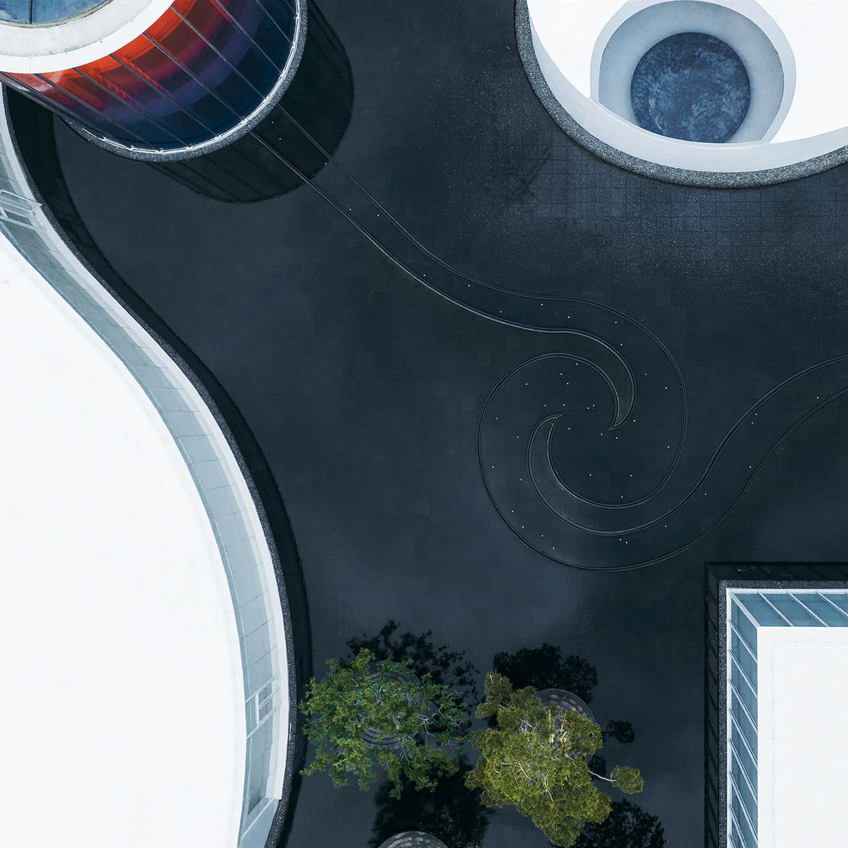
Image © Seven W
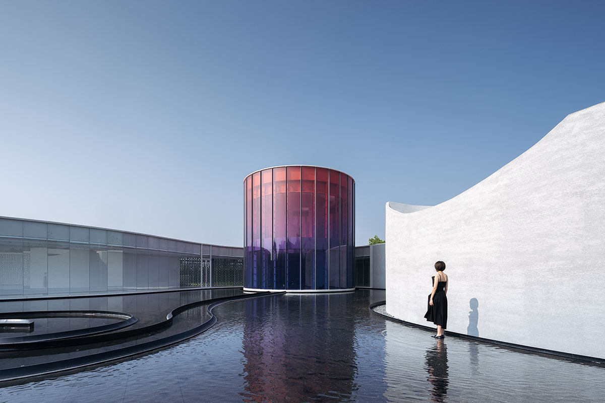
Image © CreatAR Images
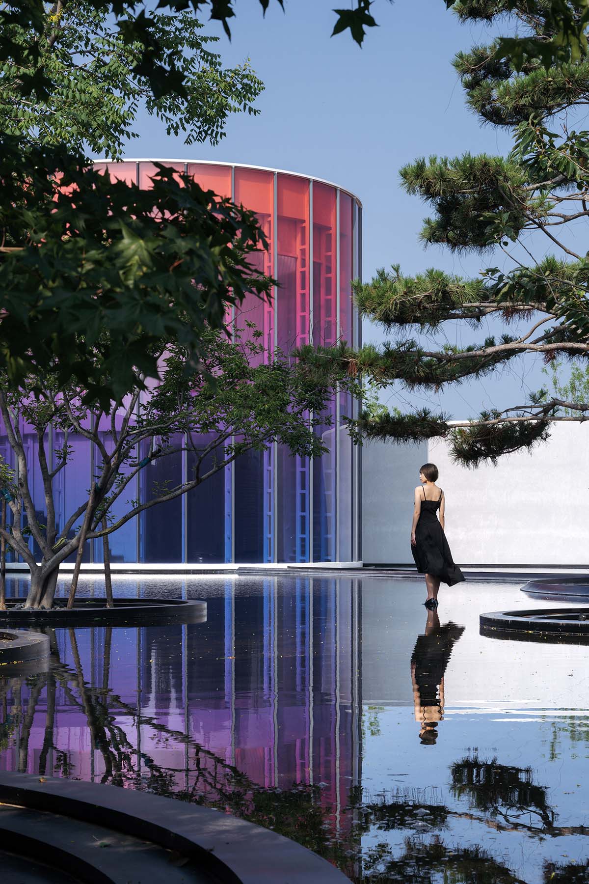
Image © CreatAR Images
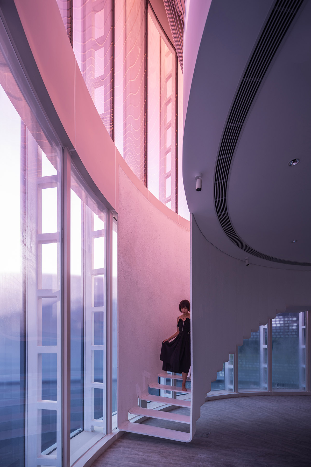
Image © CreatAR Images

Image © CreatAR Images
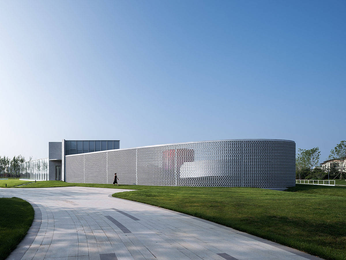
Image © CreatAR Images
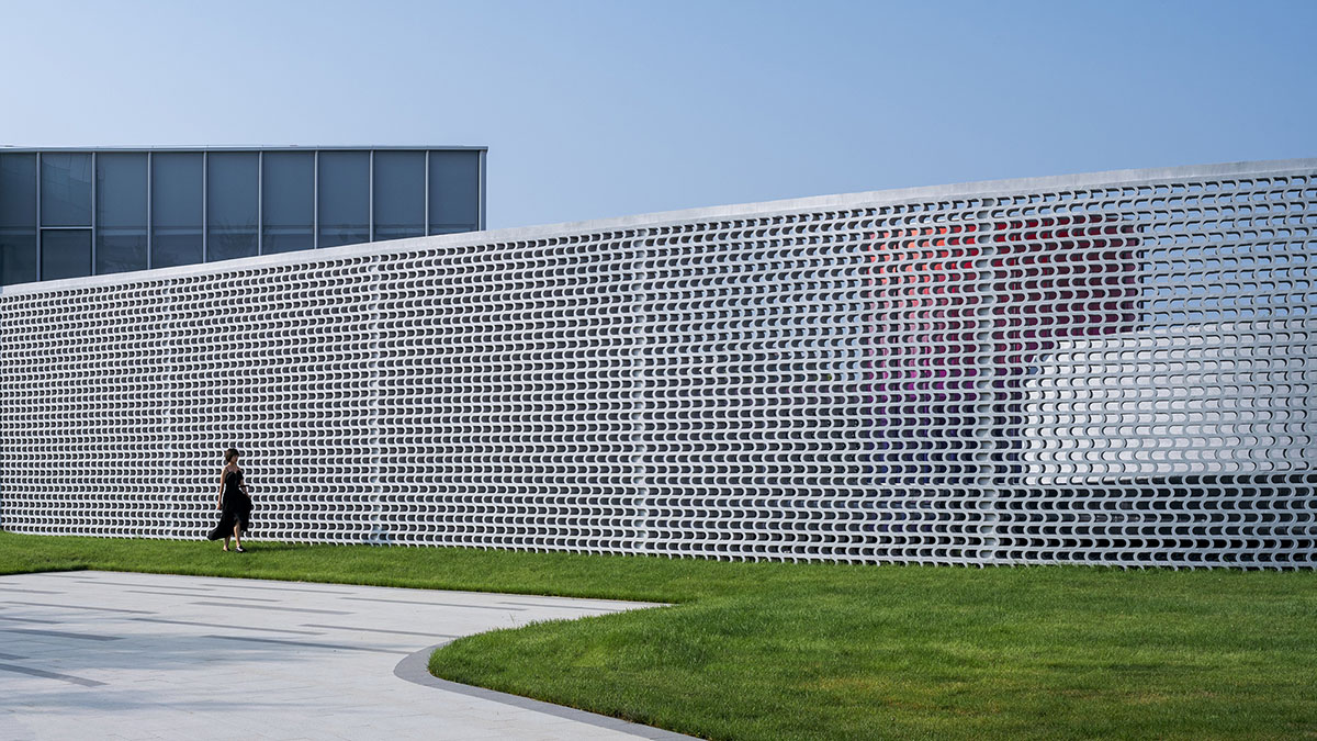
Image © CreatAR Images
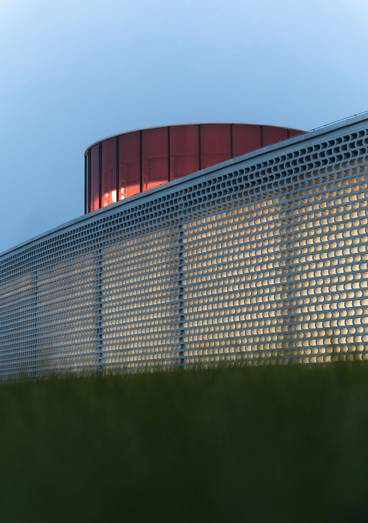
Image © Seven W
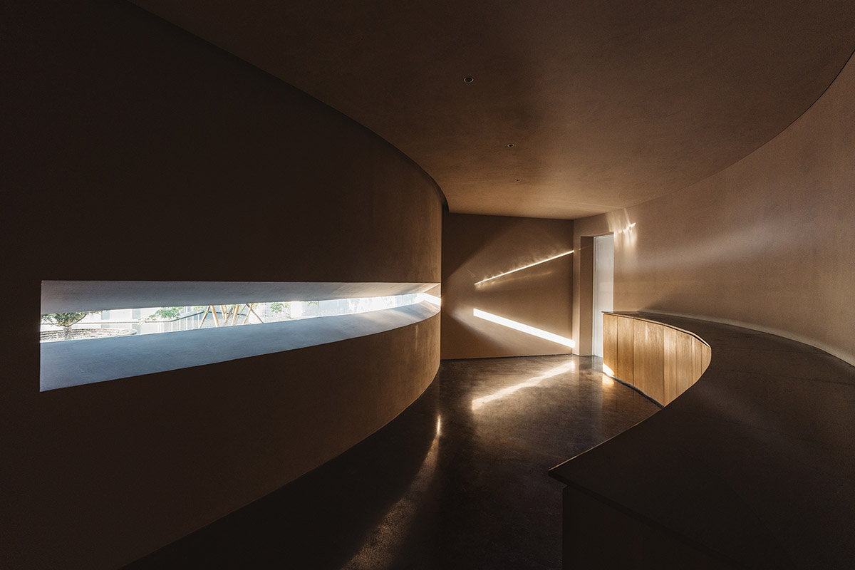
Image © Seven W

Image © Seven W
Site plan
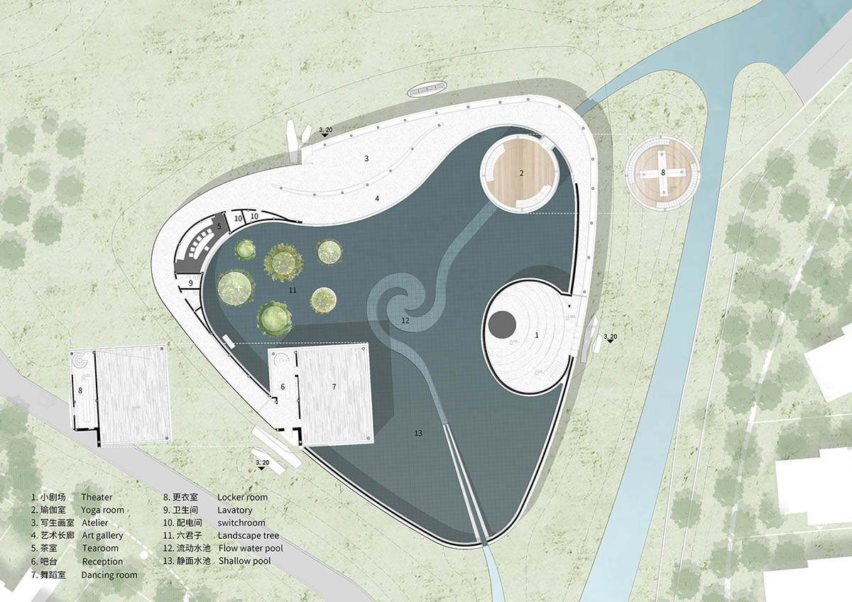
Floor plan
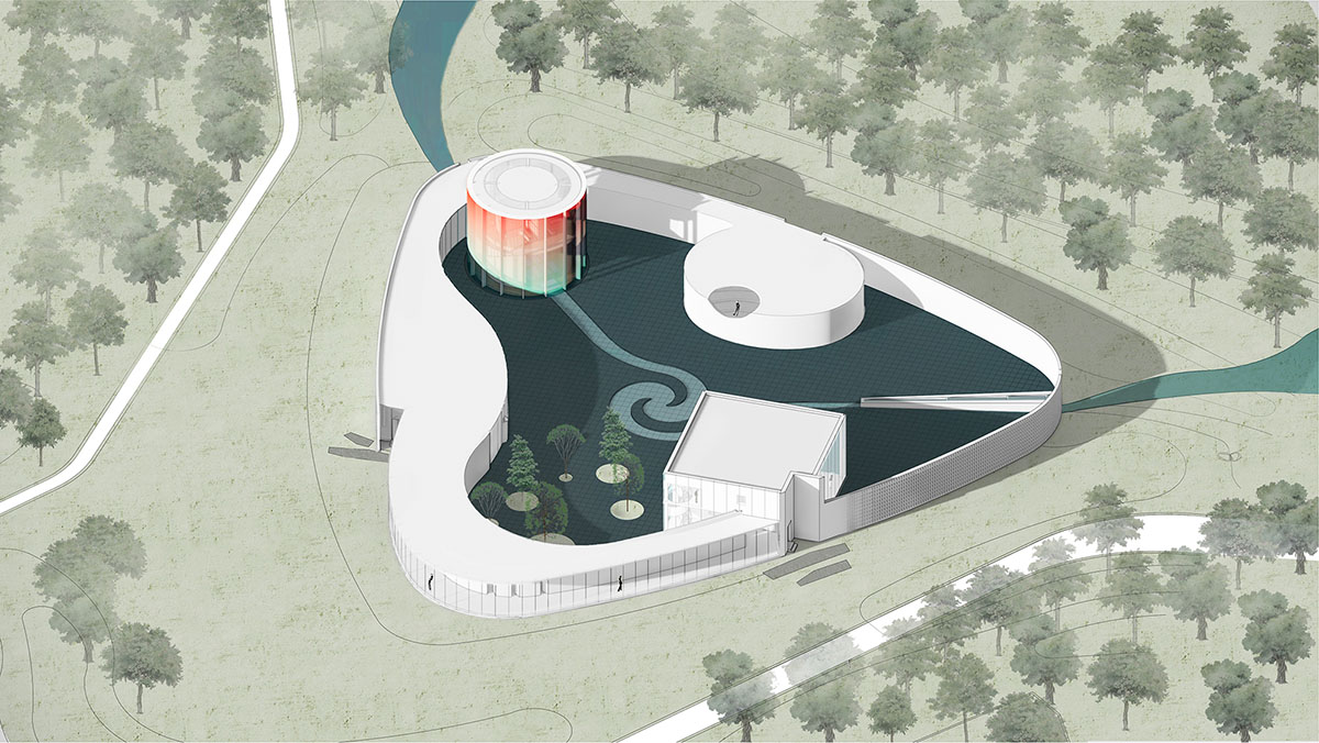
Axonometric drawing

Axonometric drawing with functions
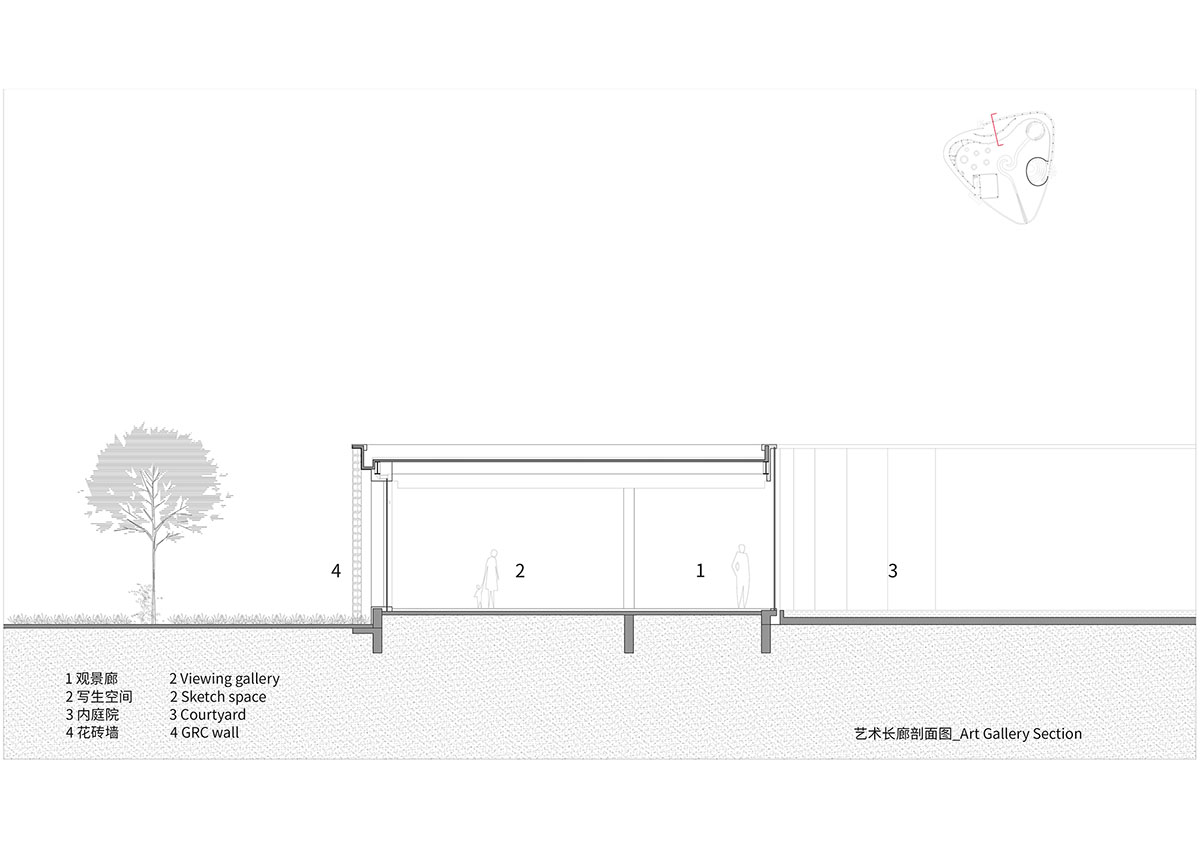
Art Gallery Section
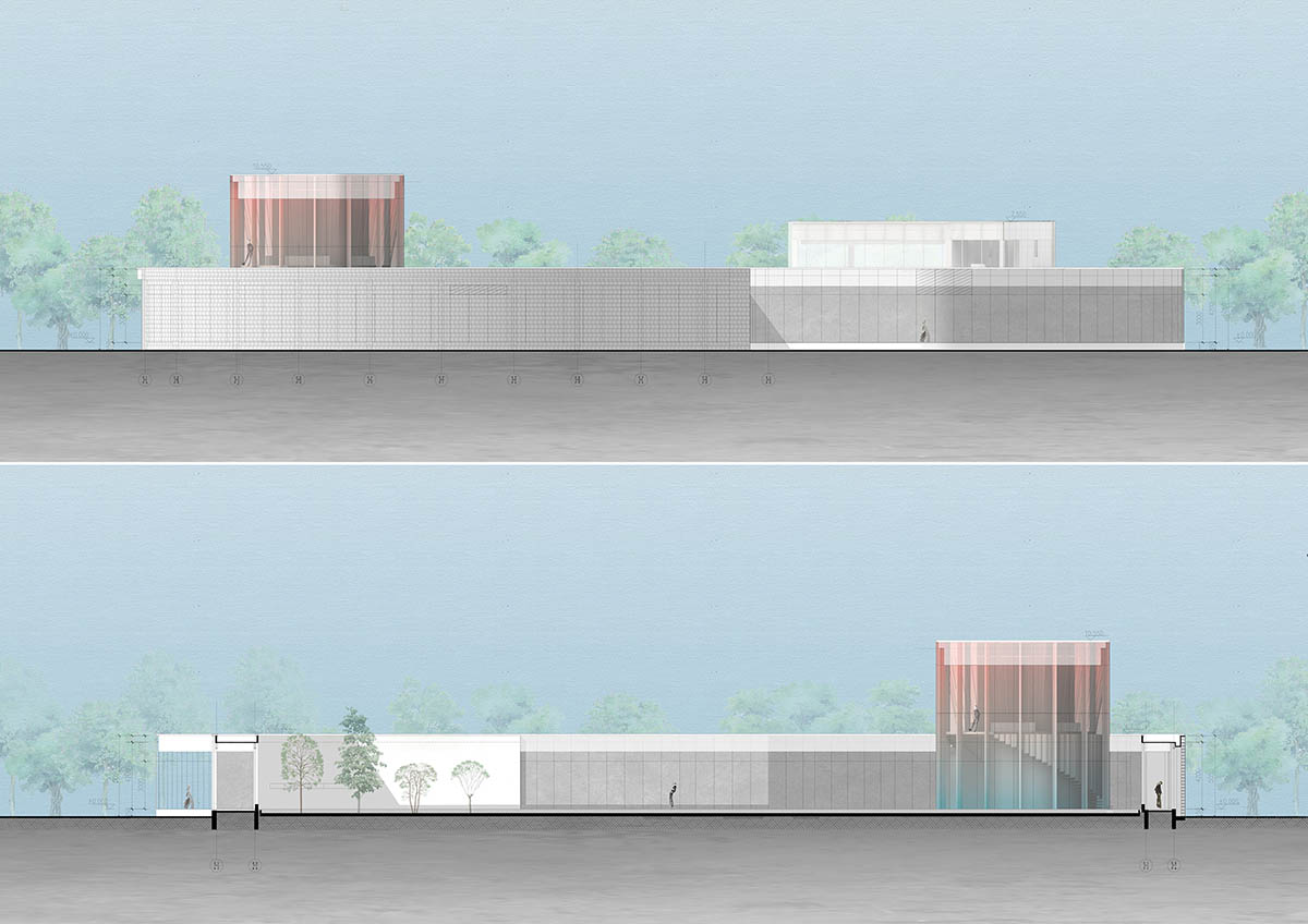
Elevations
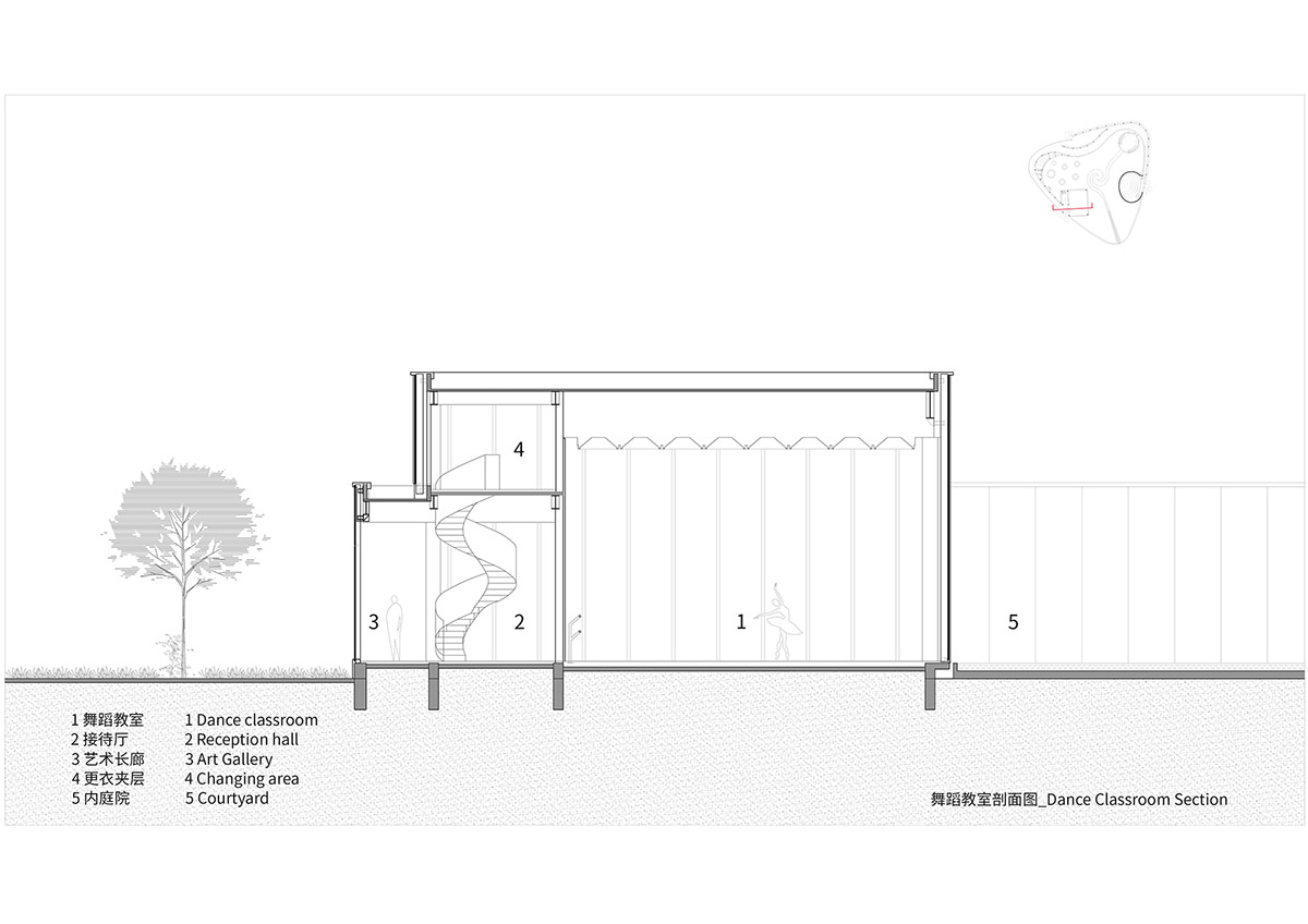
Dance Classroom Section
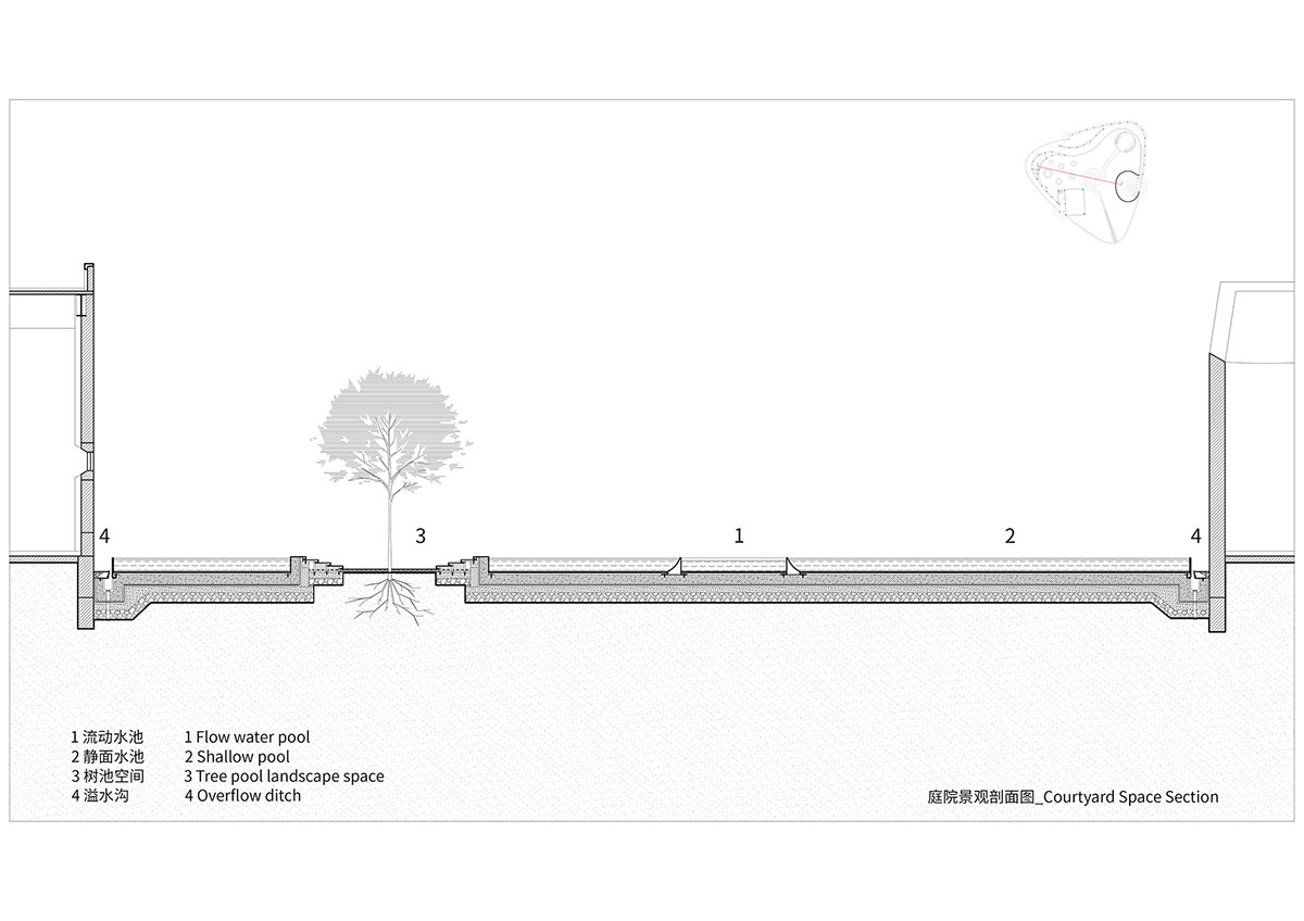
Courtyard Space Section
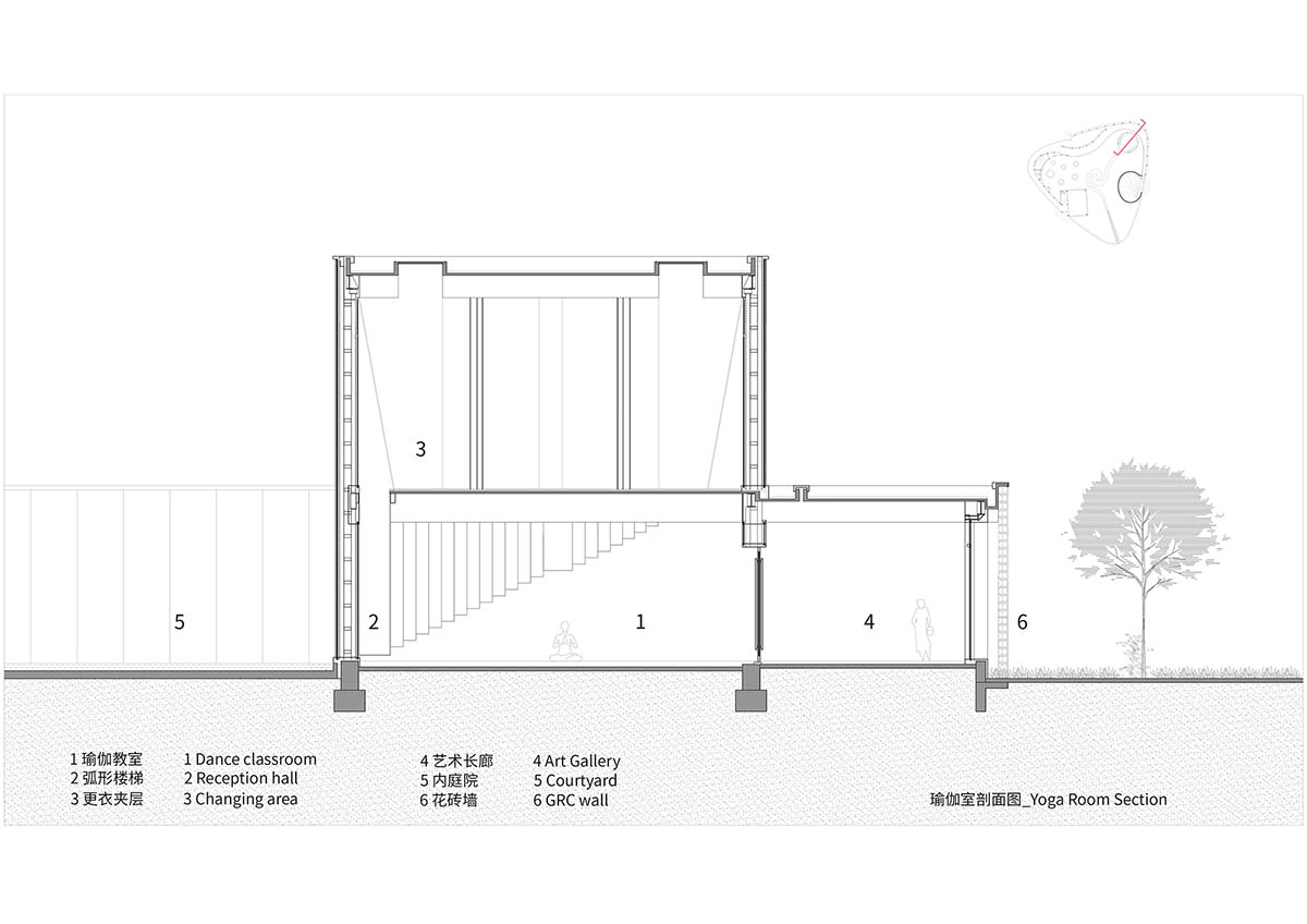
Yoga Room Section

Flower Brick Wall Diagram

Flower Brick Wall Detailed
Project facts
Project name: Monologue Art Museum
Project location: Beidaihe District, Qinhuangdao, China
Design period: April, 2021- June, 2021
Completed: July, 2022
Area: 1272m2
Architecture Firm: Wutopia Lab (Architecture, Interior, Landscape)
Chief Architect: Ting Yu
Project Manager: Hao Li
Project Architect: Hao Li
Design Team: Raven Xu, Zhizheng Wang, Ziheng Li, Xinping Jiang (Intern)
Prototype Research: Xinyang Dai, Jun Ge, Murong Xia, Binhai Miu (Structure)
Lighting Consultant: Chloe Zhang, Shiyu Wei, Xueyi Liu
Material Consultant: Jing Sun
Design Development: Shanghai SUNYAT Architecture Design Co., Ltd.
Design Development Team:
Architecture: Yumei Zhu
Structure: Wenxiao Hu
Electromechanics: Jiayin Shi, Bo Mao, Yaqian Mao, Yuheng Zou
Interior: Bing Yu, Rui Shen, Licong Zhou, Fang Zhang
Construction Drawing Design: Tianjing Tianzituowei Architecture Design Co., Ltd.
Landscape: Beijing Sino-Ocean Landscape Design Institute Co., Ltd.
Façade: BG&E Façade Technology (shanghai) Co., Ltd.
Construction Unit: SINO-OCEAN GROUP SEATOPIA
Client Team: Xiaoyan Zhang, Yuemin Jin, Dongfang Zhao, Junhao Li, Yue Yang, Yu Shi, Dongyang, Zhao, Jiyao Wang, Hai Dou, Jiang Yu, Zhining Zhang, Ning Su, Xingwang Liu, Yishen Jiao
General Contractor: Zhongtian Construction Group Co., Ltd.
Finishing: Sino-Ocean Decoration Engineering Co., Ltd.
Curtain Wall: Tianjin Dongfang Haichuan Door Window and Curtain Wall Joint-stock Co., Ltd.
Garden: Beijing Shengyuan Ecological Garden Co., Ltd.
Flower Tile: Tangshan Yuchuan Construction & Decoration Engineering Co., Ltd.
Model: Nayu Su
Top image © Seven W
All images © CreatAR Images, Seven W
All drawings © Wutopia Lab
> via Wutopia Lab
