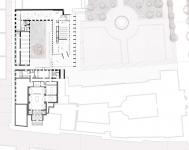
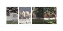
The proposed project is a master’s thesis focusing on the intervention in the Mekhitarist Monastery in Vienna. The aim of this intervention is to organize and redefine the plaza and the monastery’s surrounding space.
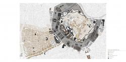
The scope of the intervention centers on Vienna's Ring, a circular avenue encircling the city center, constructed after the demolition of the defensive walls and the glacis they enclosed. From this significant urban project, one key detail stands out, which is crucial for understanding the proposed design: the buildings constructed along the Ring followed a style consistent with their function and use.
Furthermore, the design considers the architectural perspectives of three influential architects who built along or near the Ring: Semper, who believed their era lacked a distinct style; Otto Wagner, who advocated for the removal of superficial ornamentation and emphasized honesty in design; and Adolf Loos, who argued that modern style should be characterized by a lack of style, while maintaining that classical style had become timeless through its extensive use throughout history. These ideas are central, as the proposed building adopts classical architectural language while remaining entirely contemporary.
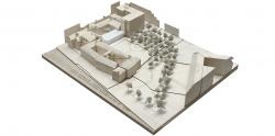
The intervention focuses on the rehabilitation of one of the wings of the Mekhitarist Monastery, currently disused. This building and the adjacent park are located at the edge of the Ring. The project seeks to recover traces of the former courthouse garden and the cloister space of the monastery. While referred to as a cloister, it does not have the traditional gallery enclosing the courtyard. However, it functions as one, creating an enclosed area for religious congregation and worship.
It is essential to highlight that the new uses of the space align with the existing urban configuration. As Carlo Scarpa once said, "The architect must be a great storyteller, capable of weaving past, present, and future into a single design."
The park is conceived through two key ideas: the first, to remember and adapt, involves creating two worlds within the same park. This is achieved by recovering traces of the past, adapting them to new uses and spaces. The second idea is to establish the park as an agora—a social landmark. Drawing inspiration from Ancient Greece, the agora was a multifunctional public space central to the social, political, economic, and cultural life of the community. This concept is reflected in both the building and its urban surroundings.
Mies van der Rohe viewed architecture as dynamic and alive, stating, "Architecture is the will of an epoch translated into space."
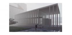
The design aspires to create a thoroughly contemporary project, mirroring the balanced coexistence between the gardens of the Ring and the neighborhood parks. This effort translates into a work that adopts the language of classical architecture to conceive a piece of elegance that integrates harmoniously into its space. The structure, discreet and refined, interacts with its surroundings without overshadowing the park. Thus, it achieves a harmonious connection between the monastery space and the urban park.
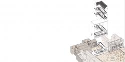
Focusing on the proposed piece, the following key principles shape the project:
Completing the cloister: This ensures protection for monastery users while providing the park with a new façade, replacing the current deteriorated six-meter-high wall.
Permeability and elevation: The existing façade of the courthouse is elevated with a podium that aligns with its Baroque style. This base extends through the cloister, forming a platform for the project. The new structure is detached from one of the wings, creating permeability between the garden and the park, and establishing a tension between the old and new elements.
Rhythm and scale: The design mirrors the proportions of the monastery’s existing façade, reproduced in a porticoed space. This portico adapts to the scale of its surroundings. On the courtyard-facing side, the design incorporates smaller, closely spaced columns, maintaining a lower scale. Conversely, the park-facing side aligns with the scale of palaces along the Ring, using larger, widely spaced columns, creating the impression of a singular volume.
Framing views of the palace and monastery: The columns of the main façade extend backward to create a visual effect. From the northern park entrance, the columns overlap to form a screen that directs focus toward the Ministry of Justice building. From the eastern plaza entrance, the view passes through the building and centers on the monastery, with its balanced proportions and pure forms blending seamlessly.
Break and protection: The plan incorporates a break in the layout to create a semi-protected space under the portico. This feature disrupts the symmetry, enhancing spatial permeability.
Marking pathways and access points: To emphasize the entrance, a distinct volume breaks symmetry and materiality. From this central access point, all the building’s functions are distributed.
Recovery and demolition: Interior partitions in the monastery’s north wing are removed, except for those with historical value. Additionally, the top floor slab is demolished to highlight the wooden truss, giving it the prominence it deserves. Both the park and the monastery aim to recover valuable elements.
Landmarks, fluidity, and pathways: The design adjusts the trace of the original staircase, creating a core that houses the building’s essential needs, freeing up the rest of the plan. This approach creates flexible, interconnected spaces, achieving spatial unity between the rehabilitated and new structures.
2023
Before delving into the structural and constructive aspects of the project, it is fitting to recall Renzo Piano’s words: "Material is the poetry of construction."
The new building is designed as a simple entity characterized by large spans of up to 15.2 meters between supports. It incorporates a glass box that blurs the boundaries between interior and exterior, connecting public and private realms.
For the roof, a reinforced slab design is used, incorporating a 35mm camber during construction. This ensures that, under load, the slab achieves a level state. The remaining floor elements are also made of reinforced slabs.
The roof’s surface, both inside and outside, is clad with GRC panels, providing visual continuity and encasing the structure in a uniform material. This material choice gives the building a polished concrete appearance.
The new building integrates into the site, becoming a part of it.
Student:
Joel Cotardo
Tutors:
Juan Prieto
Carlos Seoane
Favorited 1 times

