The company is one of the world’s oldest companies having been founded 700 years back. They are leading manufacturers of pigments in the world and Baroda office was their administrative office for the region.
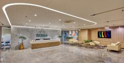
Their existing office was old and compartmentalised with lot of cabins and cubicles and devoid of any cheerful colours.
After carefully studying their work pattern we came up with the design theme.
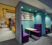
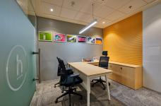
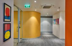
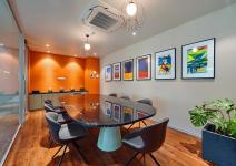
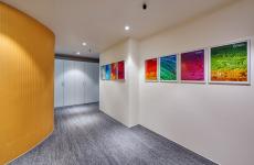
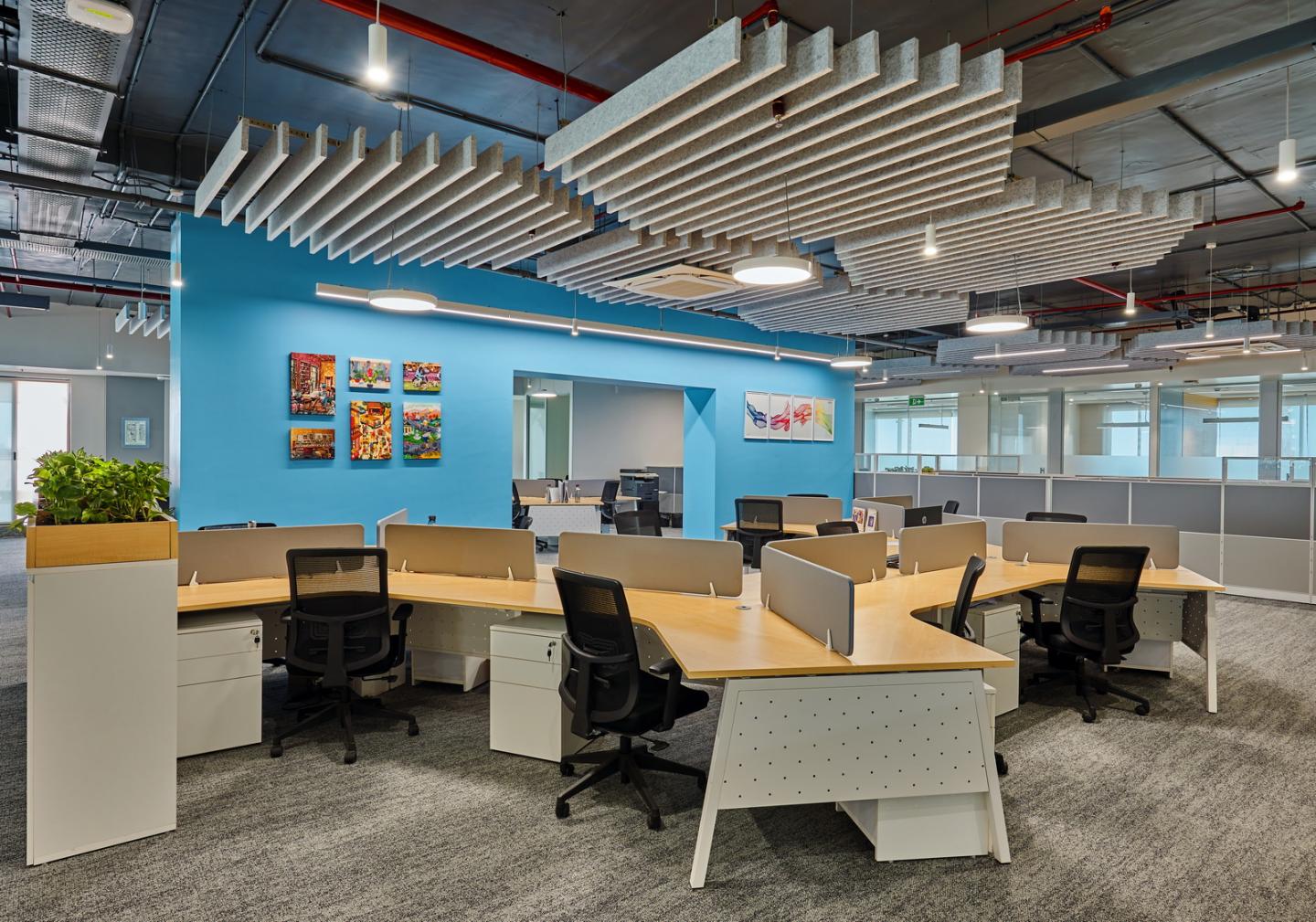
The theme was based on openness and colours, something that portrays their core competence and vision forward. As such we opted for 120 degree workstations for the employees as the entire floor looks open and welcoming.
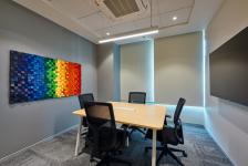
The project had the challenge of using colours however not making it look like a chaos. Hence meticulous choice of colours, their locations and surfaces went in the planning stage. Apart from furniture and wall colours, what also made a big difference was the artwork carefully chosen for the office. Every framed work was chosen to complement the theme of the organisation and only to enhance the look and feel. In this entire story, the carpet and the ceiling acted as the background artists. They were kept to the basic grey and white tones so that the vertical surfaces such as the walls, panelling etc gets the due importance and enhancement, which was needed to portray the right story.
The office has now a colourful and bright environment for everyone working inside and is also serving as a “ brand image creation tool “ for the company. It has proved to be a mood and productivity booster for the organisation !!
2022
2023
Carpets - MOHAWK, Interface
HVAC - Daikin
Light fittings - WIPRO
Concept Designer - Gopal Ade
Design team - Omprakash, Deepesh, Indrajit
Mukesh Gajjar