MINIMALISM BEACH.By R. Fernandez
If traditional beach amenities seem to adjust to neobaroque languages, frivolous and recreational (a mixture of Arquitectonica Miami and Las Vegas Jerde), or a long and re-elaborated sequel of original Brazilian flavors - a Carmen Miranda look, saved by Niemeyer and Burle Marx, but fiercely stereotyped - this recent simple work from Mar del Plata, alludes to a different rationale: drier, austere and elegant. We are bound to say minimalism, closer to recent Spanish references, as maybe Ferrater (Botanic Garden of Barcelona) or Vázquez Consuegra (Paseo Marítimo in Vigo).
This is a fragment within a larger intervention inside the Punta Mogotes complex – a “white elephant”, projected and built under “manu militari”, in the middle of the dictatorial military government, embodied by Saint Jean in Buenos Aires Province. It includes four beach amenities managed by the Automóvil Club Argentino (Argentine Automobile Club - ACA) that take up again the healthy tradition of building good and modern architecture.
This “white elephant” tradition, together with other events, originates in the “fresh” conservatism of the 30’s (Bustillo and Playa Grande Walks) and rounds up a group of great gestures – related to authoritarian times, with scarce debate – which later result in difficult preservation, low adaptability to usage change, and few possibilities of corrective interventions which could lead to subsequent improvement.
The beach area of Punta Mogotes – with a 25-year history already – was chosen for a recent contest to re-design the complex, leading to a kind or ‘master plan’. The latter was preliminarily embodied with the removal of an elevated walk that linked the twenty bunker-type buildings for the beach amenities managed by different groups.
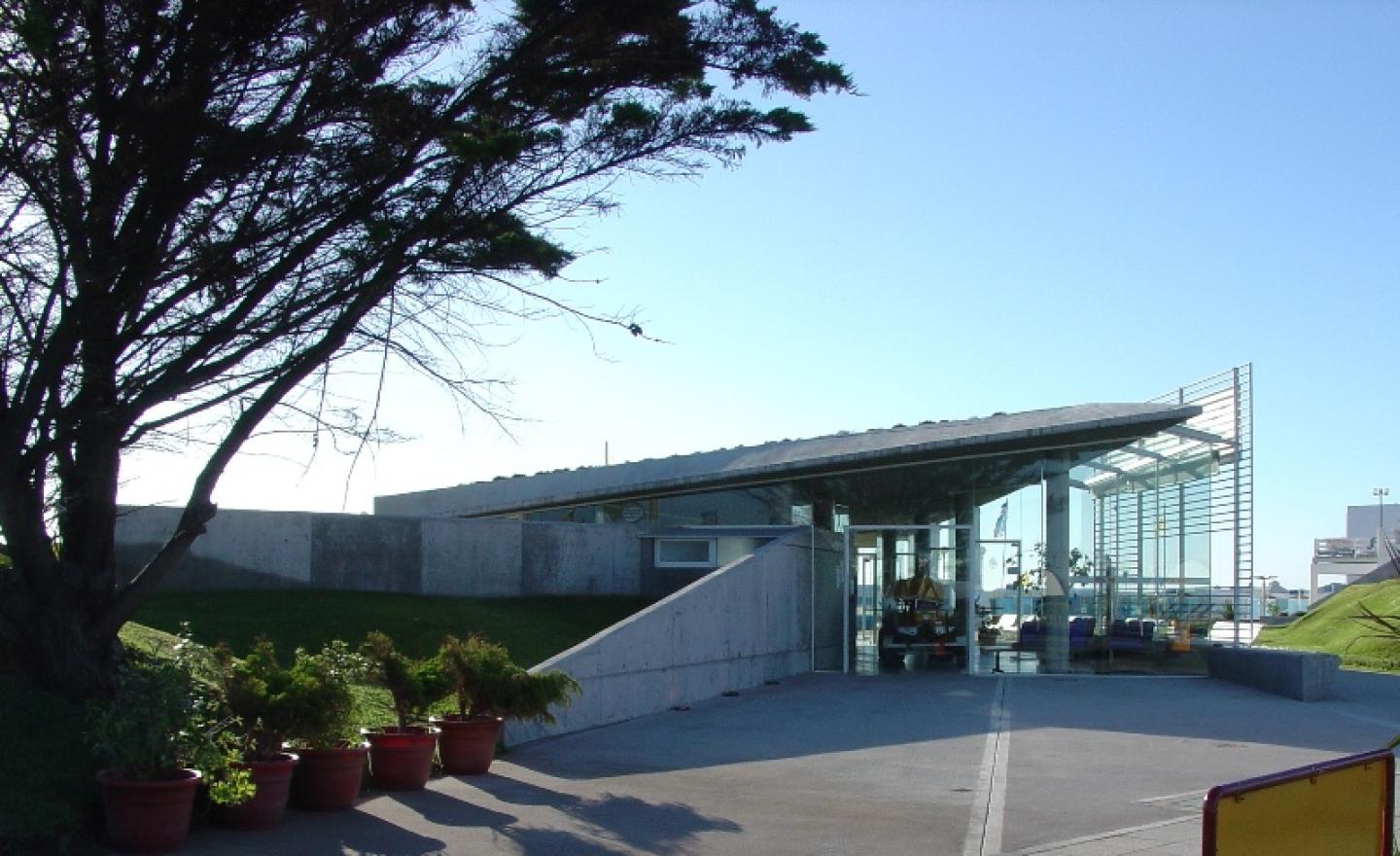
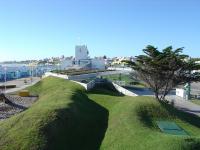
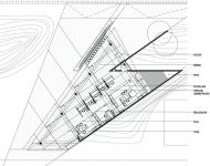
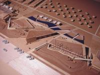
As it may be seen in the general plan and the scale model, the intervention Lemmi-Rescia – expressing a new generation of local architects with a more globalized figurative culture – proposes re-designing a pack of four units trying to bring some new significance to the monumental late-modern architecture of the original project. The proposal softens the system and adjusts it to a more elaborated production of landscape involvements, with new natural geometries (sculpting and fitting sand-dune volumes and laying grass carpets), as well as artificial ones (basically vigorous raw concrete screens which bring new perspectives to the spot, and above all, a rupture of an exaggerated parallelism between the buildings and the coast line of the original mega project.)
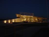
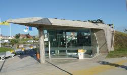
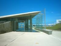
What has been built and launched the last summer season – the new office area, some tiled floors, entrances, and four new stair ways – exhibits the vigorous new design which will hopefully be completed to accomplish what was shown in the model scale. The newly-built section works well (with some easily correctable extra-project inaccuracies, such as the ACA abbreviation art design); it is accurately built (far better than many usual beach architecture set design standards) and adds the freshness of a contemporary language capable to propose at the same time, a minimalist expression (textures, colours, solutions tending to praise surface as an alternative to volumes), and a deconstructive frame of a geometry searching to increase and enhance the exasperating plainness of a simple architecture parallel to the ocean. The monotony is hereon broken and is maybe the starting point for a novel concern to project the relationship between the city and the ocean.
2003
2003
Beach amennities.
Administrative building.
Pablo Rescia, Dario Lemmi, designers.
Laila Sibello,Diego Gatica, collaborators.
