Submitted by WA Contents
The Perfect Drawing: 8 Sensational Sections That Raise The Bar For Architectural Representation
United Kingdom Architecture News - Mar 08, 2014 - 19:00 56888 views
by Angry Architect
Next month marks 20 years since the demolition of Kowloon’s infamous Walled City. If one architectural positive came from this web of urban anarchy, it is that it was documented with extraordinary accuracy, utilizing one of the great modes of architectural representation: the cross section.
This extraordinarily complex slice through Hong Kong’s ungoverned, unplanned architectural oddity—a makeshift home for thousands of Chinese refugees following World War II—has to go down as one of the most jaw-dropping architectural drawings produced in the last century. A Japanese team meticulously surveyed the anarchic maze of walls, floors, and roofs—layer upon unregulated layer—before it was demolished in 1994.
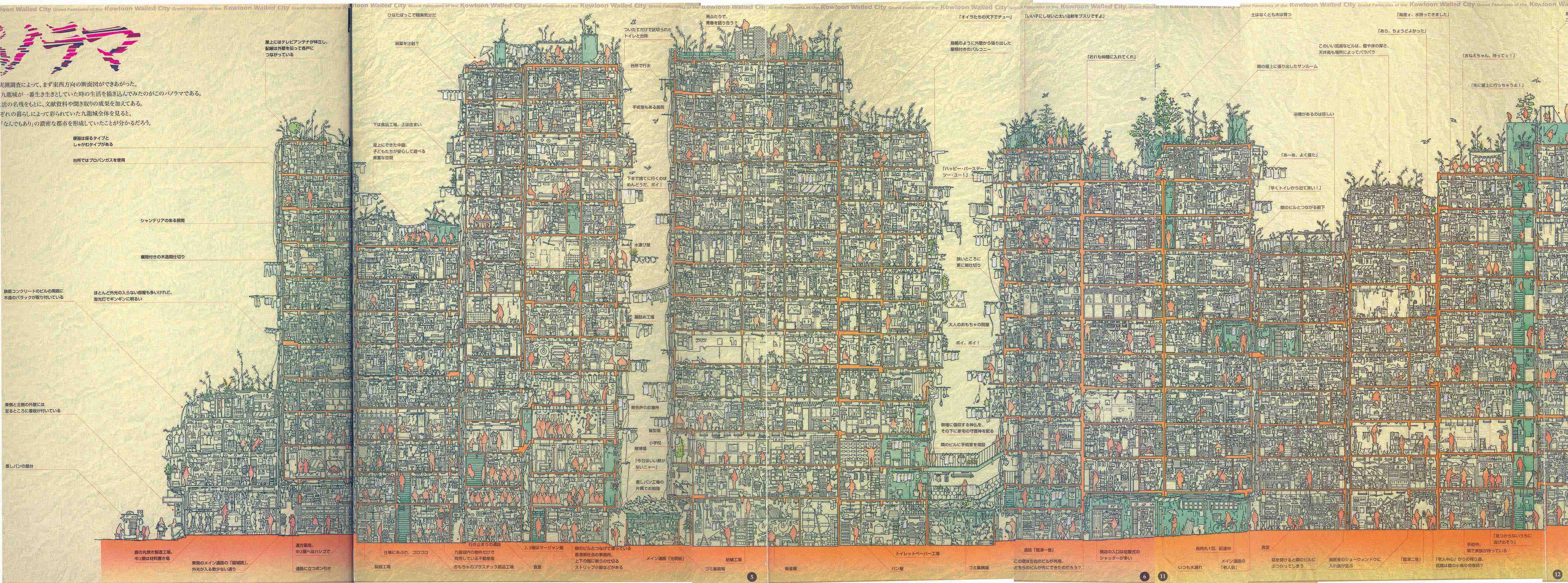
A cross section drawing of Kowloon's Walled City
The level of detail on display is truly mind-boggling: The team appears to have drawn every single possession owned by the city’s 33,000 residents, including hundreds of makeshift washing lines and a veritable forest of TV aerials covering every inch of roof. Endless narratives weave through the mega-structure, giving glimpses into what life must really have been like for the individuals in this monstrous urban anomaly.
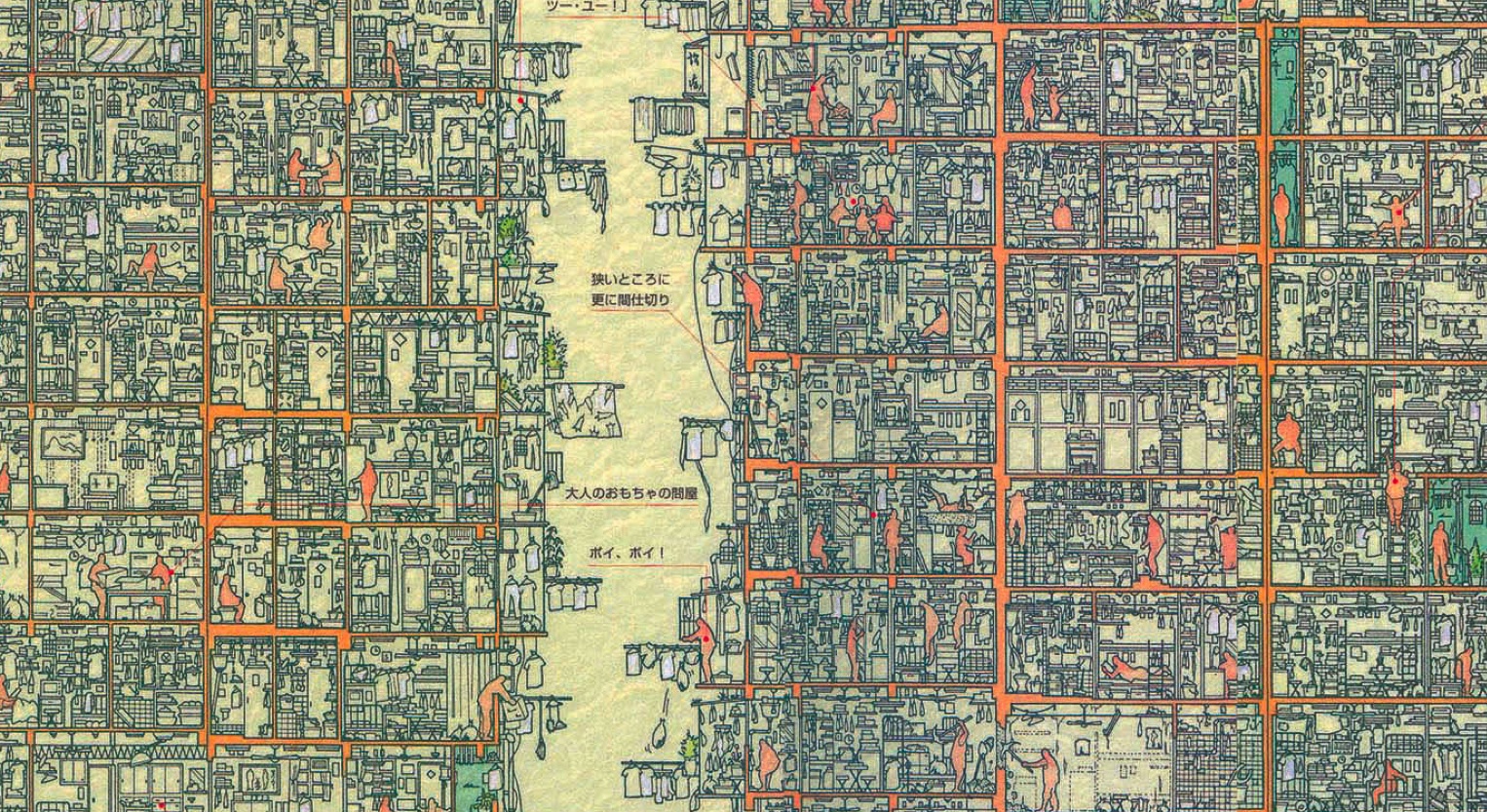
Detail from Walled City cross section
The section truly is the mother of visual storytellers. Here are seven more examples that illustrate just how brilliantly this type of drawing can communicate architectural concepts and reveal the narratives behind the grandest of designs.
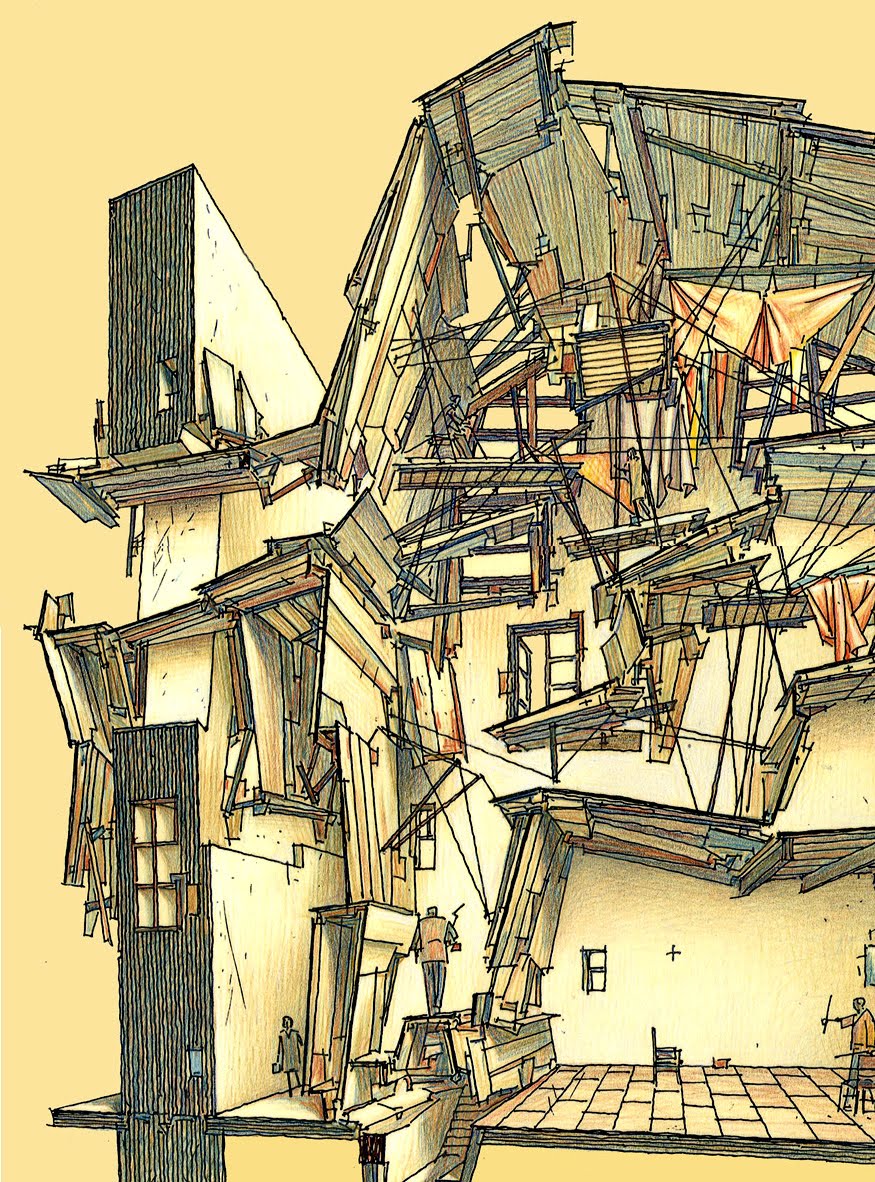
Walls of Change, Lebbeus Woods
Woods was a master at utilizing the section to express his theories on architecture’s relationship with social, economic, and political issues. His collection of sketches for the essay “Walls of Change” are full of depth and texture, and are particularly alluring to anyone with a soft spot for accidental architecture and the re-imagining of derelict or run-down structures.
Woods envisaged a series of inhabited walls for Havana, Cuba, stating: “The proposed walls would contain some infrastructural purposes: water purification, the generation of electricity, like an ‘urban battery,’ almost. This means that these would be ‘hi-tech’ walls, into which individual dwellings would plug, as self-sustaining urban units.” Plug-in units ... that reminds me of another renowned section drawing ...
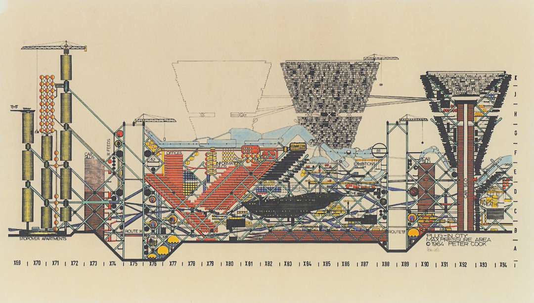
Plug-In City, Archigram
Peter Cook’s provocative design group Archigram produced a host of fantastical drawings that sparked debate on the theories of pre-fabrication and urban infrastructure. Take the cross section through its seminal “Plug-In City.” Cook’s bold, comic-book style crystalizes the main themes of the concept: It is a mega-structure with no permanent buildings taking the form of a vast framework into which cellular dwellings could be inserted and removed with the aid of enormous cranes.
This vision of our urban future was a major source of inspiration for the Pompidou Centre by Piano and Rogers and countless other projects. Indeed, the fictional drawing has affected the world of modern architecture more than many real-world projects!
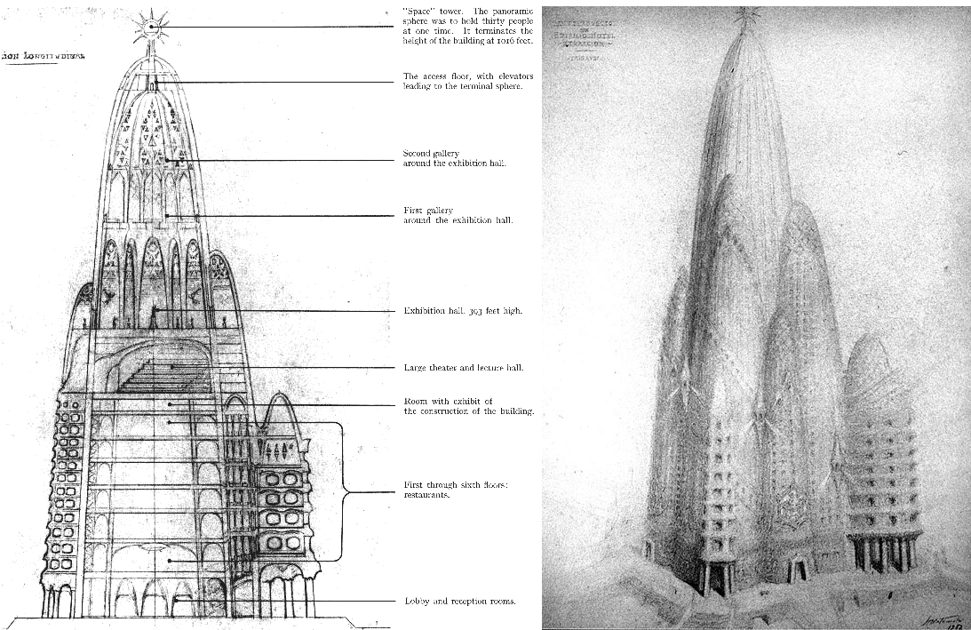
Hotel Attraction, Antonio Gaudi
True story: In 1908, the great Catalonian architect Antonio Gaudi designed a grand hotel for New York City. The location was the site upon which the Twin Towers of the World Trade Center would eventually be built between 1962 and 1974.
Gaudi’s section drawing reveals a design that is peculiar in its similarity to the architect’s more famous—and still under construction—Sagrada Familia in Barcelona. The adoption of parabolic towers on such a scale was an outlandish gesture that never came to fruition, but strands of Gaudi’s organic ideologies are evident within the recent parametric designs of Zaha Hadid and Coop Himmelb(l)au.
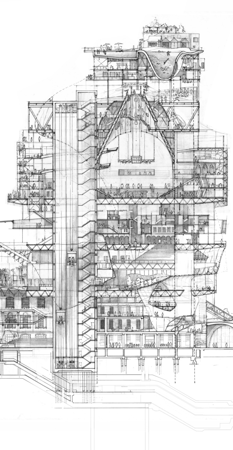
Stacked City, Stuart Franks
This hand-drawn section was made by student Stuart Franks to complete the first year of his MA at the Royal College of Art. A proposal for a stacked city above London’s King’s Cross station, it anticipates rapid population growth in the capital.
Its narrative approach draws upon Rem Koolhaas’s ideas of cross-programming, and a liberal attitude to borrowing historic and contemporary references. In its mix of structural and whimsical suggestions, its complexity and contradictions, this drawing appears, in fact, to pick up on many of the tenets of postmodernism.
Speaking of Rem…

Seattle Library, OMA
Typifying the graphic style of many contemporary firms, OMA’s diagram for the Seattle Library is unapologetic in its use of a medium so often considered the arch-nemesis of visual representation: text.
The drawing possesses the qualities of an infographic, with font size, style, and color communicating the programmatic order and hierarchy of the structure. Scale and depth are absent. Notions of character and atmosphere are sacrificed to make way for an unambiguous description of function—an approach that follows all the way through to the built forms of many of OMA’s public buildings.
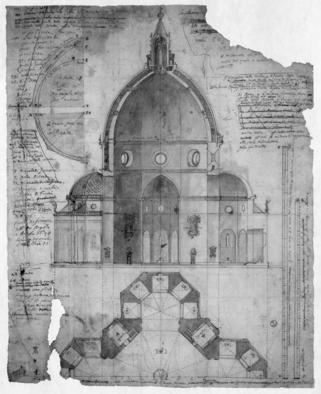
Florence Cathedral (El Duomo), Cigoli / Brunelleschi
In stark contrast to the abstract diagrams of Koolhaas, Italian painter Cigoli’s 400-year-old cross section through El Duomo's epic dome is a beautiful display of good old-fashioned drafting.
Cigoli depicts Brunelleschi’s innovative double-shell design with subtle implementation of light and shade, adding depth to communicate the vast spatial volume of the cathedral’s crossing. Built without flying buttresses or freestanding scaffolding, and using experimental methods that many contemporaries believed would surely fail, the 150-foot-wide dome effectively ignited the creative explosion known as the Renaissance. Cigoli’s fragile parchment remains one of the most elegant depictions of architectural innovation in existence.
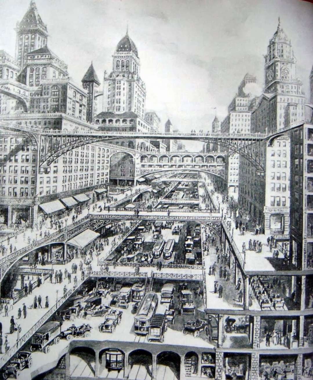
City Of The Future, W.H. Corbett
Exactly three centuries after Cigoli, Corbett’s section is decidedly more futuristic—but no less influential. In his beautifully detailed illustration, the American architect treads the line between utopia and dystopia, imagining a grand and incredibly frenetic cityscape.
Themes of overcrowding and ever-increasing urban density are typified by the layering of transport and pedestrian infrastructure, forming a multi-tiered street scene that makes for a heavenly cross-section drawing.
Corbett’s urban vision has been echoed in various forms ever since, from Fritz Lang’s epic science-fiction movie, Metropolis, to the hyper-dense enclaves of Batman’s Gotham City. In the real world, the architect contributed to numerous high-rise projects in New York City, including the Rockefeller Center in the 1920s.
> via Architizer