Submitted by WA Contents
Product showroom features slanted walls creating a harmonious sense of balance in China
China Architecture News - Jul 01, 2024 - 12:49 1931 views
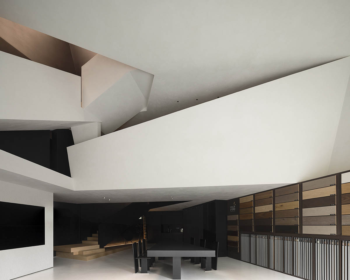
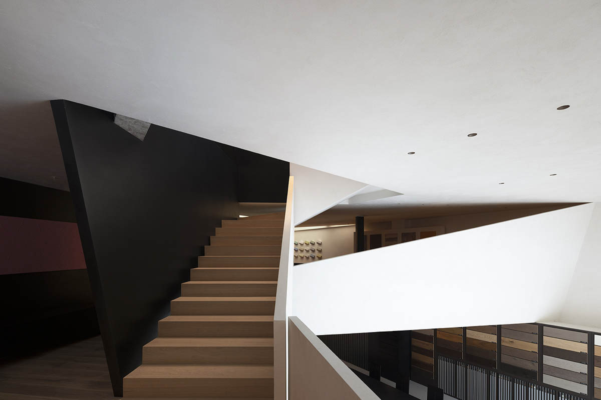
AD ARCHITECTURE has created an interior design that features slanted walls and angular beams in a product showroom, aiming to create a harmonious sense of balance in Shantou, Guangdong, China.
Named Anbong Home Showroom, the 300-square-metre showroom features beamy flooring collections and the Italian brand OIKOS, located in the New East Coastal Area of Shantou.

In commercial design, product positioning informs the overall layout with the goal of directing the aesthetic tastes of the area.
AD ARCHITECTURE has been at the forefront of commercial design in recent years, winning multiple awards with creative branding and design solutions.
"Intimate spatial scales and exploratory spatial form transform challenge into enjoyment, converting unfamiliar spaces into intimate ones, and turning a sense of imbalance into a foundation for inclusiveness and harmony," said Xie Peihe, Founder & Chief Designer of AD ARCHITECTURE.
"This transformation fosters relationships between people and their environment, as well as the intricate details within it. The overall atmosphere created by these interactions resonates, deeply connecting emotions with commercial value."
"Calculation in design involves a holistic approach that integrates all aspects of planning and execution, including form, psychological behavior, and calculated outcomes," he added.

Positioning | Exploration of the New Consumer Group
Surrounded by high-quality new residential developments, the area provides convenient access to a number of recently established schools, established market resources, shopping centers, and other facilities. This desirable area serves as a center for Shantou's new wealthy lifestyle and is great for real estate purchases. The New East Coastal Area has become a hub for Shantou's new consumer group in the last five years as it has developed into a hip, modern, and welcoming urban area.

In commercial design, product positioning informs the overall layout with the goal of directing the aesthetic tastes of the area. The firm has been at the forefront of commercial design in recent years, winning multiple awards with creative branding and design solutions.
According to the studio, the needs of the client come first. Products are presented to clients in the best possible light with no distractions thanks to the monochromatic black-and-white color scheme and the serene, unobtrusive product display.

Design System|Perception of Aura through Sensation
The primary task of this project is to optimize and try to overcome the site's irregularities.
Human aesthetic principles state that spaces with irregular shapes frequently evoke feelings of complexity and unease, reflecting the client's worries and discontent with the state of the site. Nonetheless, the studio team has a wealth of solutions and enjoys taking on challenges in imperfect spatial environments.

"Awakening a sense of balance in the imbalance, all human unease stems from the discomfort brought by the five senses. By refining these elements through aesthetic approaches, we can make the slanted surfaces of the space interact dynamically, creating a harmonious sense of balance. Thus, the design system of this space naturally comes into being," said Chief designer Xie Peihe.
Design Perception | Order and Balance in Disorder
A minimalist vibe is conveyed through the design's intricacy and sense of regularity, which ultimately reflects comfort.
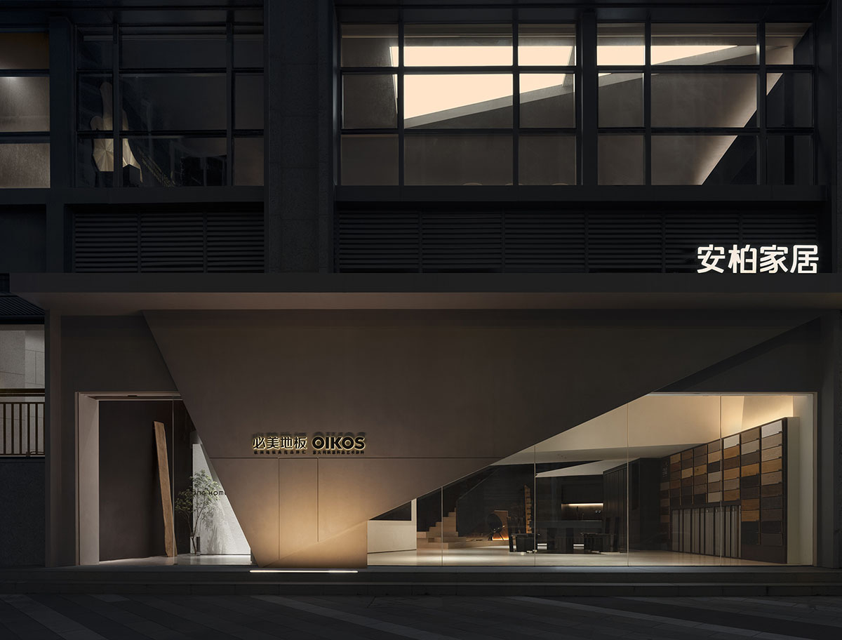
The facade design transcends the limitations of the current structure. As a result, triangular components can extend from the inside to the outside. To increase the architectural space's sense of power and generate new commercial value, a daring architectural design language is incorporated.
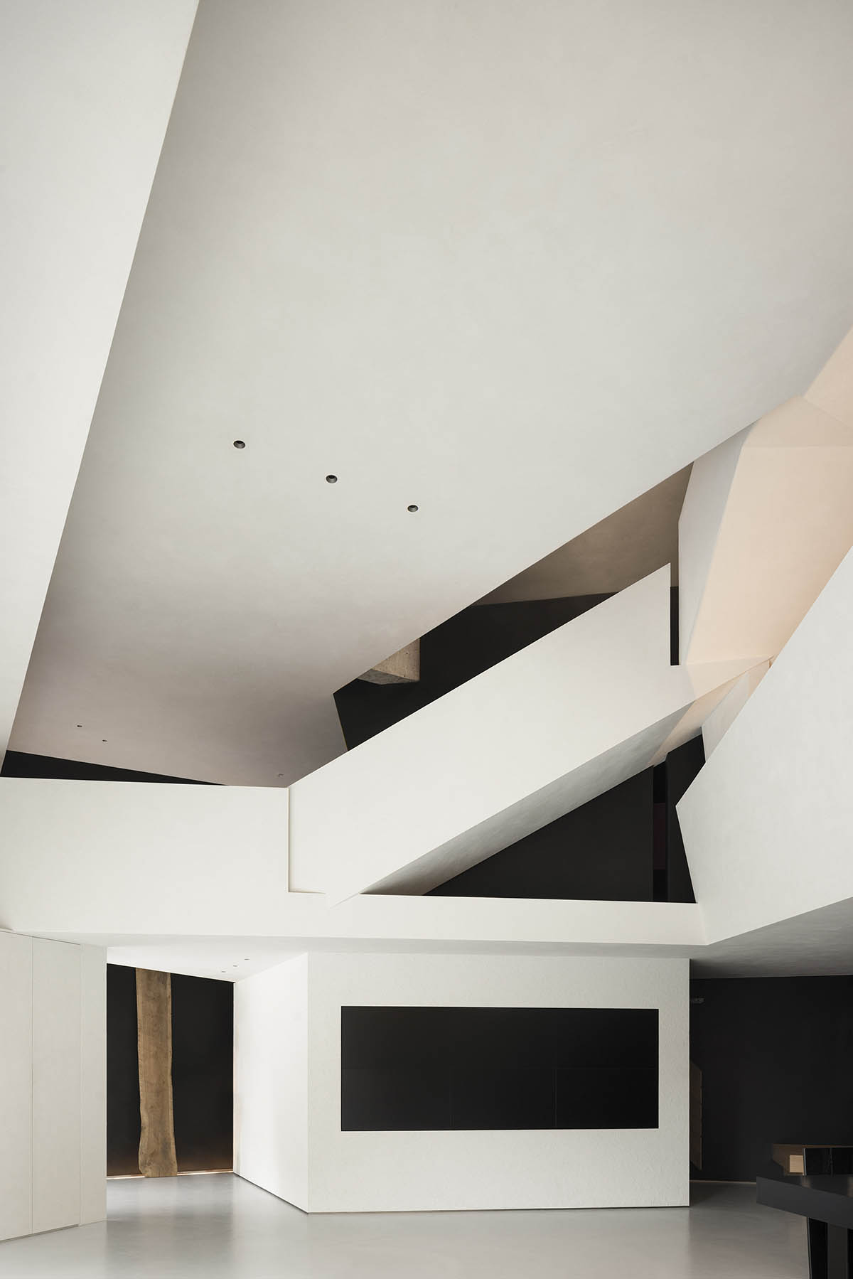
The exhibition hall and the communication area are seamlessly integrated by the narrowing entrance, which results in a well-balanced spatial environment that improves customer interaction with the products.
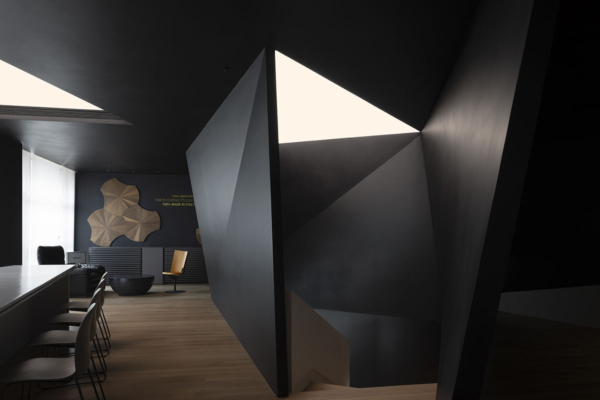
As guests enter the hall, this condensed entryway offers a delicate and understated prelude. Customers can enjoy and comprehend the intricacy of the multi-layered design within the main area. Through a unified design language, the studio adds diversity to the space and creates an immersive minimalist art experience.

Through dismantling and reinterpreting the angled spatial form, diagonal lines are organically arranged within different functional areas to create a new charm.
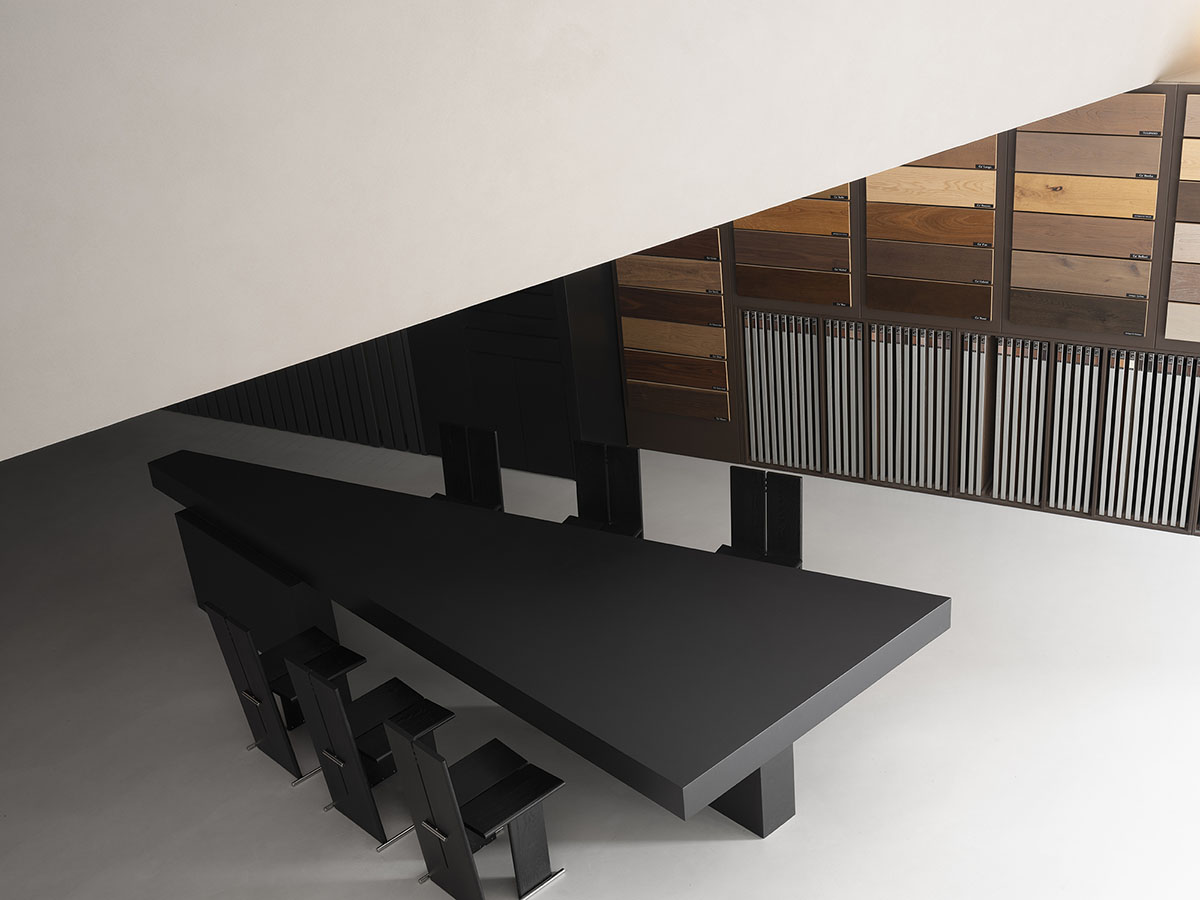
The neat product displays against the dark walls draw attention to the wood's warmth and texture. During regular business hours, the central reception tea table functions as a negotiation area and can also be the center of attention during meetings and salons.
Garden Tour|The Perspective of Exploration
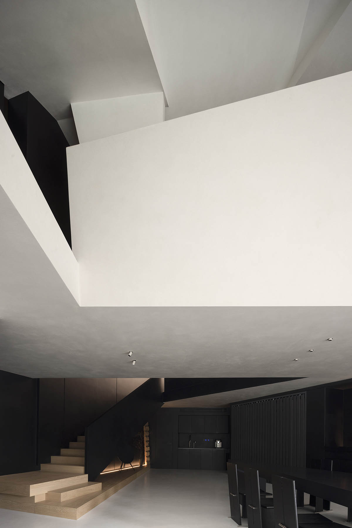
Three sizable sculpture staircases connect various height levels and establish the vertical relationships throughout the room. The design enhances the sense of depth and playfulness by opening the floor at various points and utilizing techniques like digging, covering, permeating, stacking, and winding, giving the area a limitless sense of imagination and charm. This method makes the most of spatial flow, enabling a prolonged spatial experience and bringing to mind a relaxed stroll.

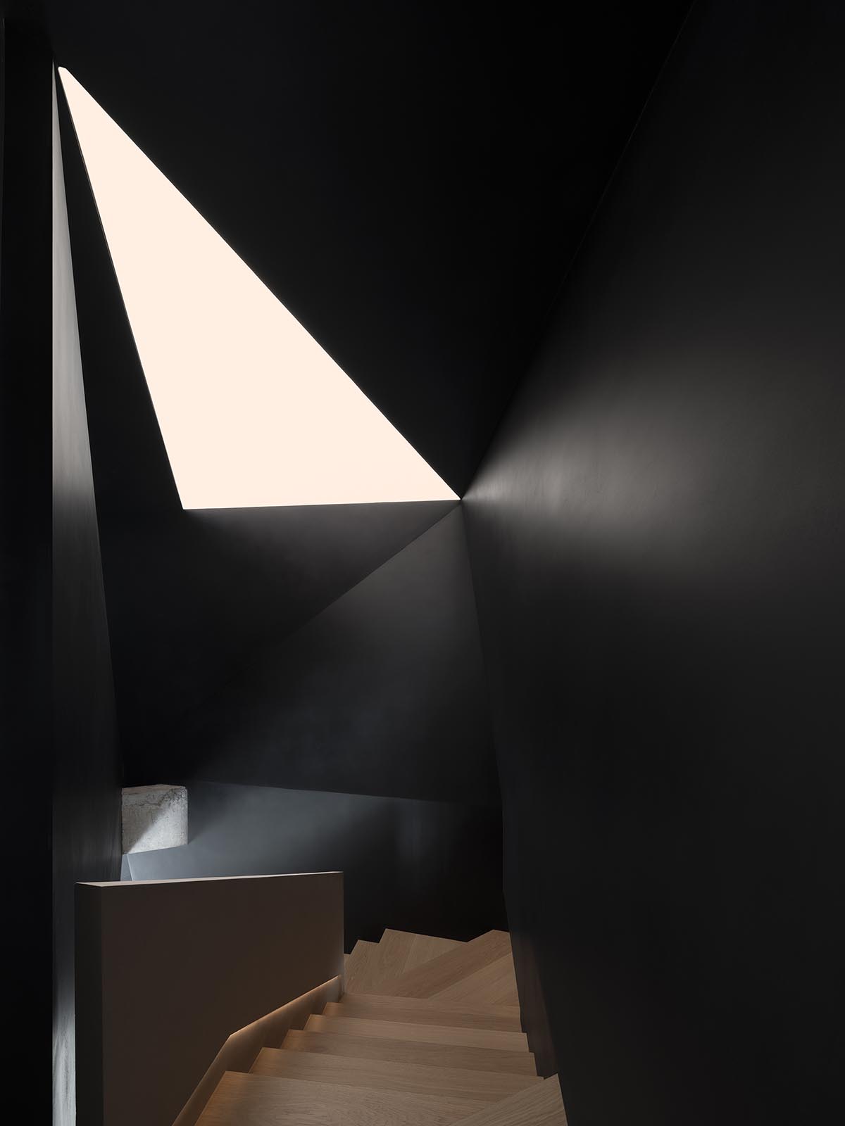
An exploratory experience is created during this visitation cycle. A distinctive visual experience is provided by the mezzanine's inverted triangular opening, which deftly brings the view of outside trees into the area.
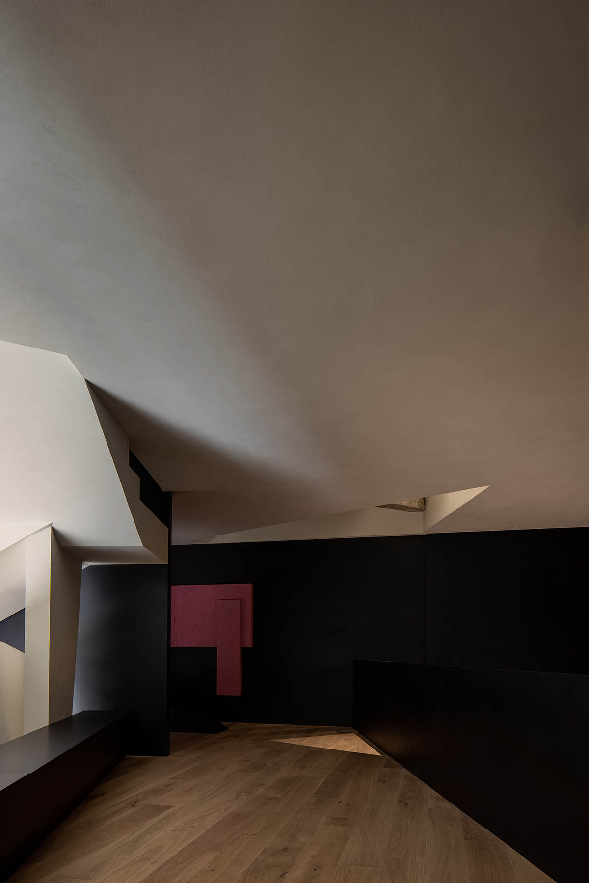
While the mezzanine offers a perspective that unites the first and second floors, highlighting their contrasting yet integrated relationship, the first floor's visual experience emphasizes spatial infinity.
Despite connecting the mezzanine and the second floor, the staircase to the first floor centers visually on the first floor, offering an unexpected visual treat.
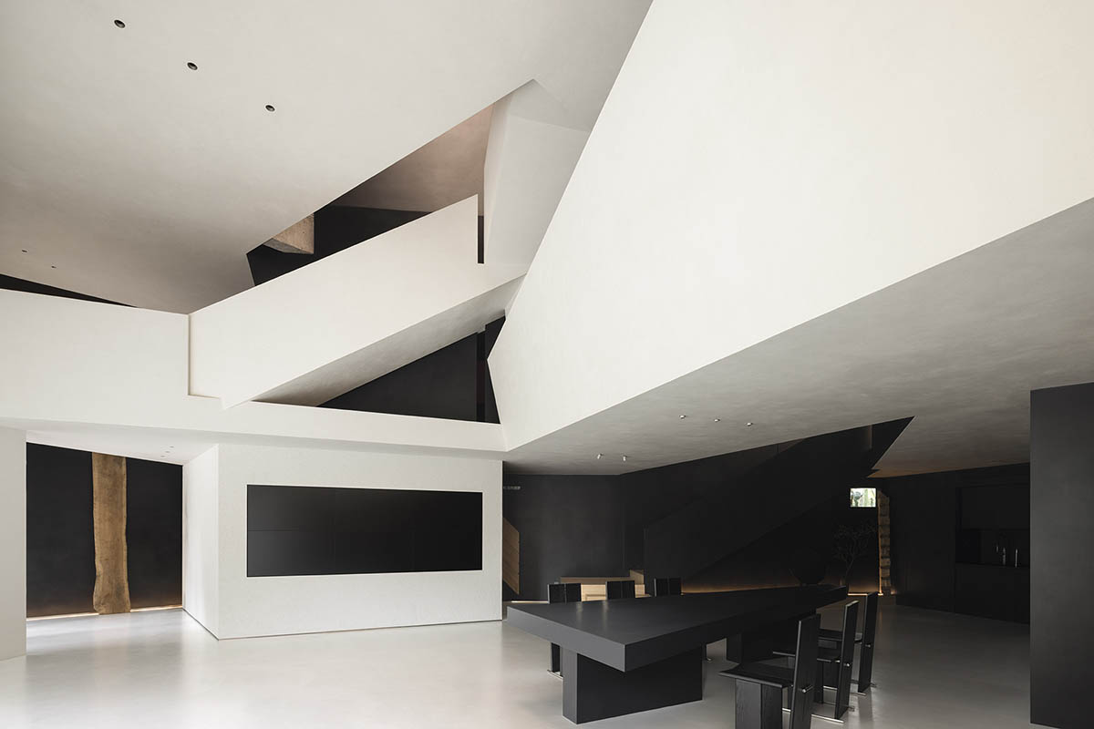
The naturally exposed concrete structural beams created an inadvertent but eye-catching design element during construction.
Through the movement of people, the triangular relationships within the space naturally create slanted surfaces and diagonals that complete the spatial composition.
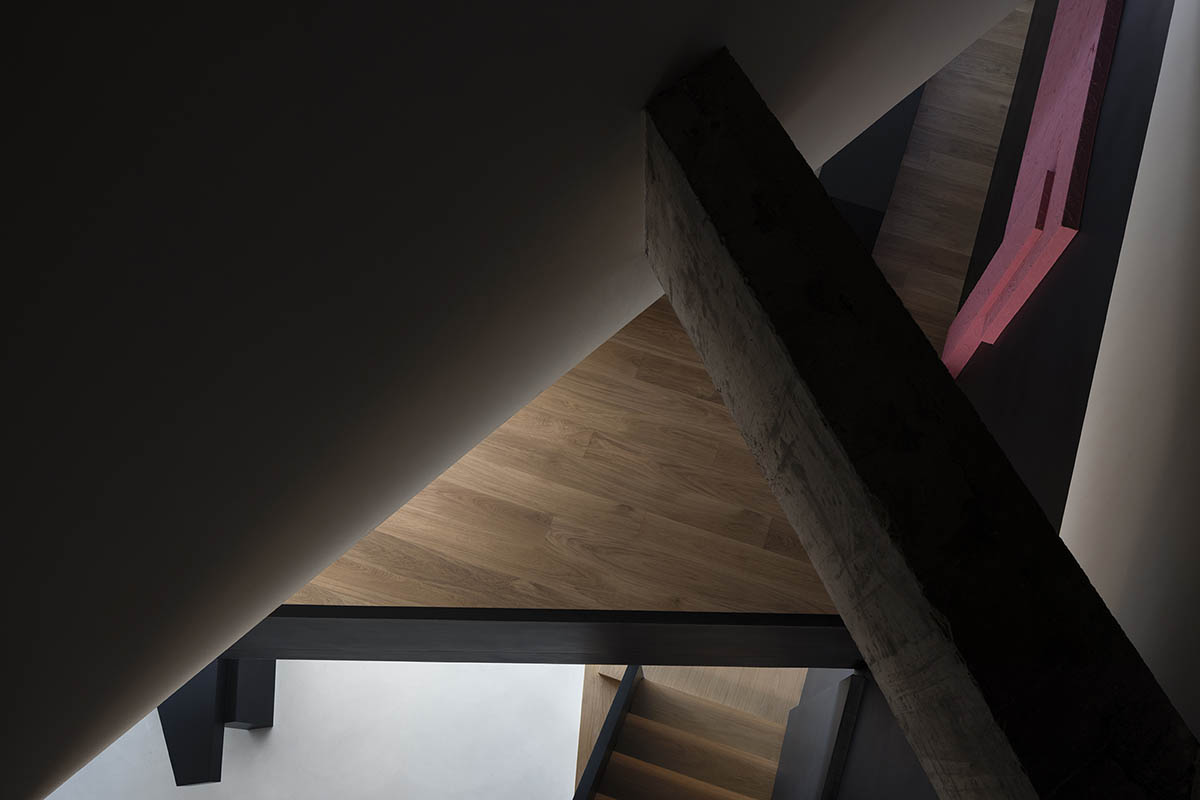
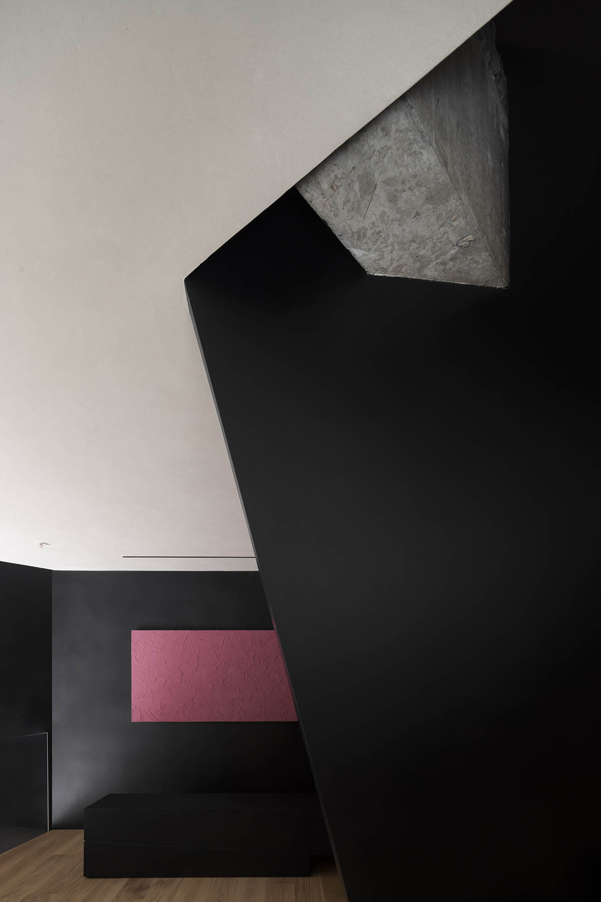
Natural textures and daylight combine with the roomy, light atmosphere to create a genuine spatial experience. A key component of design is how the people using the space interact and communicate with each other.
By improving the harmony of the building's materials, colors, and structure and creating a new, fluid relationship between the building and its site, the studio dramatically changed the building's spatial and compositional relationships.

The room is made tangible, breathable, and textured by the use of tasteful yet straightforward geometric shapes that flow freely and give the impression of suspension.
This project successfully incorporates modern aesthetic elements into a newly constructed commercial showroom. It also perfectly demonstrates the studio's strategy of invoking Eastern spatial emotions and philosophy through the application of Western design principles.
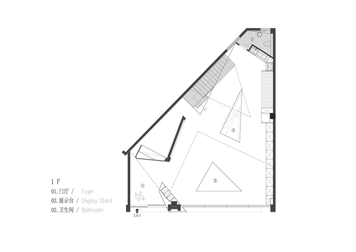
First floor plan

Second floor plan

Third floor plan
Project facts
Project name: Anbong Home Showroom
Client: Anbong Home
Design firm: AD ARCHITECTURE
Chief designer: Xie Peihe
Design team: AD ARCHITECTURE
Project location: Shantou, Guangdong, China
Area: 300m2
Main materials: handmade paint, micro-cement, metal mesh, concrete, translucent membrane
Design time: July 2023
Completion time: June 2024
All images © Ouyang Yun.
All drawings © AD ARCHITECTURE.
> via AD ARCHITECTURE