Submitted by WA Contents
TSPACE DESIGN imagines circular gallery like a round heaven in Beijing
China Architecture News - Nov 04, 2024 - 14:56 2902 views
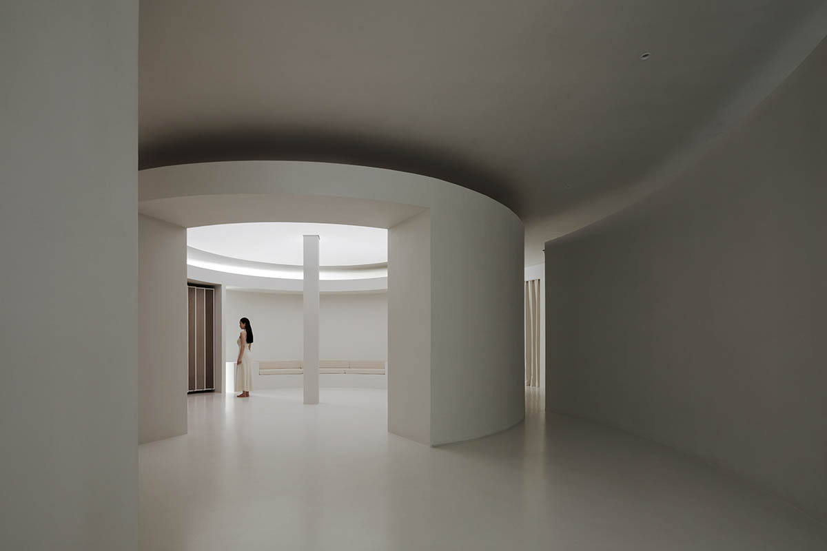
Shanghai-based interior design studio TSPACE DESIGN has imagined a circular gallery like a round heaven in Beijing, China.
Named Wood Gallery, the 200-square-metre space is located in Beijing, where the designer uses local cultural elements to try to capture the essence of the city's culture through the design of the space.

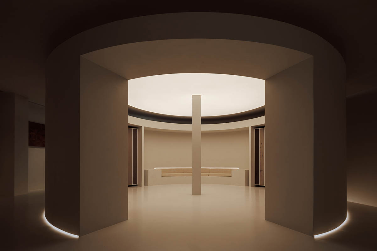
Drawing inspiration from the Temple of Heaven's Hall of Prayer for Good Harvests, the designer adds a cylindrical structure to the space's original rectangular layout.

Based on the ancient Chinese idea that "heaven is round, and earth is square," this focal point creates a layout that arranges the area in an "inner circle and outer square" pattern.
The retail sector is undergoing a significant transition away from the sale of only products and toward an experience-driven model that prioritizes emotional ties with customers, all against the backdrop of a slowing global economy, according to the studio.
The project was originally intended to serve as a showroom for a company that sold wood flooring.
Beyond the conventional, one-dimensional purpose of display and sales, the designer sought to enhance the area.
With an emphasis on the client experience and a foundation in the brand's basic principles, the design incorporates the idea of an art gallery to create an immersive setting that combines emotional connection with the essence of the place.
This enables guests to connect with the brand's deeper cultural meanings and values in addition to enjoying the wood flooring's aesthetic appeal. A big step toward implementing a curated, experience-driven business model is this strategy.
Round Heaven, Square Earth
The "round heaven and square earth" philosophy and traditional Chinese cosmology have had a significant impact on the design of ancient Chinese structures.
Using contemporary design methods, architects today reinterpret this architectural beauty, embodying the philosophical notion of the unity between humans and nature while also echoing the circle's symbolic meaning in Chinese culture, which is perfection, wholeness, harmony, and eternity.

Circular Circulation
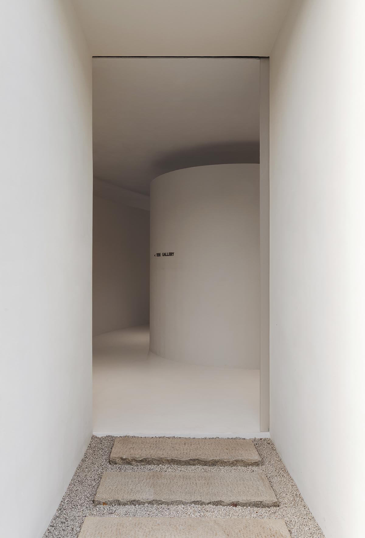
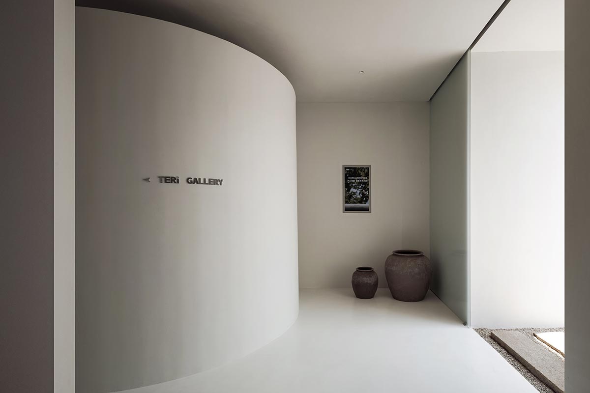
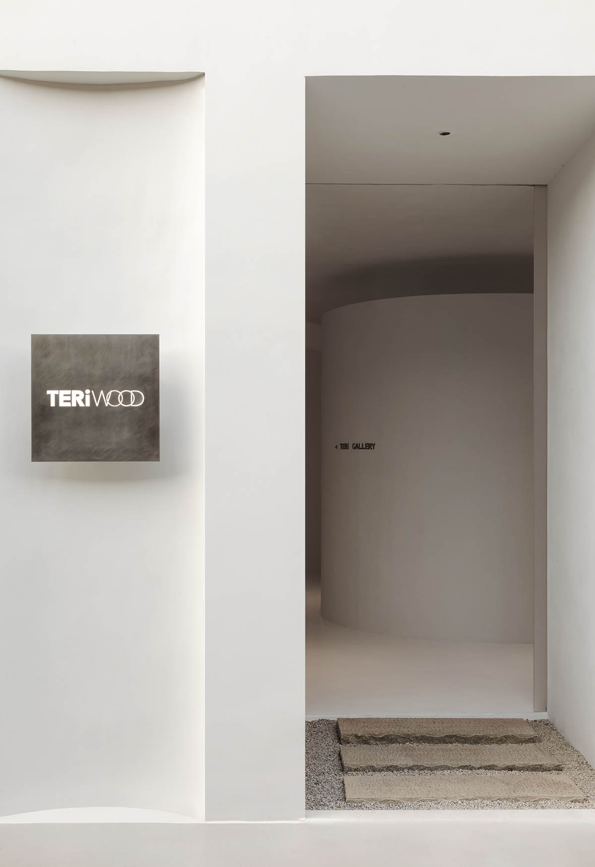
The stepping stones and the gray area at the entrance slow down entry, enabling guests to take a moment to collect themselves before going inside.
By purposefully separating the interior and exterior themes, this section serves as a transitional space. Consequently, it improves the space's feeling of layering and privacy.

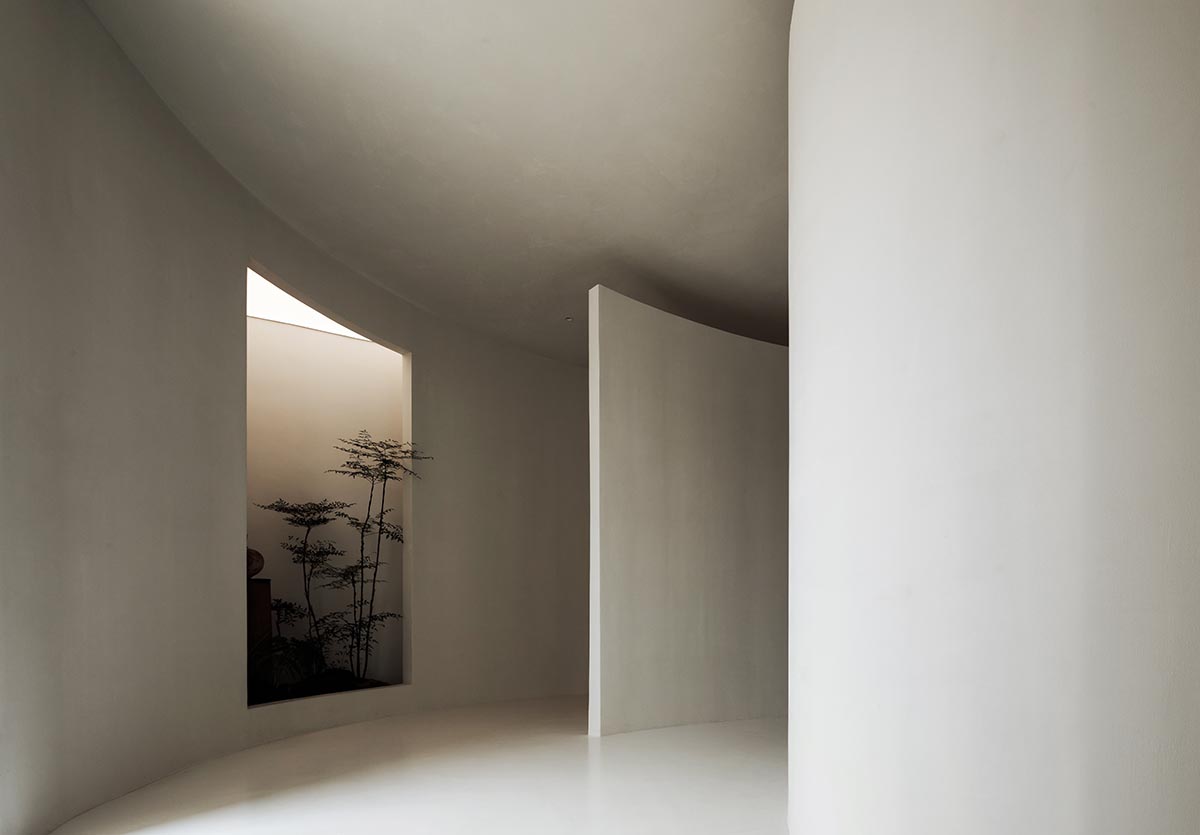
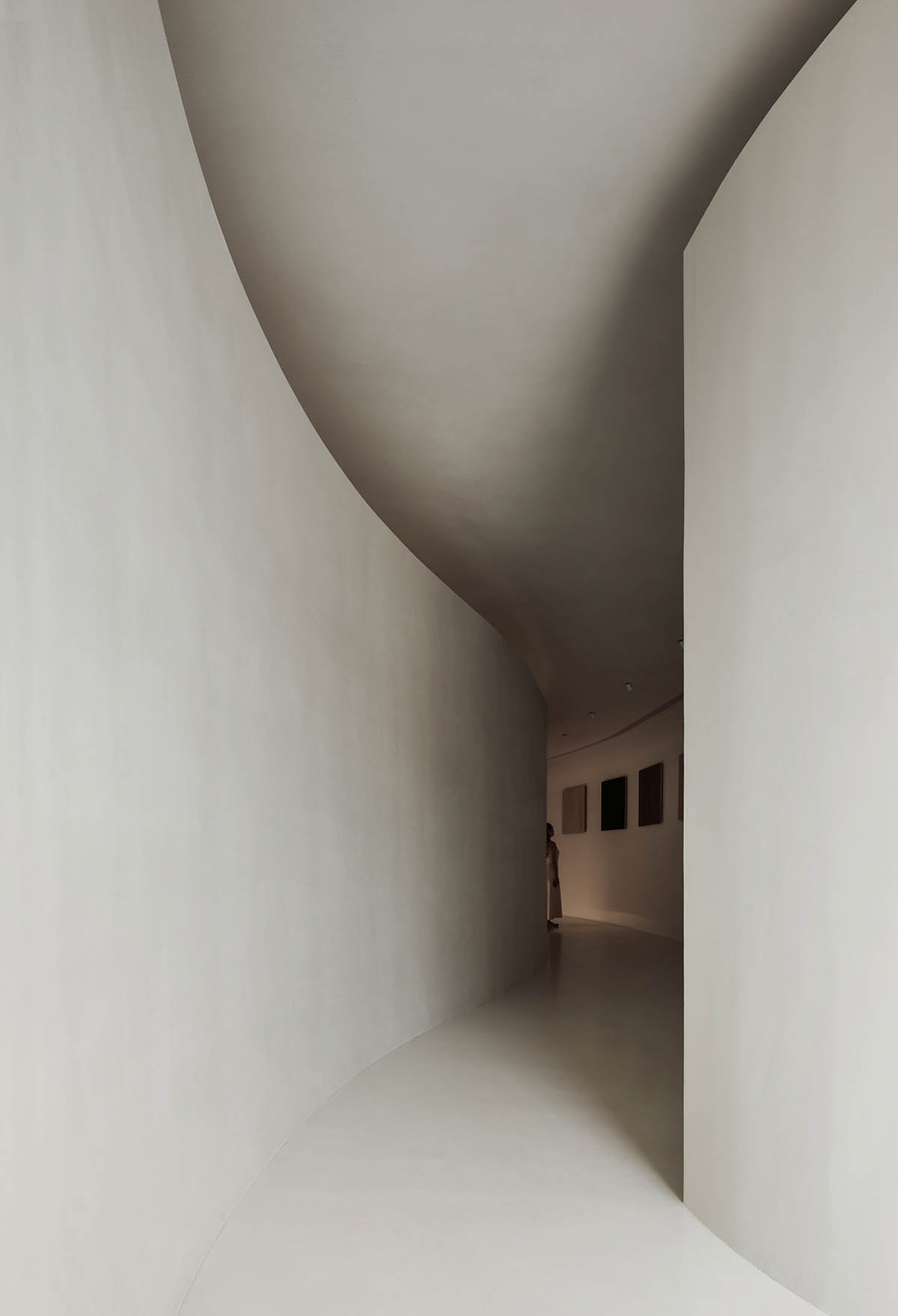
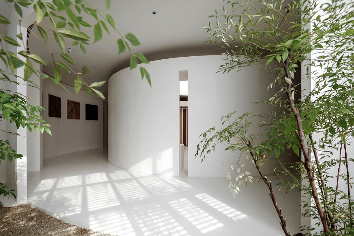
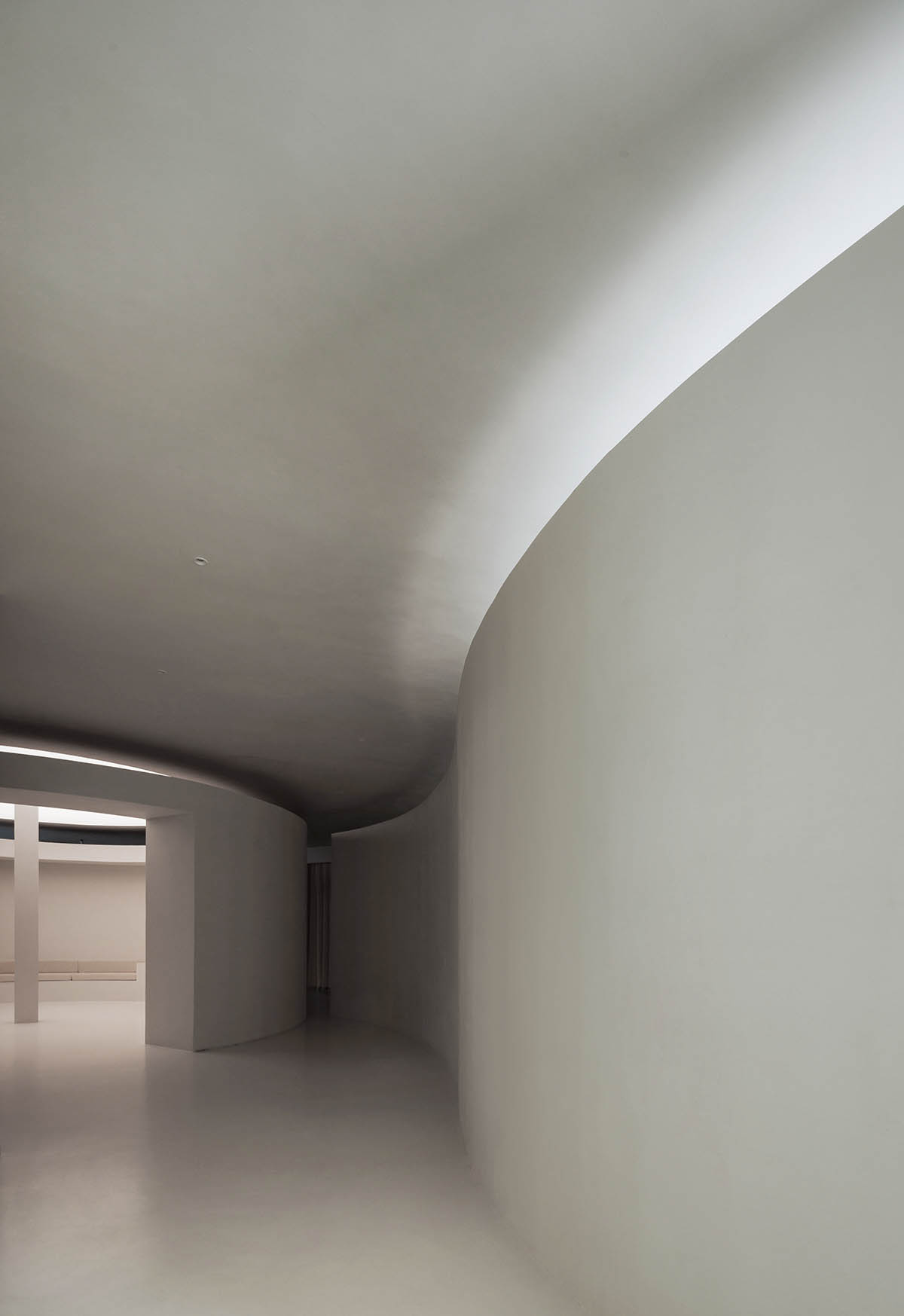
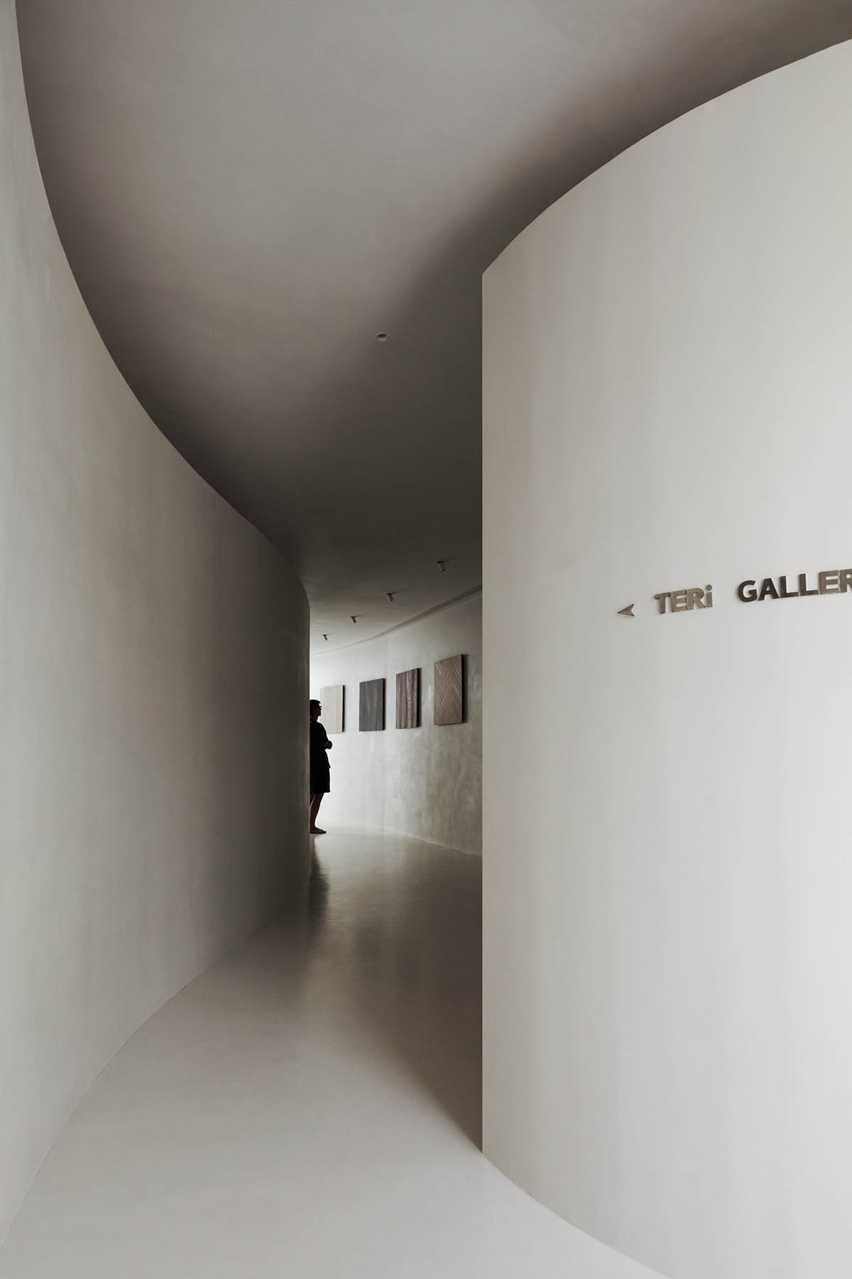
The newly added volume serves as the focal point of the room's main flow. The entrance's two curved walls visually block out the entire room, making it impossible to see it all at once.
The outer circle's movement line and light guide visitors as they progressively enter the exhibition hall. A large, light-filled circular exhibition space suddenly appears, bringing about a feeling of clarity and openness.

Following the movement line planned by the designer, visitors can swiftly exit the circular exhibition hall. The entrance and exit are carefully placed to form a circular flow through the exhibition hall in this small area.
Visitors are guaranteed a seamless, uninterrupted experience from beginning to end thanks to this design. The exhibition's designer created a multi-layered, multi-perspective spatial experience by carefully allocating the necessary functional areas within each section.
Spirit of the Place
This area heavily references the design philosophies and curatorial methodology of art galleries, in contrast to the simple product display logic of conventional exhibition halls.
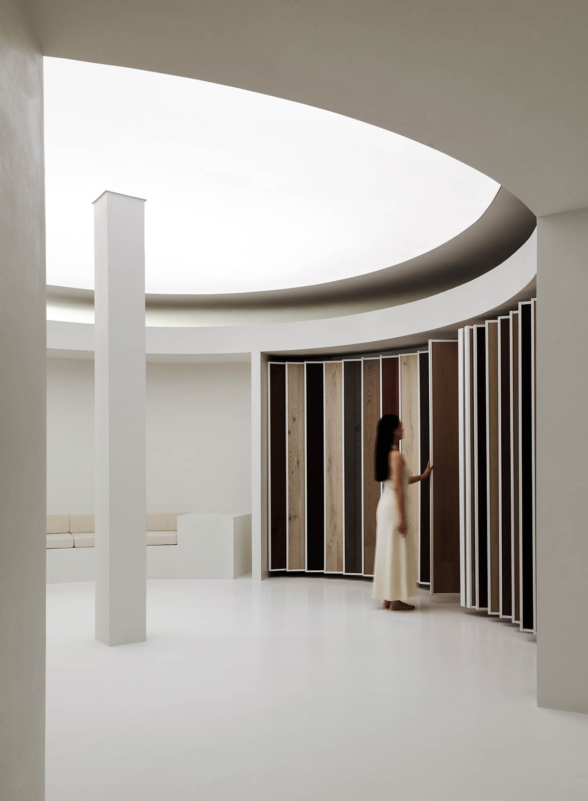
It creates an extremely cohesive and unified environment by skillfully fusing the exhibition content with the spatial form. A "white box" area that resembles an art gallery is produced by using a consistent wall and floor paint to create a crisp and textured background.

Excessive technical information displays are reduced with the use of this "white box" technique. The presentation of the wooden flooring turns it from a typical building material into an "artwork" and draws attention to the aesthetic value of the wood's rich natural textures and their development.
Visitors can closely inspect the flooring's texture, knots, cuts, and finishes in the floor gallery corridor that greets them as they enter the room. This enables them to appreciate the human race's never-ending quest for beauty as well as the intricate handiwork of time and nature.
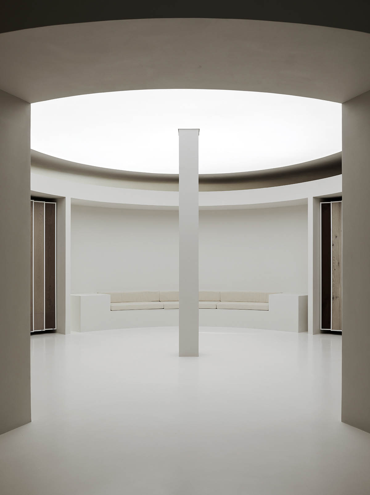
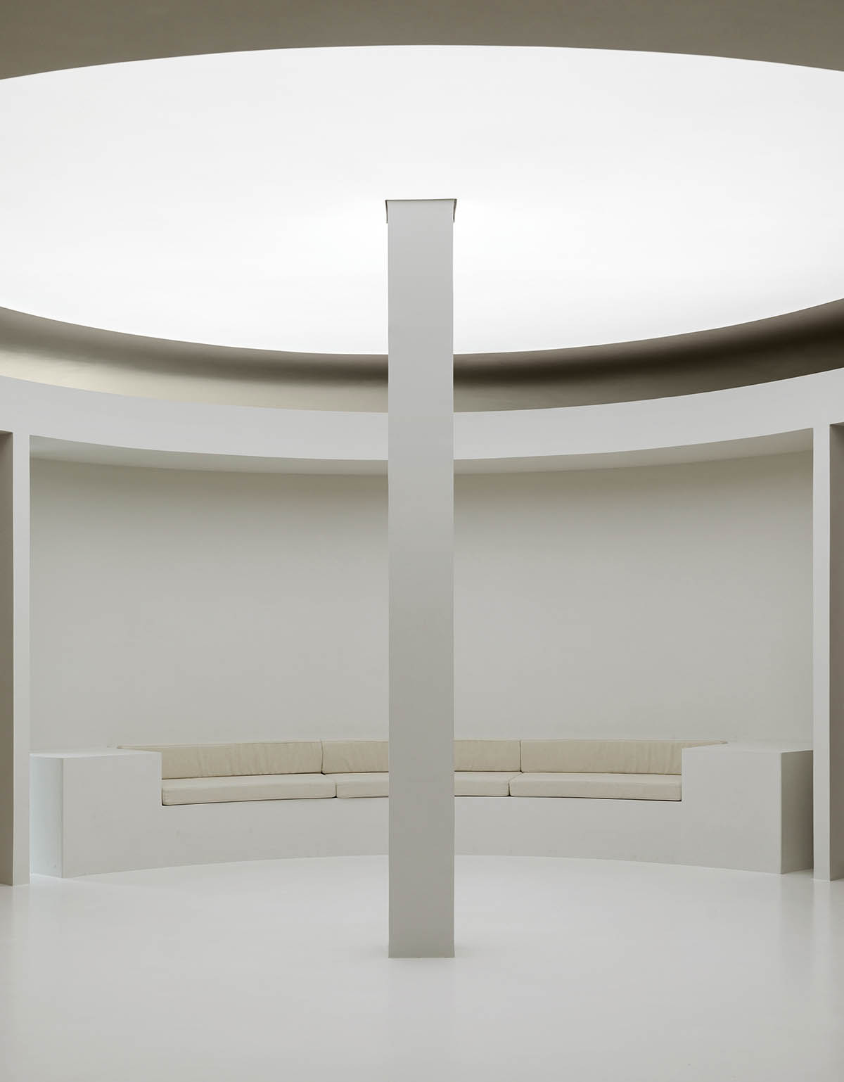
The atrium area, which serves as the focal point of the product display, uses the arrangement of curved display panels and the central enlarged column design to create a truly spiritual space.
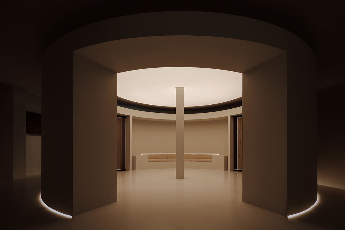
When combined with the overhead lighting film's simulation of a skylight, it enables guests to fully experience the holiness and peace that the area evokes, improving their concentration and appreciation of the surroundings.
In the meeting room by the window, plants grow organically as sunlight streams in through the glass. Sunlight and vegetation combine to produce a lively courtyard-like ambiance that makes it difficult to distinguish between indoor and outdoor areas.
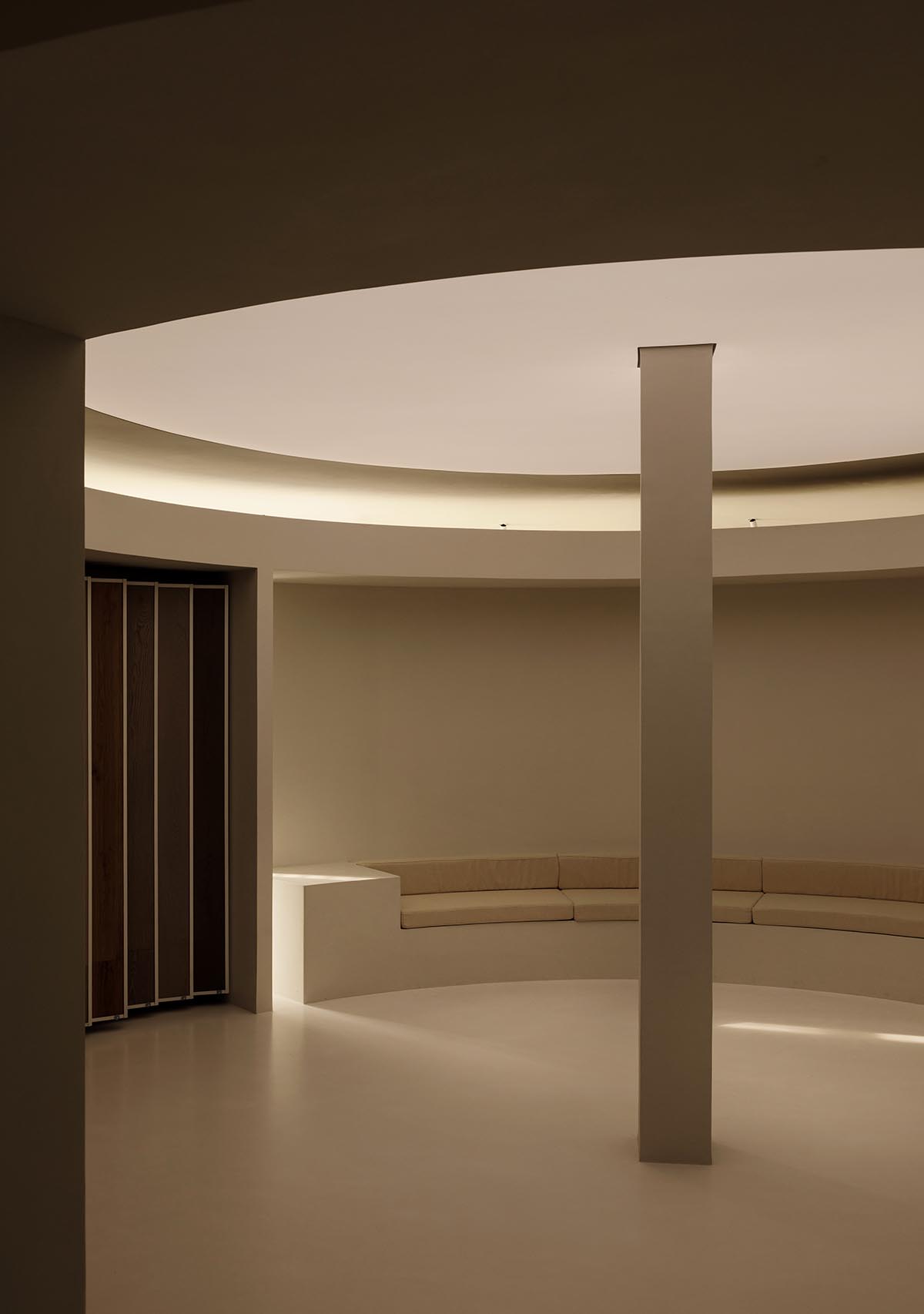
"The Wood Gallery, as a unique example of curated commercial practice, not only redefines the possibilities of brand showrooms but also deepens the interaction between consumers and brands," said the studio.
"It elevates the ordinary building material of wood flooring, transforming it into an artistic medium for conveying brand stories and cultural values."

"This represents not just an innovation in product presentation but also a significant exploration for traditional brands seeking transformation and upgrade."
"When a commercial space resonates with people and touches their hearts, it has the potential to pioneer new commercial models in a competitive market," the studio added.


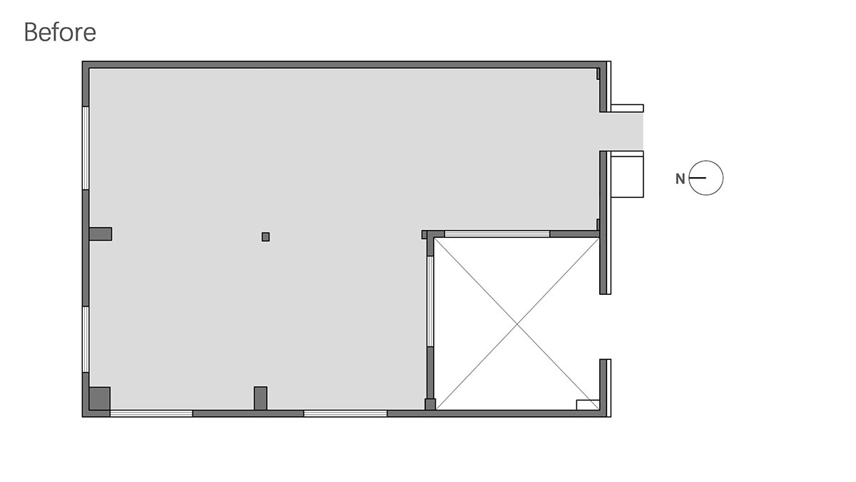
Floor plan - before

Floor plan - after
Project facts
Project name: Wood Gallery
Design firm: TSPACE DESIGN
Project location: Chaoyang District, Beijing, China
Building area: 200m2
Design period: March 2023
Completion date: September 2023
Chief designer: Tong Zhang
All images © Liming Fang.
All drawings © TSPACE DESIGN.
> via TSPACE DESIGN
