Submitted by Medha Sobti
Urbanscape Architects revamps L.T. Foods office
India Architecture News - Aug 21, 2018 - 07:34 18044 views
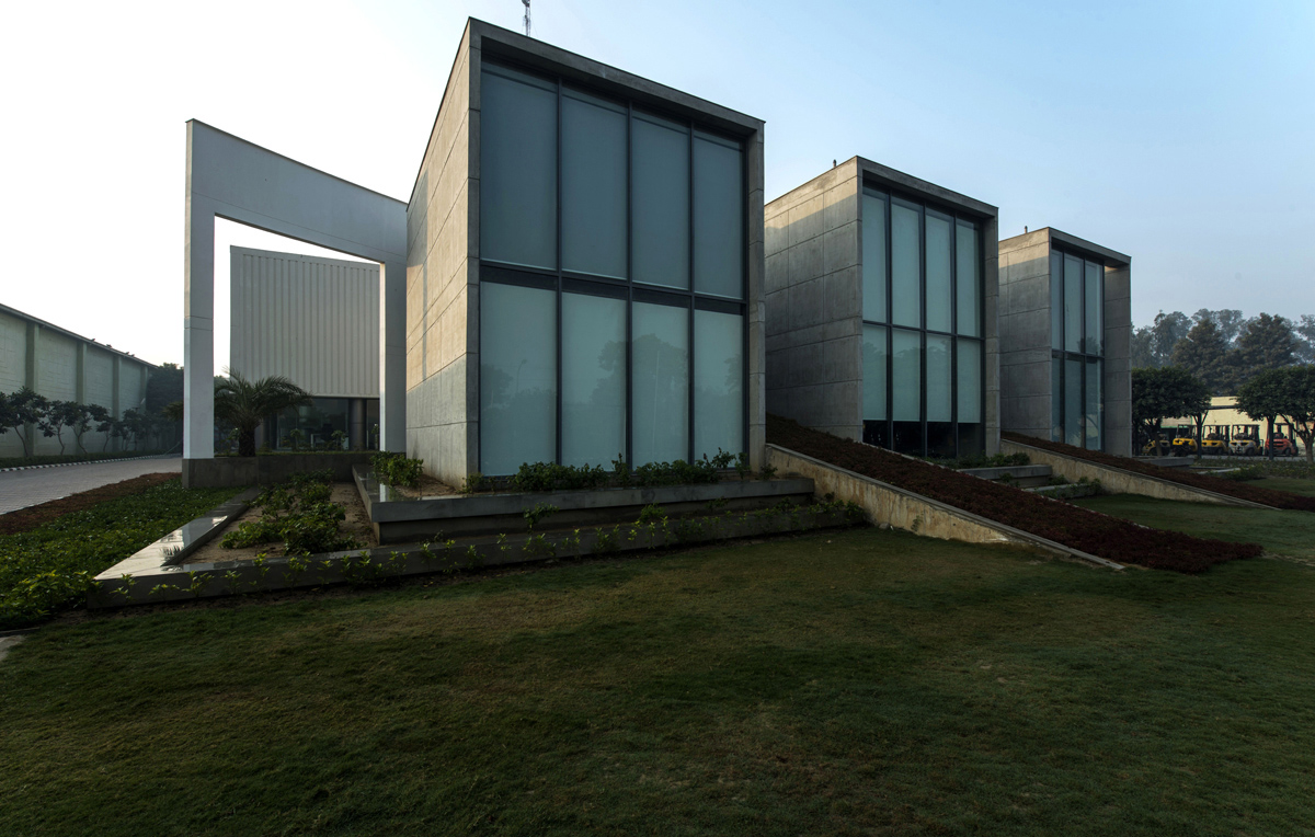
Building something anew is relatively easier than modifying the old to the new. With existing buildings, you need to battle existing realities. With existing realities, come greater roadblocks and restrictions. Armed with this knowledge, when the challenge of renovating the existing office building of LT Foods Pvt. Ltd. in Bahalgarh, Sonepat, fell into the lap of Urbanscape Architects, they dared to justify the task with umpteen creativity. Not one to shy away from a formidable task, Mr. Dinesh Panwar, the founder of Urbanscape Architects states “We knew that existing buildings are much more disposed to present design constraints. But while some designers see limitations in it, we explore possibilities and opportunities”.

Existing Building
Their client required an office space which was open and communicative. He wanted the built spaces and the greens to merge, both visually and physically. The client was clear in his dictum that he wanted to enhance the productivity of the office. This, therefore, became the sole driving force of the design.
Instead of opting for demolition, the firm retained the 10,000 sq.m block and added an extension block of 4000 sq.m. The idea was to maintain the essence and preserve the sanctity of the existing form. The result was a simple, minimalist and spatial design having an intimate association with nature.
The existing building was a large chunk of block enclosed on all sides and surrounded by vehicular roads. It was punctured to bring in ample light and ventilation. Ample green spaces were also created. The façade features exposed concrete and glass. The building is G+1; the existing drop-off foyer was converted into a reception with an exhibition space so as to prompt the user to use his waiting time efficiently.
The office building is now divided into two, an old block extended to create a new block. The old block used as a private zone with minimum visitor interaction and new block as a public zone with conference rooms and visiting areas. The new block features a curved wall which gives a clear definition to the building. It is inviting and displays grandeur. The new block is segmented into three and connected with a metal bridge on the first floor. The landscape adds serenity by making a unique connection with the building.
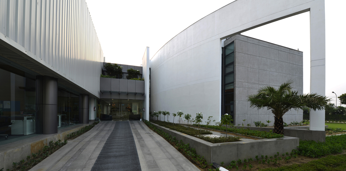 Entrance
The building boasts of a massive entrance between the old and the new block. The charm of the old and the dynamism of the new together make it a perfect gateway. The open workstations offer a refreshing view of the water body and greens in the center.
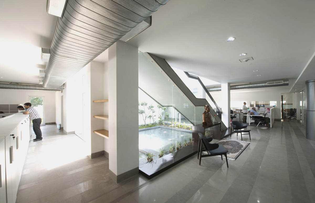 Workpool
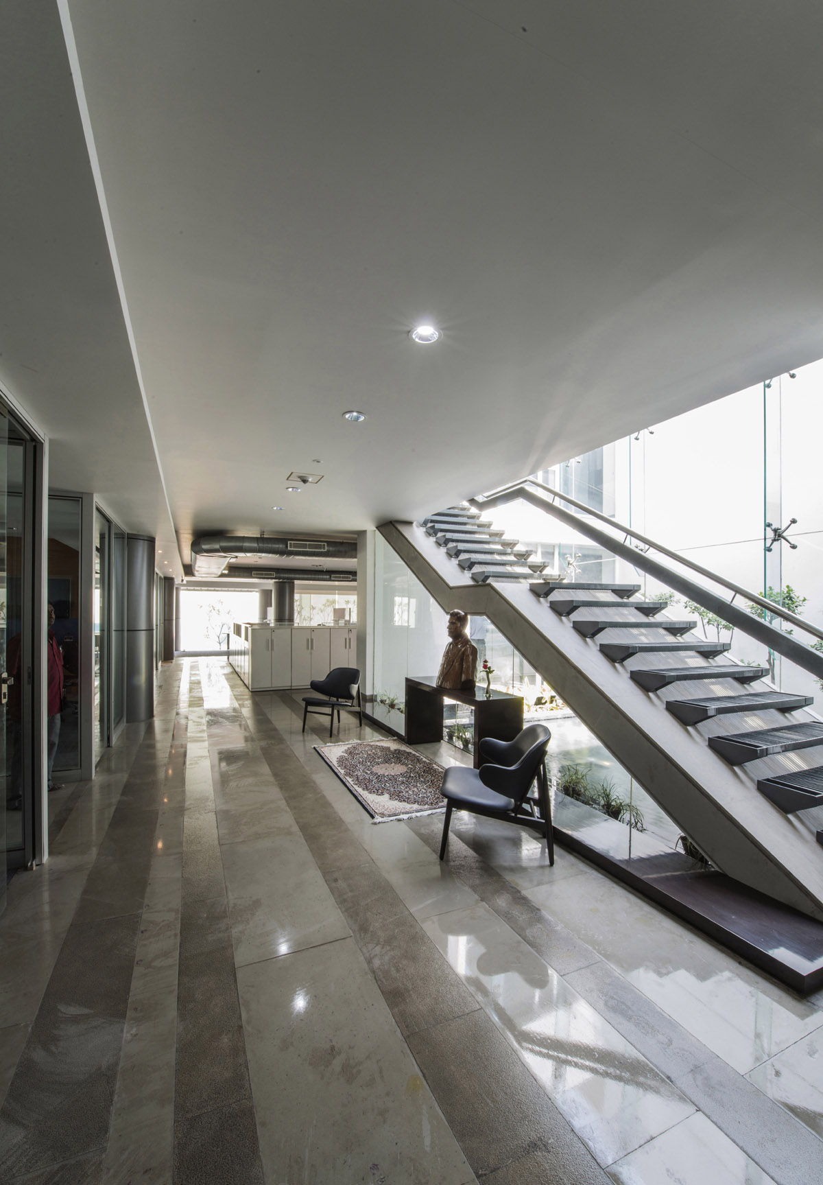 Staircase
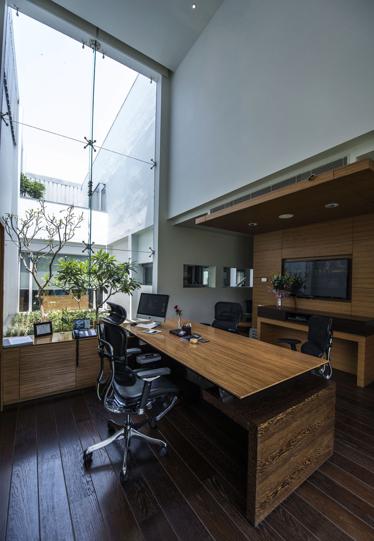 Managing Director's room
The conference room features a large north opening, adding a huge amount of visibility. The double height space feels like a grand space welcoming the user with open arms. The managing director’s room was placed in the south-west corner, but was provided with fenestrations on the north. The two terraces on either side of the building were used as internal courtyards, encased by industrial sheeting to maintain the uniformity in façade.
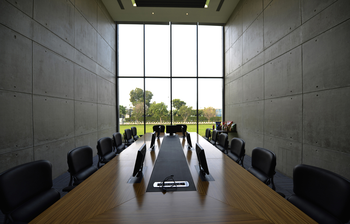 Conference Room
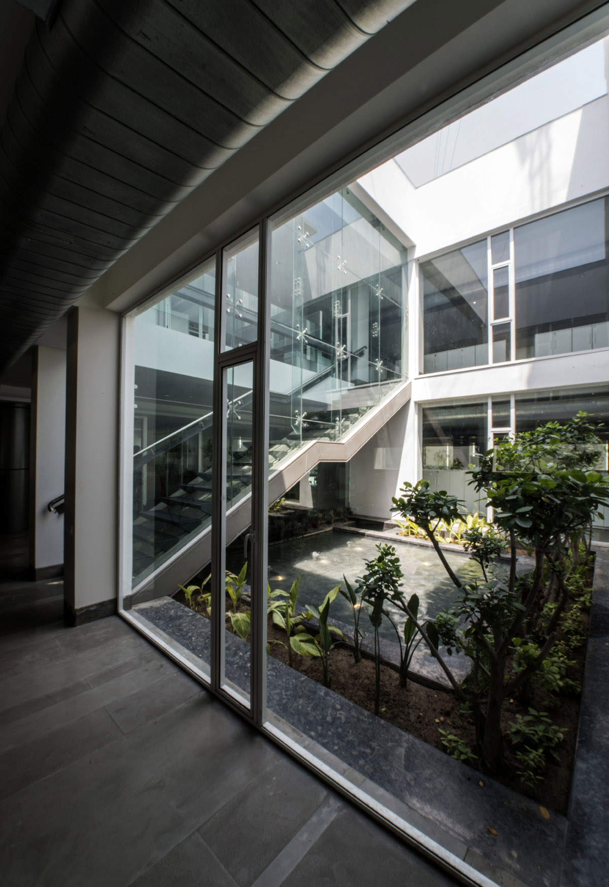 Courtyard
The highlight of the entire design is the central courtyard with a water body. The landscaped courtyard establishes a smooth flow with the built place, allowing the user to unwind and take a breath of fresh air and relax, unlike the conventional closed office spaces.
The overall design features a transformation from the old to the new, from closed to open spaces, from a site limited to only build spaces to a site playing around with greens, from lack of user friendly spaces to creation of internal courtyards. The design makes a foray into changing the conventional outlook of an office space.
All images © Kamal Kansara
> via Urbanscape Architects