Submitted by WA Contents
Smooth corners and rounded walls form cave-like wellness center designed by E Studio in China
China Architecture News - May 16, 2022 - 17:02 3643 views
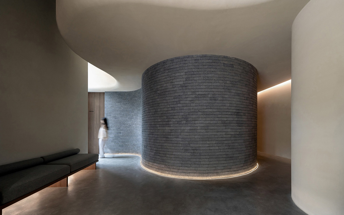
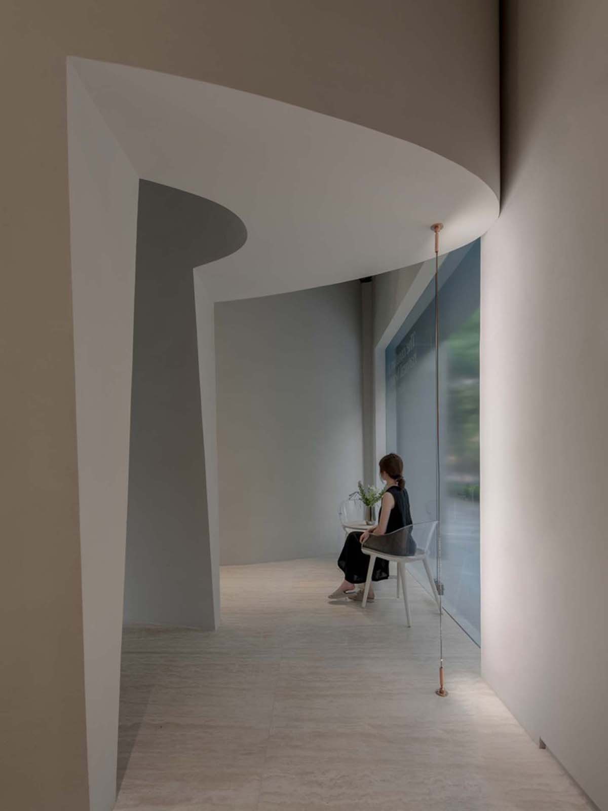
Smooth corners and rounded walls have formed a cave-like spa and wellness center designed by E Studio in Shenzhen, China.
Named Shuran Massage Commercial, the 110-square-metre space features rounded walls that divide the functional programme, which only focuses on guests' needs inside.
The space contains single room, double room, VIP room, office, shower room, dressing room, lobby, bathroom, storage and chatroom.
While message room is dedicated a larger space with curved walls, other functions are placed in other rectangular space.
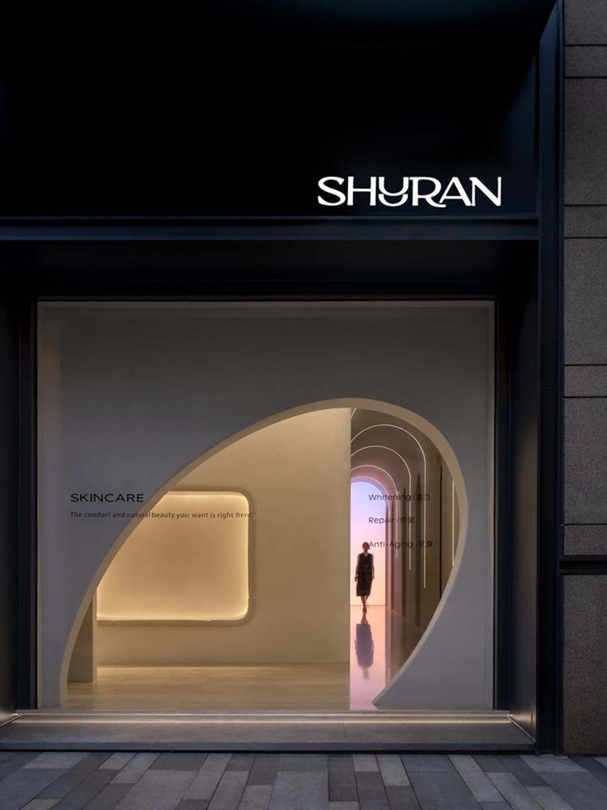
"The modern busy world is full of vague encounters and anxiety, city life makes people impatient and restless. But people need to keep a pure mind to find inner peace," said the studio.
"The journey begins with the first step, but our spirit is weak."
According to the studio, "health therapy and foot massage can help the body and mind to relax, and free the spirit. Perhaps only by feeling content with “Fan Qiu” can one truly gain inner freedom."
In this project, the studio aimed to explore the clash between traditional industry and exploration. The team have always been contemplating depth and uniqueness.
The designers have reinterpreted the Shuran brand and translate the brand's motto into a comfortable living space that focuses on people’s comprehensive needs - called "Shuran".
Based on different functions the team have divided Suran into two sections: Shuran wellness is described as "time cave” and Shuran Skincare as described as "time metamorphosis".
The studio defines "Time Cave" as "a space where time stands still and stops to release physical and mental pressure."
On the other hand, "Time metamorphosis" addresses to the reverse of time, implying that the state of the skin and body can undergo metamorphosis.
According to the team, the design takes cues from the concept of “time caves”, aiming to make a naturally quiet space.
"Using the shape of space, build a pure land” - turning space into a vehicle that softly carries people to seek inner freedom. We hope every person who enters the space feels comfortable and relaxed," the studio added.
"We highlighted the letter “U” in the name as the main focus of the brand image, highlighting its shape and pronunciation."
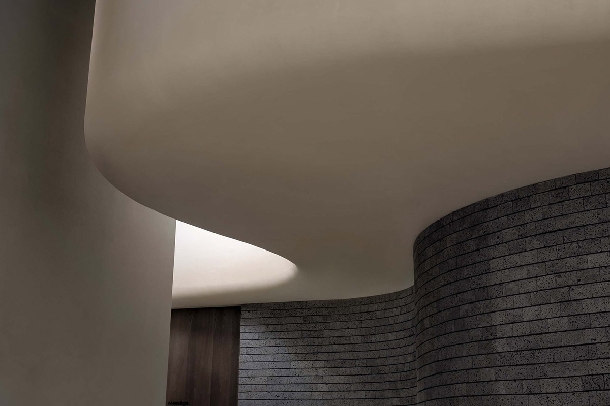
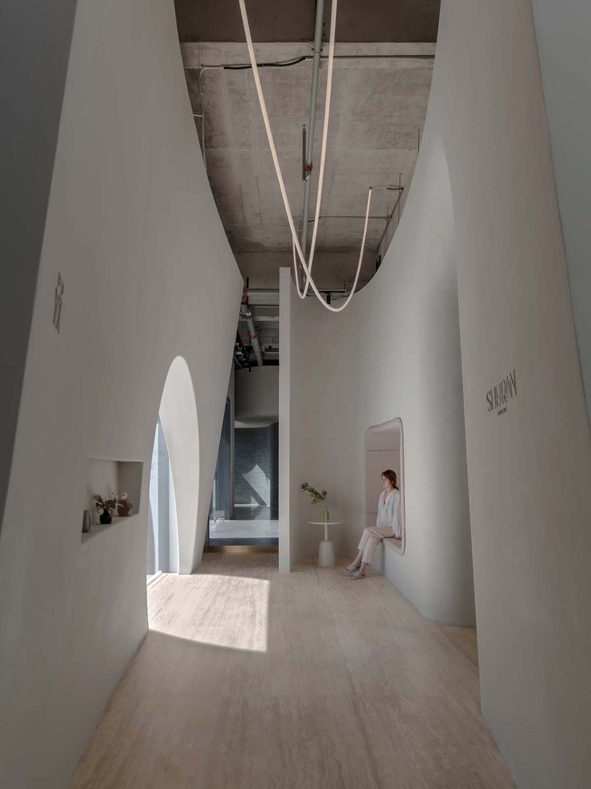
The overall brand image is also promoted to create a connection between nature, body, and mind. "Unfolding the theme of caves, the circular arc is used as the unified design language throughout the entire space," according to the studio.
Interior space surrounds people with a relaxed atmosphere and simple contour, while the upper and lower blocks are independent - but both spaces echo and complement each other.
The soft curved shape of the space is reinterpreted as the smooth integration of the two blocks. In material approach, the studio has paid attention to the selection and arrangement of materials to emphasize the individual attributes of each block.
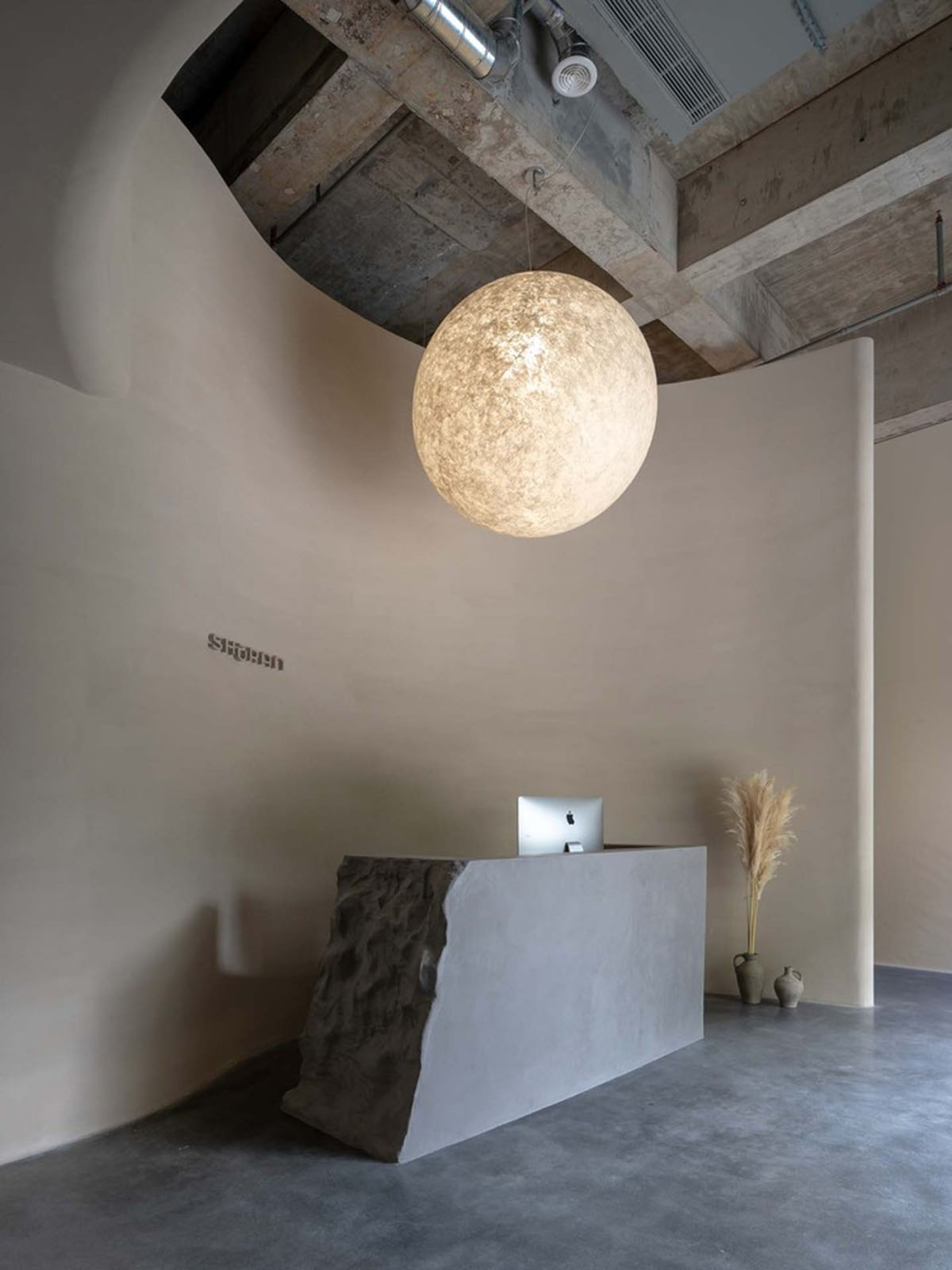
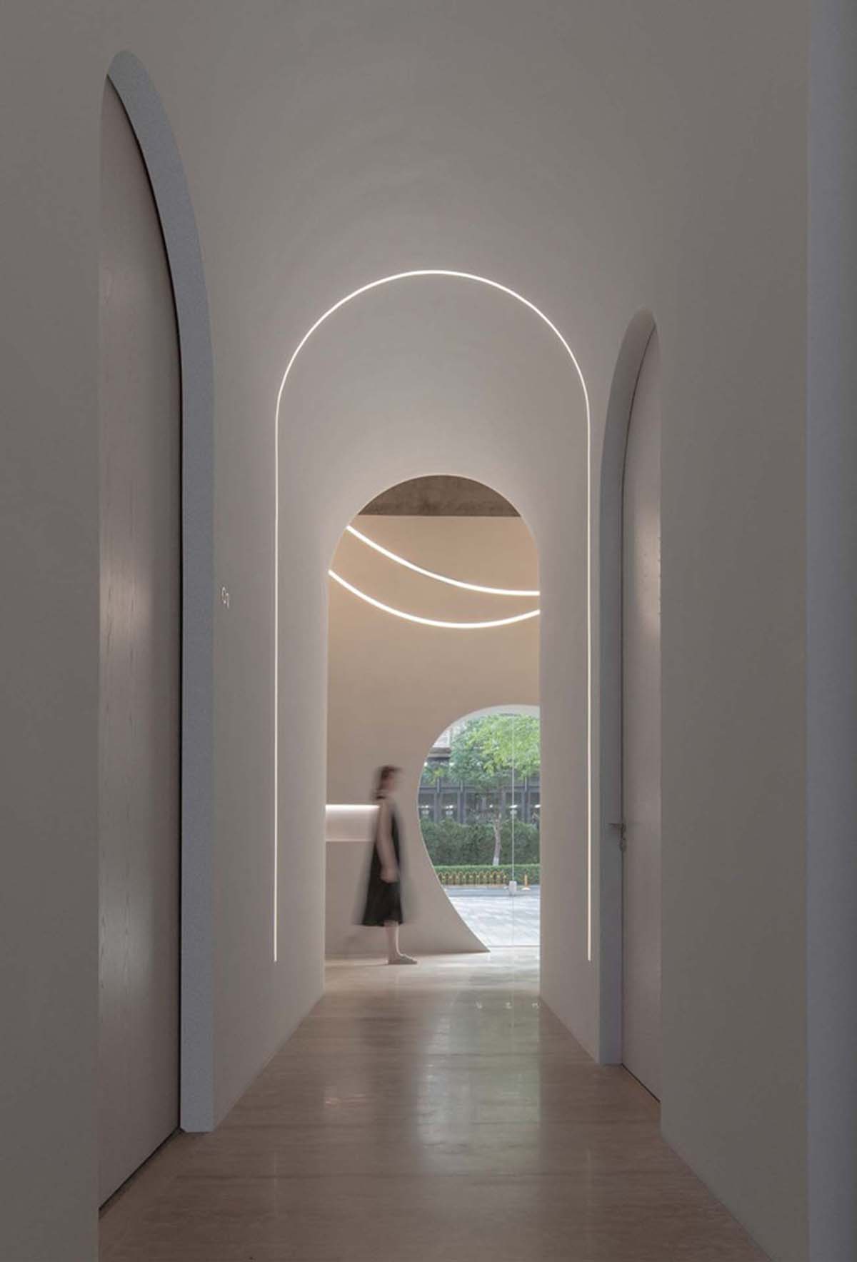
The lobby offers a cozy feeling that invites people to enter in. The coarse surface of the reception desk is made of cast-in-place concrete, which is visually similar to a stone and has a more artistic vibe.
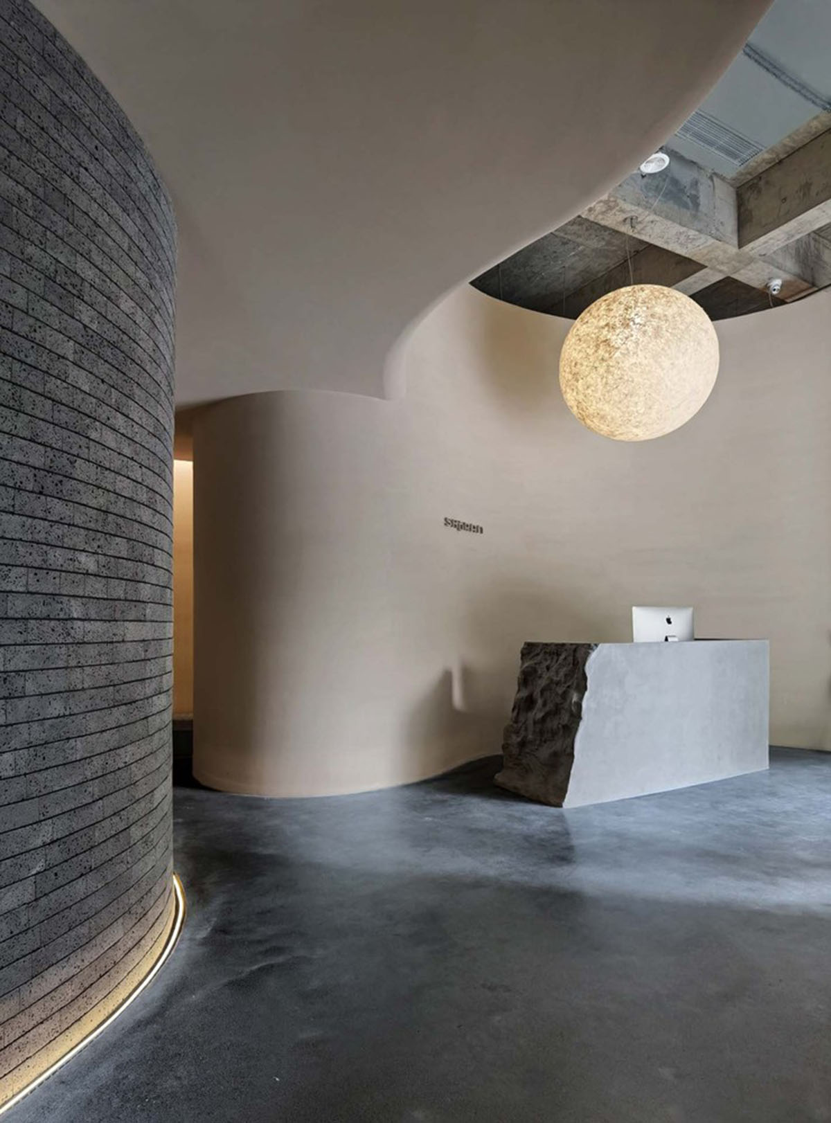
The studio added a ball-shaped lamp that is rippling with the warm light and mixing with the atmosphere in the space as if you are sunbathing.
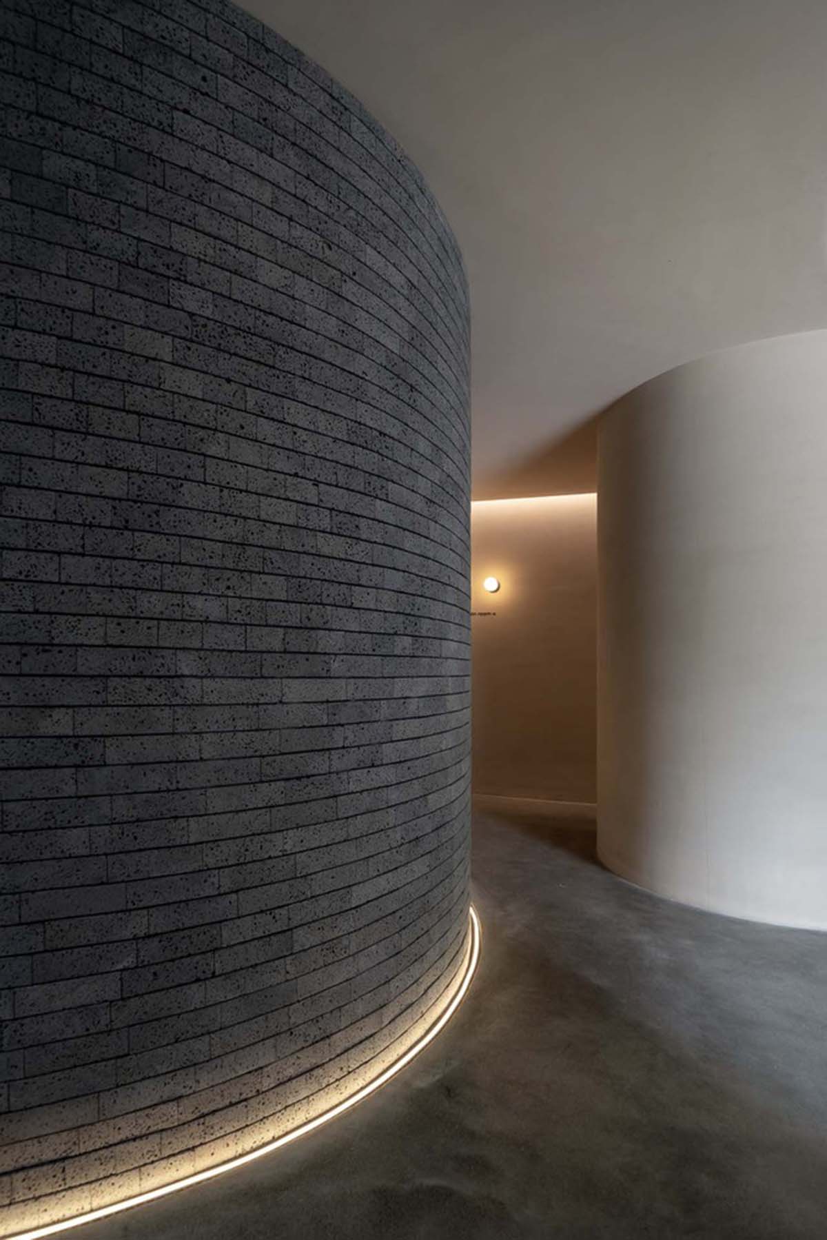
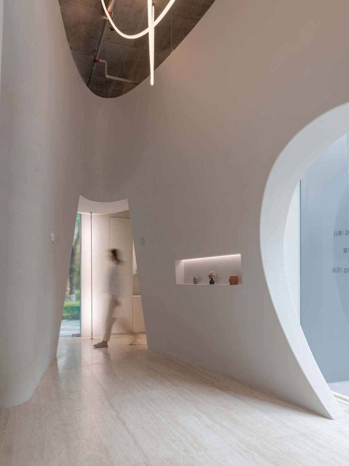
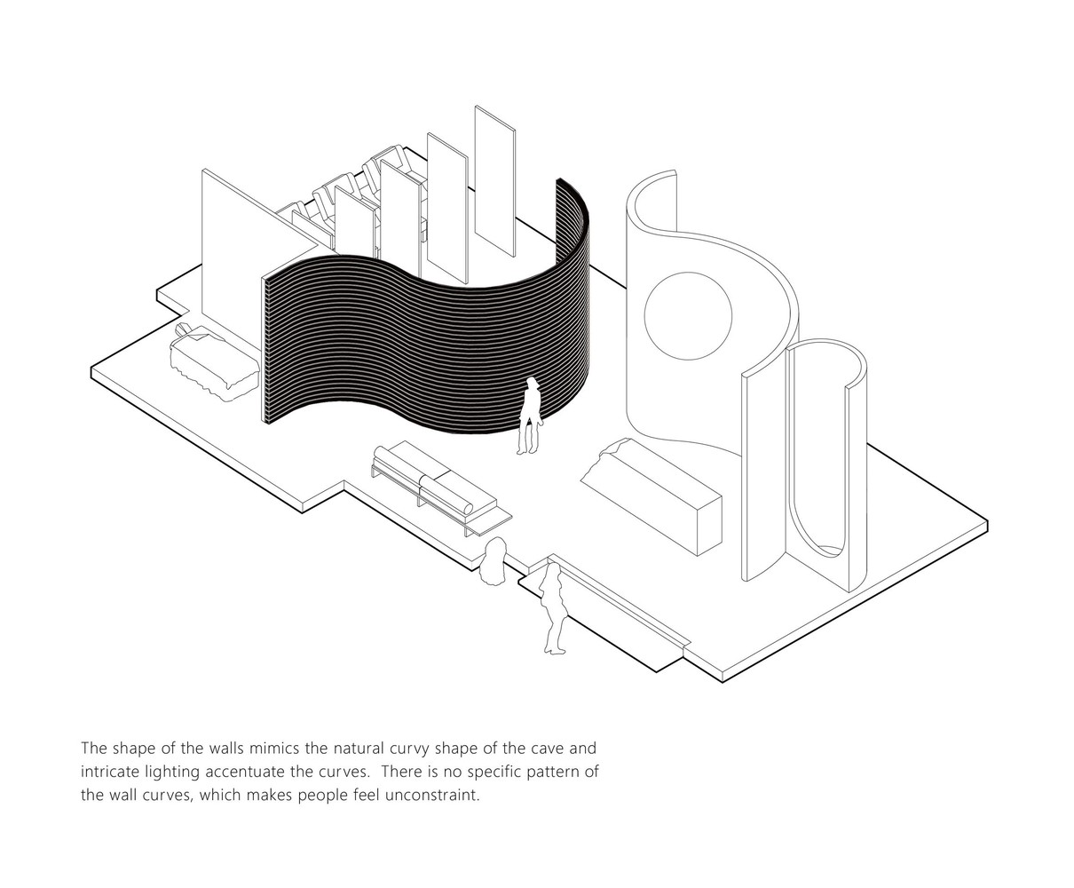
"The shape of the walls mimics the natural curvy shape of the cave and intricate lighting accentuate the curves," the team continued. To make look the wall more natural, the designers used volcanic rock texture on the walls.
"There is no specific pattern of the wall curves, which makes people feel unconstraint."
The volcanic rock is cut into irregular strips and laid horizontally in a random manner. We deliberately visually enlarged the space by using a black stripe along the curved wall," the studio added.
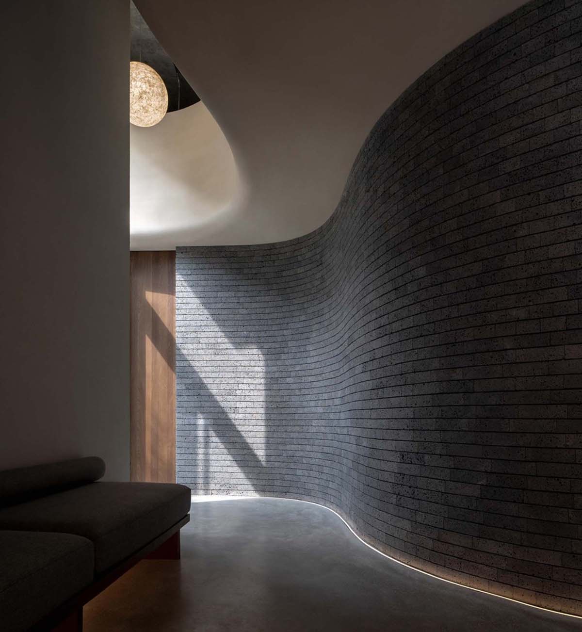
Curved walls have been used to prevent daylight from entering the space in order to avoid any distractions and bring peace and silence. However, as the studio emphasized, "the dim lights of the public massage area refer to the coziness of dusk."
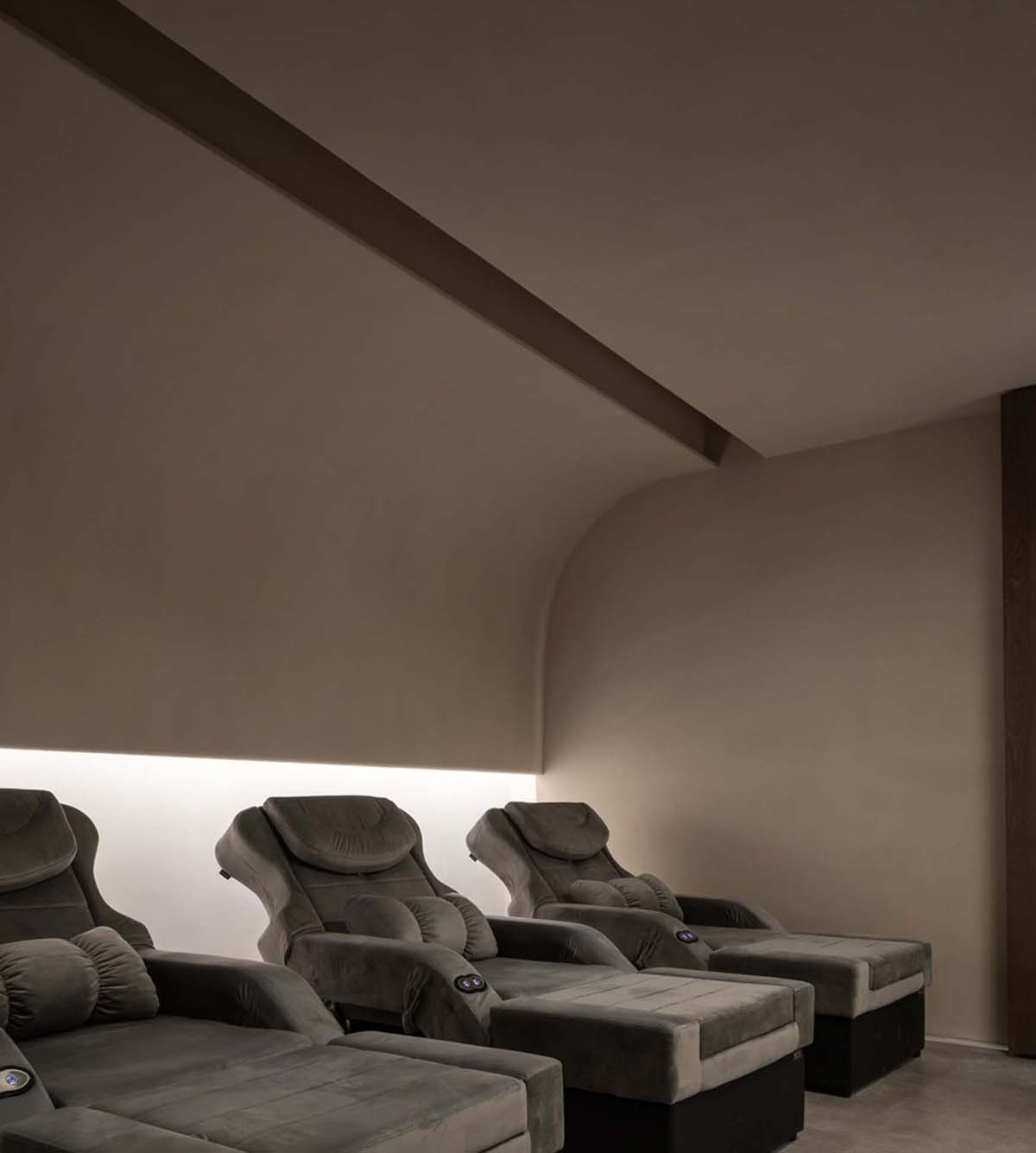
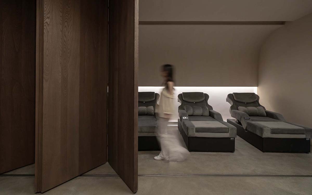
The public massage area is divided into two areas with wooden sliding doors. Massage chairs and soft-yellow colored textured walls create a secret spot where people can be temporarily away from the hustle and bustle of city life.
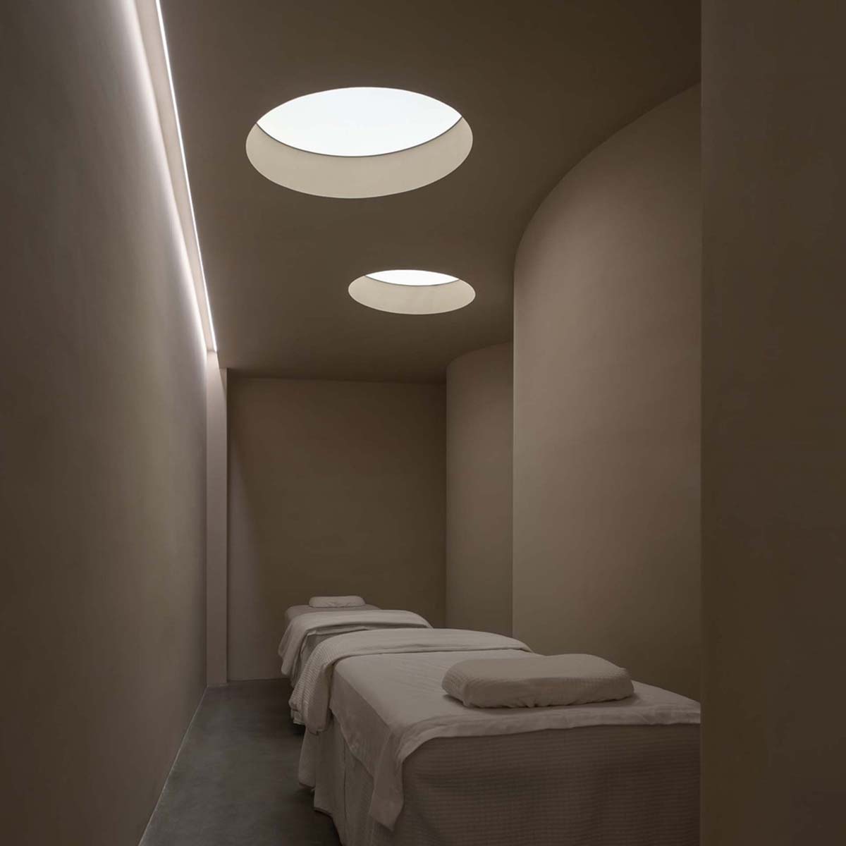
A tunnel connects all rooms
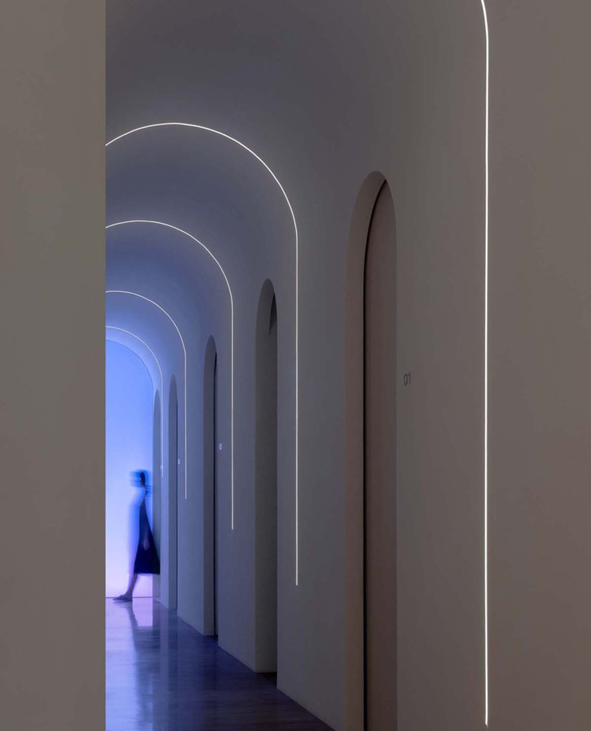
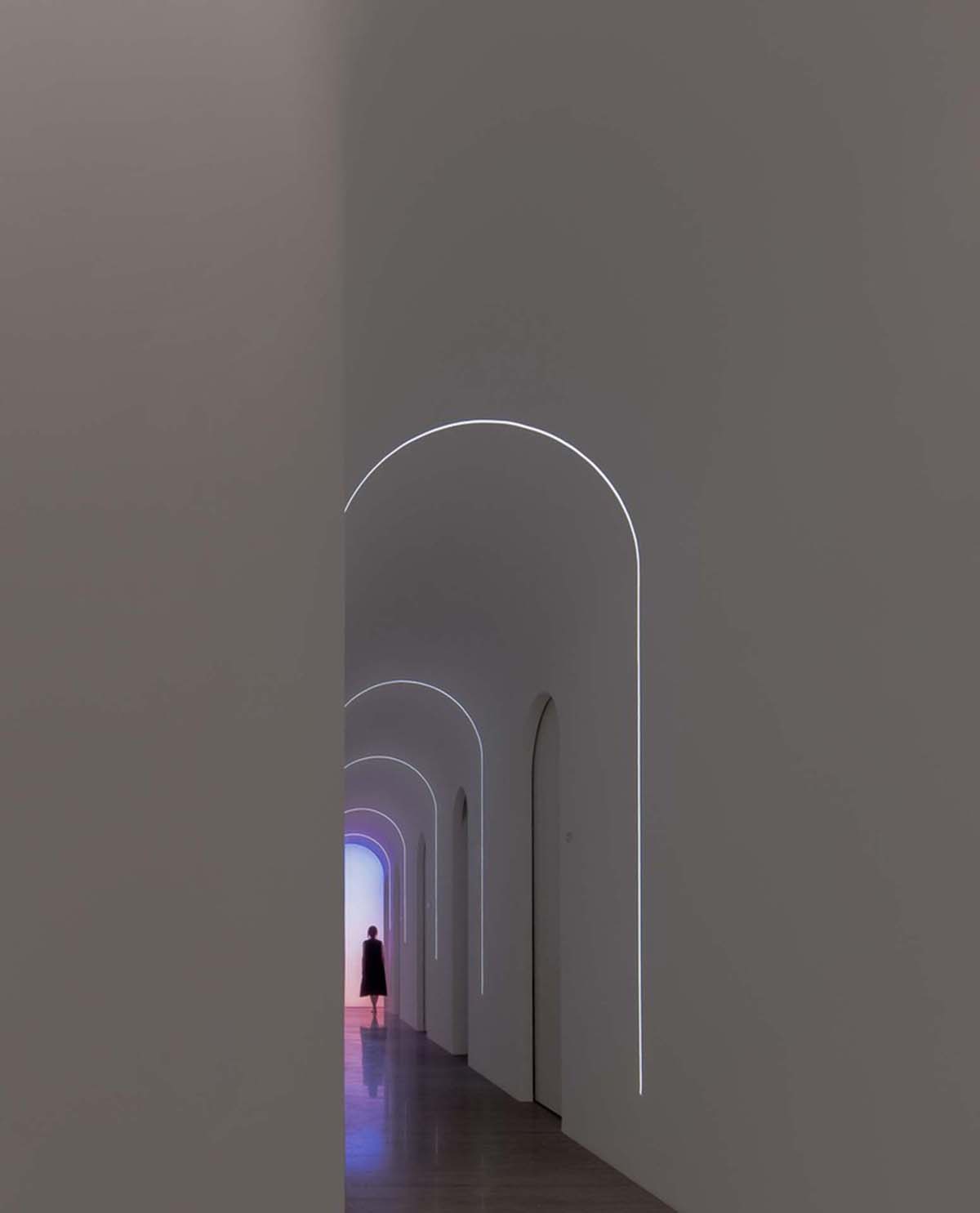
A tunnel connects all rooms to maximize the number of beautiful rooms and simplify the movement flow.
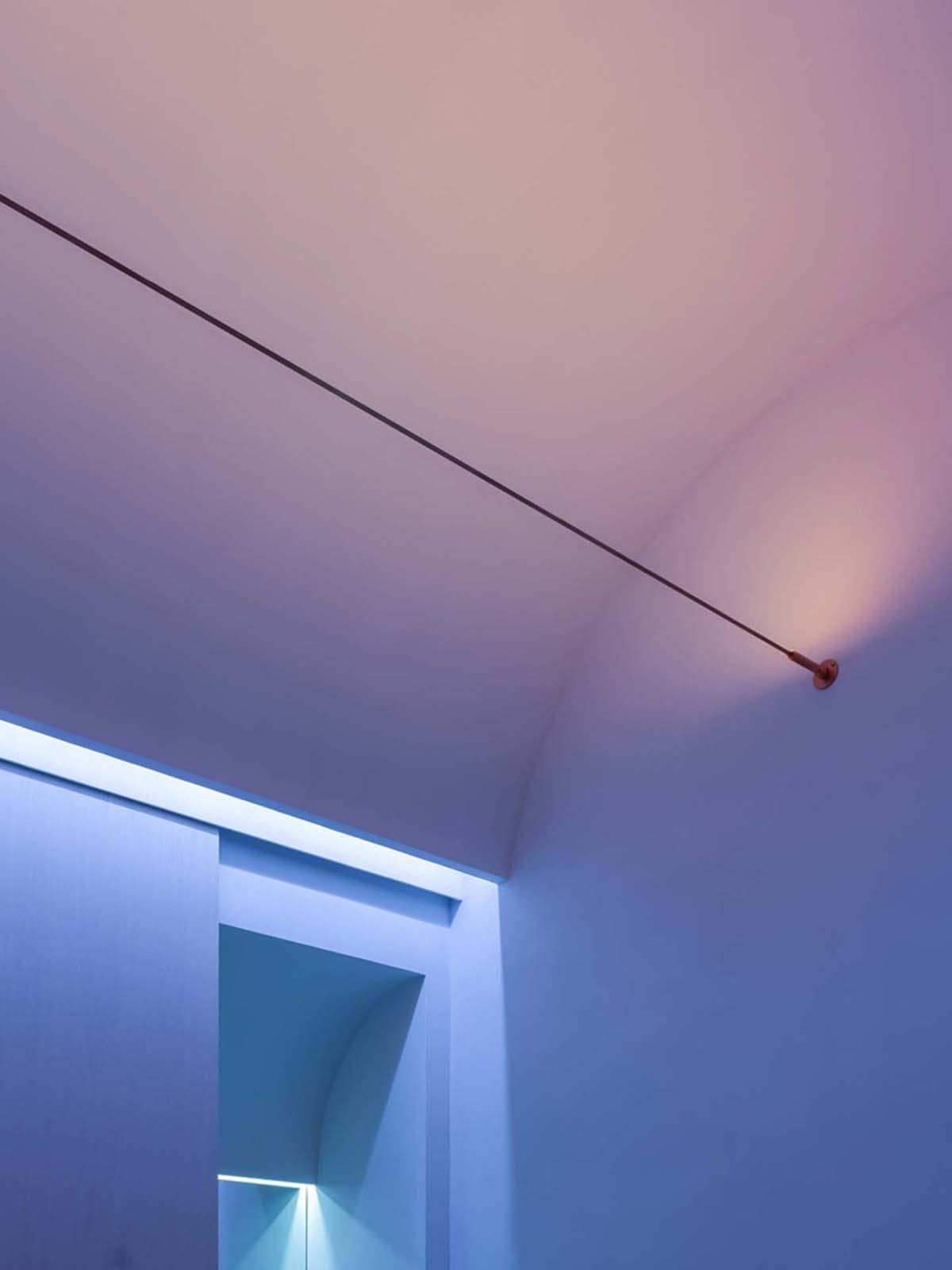
"The mysterious aurora appears at the end of the far-reaching tunnel with its gradual lights and colors, softly pulling people away from reality as if they walked through time," the office added.
"The lights of the tunnel walls create a time scale through stretched “U” shape, just like a metamorphosis of time traveling."
"We define the beauty room as "the cocoon of time” for rejuvenating the skin. The fading light creates the metamorphosis relationship with “U”."
The studio also integrated intelligent light system controlled via a chromatographic panel that allows adjusting space lighting for different beauty procedures. Every cocoon is different depending on the experience, and Shuran wants customers to define their own cocoon.
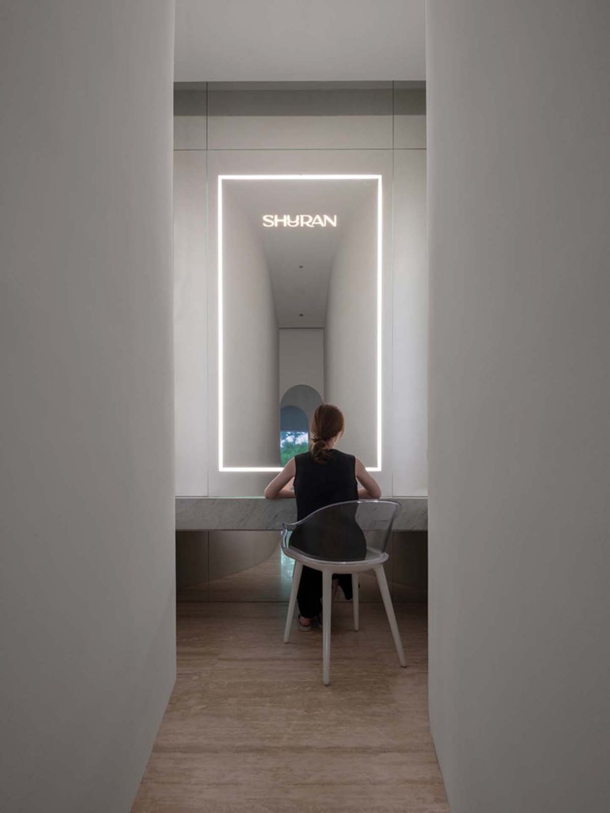
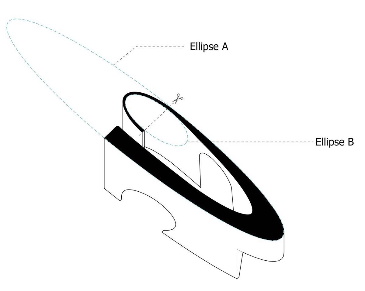
The designers design the makeup room as a quiet semi-open space. The tower-shaped walls form a symmetrical nook that makes people become the focus of the space.
"The passage is gradually widened in order to bring a feeling of change while moving forward. The mirror in the nook forms a makeup room, making it two parallel spaces with a mutual dialogue where one can undergo metamorphosis," the studio continued.
"This new business attempt requires the unification of branding for different types of services that have common ground. Using the concept of “time" for all spaces, we have created a unified yet distinguishable branding for all of them."
Axonometric diagram
Diagram
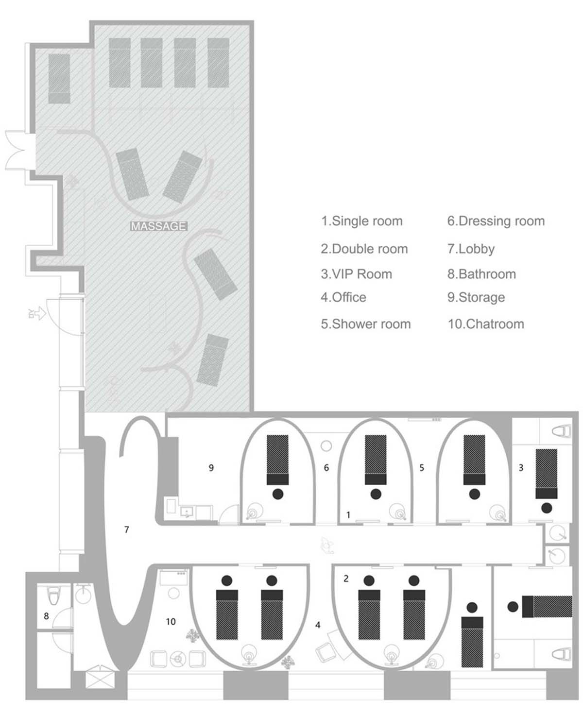
Floor plan
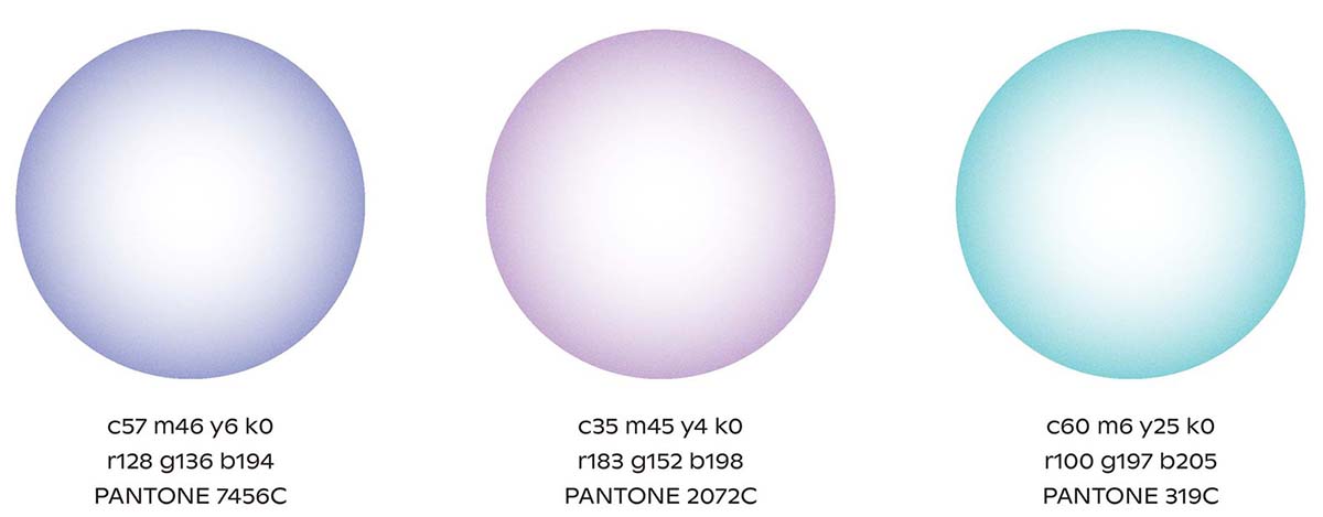
Color diagram
Project facts
Project name: Shuran Massage Commercial
Architects: E Studio
Location: Shenzhen, China
Size: 110m2
Date: 2021
All images © Chao Zhang
All drawings © E Studio
> via E Studio
