Submitted by WA Contents
Wutopia Lab completes orange-colored vertical micro social complex with light tower in Guangzhou
China Architecture News - Oct 04, 2022 - 13:55 3492 views
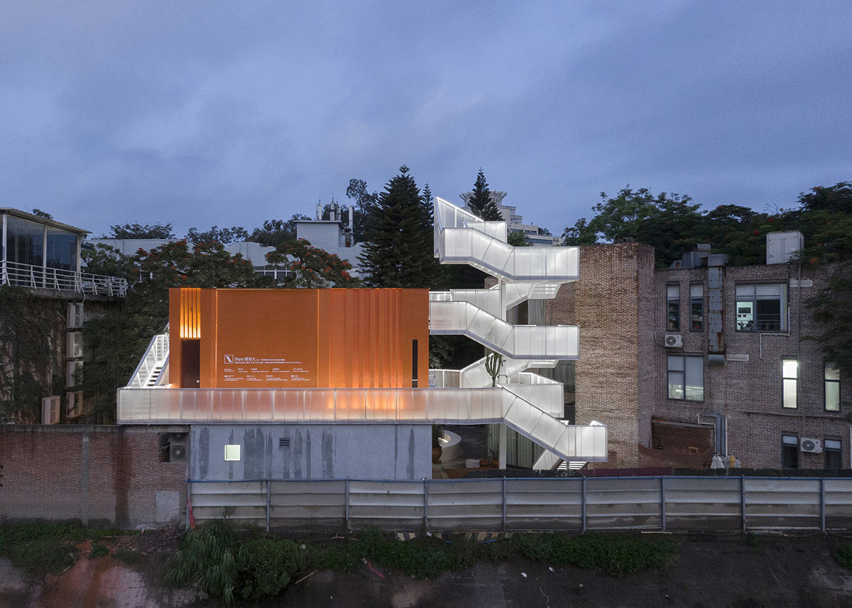
Shanghai-based architecture firm Wutopia Lab has completed an orange-colored vertical micro social complex by adding a light tower in Guangzhou, China.
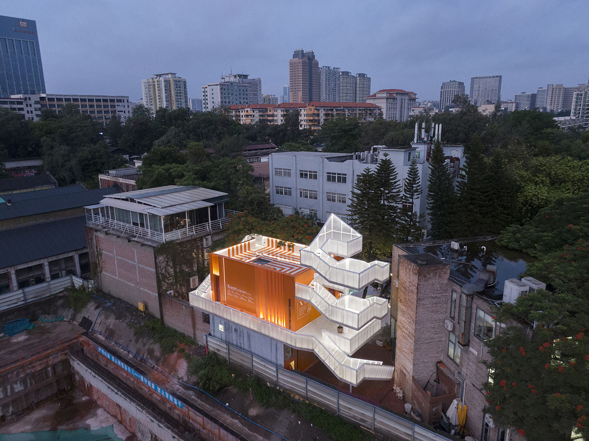
Named Popped Orange / Uhub House, the 177-square-metre building is located in the T.I.T Creative Park, Guangzhou. Designed for a digital fashion brand ifanr, the building is an open design experiment, a vertical micro social complex with a light tower as the hub, including coffee, bar, theater, exhibition, sightseeing and party.
ifanr and Wutopia Lab call it Keep Patching, an urban community and lifestyle renewal activity.
The project is also the first Guangzhou model of Wutopia Lab's urban microspace revitalization program since 2015. Read on the project narrative with the architects' own words.
The wildness of two creators
Wilson, the founder of ifanr, believes that life is inevitably a patchwork process, and that everything does not necessarily have to be pushed back. Self-augmenting is also a philosophy of life. He further said that in a sense, this unprecedented ability of human beings to self-argument themselves has led to the evolution of modern Homo sapiens and the change of civilization. This last idea is abstracted into the value proposition of ifanr, a renowned technology and lifestyle media. ifanr has launched the "Patch_in Project" following the idea of Keep Patching (infinite self-argumenting), covering five fields: Tech, City, Tool, Art, Voice. ifanr focuses on these fields to explore: what is a smarter and more efficient life, what is a more sustainable life? Wilson believes that community experiment is both a way for us to explore future life, and a way of living itself.
Yu Ting, known as Shanghailander, the founder of Wutopia Lab believes that the new paradigm of complex systems can break the state of unhealthy competitions in architecture with classical mechanics as the basic paradigm. I have always seen commissioned projects as complex systems with hyperlinks. Architecture is not just the clichés we are used to discussing, it is connected to diverse and multiple identities and lives and even to the various thoughts and vast virtual spaces we try to conceal. Architecture exists not as objects but as events.
Two founders from different realms, Wilson and Shanghailander, thinking differently yet similarly, finally decided to collaborate on the project Uhub HOUSE.
Innovative design doesn't mean risky
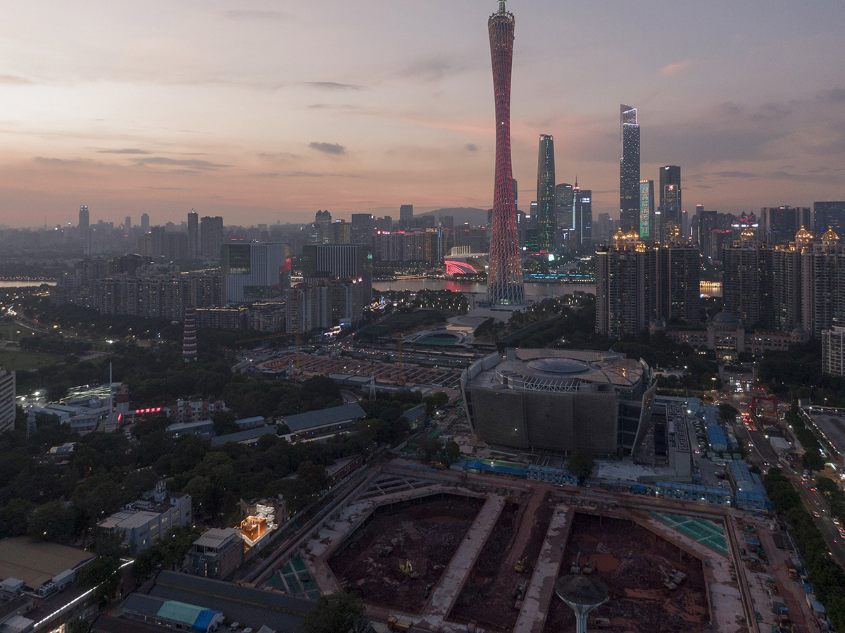
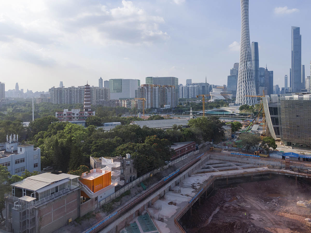
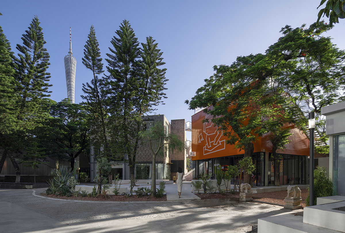
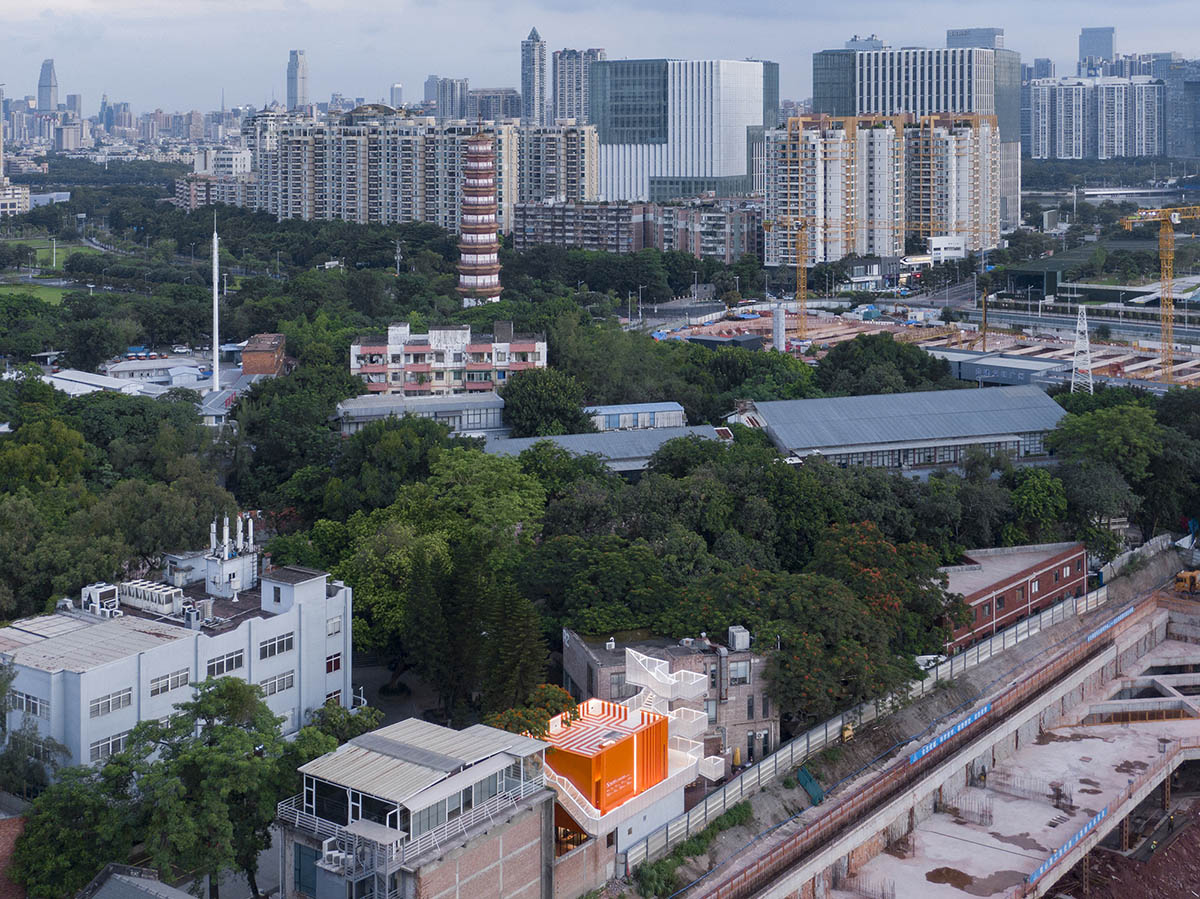
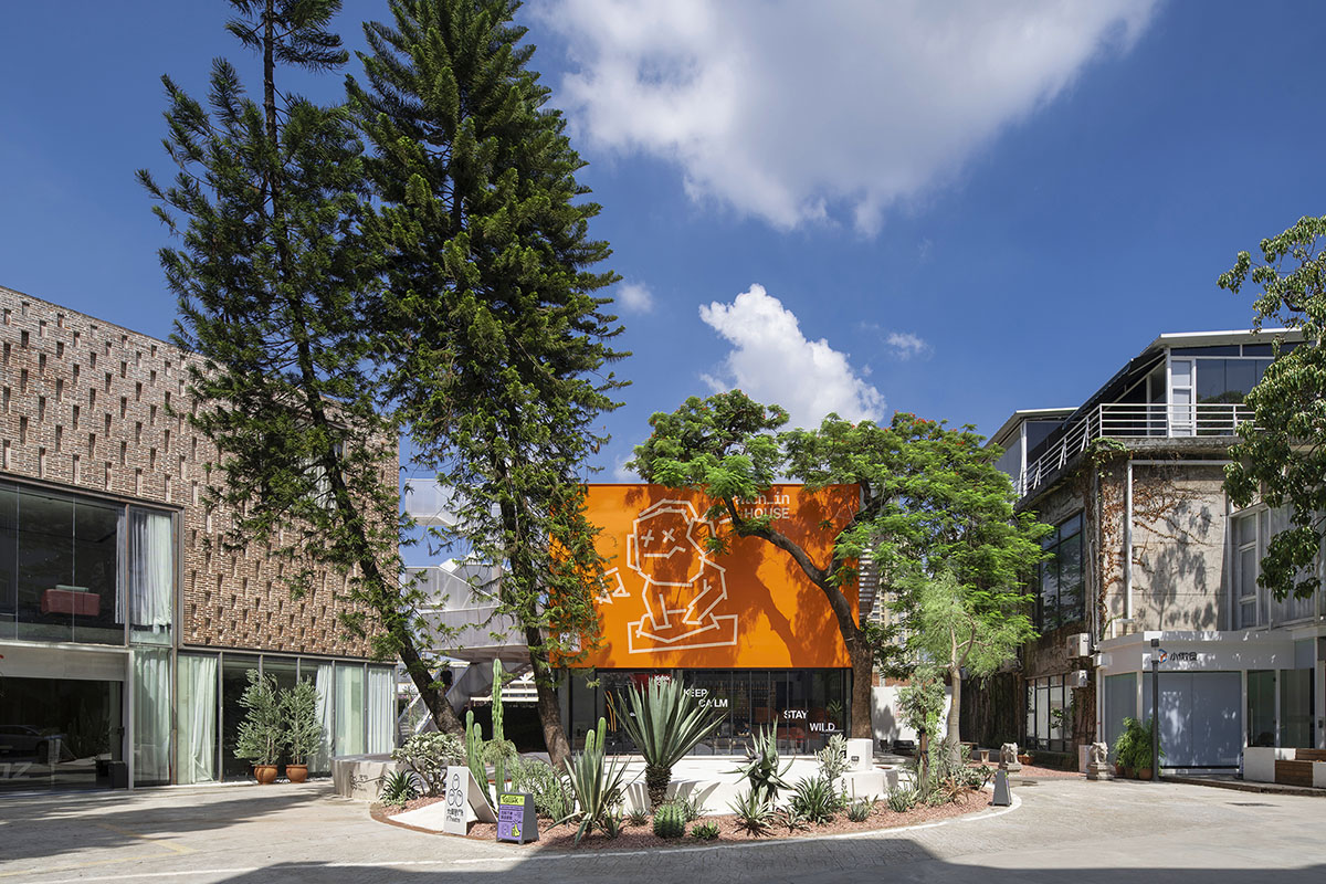
On one side of the Uhub HOUSE is the T.I.T Creative Park, which was transformed from the former site of the Guangzhou Textile Machinery Factory, and on the other side is the Guangzhou Science and Technology Museum, a large urban public building to be built as an art museum. It is located right at the border. You can think of Uhub HOUSE as an orange patch in the iteration of urban renewal: between the past and the future, across online and offline.

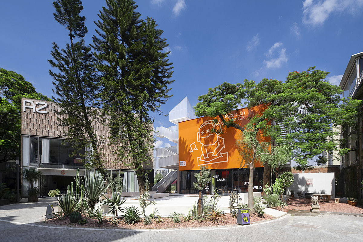
Yamazaki Ryo, a Japanese community designer, said: "It's not about designing islands that can be visited only once by 1 million people, but planning islands that can be revisited 100 times by 10,000 people." What caught my attention was also the theme curation of ifland, the second season of Plug-in Future in 2021, and the idea that "a good product is a candy". So I decided to create an abstract and pure oval island, White Garden, in the rich and diverse growing T.I.T Park. This was the original Plot I set up, which I didn't intensify every detail, since it's also an open design experiment. It has simple rules. It can accommodate mistakes, it can accommodate different people's opinions and even small emotions. It can be upgraded, and can create events beyond our imagination. Diverse and pluralistic, by patching, it's even a design experiment that never ends. Uhub HOUSE as a plot, is the foundation program of this complex system. It can be constantly patched, updated and upgraded. There are fixed parts and growing extensions, the design code is organically assembled to form a sustainable complex system with a complete image but constantly expanding and growing.
As a basic program of Uhub HOUSE has three layers
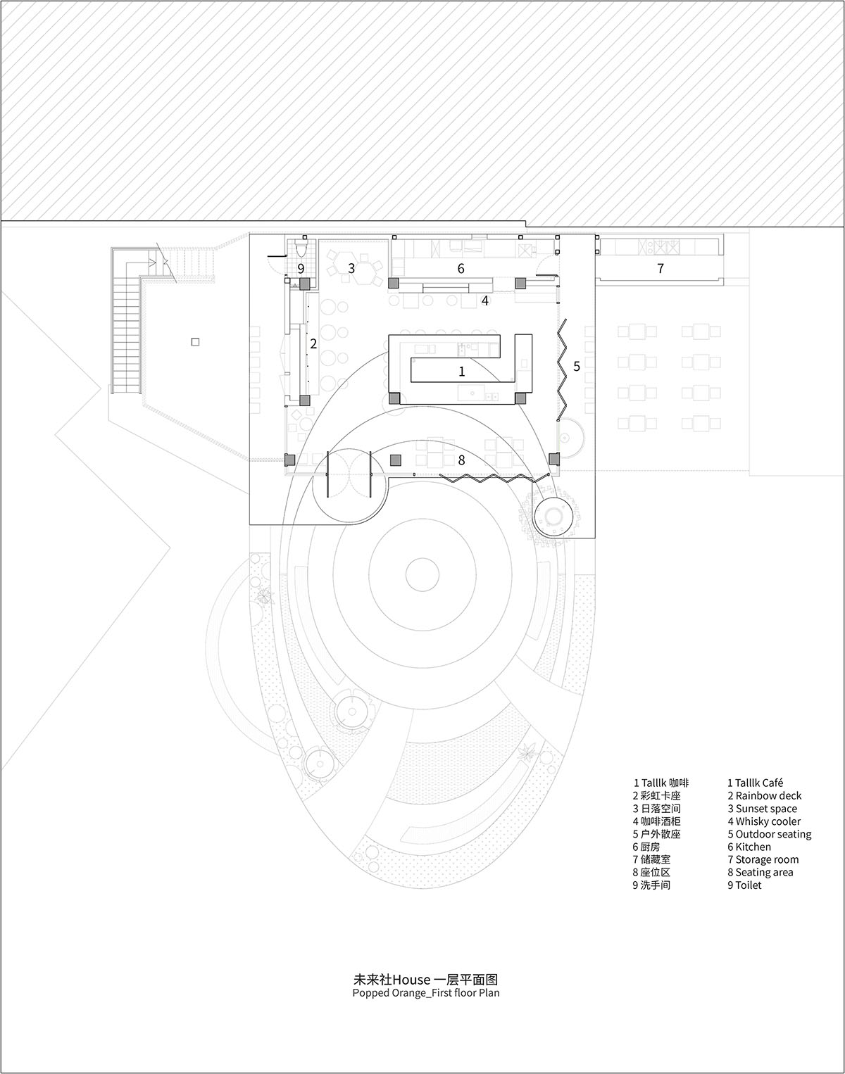
First Floor: Sunset Room
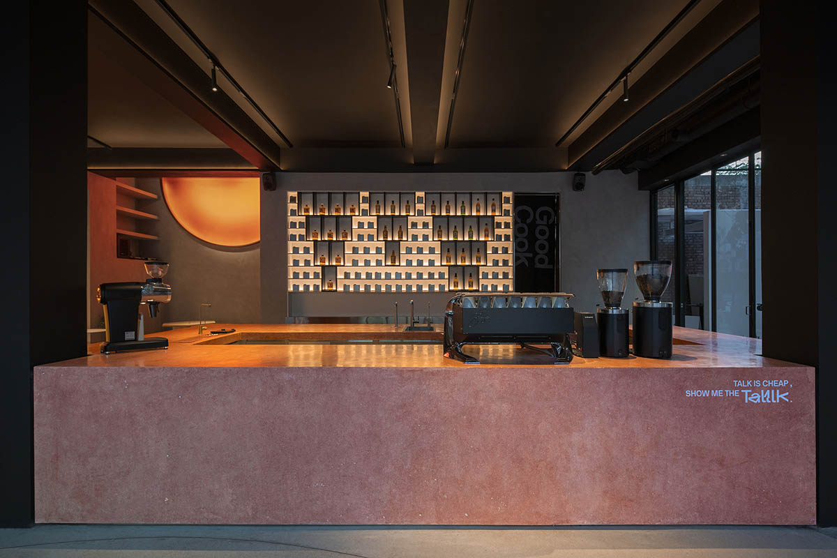
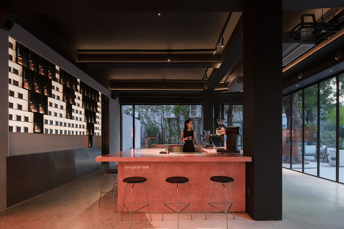
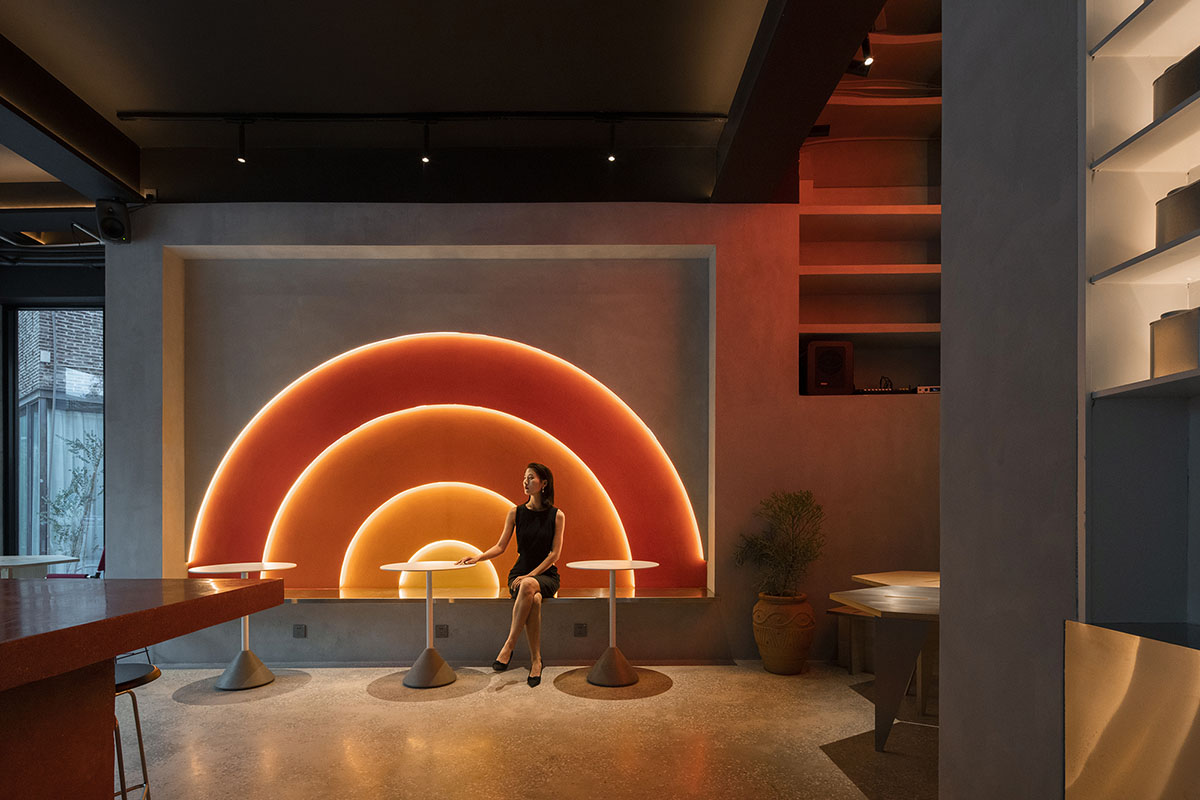
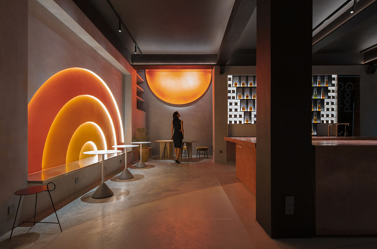
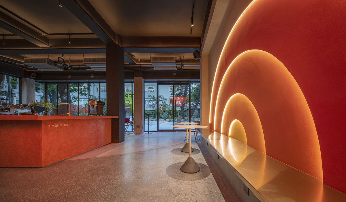
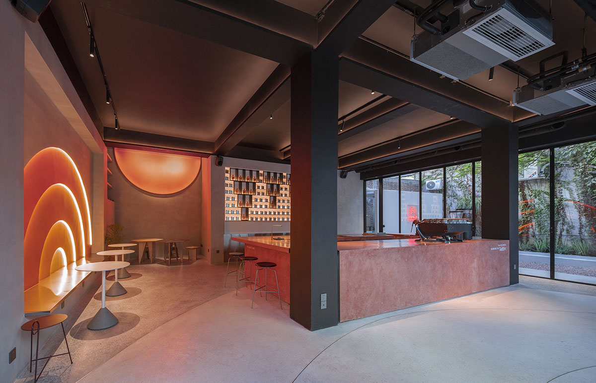
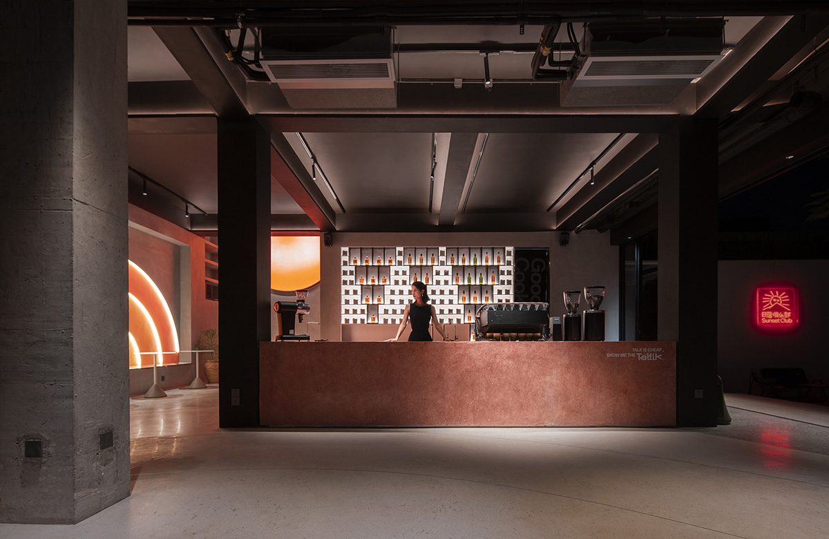
The center island circular bar inside the first floor of Uhub HOUSE is the protagonist enhancing social atmosphere throughout the space. Seating is freely arranged around the bar in which interior space can accommodate about 60 people. When the folding doors open, the coffee space and the white garden merge into one, turning it into a party venue with a capacity of 180 people. This way the usage scenario will be more flexible and diverse.
Sunset Club
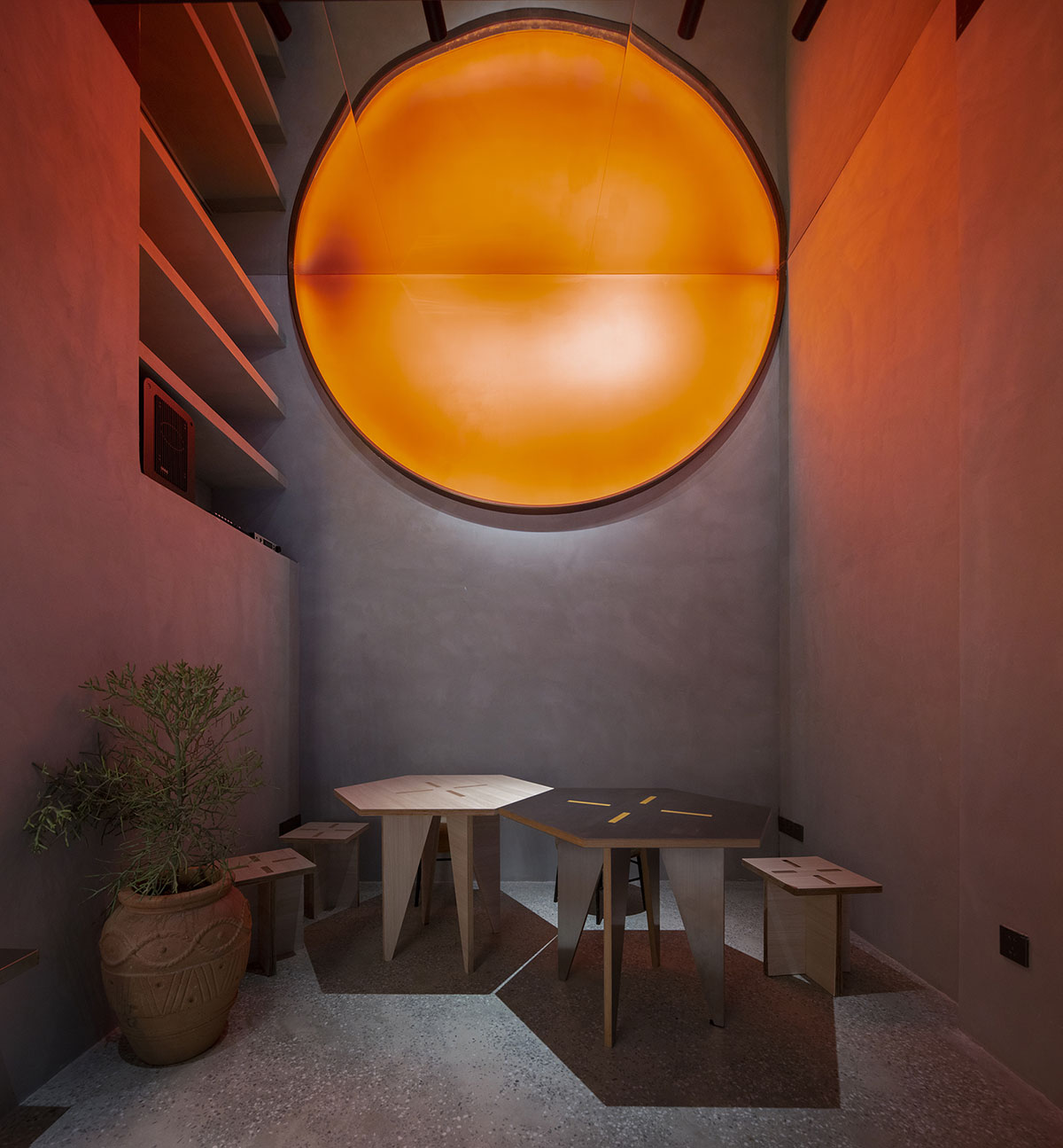
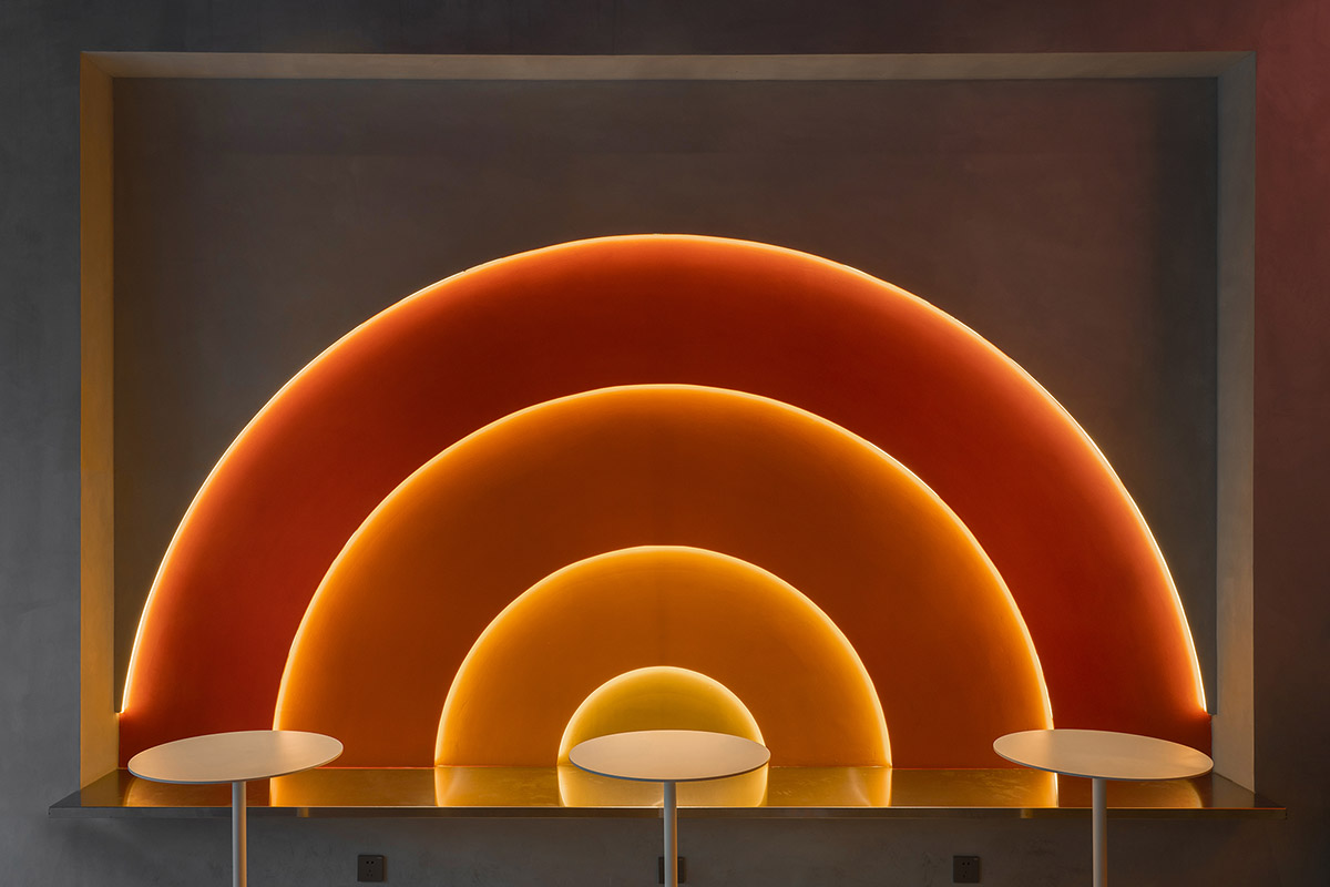
Wilson had asked if there would be too many orange circles in the interior, and my answer was: just right. Like the light of the setting sun, different orange colors are embedded in the walls, and the orange circles / semi-circles in Popped Orange space are reflected and illuminated to achieve the relaxation, pleasure and tenderness at sunset, which happens to coincide with Uhub HOUSE's "Sunset Club". Sunset represents a shift between day and night, and as night falls, the lights turn on, and the coffee bar transforms into "Young Girl on the Threshold of the Garden at Bellevue". The gentle light in the night mode, bouncing back from the wall and through the wine on the cabinet, lit up the mood at night.
The daily operations on the first floor are TALLLK Coffee, Black Host (hand-pressed coffee), and Spirit Line (wine). Special operations can be held in this venue based on different brand collaborations/pop-ups to experiment with multiple businesses and operations. ReMake.Space, a product brand "Sugar Factory" just released by ifanr, carried out a combination of life scenes and desktop peripheral display here.
Middle Floor
The middle floor is an orange cube floating above the white garden, which is the main form of the building, symbolizing ifanr's slogan "A good product is a candy," and the Uhub HOUSE is an orange fruit candy in T.I.T Creative Park.
Air Show
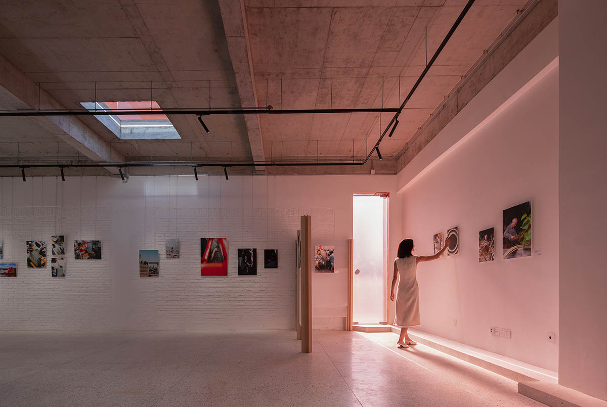
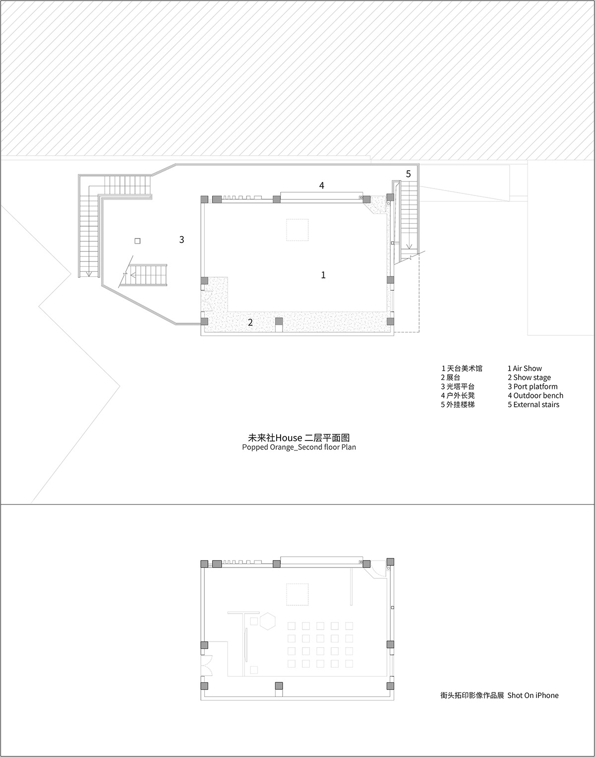
The second floor is flexible and changeable according to the operation demand, no fixed partition is set up. The partitions perform as white exhibition walls below its 3 meter height, then retains the original concrete above. Through the long strip windows, square skylights and glass doors, natural light is blended into the atmosphere. The first event during the trial operation is the shot on iPhone street topography - photography exhibition organized by Apple. More exciting events will happen here in the future, and you can always enjoy the unpredictable surprise whenever you reach the entrance on the second floor.
The daily operation on the second floor is the Air Show rooftop gallery (exhibition space), which can be transformed into a live house, sharing space, performance space and party space by special operations.
Third Floor: Secret Roof
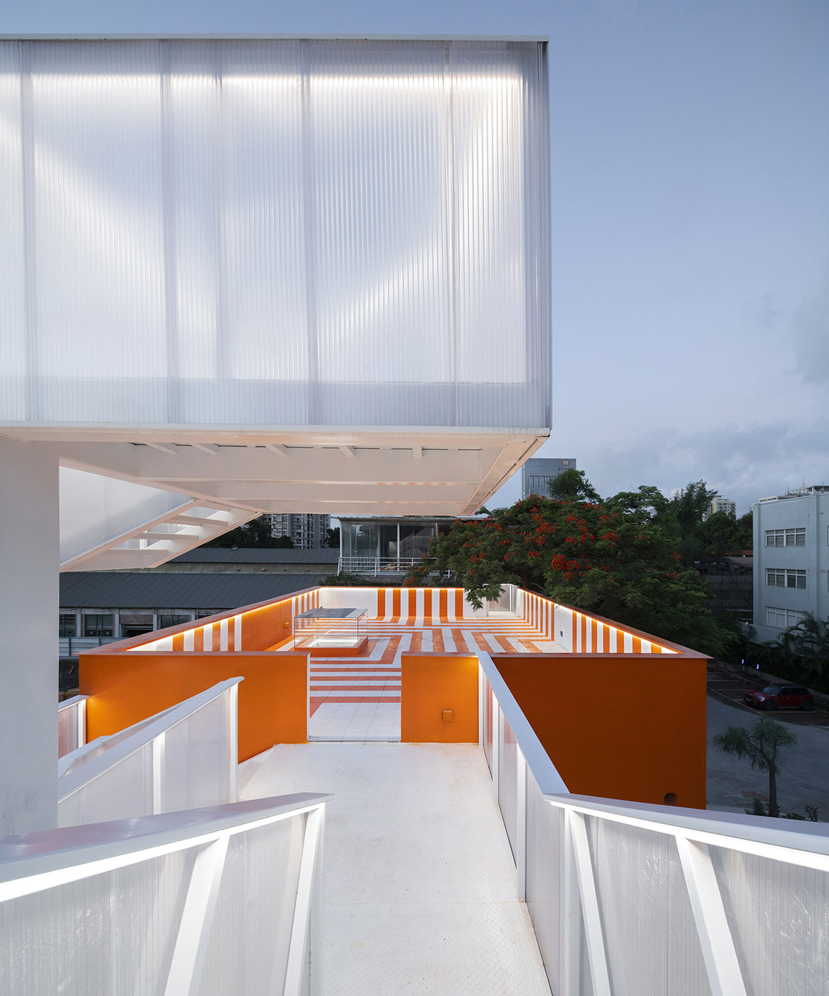
The roof is a garden and a secret party playground where let people see the trajectory of the moon at night, this is the moonlight camp. Wutopia Lab designed two paths to reach the roof, offering multiple circulations to fit flexible activities on the rooftop.
Port connects to the sky
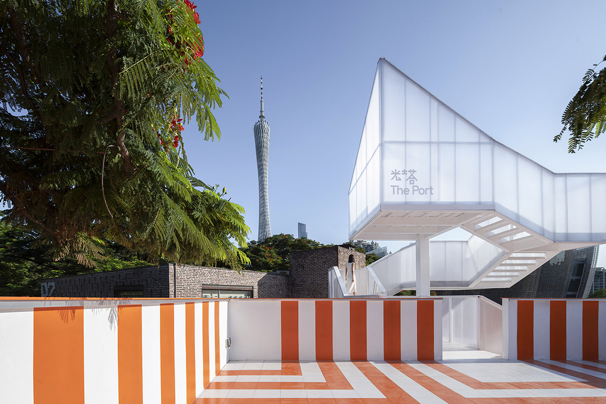
During the event, you can see the old brick-walled factory buildings in T.I.T Creative Park on the west side, and the Guangzhou Science and Technology Museum under construction and the completed Guangzhou Art Museum on the east side. With the old industrial ruins at your back and the new life of science and technology in your front, this rooftop has a unique view of Guangzhou and even the world. Not like a secret location, it's more like you are sent to a secret moment in the history to observe the city of Guangzhou. At this moment, you can feel the speed of the wind while looking at the Canton Tower.
The roof is a Secret Garden, and transformed to a Port when the special activities happened. It is a fun, ritualistic place as well as a party dance floor, terrace camp, and barbecue place.
Life is a journey of constant patching
Open design means making adjustments without changing the original frame of the design in response to the on-site situation at any time, which is patching.
Tower of Light
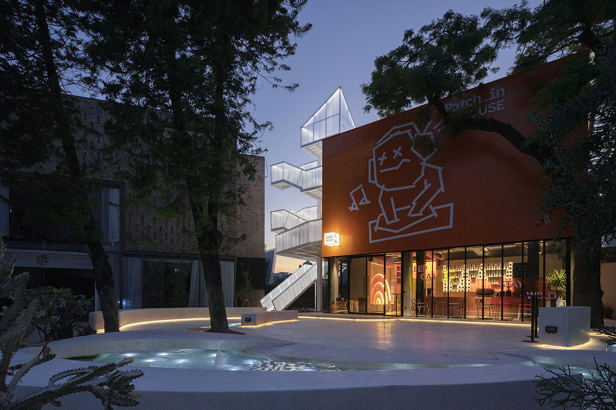
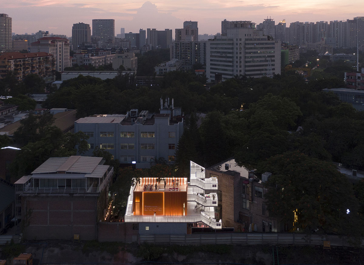
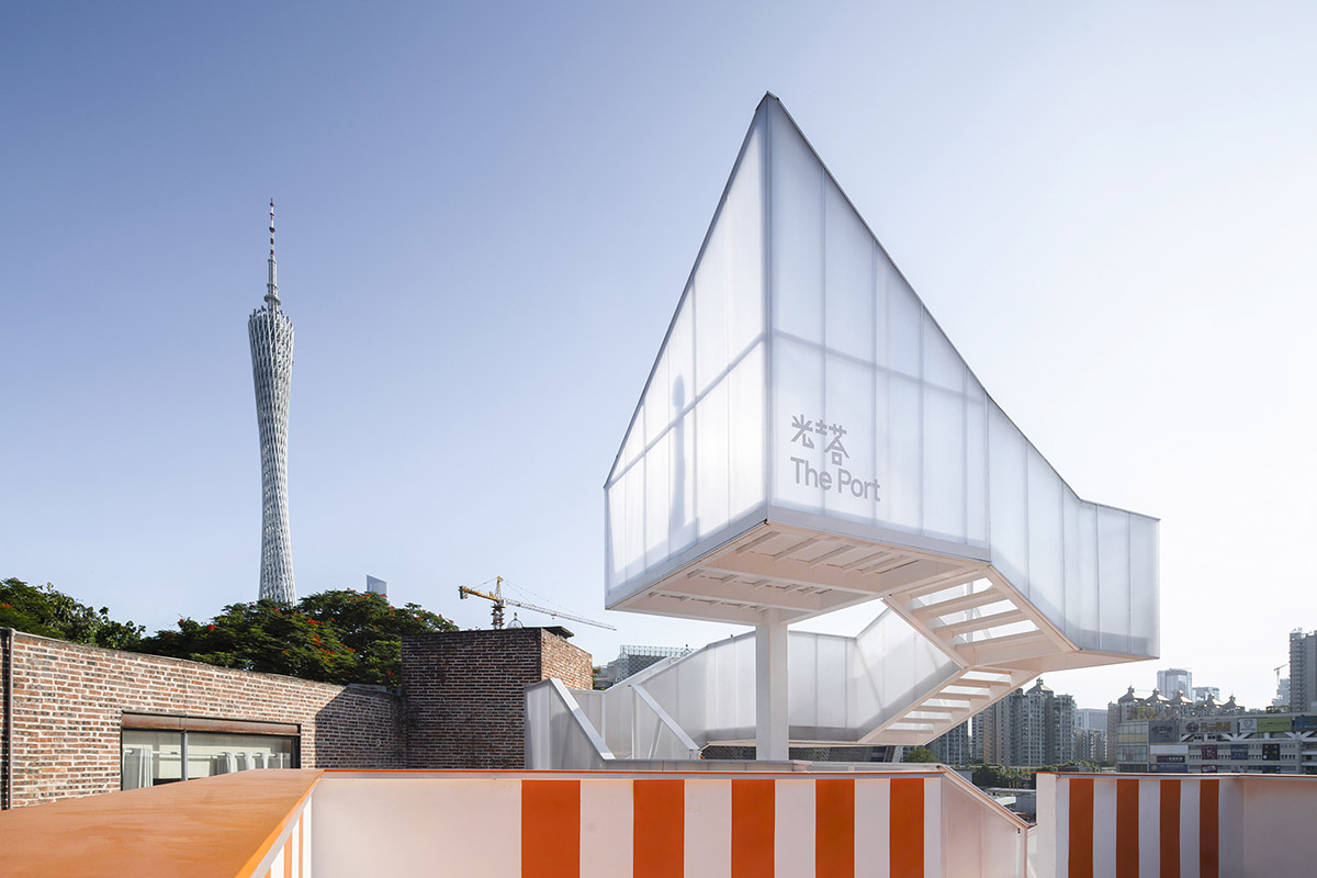
Wilson insisted that the outdoor steel ladder should be artistic. Wutopia Lab used steel, sun panels and white color to create a the tower of light, as a response to the main body of the orange Uhub HOUSE. I hope that the light tower with a structure height of 11.27m can be light enough to read as detached from the main body. Hu, who lived up to his trust (a structural engineer I mentioned several times), only set up a 300mm×300mm independent steel column for the light tower to make the stairs stand upright.
The translucent light tower not only connects the three-story space of the Uhub HOUSE as a vertical transportation vestibule, but also serves as an outdoor three-dimensional park or outdoor exhibition gallery. The staircase spirals up around the structural steel column to form a four rest platforms.
The rest platform cantilevered without a fulcrum, and the stair sections support each other. Different from the conventional plane structure, it needs to have enough torsional stiffness. Hu carried out the calculation analysis and design according to the spatial structure. The steel treads are placed on the inner side of the two ladder beams and welded firmly, and the steel treads become part of the overall force.
The actual stress condition is better simulated by spatial 3D modeling calculation, which ensures that the designed component section appeared lighter. Visitors can continue to reach the top of the tower after passing the exhibition hall on the second floor and the rooftop on the third floor. At this time, the stairs becomes an observation deck looking into the distance, which the Canton Tower, Chigang Tower, T.I.T Water Tower, the Guangzhou Science and Technology Museum, Art Museum and the slightly swaying treetops of the three trees in the garden are all in sight.
White Garden
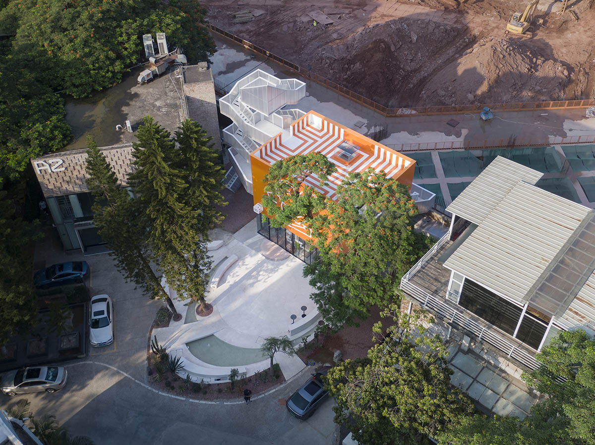
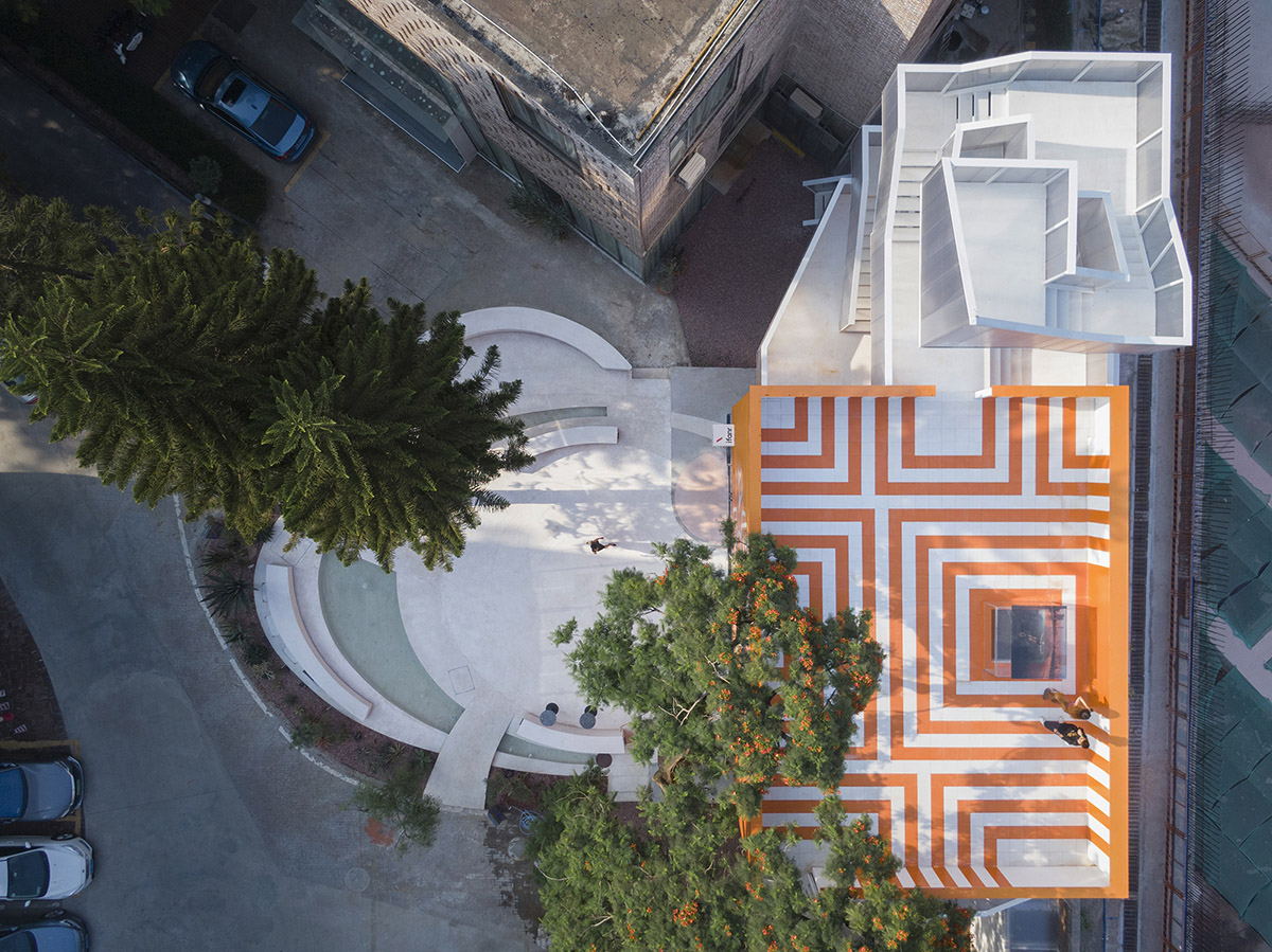
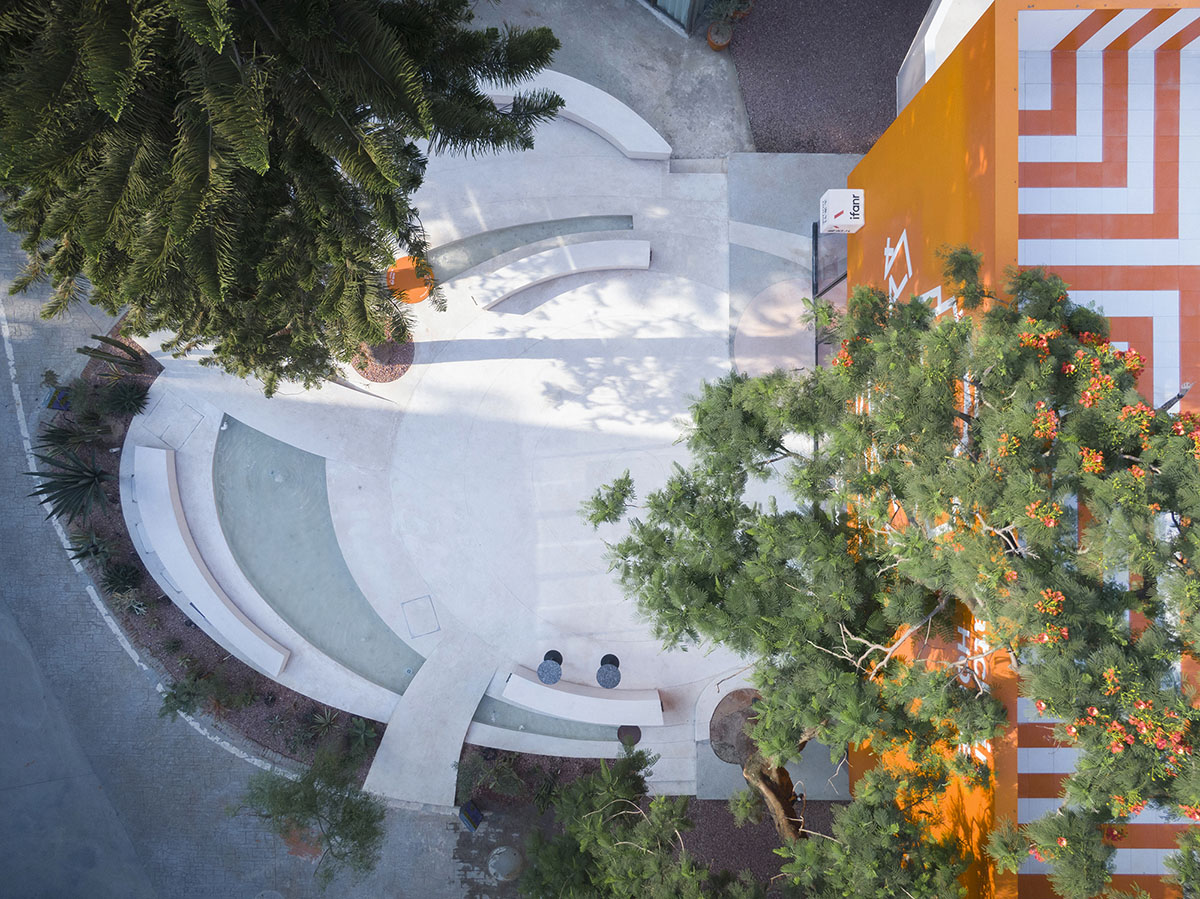
Wutopia Lab created a borderless oval white garden on the ground level that retains the on-site arbor. We turned the originally sloping and messy site into pure and clean. To ensure the accuracy and integrity of the ellipse, the first step would be determined the location of the center point. Combined with the layout density of the site's landscape facilities, the ellipse is equally divided into 24×15° angle-sector, and the compound positioning such as angle, arc length, and distance from the center of the circle to each ellipse is used to ensure the site from many aspects. The accuracy of the payout and the feasibility of data mutual correction.
Secondly, it is necessary to retain the trees and soil level through surveying and mapping to make it match the height of the garden renovation.
Fine geological survey and mapping can avoid the conflict with the old facilities on site during the renovation process. Through the application of slot-type drainage ditch, the concealment of landscape linear light strips, the setting of waterscape overflows and drains at the bottom of landscape bridges, etc., the architects have carried out a series of targeted detailed designs for facilities and elements that are not conducive to landscape effects, to ensure a complete and pure white garden inlaid in the T.I.T campus.
The floor was paved by white washed stone and the stage was emphasized by red ones. After comparison, accept Wilson and Li Hao's suggestion, giving up the sky blue washed stone for the pool. This white crescent-shaped pond in the white garden distinguishes the inner and outer fields of the garden. Visitors can cross the arch bridge to reach the inner square surrounded by curved seating areas and enter the small universe of ifanr. The circular elements of the landscape and the entrance of the building are like micro planets in the tiny universe.
On weekdays, you can sit under a tree with a glass of lemon cold brew and enjoy the solitude, or you can listen to an open-air concert after work with friends.
On weekends, there are a variety of community activities of the Uhub HOUSE: bazaar, stand-up comedy, Yoga, Swing Dance, etc. This is the place where interesting social events happen. When the curtain falls indoors, the garden becomes the audience. KEEP PATCHING. This garden must be dynamic as well. It will keep growing, renewing and keeping the state of "unfinished".
Lighting
The daily operation mode of Uhub HOUSE contains very rich community scenes. It operates as a coffee shop in the day and a bar at night, which can be switched with one click through Lighting.patch. The landscape lighting has both of the color temperatures. The orange body is warmed by the immersive light, while cold light tuned down from the the light tower elegantly responds to the warmth of the main body, as if a pair of dancing partners, dancing in the night music.
The interior lighting takes into account the dual needs of commercial display and community life. First of all, the lighting outlines the original structure lines, creating a gentle and natural light tone; then the main character "bar" is highlighted with spot lights. So that customers can enjoy the barista's latte and the bartender's cocktail to strengthen the performance attributes. The three-dimensional lighting combination in the booth areas forms a dynamic lighting environment; in the window seating area, the appropriate brightness is controlled to ensure great views.
Based on ifanr's strong sense of pioneering for the exploration of future communities, lighting provides a carrier to touch the future form. Lighting.path of "Uhub HOUSE" harmonizes architectural design, landscape design, operational activities and site symbols to build a living light and shadow.

Popped Orange
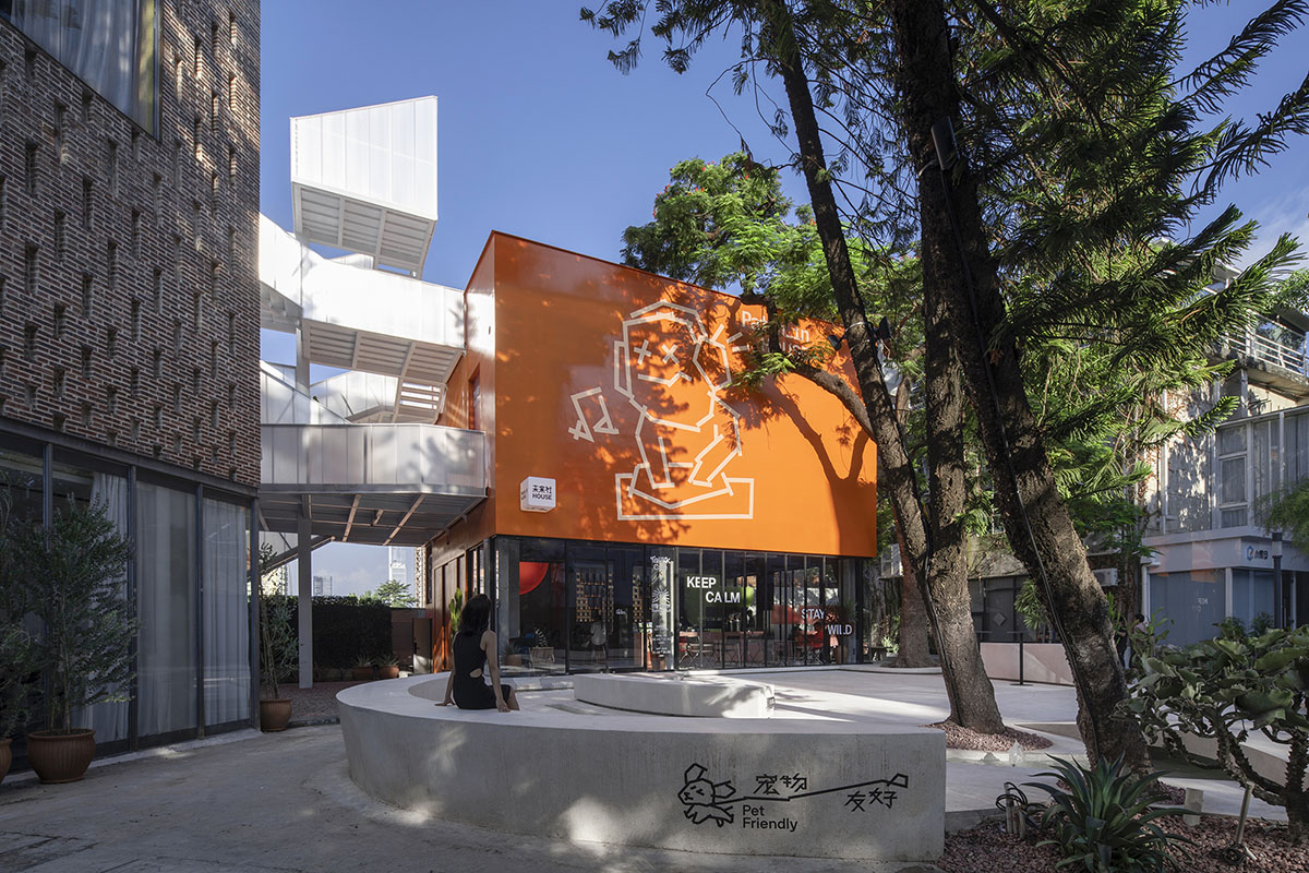
Wilson sent me a photo of the white façade of the Uhub HOUSE. I suddenly changed my mind and changed the white façade to the orange color distilled from the ifanr logo. White is what everyone can think of, but orange requires the courage to argue. In the end, it was Popped Orange that leapt out of the gray industrial site.
Striped Roof
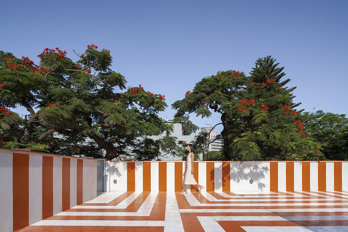
Because of the COVID, we were unable to go to the site. The construction process was also very constrained, which gave me the opportunity to deliberately adjust and refine it. When I noticed that the orange façade ended at the short wall pressure line, with both of them in white, I thought it would be a great moment to recall the demolished Anaya Visitor Center. Starting from the roof skylight booth, the entrance and the outdoor bar, the pattern composed to form orange geometries as a fifth façade on the roof. It finally expresses the complete visual theme of Popped Orange.
East Elevation
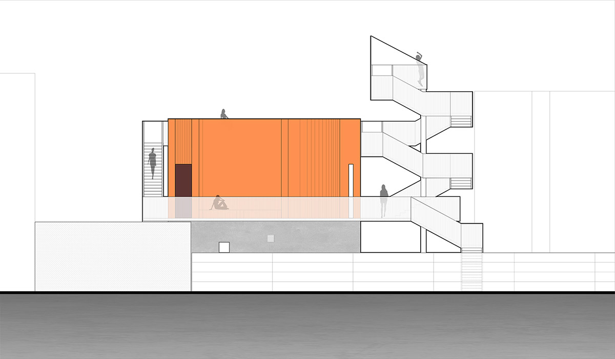
I see in the photos pilasters and downspouts protruding from the wall on the east elevation facing the Tech Museum. This construction destroyed the original design of a light wall. Instead of restoring the light wall, I asked Hao to design a grill-like texture to visually hide the pilasters and downspouts and to give the east elevation a decorative touch.
Duct Tape Man: HELLO, I'm .Patch
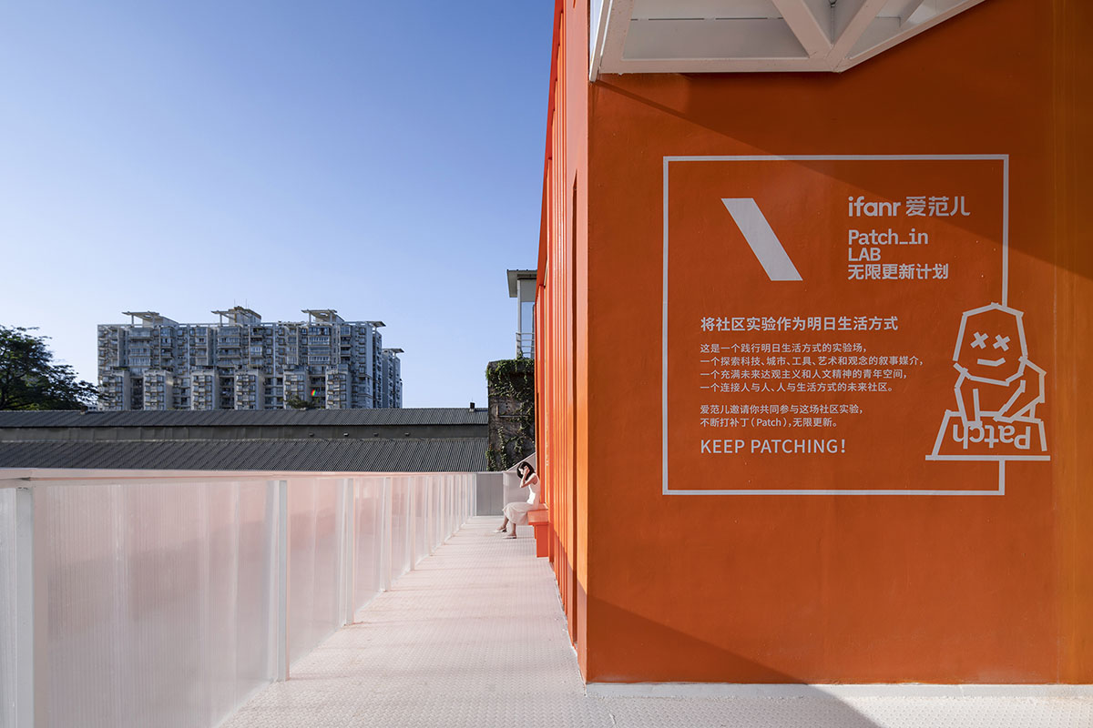
ifanr believes that in addition to the familiar graphics and videos, architecture, salons, courses, art exhibitions, cafes... are all media that carries ideas. Respect for multiculturalism and bold search for different media forms have led to the concept of "duct tape man" — a symbolic body outlined by duct tape and patches, which is the visual IP embodiment of the .patch concept proposed by ifanr. Since the Uhub HOUSE is the home of the duct tape man, I presented a giant duct tape man on the façade as a declaration.
Understanding and Respect from both ends
The client dominates the designer like a king, or in contrast, the designer stubbornly rejects any of client's opinions. are both dysfunctional relationships. Even though Wilson is an architecture enthusiast, he understands and respects me. Despite my somewhat renowned reputation, I am happy to learn and listen to Wilson's many interesting ideas that go beyond architecture. I respect his trust, and I take his ideas to inspire my own unexplored thinking to create work beyond his imagination. This relationship of mutual motivation, understanding and respect between the two parties is what ensures that this open design is not an adventure.
Completion is just the beginning
The Popped Orange / Uhub HOUSE is an aspirational community where like-minded souls can meet and get to know each other, and where fresh ideas and inspiration are constantly coming out. The day it was completed was just the beginning of something more interesting, as Wutopia Lab and ifanr Candysign released a limited edition charging head. This charging head, which absorbs the visual characteristics of the Uhub HOUSE, is a souvenir of the architectural design. In the future, architectural design will not be limited to the so-called physical space but will be able to influence us by entering our lives with more subtle touches.

Exploded axonometric

Site plan
First floor plan
Second floor plan

Axonometric drawing

Section

Section
East elevation

West elevation
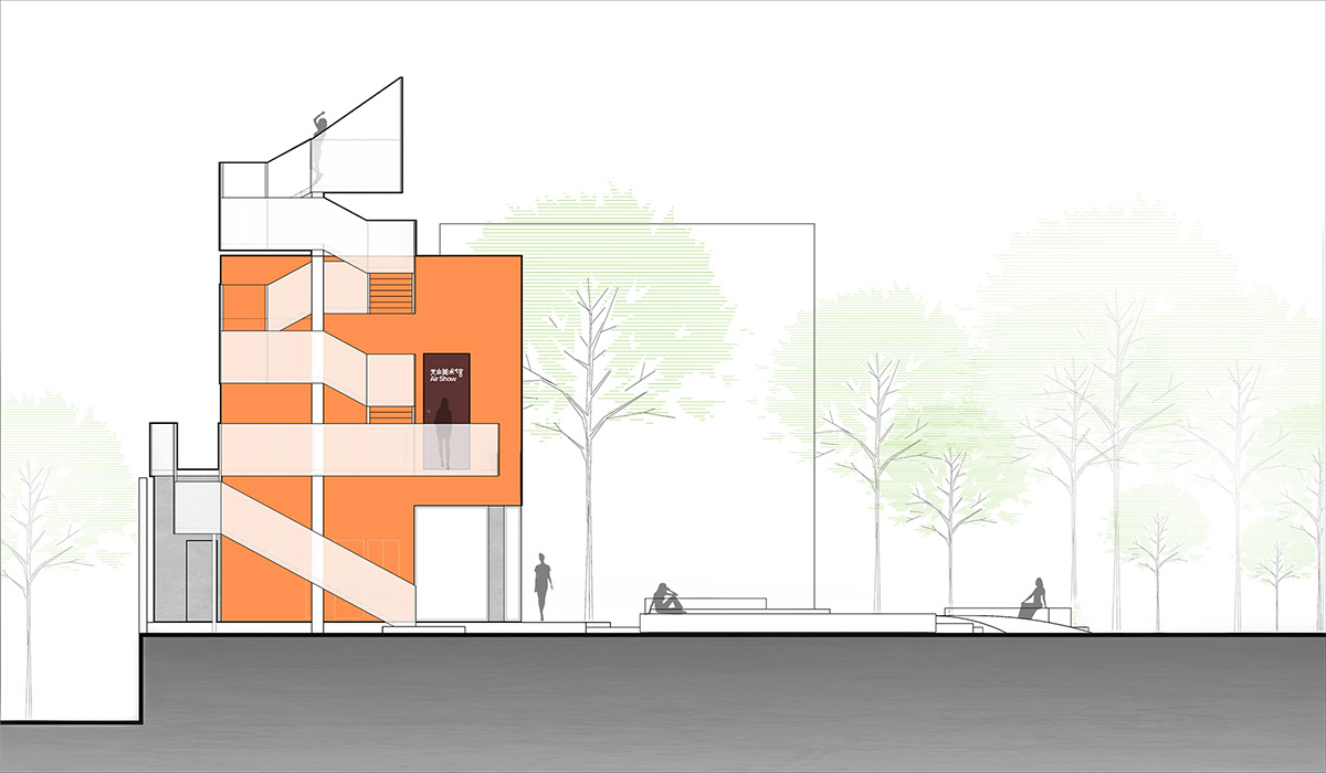
North elevation

South elevation
Project facts
Project name: Popped Orange / Uhub HOUSE
Location: T.I.T Creative Park, Guangzhou, Guangdong Province, China
Building area: 177.8㎡
Design period: 2021.12-2022.1
Completion time: 2022.8
Design firm: Wutopia Lab (Architecture, Interior, Landscape)
Lead Architect: Yu Ting (Shanghailander)
Project Architect: Li Hao
Design Team: Wang Zhizheng, Jiang Xinping (Internship)
Design Development: Shanghai Sunyat Architectural Design Co., Ltd.
Architecture Team: Zhu Yumei, Yang Jia
Structure Team: Hu Wenxiao
Mechanical & Electronics Team: Shi Jiaying, Mao Robert, Mao Yaqian, Zou Yuheng
Interior Design: Yu Bing, Shen Rui, Shao Bin
Landscape Design: Wang Chon, Guo Yuqi
Lighting Consultant: Zhang Chloe, Yu Shiyu, Du Yuxuan
Material Consultant: Wang Yu (polycarbonate sheet)
Construction: ifanr
Construction Team: Heyuan Yuchenju Decoration Co., Ltd.
Landscape Construction Team: Zhuhai Yuyuan Landscape Group Co., Ltd.
All images © Wu Siming.
> via Wutopia Lab
