Submitted by
MIAOJUE Design Studio Creates Resort-Like Office Space Where Nature, Art And Work Converge In Beijing
teaser5-1--2--3--4--5--6--7--8--9--10--11--12--13--14--15--16--17--18--19--20--21--22--23--24--25--26--27-.jpg Architecture News - Sep 16, 2022 - 11:18 2708 views
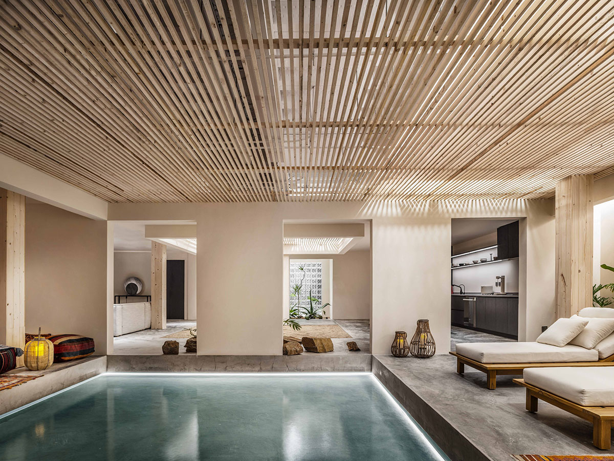
Chinese design firm MIAOJUE Design Studio has designed a resort-like office space where greenery, nature, art and work converge in soft and warm-colored palette in Beijing, China.
The 460-square-metre office building is located in the southern area of UBP, which was formerly known as the Beijing Electronic Tube Factory.
"UBP Park owns numerous building groups with a combination of Chinese and Western techniques, and all of them were constructed under the design guidance and supervision of experts from the former Soviet Union in the 1950s," said MIAOJUE Design Studio.
"These building groups are featured with elegant simplicity, unique style, a strong sense of history and cultural appeal," added the office.
The two-story office building presents its employees a relaxing atmosphere with natural colored palette, materials and a pool to strenghten the relationship between nature and workspace.

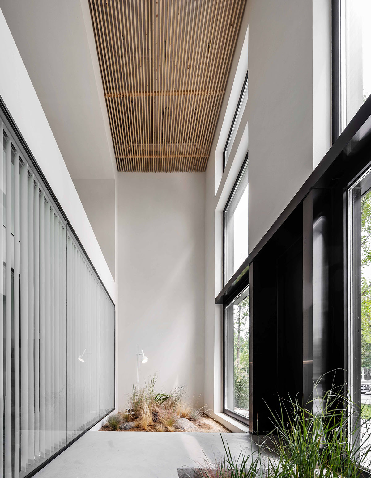
Facing south and protected by luxuriant plants, the building contracts finely with the outdoor scenery while free from the influence of the setting sun. Standing or sitting in front of the large glass windows on the first and second floors, you can immediately frame the view and daylight as you like, enjoying the blend of tree foliage with the changing color of skylight.
The project is structured in three parts, with spaces arranged in an orderly manner while maintaining sufficient landscaped areas.

From top to bottom, the first area is the daily office space on the second floor; the second area is designed with a landscaped atrium space and a large meeting room; and the third area is set up matching space as resort for rest and relaxation.
The landscaped atrium space is ingeniously contiguous with the meeting area, while the appropriate space maintained by the stairs clarifies the relationship between landscape and facility, and between nature and art.
It can meet the needs of daily meeting, guest entertaining or academic salon. A chemical collision and reaction between the sense of intimacy and ritual form can be felt here, and the use of space is quite flexible.

You can vaguely see the calm waves and plant landscape through the entrance and meeting room, sighting the interior.
The soft and warm colors of the Italian terra, the turquoise of the sea, and the freshness of agave and traveler bananas' green occupy your eyes.
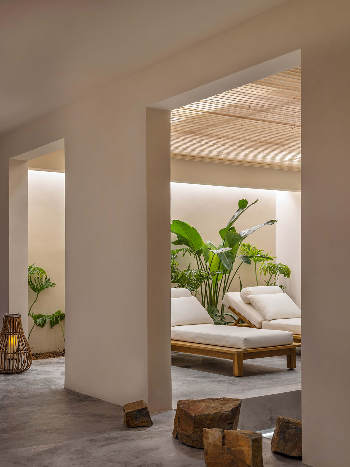
Those Italian-style chaise lounges in the relaxation area are all arranged in a serene but leisurely way, representing the easiness and the sense of relief of vacation life.
Everything here seems calm and peaceful without rigid and heavy objects, which can better integrate with the surrounding natural atmosphere. Granular Spanish beige art paint and wood are used.
The two rustic natural materials combine subtly and eternally, showing the charm of leisure in the graceful light and shadow and the flowing of time.
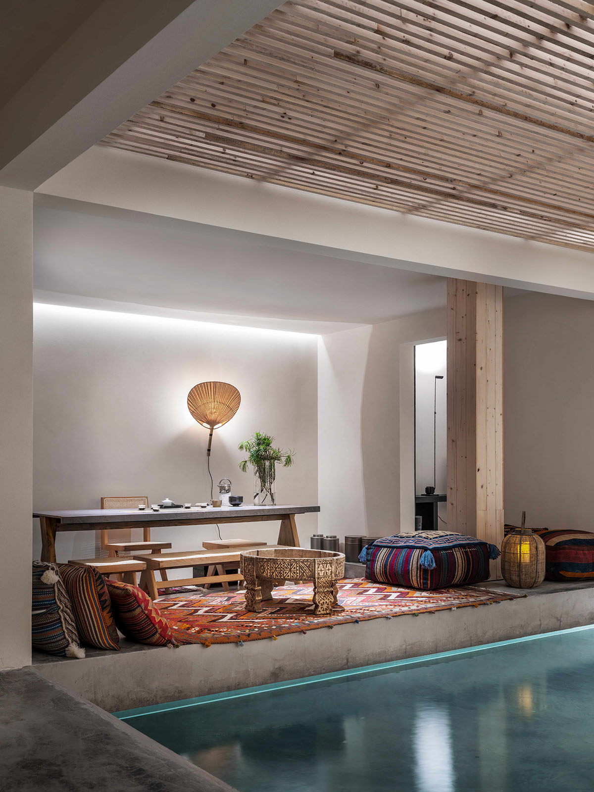
The tea room integrates oriental tea elements in the overall style and tone, from "tea set" to "tea artistic conception", and finally to "tea ceremony", presenting hospitality amid the mysterious atmosphere.
The woven fabrics from Bohemia are laid beside the water. Its novelty and comfort collide with the oriental tones of the tea space, bringing another chemical reaction, which makes the space enjoyable and interesting.

The tea space and the relaxation area are laid on each side of the water. Such layout avoids the mutual interference between the dynamic and static areas, not only maintaining each space's independence, but also completeness and pureness.
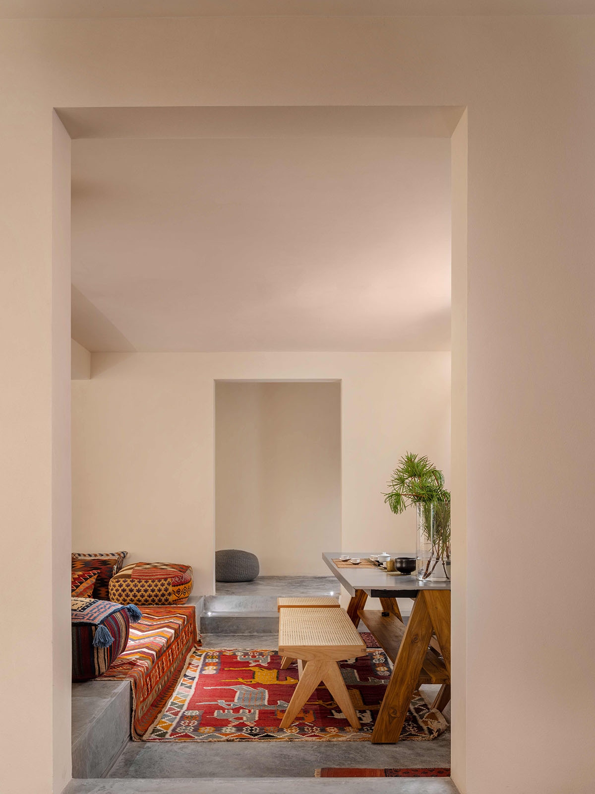
Through the space partition method, a meditation area in the central court is set up, which effectively separates the media room from the open kitchen and dining area, and mirrors the layout of the relaxation area and the tea space, connecting the routes of the interior space.
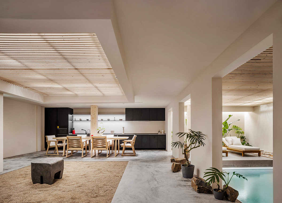
The white porcelain utensils on the kitchen booth are from various dynasties
The wooden grille ceiling is designed to let in sufficient light that brightens the side of the well-designed ceiling and the interior walls. Intriguing light and shadow penetrate each other, creating a touch of aesthetic color into the space while providing better ventilation, environmental protection and comfort.
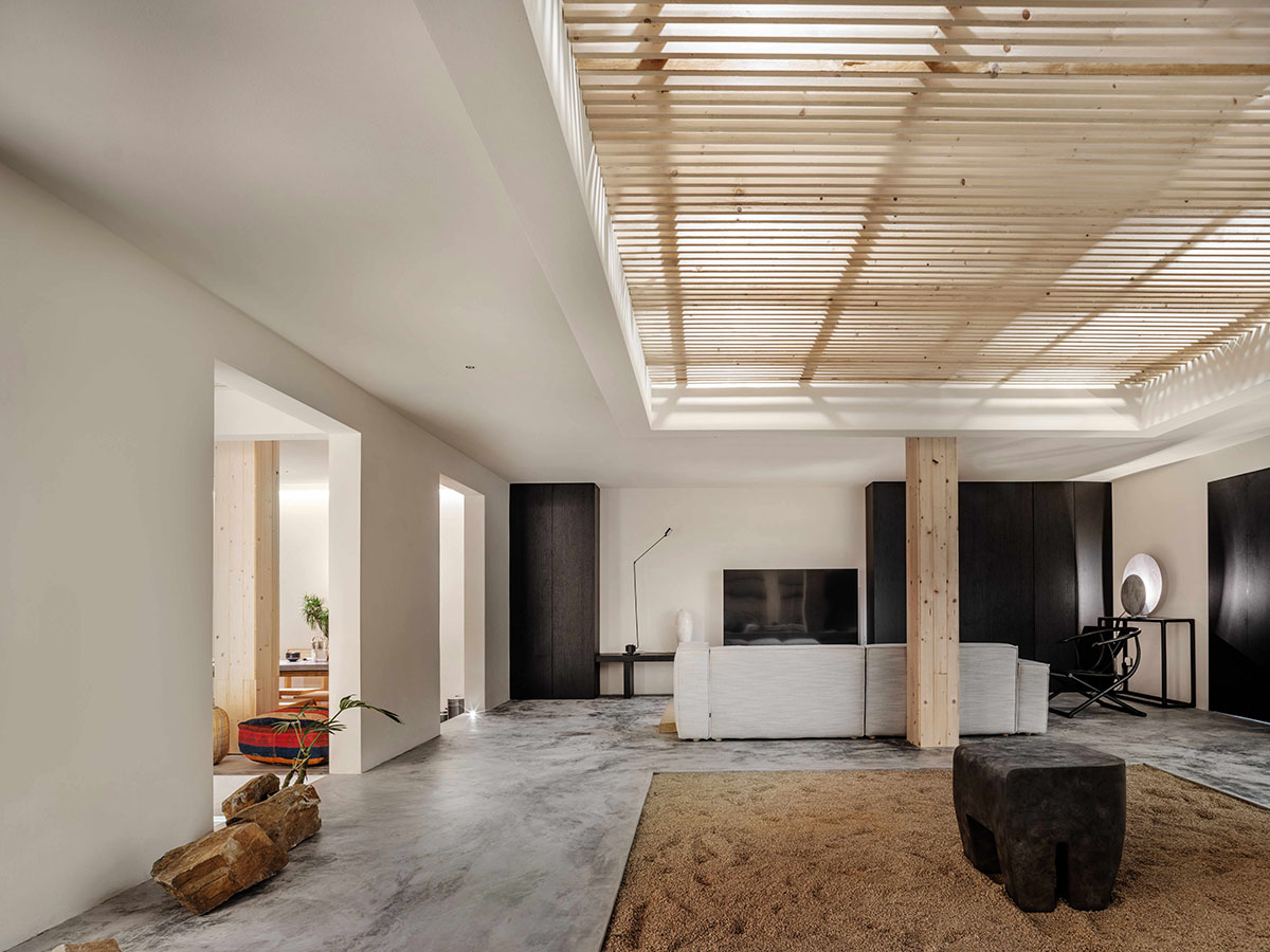
The white porcelain plum vase in the media room is an artifact of the Song Dynasty
Integrated into the relaxing resort zone, which can relieve stress in daily work and spread the happy scene and high-end experience of the office to every part of the company.
It brings the vacation office culture to the extreme and provides all employees with a people-oriented efficient office.
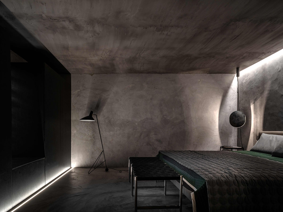
In the design of the leisurely resort space, the elements that reflects the modernization of the leisure environment and the cultural continuation are also found.
In addition to improving the comfort of use ingeniously, the design and research of the studio focus more on material matching in practice, which provides the space itself the soul and spirit of design.

The studio also designed customized office chairs for employees. The comfortable and simple shape of the chair forms a unity of tone and style with the office space, and the chair is highly praised for its flexibility and stability, a design work paying tribute to Charles Eames and Ray Eames couple.
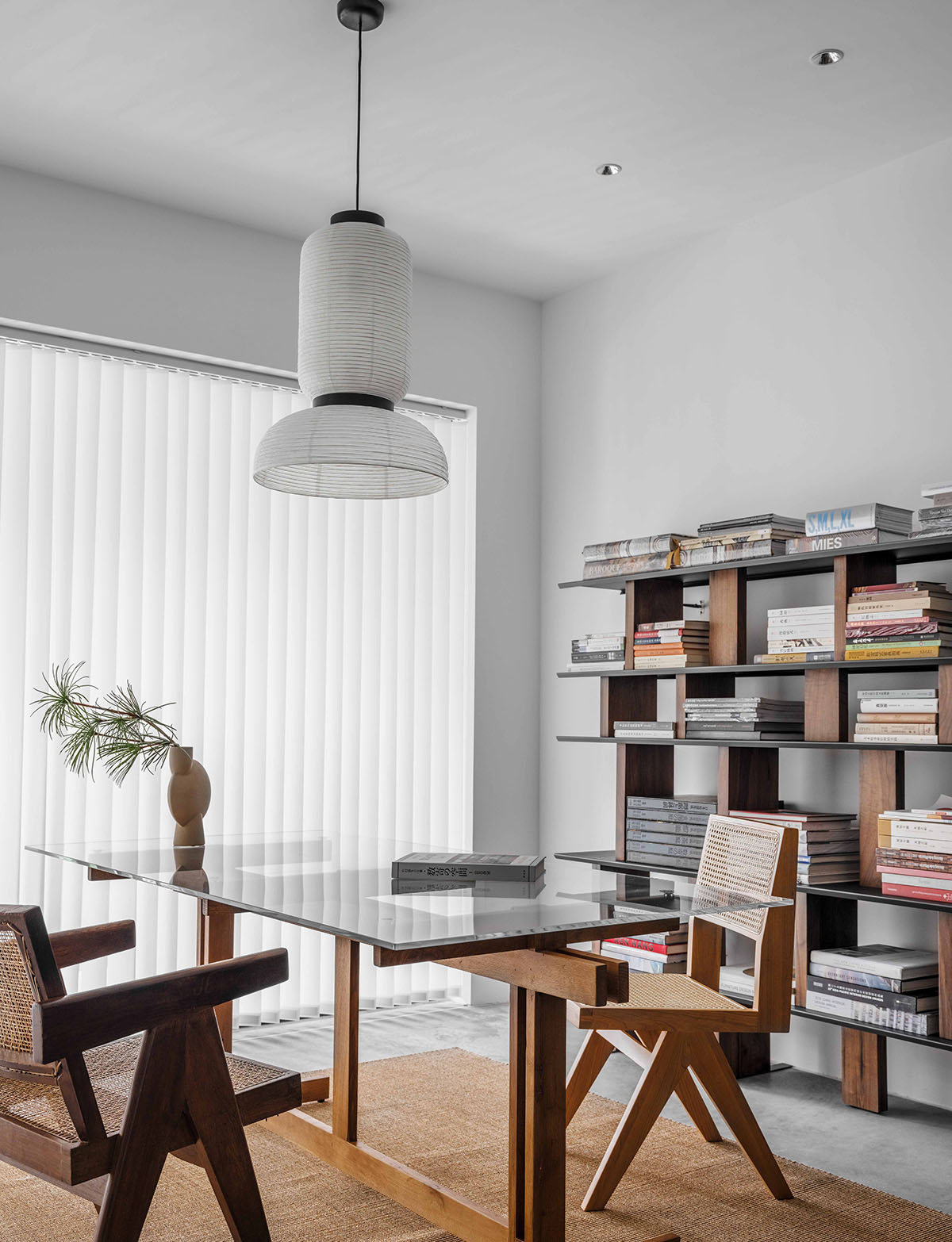
The chair of the studio owner's office is a Chandigarh chair designed by Pierre Jeanneret around 1955, which is made of moisture- and insect-proof Burmese teak wood and well-ventilated rattan.
It shows a unique sense of wabi-sabi, displaying both fashion and retro, beauty and practicality.
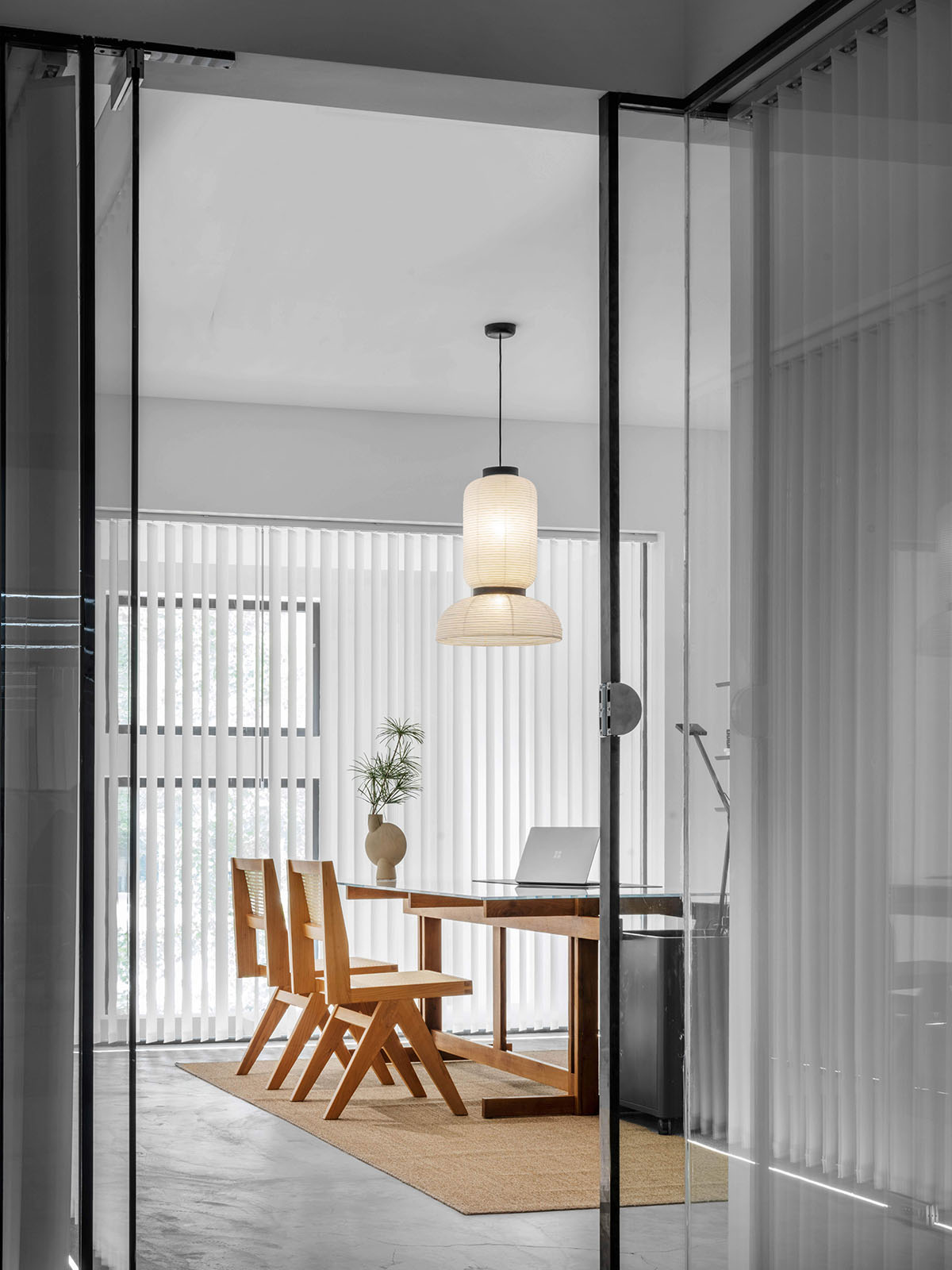
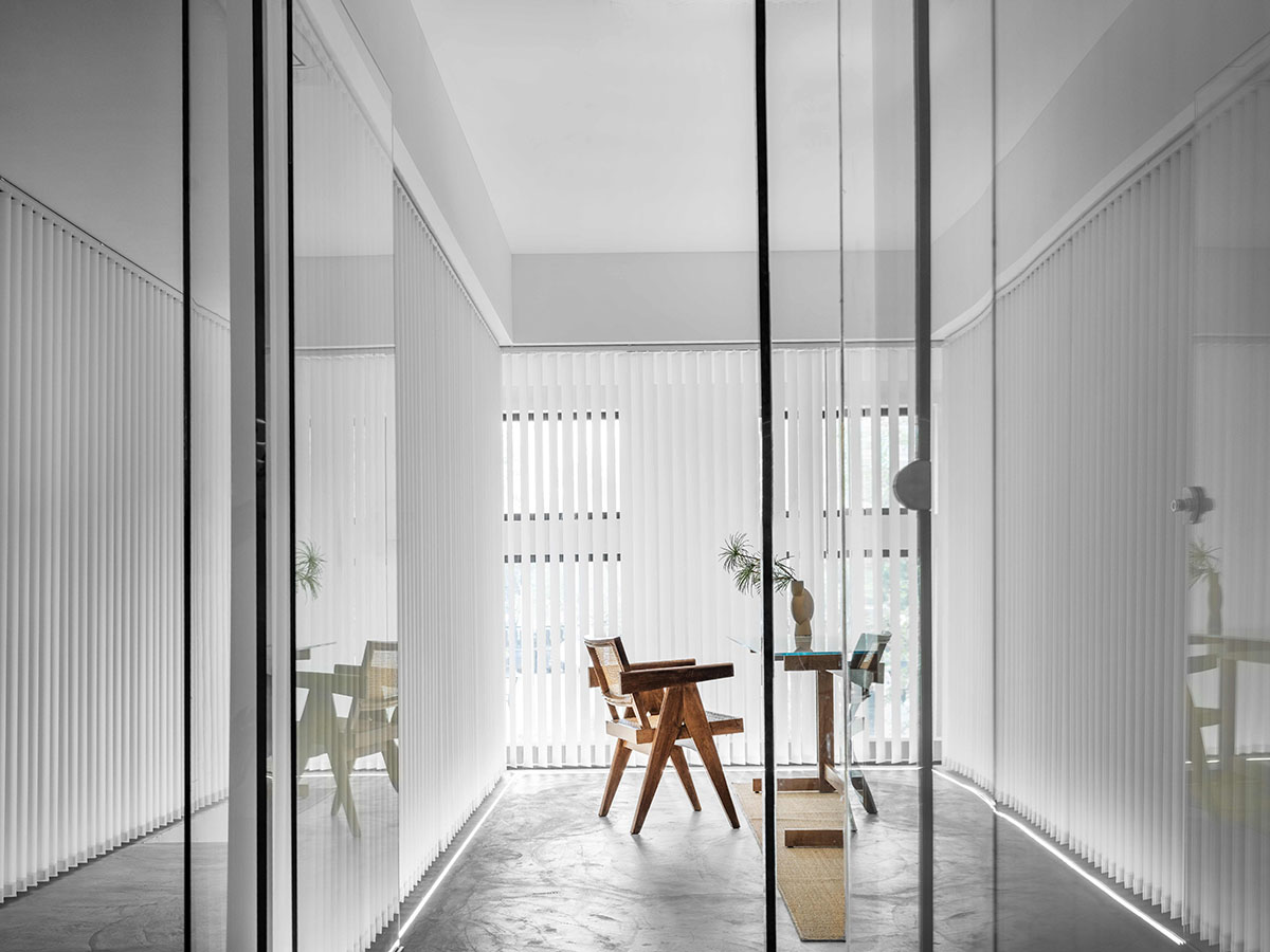
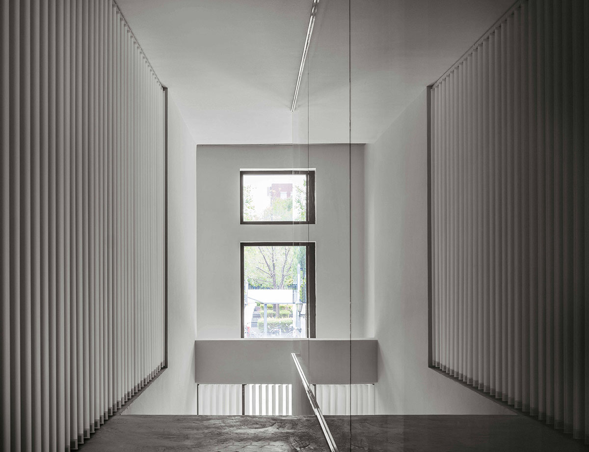
On the second floor, the application of modern-office-style ultra-clear glass and Hanas curtains let in glorious light to each space and can easily control the shadow and light according to functional requirements.
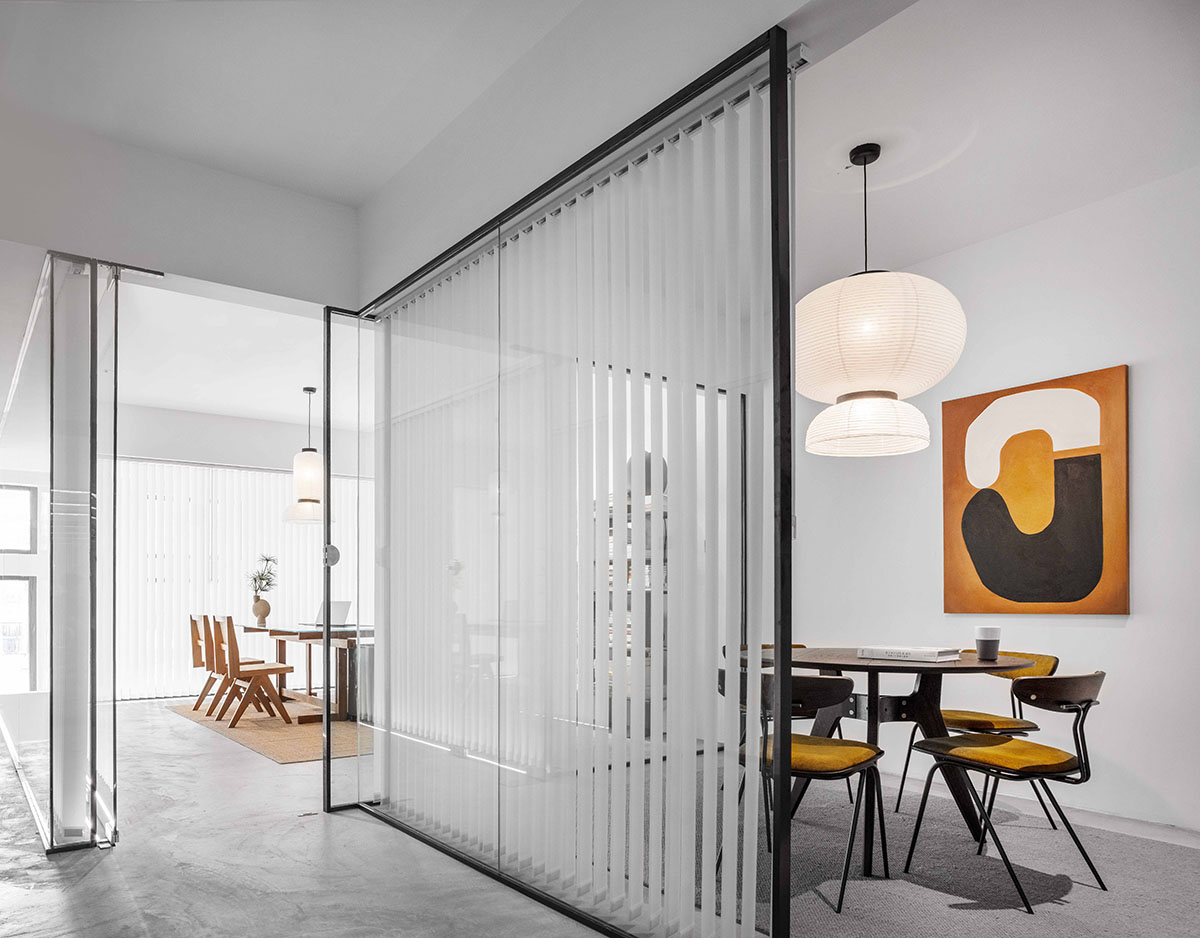
The glass element is also widely used in other areas, such as the glass brick partition in the yoga room and the figured glass partition in the spa.

Tradition's Formakami paper lantern echoes the strong sense of oriental wabi-sabi, which is simple and light
The best space to nurture creative minds must have an appropriate and relaxing environment with the concept at the forefront of the times.
The office with sense and spirit of design is also a surprising "greeting gift" for visitors.


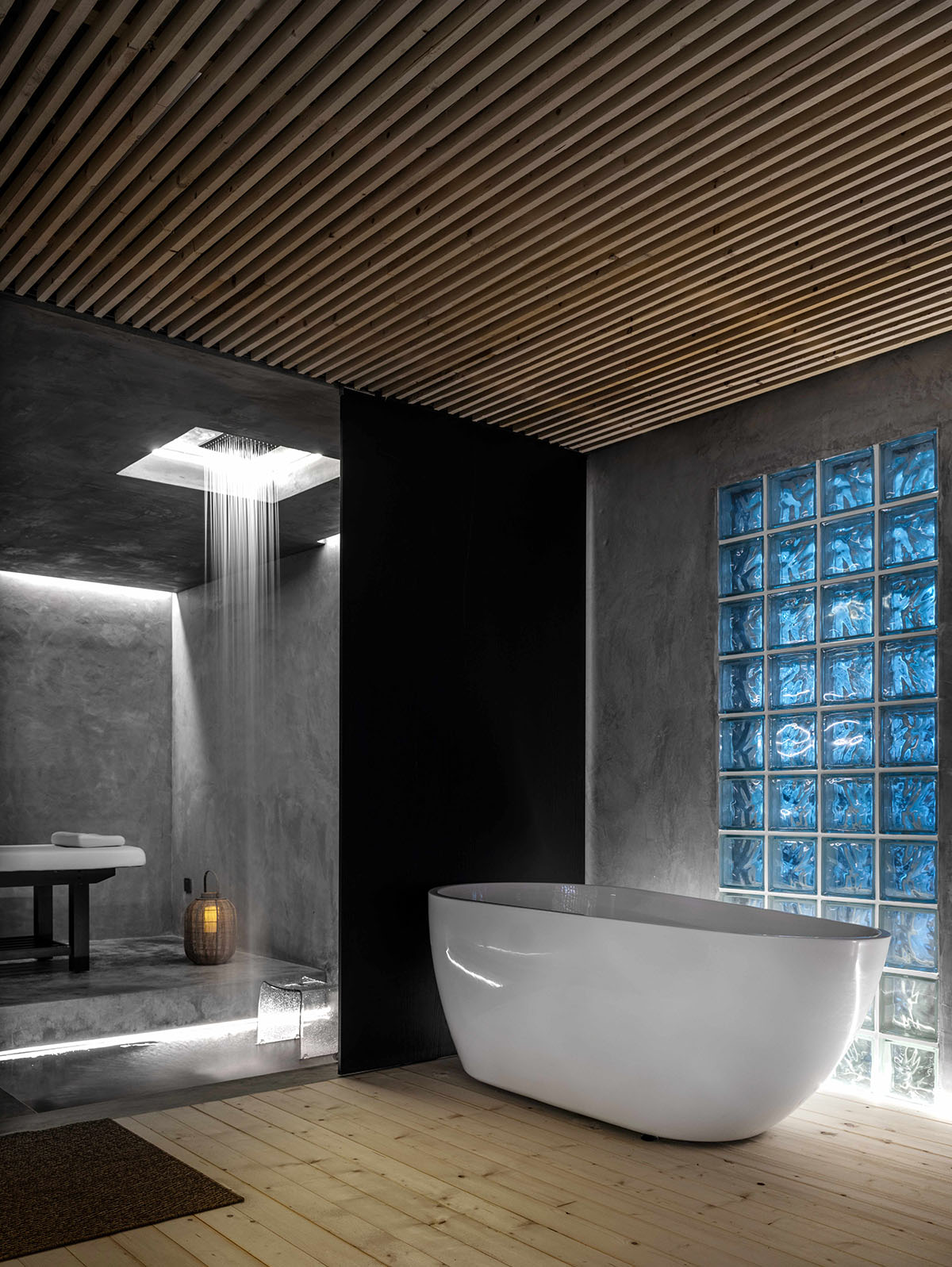
The primary color fir floor and the glimmering glass tiles make the yoga room a natural, comfortable, ethereal and quiet space

The hanging figured glass partition flexibly ensures the independence of the space while adding a touch of modern hazy beauty to the space

First floor plan

Second floor plan
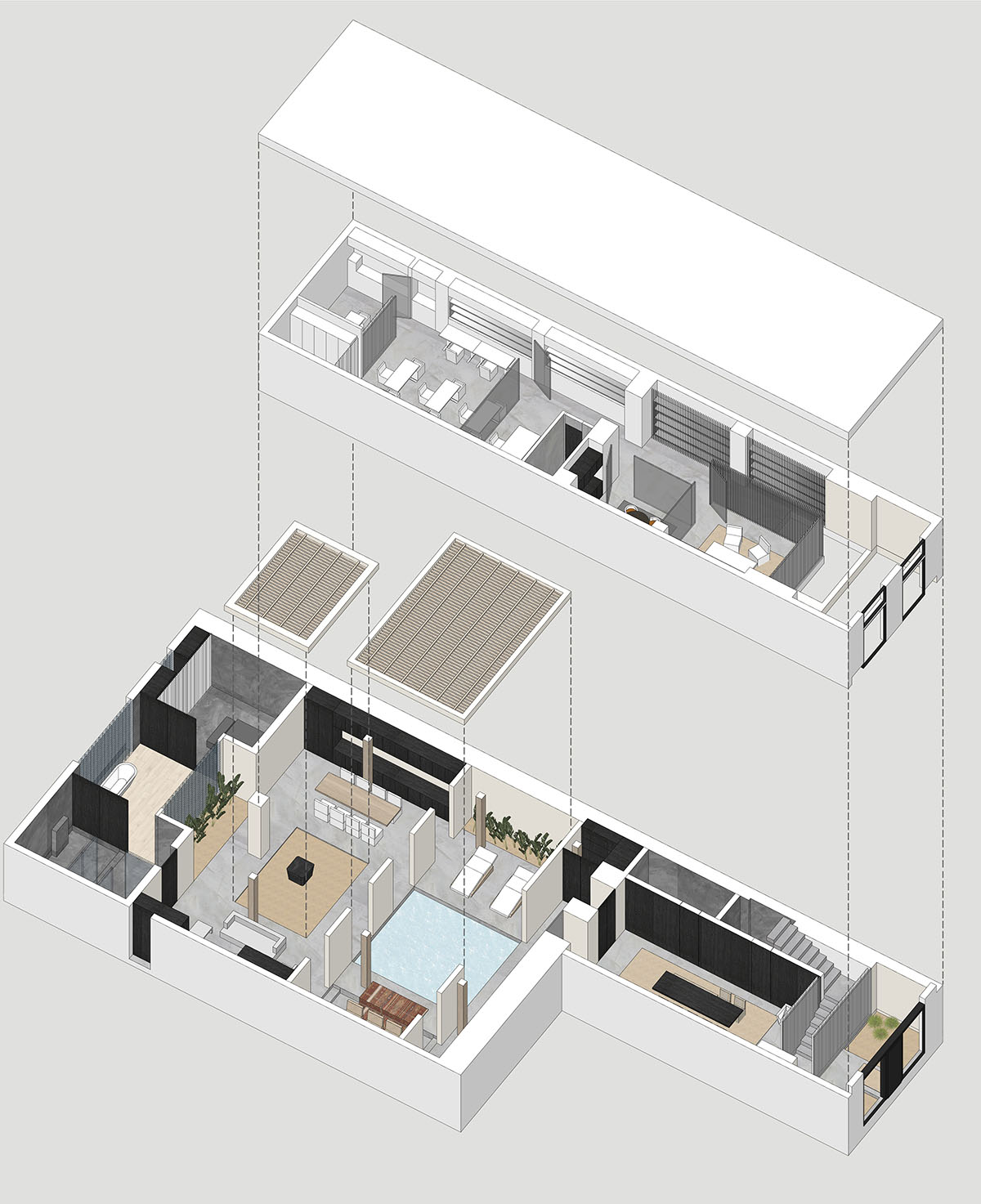
Axonometric drawing
Project facts
Project name: Office Building of MIAOJUE Design Studio
Project location: Beijing UBP b29-b05
Design team: MIAOJUE Design Studio
Chief designer: Everett Shen
Building area: 300m² 1F+ 160 m² 2F
Design time: February 2021
Completion time: June 2021
Key materials: Concrete, Spanish cream-white art paint, glass and wood
All images © Boris Shiu
All drawings © MIAOJUE Design Studio
> via MIAOJUE Design Studio