Submitted by WA Contents
UNStudio designs store with extruded metallic tubes for mobile phone brand OPPO in Guangzhou
China Architecture News - Dec 11, 2020 - 13:47 16074 views
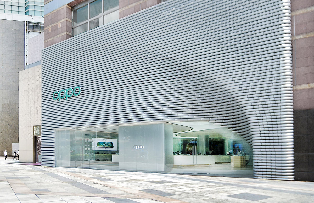
UNStudio has completed a flagship store for a mobile phone brand OPPO in Guangzhou, China, the store's facade is made of a series of extruded metallic tubes which were used as as the main module and inspired by bamboo - it is an important source of food, clothing, housing, and transportation for people in Guangzhou in ancient times.
Named Guangzhou OPPO, the store was completed for the brand of OPPO, one of China’s leading mobile phone brands and one of the world’s leading smart device manufacturers and innovators.
In line with OPPO’s forward-thinking move to upgrade their brand, UNStudio’s offices in Shanghai and Hong Kong were tasked with introducing a new customer experience that starts from the shops’ exterior facades into the retail interiors.
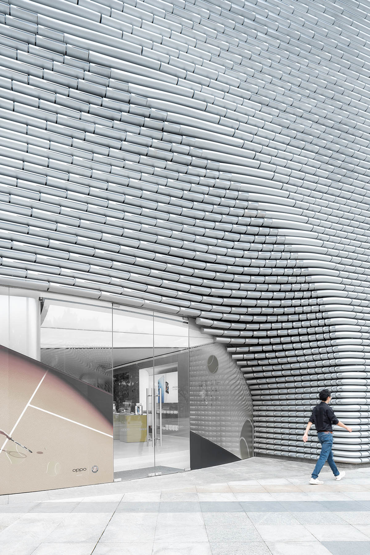
Image © creatAR
For OPPO as a brand, the stores reflect a new identity for the company in these thriving cities; a visual branding that goes beyond the products and expands the meaning of the ‘OPPO experience’.
"What we find particularly interesting about these special smaller-scale projects is that you can first really investigate the client’s products, their design aesthetics and technology, and discover ways to reinterpret these qualities into the craft of architecture," said Ben van Berkel, founder and principal of UNStudio.
"This is what we did at UNStudio Asia for OPPO. We re-crafted their information technology aesthetics into the facade, the furniture and the finishes."
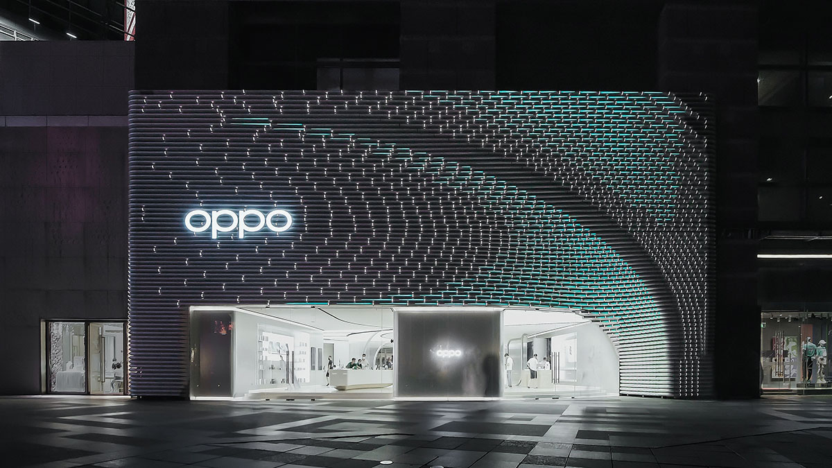
Image © Yiyi and OPPO
The 606-square-metre OPPO Guangzhou Super Flagship Store is located at Zhengjia Plaza in the Tianhe district of Guangzhou. For OPPO, it was essential that the design for the store reflect the philosophy of the brand, while aligning to the company’s existing design ethos. As such, a total brand experience had to be created for the customers that was highly tailored to OPPO," said UNStudio.
The aim of the project was to create a design that would become an integral and recognisable part of OPPO’s overall branding and a valued experience that OPPO’s customers will want to engage with and return to.
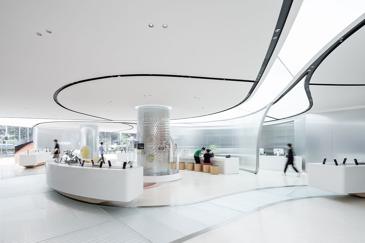
Image © creatAR
Upon entering the store, OPPO customers, with the existing and new, are welcomed with a venue where they can familiarise themselves with - and get excited about – OPPO’s products.
"Guangzhou is a wonderful mix of a historical and a modern, forward-looking city," said UNStudio.
"The challenge of designing an OPPO store within this city is to develop a contextual reaction and strategy that respects the qualities of the city, while also representing OPPO’s brand values."
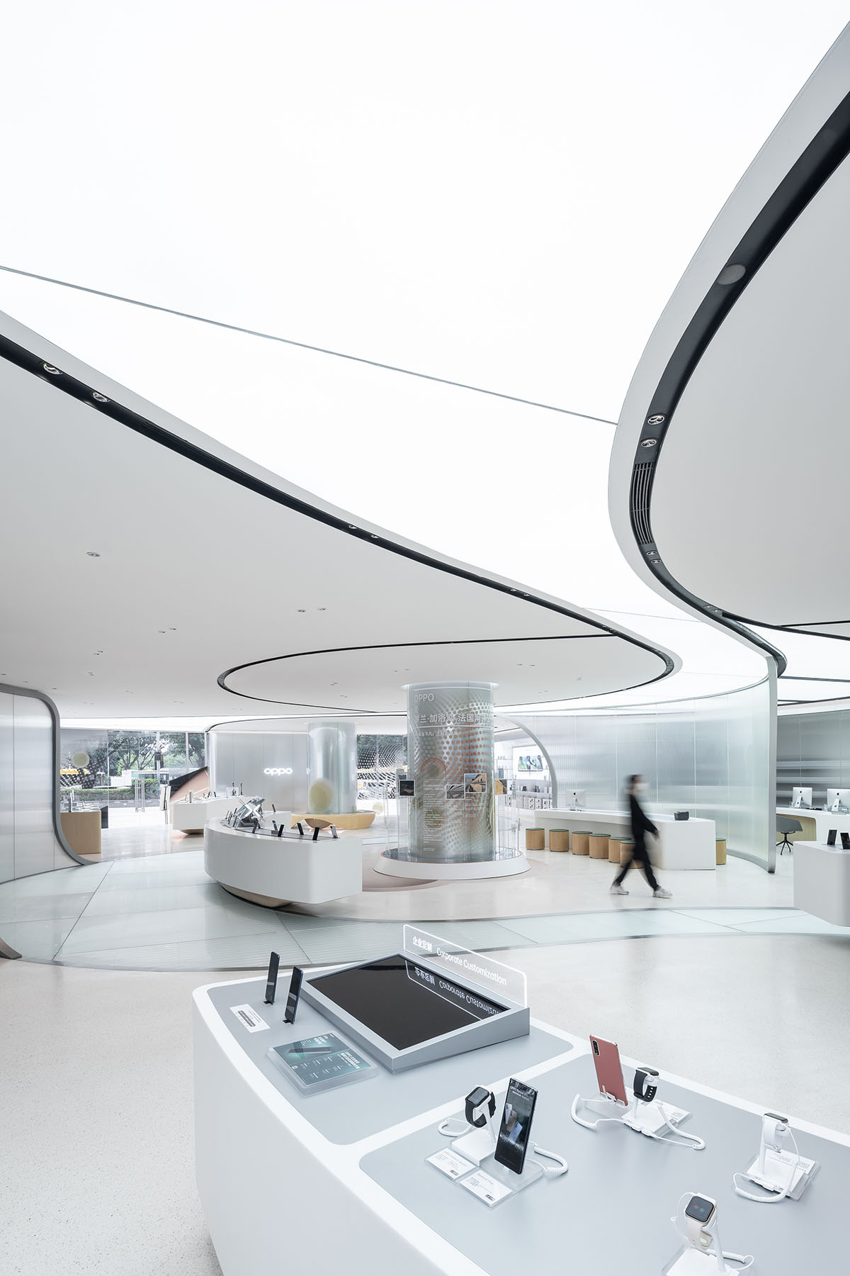
Image © creatAR
With the ambition to create a gathering space that blurs the boundaries between public space and commerce for OPPO’s customers, UNStudio introduced an ‘Urban Park’ concept. This concept creates an inclusive environment that meets the behavioral needs of the various people who visit the store.
For the interiors, UNStudio created a ‘borderless’ interactive environment, where meandering routes lead visitors through an array of ‘display zones’, thereby creating different rhythms of motion and allowing customers to browse, take their time, pause and try out the products within the store.
"The design for the Guangzhou OPPO flagship store is approached through a keen focus on craftsmanship, alongside material choices that add a contemporary twist to the vernacular architecture of the city," added the studio.
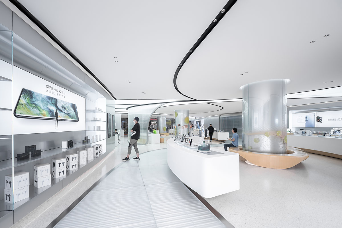
Image © creatAR
Situated along a main thoroughfare, the facade design needed to provide the store with a bold and recognizable visual identity. The studio used "a sliced extruded tube component", which was chosen as the main module.
This metallic tube is also a 3D interpretation of the ‘O’ in OPPO. This dimensional transformation results in a cylindrical tube, into which a cut is added in order to obtain a truncated cylinder. This cylindrical form is repeated in varying lengths and curvatures throughout the facade, creating a reference to both the brand and to technology.
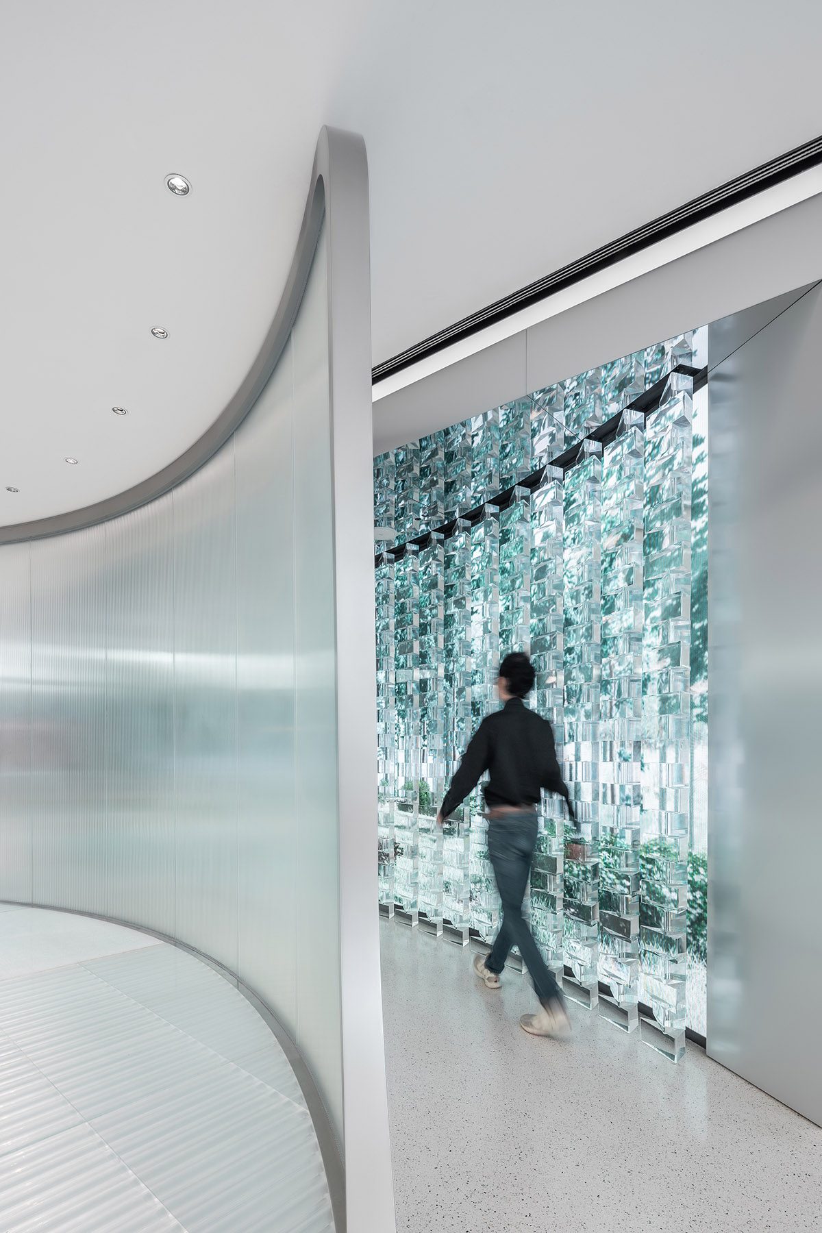
Image © creatAR
For the overall composition of the facade elements, multiple geometric strategies were studied. Following the exploration of different volumetric options, a large, sweeping folding gesture was chosen which echoes the corner curve of the OPPO brand logo, while guiding visitors towards the entrance to the store.
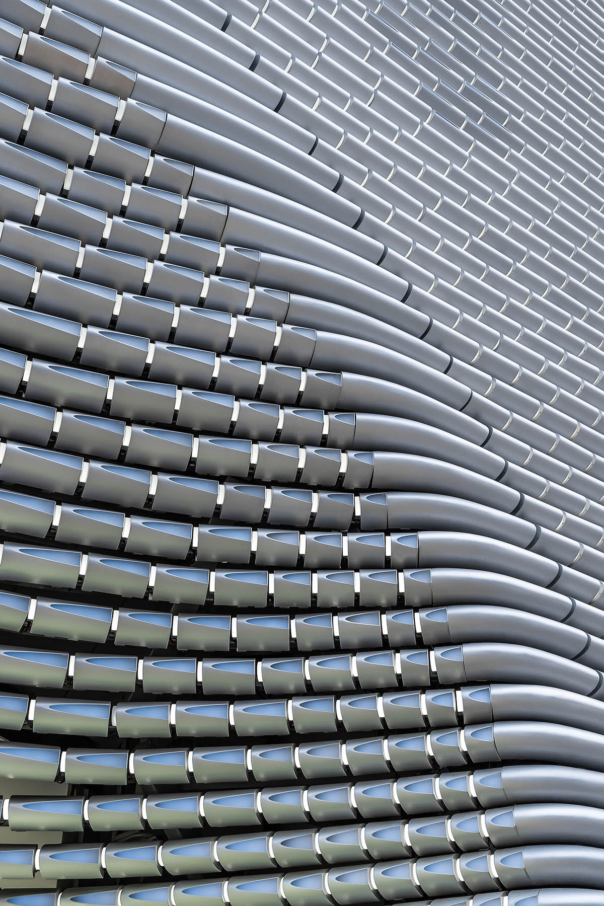
Image © creatAR
Programmable lighting embedded within each tube create an overall facade effect of dynamism and vibrancy. The result is an optical rhythmic motion across the facade, representing the new OPPO culture, new technologies and the elevated pulse of OPPO as a company experiencing continuous growth and progress.
The interior presents a fluid and continuous geometry. Achieving a fluid space in a flowing, uninterrupted movement - where an intuitive sequence of different areas enables customers to experience and interact with the products - was one of the key aims of the interior design.
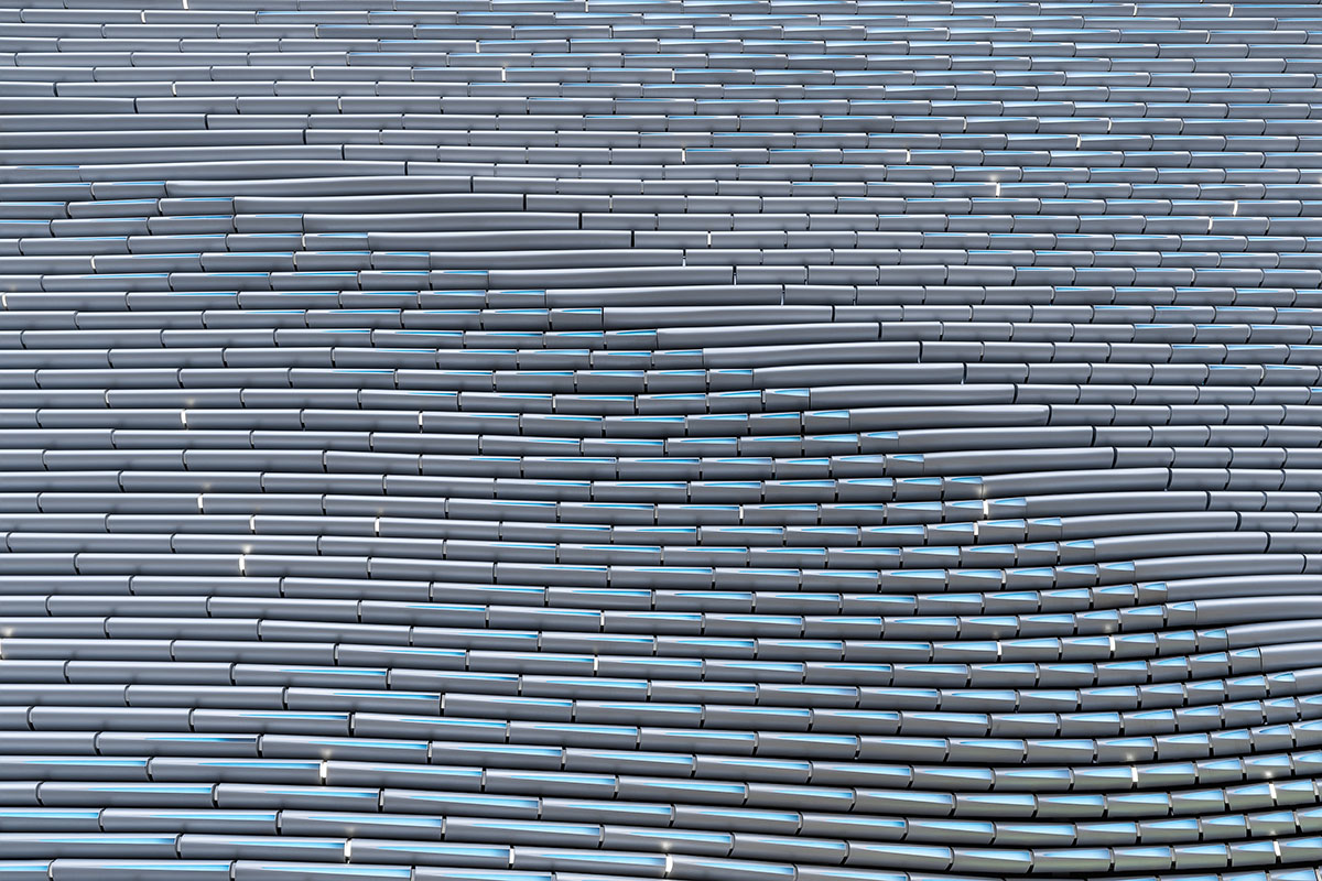
Image © creatAR
The interior space is defined by two main experiential zones: PULSE and EVOLUTION. In the PULSE area the main phone displays act as a strong focal point, while the EVOLUTION areas, in contrast, enable different experiences and accommodate social and interactive zones.
The winding circulation paths weave visitors through these zones, and along targeted seating that provide comfortable areas for customers to charge their phones, test new products, and socialise.
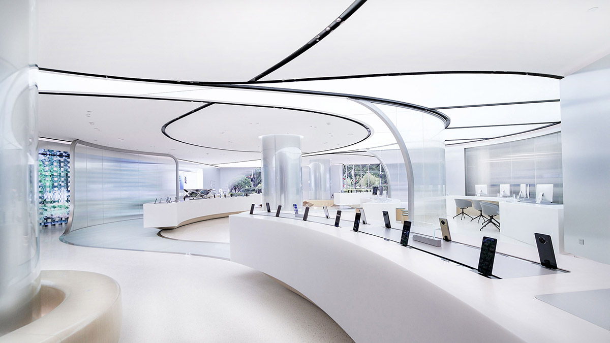
Image © Yiyi and OPPO
The store also provides customers with a playful ‘instagrammable’ experience zone, where they are also encouraged to discover the features of the phone’s cameras by taking photos and selfies.
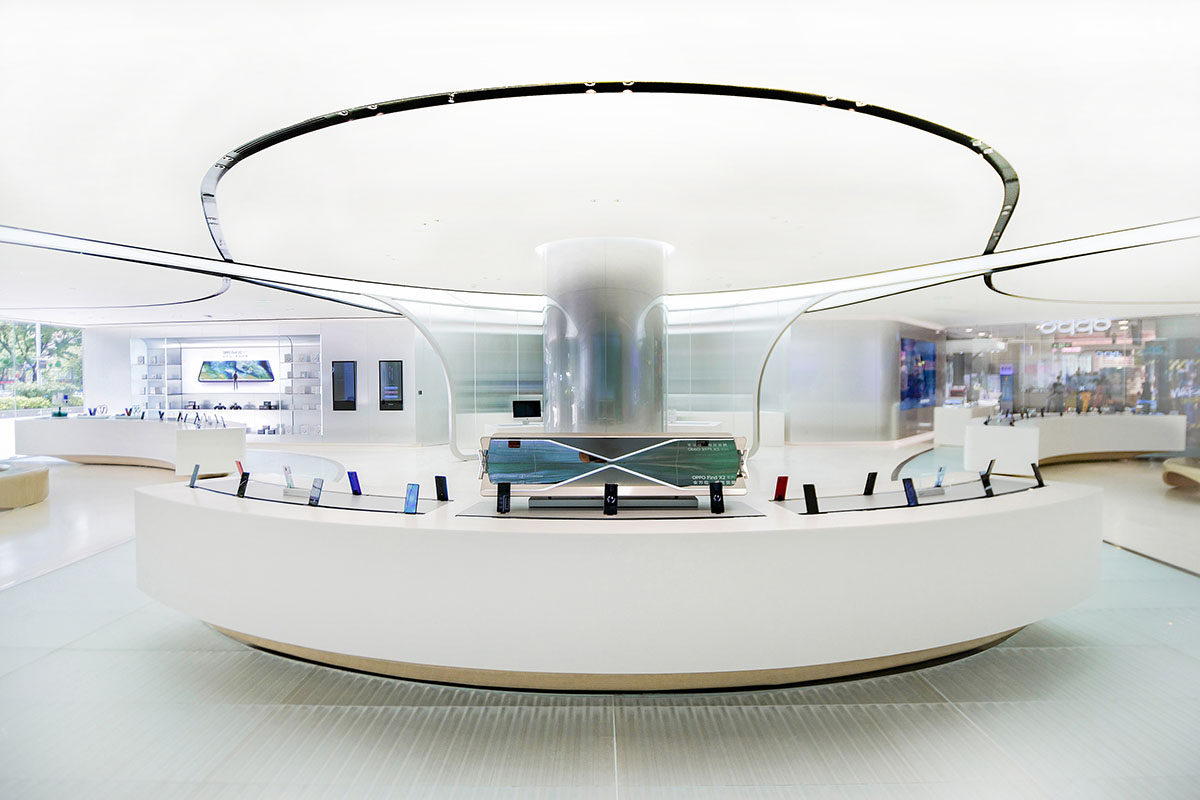
Image © Yiyi and OPPO
The accentuation of fluid forms with natural wood in a muted palette articulate the interior. Silver anodized aluminum panels juxtapose the rippled translucent glass screens and wall of acrylic prisms.
The result is a constant play on perception of subtly layered changes of depth throughout the interior, and balance between solid and transparent, heavy and light, cold and warm.
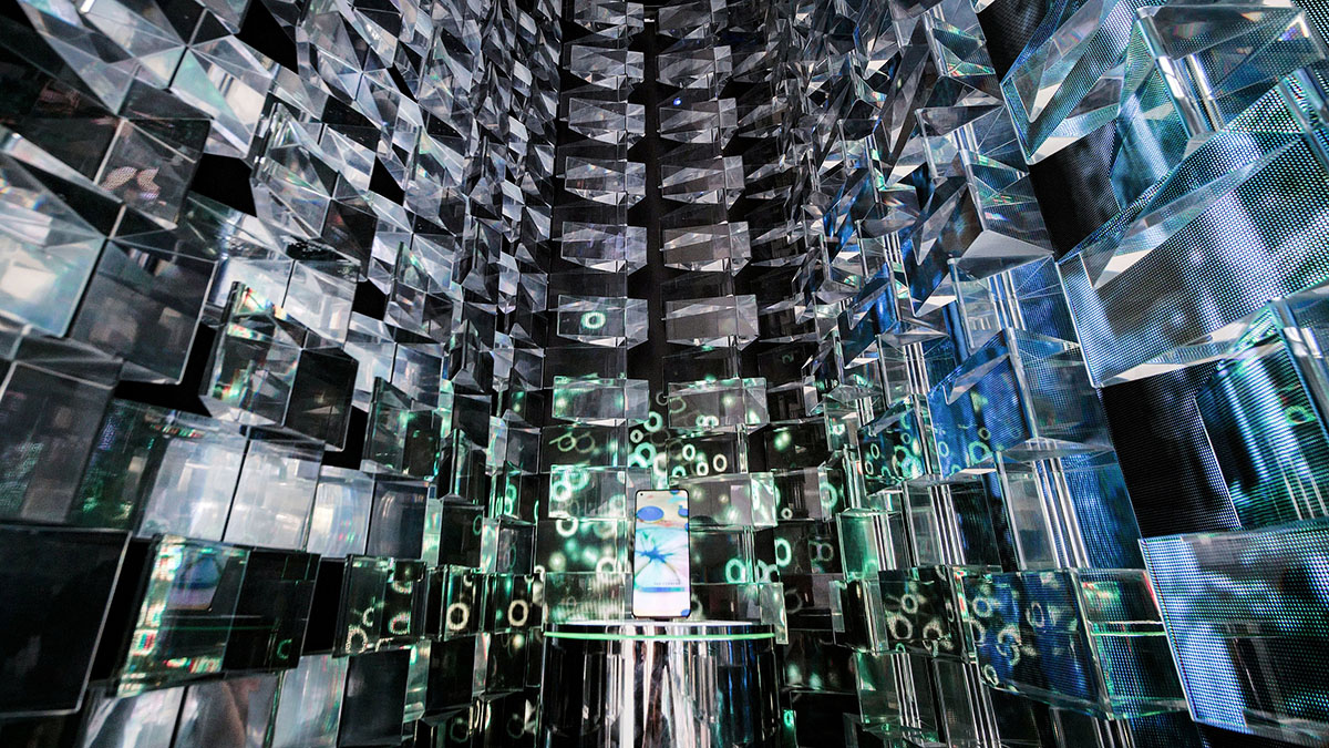
Image © Yiyi and OPPO
White terrazzo embedded with speckles of ‘Oppo green’ create the meandering paths through the store, while integrated ‘pathways’ of lighting in the ceiling mimic this fluid flow and frame the different areas and displays from above.
These pathways in the floor and ceiling further serve to guide visitors intuitively along various routes as they wander through and around the space.
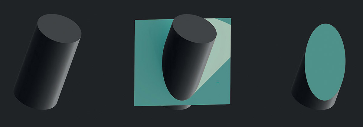
Image courtesy of UNStudio
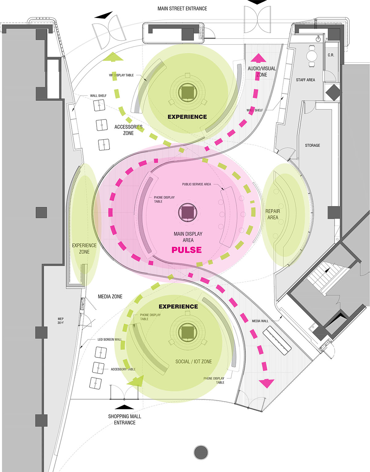
Image courtesy of UNStudio
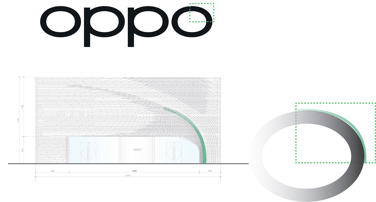
Image courtesy of UNStudio
UNStudio founder Ben van Berkel previously spoke to WAC editor-in-chief Berrin Chatzi Chousein in an exclusive interview as part of WAC's Live Interview Series. You can watch Ben van Berkel's live talk on WAC's IGTV.
Project facts
Architects: UNStudio
Designers: Ben van Berkel, Hannes Pfau, Garett Hwang
With: Alexander Meyers, Ana Castaingts Gomez, Piao Liu, Jing Xu, Idil Kantarci, Diego Ramirez Leon, Praneet Verma
Client: Guangdong OPPO Mobile Télécommunications Corp.,Ltd.
Location: Guangzhou, China
Building surface: 600 m2
Programme: Retail Store
UNStudio service: Facade and Interior Renovation Design
Status: Completed in June 2020
Advisors
Local Design Institute: DOP Design
Installation & Exhibition: Leaping Creative
Lighting: brandston partnership inc.(BPI)
Top image © Yiyi and OPPO
> via UNStudio