Submitted by WA Contents
Pantone announces "ultimate gray" and "illuminating" for color of the year 2021
United States Architecture News - Dec 15, 2020 - 14:28 18746 views
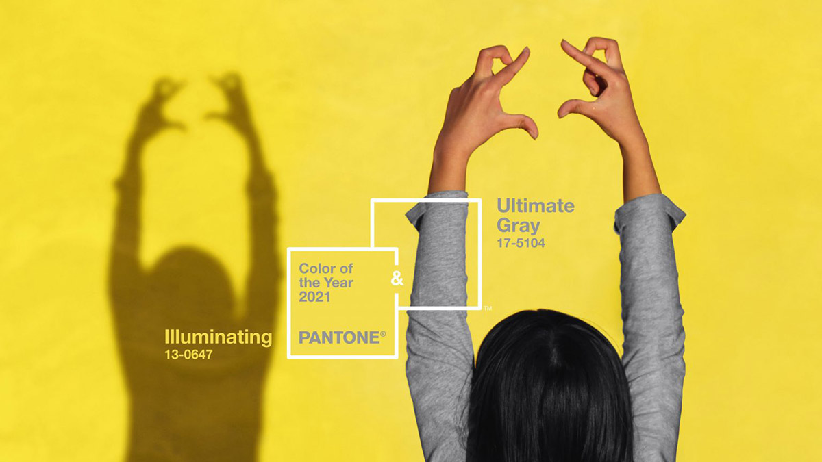
Pantone, the global color authority and provider of professional color language standards and digital solutions for the design community, has selected "Ultimate Gray" and "Illuminating" for color of the year 2021.
Pantone choice the two independent colors ultimate gray (coded as PANTONE 17-5104) and illuminating (coded as PANTONE 13-0647) as the colors of the year 2021.
As the company explains, when they come together they will "create an aspirational color pairing, conjoining deeper feelings of thoughtfulness with the optimistic promise of a sunshine filled day."
"Practical and rock solid but at the same time warming and optimistic, the union of PANTONE 17-5104 Ultimate Gray + PANTONE 13-0647 Illuminating is one of strength and positivity," said Pantone.
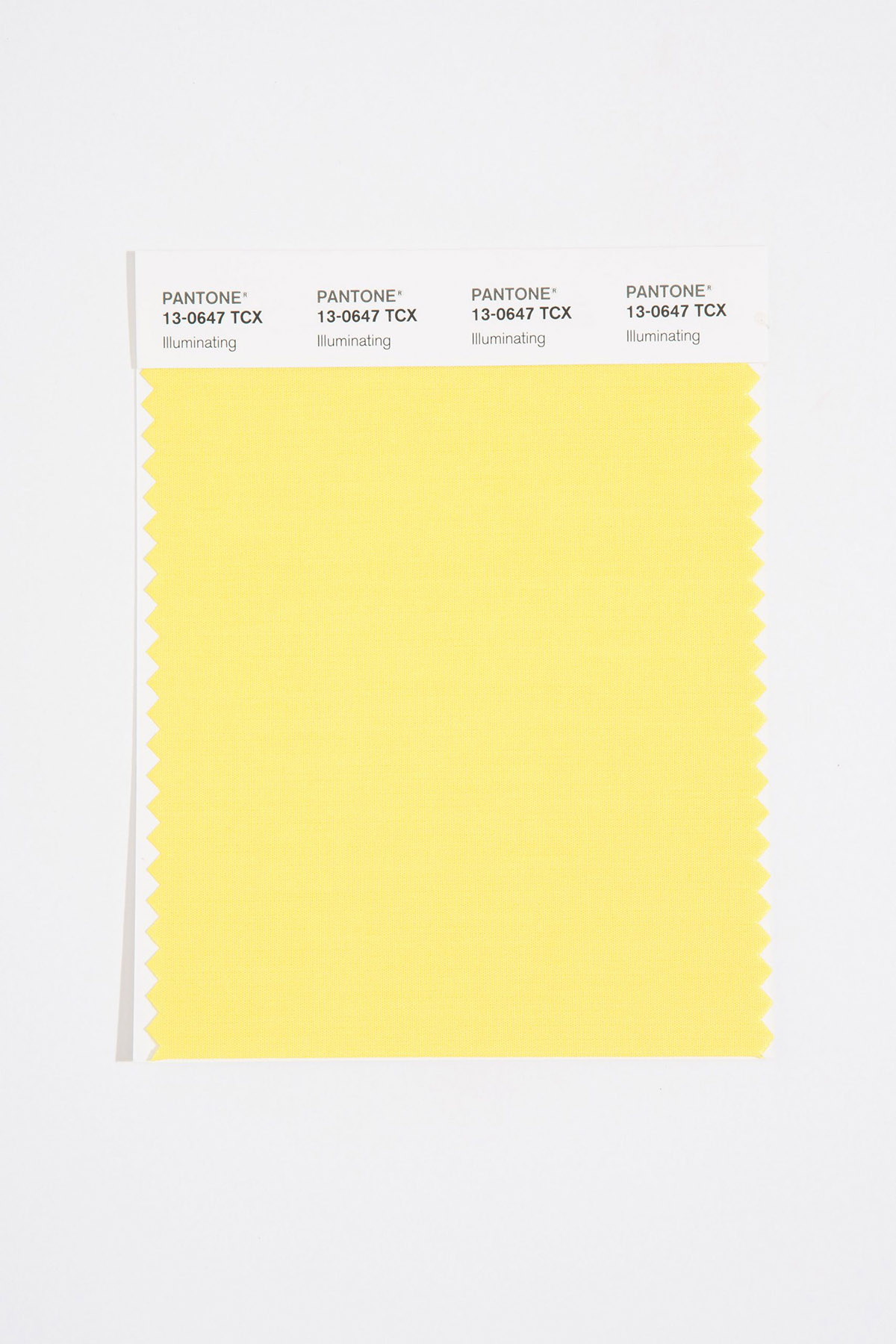
The company highlighted that a hue of yellow, called Illuminating, will help to fulfill people with "energy, clarity and hope" to overcome the continuing uncertainty, spirited and emboldening shades satisfy our quest for vitality.
"Illuminating is a bright and cheerful yellow sparkling with vivacity, a warming yellow shade imbued with solar power."
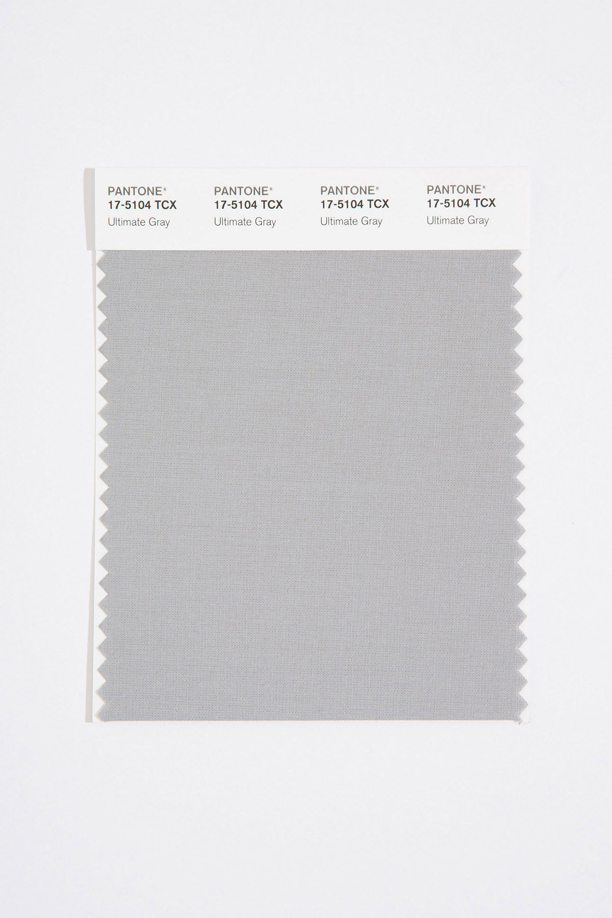
On the other hand, Ultimate Gray evokes feelings based on solid and dependable elements which are everlasting and provide a firm foundation.
Ultimate Gray is also the color of pebbles on the beach and found on natural elements whose "weathered appearance highlights an ability to stand the test of time."
"Ultimate Gray quietly assures, encouraging feelings of composure, steadiness and resilience," added the company.
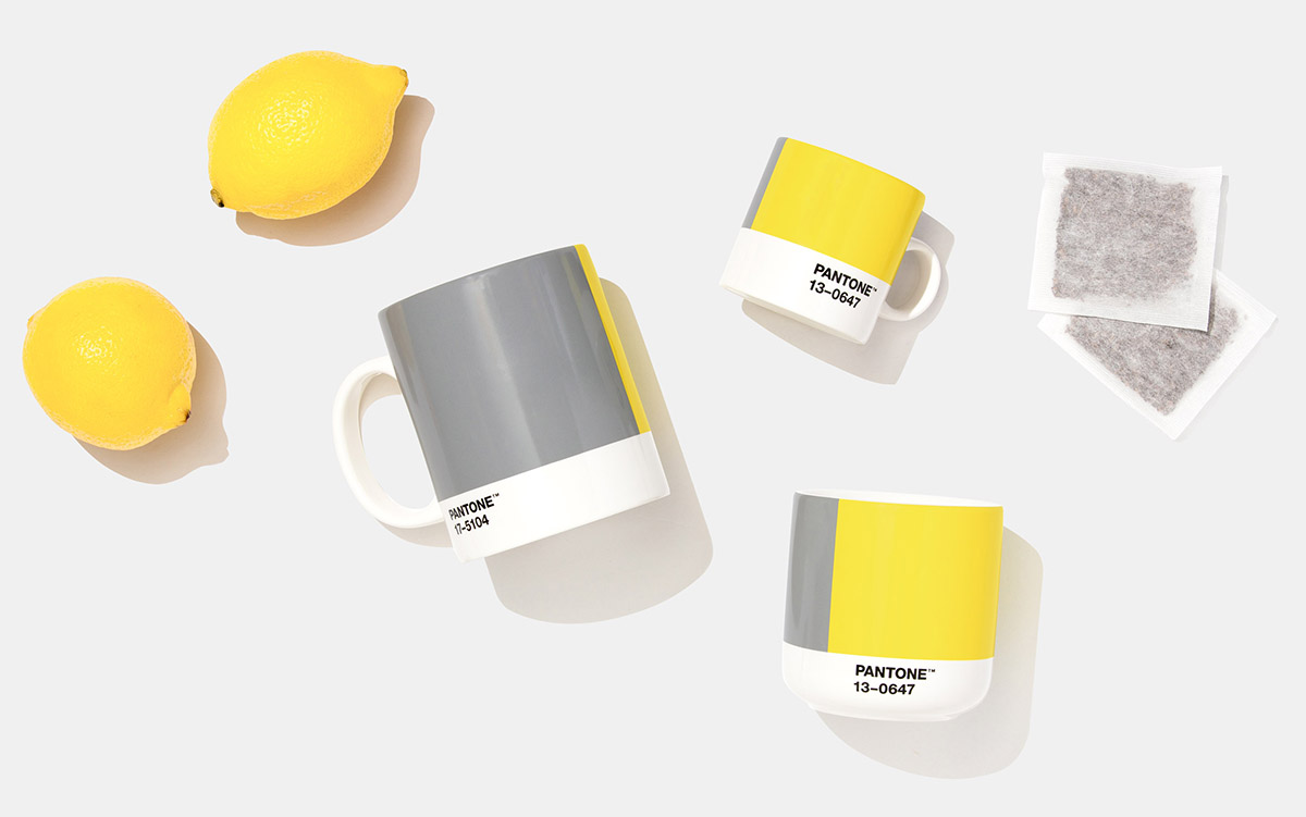
"The selection of two independent colors highlight how different elements come together to express a message of strength and hopefulness that is both enduring and uplifting, conveying the idea that it’s not about one color or one person, it’s about more than one. The union of an enduring Ultimate Gray with the vibrant yellow Illuminating expresses a message of positivity supported by fortitude," said Leatrice Eiseman, Executive Director of the Pantone Color Institute.
"Practical and rock solid but at the same time warming and optimistic, this is a color combination that gives us resilience and hope. We need to feel encouraged and uplifted, this is essential to the human spirit."
"The Pantone Color of the Year reflects what is taking place in our global culture, expressing what people are looking for that color can hope to answer," added Laurie Pressman, Vice President of the Pantone Color Institute.
"As society continues to recognize color as a critical form of communication, and a way to symbolize thoughts and ideas, many designers and brands are embracing the language of color to engage and connect."
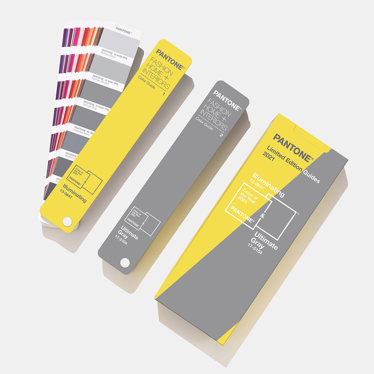
According to the company, "for over 20 years, Pantone’s Color of the Year has influenced product development and purchasing decisions in multiple industries, including fashion, home furnishings, and industrial design, as well as product packaging and graphic design."
The selection process of The Pantone Color of the Year is based on a thoughtful consideration and trend analysis. "To arrive at the selection each year, Pantone’s color experts at Pantone Color Institute comb the world looking for new color influences."
"This can include the entertainment industry and films in production, traveling art collections and new artists, fashion, all areas of design, popular travel destinations, as well as new lifestyles, playstyles, and socio-economic conditions," explained the company.
All images courtesy of Pantone.
> via Pantone