Submitted by WA Contents
So Studio combines grey-colored palette with glazed orange handmade bricks for SAMO store in China
China Architecture News - Dec 01, 2020 - 11:27 5102 views

Shanghai-based architecture and interior design practice So Studio has combined grey-colored palette with glazed orange handmade bricks for SAMO store in Chongqing, China.
The 120-square-metre store was designed for SAMO, a high-end menswear brand under JNBY Group. The studio is inspired by the ancient Greek word 'Palimpsest', the original meaning of 'Palimpsest' is that in ancient times, the original texts on the parchment scroll would be scraped off and rewritten with new contents; In the process of continuous rewriting, the traces of different depths were naturally retained.
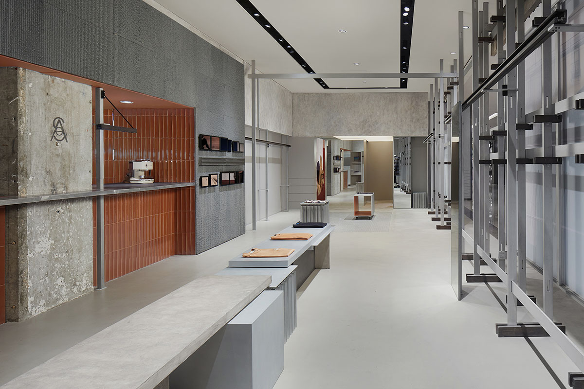
Image © Yuhao Ding
For the store, So Studio started from the "trace", hoping that the brand itself has the same sense of time; thus, several parts are developed, the first part is half-half and old school; half-half is about the idea of space division; the entire space is divided by a metal band with a height of 2.2 meters, and retreated the bottom as the clothing display.
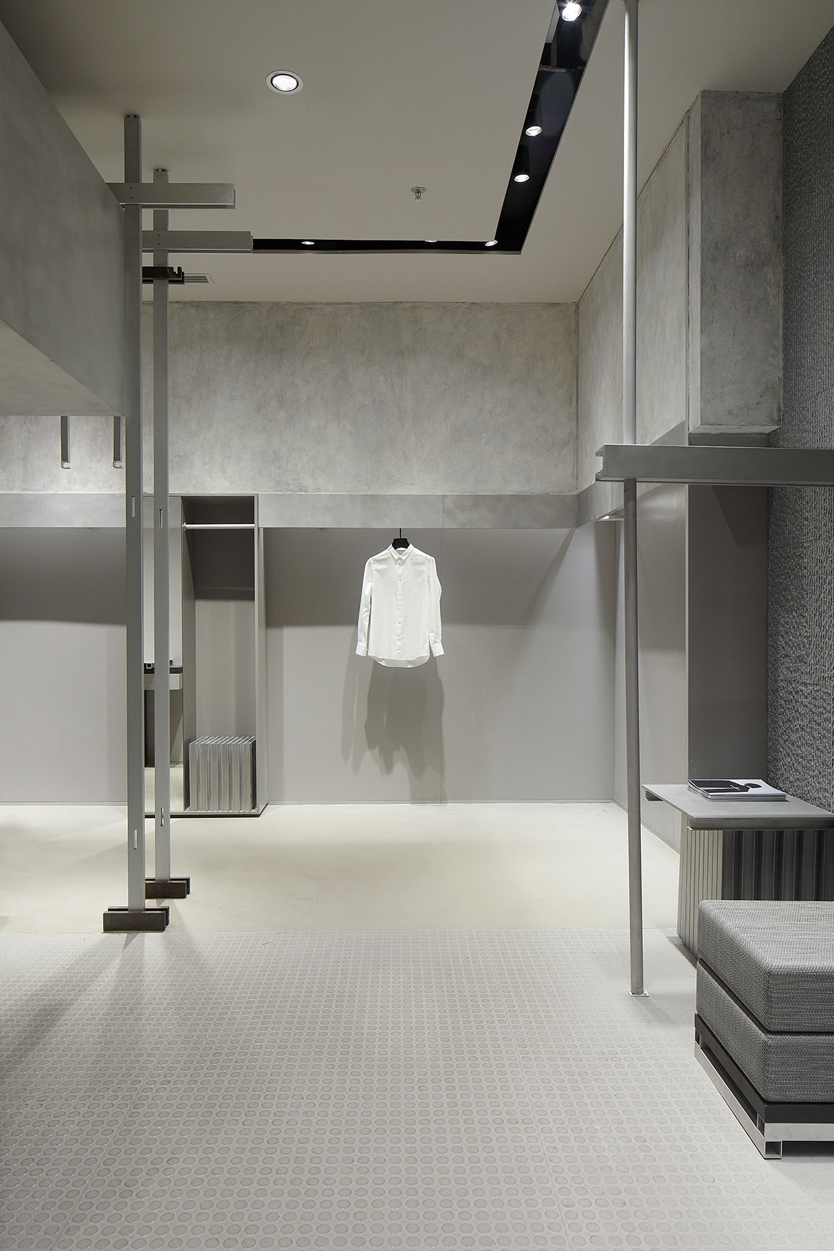
Image © Yuhao Ding
The rough paint was used as the texture to express the concept of restoration; meanwhile, the old school also expressed the attitude of the Samo brand—contemporary design and post-modern genes.
The second part is also derived from palimpsest. Take the artist Rachel Whiteread 's work as an example. While paying attention to large-scale public casting art, this female artist is also constantly expressing daily products through small sculptures, allowing the traces of these daily products to be expressed by another medium.
In this project, the architects implanted daily structures into the space; for example, our island fitting room was gradually assembled from cabinets during the design process; some of props are also imitating collage of different objects, and the metal parts of the space are copied and pasted infinitely in the form of "工".

Image © Elbe
"There are two more special points in this project," said the architects.
"One is that we chose slotted granite stone, glazed orange handmade bricks, the contemporary dot floor and chaotic metal aluminum board."
"The materials are spliced, reorganized, and collided into different spatial attributes," the firm added.
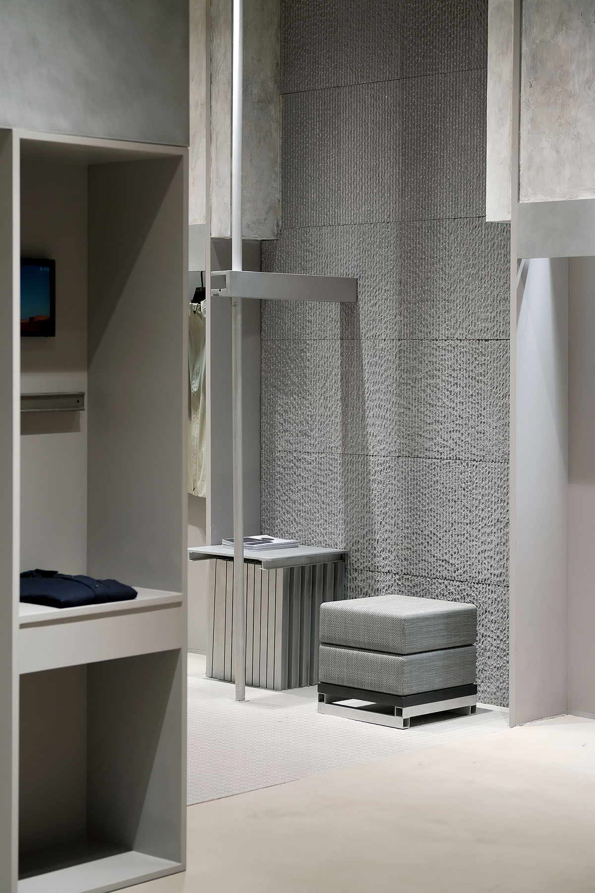
Image © Elbe
Another point is that the architects designed the entire façade as a whole system, like an easel of ultra-conventional proportions, but also like an unfinished architectural structure.
The frame system of the façade can be used as poster display, and at the same time, through the gaps of the structure show the interior of the space.
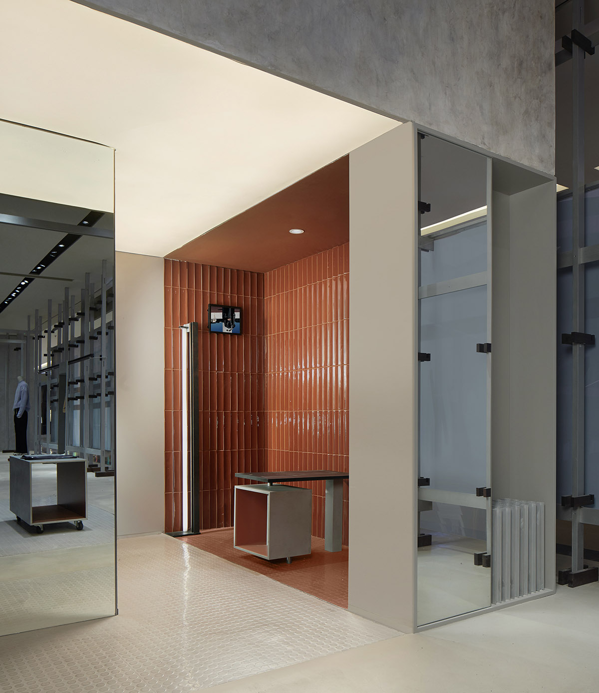
Image © Yuhao Ding
Through the dismantling and reorganization of materials and structural spaces, we give a new meaning, meanwhile, interpret new definitions of space and brand.
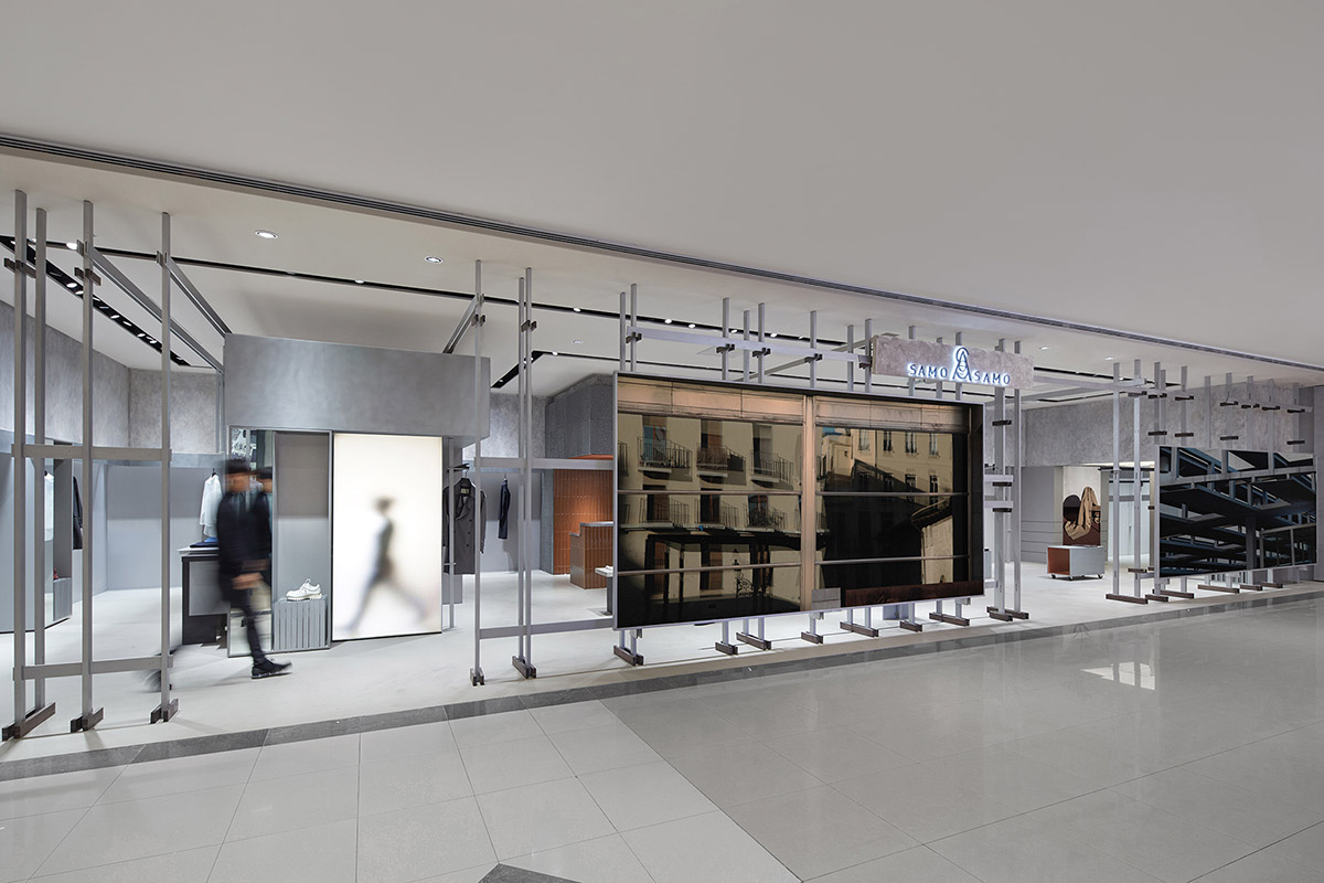
Image © Yuhao Ding
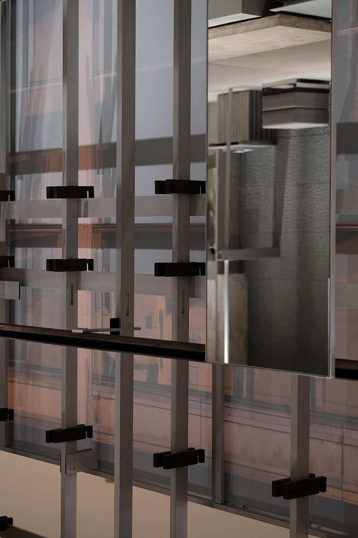
Image © Elbe

Diagram-Furniture
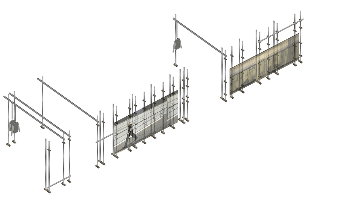
Diagram-Shopfront

Diagram - Shopfront detail

Layout
Project facts
Name: SAMO Store
Concept: Palimpsest
Gross Built Area: 120 m2
Address: L1 Paradise Walk, Guan Yin Bridge, Chongqing, China
Client: Jiang Nan Bu Yi
Completion Year: 2019
Design Firm: So Studio
Design Team: Mengjie Liu, Yifan Wu, Yufei Li
Image Production: MUYI Concept + Production
Top image © Yuhao Ding
All drawings © So Studio
> via So Studio
