Submitted by WA Contents
A beauty salon by AD ARCHITECTURE features dark-hued interiors drawing inspiration from cells
China Architecture News - Jul 29, 2020 - 12:05 14492 views

AD ARCHITECTURE has completed a beauty salon with dark-hued interiors drawing inspiration from cells.
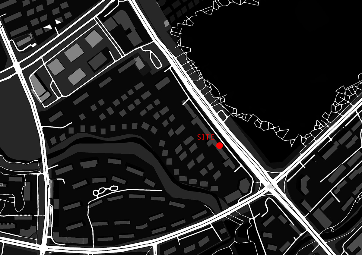
Named Sooyou Beauty Salon, the 450-square-metre space is located at Qunli New District, Harbin, China.
The structure of human body is a moving architecture, while cells – known as the basic units of all organisms, are its building blocks.
As the largest organ of human body, skin is the interface between the physical body and the outside world. Cells are constantly dying, and new ones are being made simultaneously, to maintain the healthy state of the body. It's a battle between death and rebirth.

Overview / Memory
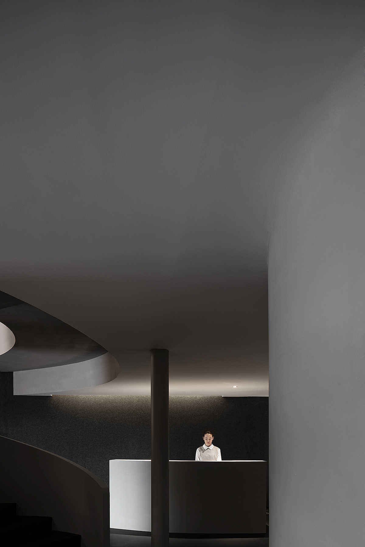
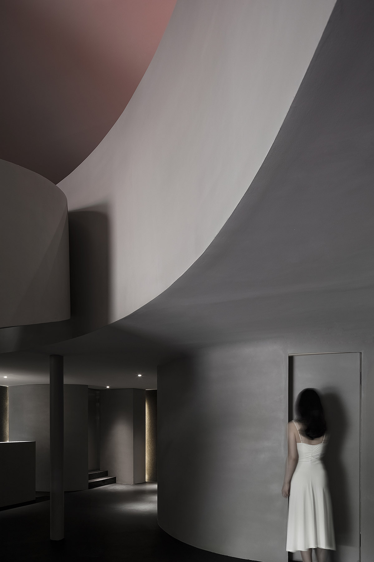
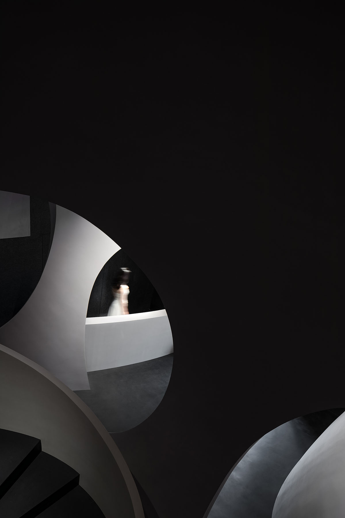
Situated at Qunli New District, Harbin, China, the project is a beauty salon that mainly targets female consumers. The entrance wall echoes the arcs of the architecture with its curved shape, creates a unique perspective to look inside, and indicates a sense of mystery in the space.
The design firm AD ARCHITECTURE drew inspiration from the constant fission of cells in human body, and translated it into spatial structures via geometric shapes and basic lines. The "fission" of structures creates rich experiences along the circulations while also providing privacy. The spatial design is aimed at evoking certain underlying body memories of people.
Form / Evolution
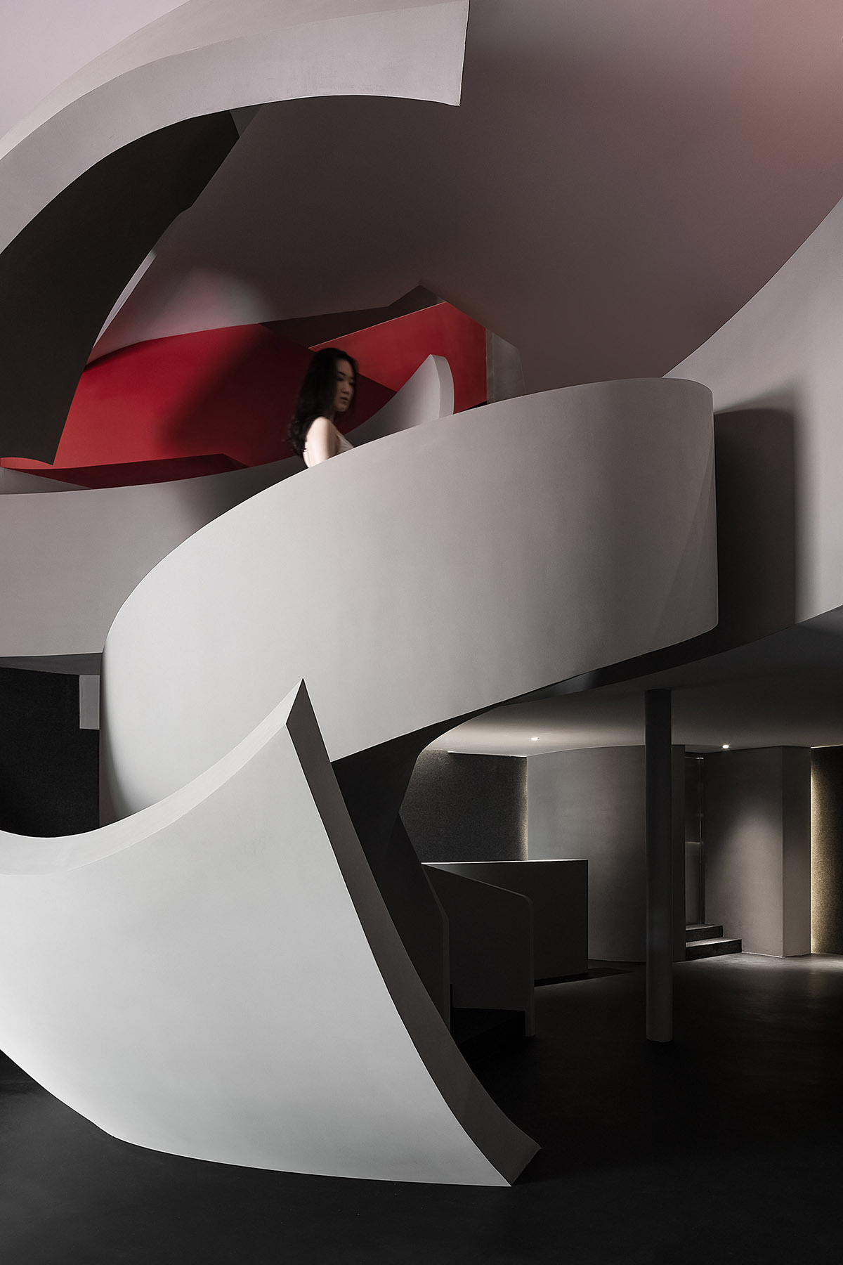
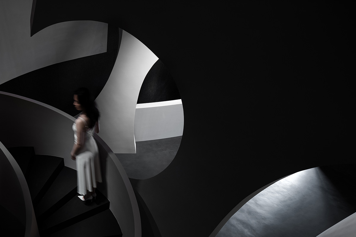
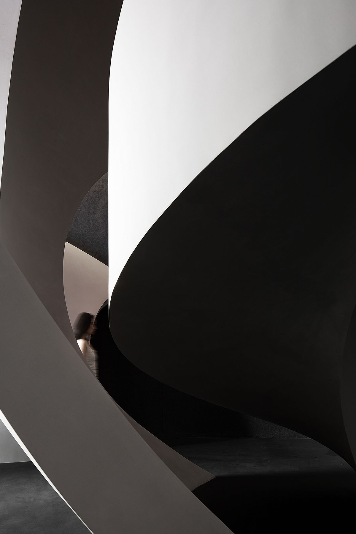
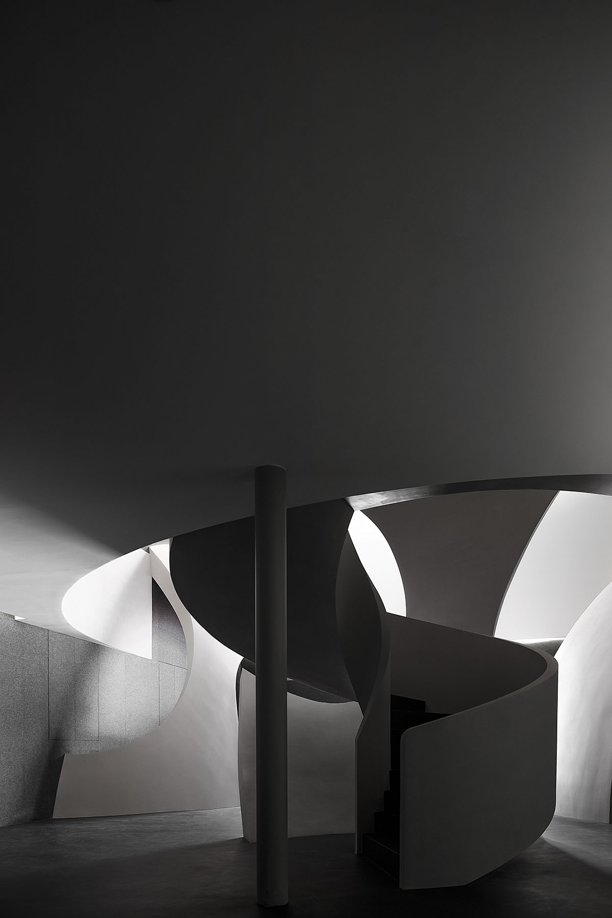
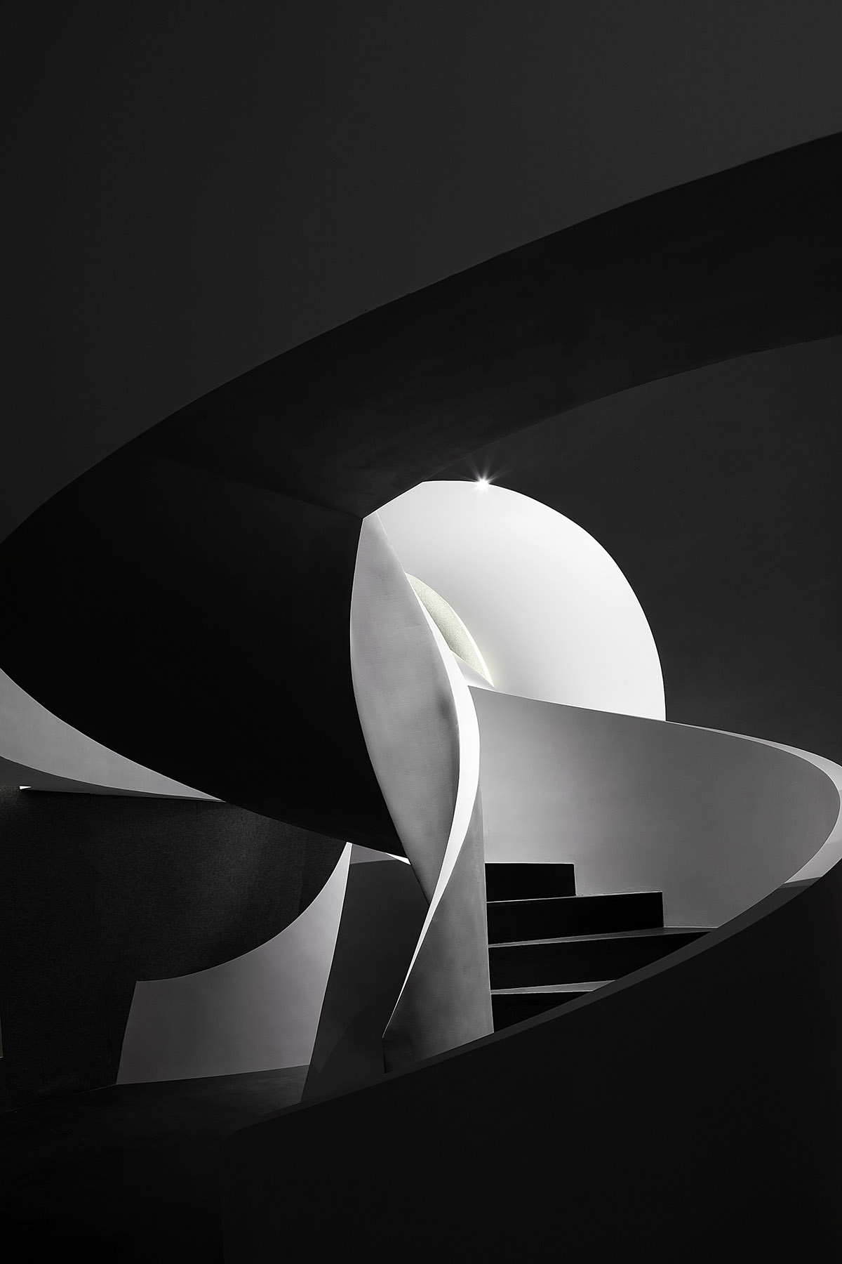
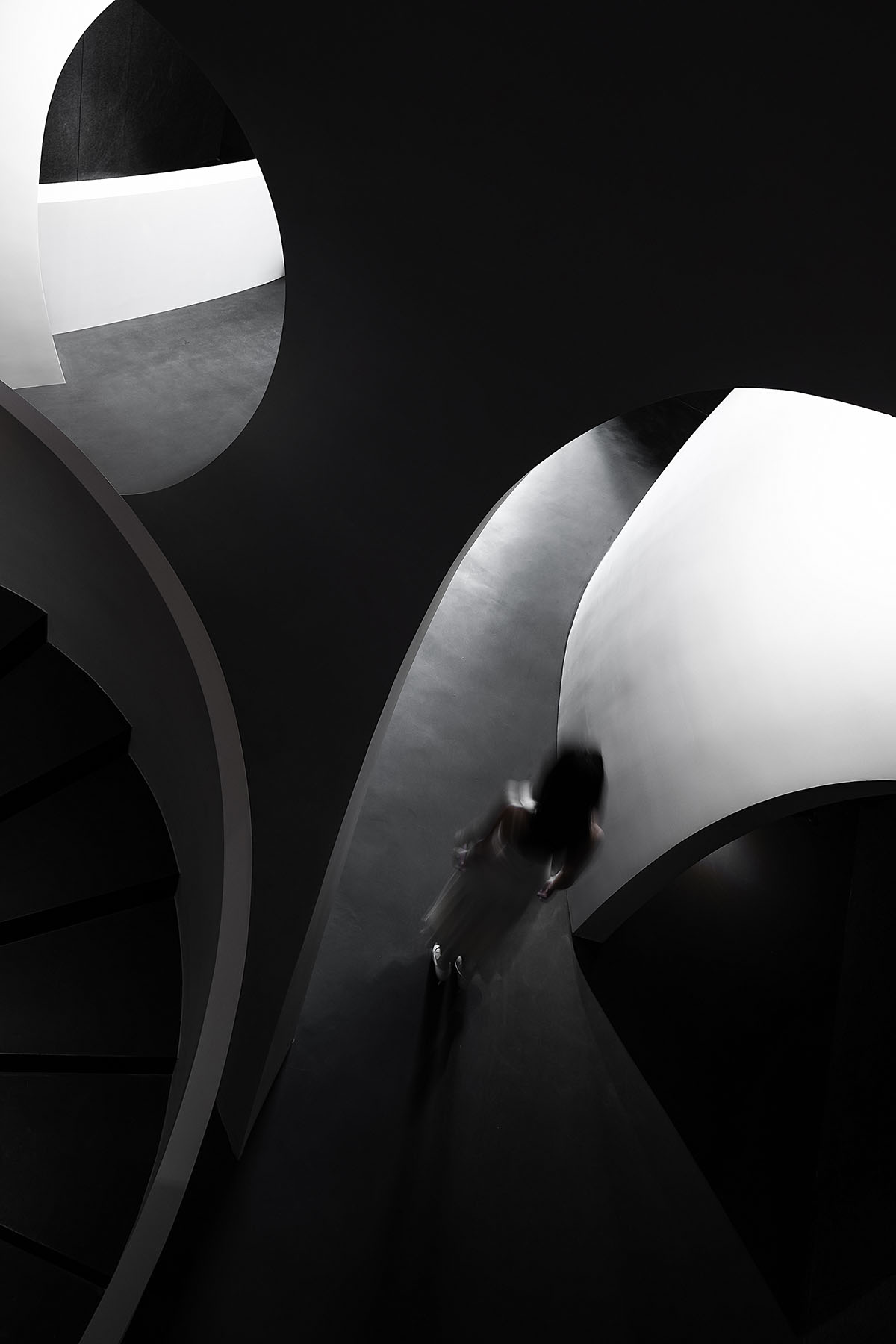
In the space, straight lines and curves are combined to outline large geometric blocks, and the cool concrete generates dramatic visual effects.
Lines stretch and interweave, indicating the fluidity of human cells. As the customers slowly move within the space, the contrast of the static and dynamic will become more apparent.
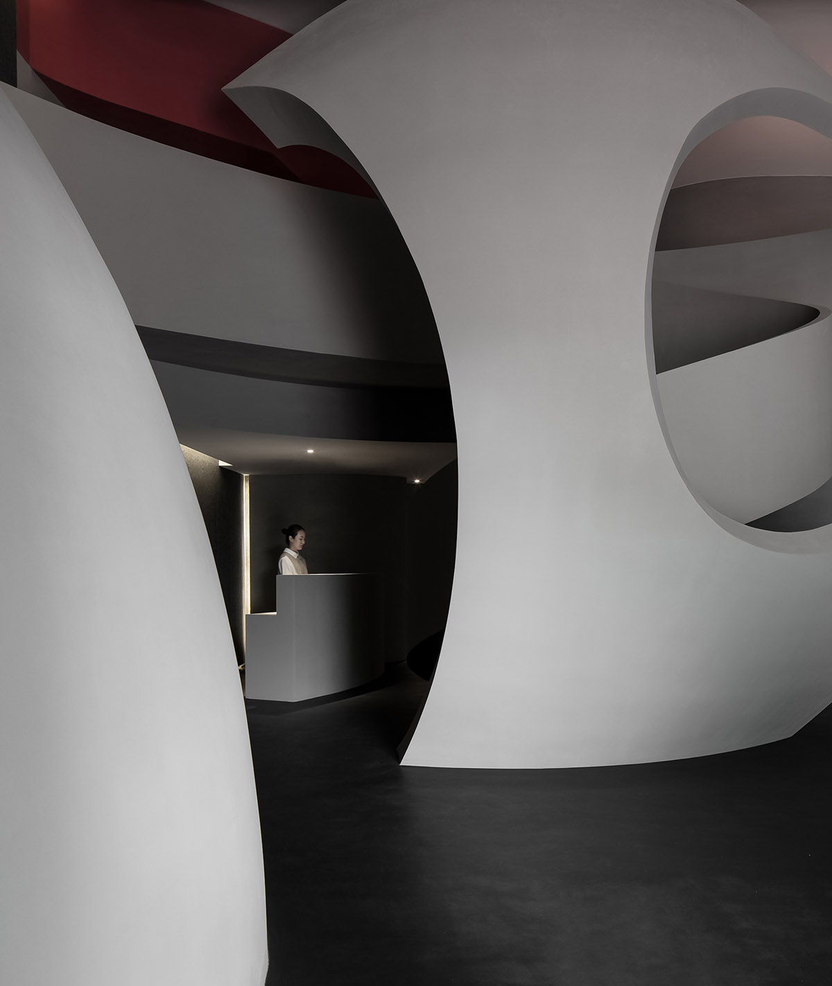
The spatial layout takes into account SOOYOU's reservation-based service system. The circulation links the product display area on the first floor, the VIP rooms on the second floor, with a product display area in between.
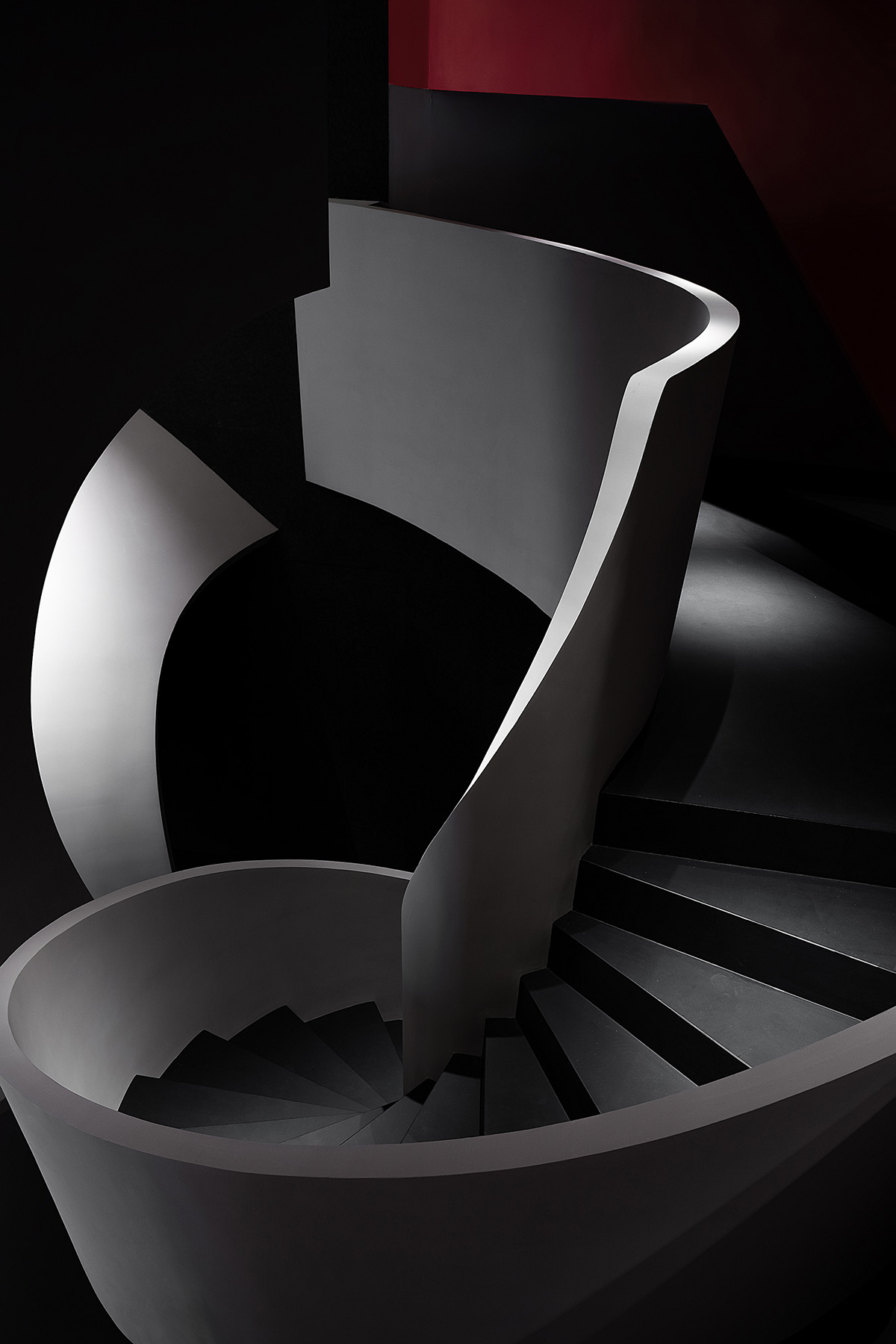
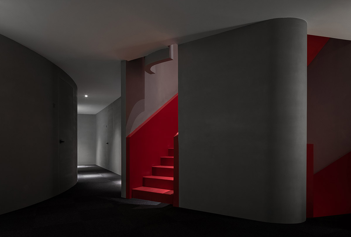
The consulting area on the mezzanine is separated to ensure privacy for customers. It can be reached by an artistic staircase, which is separated from the elevator used for customers who have already made reservation, to embody the brand's superior service system.
Light & Shadows / Materials
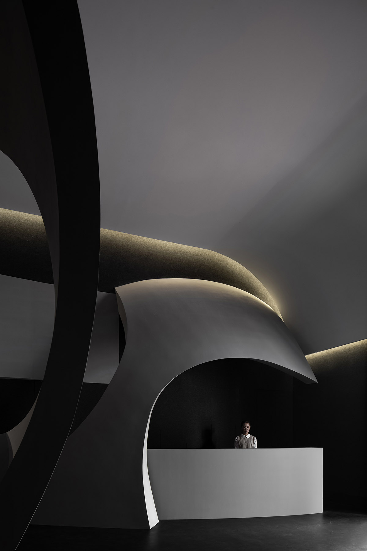
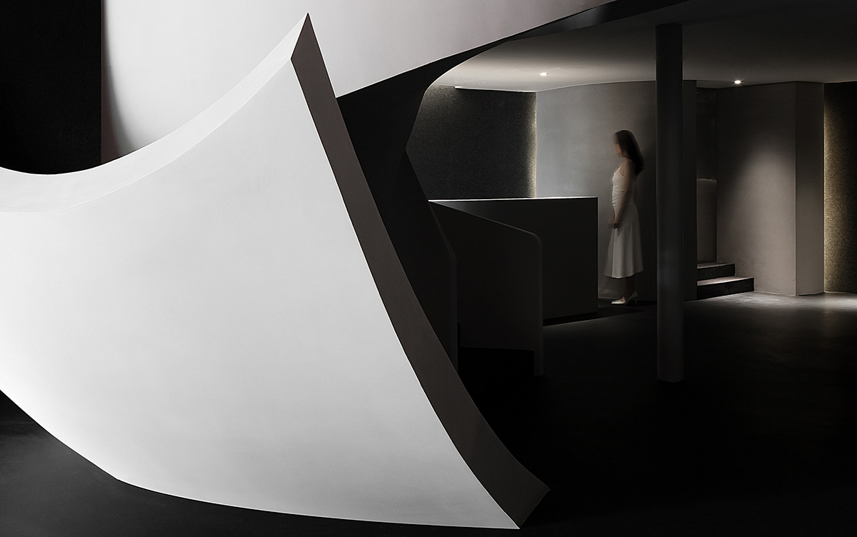
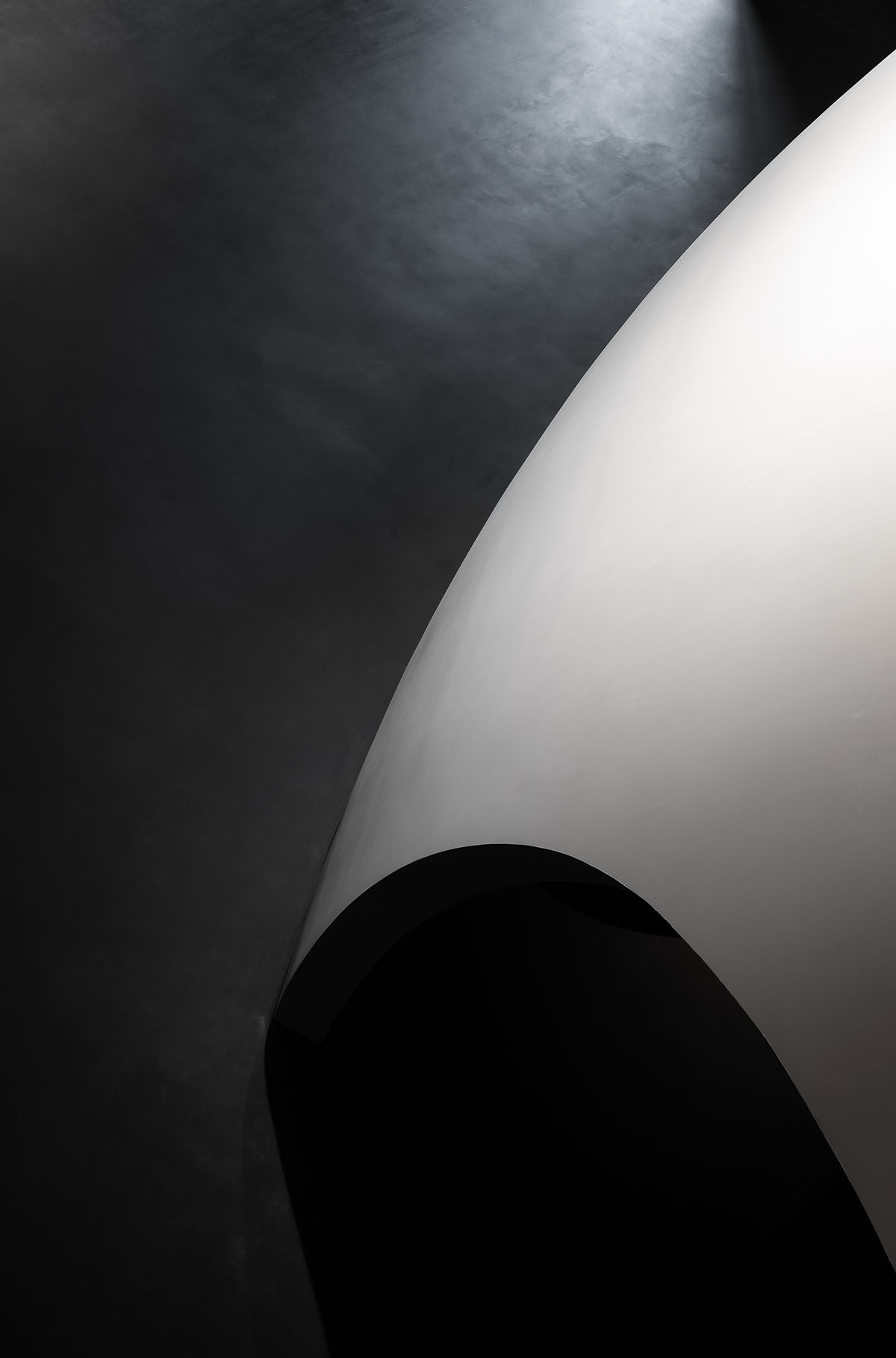
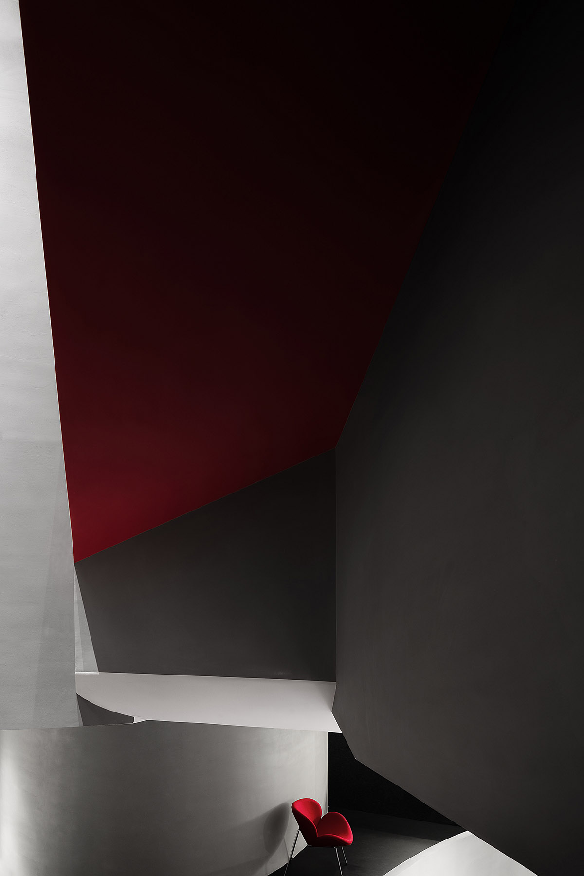
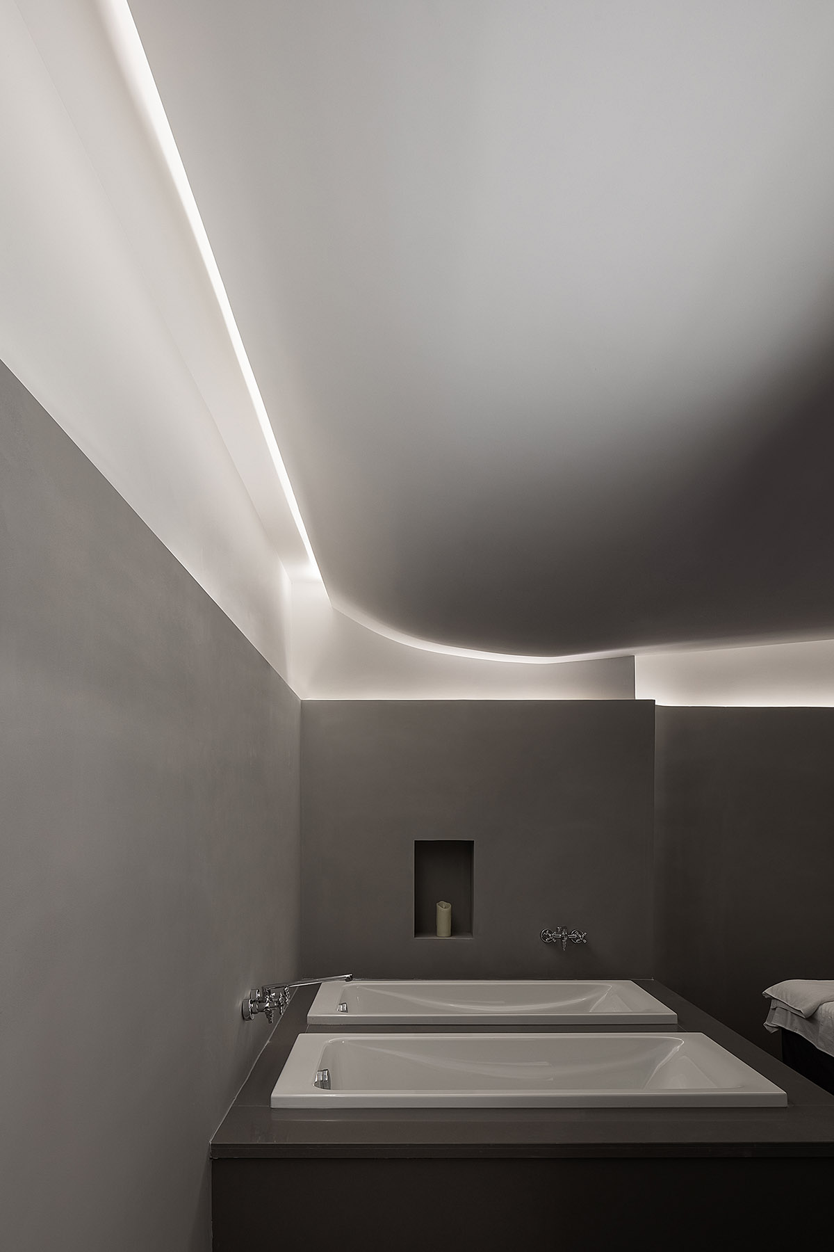
The overall space is dominated by dark hues, with the areas illuminated as spatial highlights. Shadows extend along the edges of light, leaving infinite room for imagination.
The shift of brightness and darkness at different layers stimulates emotional liberation, and offers calming and free experiences throughout the space.
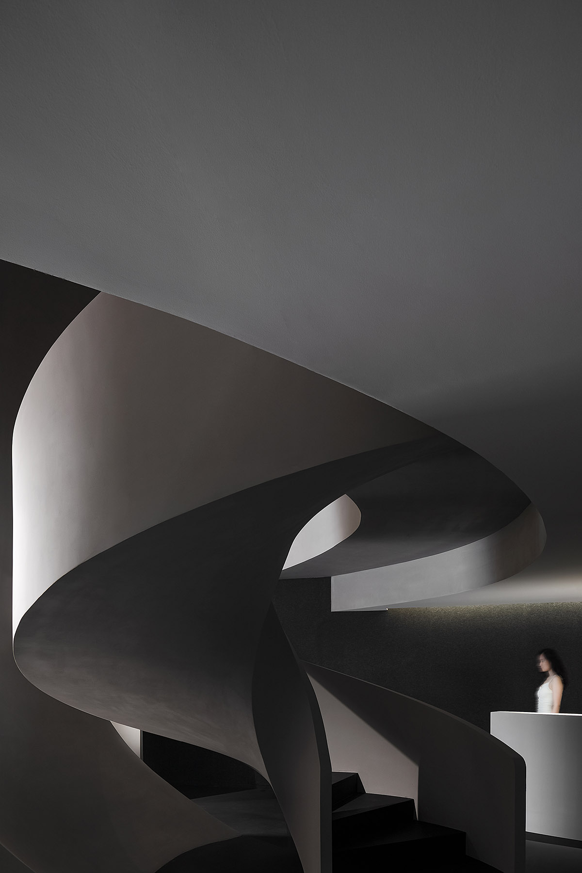
The austere texture of concrete embodies the brand's concept that advocates health and closeness to nature, whilst contributing to produce an avant-garde aesthetic space with low cost.
The black felt wall coverings visually stretch the space, and helps to generate a more tranquil and comfortable atmosphere with its sound-absorbing properties.
Colors / Dramatic Tension
Gray and black shades set the overall tone of the space, which is highlighted and enlivened by a red hue. The strong contrast of the colors generates dramatic tension in the space, leaves a deep impression on customers and guides them to explore the space.
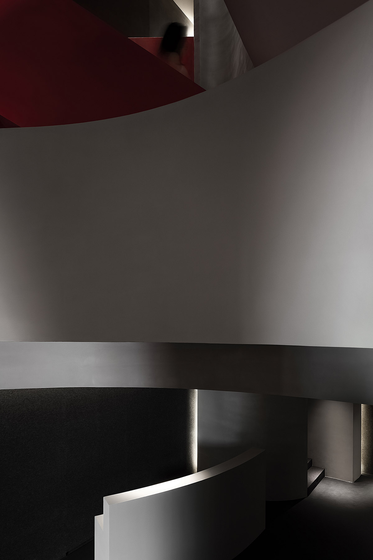
The space is a harmonious unity of various opposite scenes. Beauty treatment is a process in which cells die and reborn, which echoes the struggle, transformation and liberation of our inner mind.
As people come in, their emotions will be evoked, and new spatial scenes as well as memories will be created. This is an artistic space, which features a contradictory system and balanced coordination.
Summary
The project is a pioneering experiment that AD ARCHITECTURE carried out in commercial space design. It breaks conventional order, and injects mysterious and fun characters into the space. The designers drew on the fission and motion of cells to conceive this differentiated space, and finally produced abstract bionic aesthetic.



Site plan

First floor plan

Second floor plan

Third floor plan
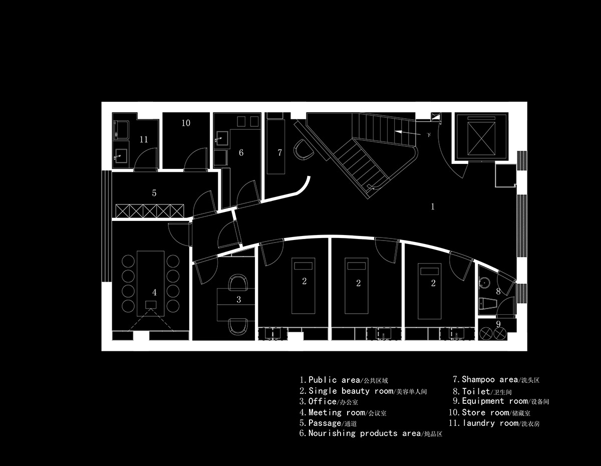
Fourth floor plan
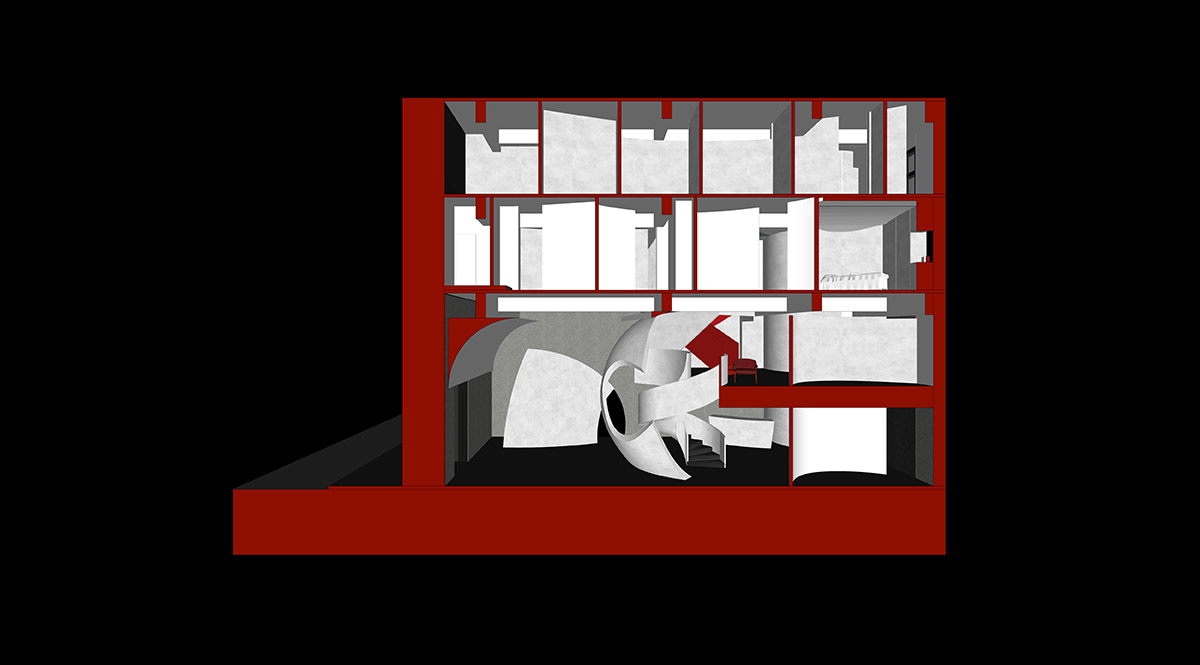
Section
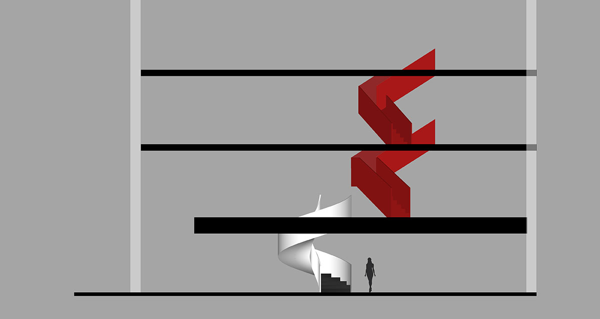
Section
Project facts
Project name: Sooyou Beauty Salon
Design firm: AD ARCHITECTURE
Chief designer: Xie Peihe
Design team: AD ARCHITECTURE
Location: Harbin, China
Area: 450 m2
Main materials: cement paint, felt, wall finishes, stone panels
Start time: January 2020
Completion time: July 2020
All images © Ouyang Yun
> via AD ARCHITECTURE
