Submitted by WA Contents
Estudio Sala designed open room by using orthogonal shapes and brushstroke-like furnitures in Brazil
Brazil Architecture News - Jul 24, 2020 - 10:14 5772 views
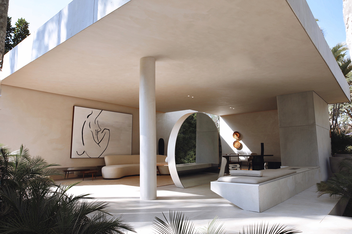
Estudio Sala, led by Minas Gerais, Carla Cruz and Philipe Pinheiro, has designed an open room comprised of orthogonal shapes and brushstroke-like furnitures in Mangaberias, Brazil.
Called Palmeiras Room, the project was designed for Casa Cor Minas 2019, the largest and complete exhibition of architecture, interior design and landscaping in the Americas in Belo Horizonte.
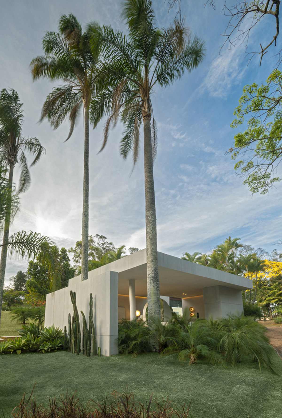
The show was held at the Palácio das Mangabeiras (The Mangabeiras Palace) designed by Oscar Niemeyer in the 1950s in a 42,000-square-metre of land in Belo Horizonte, with gardens planned by Roberto Burle Marx.
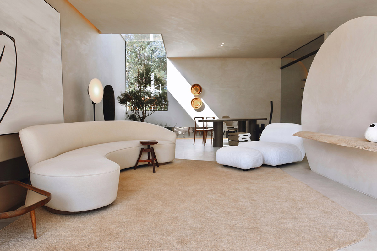
Image © João Viegas
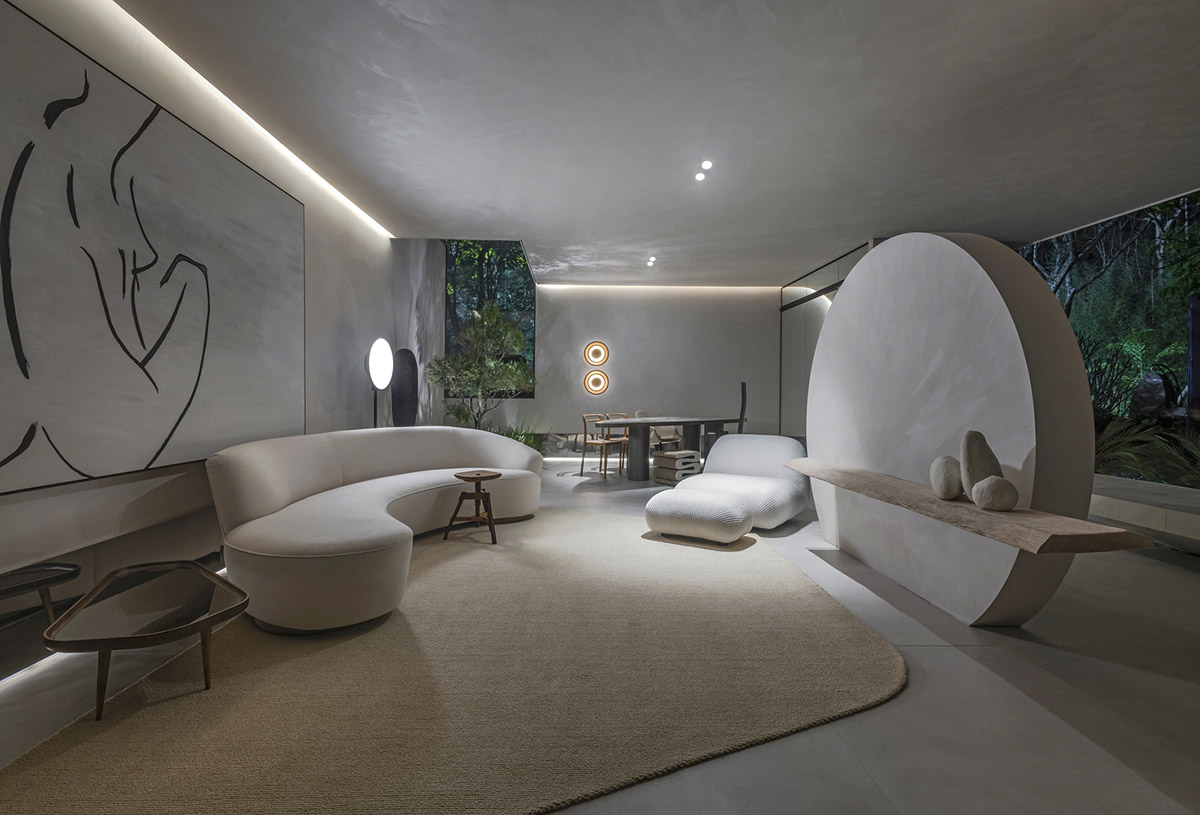
The studio created a 75-square-metre space that is limited by use and not by physical divisions. The studio created a clear contrast between the austerity and rigidity of the orthogonal shapes of the structure and the organic and fluid character of the layout and furniture.
"The impact is in the fact that all the pieces are strong separately, but together they make perfect sense," said Estudio Sala.
"The simplicity of the environment works like a blank canvas where the brushstrokes are the furniture and the light that touches the surfaces."
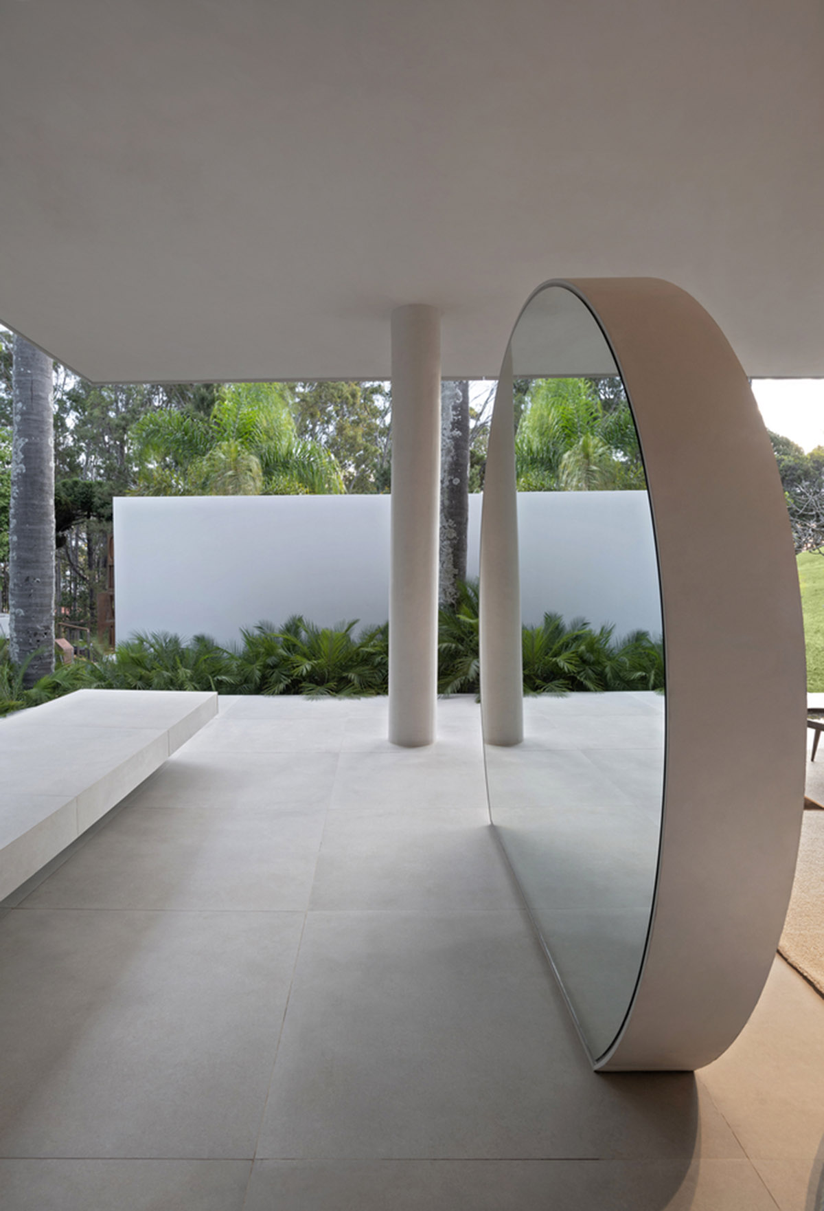
"The environment was thought of as an external room for contemplation and it opens up to Serra do Curral."
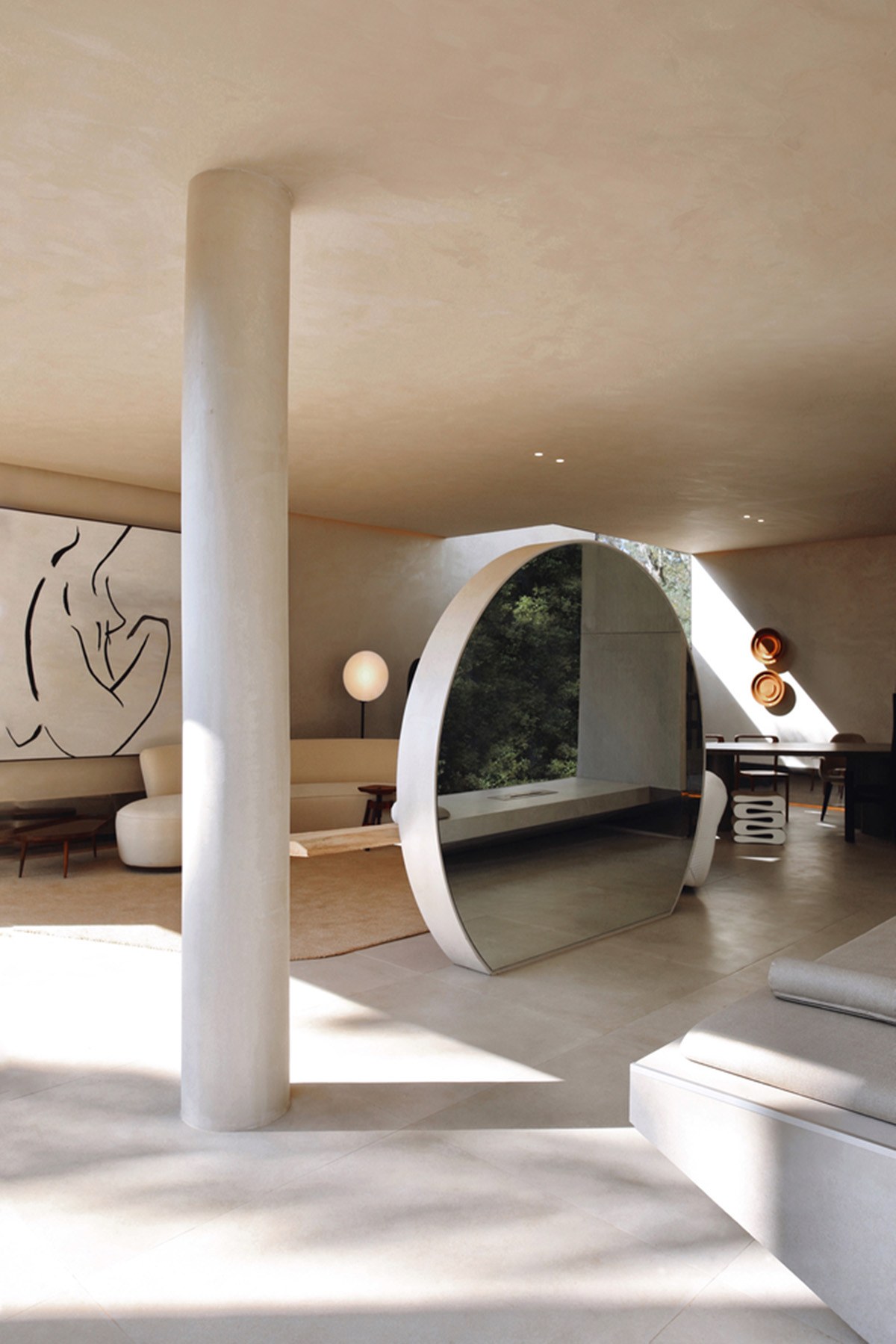
Image © João Viegas
The architects wanted to create an environment that breaks the boundaries between internal and external. "For me, it's actually a big balcony that is open all the time, Explains Philipe," added the firm.
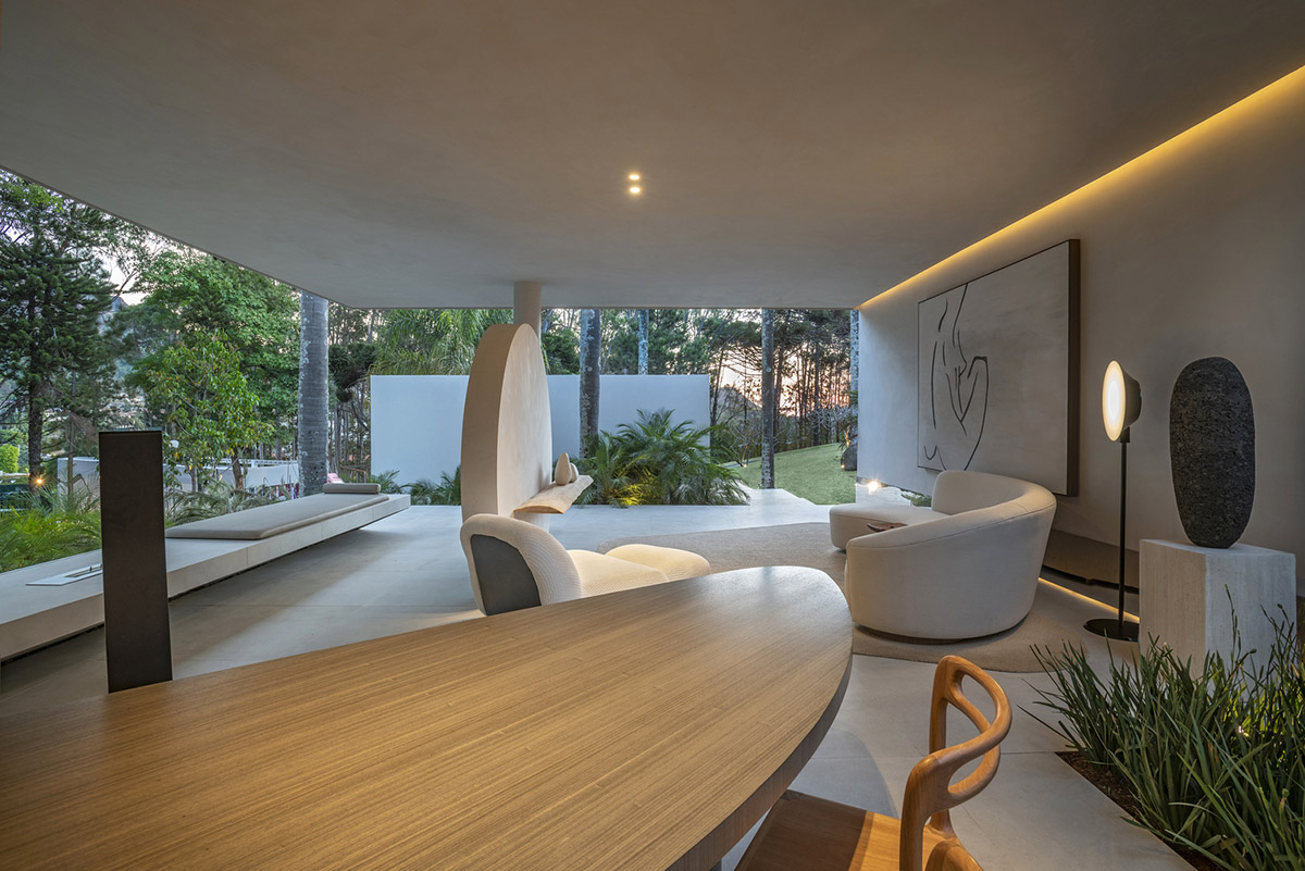
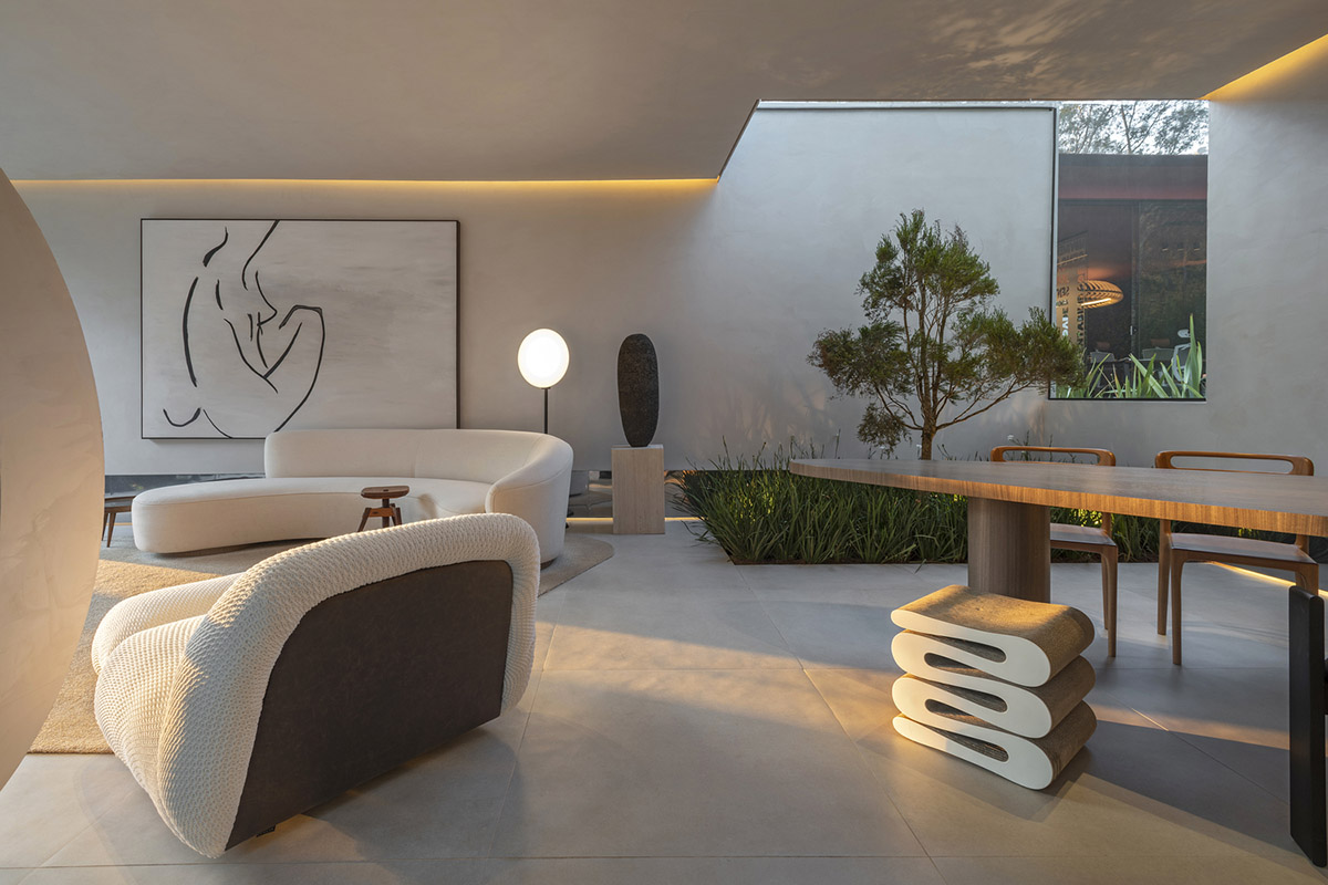
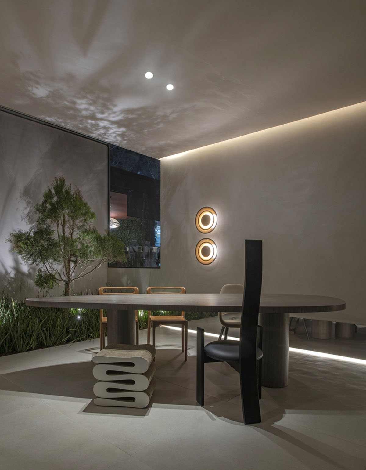
The room features distinctive design elements, such as the Cariri chairs, carved in Tauari wood, by designer Andrea Borgogni, the Golem chair from the late 60s, by designer Vico Magistretti, which was a tribute to the work of the architect Charles McIntosh and is inspired by Art Nouveau, the painting by artist Frederico Valim and the circular mirror designed by the office.
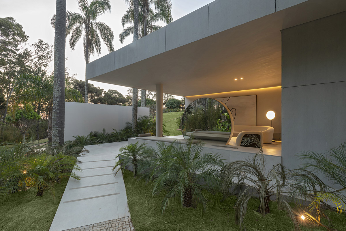
The light was the key element for the studio. They designed the light strategically. "We analyzed how natural light would enter and where transitions would take place to define how it would act in space, always looking for a poetic character," the architects added.
"Artificial light is scenic, cozy and diffuse."
"There are only two lighting points on the ceiling, to highlight the furniture, the rest is done indirectly with design lamps and led strips that frame the space, adds Carla."

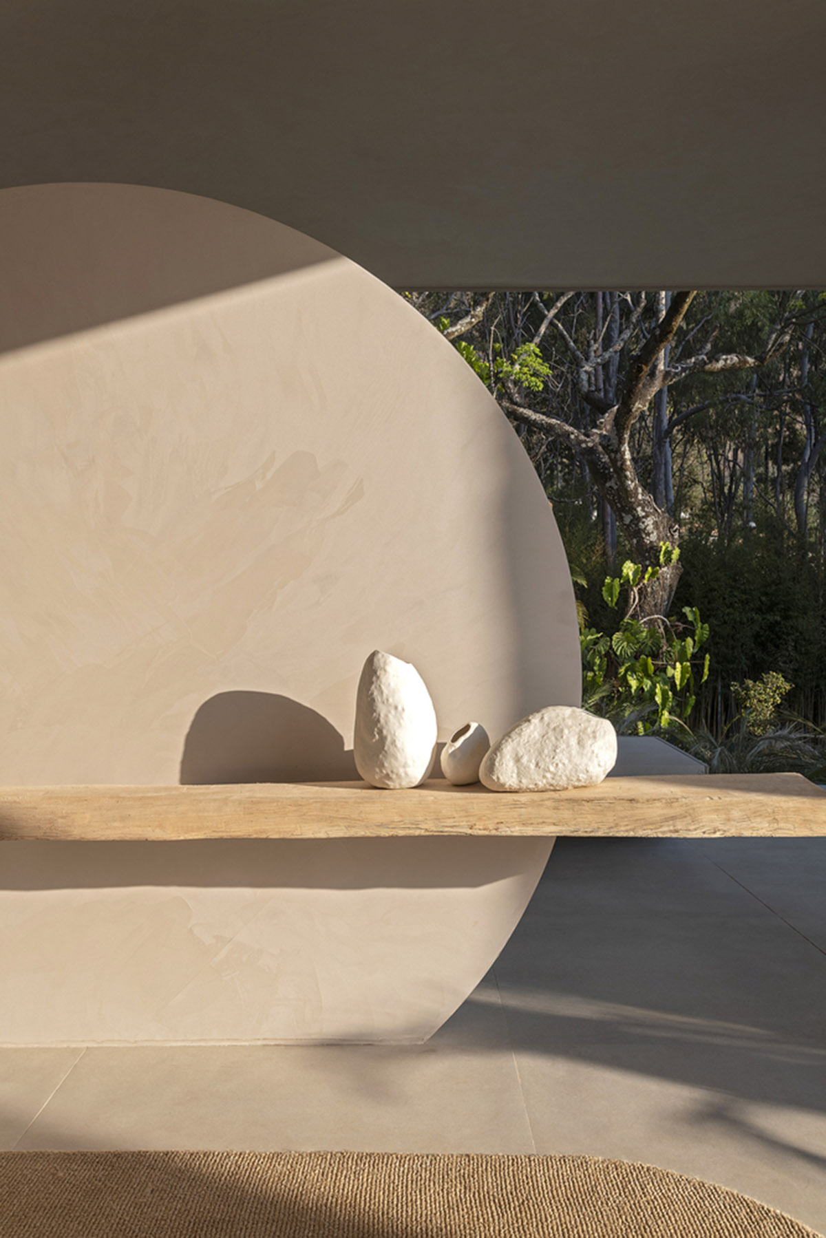
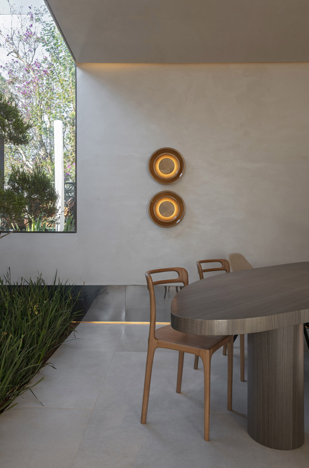
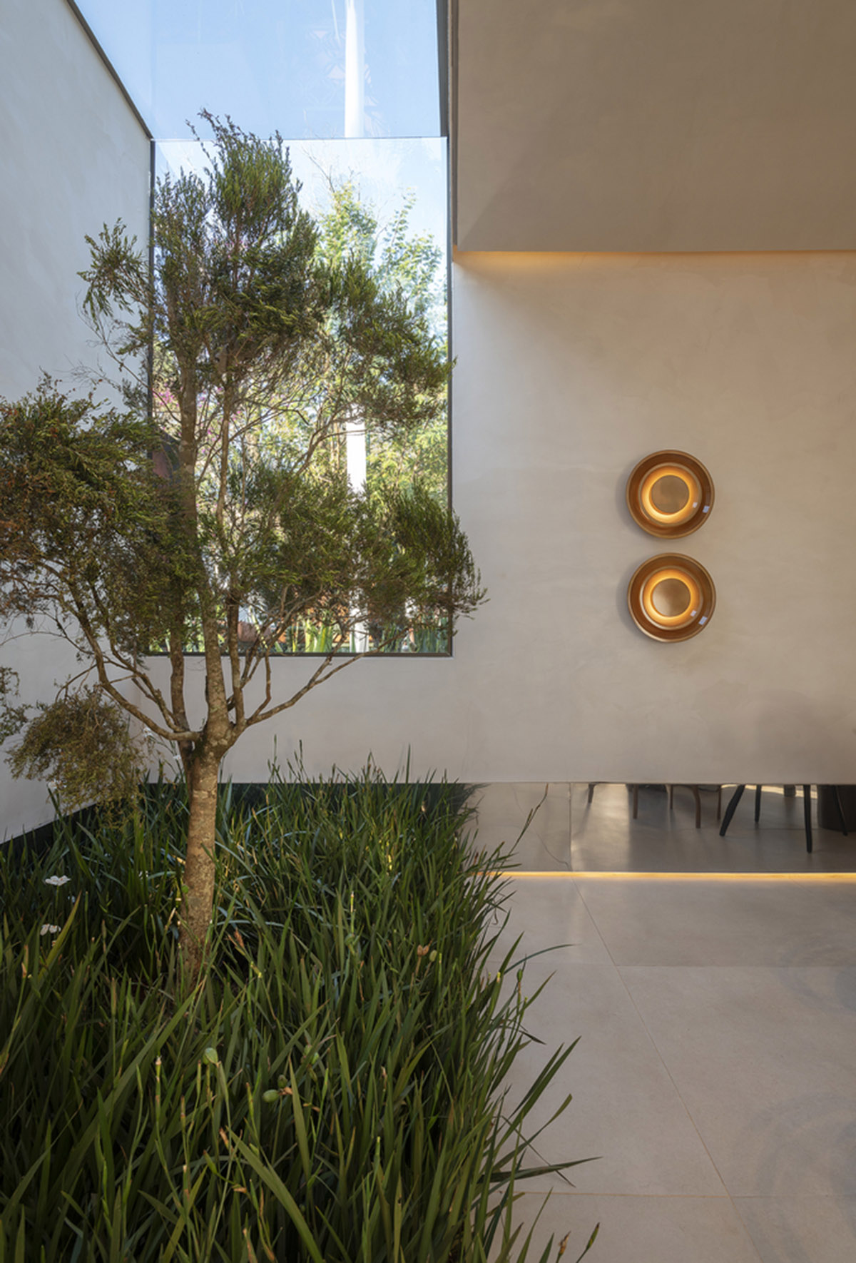
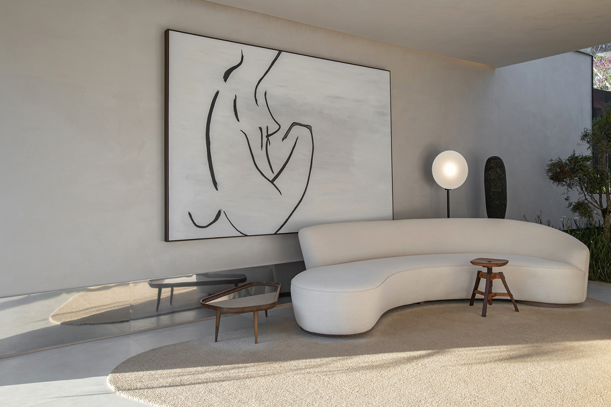

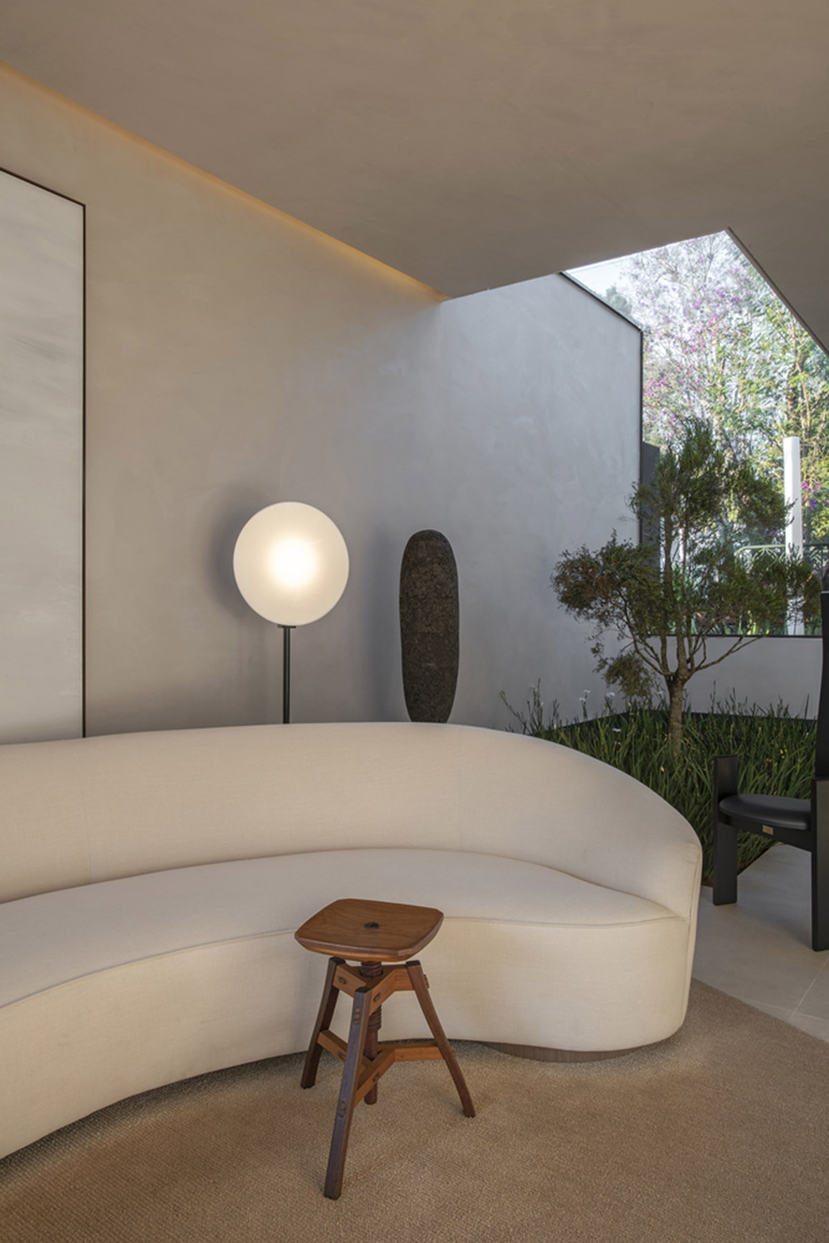
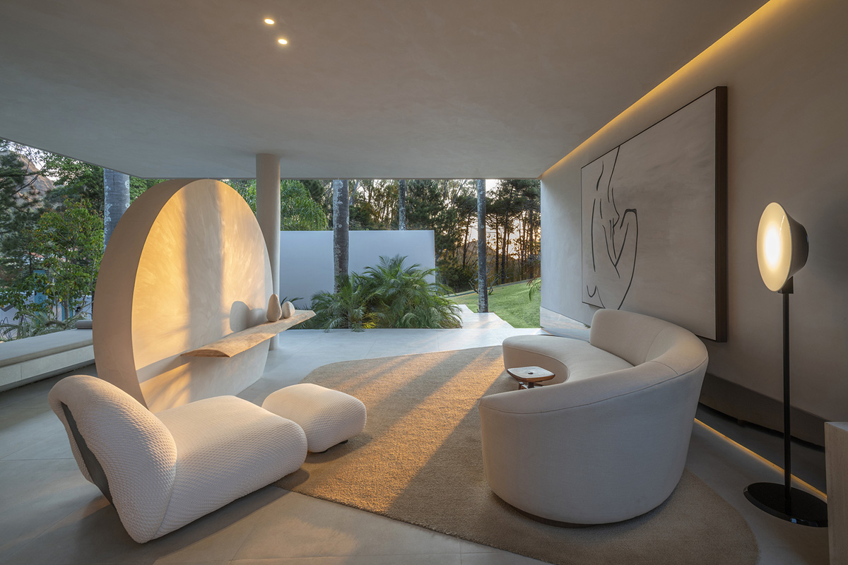
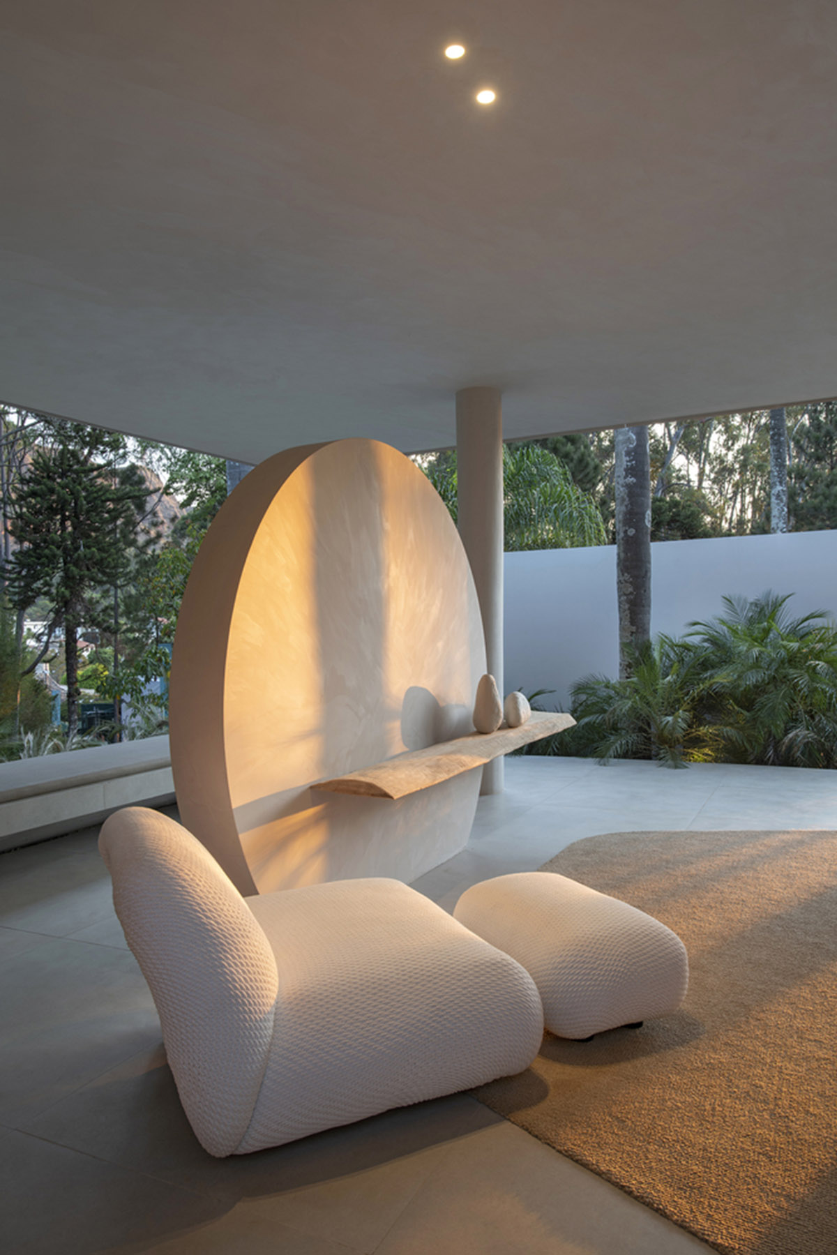
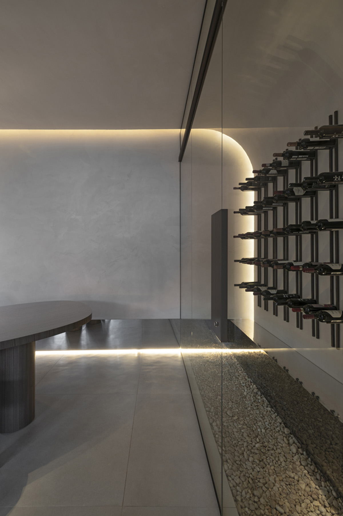
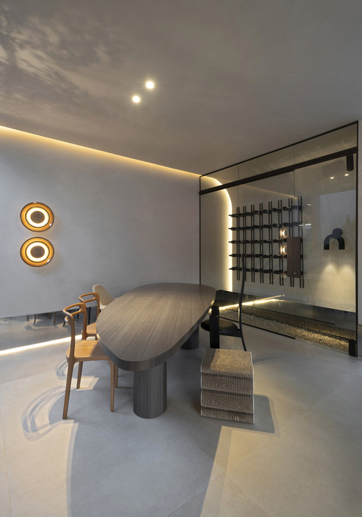
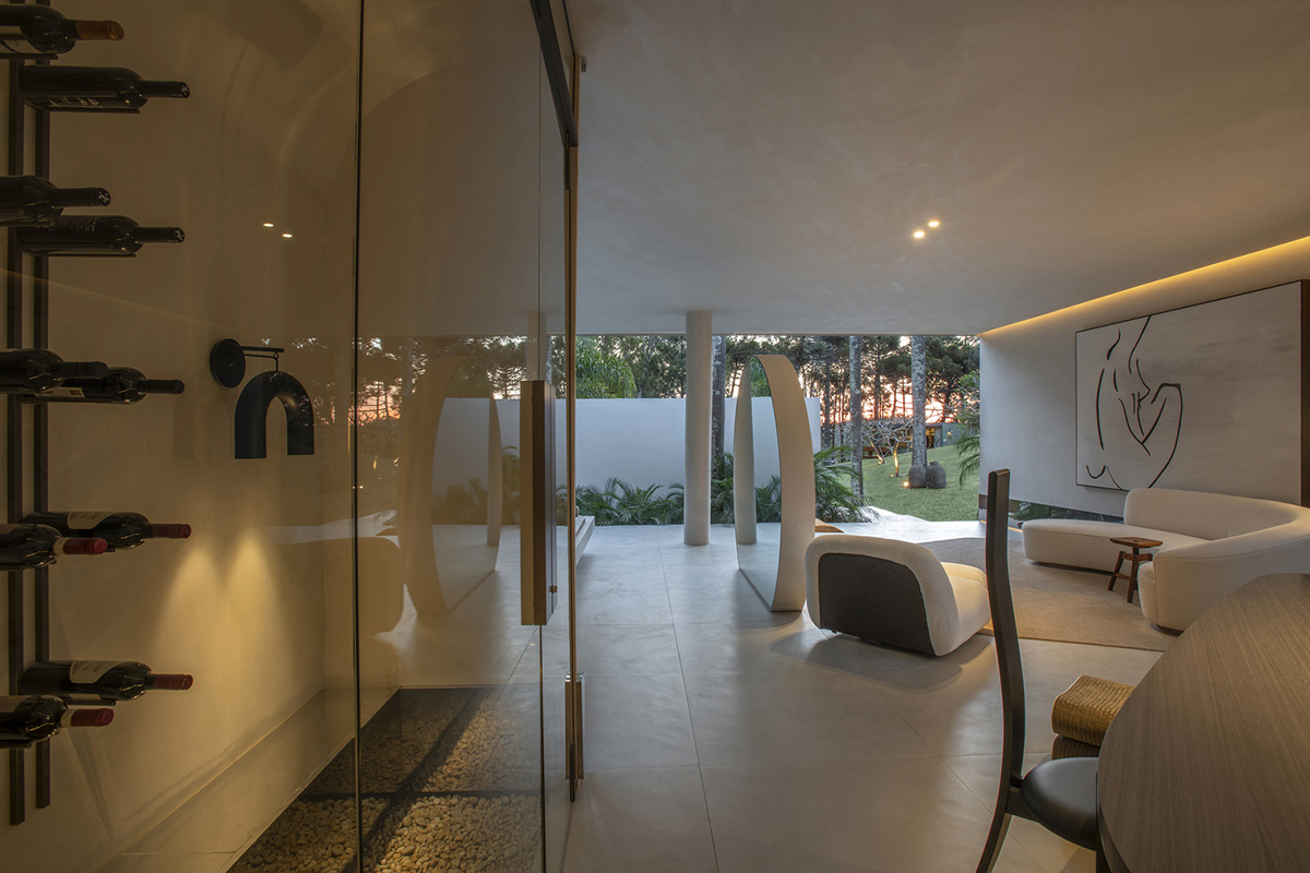
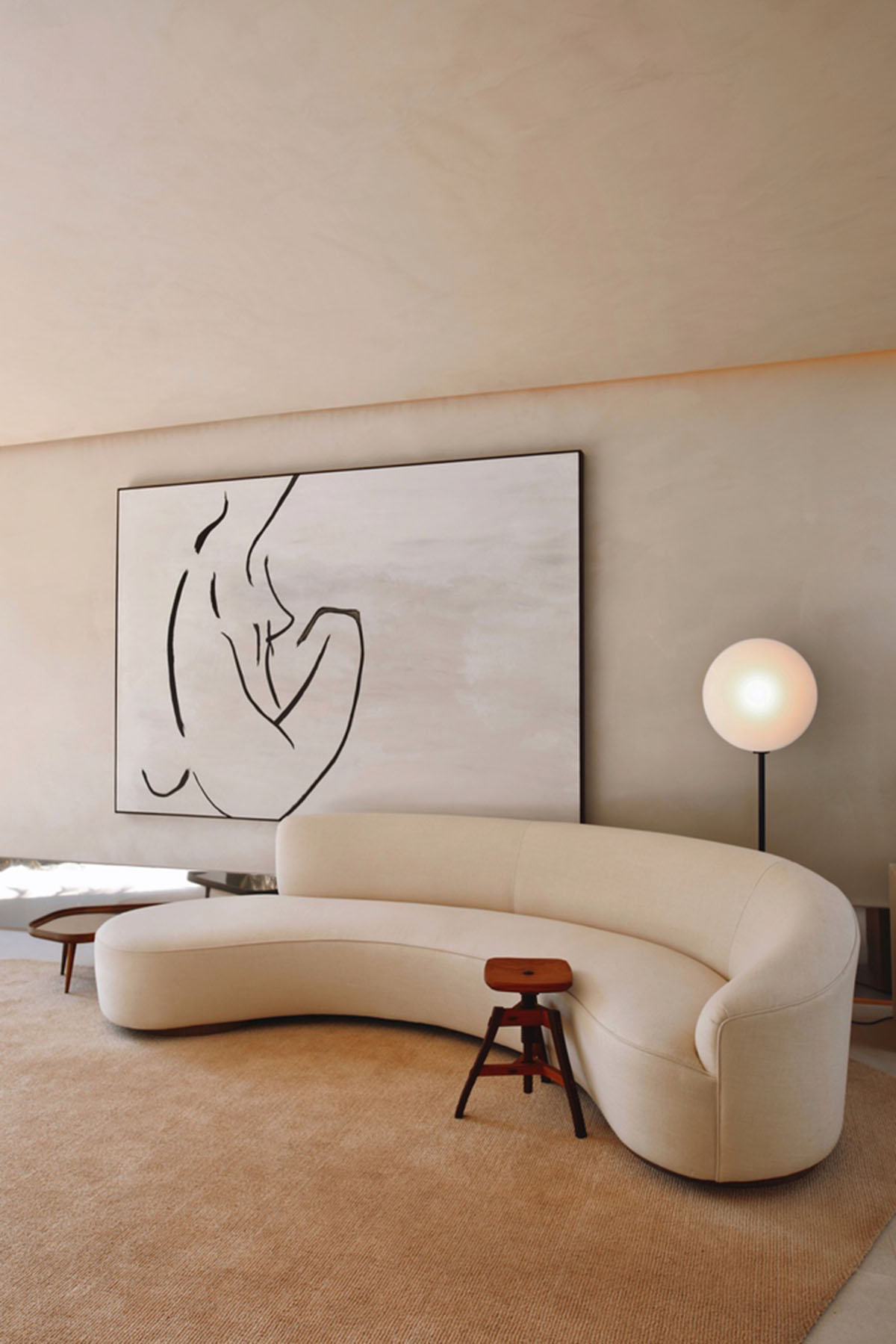
Image © João Viegas
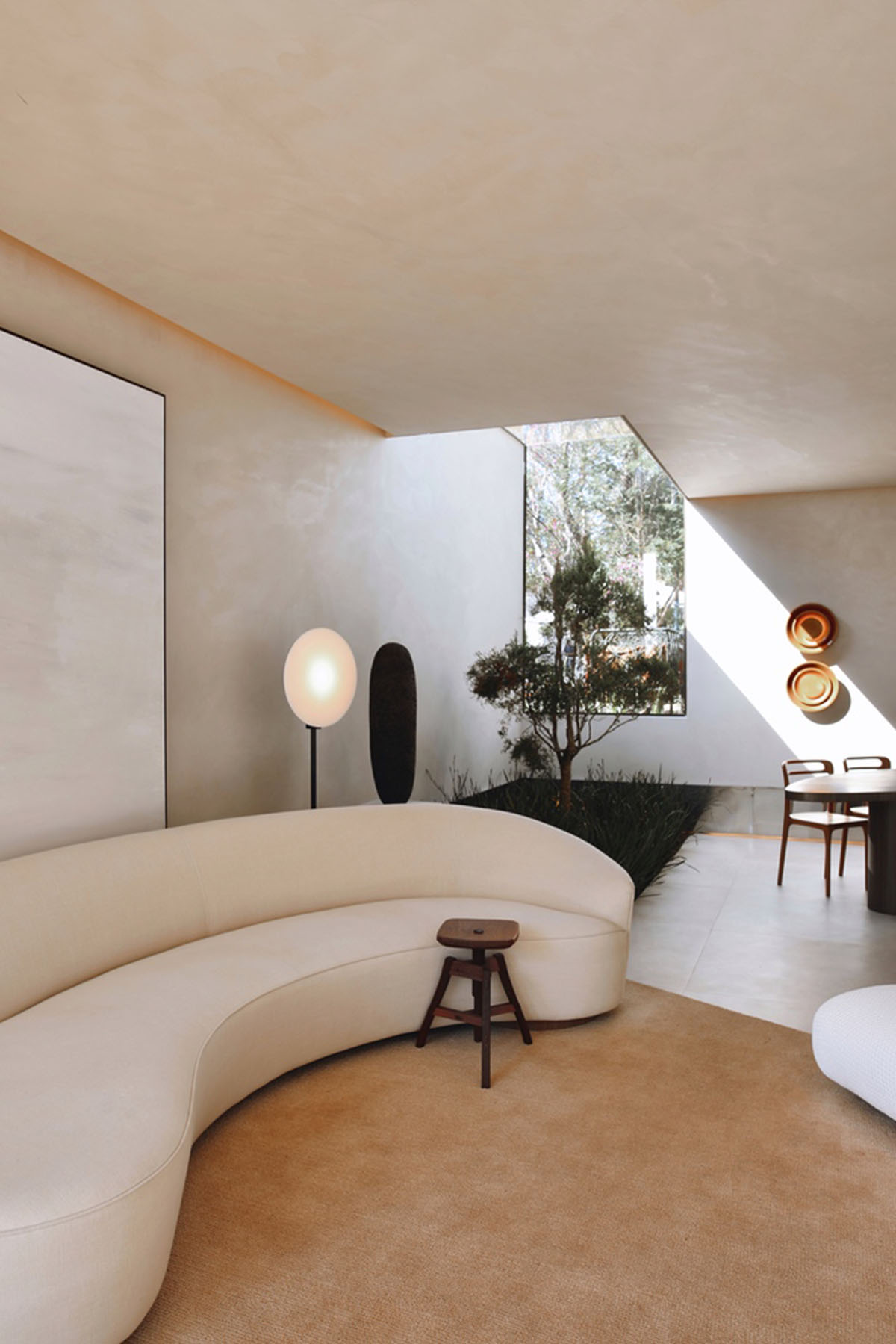
Image © João Viegas
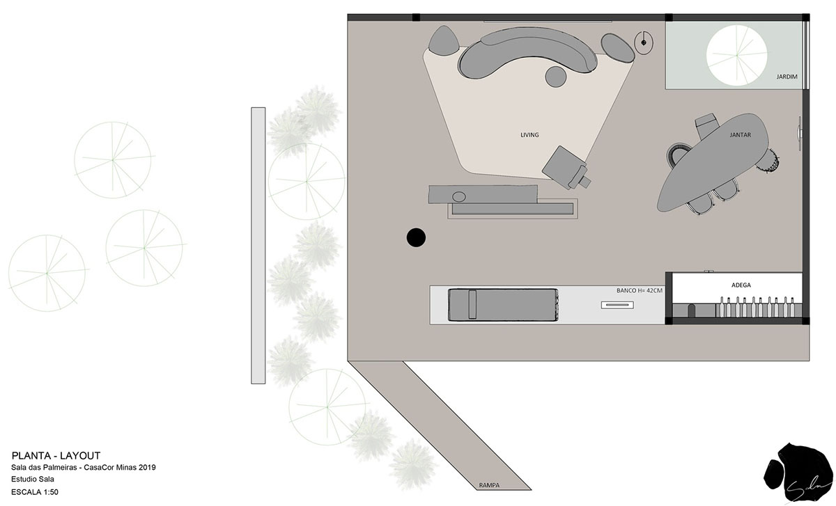
Plan of the room. Image © Estudio Sala
Top image © João Viegas
All images © Daniel Mansur unless otherwise stated.
> via Estudio Sala