Submitted by WA Contents
Cast-in-situ concrete, golden panels, metallic curtains soften beauty salon designed by balbek bureau
Ukraine Architecture News - Aug 10, 2020 - 14:49 7313 views

Kyiv-based architecture and interior design studio balbek bureau has created raw interiors for a beauty salon in Kyiv, Ukraine.
The architects harmonized grey-colored tones with different materials and textures that soften the transition between selected materials - such as cast-in-situ concrete, golden panels, metallic curtains.
Named Say No Mo Beauty Salon, the 200-square-metre project aimed to create an alternative and new space compared to the traditional beauty salons. Each space is conceived like an art zone for customers who want to feel themselves more relaxed within this salon.

Say No Mo was conceived conceptually as a new format of a beauty salon. The architects used a bar in the heart of the salon, the bar is used for both beauty services and traditional cocktail receptions.
"The main task faced by balbek bureau from the very start of the design process was to break away from a traditional perception of a conventional beauty salon, and its gender distinction," according to the architects.
"The owner of the establishment is Canadian. In her years of working in the beauty industry, she has learned how to make a client happy."
"This understanding became the basis of the interior solutions delivered by balbek bureau. To get on the same mental wave with the client is perhaps the most important aspect while working on a project. Our architectural team managed to do just that," the firm added.
"That is why the proposed concept took off instantaneously: first, in the hearts and minds, and half a year later - materializing on 36 Shota Rustavely Street in Kyiv."

The two-storey space is situated in an old building in Kyiv. With the curved-walls geometry and without a single parallel wall, the place boasts 4-meter high ceilings and has a distinctive atmosphere.
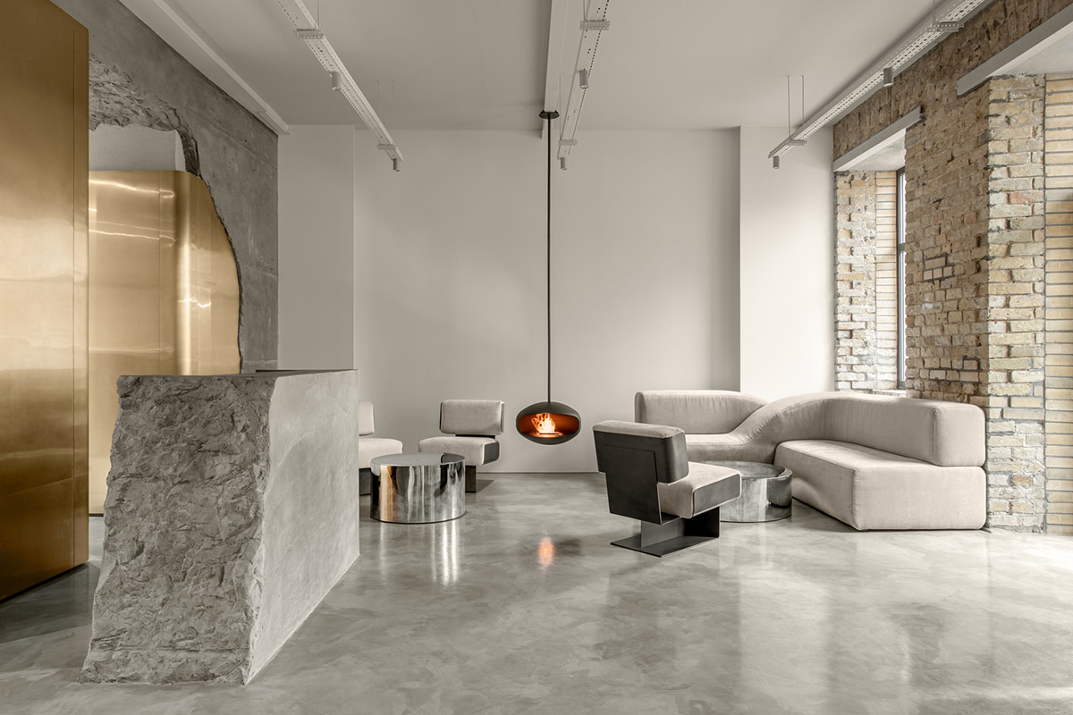
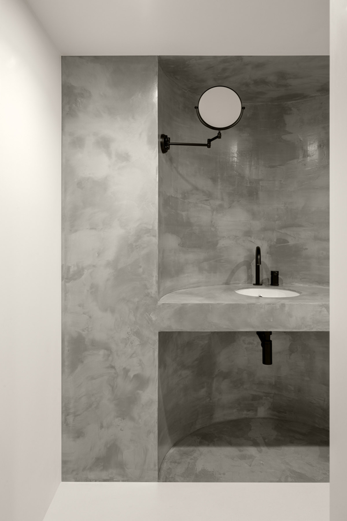
The ground level of the salon features several zones: reception, lounge, manicure/bar, and pedicure. The basement level contains a make-up zone, hair care, cosmetology, restroom, and facilities.
Reception Zone is the main area that welcomes customers. One of the main visual accents of the salon is located in the reception area and creates an instant wow-effect in visitors.
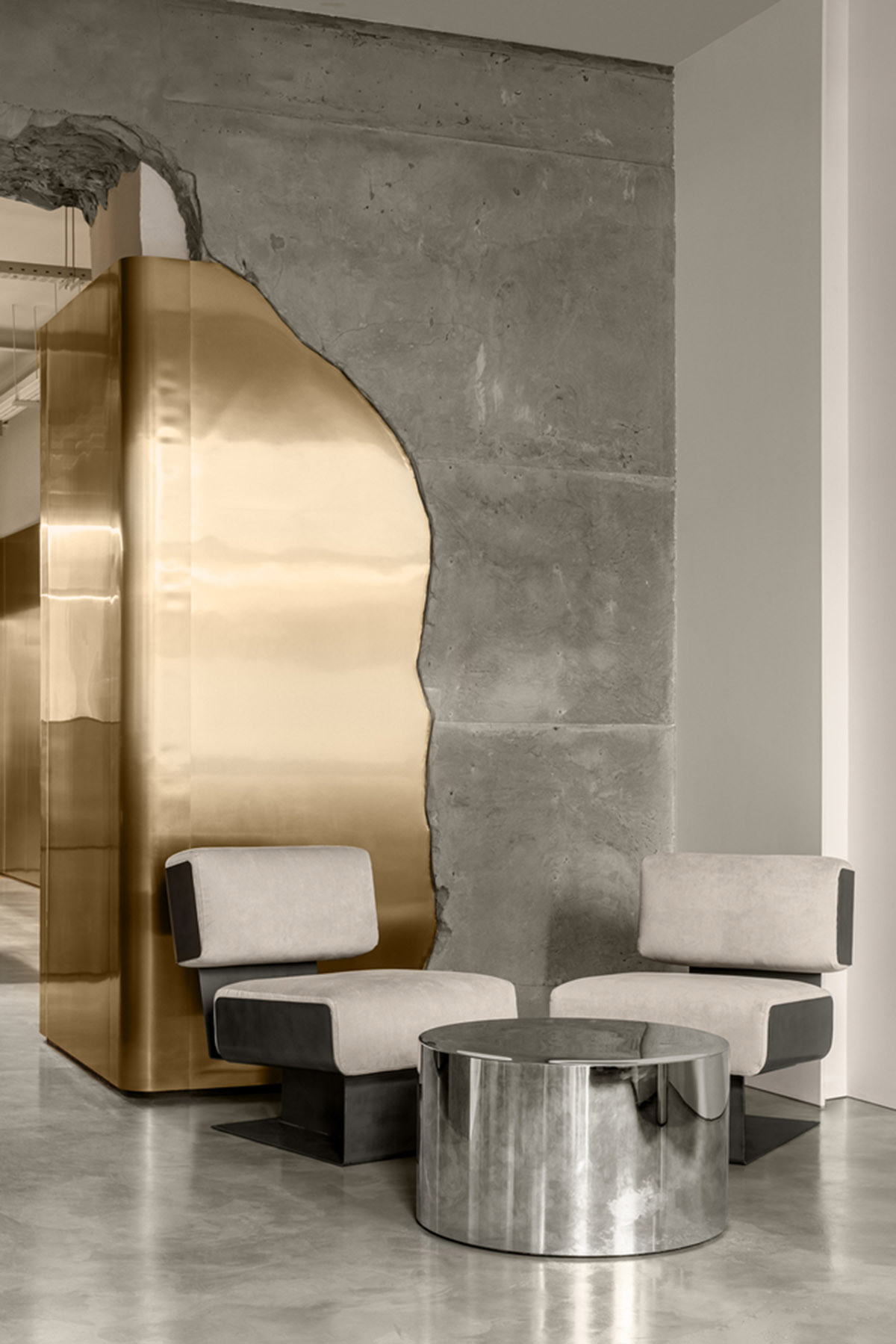
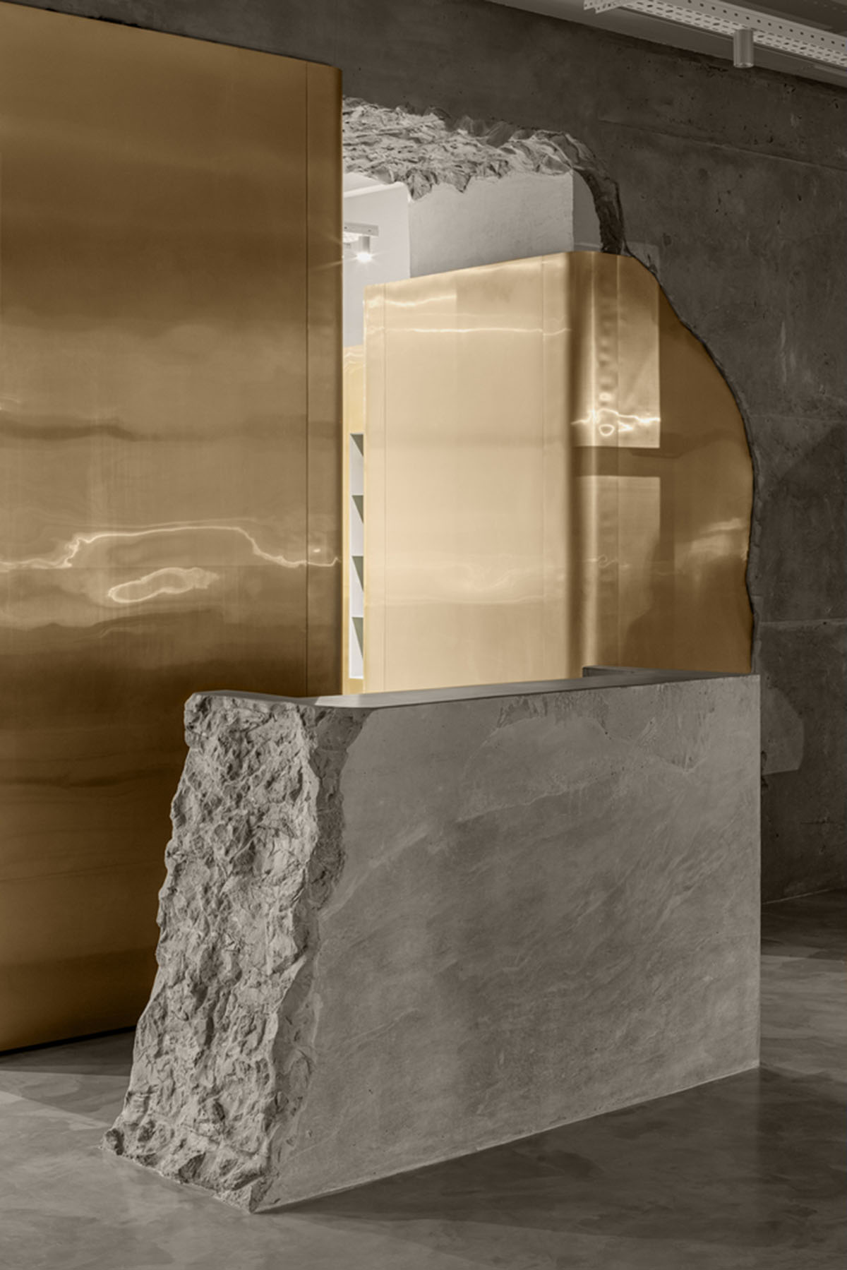
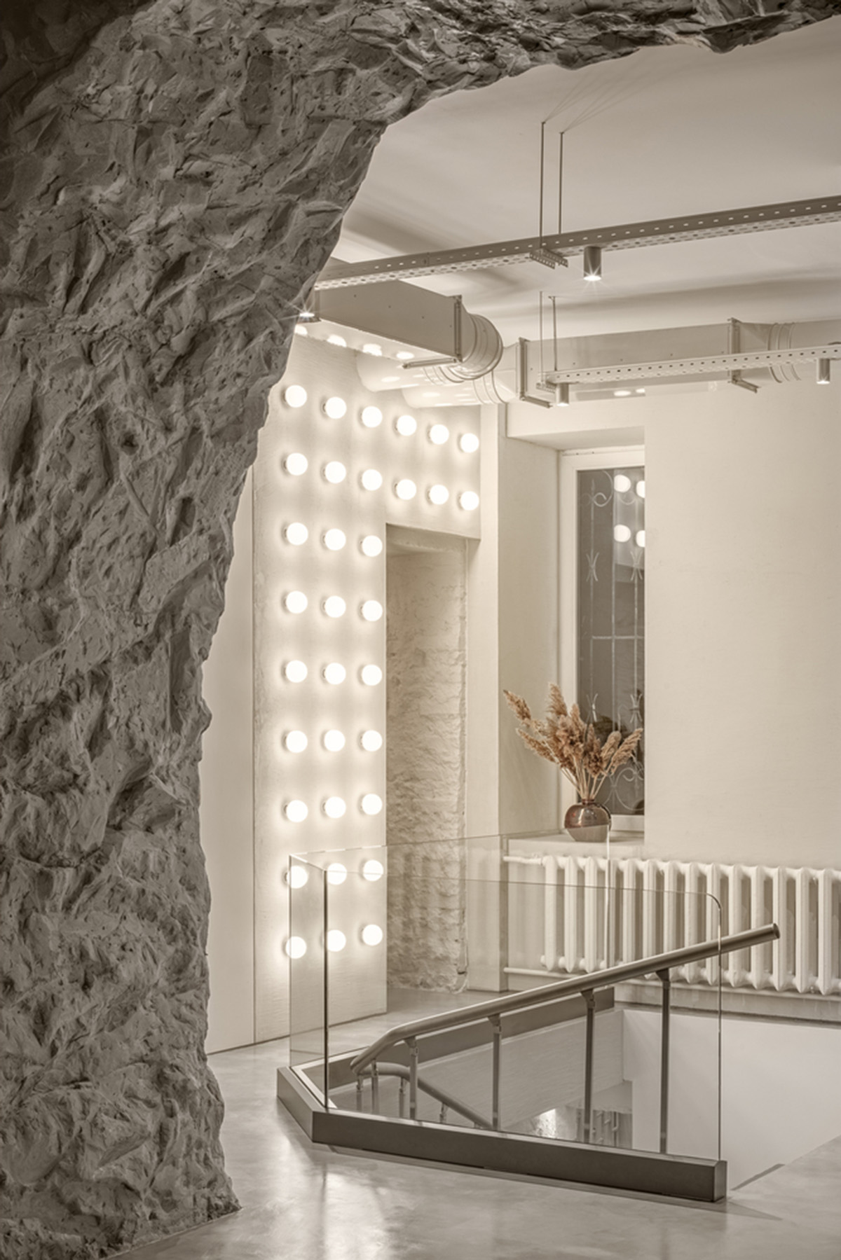
"The cast-in-situ concrete ‘broken’ arch serves as a metaphor for broken stereotypes in the beauty industry. It is made of poured concrete and weighs several hundred kilograms," said the studio.
"The construction of this form was a multi-phased process; it took more than 4 months from the docking assembly to the final joining of shears and toning of the structure."

The reception counter is also made of cast-in-situ concrete and visually resembles a stone block. However, the monolithic look does not impede its functionality – it has a desktop and plug-in connection spots to ensure a fully functional workspace.
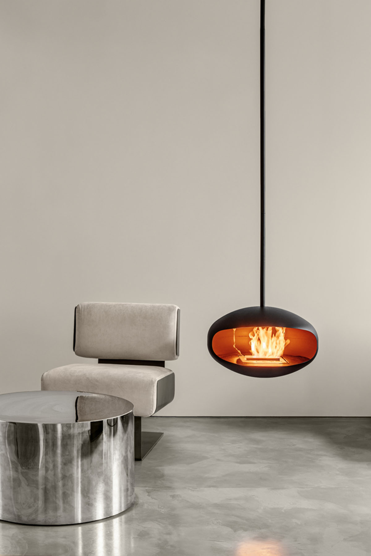
The reception zone has a lounge area with furniture groups and a fireplace that serves not only as a waiting area but also as a place to socialize during cocktail parties. Armchairs are inspired by Gianni Moscatelli for Forma Nova.

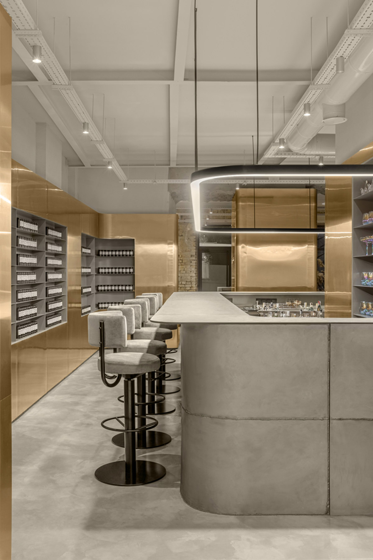
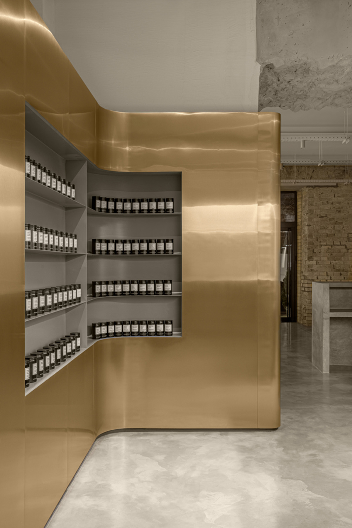
Bar Zone is another attracting area in the space. Another main element and a signature mark of the interior is a set of the rounded "golden" panels. Their shape envelopes the walls and columns and visually joins 3 zones: the entrance to the salon, the bar, and the pedicure zone.
"The panels are used in retail operations, serve as bar shelves and partitions, and mask the unevenness of the original walls. Panels are made of polished stainless steel (0.5 mm thick) with titanium nitride coating."
"The bar counter is plated with black metal with crude welding seams made intentionally prominent. The top of the bar is made of a 12-mm thick composite material."

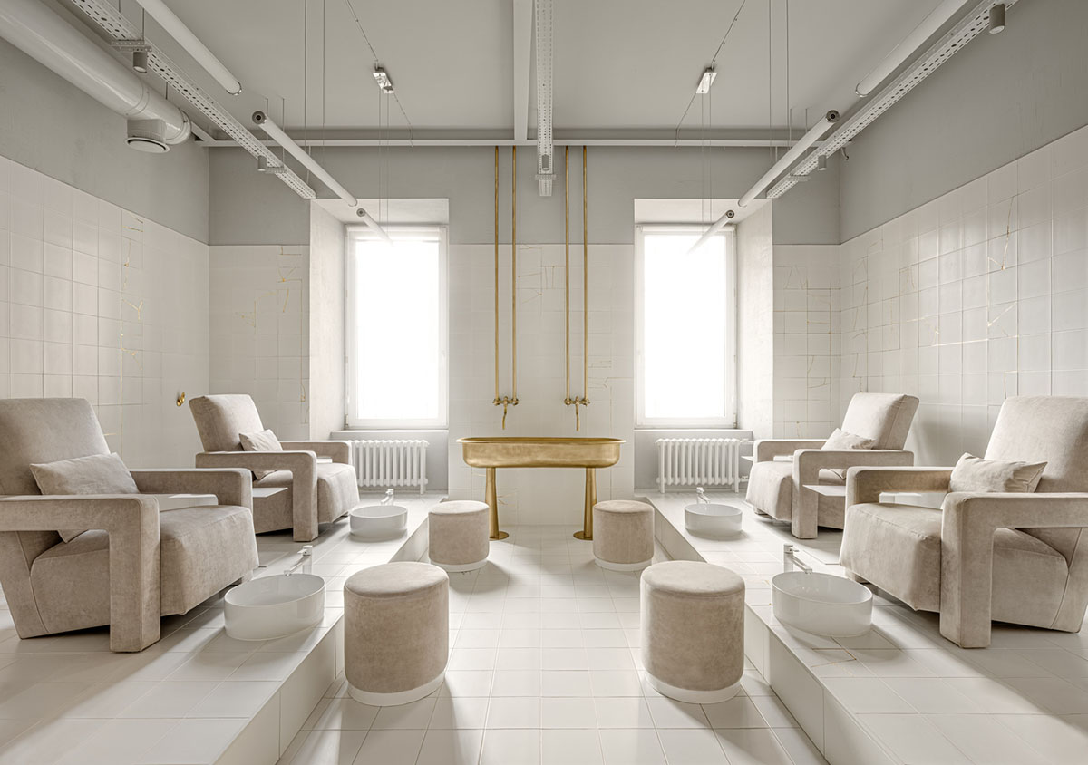
There is a pedicure zone located on podiums the ergonomics design of which is a perfect fit for nail technicians. Podiums are equipped with integrated sliding drawers and washbasins for the use of the salon staff; during parties, they are covered with hollow coffee tables.
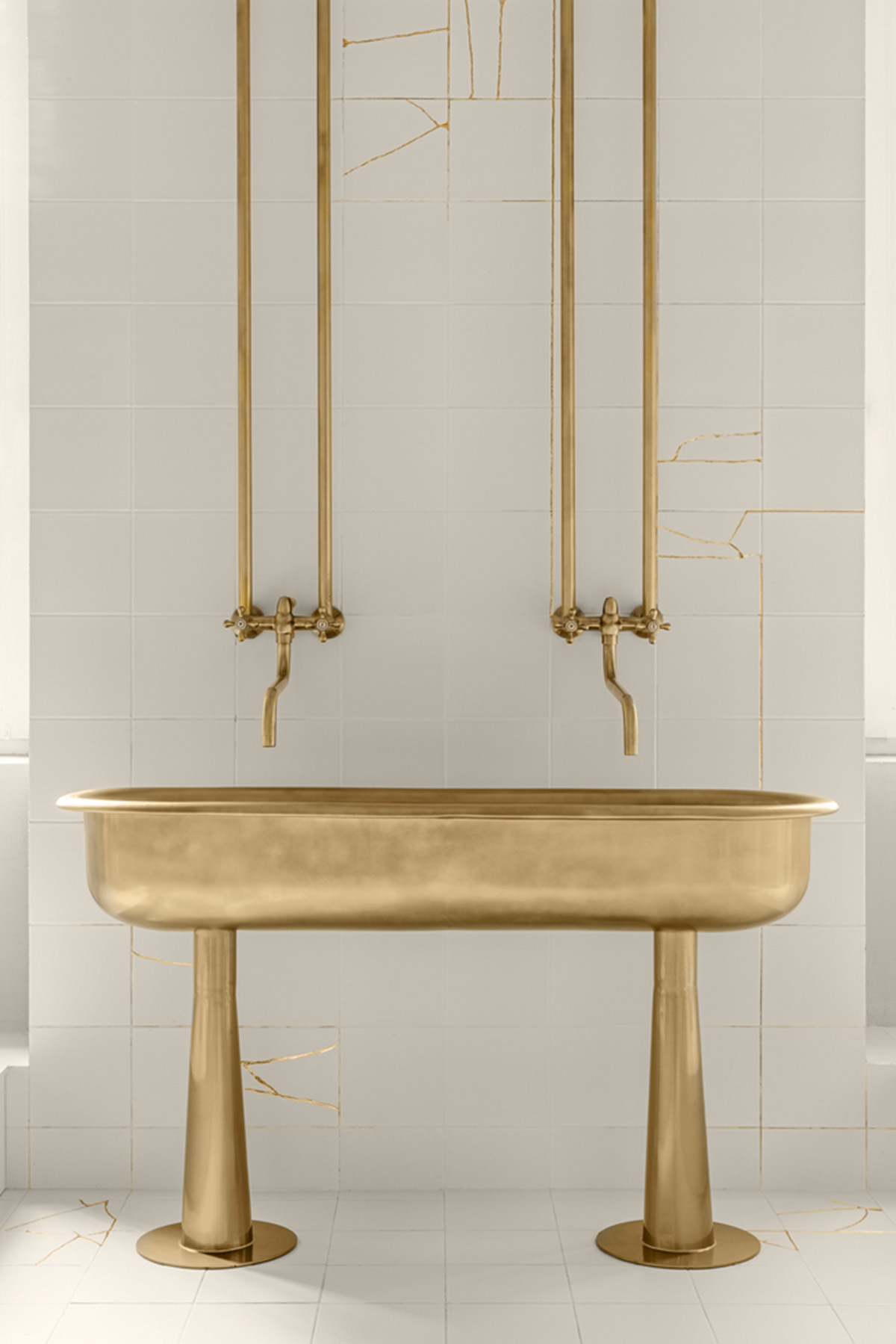
In the middle of the zone, there is a free-standing washbasin that was assembled from two Soviet-era baby bathtubs. Overall, the pedicure zone is finished in light tones with contrasting golden accents, giving it a feeling of cleanness without a sterile look of an operating theatre. Designers managed to achieve the "Berlin of the 60s" effect.
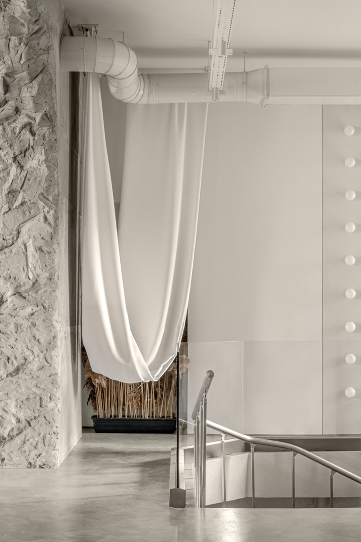
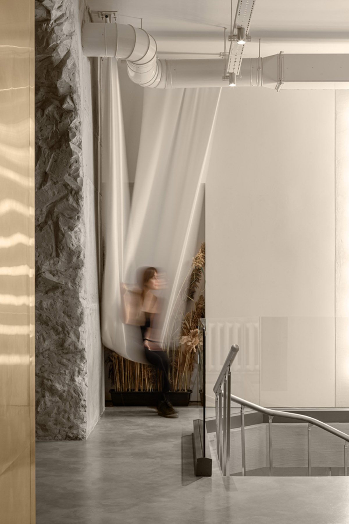
The space also includes a Nail Art Zone. The passage that leads to the nail art zone has a hanging hammock chair, which has become a favorite Instagram spot of the salon visitors.

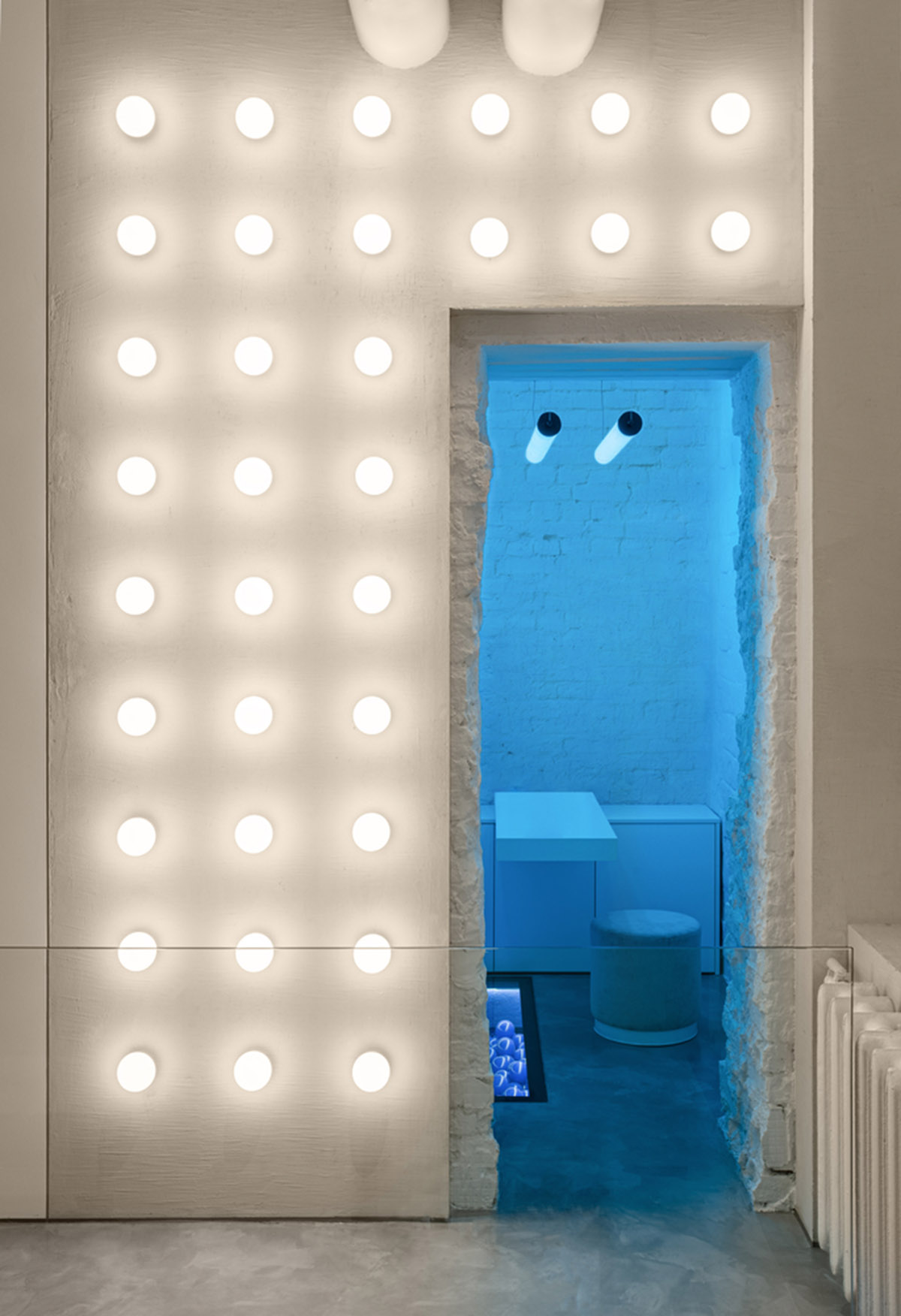
A 2-meter deep water basin was discovered in the nail art room during the leveling of the concrete screed. "Our team decided to keep this unique feature, filling it up with balls the color of the landing; a glass floor was assembled on top of the basin," continued the architects.
Make-up, Washing, Cosmetology and Restroom Zone. Salon’s -1 level is located on the basement floor.
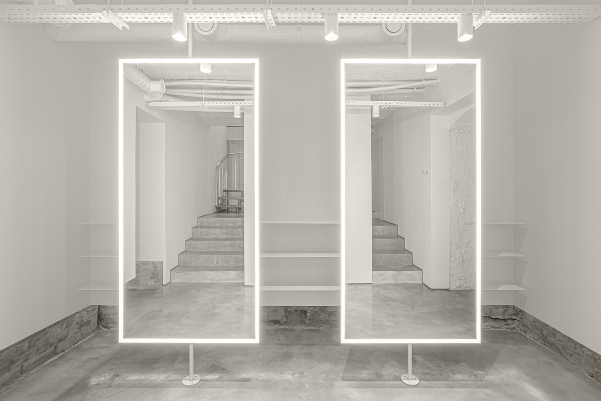
Given the lack of natural light, low ceiling height, and small square area of the premises, the entire floor has been finished in white, with the maximum use of mirrors, which visually made the space look light and airy.
"The salon’s name – Say No Mo – is in tune with balbek bureau’s approach to this project. ‘Say No Mo’ to the traditional point of view on designing beauty salons, gender distinction, ordinary solutions. And ‘Yes’ – to the flight of imagination, creativity, and aesthetics."

Floor plans

Axonometric drawing
Project facts
Project name: Say No Mo Beauty Salon
Architects: balbek bureau
Location: Kyiv, Ukraine
Size: 200m2
Date: 2020
All images © Yevhenii Avramenko
All drawings © balbek bureau
> via balbek bureau