Submitted by WA Contents
Detailed plans unveiled for Google’s first UK headquarters by BIG and Heatherwick Studio
United Kingdom Architecture News - Jun 01, 2017 - 17:05 23636 views
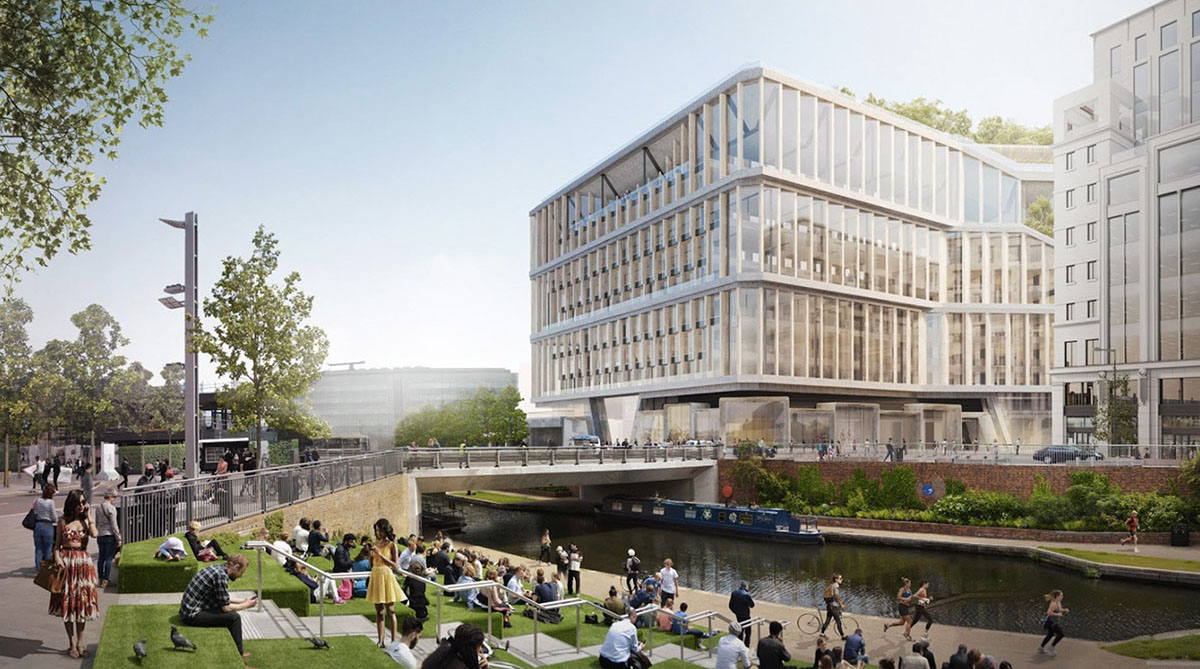
Detailed plans for Google's first London Headquarters have been unveiled and submitted a detailed planning application to Camden Council. Google works with BIG and Heatherwick Studio for its new major project - the team is also designers of Google's Mountain View campus - it's new images was also unveiled in March.
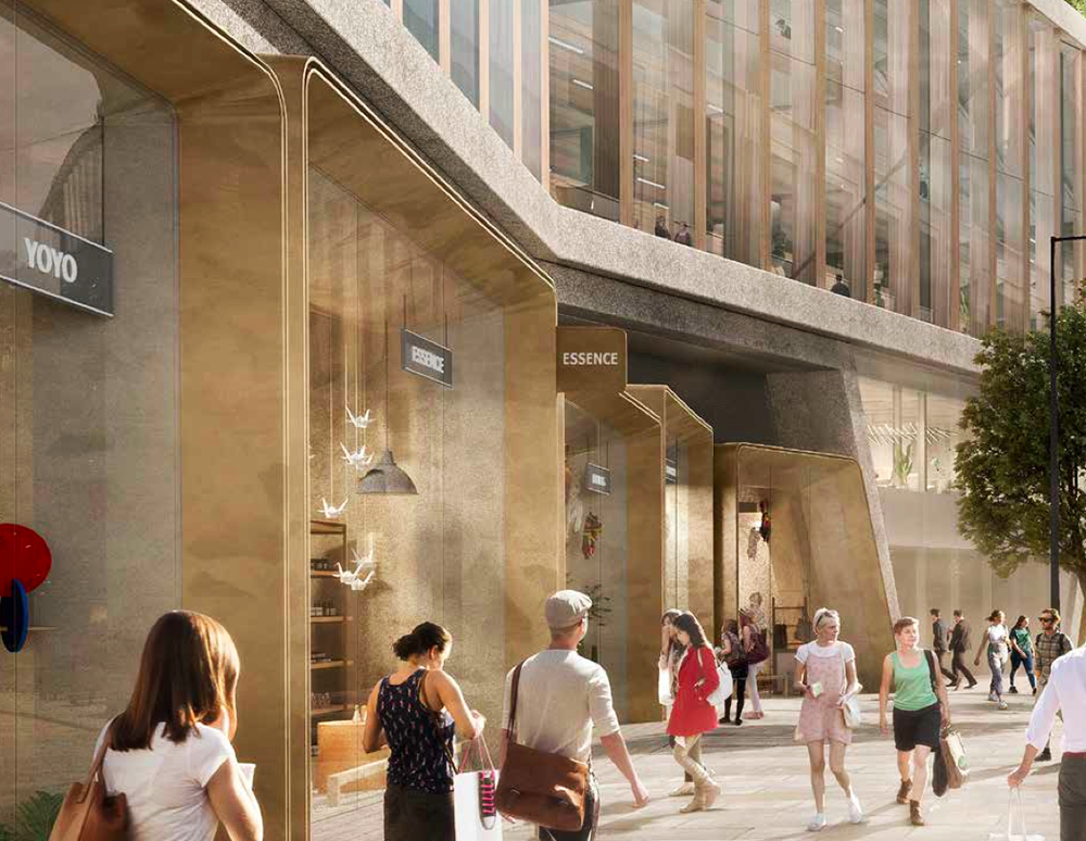
Google's £1-billion London HQ -called the Zone A Building - will be its first new building outside the United States. Sitting on a giant "plinth", the slightly sloped 11-storey building will include offices, shops, a three-lane 25 metre pool, multi-use games area (hosting basketball, five-a-side football or badminton), a gym and a huge landscaped roof garden.
"Google has signed an agreement for Lease with KCCGPL for a building on Zone A and has already committed to a further two buildings on the King's Cross site to accommodate different areas of its business, specifically: Six Pancras Square which is already occupied; and Building S2 which is currently under construction," mentioned in the report.
With the completion of these buildings, Google will accommodate 7,500 employees across these three offices. The proposed scheme for the Zone A Building shows Google’s vision for high quality, sustainable design that will provide a dynamic and flexible working environment for up to 4,500 employees that are expected to use the building each day.
"From a programme perspective, Google are looking to create an inspirational place for its employees. To achieve this, the design team have focused the plan around three large continuous stacked floorplates that provide a range of single, double and triple height workspaces with a unique volumetric quality," the team explained their design approach.

"These warehouse style floorplates provide the opportunity to create continuous desk space and a flexible working environment that is capable of change as the business and ways of working evolve."
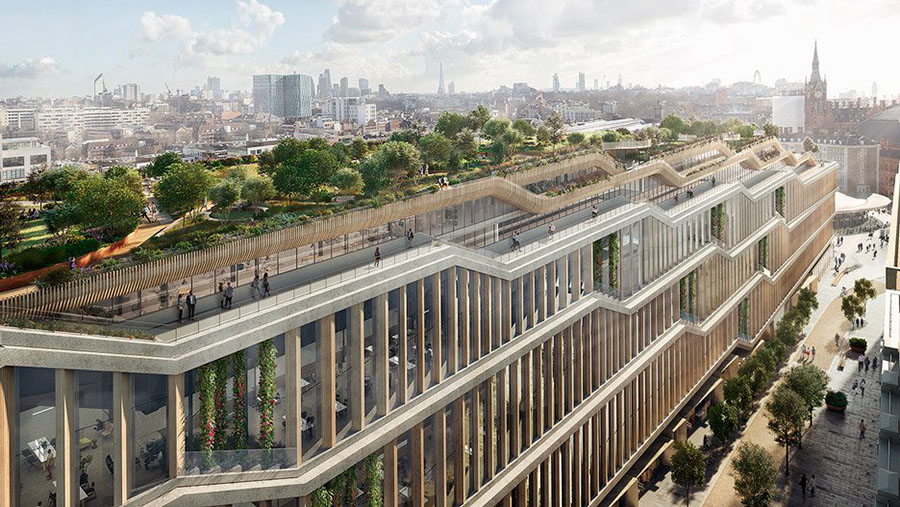
The building will consist of between 7 and 11 storeys of office above retail uses at ground floor and an extensive landscaped roof. At roof level, landscaped terraces and a walking "Trim Trail" will provide outdoor amenity and recreation space for employees.
The Zone A Building will have its own basement for servicing, as well as utilising some of the loading bays in the SSY. The basement will also contain, plant, refuse/other storage and car/cycle parking. Access will be provided by the existing ramp and a designated entrance to the cycle store, both on Goods Way.
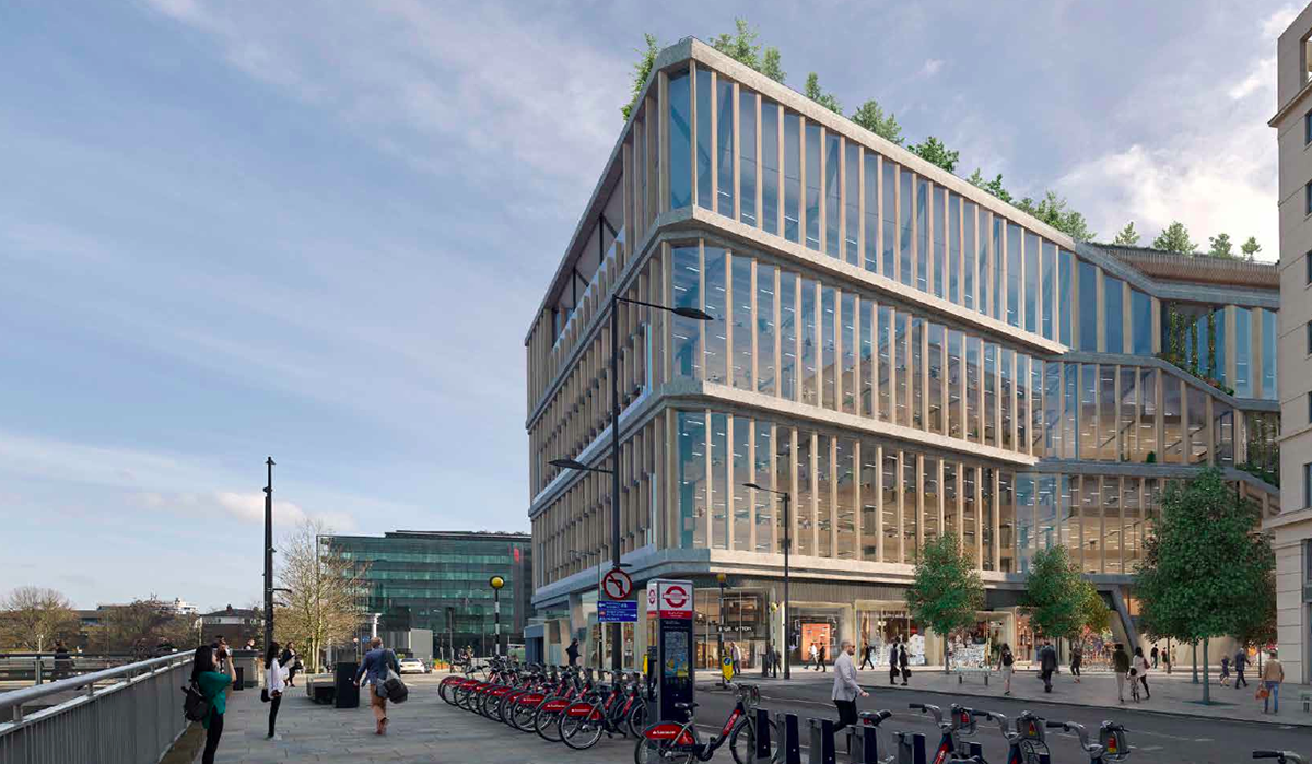
Overall, the Zone A Building will provide a total of 80,819 square-metre (GEA) of floor space, excluding basement. Of this 76,137 square-metre space will be office use (Class B1) and 4,376 square-metre of retail (Class A1) at ground floor. The basement floorspace, which is spread across two levels comprises an area of 11,084 square-meters.
The submission site comprises the building itself and some landscaping to the north, west and south of the building, which covers part of Goods Way, the King’s Boulevard and Battle Bridge Place, respectively.
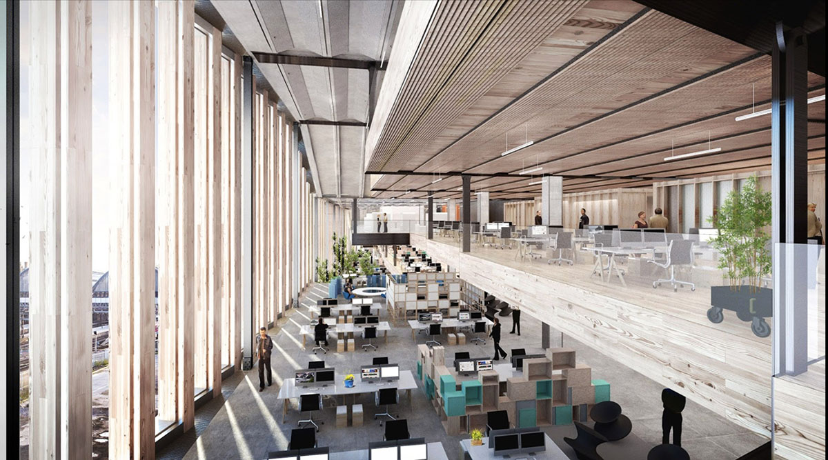
The team in the report specifically described that instead of designing 5 building typologies, the building is split into 12 parts and each of which has own identity and these modules are scattered systematically within the building.
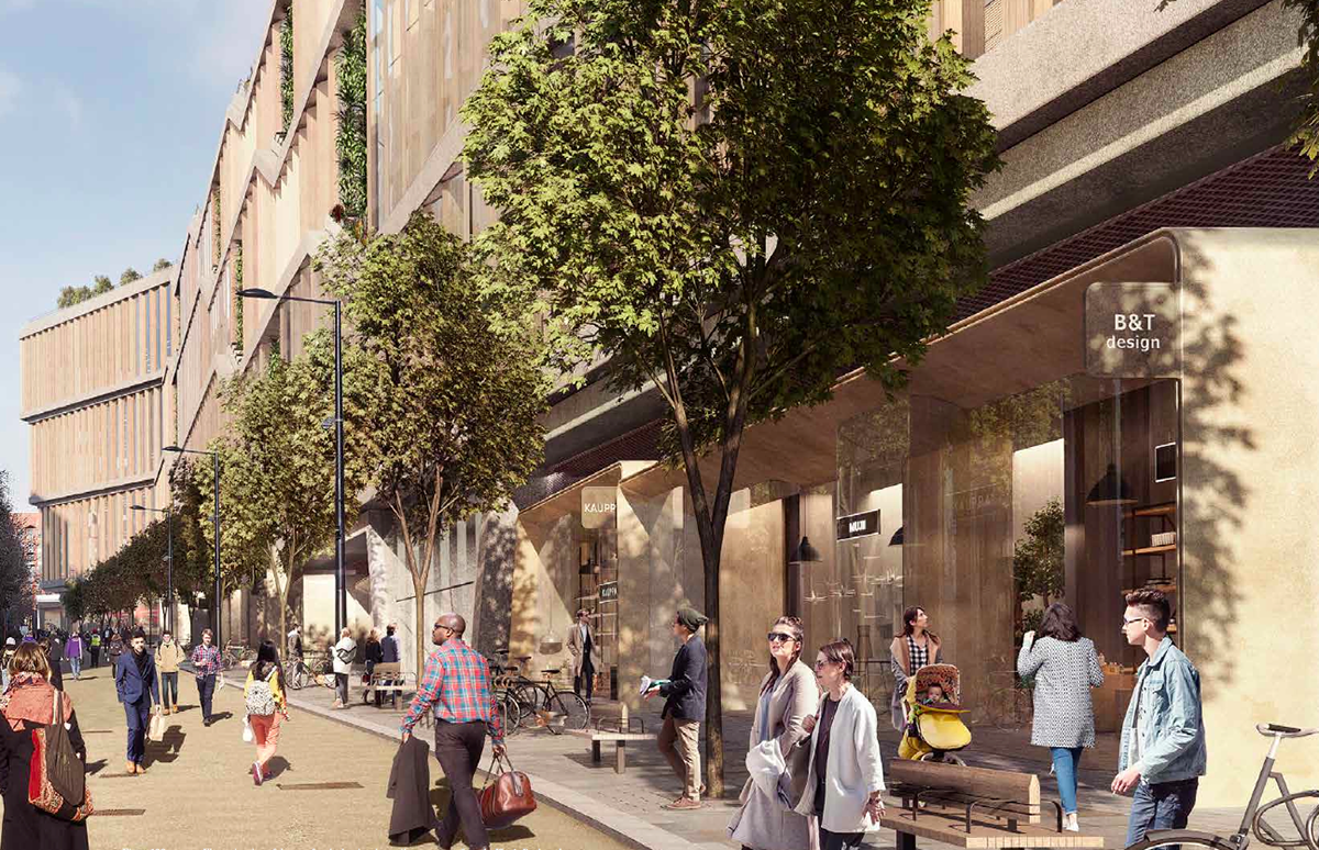
BIG and Heatherwick Studio implemented a number of scale and massing strategies across the Zone A Building in order to create visual interest and make the building and its functions legible when viewed externally.

"The gentle, graded stepping of the main massing with angled interfaces, subtly mirrors the slope to the south, bring the massing down to Battle Bridge Place. Where the layers fold, as they meet the next higher layer, the transition is marked by a planted terrace, or façade garden," stated the team.
"When combined with the other concepts, particularly the atria at the perimeter and the double/ triple stacking of the floorplates, it seeks to deliver an elegant, graded mass which responds to the urban context that surrounds the building."
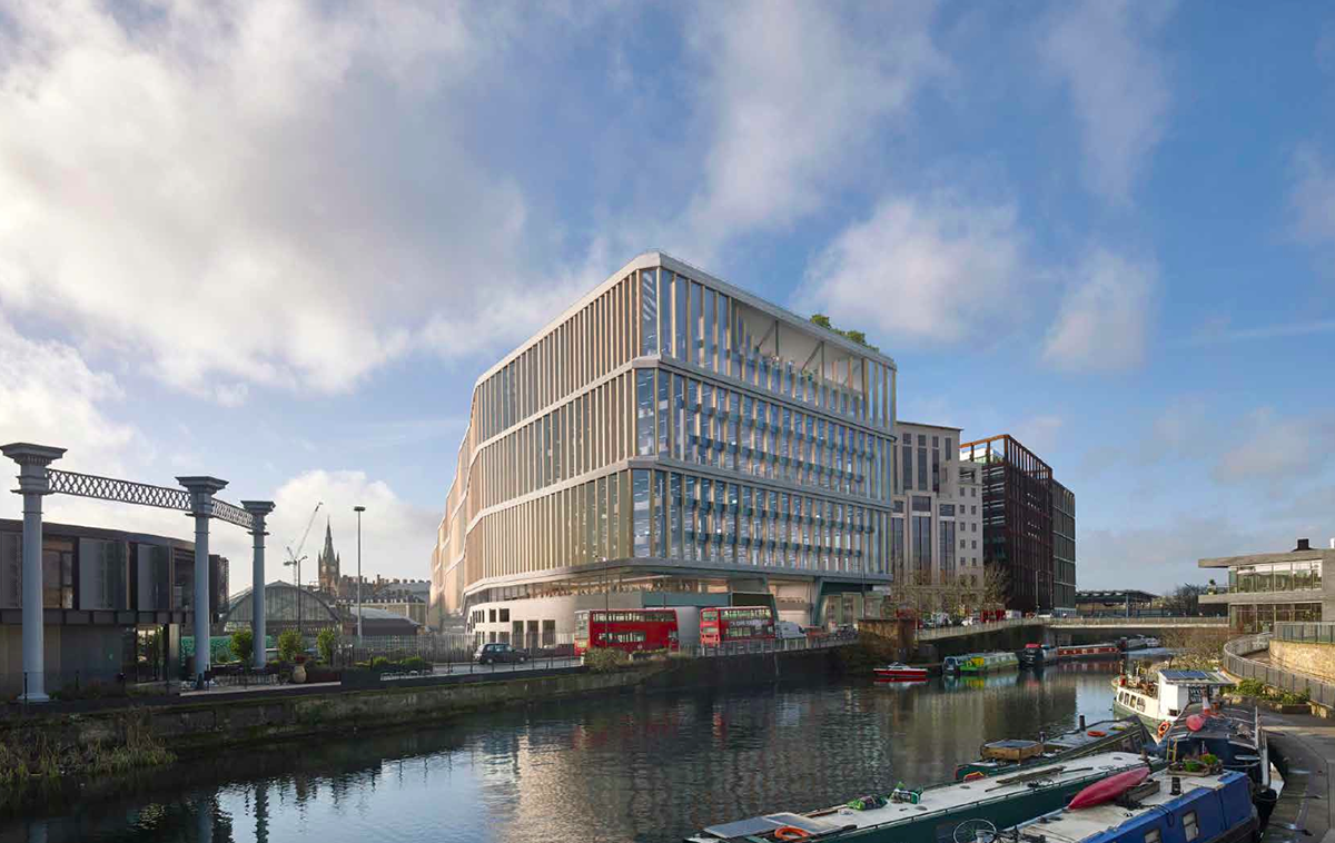
The building is essentially organised in a tripartite arrangement, with the form represented by distinct bands of "Ground Plane", "Workplace" and "Roof Plane."
Camden Council will also receive comments on the project up until June 21st, and then it will decide whether to let Google and its partners break ground on "Zone A."
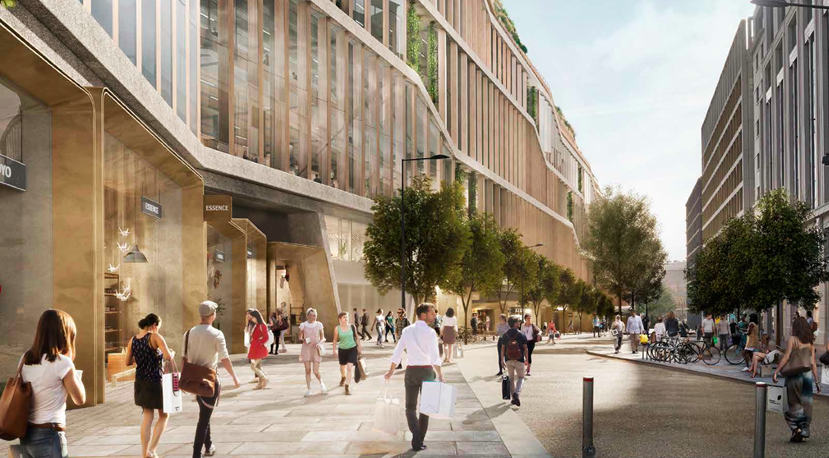
In the detailed report, the architects explain that the scale of the façade order acknowledges the scale and boldness of the stations, which frame the space. Within this two-storey order, a simpler interpretation of the pre-cast structural frame is applied to respond to the geometries established by the dominant southwards thrust of the stations and smaller urban grain of the existing historic buildings.
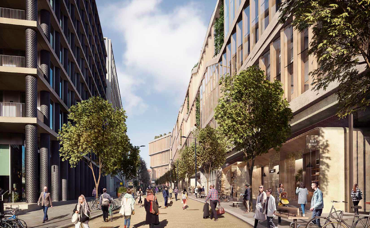
The timber fins take on a more dynamic quality on the south facade, gradually turning to respond to daylight and sunlight, and creating a varied appearance of solidity and transparency throughout the day.
This variety picks up on the robust historic station architecture, which includes significant expanses of solid masonry facade, and the more transparent elements of newer buildings in Zone B or the German Gymnasium.
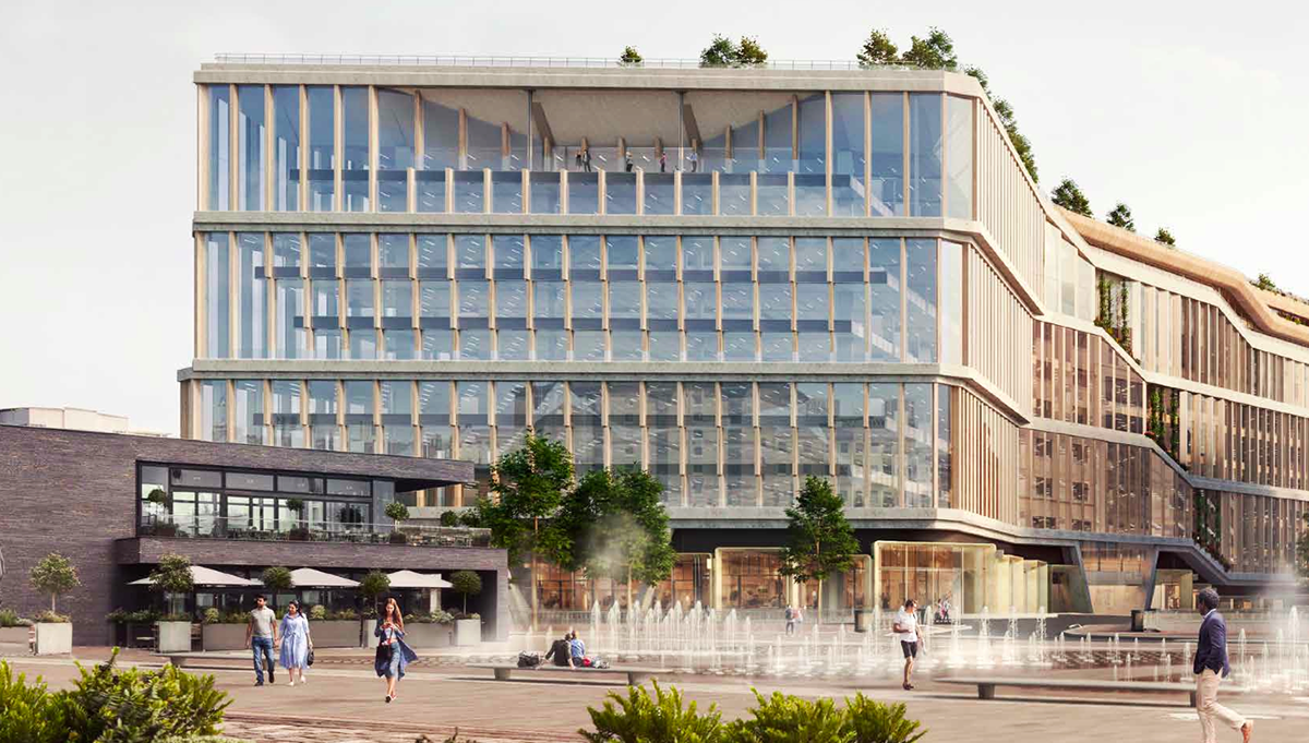
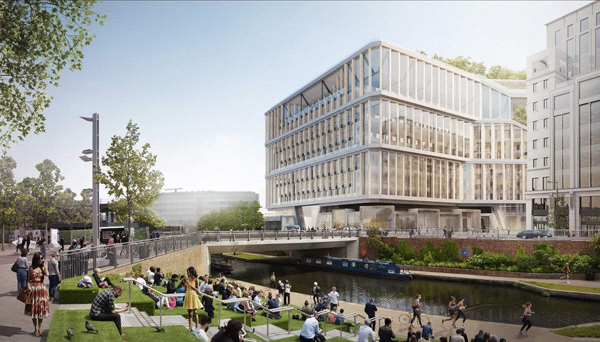
The view of the north and east elevations of the building within the context of Buildings B6, B5 and B3 along Goods Way, as seen from the Regent’s Canal
The composition of the Zone A Building follows a similar arrangement to its neighbouring Zone B buildings on Goods Way, with an articulated base, middle and crown.
The north façade is based on an expressed structure, and responds to the grid arrangement of these other buildings. At the tenth floor, the façade is set back to create a large recessed balcony which expresses the structural beam, adding further interest and scale.
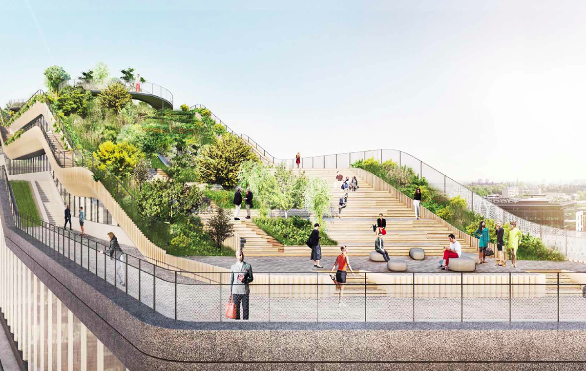
Measuring approximately 300m in length, and between 20m to 60m in width from the south to the north, the roof plane extends from Levels 7 to 11, with further accessible landscaping atop of Level 11. Roof terraces at these levels offer valuable amenity space for office employees and far reaching views across the city.
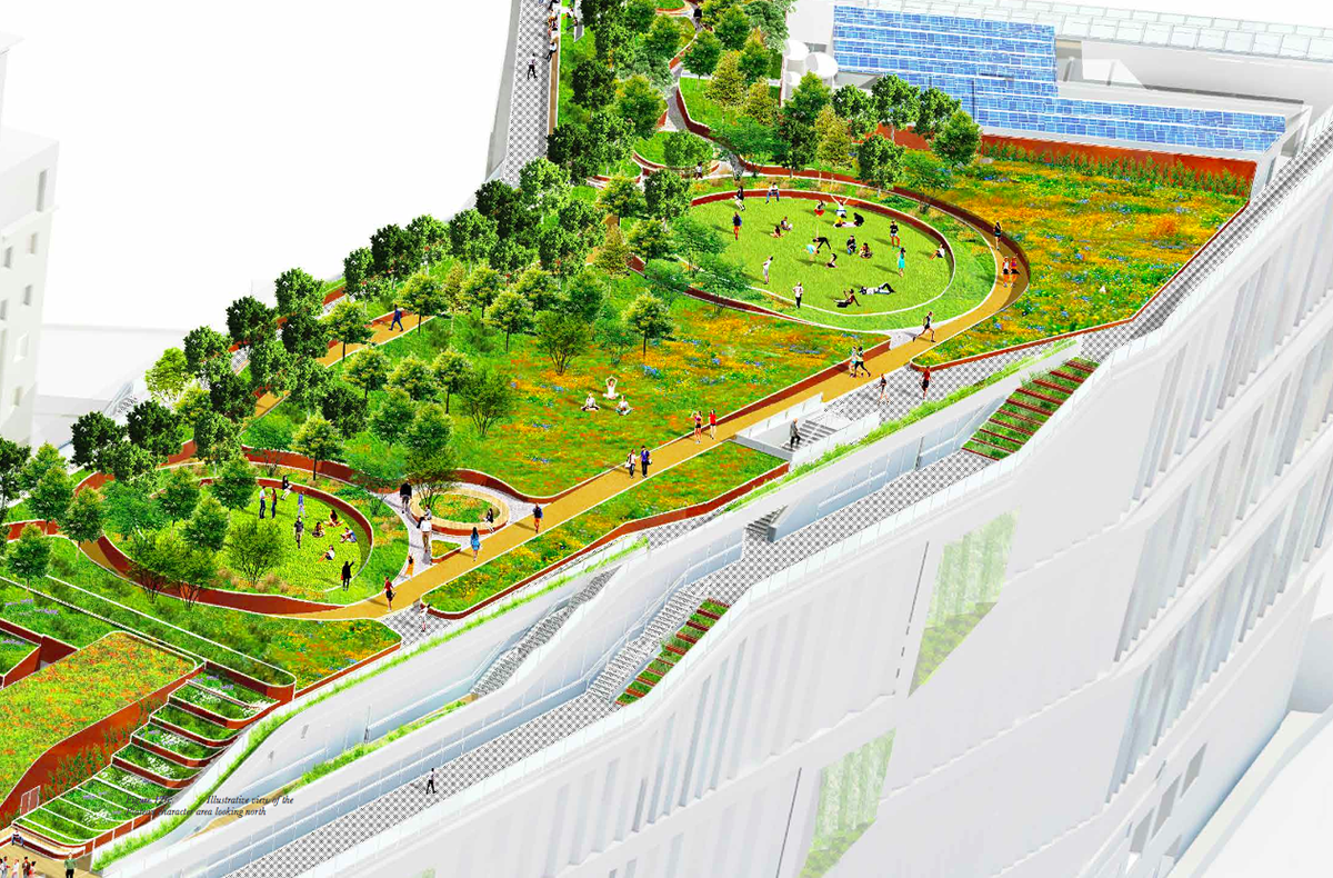
"These spaces are well-integrated into the wider building and therefore access needs to be managed to maintain security for other building users. Consequently, these spaces are intended only for employees or authorised visitors although Google has indicated that it will consider opening the roof gardens to the public on selected days, for example as part of the ‘Open House’ event or similar," stated in the detailed plans.
The design will use the 8,590 square-metre landscaped roof in total, comprising a mix of 60% soft landscape and 40% hard landscape. The rising form of the roof plane creates four distinct character areas that are intended to adopt a unique response to its position and adjacent uses.
All images courtesy of Google
> via Camden Council