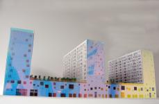
The brief of the competition predetermined the volume and shape of the block. Upon initial review, we wondered why the three slabs of the building were facing each other, and not the main avenue or the new Central Station.
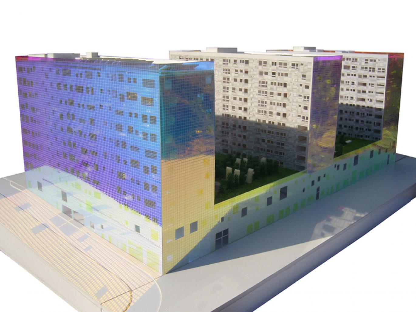
After analyzing the given volume, we understood the decision. The building, rather than creating a façade, wanted to disappear and make the station visible to the city. For that reason, we imagined that two big blocks were subtracted from the initial block to maintain views to the station, leaving a thin silhouette on the site. We started being intrigued by the character of the different surfaces of the building. Some of them had always existed on the outside, but others had been exposed through subtraction. We wanted to illustrate this aggressive gesture by treating these two conditions very different ways, strengthening the necessarily big scale of the project in the area through variation.
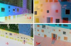
To compensate for the rigidity of the brief and the imposition of the shape we will design a building that is never the same, but rather changes with time and perspective. The originally exterior surfaces will be wrapped homogenously with a layer of diachronic film laminated with glass, a material that can reflect any colour. On one hand, the usage of a single material emphasises the rigid and static geometry of the block; on the other, the diachronic film will provide the building with an ever-changing image. The perception of the colour of the Manzana 5 will never stay the same. We will not know how the building will look until it is finished and even then we will never be able to control its image. It will change from white to red, to yellow, to pink, to golden… It may look stunning, beautiful, subtle, hideous, or delicate, all on the same day.
On the contrary, the inner surfaces will be treated delicately with glass in different white tones.
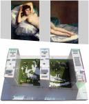
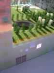
The position of the vertical slabs restricts the views that apartments have to the New Station, the Plaza Sur, or the Avenue; instead they look at each other or the communal garden. In order to make this view a pleasant one we will design the garden with a re-creation of the famous painting La Maja Desnuda (The Nude Maja) by Francisco de Goya, born in Zaragoza in 1746. This painting is one of the best-known works by Goya and the first totally profane life-size female nude in Western art (sic). The garden will feature this painting scaled to 100 times its original size, in pixellated format. It was interesting to us that the painting and the building already had the same proportions.
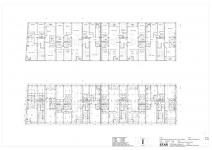
The required program of Manzana 5 is: all 168 apartments, each of which can be arranged according to 100 different typologies, all fitting within the same structural grid and services layout. The smallest is 40 m2 and the biggest is 180 m2. The building provides for 60.000 m2 of residential, administrative, and retail program.
2007
Location: Zaragoza, Spain
Site: Digital Mile neighborhood, in the future Plaza Sur next to Zaragoza train station.
Program: 168 Houses (30 typologies) from 40 m2 to 200 m2
Surface: 60.000 m² (18.100m² residential, 8.500m² administration, 14.000m² retail, 19.000m² parking, 4.500m² green areas)
Status: on going
Client: Zaragoza Alta Velocidad 2002 S.A.
Budget: 45 million €
