Let us explore the Space Planning and Interiors of Arham Surgical Hospital having carpet area of 3720 sq. ft. where every corner embraces you with the Comfort of Home, Creating Calmness in Care.
The Doctor is a renowned and one of the best Laparoscopic Surgeons In Ahmedabad practicing for over 18 years. After successfully designing the Hospital of the client before 6 years, the satisfaction provided, led them to approach us again for designing his Laproscopic hospital at one of the prime locations of Ahmedabad. The client wished to design a soothing, timeless, and elegant hospital interiors with 10 beds and utmost facilities for the patients such that they feel homely in the space.
It was a dream of the doctor to design his hospital accommodating 10 beds that is minimal, timeless, sober, and unique without eliminating any of the requirements.
Challenges:
Initially, there were 7 different shops in the space which client bought. And the client wished to incorporate a lots of requirements in the hospital and that too having a seamless flow in the hospital. The requirements includes:
1. A large and welcoming reception area
2. 2 consultation rooms for the doctors
3. An autoclave and Scrub room with changing area which is indirectly connected with consultation room.
4. 1 Super Deluxe Room
5. 1 Deluxe Room
6. 2 Special Rooms
7. 1 Semi-Special Room
8. A General Ward
9. 1 Minor OT
10. 1 Operation Theatre
11. A medical store
12. A Pantry and Common Toilet
To accommodate these requirements in the given 3720 sq. ft. area was challenging for us because we need to consider the existing beam column structure & drainage ducts which we can’t change while designing the hospital.
So, we had to prepare the layout such that it overcomes the challenges, fulfil all the client’s requirements as well as the rooms can get the abundant natural light & ventilation. Moreover, it should look like a single entity such that the user can experience the seamless flow in the space. Also, it was important to keep the unhindered flow of the outdoor patients without eliminating the privacy of the doctors.
So, we combined all 7 shops and a fresh planning was done as per the Zoning. In the zoning, we divided the floor plate with 2 zones:
a. Private zone for Doctors and Patients in Deluxe and Super-Deluxe rooms.
b. Common activities with Reception area, medical room, and patient’s rooms.
This planning made the space more spacious & interconnected without loosing the privacy of the doctors & patients.
Entrance Door:
Upon the entrance, the user feels the hugeness of the hospital with the 6 ft wide single pivoted entry door cladded with corton steel.
Reception Area:
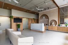
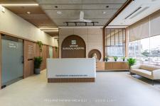
The reception and waiting area is positioned in the south-west side adjacent to full sized glass windows to get ample amount of natural light keeping the space naturally bright. The reception area is designed with a curved theme which highlights the space in a unique way. The reception table is a combination of relwood fluted panels, PU Polish, and corian top which gives a soothing contrast to the space.
The backdrop wall is cladded with peach colored traventine marble where the curved & circular niche with relwood fluted panels highlights the space in a unique way. The ganesha idol in the circular niche creates a serene ambiance in the hospital and spreads positivity upon the entrance. The ceiling is beautified with a combination of micro-cement spray texture & wooden fluted panels in criss-cross pattern which adds a raw and robust look in this space.
The backdrop of waiting area is adorned with a Sanskrit Shlok “sarve santu niramayaha” which is embossed on micro-cement textured Wall, offering heartfelt prayers for the patients to stay healthy. To break the monotony of the cement texture in the backdrop of the waiting area, it is combined with wooden fluted panels. The beige colored sofa in subtle tone gives comfort and coziness to the users. The beige colored Italian marble printed tiles in the flooring gels very well with the overall interior theme of the hospital.
Passage:
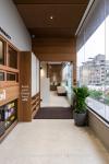
The passage is beautifully designed with relwood fluted panels in criss-cross pattern in the ceiling and combination of the same material with teak wood laminate and stone crete texture on the walls. This adds a warmth to this beautiful corridor. The horizontal profile lights above the doors guides the user by illuminating the space.
OPDs:
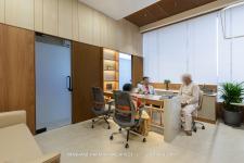
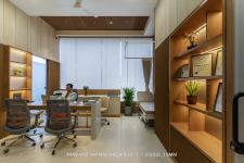
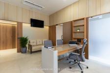
The consultation room is designed in such a way that it is connected with the road side activities as well as entrance through a glass partition. It is designed in such a way that it reflects the professional persona of the client with its charming and soothing interiors. The table here is decorated with the fluted glass whereas the walls are cladded with teak wood laminate, wooden fluted panels and rock finish MCM cladding. The ceiling follows the same design pattern with criss-cross wooden fluted panels which enhances the minimalism of the space. This area is connected with the minor OT for the conveniency of the doctor.
The minor OT is also connected to the Autoclave area, Scrub area and changing room along with Major OT which has a direct access from the passage as well.
Patient’s Rooms:
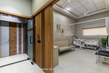
All the patient’s rooms are strategically placed in such a way that it can get sufficient amount of natural light & ventilation which gives a pleasant feel to the patients. The super deluxe rooms are exclusively designed for single patient which is also accommodated with sofa cum bed. The beds here are automated with remote control for the easy convenience of the patients. To gives these rooms a spacious and brighter look, we have used the muted color theme. For the acoustic purpose, the partitions between the rooms are sandwiched and filled with glass wool. The walls are cladded with either matte finish tiles or laminates for easy maintenance and cleaning purpose.
Emergency Exit:
The main feature in planning the activities is the provision of emergency exit cum private entry for doctors in the rear zone. The rear zone is accommodated with the private entry for the doctors and his team’s convenience so that they can enter the hospital without entering the reception & waiting area at the main entrance.
Medical Store:
The medical store is positioned in the entrance itself having the connectivity with the Reception Area which also secludes the patient’s crowd with the internal zones.
1922
2024
Material Palette:
This hospital embodies a proportionate use of earthy & sustainable materials like micro-cement concrete, relwood, & MCM, etc. creating an environment of warmth in the hospital. Whereas the colors used here are soothing combinations of browns and greys making it elegant & timeless.
Ar. Hemang Mistry, Ar. Ashish Rathod, Ar. Vasavi Mehta, Ar. Nidhi Patel, Ar. Nensi Patel, Ar. Mansi Prajapati.


