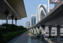
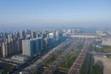
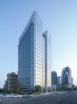
The traditional urban core always appears clustered, with less connection between buildings. Located in the heart of the new city, the Nanjing Vanke Jiuduhui offers a way to respond: The finished city skyline, which intersects with the different architectural faces, is harmonious and different, and the dialogue between the forms creates a diverse and unified interest in the entire urban interface.
Nanjing Vanke Jiuduhui is due to open in 2022. This is the third completed work, after Nanjing Gaoli Xinzhuang Plaza and Nanjing Vanke Shangduhui, located along the Nanjing High-speed Railway.
The project is located in the Nanjing South Railway Station area, which is the core area of the southern new city of Nanjing. The surrounding commercial and residential facilities are complete, and Nanjing South Railway Station is a key traffic node.
The northeast side of the base is adjacent to the Nanjing South Railway Station hub and approximately 100 meters from the South Metro Station, making it a convenient location for transportation. The plot is small and is connected to the residential site to the south, shielding the community from the high speed rail and providing commercial services to the community. To the north is the main urban interface and is located across the road from the Shanghai-Nanjing High Speed Railway. The above-ground functions of the building cover an area of approximately 22,000 square meters of office and 0.3 million square meters of retail, with a building height limit of 100m, positioning it as a Grade A office building and supporting commercial facilities.
At the beginning of the project, the owner wanted this case to become a window to the city on the Shanghai-Nanjing high-speed railway line, with a different image, while echoing the Zendai Himalaya city complex to the west, becoming an important node in the transition from the commercial to the community sector.
Based on the analysis of the site and the demands of the owner, we started with the urban interface along the high-speed railway. Along the station road from west to east are Ximalaya Centre, Jiuduhui, Duhui International and Shang Duhui; at the same time, adjacent to the Shanghai-Nanjing high-speed railway, representing the city gateway image of Nanjing, comprehensive consideration was given to the urban interface and skyline, emphasizing vertical composition along the urban display surface, of which a puzzle-complete interface is still missing, forming a complete and unified urban image with rhythm.
Therefore, the layout of the building towers mainly faces the direction of the Shanghai-Nanjing High-speed Railway, forming a complete urban interface and image. The building is divided into two main volumes, which together with Shangduhui form a group of undulating forms, creating a rhythmic skyline along the Shanghai-Nanjing high-speed railway.
The site unfolds along the north side of the road, with the northwest corner adjacent to Nanjing South Railway Station. On the west side, Mingcheng Avenue is the main city road, adjacent to the Ximalaya Centre and linked to the neighbourhood commercial function of the Vanke Jiuduhui residential area. The city plaza in the northeast corner is used as the entrance to the Princess Office, and is separated from the commercial flow to a certain extent to reduce interference.
The building is constrained by site and planning conditions and has an overall solid massing. There is also an existing tower in the middle of this case. In order to maintain the rhythm of the whole community along the high-speed railway interface, the scheme cuts and divides the massing vertically to make it more upright and to echo the approach of the high-rise buildings along the line. The crown of the tower is treated differently by dividing the proportions and the height of the volume to give it a restrained variation, which is combined with floodlighting to form an iconic shape. The contrast of material, volume and height, lines and depths makes the usual square box rational and vivid, so that people can distinguish it on the high-speed railway.
The design details are based on the principle of green design to suit the local climate conditions. The east-west direction is combined with stone walls and vertical sunshades to reduce the overall energy consumption of the building, while the north-south direction maintains open views and good lighting surfaces.
Typically, the cost of a unitary glass façade is around RMB1600/m2 and a framed glass façade is around RMB1100/m2. This project was designed with a unitized curtain wall, but was limited by cost constraints and needed to be controlled to within RMB1000/m2. The architects iterated and optimized the detailing of the framed curtain wall within the framework of the design system and reduced the area of the glass curtain wall through modelling. The building finish was well maintained despite the limited cost.
During the schematic design stage, curtain wall types were integrated and simplified, based on the 1:30 system master plan, and through collaboration with curtain wall consultants, the practice and cost of large surfaces were locked in to ensure control of the building finish.
The standard section of the curtain wall of the tower is a vertical open and horizontal hidden frame curtain wall. The conventional frame curtain wall will open overhanging windows in the human view position, which will not only affect the line of sight, but also make the façade messy and disorderly, affecting the effect. At the same time, the framed curtain wall is constrained by the fact that it is installed entirely by hand, and it is difficult to ensure the flatness of the glass across the layers, which can easily give an uneven experience through reflection when the glass curtain wall is spliced continuously.
The design of the tower curtain wall weakens the impact of the opening fan on the integrity of the façade by designing the required opening fan below each story, set back one level and using an inverted metal opening fan form. At the same time the recessed shape of each level naturally opens each level of the glass curtain wall independently, reinforcing the sense of sequence of the curtain wall and minimizing the effect of the flatness of the glass.
The east-west orientation of the tower is enhanced by the addition of vertical elements to the basic units of the curtain wall to ensure the shading needs of the building while reinforcing the sense of volume.
The tower canopy of a typical glass curtain walled office building will be fully permeable. This makes it difficult to control the effect as both the structural elements behind will be visible through the glass and the equipment and plant rooms on the roof. At the same time the roof glass will be directly visible to the sky, so it will often appear that the tower canopy is very different from the functional room glass curtain wall, affecting the appearance of the effect.
The tower crown scheme for this project uses a glass curtain wall set back from a cavity with internal lighting. It shades the roof equipment and structural elements, while avoiding back dropping sky light. The façade forms a unified volume. The cavity contains lights for easy access and maintenance, and at night creates a luminous effect of the tower canopy, which is highly visible.
The podium curtain wall emphasizes the contrast between stone and glass. The external C-shaped vertical elements of the podium glass curtain wall are both harmonious and differentiated from the tower. The design of the glass wings transforms the sunny treatment of the glass corners into shaded corners, circumventing the problem of oversized bright frame fastenings in the sunny corners that cannot be reduced in size, and enabling the evacuation exits and their canopies to be obscured, making the glass boxes complete and uniform.
Along the Nanjing South Railway Station, the community interface represented by Jiuduhui the business district interface represented by Ximalaya
Centre form an interesting contrast, reflecting the diverse urban landscape of the southern new town.
This project hopes to express the beauty of rational simplicity and steady modernity. It is a modern and elegant project that will stand the test of time.
Finally, I would like to thank the collaborating designers. After taking over the design, a number of design adjustments were made for various reasons. The partner always adhered to most of the original design, which was one of the key factors in ensuring a high level of completion of the project.
2016
2022
Gross Built Area: 55035㎡
Project location: Nanjing, Jiangsu Province
Photo credits: Zhao Yilong
Design chief: Ling Kege
Architectural design team: Bai Xiaosong, Ao shenying, Dai JIaxi, Tang Liujing,etc.
Client: Nanjing Vanke Real Estate Co., Ltd
Design master control: DuShe Architectural Design Co. Ltd., Shanghai
Architectural Design: DuShe Architectural Design Co. Ltd., Shanghai
Cooperative design: Nanjing Xinghua Architecture Design & Research Institute Co., Ltd.
Curtain Wall Consultant: Shanghai Ruibai Curtain Wall Design Consulting Co., Ltd.
Curtain Wall Design: Golden Curtain Wall Group Co., Ltd.


