An inside of the inside.
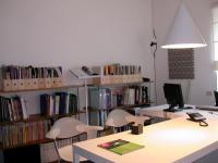
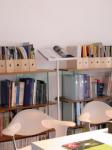
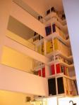
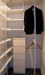
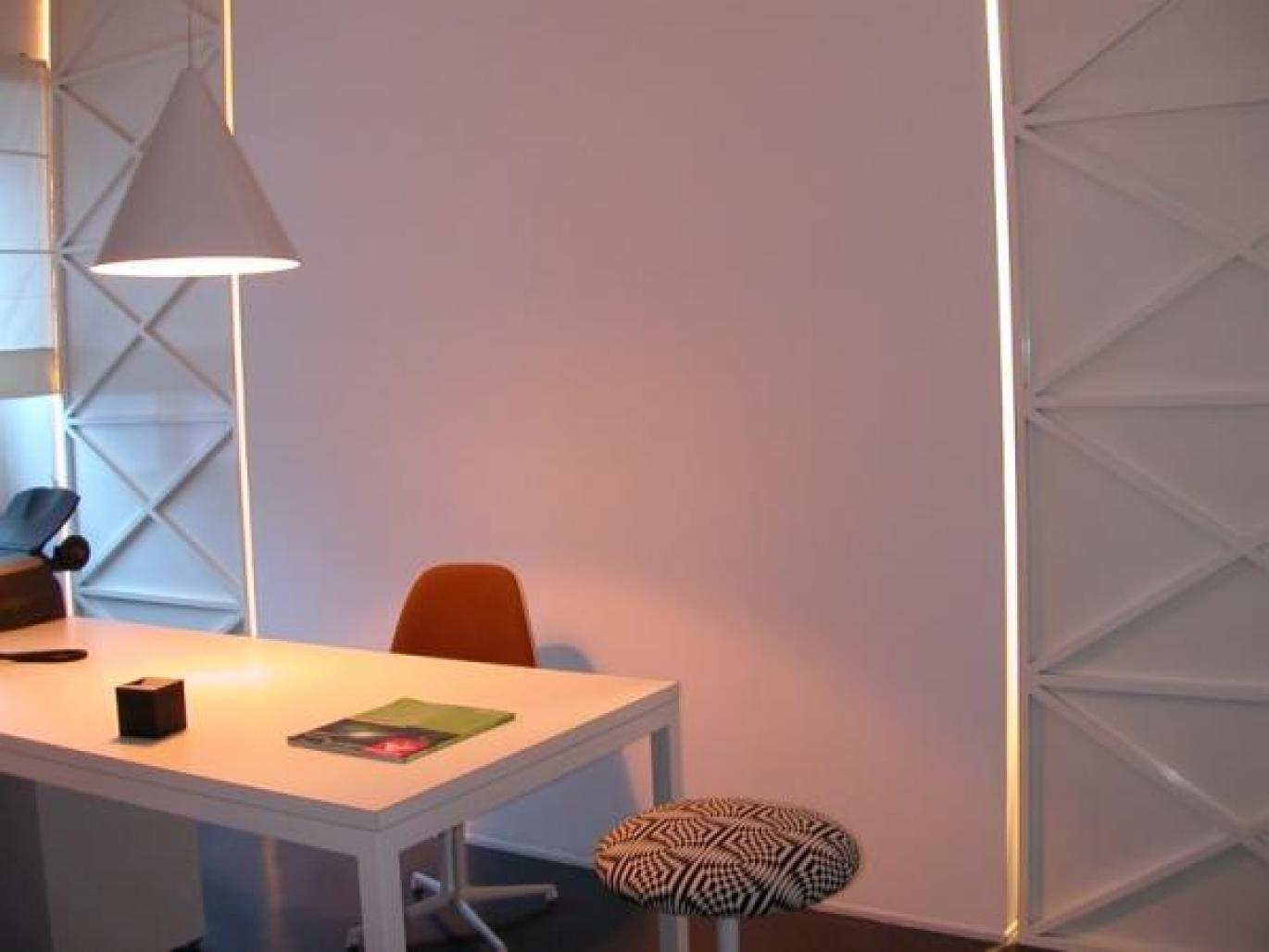
Sometimes projects happen, almost with no effort. This is what happened at the inside of the space of about 28 square metres.The result? A small architecture office and at the same time a place to be isolated: an inside of the inside. An office that when needed can be transformed in a living shelter, a “survival unit” to give oneself, all-nighters or simply to think in solitude. The entire project asks for a hypothesis: designing a house /studio apparently adherent to the needs of the owner, underlining the space character so to make the perception of space discontinuous {and so not granted}. The role of details, in this case, becomes a simple deepening of scale, to verify in some significant points. A detail that is solved with creativity coincident with simple structural elements and home decorating: the centre of the wall that is transformed in a projecting screen when needed, the “door-panels” in all their height that is pierced through by “blades of light ” at sunset, the nearby shelves that continue and reinforce the design, the mirror effects that doubles the decorations and spaces besides following the horizontal lines of the wall shelves, the reading desk that with a fast rotation is transformed into a top {for example for a projector}. At last the accent placed on some functions, for example the paintings made with material designed by architects like Charles & Ray Eames or Verner Panton emphasised in this new use, as to subtract them to a granted dailyness. What prevails is the use of the straight line, synonym of clearness and simplicity, economy, abstraction, the prevalence of bi-dimensional shelves, always strongly accentuated: seven walls, rubber floors, like in public spaces, that increase the sense of border violation between inside and outside. Let alone the central role assigned to light, natural or artificial, with which the projector plays modulating it diffused, soft, in constant dialectic with shadows. But also the abolition of all colours,that derives from the materials themselves, with the prevalence of different tones of white {on the walls like in the works of iron or in the decorations}, from the warm tones of the wood {for example “the pine wood ” in the wall shelves or in the bed space} and the anthracite grey of the floors. A luxury given by the perfection of details.
2003
2003
nicola auciello