Palimpsest Paradigm
Palimpsest: a manuscript or piece of writing material on which later writing has been superimposed on effaced earlier writing.
Paradigm:a typical example or pattern of something; a model.
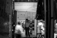
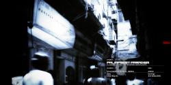
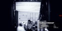
The store was located within the crevices of the old historic core of the old generic yet rigid part of the city of Delhi ."Chandni Chowk" : A place stuck in time and deprived of any kind of modernity. A place hesitant of change. A place whose "Manuscript" and "Paradigms" have been written over the ages dictating its fabric. However, this evolving "Palimpsest of Paradigms" of the built has stopped evolving over the ages. Amit Talwar Associates / Office of Blurred Edges chose to resume this tradition of evolution. We chose to re-write the essence of the existing in the hope to inspire tradition to transcend into a New History.
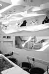
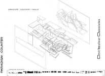
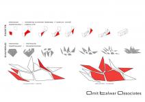
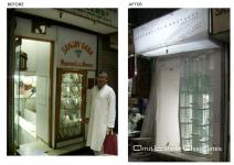
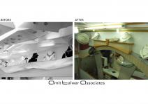
Concept: We treated the Interiors to be a Branding Element for the client who was a Diamond Merchant. So we took the source of the entire of the store to be exactly that- a Diamond. We imagined the Interiors and its gloomy setup as if it were a "cave of glittering diamonds". So every element from the Display case to the Signage Board are faceted in the form of the crystalline shapes of diamonds. The pattern of the wall inlay Mirrors and Lighting around have also have also been incorporated in the form of and "Exploded Diamond". The "Window Display Case", towards the street, was increased to almost double its height as before as can be seen from the "Before/After" images. The design here was to replicate the depiction of perhaps the random playfulness of Diamonds in Nature.
It was unfortunate that change of flooring, furniture, choice of fabric and placement of photos were NOT in our scope of work.
Despite many irregularities, challenges including the lack of availability of educated and skilled labour we were able to produce a "Palimpsest Paradigm" for Chandni Chowk and the City of Delhi
2012
2013
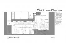
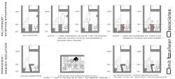
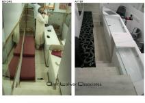
The existing structure was battling with termite infestation, water seepage, and unhealthy sanitary conditions. Our client was in physiotherapy due to atrocious Design Elements which would lead him to be seated for 8hrs with his knees pressed up against his counter. We did an entire study (seen in image 7:Existing Situation). In order to combat existing technical physical conditions , 2 cement sheets + Dupont Corian were used . A new larger Bathroom and a pantry (addition) were also incorporated into the first floor of the structure in the same space. Amit Talwar Associates / Office of Blurred Edges redefined "Standards" to evolve this tiny space into a feasible and efficient work environment. Our battle was down to every minute inch of space. An increase of 4" space due to adopted Design Strategies was a Victory.
Design Partner: Amit Talwar
Project Lead: Jeetika Malik
Architect: Sofia Bertoldi
Intern: Jagriti Arora
Photography: Malini Kochupillia
Contractor: Noor Alam


