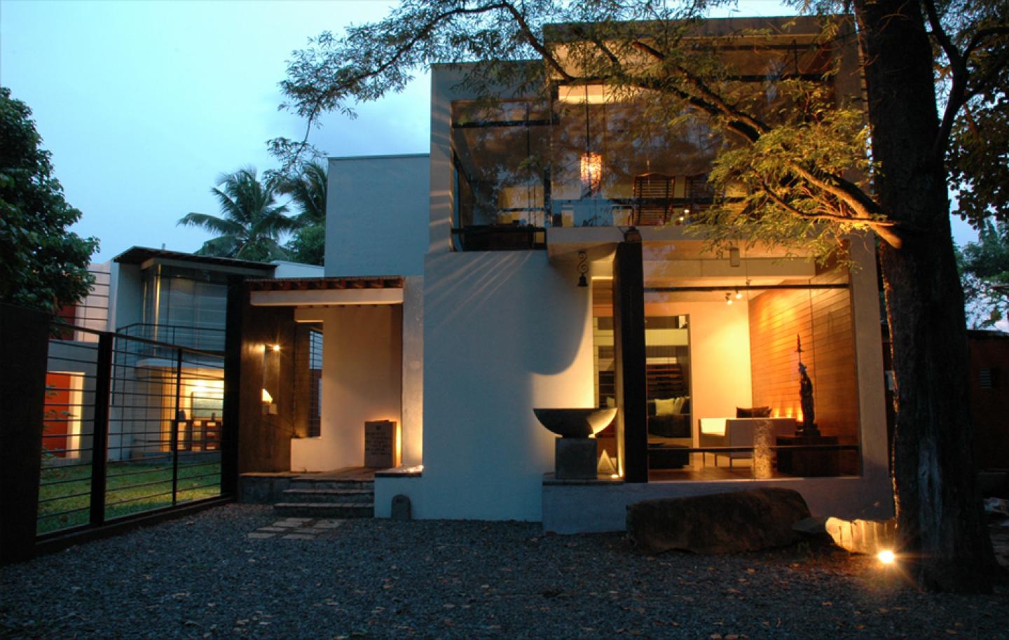
The design of the family home is based on the facts of today’s life style in Sri Lanka where people tend to captivate the global trends. The property, despite being on a suburb, has a strong feeling of nature through its surroundings. The design approach was based on a review of the condition of the site and its shape, and to respond to its surroundings. The functions related to each other had to be considered as well. The ‘V’ shape configuration of the main building allowed the creation of a versatile interior. The different spaces receiving through the house make each other to create many views / vistas. The extension of the interior spaces towards the exterior linked perfectly with its intermediate spaces and makes it blend with the immediate nature. The approach also makes a harmonious relationship between the interior and exterior by its shape and focus, which austerity to reflect the surroundings. Although it is merged by the interior spaces, the house tends to separate its public and private areas by varying the levels, heights and orientations. The detached garage and the small office breaks the continuity of the structure and creates a different identity, and it is also helps to create the balance between the spaces. The placement of the elements of the house to form the whole has made some vernacular spaces too. The garden between the wings could be considered as such space, although the whole structure could be considered as a modern, The feeling of being vernacular adds the comfort to the house. The choice of material used in this house is varying from stone to glass, and to metal, which gives the combination of different feelings of soft and hard to the eye. The shape of the house and the way the glasses have been installed, adds some lighting to the spaces, as well as allows the dialog between the spaces. While there is no sense of the house being ordinary, it still maintains the functionality of a typical suburban family home.
Cubism.... Light & shade.... Soft & hard..... Blend with the nature to give the balance between forms &various planes of the structure. It also helps to get ambient lighting through out the design to penetrate through various planes of the structure........ The vistas have been emerge in various places makes environment more soothing.
2003
2005
The material use in this house is minimal. The main structure was concrete, supported with the steel frame work to hold the large glass panels. The steel screens added the variety to the structure. The finishes are mainly in their original forms such as cement cut flooring, timber decking, and concrete planks used in roof deck etc. All the walls are rough plastered and some are cladded with timber stripes, some walls are painted in aluminum primer with a brush marked finished, while others are standard emulsion paint. The colors are white, heritage red, silver and black.
D.A.K YAPA ASSIST ARCHITECT
KUSHAN COORAY ARCHITECTURAL ASSISTANT
PRIYANTHA PUSHPAKUMAR STRUCTURAL ENGINEER
ARIYASENA BASS HEAD MASON
KRUNE BASS MASON
WILSON BASS CARPENTER
DICMAN (YAKADAYA ) STEEL FABRICTOR


