1. Program Statement:
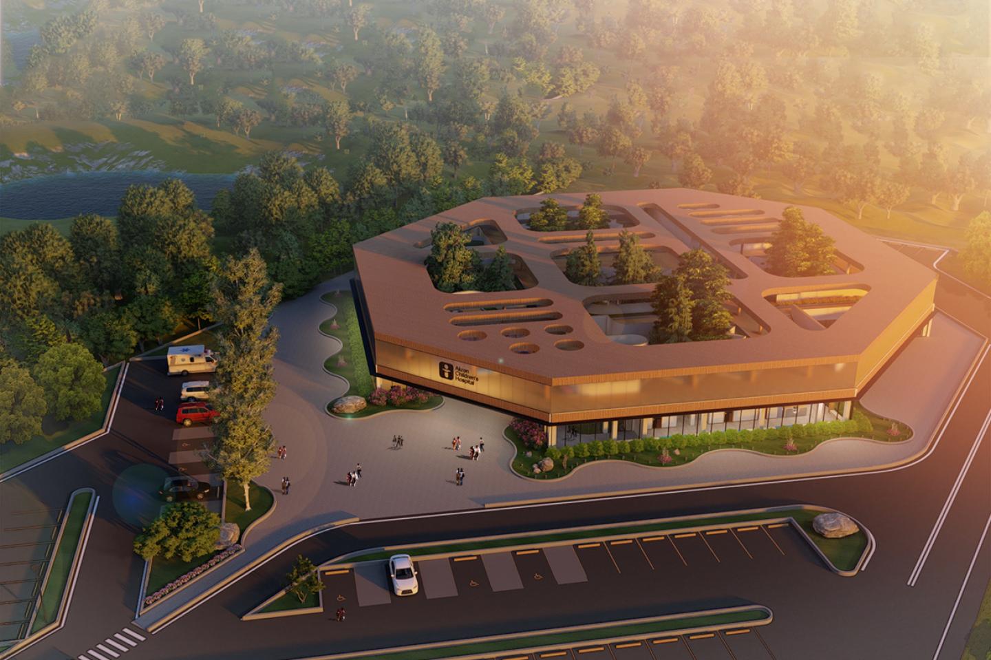
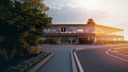
This project is designed as a conceptual building to introduce novel innovations to the atmosphere of a hospital. The pediatric setting and the fact that no budget limit was defined for construction allowed us to fantasize about a clinic designed to be a joyful place, not just an enclosed structure associated with pain and misery. It is designed to elevate the level of imagination for the design of a clinic. It aims to send a message to future healthcare spaces to escape monotony. The design pushes boundaries of functionality and endeavors to present indigenous features and concepts that have not yet been explored in a healthcare setting. It is designed to exhilarate children and even adults and to minimize the horror of visiting a clinic.
2. Design Process:
Akron Children’s Hospital’s current construction site in Ohio was chosen as the design site, since its space programming was similar to the intended project for the studio. The two main concepts of this design were the implementation of courtyards and a roof garden while maintaining patient privacy. The site previously had countless trees, which would allow the building to revolve around those trees as courtyards’ vegetation. The floor plans were all formed based on the design of a unique exam room layout and the arrangement of 30 of them along with other spaces all around the courtyards. The arrangements eventually led to a hexagonal geometry, and five pods of rooms that revolve around five courtyards.
3. Design Concepts:
The primary concept was the use of several courtyards in a healthcare setting, as a solution to introduce natural lighting. The secondary concept was to design an inclusive space for children, adolescents, and adults. the secondary concept led to the execution of a roof garden on top of the traditional spaces of the clinic to be a respite for adults and to satisfy children’s curiosity.
4. Outcomes :
The ultimate desired outcome was to clear the image of stressful visits to clinics from the children’s minds. Measures to evaluate the success could be a qualitative analysis of interviews with parents and observational studies of children’s behaviors from the moment they get out of the car until they enter the rooms and finally exit the facility.
5. Project Details:
5.1 Exam Rooms: Natural Light
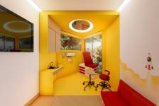
All the exam rooms have two windows to bring natural light inside. The exam area is separated from the caregiver’s area to make the children feel special once they enter the exam area and remedy their anxiety. The exam chair is located close to the window, so they stay connected to the outside world. If they need to lie down, a mirror on the ceiling will depict the surroundings and maintain their awareness of the room. Sufficient cabinet space, as well as a sink, is provided for the physician. Walls have illustrations on them, and a TV will allow for endless opportunities for the physician to elucidate matters or to entertain people in the room. Bright saturated colors bring a sense of prosperity and exhilaration.
5.2 Exam Rooms: Privacy
Exam room pod layouts are around several courtyards scattered through the floor plan to allow each exam room’s two windows and provide a pleasant view outside of them. Since the exam rooms are located next to each other, pods of exam rooms could see through the adjacent exam rooms’ windows ending up in compromised privacy. To solve this problem, windows have a height difference, not letting people see other rooms easily. The foliage will also add a layer of complexity to block windows. Ever-green plants are suggested to be used to maintain aesthetics and privacy matters during the winters.
5.3 Nurse Stations
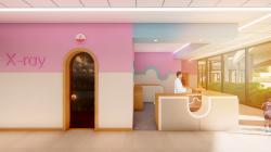
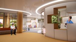
Once families enter the facility, they have multiple choices on how to spend their time waiting for their visit. First, they can take a seat in the lobby. Second, they can let their children play in the play area where there are multiple playing choices, including a pit and drawing desks. The registration area is able to overlook the children if needed to ensure their safety, and parents can site nearby. Third, they can explore the roof garden, which is explained on the next page.
5.4 Waiting Experience
Once families enter the facility, they have multiple choices on how to spend their time waiting for their visit. First, they can take a seat in the lobby. Second, they can let their children play in the play area where there are multiple choices for playing including a pit and drawing desks. The registration area is able to overlook the children if needed to ensure their safety and parents can site nearby. Third, they can explore the roof garden which is explained in the next page.
5.5 Roof Garden
The roof garden is a hybrid of waiting and play area. The goal was to add a layer of excitement to the building for the children. It is a space to explore. With views of the courtyards and with a playground in the middle, it is designed to be a safe place to roam around. Visitors can go up there while they are waiting, or they can drop by before leaving the facility. One issue that arose was people who stood close to the parapets could see into the exam rooms around the courtyards; to remedy that, small gardens are positioned around the courtyards to limit the viewing angle.
2020
0000
Location: Ravenna, Ohio, USA
Project Date: 2020
Total Construction Area: 18100 sqm
Softwares Used: Autodesk Revit, Lumion, Adobe Photoshop, Adobe Illustrator
Student: Parsa Aghaei
Professor: Caitlin Cashner
