The doctor client came to us to renovate his current hospital. The current hospital had the same ambience as any typical hospital.
Now, in addition to being an architect and interior designer, we had to think every activity as a patient, a doctor as well as other medical staff to work out in the best possible ways.
The architect worked on every issue…the patient’s movement, their stay, accommodation, everyday rush of staff as well as their routine activities along-with doctors’ comfort and their medical conveniences were also taken into consideration while designing.
The project size was quite good to accommodate all the services and facilities…around 10,000 sq.ft. The architect worked with a theory of - “The space should not only speak for its users but should also succeed in delivering a simplistic, breathable space with no hint of overdoing.”
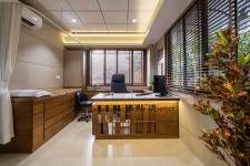
During the planning stage, the architect took some decisive steps like re-arranging the activities for easy movement and better placements. The doctor’s cabin is designed in a corner with good light and air-ventilation.
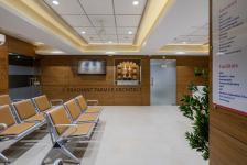
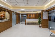
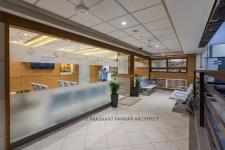
The reception and the waiting area are a neatly designed space with a minimal approach. What brings tranquility here is the technique of using veneer and tiles on walls. The use of tiles made it maintenance free space.
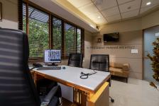
The Doctor’s consultation room is a well-lit space with major use of veneers for furniture and the same tiles on wall for minimal maintenance. And hence it gives a perfect choice to achieve this desirable character for space.
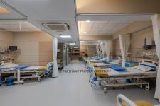
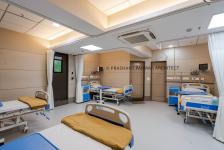
The same material palette and the design concept gets followed across all the passage, all wards and I.C.U. Materials that are easy to maintain and those that meet the standards, efficiently find their place in here. Neat design, adequate lighting, and ventilation suffice to the significance of the space.
This project very well justifies the designer’s art of crafting any space beautifully along with fulfilling the functional requirements of a facility with such multitudes. The ultimate output that gets manifested here is a sober tranquilizing space for the patients to truly heal themselves with a homely feel.
2021
2021
Now, in addition to being an architect and interior designer, we had to think every activity as a patient, a doctor as well as other medical staff to work out in the best possible ways.
The architect worked on every issue…the patient’s movement, their stay, accommodation, everyday rush of staff as well as their routine activities along-with doctors’ comfort and their medical conveniences were also taken into consideration while designing.
The reception and the waiting area are a neatly designed space with a minimal approach. What brings tranquility here is the technique of using veneer and tiles on walls. The use of tiles made it maintenance free space.
The Doctor’s consultation room is a well-lit space with major use of veneers for furniture and the same tiles on wall for minimal maintenance.
Ar. Harikrushna Pattani, Ar. Hemang Mistry, Ar. Ashish Rathod, Ms. Pooja Solanki, Ar. Vasavi Mehta.

