Vodafone Red Academy is an institutional education center having 550 sqm of area in its 8 floors, realized after interior and architectural designs of mimaristudio team.
The compact spaces on all levels of the building, which was formerly occupied by a retail clothing franchise, were designed to house different functions determined by the academic program. Considering the targeted, young user profile, a dynamic but also corporate approach was set as a starting point for the design of the levels. Both the selection of materials and the usage of the color formed the spatial concept based on this approach.
2015
2015
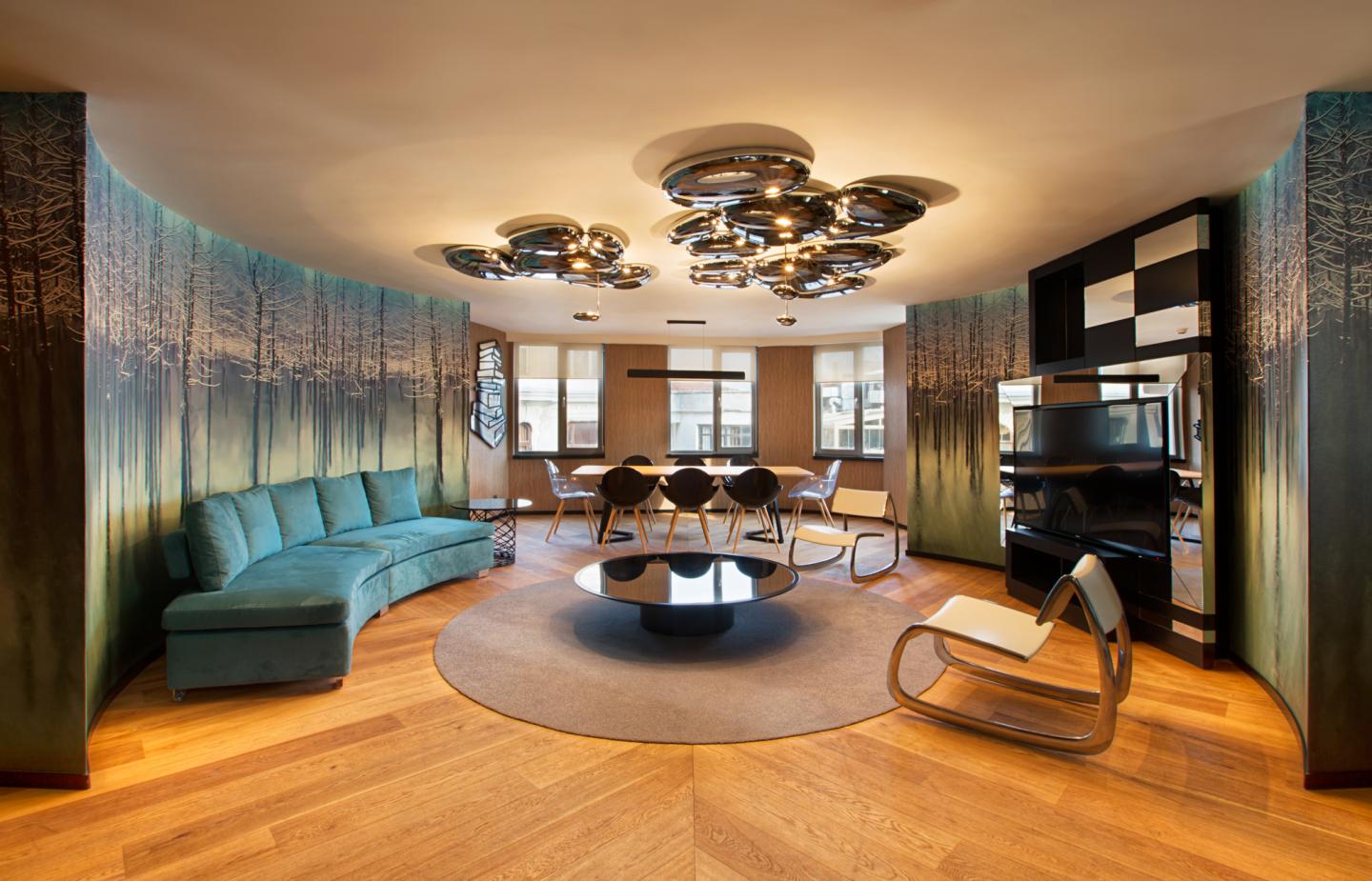
A library, seminar rooms, computer based education spaces, meeting rooms, work spaces and guest hosting services are specified according to the buildings usage. This composition leaded mimaristudio to design all the floors varyingly choosing different materials and deciding different color and texture compositions for each level. An inviting reception space is considered for the library level while the hosting level is designed in a corporate fashion. Levels containing education, seminar, meeting and working spaces are designed with a colorful and vibrant approach considering the user profile and user quantity. These approaches turned these levels with tight spaces, into places that are more entertaining and easier to spend a long time in.
The unorganized form of floor plans are rearranged with an idea of symmetry. All of the floor plans have the same basic composition. This approach provided entrances to be in the core of space in all of the floors regardless the function of the level. However each level is interpreted differently in the manner of interior planning and design due the levels usage. Based on the same approach, the halls are organized so that kitchen, toilets, cloakroom and technical spaces are on the same vertical axis.
Different tiling and applications on both floors, walls and the ceilings also the different design and selection of the furniture, also varying lighting concepts make the users and the visitors of the building easily perceive the independent identity of each level. While porcelain ceramics are used in the common use area floors, the warmth of laminated parquet flooring is preferred in the visitor hosting level. On all other levels different selections of carpet tiles are used both for acoustic needs and for visual diversity and harmony of the spaces. The inner envelope of the building is animated by using varied paint jobs in walls and ceilings and also using different kinds of aluminum profile extrusions and visual coverings in the interiors.
The lighting design of the building is also done by the mimaristudio team as an extension of the spatial design concept. Site specific planning and selections, suitable for the different designs and the functions of the different levels are made. LED technology is chosen for the entire buildings lighting works. Different luminosity requirements for different places are calculated, also decorative lightings are installed in addition to lighting luminaries which compose the general lighting design.
Graphic design applications and visuals are also applied in the interior design likewise other projects done by mimaristudio. These applications which intensify the identity of each level are designed by Ideas of mimaristudio team and the work of Future-ist Design and Colsultancy. This teamwork provided colorful, dynamic and fun visuals which were in harmony with the corporate identity of the client and usage objectives of the building. Both in mottos and in the graphic designs and visuals, the young user profile of the levels is highlighted.
The project, with its design approach and the usage potentials with various alternatives it created, is finalized being fit to its objectives and coherent with the international identity of the client.
Interior design: mimaristudio
Designers: Ayça AKKAYA KUL, Önder KUL
Vodafone Project Management: Muge YALCIN, Tunc DARICI
Project team: Leyla ARSLAN
Photographer: Gurkan AKAY


