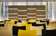
The Corporate Customers Experience Center project performed by the mimaristudio team invited to the design competition organized by the Corporate Sales Department of Turkcell Iletisim Hizmetleri A.S. is a boutique project in the “Levent Ofis” building.
The venue was designed as a center for regularly informing the corporate clients of Turkcell Iletisim Hizmetleri A.S. regarding the company’s products and services. The works were in four months of project and application process performed on an area of 350 square meters.
It is a multipurpose center that not only enables the promotion of the company’s products and services to its corporate clients operating in various sectors, but also assists the corporate clients in experiencing these goods and services. It is designed to be open day and night for sector meetings and promotions. During the design process, the employer’s current needs, past experiences and future visions were combined with the creative approach of the team of architects, and a technological and innovative venue reflecting the corporate identity of the company.
2013
2013
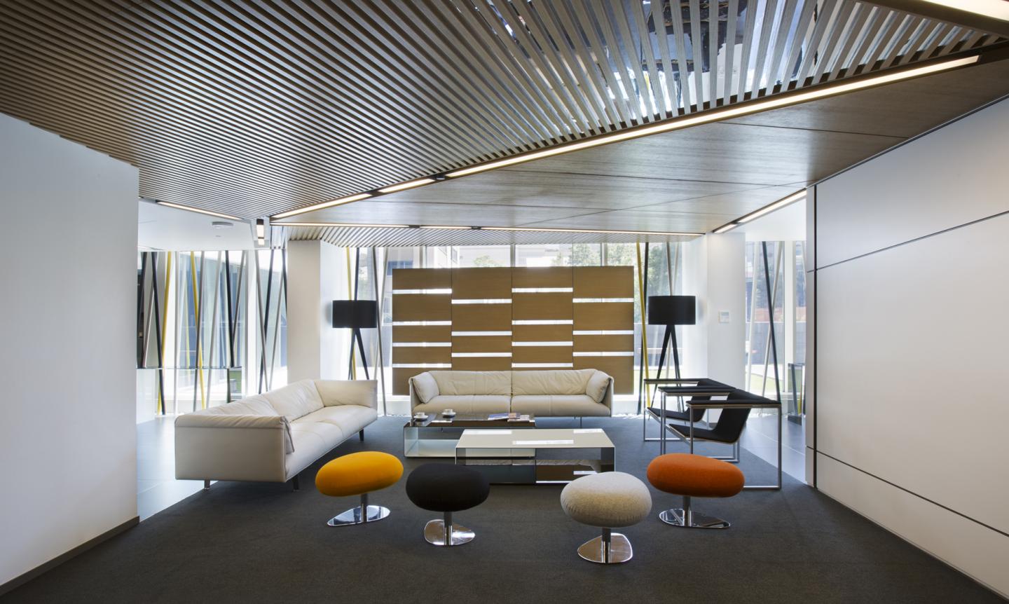
The center consists of three main sections, namely the reception and entertainment section, the meeting section and the experiencing section. Visitors are welcomed in the reception section at the entrance of the venue, designed by mimaristudio. This section that stands out with its distinctive geometrical structure also serves as the master control desk for the audio and video systems in the entertainment section.
The entertainment area, which is the first section, may be used for three different purposes. The area may be used as an entertainment, seminary or meeting venue, by changing the location of the furniture. The video-wall technology with the audio infrastructure also supports these purposes in the area.
The meeting area was designed as a room for private meetings. Equipped with videoconference technology, the room was specifically designed based on the needs of this room, and all products were designed and applied by mimaristudio. The glass wall to be used as a board and the ceiling design that gives a depth to the area are the remarkable details in this room.
The main area of use in the center, which is the experience area, is reached through a technology tunnel. A technology wall made up of screens allows the display of various visuals regarding the company to the visitors, while passing through this tunnel to reach the experience area.
The interior design of the experience area keeps the remaining sections in the background, and emphasizes all products and services. This concept stands out with the colors and the materials chosen for this purpose. It was aimed and displaying all products and services by using light color panels placed on a dark background.
The dominating dark colors in the venue were used in harmony with the corporate color of the company. This color match draws attention in specially designed and manufactured separators arranged unevenly in the façade. This arrangement made for preventing the disconnection of the venue from the world outside also adds dynamism to the venue. Different materials and colors were used in different areas of the venue for different purposes. Warm and inviting materials and partially reflecting surfaces and colors were used in the reception and entertainment areas, while a concept aiming at preventing distraction was preferred in the experience area.
mimaristudio designed all materials, other than the movable furniture, and selected the colors specifically for this project, and had these materials manufactured and applied. The dark colors supporting the corporate colors were used particularly on shiny lacquer surfaces, supported by reflective glass surfaces. The venue was warmed up with the natural beauty of the wooden finishes, and the floors, the ceilings and the walls were designed as pieces of a whole. The natural wooden finishes selected for the entertainment and meeting areas were extraordinarily designed and applied in order to support the acoustic.
The audio and video infrastructure of the venue were designed separately for each area, and applied by Mobinotech. Particularly the video wall technology was designed to serve diverse purposes, with audio support in different points in the center.
The ceiling forms and materials completing the interior architectural design, and the lighting design are also important parts of the venue. The lighting design created by mimaristudio was applied in cooperation with Dark Lighting and Ukon Lighting. The lighting values were calculated and the fixtures were selected in order to provide the ideal comfort and use, taking into consideration the requirements and the architectural expectations in each section of the venue.
The central is indirectly lighted in general by using the led technology, but softer colors were used in the entertainment section, and high-intensity lights focused on the products were used in the experience area. A special lighting control is used in the meeting area for providing different levels of lighting suitable for meetings and video conferences.
The center is a unique venue with an architectural concept and technological aspects reflecting the company’s identity and innovative vision, and it provides alternative uses for the users.
Interior design: mimaristudio
Designers: Ayça AKKAYA KUL, Onder KUL
Photographer: Gurkan AKAY
