Payguru Office is a technology office situated in Arı Teknokent 1, which is the first technopark building in İTÜ Teknokent complex. It is 210 sqm in area and its interior design, project design and site application were all provided by is mimaristudio team.
Payguru is new generation payment platform which gives services like in-app, mobile and subscribed payment also meets all regulative requests. The firm went into an inside company transformation to adapt changing country and business conditions. They decided to start this change from their physical structure which is their office.
2015
2015
Dynamic structure of the sector which Payguru is active and the young staff profile whom will be the new designs main users became the starting point for the design project. The liveliness in the interior architecture style and in the usage of materials in the finishes are references to these aspects of the company.
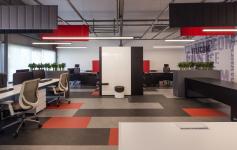
The usage of daylight is prioritized in the planning process so that all of the workplace could benefit from natural light. After the relations between the different internal units of the firm are studied, the divisions between units are decided to be landscape elements. Especially the direct relationship between the office space and the garden boosted the landscape applications that are designed for the interior.
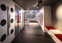
When visitors enter the place, they arrive at a custom made welcome desk after passing through the entrance hall. By this desk area, where the general feeling of the space is captured, there is a hosting place which can be used not only by the visitors but also by the employees. The area which is diversified with a game console is also associated with the service kitchen nearby.
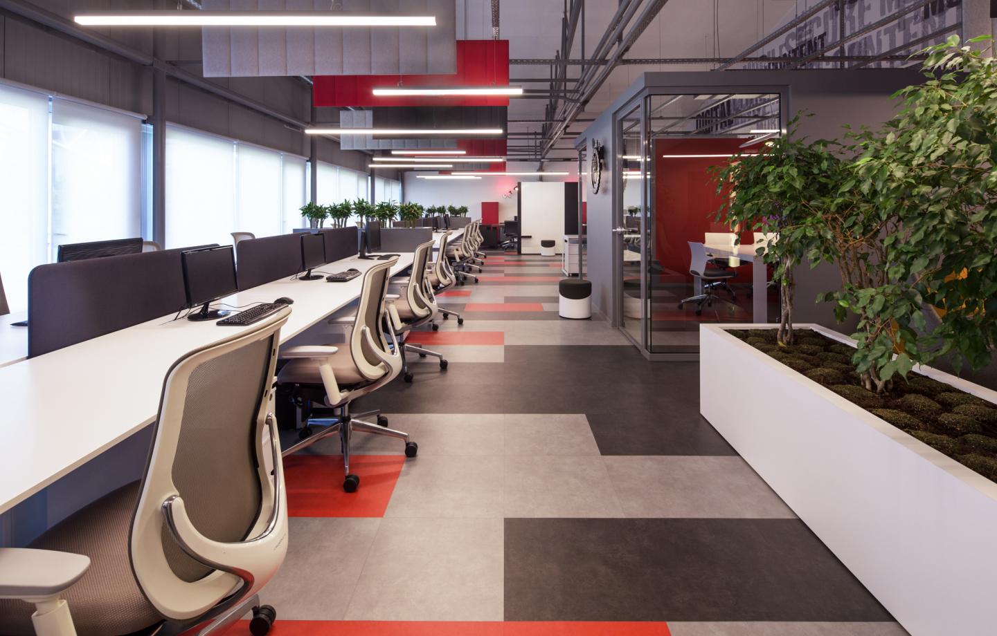
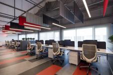
The main space which is right after the entrance area is an open workspace with a balanced planning.
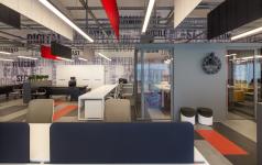
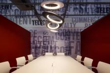
The managers were not excluded from the “open working space” approach due to the companies’ inner organization. Separation is only emphasized in the groupings of the furniture and in the colors used. Also with this approach, senior management working units are solved in a semi open space on an 8 meter working line that also serves as a meeting table. In addition to these, a semi closed meeting room is designed for closed meetings.
Mimaristudio, as their general approach to design, has selected simple building materials that are less in variety and are complementary to the general concept. On the floors, 5 mms of PVC tiling is used upon the raised floor which is rendered to reflect the technological face of the firm. For regulating effect of the spatial geometry of the place to acoustics, panels in varying sizes and colors that are complementary to the design concept are used after the calculations. These acoustic panels are placed in a random order with the lighting fittings forming a complex surface geometry.
Mimaristudio prioritizes the consistency with the general design concept in the design and selection of movable and fixed furniture. While dynamic products with high technology are selected for the office chairs, tables with sharp lines are preferred for the work groups. For file cabinets, products specific for the spatial concept are designed. These products which vary in 3 different colors and different dimensions are more than usual office furniture.
The lighting design of the building is also done by the mimaristudio team as an extension of the spatial design concept. LED technology is chosen for the entire buildings lighting works. Professional collaboration with Crealux firm is made for the lighting consultancy to calculate requirements for different lighting levels for different locations of the project. Decorative lightings are also installed in addition to lighting luminaries which compose the general lighting design.
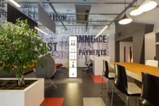
Graphic design applications and visuals are also applied in the interior design likewise other projects done by mimaristudio. The visual designs which consist of mottos are continuous through the entire office space.
They are designed by Ideas of mimaristudio team and the creative work of Future-ist Design and Colsultancy’s. This teamwork provided colorful, dynamic and fun visuals which were in harmony with the corporate identity of the client.
This project is a follow-up of a serie of mimaristudio’s designs for start-up companies and finalized to be a work which is coherent with identity, vision and objectives of the client.
Interior design: mimaristudio
Designers: Ayça AKKAYA KUL, Önder KUL
Project team: Leyla ARSLAN
Photographer: Alp EREN (ALT KAT)
