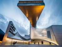
The plot selected for the design of the digital arts museum is in such a spot where the historic buildings of Madrid are dense, access is provided with narrow roads, squares which form urban spaces are rare. To the north of the site the square in front of Valle Inclan theater takes place and to the northwest Lavapies Square takes place. These squares are the of rare spaces that can be found among the densely built attached blocks. In the design of the museum and in the placement of the building to the site, continuity of urban space of these two mentioned squares into the competition plot was a determining factor.Thus inadequate urban space will be increased by the new area reserved for public in the project plot. By pulling back the line of historic building in the plot it was aimed to be respectful to the neighbourig old buildings and at the same time a new urban square was formed. A harmony was sought between the new and the old by proposing the building at in the rear of the historic ones. At the west of the site conference hall is designed at the east of the site museum units are designed.By differentiating the conference hall and the other functions it as envisaged that different users may take advantage of the hall for different densely used actitivities (cinama, music, conference…etc) in different times of the day, therefore museum will not be affected by this density. The roof of the conference hall is raised as a concave part of a sphere like the screens of i-max theaters. Thereby people in front of the building will enjoy an urban screen. In the imax spherical screens 3d display is achieved unlike classic 2d display. Because this museum is not only an art museum but a digital arts museum, users can be presented with 3d shows before entering the building. From the square in front of Valle Inclan this spherical imax screen can easily be seen. The rising volume that houses the other functions of the museum is attached and in touch with historic building in search of a harmony with history. In the first four floors, entrance hall, gift shop, library, classrooms and offices take place. At the maximum height of the historic building which the project touches, the building rises backwards with a curved fashion like i-max spheres and forms the space where temporary exhibition gallery will take place. The backwards movement is a result of the seek of the harmony with the historic building. At the point where building plan is no more than the vertical circulation units, it starts to spring as a cantilever to the road inside the plot, thus these movements define an urban vertical space. At the projecting floor permanent exhibition takes place on the top of which cafe and restaurant were deployed. The main gallery and cafe-restaurant unit are at a dominant level to urban scenery. The curved form starting from the i-max roof of the conference hall, continuing at the facade of vertical gallery, and the harmony sought in the high and low volumes are of the artistic searches that made in a building which will house an art museum. The high volume that contains galleries are enveloped with mesh facade. Therefore solar control was aimed to be provided. The projection of the main gallery towards the city as a cantilever at the hight of 37.50 meter defines the new urban square vertically. In addition to this new square an urban space is being formed. It was proposed that reinforced concrete and steel would be used together for the strcuture. The steel structure forming the cantilever of the main gallery will be stabilized by anchoring to the reinforced concrete envelope of vertical circulation shaft.
2014
Mesh and steel facade
Selim Senin


