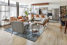
Providencia is a three-level penthouse located in the Del Valle neighborhood, an emblematic area in the south of Mexico City known for its wide variety of multi-family vertical developments. The project is a comprehensive remodeling of the interiors of an apartment, carried out by individually restructuring each of the spaces and the elements within them. The design started from a study of the induction concept to generate a general dialogue. Specifically, the aim was to articulate and imprint a unique personality on each space without losing the overall cohesion of the design through chromatic echoes, materials, and furniture.
The interior design of the apartment takes on significant prominence, as the diversity of architectures coexisting in the area demands a strong presence of interior spaces to stand out in this vast real estate universe. The project's clients work in creative industries. It was essential for them that the design reflected the creative and diverse personality of the family. Each space had to feel unique and full of character to enhance their enjoyment. The project proposed a color palette and materials characterized by their thermal contrast, using woods, textiles, and metals. Providencia is an example of how interior spaces can be a benchmark in the habitability of spaces and a key piece in the dialogue between the project, the user, and their environment.
The apartment is spread over three levels: the public areas are on the first level, the private spaces on the second, and a workshop developed on the third level serves as the main living space and central gathering point for the entire family.
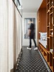
The first level was designed with the most aperture possible to create a sense of spaciousness and fluidity. Each space has a unique personality and is articulated with the others through chromatic, material, and textural articulation. The renovation began at the entrance by tearing down a drywall that significantly reduced the width of the space, which covered the rainwater pipe located behind it. To expand it, custom furniture was created to hide only these ducts and gain 50 cm to place a seat in the center, add shelves, and other secondary storage spaces. The contemporary design of this created a chromatic dialogue with the black and white mosaic rug. This way, the entrance space was expanded to create a more welcoming, aesthetic, and functional lobby.
The bathroom was another distinctive space on this level. Its design was based on two main sources of inspiration: typical mid-century materials in Mexico, such as terrazzo and brass, and the chromatic palette used in Valentino's showrooms. The aim was to create an atmosphere of unexpected luxury and personality.
The living room and dining room were intertwined continuously through a set of independent armchairs arranged freely within the boundaries of this space. In this way, traditional living room models were avoided to give prominence to each of them. To articulate them, rugs and textiles were used as decorative elements to merge these individual elements. Additionally, specialized furniture paintings were placed to give a more complete aesthetic reading to this part of the project.
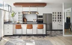
The kitchen was expanded by tearing down an adjacent dividing wall and was inspired by rustic French kitchens to create an atmosphere that encouraged its use. The adjoining laundry area was transformed into a small breakfast nook with an L-shaped bench and a small table. The design maintained a chromatic palette of neutral and cold contrasts with warm details. White dominated in cabinets, doors, and breakfast nook walls with its white subway tile mosaic in a Herringbone pattern arranged at 45°; grays and blues are located in the floor mosaic and countertops; warm tones create specific accents on the wooden veneer ceiling and leather bar stools.
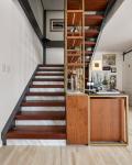
The staircase was another key element in the renovation. A functional piece of furniture was added integrated into the railing that, in addition to being aesthetic, provided greater support and privacy to the circulations towards the private areas. Solid walnut woods were used on the steps and natural veneer covers of the same type of wood in conjunction with the brass-colored steel structure to give greater warmth to this element, creating a sculptural and functional body.
Following this space, in connection with the upper level, a small rest on the stairs served as a lobby and contemplative section to the art displayed on the double-height wall. The clients are avid art collectors, and it was important to pay tribute to their most significant pieces to create a presence that combined art with design to generate a more complex aesthetic proposal.
On the second level, the secondary bedrooms were designed with Nordic inspiration, based on material minimalism and a high degree of functionality to make the most of the limited space of each of them. Each of these rooms' chromatic palettes directly respond to the personality of each of its users. The master bedroom, on the other hand, was distinguished by a contemporary style that combines overloaded elements inspired by Baroque in the plaster moldings and carved wood panels on the end wall with modern decoration and furniture. To break the classic and pure spirit of the first elements, a gray color with green tones was used for the headboard. An important component was the marble and walnut dressing table that was handcrafted to unify the room's furniture materially and generate chromatic contrasts with the brass and the pink reading chair.
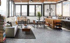
On the last level, where there used to be a guest room with a full bathroom and a small terrace, the workshop space was designed. The transformation involved fully opening the area by removing the interior walls and the roof to the outside. Additionally, the floor was leveled and standardized so that all elements worked in harmony. The project's challenge was to achieve greater openness to the outside, so half-height windows and a glass roof were installed, creating a full double height. This structure was covered with wooden ceilings and natural and synthetic insulators to avoid the greenhouse effect's thermal increases produced by these changes.The workshop has small gathering and creation areas necessary to stimulate creativity. The materials used in this space were used raw, following an industrial inspiration that suited these possibilities. The arrangement and choice of furniture were made with the aim of offering the highest number of possible activities, thus creating a dynamic and diverse space in its interaction with the user. Thanks to this mobility, circulation, and gathering freedoms, the workshop becomes the true nucleus of the entire project's coexistence.
Providencia is a comprehensive interior transformation that stood out for its conceptual approach through inductive changes in each of the spaces. The project demonstrated that it is possible to articulate a solid eclectic general design discourse from the subtlest individual elements. All work together through finishes, materials, furniture, and chromatic palettes. In this way, in an area where exacerbated real estate development requires significant interior design exploration to generate habitability that reflects and translates the client's needs, the project is an example of creativity, attention to detail, and dialogue.
2021
2022
250 m2
Darío Salazar
Denisse Salazar
Mónica Elguea
Alan Mayscell

