The Joan Clinic designed by CAA architects recently has completed and been put into use.
The cooperation between CAA and BCC Group, a leading enterprise in the medical beauty industry, dates back to ten years ago. Based on the design concept of creating "natural vitality", CAA built the first clinic for Joan brand. Now with ten years after, CAA was invited again for its brand upgrading. The project is located in Lido, an international community landmark in Beijing. With a design area of about 1200 sqms, it is divided into two floors, mainly composed of public services and a full-discipline medical beauty treatment spaces.
Today, the medical beauty market in China has reached the fastest growth rate in the world. Under the situation of rapid development of the industry, there has been a mixed and even chaotic development situation. CAA architects intends to redefine the industry standards of the medical beauty field by Joan Clinic’s design, and reshape people's recognition that the medical beauty industry should respect life, pursue nature and advocate art.
The project continues the concept of CAA interior project, showing people's eternal pursuit of "body beauty" in a dynamic and vital space. The overall space is developed around the design language of organic, digital and Oriental freehand style.
01 LIFE CURVE
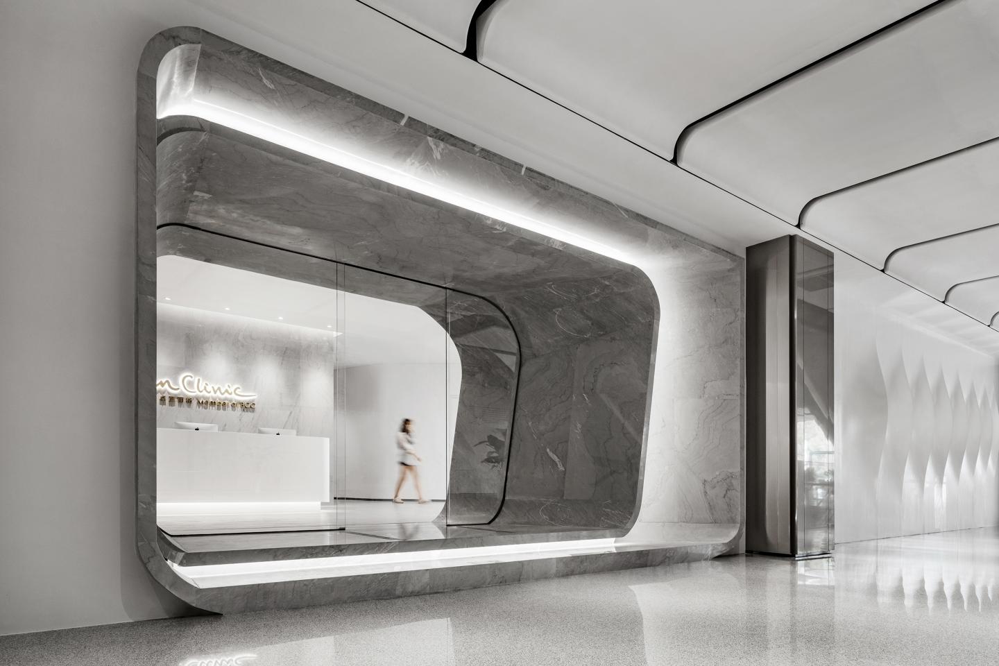
Walking into the entrance facade, the pure and smooth wall is like the skin of a living body, growing with layers of rhythmic and breathing "gills". Soft light and shadow pass through, opening and closing, breaking the boundary between the internal and the external public space of the beauty center, and organically merging the two.
02 TRANSFORMATION OF TIME & SPACE
The entrance is a cavity of three-dimensional curved surface enclosed by light gray natural stone, which becomes the medium for the transition and conversion between the interior and exterior of the beauty center. The enclosure and superposition of hyperboloid further evolves into a "container" to absorb people.
03 NATURAL TEXTURE
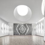
The ceremonial lobby space unfolds along the central axis, and the walls on both sides seem to be endowed with life, opening and closing in rhythm. At the same time, the irregular cracks eliminate the boundary between the reception space and the functional spaces in the hall.
The visual end is a contemporary art work with an image like traditional Chinese ink painting composed by geometric pattern stones. Looking inward from the center, it is transformed from two-dimensional to three-dimensional, like an interstellar space-time tunnel.
04 ORGANIC GROWTH
Enclosed by two spiral staircases, the "cellular" space is a VIP reception area that resembles an elegant and rich living organism. On its skin is the digital texture translated from abstract landscape, conveying the energy contained in its body in the semi-transparent, half-hidden, half-virtual and half-real. In it, people seem to be contained in a matrix, mysterious and quiet.
05 ELEGANT COLOR
In the overall space color system and material design, advanced gray and light gray warm wood grain as the main color of the space, with pure gray and white system. Neutral color, texture and texture combine to present a warm, comfortable, quiet and elegant space experience, creating a kind of Oriental Zen.
06 ORIENTAL CONTEXT
The VIP space adopts the design technique of combining virtuality and reality. The "bamboo shadow" screen is used as the medium of space transformation. The axial symmetric space seems to be separated from each other. Looking through the grid screen, the virtual and the real are mutually generated, and the implicit and hazy oriental aesthetic conception is displayed between half exposure and half cover.
Quoting the Oriental aesthetic master Zong Baihua's description of the ideal state of Oriental art: "Comprehend the subtle and deep Zen state of color from the gentle smile." CAA intends to reflect the traditional Oriental aesthetic ideology of "Gentle Smile", which is not publicity and directness, through the creation of space design.
07 INK PAINTING INTENTION
In the whole space design process, the "freehand brushwork" technique of traditional Chinese landscape painting has been used for many times in the modernist interpretation. From digital translation of calligraphy and painting strokes to the pursuit of elegant texture of ink and wash when selecting natural stones, it is a contemporary interpretation of CAA's respect for traditional ink and wash freehand brushwork.
This is an organically grown digital freehand space experience, which continues CAA's consistent design concept and practice, superimposes futurism on abstract oriental humanistic context, completes adaptive and flexible design for the medical beauty industry, and defines the brand from the dimension of space to a new height.
2022
2022
Client: BeauCare Clinics/BCC
Category: Healthcare
Design Area: 1200㎡
Design Date: 01/2022
Completion Date: 10/2022
Status: Completed
Designer: CAA architects
Lead Architect: Liu Haowei
Technical Director: Leo Dy.Aojima, Miriam Llorente
Project Manager: Zhang Pan, Luo Xuan
Design Team: Ye Wenjie, Li Shuyao
Cooperative Building Material Suppliers: Qi Ku (Bei Jing) Architectural Decoration Material Co., Ltd; Shanghai Keding trading Co,. Ltd
Construction: Beijing Zhongzhu Hongcheng Construction Engineering Co., Ltd.
Photogarphy: Boris Shiu


