A Steel and glass garden for AMPM!
A garden is a place for all ages, interestingly planned for display, cultivation, contemplation, and indulgence. Taking off from Chinese tradition a Japanese philosopher once observed that a zen garden can be made in places where there are no lakes and streams. If this statement is true, A cacophonous modern Indian shopping space is probably one great place to attempt the idea of zen.
An apparel store as a Zen garden!
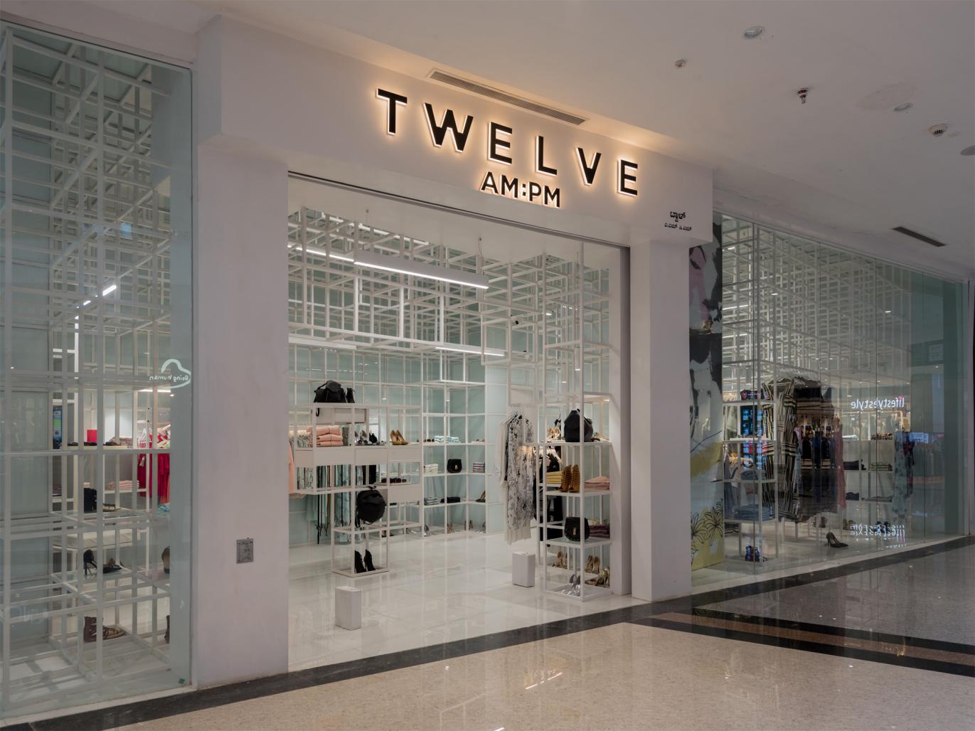
AMPM an offshoot of the apparel brand 12AMPM, decided to shed its ethnic identity and moved forward to address the aesthetic demands of the ever-evolving contemporary Indian. The fashion designers at AMPM consciously stripped the elements of decoration and adopted the idea of reduction and abstraction. A Zen or Zen gardens to be specific share a similar idealogy of expressing nature through abstracted forms, transmitting very profound thoughts through its simplistic existence.
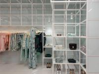
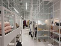
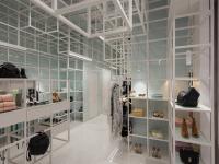
It is this commonality that interested us as Architects and Interior designers as we decided to express this strong relevance through the built form. In Zen a piece of rock and spread white sand and pebbles reflect the idea of mountains and fields. At AM PM our intent was to recreate the idea of a Zen garden with trees and other natural elements reduced to geometrical grids, scooped and pixelated at various points in 3 dimensions to create an axis, access, movement, display, and indulgence.
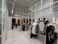
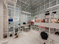
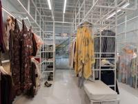
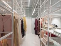
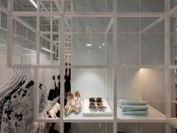
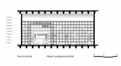
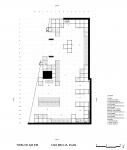
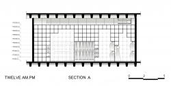
The given space is defined by a series of girds stacked in the x, y, and z-axis, creating an enclosed system as in the Zen garden. Then layers of information constituting various zones, ingress and egress points, method of display, movement, and pause points were overlapped to create a meandering system and then subtracted from the 3D grids resulting in an interesting spatial definition. The series of grids provided order and the meandering system created strategic chaos.
Steel and glass were chosen as mediums of material expression given their versatility to generate visually hazy space creating transparency, translucency, and opacity at required zones. The highly reflective wall and floor surface further enhance the ambiance providing a soft tender to the space. The neutrality of the space creates a gentle backdrop and allows the objects on display to take prominence.
Artificial lighting follows the system of grids and by carefully organizing generates a sense of definition and organization in space.
2015
2016
TATA / Mild Steel 25mm Square Pipe
Saint Gobain / Lacquered Glass
Design Team: Senthil Kumar Doss, Deepak Ramadasan, Mahesh Pandian, Deepan,Prathiksha, Seetharam, Harish, Prasanna Kumar, Subashree, Sreevanth, Shradha, Niloofer, Siddesh.
Project Incharge: Dinesh, Periyasamy P.
Fabrication and Carpentry consultant: Saravana (Om Shakthi Engineering and Fabrication)
Lighting consultant: Ar. Anusha ( Lighting Spaces )
