The design needed to satisfy basic office functions while conveying the client's corporate culture and spirit.
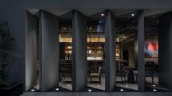
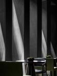
Black ceramic atomization coil with metallic film is a representative product and technology of SMOORE. In response to the client's requirement, the design team adopted a tasteful dark color palette as the main tone of the space to echo the product. The jagged array of grayish black screen walls set at the public area brings in daylight, which guides visitors into the office area.
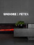
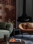
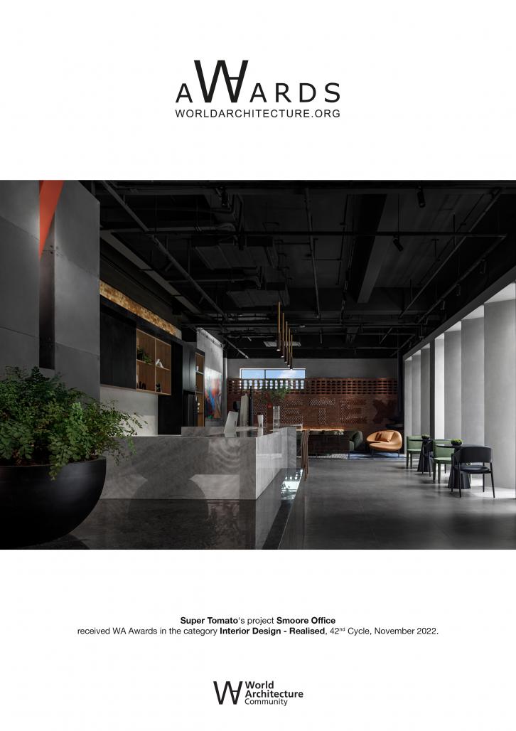
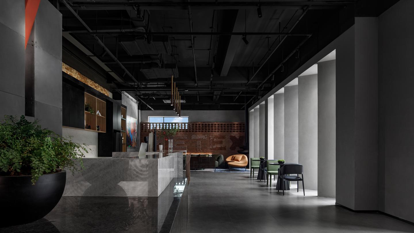
The visitors' first impression of the space is defined by the iconic corporate logo wall and bright-colored "fireplace" in the entrance lobby. Meanwhile, the space teems with a sense of openness and experience, with a water bar and reception area on the side that perform reception functions while serving as a place for employees to unwind.
A brand logo wall made of red bricks is subtly set in the space, to infuse a youthful and modern vibe into the interior.
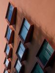
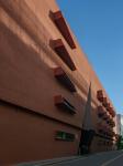
The rhythmic screen walls on the other side are installed in combination with windows, to bring daylight into the space and create a unique sense of order.
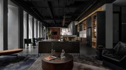
The overall space is dominated by gray and dark tones. Natural light from the outside and the interior lighting complement each other, and accentuate the detailed textures of the space. The reception area provides an intimate and comfortable communication setting. The colorful artistic painting and the orange sofa create a visual focus, and produce a more relaxing spatial atmosphere.
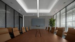
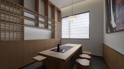
The project adopts a differentiated style for varying functional spaces. In the meeting room and the more private reception tea room, the bright and neat environment helps concentrate users' thoughts to engage in discussion and communication.
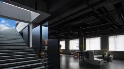
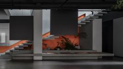
Different from the lobby on the first floor, the public area on the fourth floor is used more for in-house purposes. Its design extends the gray and black tones while highlighting the staircase leading to the rooftop.
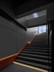
Surrounded by overlapping blocks, the staircase appears lightweight and energetic. Amidst the gray and black tones, the bright orange representing the brand, illuminated by the skylight, appears even more invigorated.
From another angle, the overlapping staircase steps and handrails resemble the black slab in Stanley Kubrick's classic film 2001: A Space Odyssey, conveying ideas of precision, exploration and enlightenment.
2021
2022
Project area: 2520㎡
Main materials: fiber cement board, red brick, gray stone, gray paint
Design company: SUPER TOMATO ;
Chief designer: Li Zhifei
Smoore Office by super tomato in China won the WA Award Cycle 42. Please find below the WA Award poster for this project.
Downloaded 0 times.
Xianglin Luo